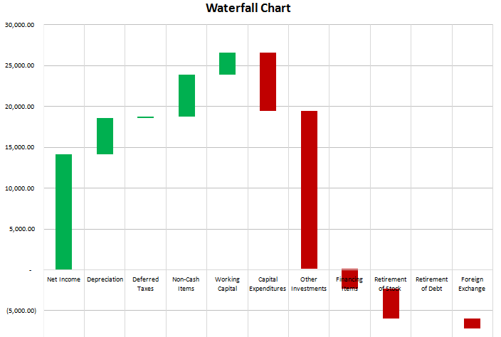
On the data tab all that is required is the change column (B), and the remaining formulas can stay intact.
If you were to track the changes in an income statement, you want to be careful to make sure favourable changes are positive and unfavourable ones negative. For example, if sales are up 100,000, that should be favourable since it has a positive impact on net income. However if expenses are up 100,000 that is unfavourable since it has a negative impact on net income, so although it is technically an increase, the change should be negative. This is where the cumulative change column is helpful because it shows you the running balance, and the ending figure in that column is what you are reconciling to. If that number is not correct then you know somewhere a sign is wrong or an amount is missing.


Add a Comment
You must be logged in to post a comment