
A good chart in Excel can display a lot of useful information in one visual. In this example, I’m going to show you how to display minimum and maximum values, as well as the range between them. This can be helpful in reviewing products to identify not only how cheap or expensive they may be, but also how much the price has fluctuated in the past. Narrow ranges may imply not a lot of movement, whereas wide ones could mean that there’s a lot of variation, and opportunity to buy that product at a lower price, assuming that past trends repeat.
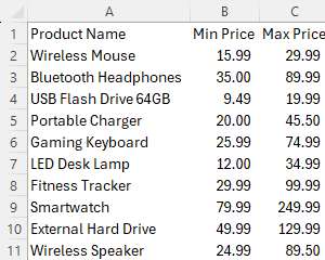
For this example, I’m going to use some tech products and use sample price ranges that might be applicable to them:
Calculating the range between min and max values
Determining the range can help you analyze just how large the delta is between two values, particularly the high and the low. To calculate it, simply take the maximum value and subtract the minimum. Assuming my first max price is in C2 and the min price is in B2, here’s how the formula will look:
=C2-B2
This value is entered into the next column, resulting in the following column added to this table:
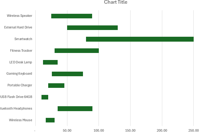
You can quickly spot the product with the largest range — the smartwatch. The high-priced item can have significant fluctuations depending on the quality and features it offers. The more modestly priced flash drive, however, has a much smaller range and less room for variance.
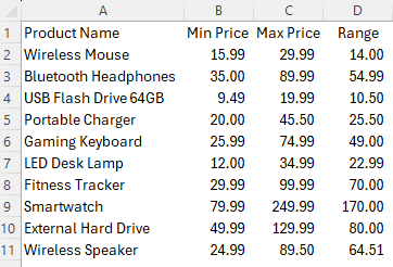
Plotting the values on a bar chart
The next step involves putting all this data on a chart. In particular, you’ll want to create a stacked bar chart. When selecting your data ensure you select the first option on the stacked bar section, which doesn’t contain a large legend. In this example, there should only be three different series: min, max, and range.
Modify the bar chart hierarchy
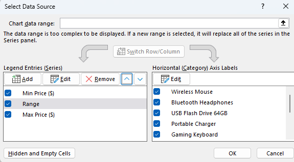
In order to ensure that your bar chart is displaying correctly and stacking properly, you’ll want to modify the way the different series are ordered. Right-click on the chart and click Select Data. By default, it will arrange the data in the order of the columns. However, I want to ensure that the range comes between the min and max values. That way, the min value is added first, then the range is stacked, followed by the max value. By using the arrow keys under the Legend Entries, you can adjust the order of the series. This is how it should look:
Adjusting the fill colors
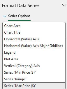
By changing the hierarchy, you can ensure the chart is stacked in the correct order. But you’ll still want the min and max bars to not be visible. The point is to plot those values but to only show the range. To do this, right-click on any bar chart and select Format Data Series.
Select the fill bucket, and ensure that the series you’ve selected is either the min or the max. This can be done click clicking on the down arrow next to Series Options:
This can be an easy way to select the correct data series. Now, with the correct field select, you can go back to the fill settings and chose the option for No fill.
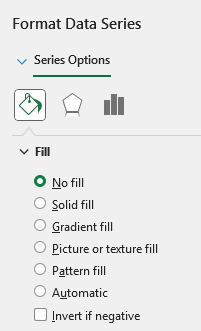
Now, repeat these steps for the other series. In my example, that’s going to be the Min price. And now, after selecting no fill, I’m only left with a chart that shows the range:
Adding min and max labels to the chart
What you may also want to do is add labels to the chart, to display the maximum and minimum values. To do this, right-click on either one of the bars that doesn’t pertain to the range, and select Add Data Labels. You’ll see a number displayed, and if you right-click on it, you can select the option to Format Data Labels.
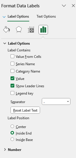
You can adjust the label to show it in the center, inside end, or inside base. Inside base will put at the start of the bar value, while inside end will display it at the end. In my example, I’m selecting inside end for the minimum value, so that its shows towards the right.
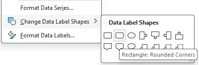
I’m also going to right-click on the label and select Change Data Label Shape and select a rounded rectangle, to ensure the value is easy to see.
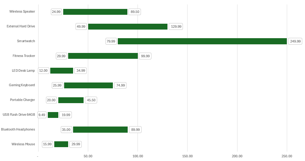
I’ll repeat the steps for the maximum value label, and select inside base. And with the rounded rectangle added, this is how my chart looks after these changes:
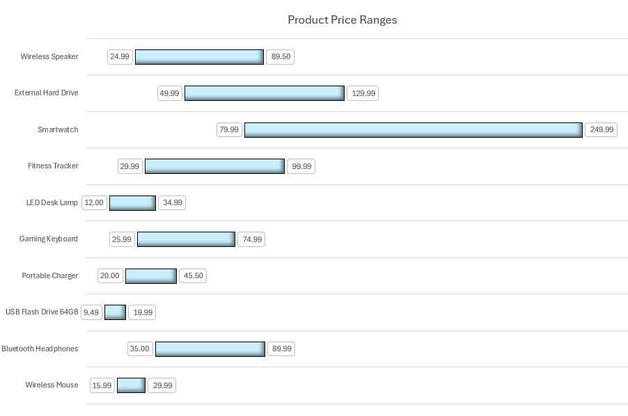
Formatting changes and final adjustments
The only thing left to do at this stage is to apply any final changes. Since I have the min and max values listed, I’m going to opt to remove the axis at the bottom, and add only horizontal gridlines. I can also remove the legend since the min and max values should be self explanatory. I’ll also change the bar chart color to a light blue color.
If you like this post on How to Create Dynamic Min-Max Range Charts in Excel, please give this site a like on Facebook and also be sure to check out some of the many templates that we have available for download. You can also follow me on Twitter and YouTube. Also, please consider buying me a coffee if you find my website helpful and would like to support it.