A key performance indicator (KPI) is a way to track how well you’re progressing towards a particular goal. Oftentimes, you might have many KPIs that you will want to track. You can create these visuals in Excel using donut charts, and below, I’ll show you how you can also have them change color based on whether you’re on track for hitting your goal or not.
Start by categorizing your results
One thing you should consider doing is to create different groups to categorize your results. For example, suppose a key metric was to ensure operating expenses were no more than $10,000 for the current period. If my actual expenses are at $9,000, I would want the chart to show green and to indicate I’m on track versus if my actuals were over $15,000 and I was way over budget.
I can classify these values based on how close they are to the target amount. Here are three categories I will set up and the rules for them:
On Target: If the actual amount is <= 100% of the target.
Slightly Over: If the actual amount is >100% and <=125%.
Well Over: If the actual amount is >125%.
One field I will also create to help track the progress will be % of Target where I take the actual and divide it by the target. Your rules could vary depending on KPI. With expenses, obviously the goal will be to come in under them whereas with sales the incentive will be to come in higher. So you don’t want to assume that your calculations will always be the same in every situation.
I also created a field called Remainder which will capture the unfilled part of the circle. Think of the top half of a circle adding to 1 and the bottom half to another 1, together they total 2. And for the remainder, I use the a formula that takes the maximum of 0 and 2 – the % of Target amount. The purpose of this is to ensure that the remaining amount isn’t negative and that everything adds up to 2.
By creating these classifications, it will be easier to set up the chart to show different colors based on which category a result falls into. Here’s an example of how this might look on Excel. These categories have been created using IF statements based on the rules noted earlier.

The key goal of creating these categories is by ensuring no result shows up in more than one place. For Expense 1, it was on target so that’s the only category it falls under. Expense 2 was 20% higher than the target, so it goes into the ‘slightly over’ category. And Expense 3, which was 50% higher, it falls into the ‘well over’ category.
Now that these categories are set up, I can go about and create the actual chart.
Creating the donut chart
Using the table shown above, I’ll create a donut chart for Expense 1.
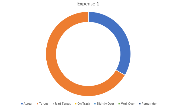
This includes all the categories I have set up, which isn’t what I want. There are multiple changes I’m going to make to this chart:
- Remove the unneeded fields.
- Apply different colors for the categories.
- Adjusting the chart so it goes from left to right.
- Adding some text boxes.
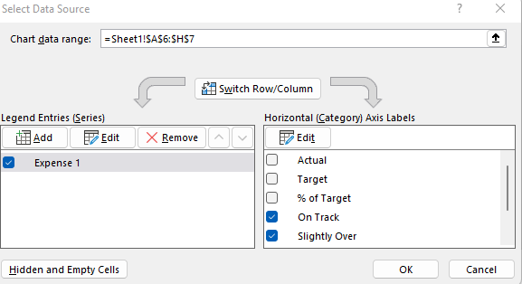
To remove the fields that aren’t needed, I’ll right-click on the chart and click on Select Data. Then, uncheck the first three field:
Next up, I’ll adjust the colors. The easiest way to do this is to click on the different colors in the legend box:

I’ll click on the blue box for ‘On Track’ series and select the color Green from the Home tab for that (note: you’ll first have to select the legend, and then click on the individual series). After setting all the different colors, this is what my chart looks like thus far:
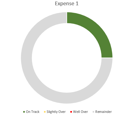
I still need to adjust the starting point of the chart as the green slice starts from the middle, not the left. To fix this, I right-click on the chart and select Format Data Series. Then, I’ll change the angle of the first slice to 270:
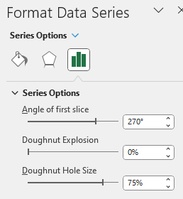
Here you can also change the hole size. The smaller the hole, the larger the slices will be. If I adjust it down to 50%, here’s what my updated chart looks like:
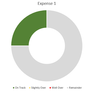
At this point, the legend really isn’t necessary anymore since the colors will do the job and I don’t really need the labels.
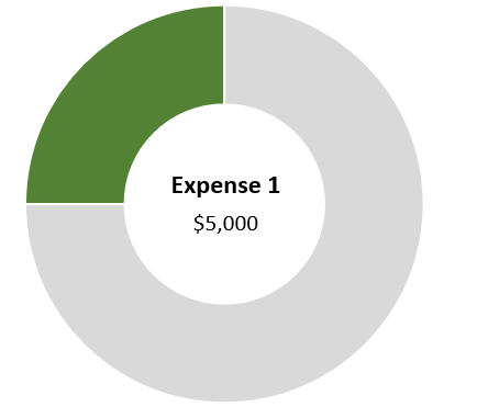
One final step you may want to consider is to use a text box instead of a label. Once you’ve added a text box, you can link it to the name of your metric (this can be done through the formula bar). Repeat the same steps for the Actual, and you can have both the name of the metric and the value to automatically update:
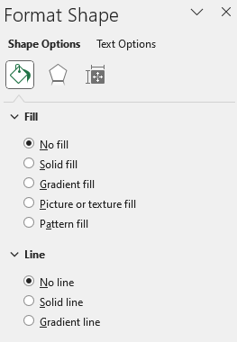
When using textboxes, I always format them to remove the background fill and remove the border. You can do this by right-clicking Format Shape and select No Fill and No Line
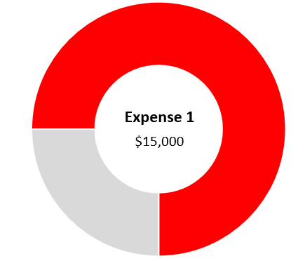
Now if I were to update the Actuals for Expense 1 to $15,000, pushing me into the ‘well over’ category, my chart would automatically update:
If you liked this post on How to Create and Track KPIs in Excel Using Donut Charts, please give this site a like on Facebook and also be sure to check out some of the many templates that we have available for download. You can also follow us on Twitter and YouTube.

