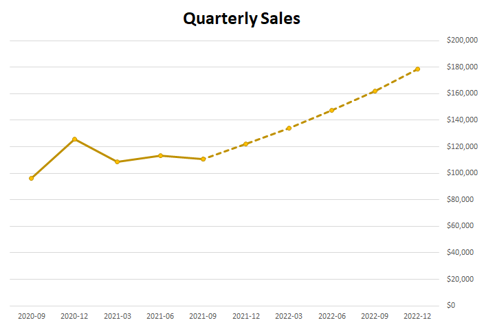
Charts are an effective tool in forecasting. In this post, I’ll show you can show you can make an actual and forecast chart in Excel look like one continuous line chart, with the forecasted numbers being shown on a dotted line.
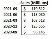
For this example, I’m going to use Amazon’s recent quarterly sales as my starting point:
I’m going to create another column for forecasted amounts for future quarters. I’ll make a simple forecast and assume that sales will increase by 10% every quarter:
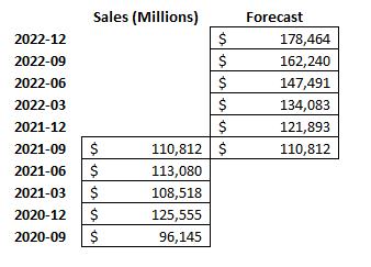
For the last quarter (2021-09), I’m including the same total in the Forecast column. This is to ensure that the new line chart picks up where the last one ends and that there isn’t a gap. Then, I’ll create a line chart for these data points, which, by default, looks like this:
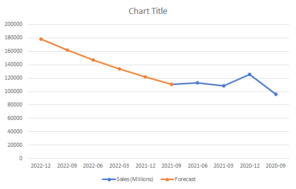
I’m going to flip this chart in reverse order so that the forecasted values are on the right. To do this, right-click on the x-axis and select Format Axis. Then, check off the box that says Categories in reverse order:

Now, at least my chart is going in the right direction (an alternative could be to structure your data in the opposite direction):
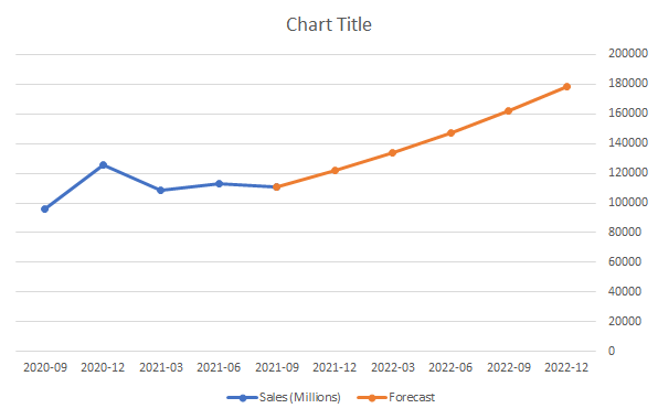
Because of the change in colors, this makes it easy to differentiate my actuals from my forecast. But I want it to be all the same color and only be differentiated by dotted lines. To do this, I will right-click on the forecasted line and select Format Data Series:
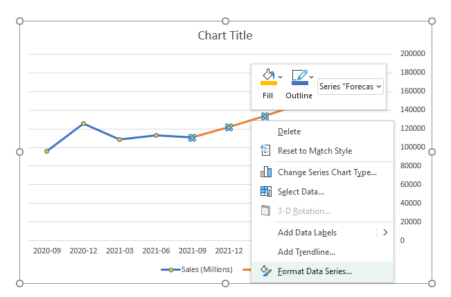
There will be an option to change the Dash type. The default is solid, and I’m going to change that to the second option from the top — Square Dot. After changing that and making the colors the same, and applying some formatting, here’s what my chart looks like:
If you liked this post on How to Make a Forecast Chart in Excel With a Dotted Line, please give this site a like on Facebook and also be sure to check out some of the many templates that we have available for download. You can also follow us on Twitter and YouTube.


Add a Comment
You must be logged in to post a comment