
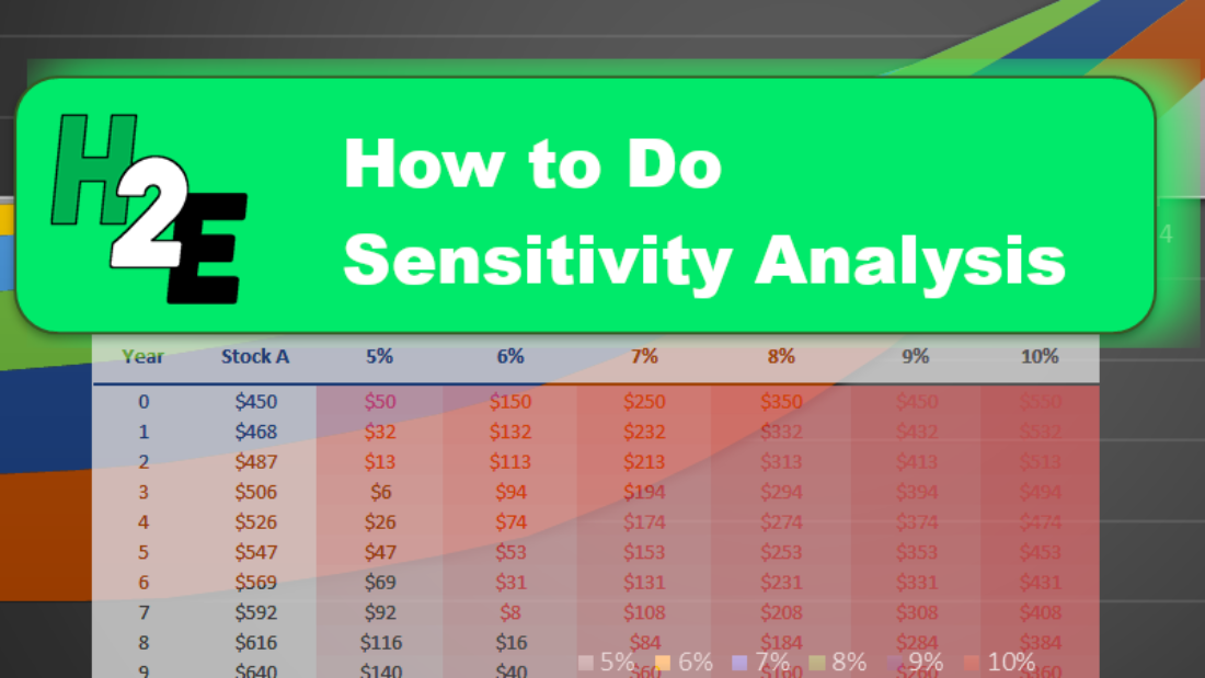
Sensitivity analysis is a powerful way to make your template or Excel model update to reflect changes in variables. It makes it easy to run various what-if scenarios at once. In this post, I’ll show you how you can conduct sensitivity analysis in Excel in a way that’s user friendly and that can make your spreadsheet that much more versatile.
In this example, I’m going to compare two dividend stocks. One that pays a high yield right now versus one that pays a lower yield but that grows its payments over the years. I’ll look at how long it’ll take for the growing dividend to become larger than the one that’s higher today. I’ll also look at what the projections are when I make changes to my assumptions.
Setting up the analysis
First thing’s first, let’s start with the basic analysis. Once that’s setup, then we can move on to adjusting the variables and setting up the visuals. To make things simple, we’ll assume that the investment in both stocks is going to be a nice, round, $10,000.
Let’s say that in our example, Stock A pays a dividend yield of 3% per year and on average it will increase its payouts by 5% ever year. Stock B, however, won’t increase its dividend payments but it currently yields 7%.
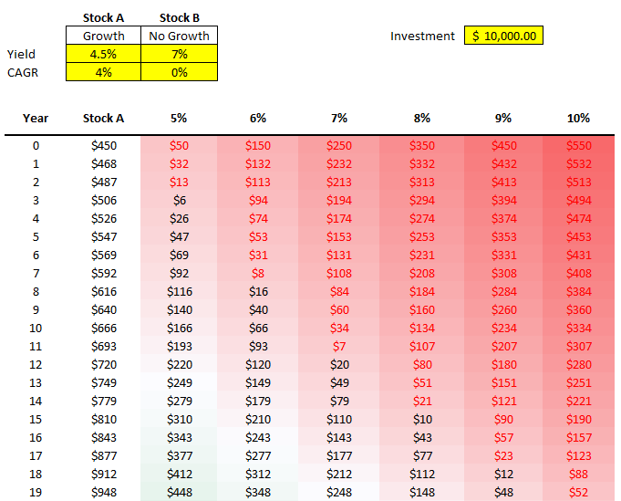
Here’s how much dividend income each stock would generate annually over the years:
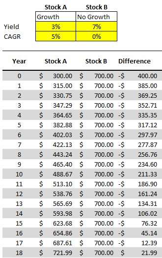
Under these assumptions, it would take 18 years before Stock A begins producing more in annual dividend income.
All that this spreadsheet is doing is just taking the total investment of $10,000 and multiplying it by the dividend yield for the first year. And for subsequent years, it’s adding on the compounded annual growth rate (CAGR). That will determine what the dividend payment will be after factoring in any increase. With Stock B, since there aren’t any increases, the dividend income remains the same. Stock A, however, increases by 5% every year.
To prove the calculations out: 1.05^18 * $300 = $721.99.
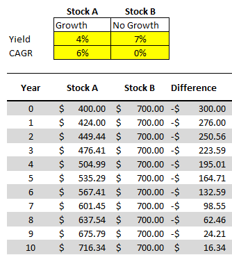
Now, suppose we change these assumptions and say that Stock A’s yield is 4% and that it grows by 6%, and Stock B’s yield remains the same. With those assumptions, it would take just 10 years before Stock A’s yield becomes the larger payout:
But rather than updating our model each and every time, we may want to have a quick glimpse as to what these differences will look like at different dividend yields.
Adding in the comparables
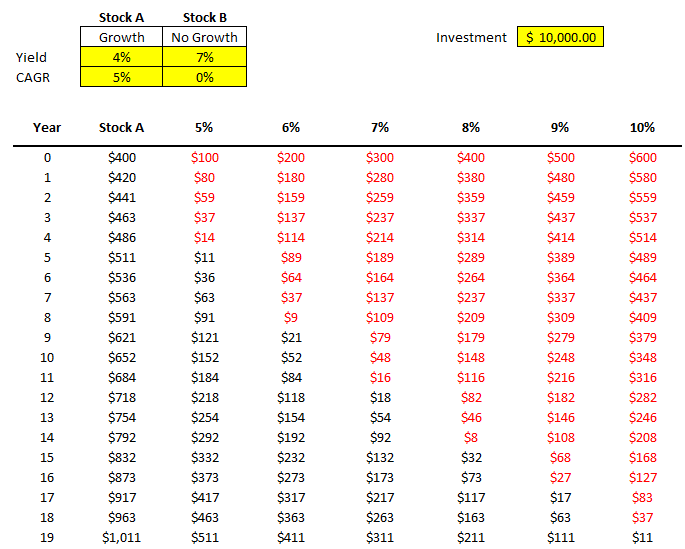
Instead of repeating these steps over and over for different stocks, to do a sensitivity analysis, I can quickly compare Stock A against a series of other stocks. For instance, I’m going to keep the assumptions for Stock A the same, and now I’ll simultaneously compare it to stocks that yield 5% all the way to 10%. I’m going to create a column for each percentage and then calculate the difference between that column and Stock A. Here’s how that looks:
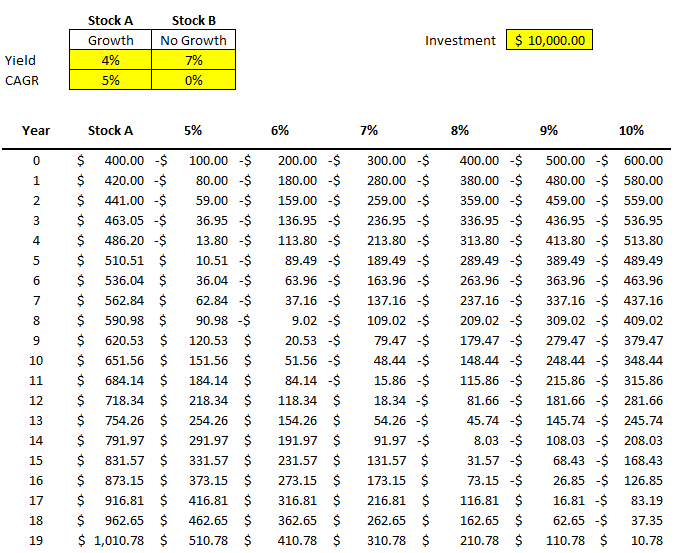
All that I’m doing for these different columns is taking the value from Stock A and subtracting from it the dividend income earned at a 5% yield, at a 6% yield, 7% yield, and so on. The difference between a 4% yield and a 5% yield on $10,000 is just $100 (this the first value under the 5% column). But as the dividend rates rise, that delta grows. At a 10% yield, there’s a difference of six percentage points. That means the non-growing dividend stock pays $600 more in year 0.
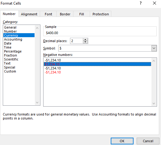
One thing that helps a sensitivity analysis chart is some formatting. First, I’ll change the format of these numbers so that negatives show up in red. I can select the cells in the other columns and change their formatting to Currency and select the red option for negative numbers:
I also removed the decimals to save space. Now, it becomes easier to see my data and when the numbers flip from positive to negative:
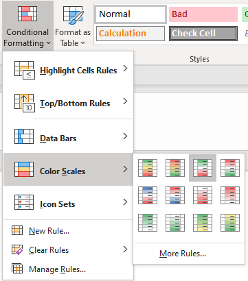
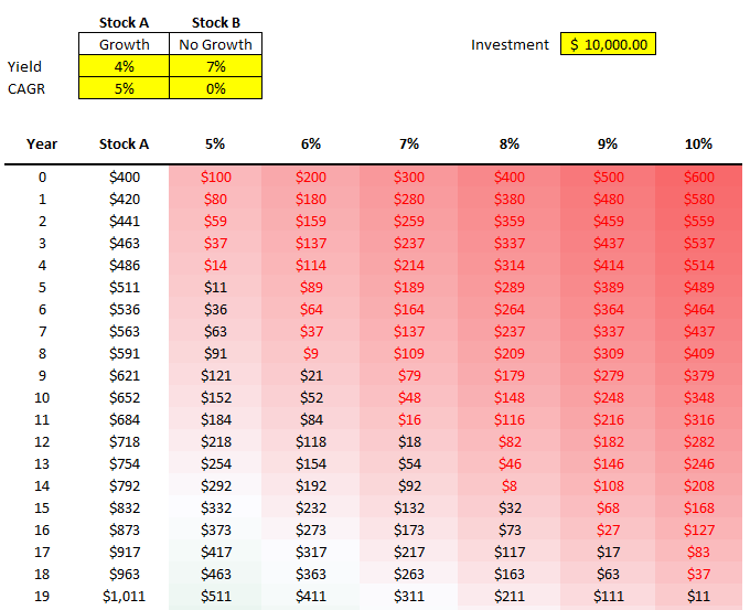
Another thing I can do is add conditional formatting. Color scales can be really helpful here, such as these ones:
Now it’s even easier to see the progression and how it relates from one dividend yield to the next:
You can adjust the formatting to how you prefer. These are just some of the ways you can help your numbers pop out.
Changing your data becomes much easier
Now, what if the stock you’re comparing changes? You’ve found one that pays 4.5% and grows by 4%. You can easily change Stock A and now the rest of the values and the formatting will update:
By being able to easily update your base stock (Stock A) and then just see the changes update for all your other comparables, you can easily run through various what-if scenarios on the fly without having to update all your other formulas. That’s where a sensitivity analysis becomes very useful; it prevents you from having to repeat steps over and over to compare different scenarios. It does it all at once for you and avoids the inevitable follow-up questions you may receive in your analysis of what about this scenario or that one.
And Another way to visualize the data, is of course, through charts. And rather than a boring line chart, one that I found particularly effective to demonstrate these differences is the 100% Stacked Area Chart. Here’s how it looks like:
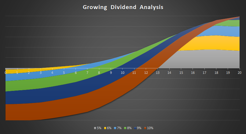
I only mapped the first 20 years. That’ because by that rate, it’ll capture the year when Stock A surpasses the 10% dividend yield. The chart does a great job of showing the size of the differences over the years and just how much longer it’ll take for Stock A to overtake a 5% yield versus a stock that’s yielding 10%. It’s certainly not the only chart that might work. However, it definitely has a nice effect that helps it stand out and summarizes the data well.
If you’d like to follow along, you can download the spreadsheet I created for this example here.
If you liked this post on how to do a sensitivity analysis in Excel, please give this site a like on Facebook and also be sure to check out some of the many templates that we have available for download. You can also follow us on Twitter and YouTube.
Add a Comment
You must be logged in to post a comment