WeightedAverage

How to Calculate Weighted Average in Excel

A weighted average is a type of average that assigns different weights or values of importance to each element in a dataset. Unlike a simple average that treats all elements equally, a weighted average adjusts the contribution of each element based on its relative significance. This means that some elements have a greater impact on the final result than others, depending on their weights.

Why use a weighted average?

Weighted averages are useful because they provide a more accurate representation of the data by taking into account the importance of each element. For example, in financial analysis, a weighted average may be used to calculate the average interest rate of a portfolio of loans or investments, where the weight of each loan or investment is based on its size or duration. In schools, a weighted average may be used to calculate a student’s overall grade by assigning different weights to assignments, quizzes, and exams based on their importance or difficulty. Anytime you don’t want everything to have the same weighting or importance is when you’ll want to use a weighted average.

Calculating a simple weighted average in Excel

A common way to apply a weighted average is by using a points system. Suppose you are looking to buy a house and have many different criteria that you want to take into consideration, such as square footage, location, if it has a basement, etc. But not all of these items are equally important, and so you may want to say that location is worth 30 points and square footage is worth 25 points, and so on.

The first step is to assign a weight, or point value, to each one of these criteria. Then, assign a score to each one of them criteria, perhaps within a range of 1 to 100. Once you’ve done that, you multiply the score by the points. Total that up, and divide it by the total points, and you’ve got your score, or weighted average. Here’s an example:

Sample weighted average calculation when evaluating the purchase of a house.

This particular house scored high on the most important items, and thus, resulted in a high weighted average. The total of the score x points column was 10,190. Taking that value and dividing it by 145, the total points, results in a weighted average of 70.28.

Here’s another house, which scores far lower, with a weighted average of just 45.48:

Sample weighted average calculation when evaluating the purchase of a house.

Although it scored high on areas such as school and kitchen, because of its low scores on the top two weightings — location and square footage — that kept its weighted average down.

Creating a template like this in Excel and comparing your different scores can be a way to help compare houses and other things, while giving each criteria an appropriate weighting. By simply scoring everything on a value of 1-100 without weighting, the problem would be that each criteria would effectively be equal, saying that things like layout and the garage are just as important as the location and size of the house, which most people likely wouldn’t agree with. By using weights, you can better take into account the value of each individual criteria.

Calculating grades using weighted averages

Another use for calculating weighted averages is when it comes to grading. In a class, you might have a specific weighting scale that says assignments are worth 10% of your grade, quizzes are 20%, a project is worth 5%, a mid-term is 25%, and the final exam accounts for 40%.

In this case, you’re using percentages that add up to 100% rather than weights, which may be more subjective. This still works in largely the same way as you are multiplying a score by the weight. Except now, since the weights add up to 100%, you don’t need to worry about taking the total and dividing it by the total weights. Whatever your result is, that is the total score. Here’s an example of how a student scored in a class:

Calculating a student's grade using a weighted average calculation.

When using percentages for weighting, it’s important to double check they add up to 100% to ensure everything is accounted for. In this example, the student had a score of 72.25, which would be the same as saying they scored 72.25%, which would be their grade for the course. As you’ll notice, the student’s high scores on the quizzes and mid-term exam were unfortunately offset by a poor final exam mark.

In this example, since we’re just looking at percentages, you can do without the extra column for value, which takes the weight x the score. Instead, you can use SUMPRODUCT. If the weightings are in cells A2:A6 and the scores are in B2:B6, the grade can be calculated with the following formula:

=SUMPRODUCT(A2:A6,B2:B6)

The formula will multiply each value by the corresponding value in the same row, thereby eliminating the need to use an extra column. By using an Excel formula, you can save yourself the extra step of having to tally up the values and then dividing them by their weights again.


If you liked this post on How to Calculate Weighted Average in Excel, please give this site a like on Facebook and also be sure to check out some of the many templates that we have available for download. You can also follow me on Twitter and YouTube. Also, please consider buying me a coffee if you find my website helpful and would like to support it.

NPVIRR

How to Calculate Net Present Value (NPV) and Internal Rate of Return (IRR) in Excel

What is Net Present Value (NPV)?

Net Present Value (NPV) is a financial metric used to determine the current value of a series of cash inflows and outflows. It takes into account the time value of money, which means that a dollar received in the future is worth less than a dollar received today due to factors like inflation and the opportunity cost of not having that money available to invest in other projects.

The calculation of NPV involves discounting the expected future cash flows of a project or investment back to their present value using a specified discount rate. The result is the difference between the present value of the expected cash inflows and outflows.

NPV is an important calculation because it helps you evaluate the profitability and feasibility of an investment. It can also allow you to compare the expected returns of different investment opportunities, and to make informed decisions about which projects to pursue.

If the NPV is positive, it means that the project is expected to generate more cash inflows than outflows, and thus, it’s a profitable investment opportunity. However, if the NPV is negative, the project is expected to result in a net loss and is therefore not considered a viable option.

The NPV calculation is an important tool in finance as it can help decision makers determine whether to move forward on a project.

What is the Internal Rate of Return (IRR)?

The Internal Rate of Return (IRR) is used to measure the profitability of an investment project or opportunity, often in conjunction with calculating NPV. It is the discount rate where the present value of expected cash inflows equals the present value of expected cash outflows, or when NPV is equal to 0.

IRR represents the rate of return at which an investment will break even over its lifetime. It is shown as a percentage. And if you use the IRR percentage as your discount rate in the NPV calculation, the result will be an NPV of 0.

With Excel, you can quickly calculate the IRR through a simple formula, rather than having to go through a time-consuming process that might otherwise involve trial and error.

Calculating NPV and IRR in Excel

To illustrate how to calculate NPV and IRR, I’ll use the following example. Suppose that you are investing $1,000 into a project that will generate the following cost savings:

  • Year 1: $50
  • Year 2: $100
  • Year 3: $250
  • Year 4: $300
  • Year 5: $600

In total, that is $1,300 in cost savings. Although that’s more than the original $1,000 investment, those savings are spread out over a period of five years. To get a true picture of whether the project is worthwhile, you need to adjust for the time value of money and adjust those amounts and calculate their present values — what their values are today. This is where the NPV function comes into play.

However, before using the NPV function, you need to determine the discount rate that you are going to use. The discount rate is important as it tells you the interest rate that you will be using when adjusting the cost savings back to today, and to calculate the present value. If the discount rate is high, then it’ll be more difficult for the NPV calculation to be positive (and hence, suggest that the investment should be taken on). And if the discount rate is too low, then it could be too easy to clear the bar and for the NPV formula to suggest the project is worthwhile.

The discount rate should be higher than the risk-free rate since you are taking on some risk, and thus, you should be compensated for doing so. If you were to use the same rate as what you could earn on a treasury bill or a bank deposit, there would be little incentive to go ahead with the project even with a positive NPV. After all, what’s the point of taking on the risk if you’re not getting a better return?

In this example, I’m using a discount rate of 5%. This is what the NPV formula will look like with all of the inputs:

=NPV(0.05,50,100,250,300,600)-1000

As you can see, the order of the values is important as that will determine how many periods each value will be discounted by. The result of this formula is a value of $71.21. It’s a positive amount, indicating that the project should be undertaken as the present value of the future cost savings offset the current investment.

To prove that calculation out, I’ll show you how this calculation could be done manually. Here, for example, is how the present value would be calculated for the $50 in cost savings that is achieved in year 1:

=50*(1+0.05)^-1

One plus the discount rate is raised to a power of negative one to bring the value back one period, using the discount rate. That returns a value of $47.619. Here are the other present value calculations:

  • Year 2 ($100) : $90.703
  • Year 3 ($250) : $215.959
  • Year 4 ($300) : $246.811
  • Year 5 ($600): $471.116

If you add all of these present values up, they total $1,071.21. And that is $71.21 more than the $1,000 initial investment, which is the same result as the NPV formula.

One thing you may be wondering is at what point does the value equal 0 — where is the breakeven? This can be calculated using the IRR formula. In Excel, this is a simple formula that just takes all the inflows and outflows. For example, if you had the negative investment amount of $1,000 in cell A1 followed by the cost savings in the the adjacent columns (until column F), then the formula for IRR would be as follows:

=IRR(A1:F1)

The end result is a value of 6.8576%. If you use this as the discount rate in the NPV calculation, you will get an NPV value of 0. This tells you that if you use a discount rate higher than this percentage, your NPV value will be negative as the level of discounting will be too high for the project to have a positive NPV value. On the other hand, anything below the IRR rate will result in a positive NPV value and thus indicate that the project should move forward.


If you liked this post on How to Calculate Net Present Value and Internal Rate of Return in Excel, please give this site a like on Facebook and also be sure to check out some of the many templates that we have available for download. You can also follow me on Twitter and YouTube. Also, please consider buying me a coffee if you find my website helpful and would like to support it.

EconomicDashboard

Create a Dashboard in Excel to Track Economic Indicators

Creating a dashboard can be an effective and efficient way to pool in many data points. In this post, I’ll show you how to create a dashboard that factors in several economic indicators, including inflation, interest rates, housing starts, GDP, unemployment, and the performance of the stock market. It will utilize power query and allow you to easily refresh the data.

Creating and collecting the data points

To make the data that I’m dynamic, I will also use a variable for the current date, so that the data will automatically update. In this example, it will be called todaysdate which is equal to the following formula:

=TEXT(TODAY(),"YYY-MM-DD")

Below are the sources for the data that I will use in creating this dashboard along with the Power Query links I will use (along with the variable for the date). I’ll also set up the Power Query links as named ranges in the Excel spreadsheet, making it easy to reference them within the queries.

Unemployment:

Named Range: unemployment

Source: https://www.bls.gov/charts/employment-situation/civilian-unemployment-rate.htm

Power Query: https://www.bls.gov/charts/employment-situation/civilian-unemployment-rate.htm

GDP:

Named Range: gdp

Source: https://fred.stlouisfed.org/series/A191RL1Q225SBEA

Power Query: https://fred.stlouisfed.org/graph/fredgraph.xls?drp=0&fo=open%20sans&mode=fred&ts=12&tts=12&width=1168&nt=0&thu=0&trc=0&id=A191RL1Q225SBEA&cosd=1947-04-01&coed=2022-12-07&mw=3&lw=2&ost=-99999&oet=99999&mma=0&fml=a&fq=Quarterly&fam=avg&fgst=lin&fgsnd=2020-02-01&line_index=1&transformation=lin&vintage_date=2022-12-07&revision_date=2022-12-07&nd=1947-04-01

Interest Rate:

Named Range: interest

Source: https://fred.stlouisfed.org/series/DFEDTARU

Power Query: https://fred.stlouisfed.org/graph/fredgraph.xls?bgcolor=%23e1e9f0&drp=0&fo=open%20sans&mode=fred&recession_bars=on&ts=12&tts=12&nt=0&thu=0&trc=0&id=DFEDTARU&cosd=2008-12-16&coed=2022-12-07&mw=3&lw=2&ost=-99999&oet=99999&mma=0&fml=a&fq=Daily%2C%207-Day&fam=avg&fgst=lin&fgsnd=2020-02-01&line_index=1&transformation=lin&vintage_date=2022-12-07&revision_date=2022-12-07&nd=2008-12-16

Inflation:

Named Range: inflation

Source: https://data.bls.gov/timeseries/CUUR0000SA0?years_option=all_years

Power Query: https://data.bls.gov/timeseries/CUUR0000SA0?years_option=all_years

Housing Starts:

Named Range: housing

Source: https://fred.stlouisfed.org/series/HOUST

Power Query: https://fred.stlouisfed.org/graph/fredgraph.xls?bgcolor=%23e1e9f0&drp=0&fo=open%20sans&mode=fred&ts=12&tts=12&nt=0&thu=0&trc=0&id=HOUST&scale=left&cosd=1959-01-01&coed=2022-12-07&mw=3&lw=2&ost=-99999&oet=99999&mma=0&fml=a&fq=Monthly&fam=avg&fgst=lin&fgsnd=2020-02-01&line_index=1&transformation=lin&vintage_date=2022-12-07&revision_date=2022-12-07&nd=1959-01-01

Stock Market:

Named Range: stockmarket

Source: https://finance.yahoo.com/quote/%5EGSPC/history?p=%5EGSPC

Power Query: https://finance.yahoo.com/quote/%5EGSPC/history?p=%5EGSPC

Loading the data into Power Query

Note on named ranges

Using the links above, I’ll create the connections in Power Query and make adjustments where necessary. To reference a named range in Power Query, you can use the following code as an example:

NamedRange = Excel.CurrentWorkbook(){[Name="namedrange"]}[Content]{0}[Column1],

The name is case-sensitive so if you use a named range that is all in lowercase as I have done, then those references also need to be in lowercase in Power Query. However, for the purposes of this example, you don’t need to use named ranges and it is an optional step.

Creating the Power Query connections

To create a Power Query connection, I’m going to start by going into the Data tab and selecting From Web under the Get & Transform Data section. For the unemployment rate data, I’ll use the link for that:

Selecting the URL to create a power query connection from the web.

After click on OK, I’ll select the table that I want to use, which is the first one on the list:

Selecting the table to use in Power Query.

I’ll click on the Transform Data button before loading it. What I will do is split the Month column so that I have both a Month and Year field. To do this, I’ll select the column, right-click and select the option to Split by Delimiter and use a space. I’ll also use this opportunity to put in my named range for the data link. In the Power Query window, under the Home tab, there’s an option to click on the Advanced Editor. Here, I’ll enter my NamedRange variable and use that when referencing the Source:

Using the advanced editor in Power Query to reference a named range.

When you’re running a query for the first time, you may see a warning asking you about Privacy Levels. Set these to Public and select Save.

Setting the privacy levels in Power Query.

Now it’s time to repeat the steps for the other data sources.

Transforming the data in Power Query

There will be some adjustments that need to be made along the way when loading the data. For example, for the data that comes from the FRED website, there are some rows at the top that need to be removed:

Removing extra rows in Power Query that appear at the top.

In this case, I’ll need to click the Remove Rows button at the top, and specify that I want to Remove Top Rows and enter a value of 11, to remove the first 11.

For the housing and inflation data, I need to make additional adjustments since the data is raw and doesn’t show the percent change, which is what I want. Here are the steps I’m going to take for those queries:

  • Unpivoting the data. This is important for the sake of making sure that months are not going across and are instead going vertically. Refer to this post on how to flip and unpivot data in Power Query.
Unpivoting data in Power Query.
  • Generating previous and current period data. I’ll create a calculated column to calculate the current period and the previous period. After the current period column is created (by simply joining the month and year together), I’ll duplicate the query so that there is an additional table for the inflation data. As for the previous period, this involves subtracting 1 from the year to get the previous year’s values. Then, the year and month are concatenated:
Calculating the current and prior-year period dates in Power Query.
  • Doing a lookup of the prior-year period. I’ll now merge the query with the one I copied earlier (the other inflation period). This involves doing a lookup of the previous period on the other table’s current period. The goal here is to get the prior-year period’s value. Here’s an overview of how to merge queries in Power Query.
Merging queries in Power Query.
  • Calculating the percent change. Once the prior-year period’s value is loaded and on the same row, I can create a custom column to calculate the year-over-year change, which is just the new value / old value -1.
  • Removing unneeded values. The final steps involve removing any blank values from the inflation rate and removing and periods that contain the word “HALF” indicating half-year values. Lastly, I’ll split the columns back out so I again have the year and month broken out, this time, along with the inflation rate %:
Power Query table showing the inflation rate by month and year.

These steps will be similar for the housing data, except I won’t need to unpivot the data since it isn’t broken out by month and year.

Creating the pivot tables and linking to the data

Now that the data is loaded, the next step is to link to it or create pivot tables, to populate the dashboard. For the unemployment data, I will summarize the average by year:

Pivot table showing unemployment data averages by year.

For the GDP tab, I’ll pull in just the four most recent quarters. To do this, I can use the INDEX function and the COUNTA function to grab the furthest values. For the most recent period, I can use the following formula:

=INDEX(A:A,COUNTA(A:A),1)

For more recent periods, I’ll deduct 1, 2, and 3 from the COUNTA value:

The GDP growth rates in Excel for the past four quarters.

The interest rates I will leave as is as that data can chart smoothly given that there normally aren’t many interest rate changes.

For the inflation rate, I will again take the average annual rate using a pivot table but only looking at data since 2010:

Pivot table showing the average inflation rate by year.

On the housing tab, I will break out the average housing starts by quarter, again using a pivot table:

Pivot table in Excel showing housing starts by quarter.

Creating the dashboard

Now that the pivot tables are set up, I can start putting together the dashboard.

For starters, I’m going to go for a clear, dark background, setting it to black. I’m going to create headers for each of the different categories: Unemployment, GDP, Interest, Inflation, Housing Starts, and Stock Market. I’ll link to the key data, referencing the key metric that I want from each tab. Each header will take up three columns, with a space between each one:

Key economic indicators showing in Excel.

What I will also do is create some conditional formatting rules for these values so that they can appear green or red based on their values. Refer to this post for an in-depth overview on conditional formatting. Below the values, I will also extract the date of the most recent data and put it within a formula, to show when the data was last updated:

Economic indicators in Excel with conditional formatting applied to them.

Next, I’ll create the charts for the different pivot tables. This is really down to preference and style, but I’ll use a combination of bar, column, and line charts to display the data. Here’s how the dashboard looks after adding a title:

A dashboard showing economic indicators, using headers and charts.

And with the data all coming from the web and utilizing Power Query, you can simply just refresh the data to pull the latest numbers, making your dashboard dynamic and easily updateable.


If you liked this post on How to Create a Dashboard in Excel to Track Economic Indicators, please give this site a like on Facebook and also be sure to check out some of the many templates that we have available for download. You can also follow us on Twitter and YouTube.

H2EKPIs

How to Create and Track KPIs in Excel Using Donut Charts

A key performance indicator (KPI) is a way to track how well you’re progressing towards a particular goal. Oftentimes, you might have many KPIs that you will want to track. You can create these visuals in Excel using donut charts, and below, I’ll show you how you can also have them change color based on whether you’re on track for hitting your goal or not.

Start by categorizing your results

One thing you should consider doing is to create different groups to categorize your results. For example, suppose a key metric was to ensure operating expenses were no more than $10,000 for the current period. If my actual expenses are at $9,000, I would want the chart to show green and to indicate I’m on track versus if my actuals were over $15,000 and I was way over budget.

I can classify these values based on how close they are to the target amount. Here are three categories I will set up and the rules for them:

On Target: If the actual amount is <= 100% of the target.

Slightly Over: If the actual amount is >100% and <=125%.

Well Over: If the actual amount is >125%.

One field I will also create to help track the progress will be % of Target where I take the actual and divide it by the target. Your rules could vary depending on KPI. With expenses, obviously the goal will be to come in under them whereas with sales the incentive will be to come in higher. So you don’t want to assume that your calculations will always be the same in every situation.

I also created a field called Remainder which will capture the unfilled part of the circle. Think of the top half of a circle adding to 1 and the bottom half to another 1, together they total 2. And for the remainder, I use the a formula that takes the maximum of 0 and 2 – the % of Target amount. The purpose of this is to ensure that the remaining amount isn’t negative and that everything adds up to 2.

By creating these classifications, it will be easier to set up the chart to show different colors based on which category a result falls into. Here’s an example of how this might look on Excel. These categories have been created using IF statements based on the rules noted earlier.

Table categorizing KPIs in Excel.

The key goal of creating these categories is by ensuring no result shows up in more than one place. For Expense 1, it was on target so that’s the only category it falls under. Expense 2 was 20% higher than the target, so it goes into the ‘slightly over’ category. And Expense 3, which was 50% higher, it falls into the ‘well over’ category.

Now that these categories are set up, I can go about and create the actual chart.

Creating the donut chart

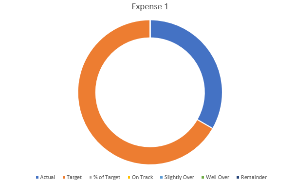
Using the table shown above, I’ll create a donut chart for Expense 1.

Donut chart in Excel.

This includes all the categories I have set up, which isn’t what I want. There are multiple changes I’m going to make to this chart:

  1. Remove the unneeded fields.
  2. Apply different colors for the categories.
  3. Adjusting the chart so it goes from left to right.
  4. Adding some text boxes.

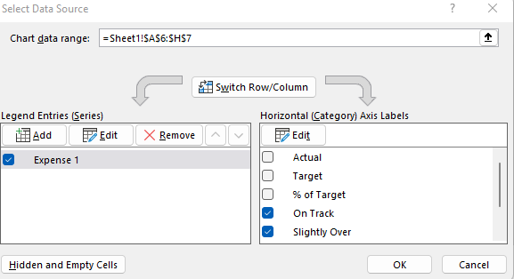
To remove the fields that aren’t needed, I’ll right-click on the chart and click on Select Data. Then, uncheck the first three field:

Selecting the fields to include in an Excel chart.

Next up, I’ll adjust the colors. The easiest way to do this is to click on the different colors in the legend box:

A chart legend showing different colors.

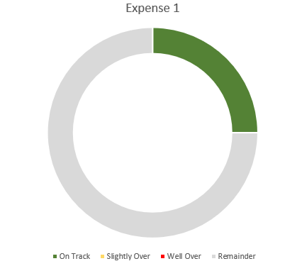
I’ll click on the blue box for ‘On Track’ series and select the color Green from the Home tab for that (note: you’ll first have to select the legend, and then click on the individual series). After setting all the different colors, this is what my chart looks like thus far:

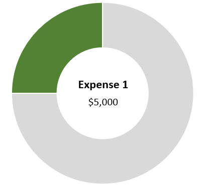
Donut chart with green slice indicating progress.

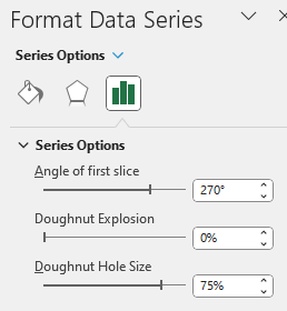
I still need to adjust the starting point of the chart as the green slice starts from the middle, not the left. To fix this, I right-click on the chart and select Format Data Series. Then, I’ll change the angle of the first slice to 270:

The format data series settings for a chart in Excel.

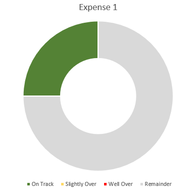
Here you can also change the hole size. The smaller the hole, the larger the slices will be. If I adjust it down to 50%, here’s what my updated chart looks like:

A donut chart that starts from the left and that has a smaller hole size.

At this point, the legend really isn’t necessary anymore since the colors will do the job and I don’t really need the labels.

One final step you may want to consider is to use a text box instead of a label. Once you’ve added a text box, you can link it to the name of your metric (this can be done through the formula bar). Repeat the same steps for the Actual, and you can have both the name of the metric and the value to automatically update:

Donut chart with text boxes linking to the description and amount.

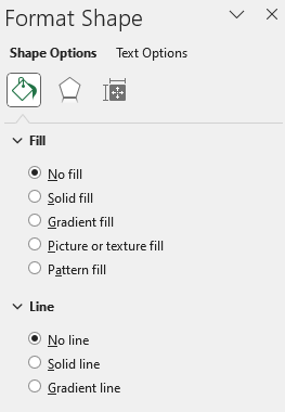
When using textboxes, I always format them to remove the background fill and remove the border. You can do this by right-clicking Format Shape and select No Fill and No Line

The format shape settings in Excel.

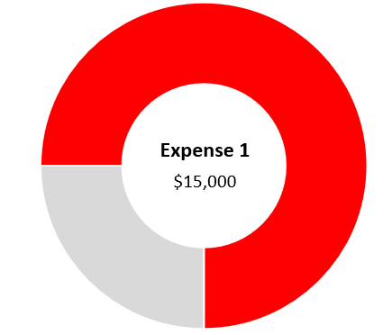
Now if I were to update the Actuals for Expense 1 to $15,000, pushing me into the ‘well over’ category, my chart would automatically update:


If you liked this post on How to Create and Track KPIs in Excel Using Donut Charts, please give this site a like on Facebook and also be sure to check out some of the many templates that we have available for download. You can also follow us on Twitter and YouTube.

H2EInflationRate WEBP

How to Calculate the Inflation Rate in Excel

Inflation has been on the rise and it’s a popular topic these days. In an earlier post, I showed you how to create an inflation calculator to determine what something would have cost in a different year. This time around, I’ll go over how to calculate the actual inflation rate in Excel, showing it as an actual percentage. Let’s get started.

How do you calculate the inflation rate?

If you follow this link to the U.S. Bureau of Labor Statistics, you’ll see a table that has all the latest inflation data. These are indexed values and so to calculate the inflation rate, all you really need to do is take the current index value and divide it by the prior year’s data. For example, September 2022’s inflation rate was 8.2%. To arrive at that, you can simply take the September 2022 index value of 296.808 and divide that by 274.31, which is the value from September 2021. The result is 1.082.

You could download this table into Excel and do a series of lookups to do these calculations. But that’s effectively what I did in the previous post. This time around, I’m going to make this much more automated and involve Power Query.

Download the data using Power Query

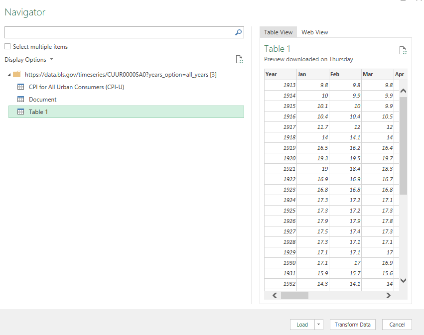
First, go to the Data tab in Excel, and click on the From Web button next to Get Data. Then, paste the URL from the link that has the inflation data. Then, you’ll see the Navigator page for Power Query, where you can select from the different tables that are found on the webpage:

Selecting a table from the Power Query Navigator window.

Table 1 is the one that contains the inflation data organized by month and year. Before loading this into my spreadsheet, I’m going to make some adjustments so that I can easily calculate the inflation rate right within Power Query. To do that, click on the Transform Data button.

Modifying the data in Power Query

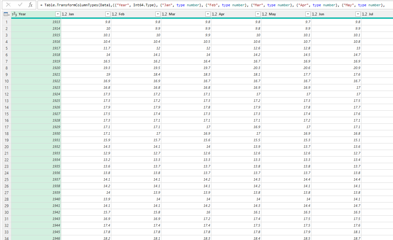
By default the data shows in the following format:

Inflation data loaded into Power Query.

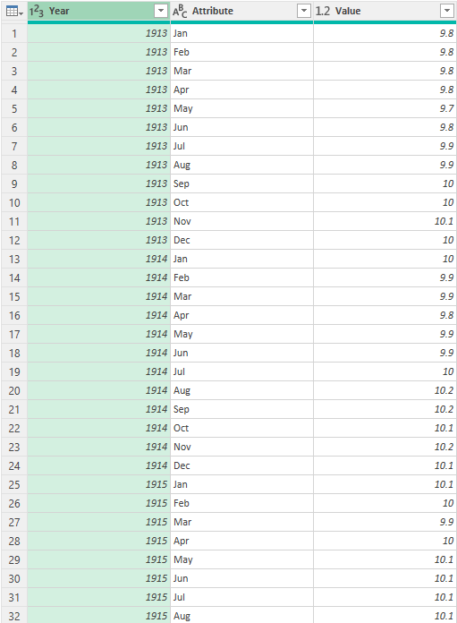
I want the years and months to both be in columns. That means I need to flip the months. To do this, I’ll right-click on the Year header and select Unpivot Other Columns. And then voila, my data is in a more manageable format:

Power Query table after unpivoting headers.

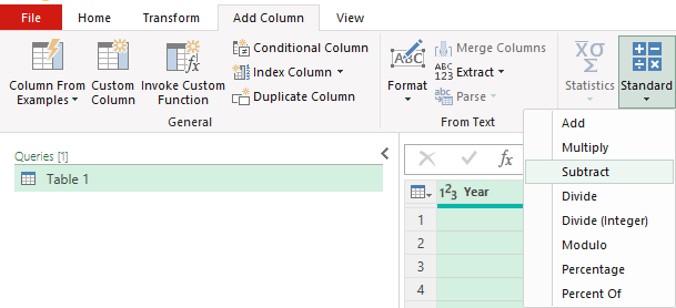
Since I want to compare to the previous year, I’ll also create another column for the previous year. To do this, I can just select the Year column and in the Add Column section, click on the Standard icon that shows different mathematical operators and select Subtract:

Using the standard button in Power Query to quickly apply calculations to a field.

The next screen will ask me for the number I want to subtract from each value, which will just be 1. After entering that and clicking OK, I will have a new field, which I will re-name to PreviousYear.

Next, I’m going to create a combined field for the year and month. First, I’ll convert the Year and PreviousYear fields to text. This can be done by clicking on the icon in their headers and selecting Text.

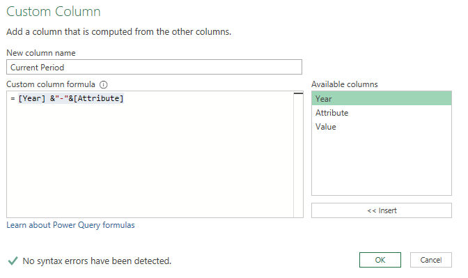
Then, under the Add Column section, I’m going to select Custom Column. From there, I can enter the following formula to concatenate the fields:

Creating a custom column in Power Query to join year and month.

I’m going to repeat these steps for the PreviousYear, and that column I’ll call the Previous Period.

Next, I’m going to split this table into two. I’ll rename the current table to Current. Then, I’m going to create a copy of it by right-clicking and selecting Duplicate, and I’m going to call the new table Previous. In the Current table, I’m only going to leave the following columns: Current Period, Previous Period, and Value. While on the Previous table, I’m only going to include the Current Period and the Value.

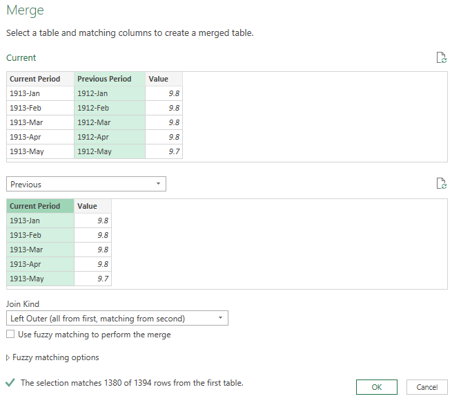
What I will do next is to merge the tables, where I’ll be looking up the prior period’s value. To do this, I’ll go to the Current table and under the Home tab, select the option to Merge Queries. I’m going to connect the queries with the Previous Period from the Current table to the Current Period in the Previous table. The goal here is to be looking up the prior-year period:

Merging tables in Power Query.

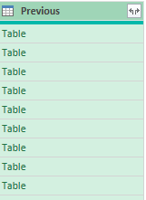
Next, I’ll click on the icon in the newly created column to expand the fields out:

New field created in Power Query after merging queries.

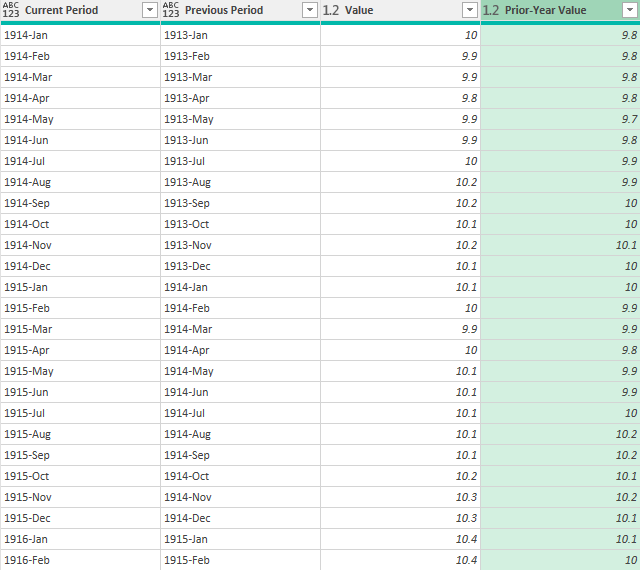
I’m only going to select the Value, as that is the prior value that I want. I’m going to rename that field the Prior-Year Value:

Power Query table after merging queries and extracting the prior-year period value.

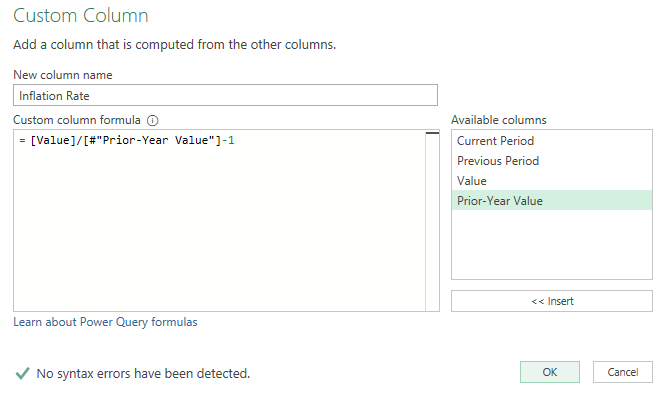
These values shouldn’t be the same and you can easily check to make sure that they are correct. For example, 1914-Jan will show up in both the Current and Previous Periods. And those corresponding values both show 10. Now that I’ve got the current and previous values, the next step is to calculate the percent change. To do this, I’ll create another Custom Column, with this as my calculation:

Calculating the inflation rate in Power Query.

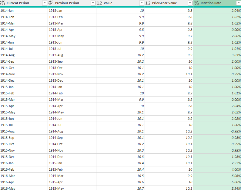
I’ll then convert the field so that it is in a percentage format, and here is what my inflation rate column looks like:

Power Query table with the inflation rate calculated.

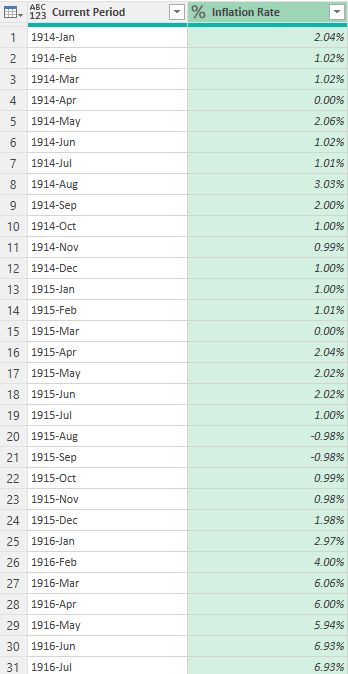
The only thing left at this point is to clean up the Power Query table to remove any unnecessary columns and values. I will filter out any values that are empty. To do this, I’m going to click on the drop down for the Inflation Rate header and select Remove Empty. This will get rid of the values that didn’t have a prior year value. I’ll also remove all the columns except for the Current Period and the Inflation Rate.

Power Query table showing only the current period and the inflation rate.

Now that my transformations are complete, I can load this into Excel using the Close & Load button on the Home tab. It will load the Previous table as a new tab, but I can delete that so that I only have the Current table.

Now, moving forward, as the inflation rate data updates, I can just right-click on this table and click Refresh, and Power Query will load the data and calculate the latest inflation rate for me.


If you liked this post on How to Calculate the Inflation Rate in Excel, please give this site a like on Facebook and also be sure to check out some of the many templates that we have available for download. You can also follow us on Twitter and YouTube.

DoublingTimeLambda

Calculating the Doubling Time Formula in Excel

Do you want to calculate how quickly it will take for something to double in value? In this post, I’ll show you how to calculate that using the doubling time formula. By utilizing variables, it can also be easily updated in Excel to factor in different growth rates, making it easy to do what-if calculations.

What is the doubling time formula?

The doubling time formula utilizes logarithms and takes an assumed growth rate to determine how long it will take for a value to double in value. For example, if your investment were to rise at a rate of 10% per year for 10 years, it would be worth roughly 2.59 times what it is now. But rather than doing trial and error to try and determine exactly at what point it will double in value, you can use a formula to do that for you.

In essence, all the doubling time formula involves is taking the logarithm of the change in value you’re trying to get to (e.g. 2) and dividing that by the logarithm of the current growth rate plus 1 (e.g. 1 + 0.1 = 1.1). By doing this calculation, you get an answer of 7.27 for this example. You can plug that into the following formula to check:

1.1^7.27

And the result will 1.9995. The more decimal places you keep in the above calculation, the closer you will get to precisely 2. This formula can also be adapted if you want to calculate how long it will take to triple, or quadruple. In those cases, you can just change the numerator so that instead of taking log 2, you’re taking log 3 or log 4, if you want to calculate tripling or quadrupling time, respectively.

Setting up the formula in Excel

As you can see, this isn’t a terribly complex formula. The key is really just using logarithmic functions in Excel. And whether you use a natural log or not doesn’t matter, your results will be the same. You can use the LOG function for these purposes. In Excel, the earlier formula would be calculated as follows:

=LOG(2)/LOG(1.1)

To make it more versatile, I’ll also add some variables here. One for the current growth rate, and one for the target growth (this is where you can specify if you want to double, triple, quadruple, etc.). Here’s how that looks:

Doubling time formula in Excel.

A value of 2 will read as 200% in Excel. The formula to calculate the years to double will simply need to be adjusted to factor in for these variables, which I’ve named TargetGrowth and GrowthRate in my file:

=LOG(TargetGrowth)/LOG(1+GrowthRate)

By utilizing these variables, I can now easily update my calculations.

Creating a LAMBDA function to make it even easier

Another thing you can do is to create your own LAMBDA function. If you’re on the latest version of Excel, these are custom functions you can ease, without the need to even set up a template and separate cells. All this involves is going to the Name Manager in Excel as if you were creating a new named range (the long way). Except when you create it, the name you’re assigning is the name of the function. And rather than referencing cells, you’re entering in a formula.

This particular function should contain two variables, one for the current growth rate, and one for the target. It will then plug them into the formula I referenced above. Here’s what the formula will need to look like within the Name Manager:

=LAMBDA(current,target,LOG(target)/LOG(1+current))

You’ll notice it needs the LAMBDA prefix so that Excel knows to treat this differently. Here’s how it looks within the Name Manager:

Doubling time lambda function in Excel.

I called it DoublingTime even though it can do more than just calculate that. You can of course call it whatever you prefer. Now, this formula can be used in Excel to do the exact same calculation as above, without the need for extra cells:

You’ll notice here I’m just entering in raw values as opposed to percentages. This is just because of how I structured the formula and to keep it as simple as possible.


If you liked this post on Calculating the Doubling Time Formula in Excel Functions, please give this site a like on Facebook and also be sure to check out some of the many templates that we have available for download. You can also follow us on Twitter and YouTube.

H2Efinancials

How to Import Financial Statements Using Power Query

In this post, I’ll show you how you can import a company’s financial statements into Excel using Power Query. Previously, I’ve covered how to get stock prices from both Yahoo Finance and Google Sheets. But to get financial statement information, I’m going to use a different source: wsj.com. The reason being, is it’s in an easy format to export and that makes the import process very easy for Power Query.

Downloading the data

I’m going to use Walmart’s financials for this example. And if you navigate to the following URL, you will get a summary of Walmart’s quarterly financial statements:

https://www.wsj.com/market-data/quotes/WMT/financials/quarter/income-statement

What’s convenient about this URL is that it contains both the ticker, the statement type, and indicates that the financials are quarterly. That makes it easy to alter in case you wanted to look for annual statements or a balance sheet rather than an income statement. Just changing the URL will get you to the right page. The above link is what I’m going to use for this example.

To load the data into Power Query, go to the Data tab and click on From Web:

The data tab in Excel that shows the Get & Transform data section.

Then, paste the URL in the following box:

Entering a URL in the From Web section.

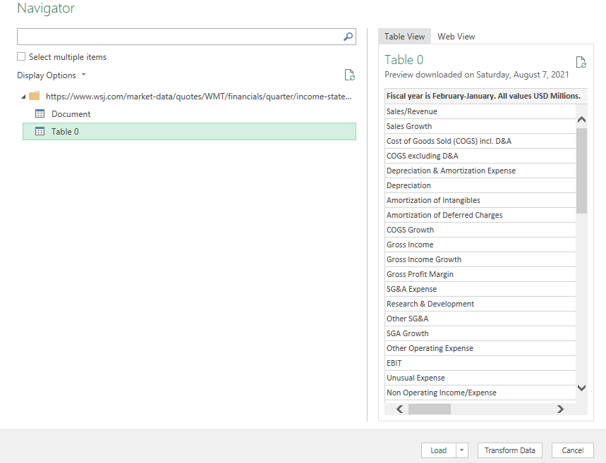
After clicking OK, you can select which table to import. In this case, it’s going to be Table 0:

Selecting which table to import from a Power Query import.

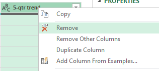
Next, press the Transform Data button to make changes before it gets imported. I’ll start with removing the column at the very end, showing the trend, as it doesn’t contain any information. To remove it, right-click on the header and click Remove:

Removing a column from Power Query.

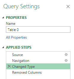
I’m also going to remove the Changed Type step, which automatically changes the data types. To get rid of the step, click on the X next to the step:

Removing a step from Power Query.

This is important because since the header names change based on the quarter, it isn’t going to be helpful to have this step since it looks for hardcoded values. An optional step you could take is to Demote Headers so that the header names are generic and not tied to a specific quarter. However, this isn’t necessary if you remove the Changed Type step. For more information on changing header names, refer to this post.

Once you’re done making changes, click on Close & Load in the top-left corner, and then your data will load into a sheet.

Close & Load button in Power Query.

The download will work just fine right now. However, let’s also make the file a bit more versatile in case you want to quickly change the ticker symbol.

Setting up the variables

First up, I’ll create a named range for the ticker symbol, called ‘Ticker’ :

Power Query table with a variable for a company's stock ticker off to the right.

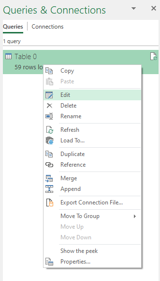
I’ll now go back into the query editor to account for this named range. To edit a query, go into the Data tab, click on Queries and Connections, and then off to the right you should see your queries. Right-click edit on the one you want to adjust:

Selecting the option to edit an existing query in Excel.

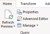
Then, click on the Advanced Editor button near the top of the Power Query window:

The Advanced Editor button located on the Power Query Home tab.

I’m going to add the Ticker variable under the let section as follows:

Ticker = Excel.CurrentWorkbook(){[Name=”Ticker”]}[Content]{0}[Column1],

Note that Power Query is case-sensitive and you will get an error if what you’ve entered doesn’t match exactly what you’ve set as your named range. Also, make sure to add a comma at the end.

I will also need to adjust the Source variable so that it uses the Ticker variable:

Source = Web.Page(Web.Contents(“https://www.wsj.com/market-data/quotes/”&Ticker&”/financials/quarter/income-statement”)),

The key thing here is to break up the part of the URL that mentions WMT and replace it with the named range. Here’s what the code looks like within the Advanced Editor:

Power Query code in the Advanced Editor.

Now, you can Close & Load back into the worksheet. To test the named range, what you can do is replace the ticker value from WMT to AMZN, and if it works correctly, it should load Amazon’s income statement instead. After changing the ticker symbol, remember to press the Refresh All button under the Data tab:

The Refresh All button in the Data tab.

If it works, you should see a whole new set of data populate on your spreadsheet:

Amazon's income statement loaded into an Excel spreadsheet using Power Query.

If you liked this post on How to Import Financial Statements Using Power Query, please give this site a like on Facebook and also be sure to check out some of the many templates that we have available for download. You can also follow us on Twitter and YouTube.

h2eVariances

How to Calculate Variances in Excel

In this post, I’m going to show you how you can easily calculate variances in Excel. I will also go over how to group variances and how using pivot tables, charts, and conditional formatting can help save you time in reviewing them.

For this example, I’m going to use data from the S&P 500 as stock prices frequently fluctuate. To start, I’m going to download the data from the past year. I’m going to remove everything except the closing values just to keep this example simple:

Download of the S&P 500 closing prices over the past 12 months.

Calculating the variances

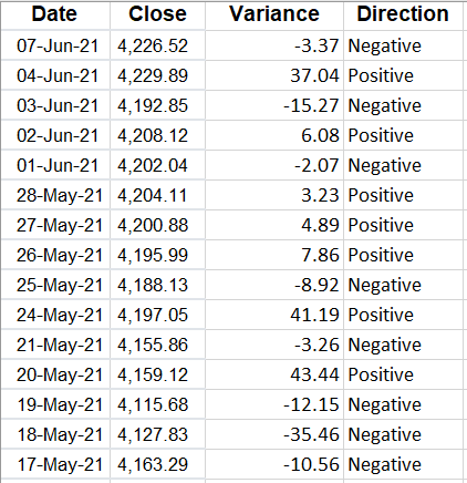
The calculate the variance in these data points, what I need to do is to take the current closing price, and subtract the previous day’s closing price from it. That will tell me how much of a move there was that day. On June 7, for instance, the S&P 500 fell from 4,229.89 on June 4 (the previous trading day) to 4,226.52. If I minus the current day’s close from the previous, I get a value of -3.37.
But we can dig a lot deeper than just looking at the difference in price. Let’s also create a field to indicate whether these variances are positive or negative. To do that, I’ll create another column called ‘Direction.’ For this calculation, I will take a look at the value in column C (where my variance is) and create a simple IF formula:

=IF(C2>0,”Positive”,”Negative”)

Here’s what my sheet looks like now:

Table of variances showing positive and negative values.

Although you can determine whether it is positive or negative from the variance field, by creating another column you can quickly filter if you want to look at all the negative or positive values. Another column I’ll insert here is for the percentage change.

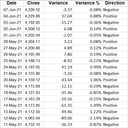
To do this, what I will do is take the variance amount and divide it by the previous day’s closing price. This will tell me how much the price has moved as a percentage of what its value was the day before — which is much more useful than just looking at the raw value. After inserting the column, I have the total variance, variance %, and which direction it went in:

Variances by raw amount, percentage, and positive or negative indicator.

I changed the variance % field to show percentages and I added a few decimal places since the percentages are fairly small. To add decimal places, go to the Numbers group on the Home tab and click the following button on the left:

Button to increase or decrease the number of decimal places.

The one on the left will add decimal places while the one on the right will remove them.

However, what if you don’t care about positives or negatives and are just interested in the absolute value of the changes? I’ll cover that next.
Calculating changes in absolute value

With absolute value, you remove the positive or negative indicator. And to calculate a variance this way, you just need to add a formula to the calculation in the variance field. Rather than this:
=B2-B3

You would enter this:

=ABS(B2-B3)

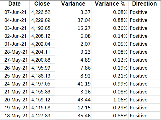
Now, my variances update and I no longer have a use for the Direction field since all the values will be positive:

Variance table when only calculating absolute values.

Alternatively, you could also just create another column specifically for the change in absolute value.

Now that the variances have been created, what you may want to do next is to group them.

Grouping variances

Why would you want to group variances? The big advantage in doing so is they can make it easier to analyze a large data set by showing you where the bulk of the variances are.

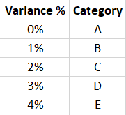
Rather than creating a bunch of IF statements, what I’ll do is create a table to show where the variances belong:

Table grouping the variances.

I’ve created a named range called VarianceTable for this. And now, all I need to is use a VLOOKUP formula to find which category a variance belongs in. Since I’m not using an exact match, I will set the last argument in the function to ‘TRUE’ :

=VLOOKUP(D2,VarianceTable,2,TRUE)

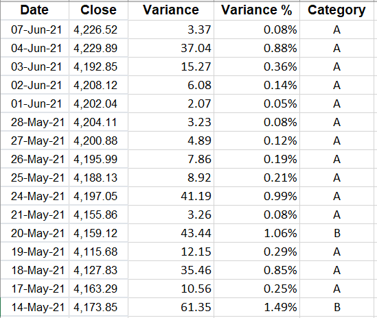
Now I have a category field instead of the Direction:

Table with variances grouped by category.

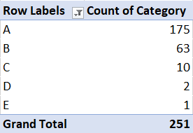
But this doesn’t tell me a whole lot. I could filter by the category. However, a better approach is to create a quick pivot table that shows me a summary of where the values fall:

A pivot table showing the count of the different variances groups.

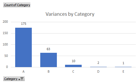
And from that, I can quickly display these variances on a chart:

A chart showing variances by category.

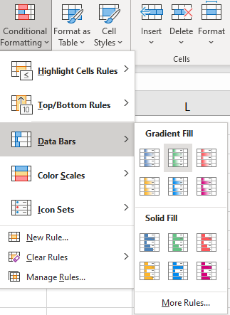
Another way you can help identify extreme values in variances is by using conditional formatting. To apply conditional formatting, select either the variance column or the variance % column and under the Conditional Formatting button on the Home tab, you can select either Data Bars or Color Scales. I prefer using Data Bars since there are fewer colors:

Selecting data bars under the conditional formatting section.

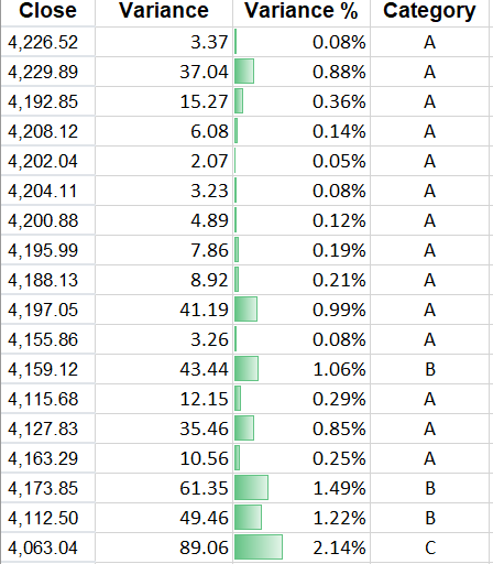
Then, my variances are easier to visualize and to see where the highs and lows are:

When you are analyzing variances, using conditional formatting, pivot tables, and charts can help you summarize your findings.


If you liked this post on How to Calculate Variances in Excel, please give this site a like on Facebook and also be sure to check out some of the many templates that we have available for download. You can also follow us on Twitter and YouTube.

adc

Average Down Calculator Template

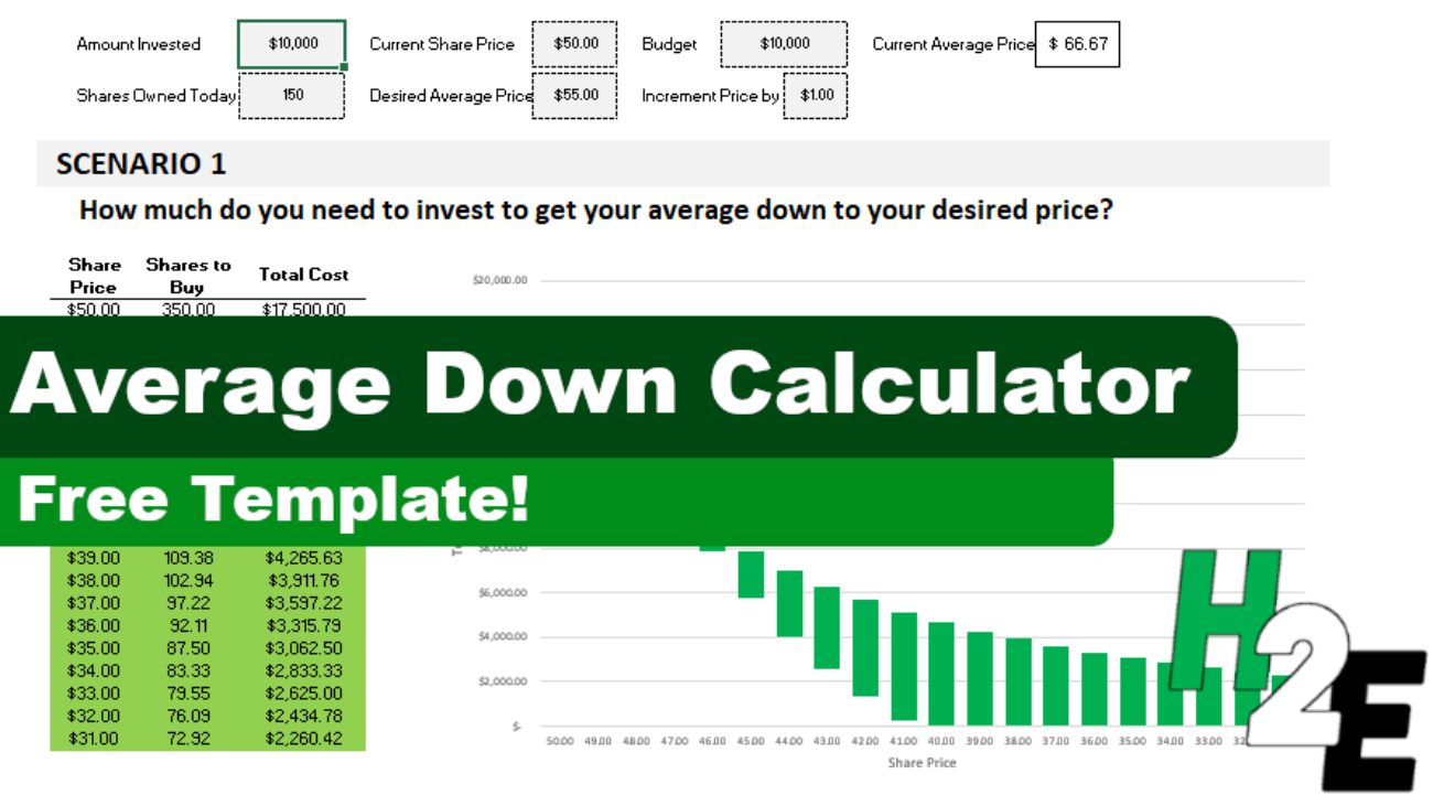
If a stock you invested in dropped in price, it could be a good opportunity to buy more shares and bring your average down. You can use the average down calculator on this page to do a quick what-if calculation to determine how many more shares you would need to be. However, you can also use this template, which will allow you to run through the same scenarios within Excel.

How the average down template works

There are only six inputs on this template:

  • Amount invested
    • This is how much money you have already invested into the stock.
  • Shares owned
    • The number of shares that you own.
  • Current share price
    • What the share price is.
  • Desired average price
    • What price you want to average down to.
  • Budget
    • How much money you can afford to invest.
  • Increment price by
    • This is for the sensitivity analysis and determines by how much you want it to move by. The default is set to $0.50.

Once you’ve entered that data, the rest of the template will populate. Here are the two scenarios that it will show you:

1. Getting to your desired average price

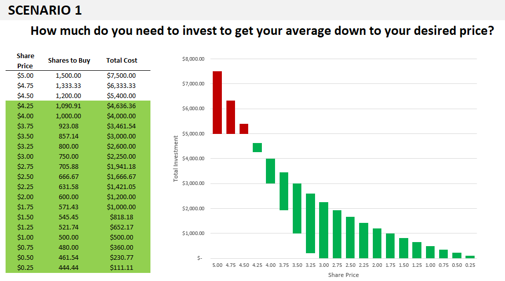
In this scenario, the template will show you how much to invest at different price points to get your average down to your desired average price. You will see up to 20 different data points to show you if the price continues to get lower, how many shares you will need to buy to reach the average price you are targeting.

And any scenarios that fall within your budget will be highlighted in green, and so will the corresponding chart:

Average down calculator showing how to get down to an average desired price.

If all the data points aren’t filled in or it looks like the chart doesn’t go all the way to the right, this is a sign you need to fix your Increment Price by value. Enter a smaller price increment and you’ll see more data points and a more complete chart.

2. How low you can get your average

The second scenario ignores the desired average price and simply tells you the different average prices you can average down to if you buy at the current price. This is good if you don’t have a specific average in mind and just want to see how low you might be able to go.

Average down calculator showing how low you can get your average.

You’ll notice on the x-axis it refers to the average price rather than the share price in the earlier chart.

Please note that the template is locked down and this is to prevent overwriting formulas which could lead to errors in the calculations and the charts.

Download the file

You can download the file for free, from here. The free version is limited to five price points. On the full version, there are 20 different prices, no ads, and there are more scenarios:


If you liked this Average Down Calculator Template, please give this site a like on Facebook and also be sure to check out some of the many templates that we have available for download. You can also follow us on Twitter and YouTube.

Price to Earnings Ratio Calculator

To enter data in the price to earnings ratio calculator, start from top to bottom. Tabbing over or hitting enter will update the calculations.

    Current Stock Information

Price $

EPS   $

P/E      

  What-if Analysis

      Change


      to


What P/E is and why it’s important for investors

The price-to-earnings (P/E) ratio is a key metric that many investors use when analyzing whether a stock is well-priced and a good buy, given its level of earnings. The calculation takes the current stock price and divides it by the company’s earnings per share, typically over the last four quarters. You can also calculate a forward P/E. This is what the ratio will be in the future, based on estimates of earnings.

This is a particularly useful calculation in a year like 2020 when the coronavirus pandemic has thrown many businesses out of whack and some are over or underperforming. And that means their P/E ratios may not be all that reliable right now.

Using a P/E ratio is particularly useful when comparing one stock against another. If a stock is trading at a very high P/E of 50 or more, it could be a sign that it’s overvalued. However, this can be skewed if a company is coming off a bad quarter where its profits were low. It’s always important to consider the context. And comparing different types of industries may not be helpful, either. A bank stock that is relatively stable and that may not achieve much growth will trade at a much lower P/E than a high-growth tech stock where its sales are climbing by 50% or more.

How to use this calculator

I wanted to create a calculator that could be useful for setting up alerts. For instance, if a stock is trading at a P/E of 50 and you want to set up an alert for when it falls to a lower multiple. You can use the What-if analysis section to plug in the P/E that you want to buy it at. It will then tell you the price it will have to fall to or the EPS that it will need to rise to.

You could also use it as a simple P/E calculator. While many financial websites may give you a P/E number they won’t always update quickly, like when a company reports its earnings. If you know what the new P/E is, you can plug it into the calculator. You can also do a what-if analysis to see what the ratio will be if earnings rises or falls to a certain number.

To enter data into this calculator, you’ll want to start from the top and work your way down. Enter the price and EPS first and then make your selections in the what-if analysis. If you go straight to the what-if analysis then the calculation won’t be correct. As you’re entering data and tabbing over, the formulas will automatically update. Hitting enter after entering in a number will also update the calculation.

Another calculator you may want to try is the average down calculator, which can help you determine how many more shares you’ll need to buy to get your average price down to a specified amount.


If you liked this post on the price to earnings ratio calculator, please give this site a like on Facebook and also be sure to check out some of the many templates that we have available for download. You can also follow us on Twitter and YouTube.