TexttoColumns

How to Convert Text to Columns in Excel: The Ultimate Step-by-Step Guide

Are multiple fields taking up just a single column in your Excel spreadsheet? This is a common issue when working with data from an external source. But manually retyping data into separate columns is tedious and error-prone. Fortunately, Excel offers a powerful feature designed exactly for this problem: Text to Columns. In this guide, I’ll walk you through how to use the Text to Columns wizard, and if you’re using the latest version of Excel, I’ll also show you other ways you can convert your text into multiple columns.

What is “Text to Columns” in Excel?

Text to Columns is a built-in Excel tool that splits a single cell of text into multiple cells based on a specific boundary. This boundary is usually a character (like a comma or space) or a fixed position in the text.

Common use cases include:

  • Splitting full names (John Doe) into First Name (John) and Last Name (Doe).
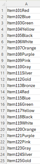
  • Separating product SKUs (Item123Red) into ID, Batch, and Color.
  • Cleaning up data exported from CSV files or database software.

Method 1: Using the Text to Columns Wizard (Delimited)

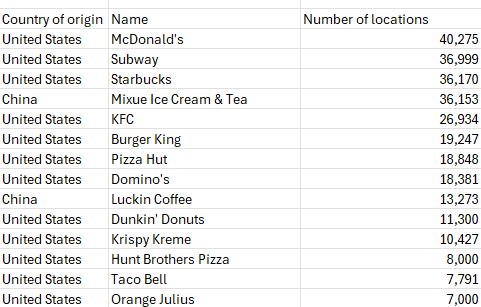
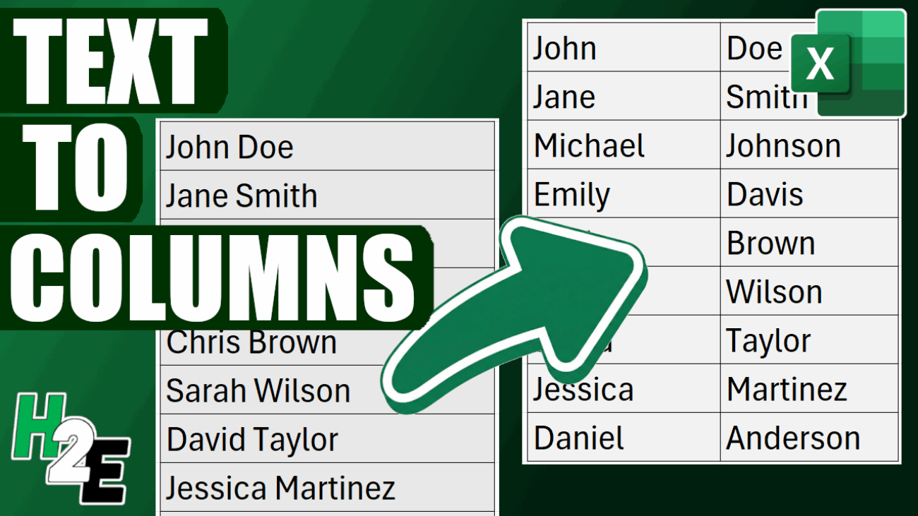
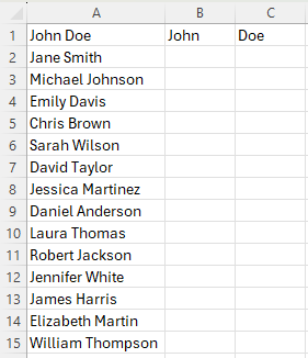
This is the most common method. You use this when your data is separated by a specific character, known as a delimiter (e.g., commas, tabs, semicolons, or spaces). In the following example, I have a list of values in one column showing first and last name. I am going to break it out so that first name is in one column and last name is in another.

List of cells in Excel containing both first and last names.

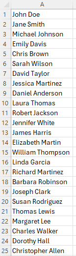
Step 1: Select Your Data

Starting by highlighting the range of cells containing the text you want to split.

  • Pro Tip: Ensure the columns to the right of your data are empty. Excel will overwrite any existing data in those cells.

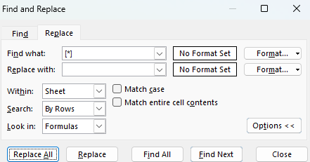
Step 2: Open the Wizard

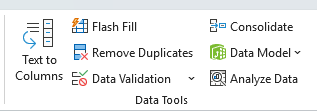
Go to the Data tab on the Ribbon and click Text to Columns in the Data Tools group.

The data tools section on the data tab in Excel's ribbon.

Step 3: Choose “Delimited”

A wizard window will pop up. Select Delimited and click Next.

Step 1 of the text to columns wizard in Excel.
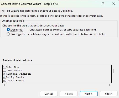
  • Pro Tip: Unless you always need to split a cell in the exact same place each time, you won’t need to use the Fixed Width option.

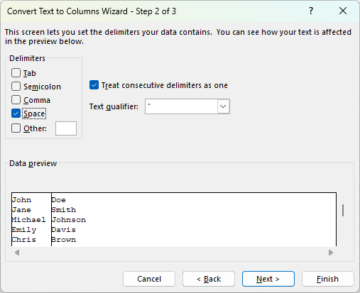
Step 4: Select Your Delimiter

Check the box that matches how your data is separated.

  • If your data looks like Doe, John, check Comma.
  • If your data looks like Doe John (as it does in the example above) check Space.
  • You can see a preview of how your data will be split in the Data preview window at the bottom. If it looks okay, click Next.
Step 2 of the text to columns wizard in Excel.

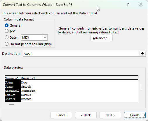
Step 5: Format and Finish

In the final step, you can choose the data format (e.g., Text or Date) for each column.

  • Destination: By default, Excel overwrites the original column. If you want to keep the original data, change the Destination cell to the next empty column (e.g., $B$1).
  • Click Finish.
Step 2 of the text to columns wizard in Excel.

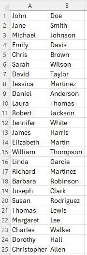
The end result is that the original column has now been split into two.

Data in Excel after the text to columns tool has been used.

Method 2: Using the Text to Columns Wizard (Fixed Width)

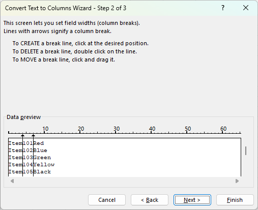
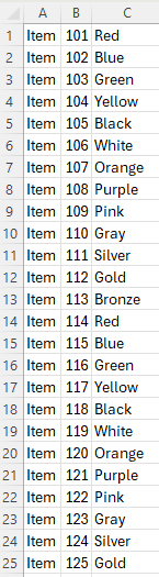
Use this method when your data isn’t separated by a character, but rather organized by specific spacing (e.g., the Product ID is always the first 5 characters, followed by a space, then the Date). In the below example, the first two fields always contain the same length, and there is no delimiter that can break all of them apart.

Data set in Excel where three fields are in a single column, without a delimiter.
  1. Select your data and open Text to Columns.
  2. Choose Fixed width and click Next.
  3. Set Field Widths: Click in the ruler area within the Data preview section to create a break line. You can drag the line to adjust the width or double-click to delete it.
  4. Click Next, verify your format, and click Finish.
Convert text to columns with fixed width.

Since the lengths of the first two fields are always the same, using Fixed Widths is an ideal solution in this example. This produces the following result:

Data in Excel after the text to columns option has separated it out based on fixed width.

Method 3: The Faster Alternative (Flash Fill)

If you are using Excel 2013 or newer, you might not need the wizard at all. Flash Fill uses pattern recognition to do the work for you.

How to use Flash Fill:

  1. Suppose your data is in Column A. In Column B (the adjacent cell), manually type exactly what you want to extract from the first cell.
  2. Move to the cell below it and start typing the second entry.
  3. Excel usually detects the pattern and offers to fill the rest in ghosted gray text. Press Enter to accept.

The Shortcut:

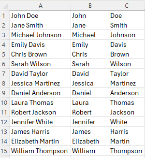
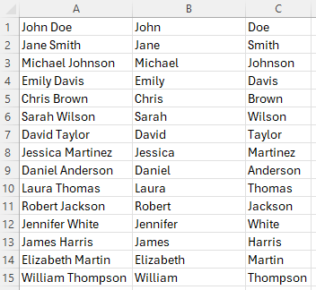
Simply type the first example, click the cell below it, and press Ctrl + E. In the following example, I’ve entered my first values in column B and C, as an example of what my output should look like.

Data in Excel showing first name and last name in one column.

Next, I’ll go to cell B2 and press CTRL + E, and do the same in cell C2. Excel has now automatically filled in the pattern for me:

Using flash fill in Excel to convert text to columns with a pattern.

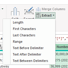
Method 4: Using Excel Formulas (TEXTSPLIT)

For users with Excel 365, you can use dynamic array functions to keep your data live. If the original text changes, the split columns update automatically.

The formula simply takes two inputs, the range, and the delimiter. In the case of a space being the delimiter, this is what the formula would look like:

=TEXTSPLIT(A2, " ")

This produces the same result as the other methods.

Converting text to columns with the TEXTSPLIT function.

The benefit of this approach is that even if your data changes in column A, the formula will update; there’s no need to redo the flash fill or use the text to columns tool again.


If you liked this post on How to Convert Text to Columns in Excel: The Ultimate Step-by-Step Guide, please give this site a like on Facebook and also be sure to check out some of the many templates that we have available for download. You can also follow me on X and YouTube. Also, please consider buying me a coffee if you find my website helpful and would like to support it.

H2EThumbnail AltmanZScore

How to Calculate the Altman Z Score in Excel

The Altman Z Score is a financial formula that evaluates a company’s financial health by analyzing key balance sheet and income statement ratios. In simple terms, it produces a single number (“Z-score”) that helps predict the probability that a company will go bankrupt.

A low Z-score can alert you that a company is at high risk of insolvency before obvious signs of distress appear. Since it relies on objective financial data, the Z-score offers an unbiased measure of a company’s stability.

What are the five key ratios in the Altman Z Score Formula?

The Altman Z Score is calculated from five financial ratios, each capturing a different aspect of a firm’s financial health:

  • A: Working Capital / Total Assets: This measures liquidity by comparing net working capital (current assets minus current liabilities) to total assets. It indicates the company’s short-term financial stability and ability to cover its short-term obligations. A higher ratio means the firm has more liquid assets relative to its size, which is a positive sign.
  • B: Retained Earnings / Total Assets: This profitability ratio shows the cumulative profits that a company has retained (not paid out as dividends) relative to its total assets. It reflects the company’s long-term earning power and age – older, profitable firms will have large retained earnings.
  • C: EBIT / Total Assets: EBIT stands for Earnings Before Interest and Taxes, essentially the operating profit. This ratio measures operating efficiency – how effectively the company’s assets generate earnings. Higher values mean the company’s core business operations are very profitable relative to its asset base.
  • D: Market Value of Equity / Total Liabilities: This leverage ratio compares the company’s market capitalization (market value of all shares) to its total liabilities. It introduces a market perspective on leverage. A larger value suggests investors value the company’s equity highly relative to its debts, implying more of a buffer to absorb losses.
  • E: Sales / Total Assets: This is an asset turnover ratio indicating how efficiently the company generates revenue from its assets. It varies by industry, but generally a higher Sales/Assets ratio means the company is using assets effectively to drive sales.

Each of these five ratios captures one dimension of financial performance – liquidity, retained profitability, operating performance, market leverage, and asset productivity respectively. Altman’s insight was that a weighted combination of these ratios could reliably distinguish healthy firms from those likely to fail.

What the different Z-score values mean

Once you calculate a company’s Z-score, it falls into one of three risk categories (zones) originally defined by Altman:

  • Z > 2.99 – “Safe” Zone: A score above 2.99 is considered safe. The company is likely in solid financial health and at low risk of bankruptcy in the near term. Investors can take comfort if a firm’s Z-score is around 3 or higher – it suggests the business is financially stable.
  • 1.81 <= Z <= 2.99 – “Grey” Zone: A score between 1.81 and 2.99 falls into a grey zone. This is an ambiguous middle range indicating some moderate risk. The company isn’t obviously about to fail, but there are enough warning signs that it’s not completely safe either. Investors should be cautious and perhaps investigate further – the firm could go either way over time.
  • Z < 1.81 – “Distress” Zone: A score below 1.81 signals the company is in distress and has a high risk of bankruptcy. In Altman’s study, companies with Z < 1.81 often did go bankrupt within a couple of years. Such a low score is a glaring red flag for investors to be extremely careful – it suggests the company’s financial foundations are very weak.

Setting up the Altman Z Score Calculation in Excel

To calculate the Altman Z Score in Excel, we can set up some inputs to make it easy to enter data. And from there, formulas can be setup to take care of the remaining calculations. We’ll need inputs for the balance sheet, income statement, along with the current share price. Here’s a look at what the inputs look like on my sheet:

Inputs for the Altman Z-score calculation in Excel.

The point of these inputs is for the user to easily plug in values from the income statement and balance sheet, without having to worry about setting up the formulas. Those will be done on the following cells:

Calculated cells on the altman z-score template in Excel.

For item A, the working capital balance will be calculated by taking the current assets and deducting the current liabilities, and then taking that result and dividing it by the total assets.

For item D, we need to multiply the shares outstanding by the stock price to get the market value of the equity, and then dividing that by total liabilities.

For all other items, the calculations should be self explanatory as they are referencing different values from the input cells.

There is also a weighting that gets applied (multiplied) to the cells, and this lookup table can also be setup on the worksheet:

Weighting for the Altman z-score in Excel.

The Altman Z Score weighting is designed primarily for manufacturing companies but there are other variations. And by setting a place where you can change the weighting, you can easily customize the weighting should you need to.

Let’s also setup a lookup table for the different thresholds. If the Z-score is below 1.81, for instance, then the business is in distress. If it’s 3.00 or more, then it’s considered safe. Anything else falls into the Grey zone. The following lookup table will enable us to do a lookup to determine which zone a company falls within:

Lookup table for z-score Altman scores.

The above table can be used with a VLOOKUP function and by setting it up for approximate matches (rather than exact ones), it will ensure the correct classification is applied based on the Z-score value.

Now, to pull it all together, what we need to do is to calculate the Z-score. And this can be done by tallying up the calculated fields. And next to the output, I’ll setup a VLOOKUP formula to determine which classification it falls under: distress, grey, or safe.

Altman Z-score calculation and lookup value in Excel.

Now, let’s try it out by entering the following values for a manufacturing company, Caterpillar. These values are pulled from Yahoo Finance for 2024:

Altman Z-Score inputs for Caterpillar.

Based on my Excel spreadsheet, this produces the following values and related Z-Score:

Altman Z-Score values for Caterpillar.

I’ve added conditional formatting to help highlight the cell based on its value and the category that it falls in. You can download the template that I’ve created here if you want to compare your formulas to mine, or if you just want one that is ready to use.


If you liked this post on How to Calculate the Altman Z Score in Excel, please give this site a like on Facebook and also be sure to check out some of the many templates that we have available for download. You can also follow me on Twitter and YouTube. Also, please consider buying me a coffee if you find my website helpful and would like to support it.

TTMCalculation

Calculate Trailing 12 Month (TTM) Values in Excel

Calculating trailing-12 month values, also known as TTM, can be a powerful way to analyze financial or business data over the most recent year. This method focuses on the latest 12-month period, providing a rolling snapshot of performance or trends. Unlike calendar-based analysis, which adheres strictly to yearly or quarterly periods, TTM values are dynamic and update with each new data point. This makes them ideal for ongoing monitoring, where understanding recent trends is more relevant than sticking to predefined reporting periods.

The concept of a TTM value is straightforward: it involves summing, averaging, or otherwise aggregating data from the most recent 12 months. For instance, if you’re tracking monthly revenue, a TTM sum would include the total revenue for the latest 12 months, updating automatically as new months’ data becomes available. This ensures that you’re always working with the most current information, offering a more flexible and actionable view of performance.

Why Are 12-Month Trailing Values Useful?

Calculating TTM values is valuable in contexts where trends or seasonality play a significant role. For example, retail businesses may experience seasonal spikes during the holiday season, while other industries might have cyclical patterns tied to the economy. A TTM analysis smooths out these seasonal fluctuations, offering a clearer picture of overall performance without being skewed by short-term anomalies.

For investors, financial analysts, and business owners, this calculation can be a crucial metric. It helps in understanding key financial ratios (including price-to-earnings ratios), by providing a consistent timeframe for comparison. It also allows for benchmarking against competitors or industry averages, as trailing metrics are widely used in reporting and valuation. Moreover, it can aid in spotting trends early, such as declining sales or increasing costs, enabling proactive decision-making.

Calculating TTM Values in Excel

In the following example, I have sales data by quarter. Since they are quarters, I only need to pull the last four values to get the last 12 months worth of values.

Revenue by quarter.

In the simplest approach, you can just use the SUM function and grab the last four values from the top:

Using the SUM function in Excel to calculate trailing-12 month sales values.

By not freezing any cells and copying the formula down, it will automatically adjust so that it’s always getting the most recent four values.

You can make the formula more dynamic by using the OFFSET function. You can change the number of values you want to add up. And it can be useful if your data is at the bottom, and you want to start from the last value you input. Here’s how you can use a variable to determine how many trailing values you want to calculate.

Using a variable along with the OFFSET function to calculate TTM values in Excel.

Using the OFFSET function, you can specify the height and width of the range. In the above example, I’m using cell F1 to specify the number of periods I want to sum up.

If your most recent values are at the bottom of your range, the OFFSET function can help you with this as well. Here’s how the formula would look like:

=SUM(OFFSET(B2,COUNTA(B:B)-2,0,-4,1))

B2 is the starting reference point.

The COUNTA function counts the number of nonblank cells in column B. It is reduced by 2 since the reference point, B2, is in row 2. It needs to be reduced by 2 to get back to 0.

There are 0 columns to offset, hence the next argument is 0.

The -4 tells the formula that you want to go back 4 rows.

The 1 at the end tells the formula that it is just 1 column wide.

This produces an array, which is then summed up through the SUM function.


If you like this post on How to Calculate Trailing 12 Month (TTM) Values in Excel, please give this site a like on Facebook and also be sure to check out some of the many templates that we have available for download. You can also follow me on Twitter and YouTube. Also, please consider buying me a coffee if you find my website helpful and would like to support it.

sddefault (2)

How to Import Tables From Wikipedia Into Excel

You can import a lot of different data into your Excel spreadsheet. In this post, I’ll show you how you can get tables from Wikipedia both manually and with the help of Power Query. For this example, I’m going to use the page for the largest fast food restaurant chains. The data is sorted in a table, making it ideal to import into Excel.

How to import a Wikipedia table into Excel by copying and pasting

1. Copy and paste the values. Since the data is easily organized in Wikipedia, you can just use your mouse to drag, and copy and paste everything into Excel. The hardest part is just to make sure you’ve selected everything you want to copy.

Here is how the data looks after you’ve removed formatting:

Wikipedia table showing fast food restaurants and the number of locations.

Pro tip: if you have the latest version of Excel, you can use CTRL+SHIFT+V to copy the values without any additional formatting.

2. Remove the comments and values in brackets. In Wikipedia tables, you’ll often see references and notes after values. To remove this, you can use find and replace in Excel to get rid of the values. Set it up so that you replace [*] with nothing. The asterisk will remove everything which comes between the brackets, as well as the brackets themselves.

Replacing values in brackets with blanks.

You can repeat these steps if there are any values in parentheses ( ) as well and any other special characters. After these steps, your data should look much cleaner. The downside is that it may take multiple adjustments to get the data cleaned up correctly and for all the issues to be accounted for.

Wikipedia table showing fast food restaurants with data cleaned up.

Import Wikipedia tables using Power Query

Another way you can import tables is with the help of Power Query. Here’s how you can do that:

1. In the Data tab, select From Web and copy the link and press OK.

Using Power Query to import a web page.

2. Select the table which resembles the data you want to import. Oftentimes there can be multiple tables, so it can be a good idea to cycle through them to see which one is the best match for your data. Then hit the button to Transform Data.

Selecting the table to import in Power Query.

3. Remove any unneeded columns. To remove columns in Power Query, right-click on the headers and select Remove.

Removing columns in Power Query.

4. Clean up the data. You can use the Extract option in Power Query to grab values that come before a specific character. This is similar to the find and replace function but it can remove everything before a value:

Using the Extract function in Power Query.

Here you can specify the opening parenthesis as the character. You can repeat this step for brackets and other characters as well. This type of find and replace can also be done within Excel by just using *( to grab everything before the opening of a parentheses or *[ before an opening bracket.

Using text before delimiter in Power Query to pull values before a specified text.

Then, convert the values to Whole Number to ensure they are formatted correctly. If they aren’t, you’ll see some error values, in which case you’ll have to go back to the previous step to correct them. Otherwise, you are done and ready to move on to the last step.

5. Load the data back into your Excel spreadsheet. For this step, all you need to do is click on Close & Load on the Home tab.

The Close and Load button in Power Query.

Your formatted table is now loaded into Excel:

A Wikipedia table downloaded and formatted into Excel using Power Query.

The benefit of using Power Query is that it saves your steps just like a macro would. If you want to refresh the data and download it again, to check for updated information, you can just right-click on the table and select Refresh.


If you like this post on How to Import Tables From Wikipedia Into Excel, please give this site a like on Facebook and also be sure to check out some of the many templates that we have available for download. You can also follow me on Twitter and YouTube. Also, please consider buying me a coffee if you find my website helpful and would like to support it.

sddefault (1)

How to Print Graph / Grid Paper in Excel

An Excel spreadsheet has lines and displays like a grid. And rather than buying graph or grid paper, you can print it out yourself and customize it. Below, I’ll show you how.

How to create your own graph and grid paper in Excel

1. Select all the cells in your spreadsheet. You can do this by using the CTRL+A shortcut.

2. Adjust your column width. Right-click any column header and re-size the column width to 2. You can make this smaller or larger if you prefer.

Adjusting the column width in Excel.

3. Select the PDF printer. Go to File -> Print and select Microsoft Print to PDF.

4. Modify the margins. Instead of Normal Margins, select Custom Margins. Set the margins all to 0 to maximize the space on your sheet. Also, on the margins page, select the options to center your page both horizontally and vertically.

Modifying the margins in Excel.

5. Select the cells on the main tab. Go to the View tab and select Page Layout to see what an entire page will look like. Select all the cells for that initial page.

6. Adjust your borders. On the Home tab, select the drop-down option for borders and select More Borders.

Modifying borders in an Excel spreadsheet.

Here you can adjust the color and look of your gridlines. Although Excel looks like it has gridlines on the cells, they won’t actually print out until you do this step and actually format them. I prefer to use a moderate grey color so that the outline isn’t too dark or too light.

Applying border formatting to cells in Excel.

6. Save the file as a PDF. By saving the gridlines how you want, you now have a graph paper template which you can re-use to print out whenever you need to. If you want 1 page or 100, you can just create as many copies as you need.

The benefit of setting up your own grid paper is that you can customize it so that it looks just how you want. For example, you could decide to highlight certain cells a specific color and apply different types of formatting to suit your needs.


If you like this post on How to Print Graph / Grid Paper in Excel, please give this site a like on Facebook and also be sure to check out some of the many templates that we have available for download. You can also follow me on Twitter and YouTube. Also, please consider buying me a coffee if you find my website helpful and would like to support it.

Alphabet's historical stock price.

Use MAXIFS and MINIFS to Find Values Within a Range

Whether you’re using VLOOKUP or XLOOKUP, one limitation you’re going to face with those functions is that you can’t search within a range or use multiple criteria in your lookups. For example, suppose you’re looking at a stock’s history and wanted to know the last time it fell within a certain price range. You wouldn’t be able to do that with the aforementioned functions. But there is a way to accomplish that, using either MAXIFs or MINIFs. Here’s how.

Using MAXIFs and MINIFs as a lookup

With the MAXIFs and MINIFs functions, you are extracting either the smallest or largest data point in a range. And since you can apply multiple IF statements within these functions, you have the possibility to use multiple criteria. In the following example I have a list of Alphabet’s historical stock price going back multiple years:

Alphabet's historical stock price.

Let’s suppose I wanted to find the last time that the stock was trading between $70 and $80. This is how the formula would look, assuming the date is in column A and the closing price is in column B:

=MAXIFS(A:A,B:B,”>=”&startprice,B:B,”<=”&endprice)

In column B, I have two criteria, one to check if the value is greater than or equal to the startprice variable ($70), and another to see if the value is less than or equal to the endprice variable ($80). Whenever that criteria is met, the value from column A is returned. And since the function is taking the maximum of those values, it will return the latest date in column A (i.e. the most recent, or the one closest to today’s date). If the date values were sorted in descending order rather than ascending order as they are above, then I would use the MINIFS function to get the same result.

Using the formula, it tells me that the last time Alphabet’s stock price was between $70 and $80 was on Oct. 29, 2020. And when looking at the range, it’s evident that looks to be correct:

Alphabet's historical stock price.

Without the use of ranges and utilizing MAXIFS, this would have been a much more difficult process. There are multiple ways to approach a lookup and it ultimately depends on the situation and what you need to accomplish. MAXIFS and MINIFS are particularly useful when working with dates. But in other situations, you may need to use a different function instead.


If you liked this post on Use MAXIFS and MINIFS to Create a Lookup With Multiple Criteria in Excel, please give this site a like on Facebook and also be sure to check out some of the many templates that we have available for download. You can also follow us on Twitter and YouTube.

H2EExpenseTracker1

Free Expense Tracking Template in Google Sheets

Want an easy way to track your expenses? In this post, I’ll show you how you can use my free expense tracking template, which is based in Google Sheets. It makes copying and pasting expenses over simple, and you can quickly see reports that summarize your spending. No need for macros or even refreshing data.

How the expense tracker template works

There are just two tabs in the expense tracker template. One is Data tab where you enter all your expenses, and one is the Summary tab that has charts where no data entry is required.

Entering the data

On the Data tab, these are the following areas where you’ll enter in information:

  • Columns A & B are for the Vendor and Amount. Expenses should be positive and refunds are negative. This can just by copy and pasted from your bank or credit card statement downloads.

  • Column C is optional and only necessary if you don’t want an expense item to go to its default category. For example, you may have a one-time expense that throws off your budget for a spending category. You can check off the box for ‘Irregular’ and it will flow through to that category and bypass the default spending category.
Transactions entered on the expense tracking template.
  • Columns G and H are where you will set up your Vendors and which spending category they relate to. This is important so that when you enter your transaction data in columns A & B, the Category field (Column E) will automatically populate as well. Otherwise, everything will go into a “Not Categorized” bucket.
Vendor setup on the expense tracking template.
  • Column J (aside from the first row which is reserved for income) is where you will set up your spending categories. The spreadsheet accommodates 10 categories. Any more than that and the charts can become difficult to read.

  • In Cell K1 you can enter an income amount (if applicable). The other values in column K are simply a tally of the spending by category.

Once you have all your transactions entered, you can go to the Summary tab where you’ll see a summary of your spending.

The reports

There are three charts on the Summary tab:

  • A waterfall chart is the main chart that you’ll see on the page. It shows you your spending during the period. This starts with an income amount (this is entered on the Data tab) and every expense is negative afterwards, showing you how much of your income is left over. There are two totals, one before irregular expenses and one that includes everything. The purpose here is to show how your spending would have looked if not for one-time, irregular expenses, and how much of your income was left before and after those expenditures.
Waterfall chart showing income less expenses.
  • There is an Amount vs Vendor chart which shows you spending by Vendor.
Chart showing spending by vendor.
  • % of Expenses shows a breakdown of spending by the different categories. In the middle it shows the total spending during the period.
Pie chart showing spending by category.

There is no defined period for this template

There are no date fields in this template for the purpose of keeping it simple. Whether you want to look at one week, two weeks, a month, or several months, you can plug the data into here to see how much your spending was for that period. However, if you get past row 200, you will want to copy down the checkboxes and the formula in column E.

Download and use the template

The reports in the template don’t require a refresh and so as soon as you enter your data, you can begin viewing the Summary tab.

If you’d like to use the template, you can get a copy of it here.


If you like this Expense Tracking Template, please give this site a like on Facebook and also be sure to check out some of the many templates that we have available for download. You can also follow us on Twitter and YouTube.

H2Econvertpercent

How to Convert Percent to Decimal

There are numerous ways to display numbers in your reports. Using percentages and decimals are two common ways to do so. In this post, I’ll cover when it might makes sense to use percentages and when to decimals may be more appropriate. I’ll also provide you with some easy-to-use formulas that will allow you to convert percent to decimal, and vice versa. You can do these calculations whether you’re in Excel or just have a calculator handy.

Converting between percent and decimal

If you want to convert numbers between percent and decimal, the process is incredibly simply in Excel. Select the value(s) you want to change and then select the format you want.

However, if you’re not using Excel, you can still accomplish this manually. To convert a percent into a decimal, all you need to do is to pretend you’re moving the % sign two spots to the left, and then convert it into a period.

In the case of 50% it becomes .50, or 0.50, depending on whether you want to display the 0 in front. This also works with large percentages, such as 1,000%. That’s a significant percent, but the same logic applies, and following the same steps would convert the value to 10. That tells you that the new value is 10 times the size of the original value.

To convert back into percent, you multiply the value by 100 and drop the % sign.

Formula for converting decimal to percent:

Formula to convert decimal to percent.

Formula for converting percent to decimal:

Formula to convert decimal to percent.

How to calculate percent of something versus percent change

One important distinction you should consider is to determine whether you’re looking at a portion of something, or a change in value. If you’ve eating half of a pizza, that’s 0.5 of it, or 50% of it. But if you’re talking about the price of something going up by 10%, that’s a slightly different calculation.

Let’s take the stock price of Microsoft as an example. At the start of 2020, its stock price opened at $158.78. By the end of 2021, it finished the year at $339.32. If we take the ending price and divide by the beginning price (339.32/158.78), then that gives us 2.14, or 214%. It would be correct to say that $339.32 is 2.14 times $158.78. But it would not be correct to say the stock price increased by that amount. That’s because you’re not calculating the actual increase in value. To do that, you need to subtract 1, to arrive at 1.14, or 114%.

If the stock didn’t increase at all, you would be left with an equation of 158.78/158.78, which would be equal to 1, or 100%. The ending value was 100% of the beginning value, but it certainly wasn’t an increase of 100%. Thus, the need to deduct 1 will give us the correct answer in that case — a 0% change. The same goes for decreases. Suppose the stock fell by 30% to $111.15. Dividing $111.15 by $158.78 would tell you the price is now 70% of the value it was at the start of the year. That’s correct, but to get the percent change, you deduct 1 from that, which tells you it declined by 30%.

The formula for percent change:

Formula to calculate percent change.

The formula to calculate the portion or relative size of something:

Formula to calculate portion or relative size.

It’s a subtle difference but it’s an important one to note, which can prevent you from making a mistake in your calculations.

What to do if your decimals or percentages are very small

If you’re dealing with numbers that go to four or five decimal places, it may not be helpful to display them as percentages or even as decimals. For example, if you were to say the odds of getting struck by lightning in your life were 0.00654% or 0.0000654, whether you use decimal or percent isn’t going to be helpful in conveying those adds.

One thing you can do is flip those numbers around by calculating the inverse. By taking 1/0.0000654, that returns a value of approximately 15,300. Stated another way, it tells us that the odds of getting struck by lightning are 1 in 15,300. It’s a far more effective way of communicating the odds as you’re no longer dealing with miniscule percentages that can be hard to visualize.

The formula for converting from a decimal value to a rate:

Formula for converting a decimal value to a rate.

As you can see from these formulas, they are fairly simple and can be incorporated into your spreadsheet and even done just on a calculator. You could create LAMBDA functions with these formulas, but they involve so few steps that the time savings may not amount to much.


If you liked this post on How to Convert Percent to Decimal, please give this site a like on Facebook and also be sure to check out some of the many templates that we have available for download. You can also follow us on Twitter and YouTube.

NestedIF

How to Avoid Using Nested IF Statements in Excel

Nested IF statements aren’t always the most efficient way to structure your formulas. And they can make it difficult later on if you need to fix a formula or make a change to it. What’s worse, is if you inherit someone’s spreadsheet and try to dissect their nested IF functions. In this post, I’ll show you how you can get around using nested IF statements and the different alternatives you can use.

How nested IF statements works

To start, let’s look at how you might construct nested IF statements. Here’s a data set that has different cardholders and their related expenses:

Data set showing cardholder expenditures by store and category.

I’m going to create a column with a series of IF statements to see how much Bob spent on home repair since the start of 2021. With a nested IF statement, I might first check if the cardholder is Bob. Then, if that’s true, check if the category is Home Repair. And then, check if the date is after Jan 1, 2021. Here’s how that would look inside of a formula:

=IF(B2="Bob",IF(D2="Home Repair",IF(A2>DATE(2021,1,1),E2,0),0),0)

You can see this starts to get pretty messy. And the IF statements could continue going on if you have even more criteria you want to fit into here. If I were to copy this formula down, I could get a total of all the values where Bob spent money on Home Repair. However, this wouldn’t be terribly efficient.

You could use a pivot table to quickly summarize the data by cardholder spending and category. But for this example, let’s assume that you need to do it within a formula and can’t rely on creating a pivot table when doing these types of calculations.

Using the AND function to group multiple criteria

An effective option in making your nested IF functions shorter is by using the AND function. It allows you to put all your conditions in one neat formula that you can embed within an IF function. Within the AND function, I can enter all these arguments:

AND(B2="Bob",D2="Home Repair",A2>DATE(2021,1,1))

You can keep on adding to conditions to the AND function for as many rules as you’d like to apply. This can make it cleaner to see all your criteria. All of the criteria within the AND function need to be met for the formula to return a TRUE value. Similarly, you can use the OR function if you want to check if any criteria are met.

The above formula can easily be embedded within the IF function as follows:

=IF(AND(B2="Bob",D2="Home Repair",A2>DATE(2021,1,1)),E2,0)

This does the same job as the nested IF formula except it’s a lot cleaner. However, the drawback here is that like with the nested IF statement, if you wanted to calculate all of the instances where Bob spent money on Home Repair, you would need an extra column and ad all the values up. That’s still not very efficient.

Using an Array function

Another option you can use for quickly tabulating these results is by using an array function. This can apply the logic to every cell and calculate the total for you. Rather than IF and AND statements, you can evaluate each argument, force a 1 or 0, and then multiply that by the amount to arrive at a total. Here’s how that formula might look:

=(B2:B100="Bob")*(D2:D100="Home Repair")*(A2:A100>DATE(2021,1,1))*(E2:E100)

This formula extends to the bottom of my data set. How it works is that each group of parentheses represents an argument. If it evaluates to TRUE (i.e. the criteria is met) then the value becomes a 1. If the criteria is not met, then it evaluates to a 0. So if all the criteria is met, the results will be 1*1*1 multiplied by the amount in column E. If any one of the conditions is not met, then the result will be a 0. This is the same method as the earlier examples.

The downside of an array is that it will automatically extend to the bottom of the data set:

Array formula automatically extended to the bottom of the data set.

This again runs into a similar limitation where your formula of using up more cells than you might want to occupy. But to get around this, you could add the SUM function before your array formula:

=SUM((B2:B110="Bob")*(D2:D110="Home Repair")*(A2:A110>DATE(2021,1,1))*(E2:E110))

Using SUMPRODUCT

Another function that can do the job is SUMPRODUCT. With this function, it can take care of all the criteria while also summing up the total in just one cell. The logic is similar to how the array formula was calculated above. The key difference here is to put that all within the SUMPRODUCT function. Here’s how it looks:

=SUMPRODUCT((B2:B110="Bob")*(D2:D110="Home Repair")*(A2:A110>DATE(2021,1,1))*(E2:E110))

This will obtain the same result as if you were using the array function. SUMPRODUCT is used for multiplying arrays but it can be made to work in this fashion as well. The key is making sure you encompass all the arguments withing parentheses (hence why I opened and closed SUMPRODUCT with not one but two parentheses.

As you can see, there are many different ways you can make your formulas more efficient in Excel without having to rely on nested IF functions.


If you like this post on How to Avoid Using Nested IF Statements in Excel, please give this site a like on Facebook and also be sure to check out some of the many templates that we have available for download. You can also follow us on Twitter and YouTube.

ChartwithTargetLine

How to Create a Chart With a Target Line

Are you creating a chart that shows progress, with a certain goal in mind? In this post, I’ll show you how to create a chart with a target line so that you can see how close you are progressing toward your goal.

A common example for this type of chart is where you are reporting monthly sales and have a goal you want to reach for the year. Here’s a chart that shows the monthly revenue and has a cumulative total as well:

Chart showing monthly and cumulative sales.

Creating the target line

To create a target line, I need to add another series to this chart. For example, let’s say your goal is for sales to hit $50,000 for the year. To do that, you just need to create another series. I’ll call it ‘Target’ and for each of the values, I’ll enter in $50,000:

Excel table showing monthly and cumulative sales alongside a target.

You don’t need to enter $50,000 manually into each cell. You could use the autofill to copy the values down. However, a more flexible way to do this is to enter $50,000 into the first cell, and use a formula to refer to that cell. That way, if you change your target amount, you only need to make the change in one cell.

If you’ve already created your chart and want to add the line to your chart, you’ll need to right-click on the chart and click Select Data. Then, adjust your chart range so that it includes the extra column, and then you’ll see your chart update with the line. If you are creating a chart from scratch, then you just have to select the correct range when first creating it.

Chart showing monthly and cumulative values with a target line.

One additional thing you may want to do at this stage is to adjust the formatting of the target line. A good idea can be to make it look different from the other lines on your chart. One way you can do this is by using dashes. If you click on the target line, you will see a pane show up on the right-hand side showing you options to format the data series. Click on the paint bucket icon and you’ll see various settings for the line. There is one option for the Dash type which will allow you to show the line as breaking up as opposed to being solid:

Changing the dash type for a line chart.

After also changing the color to a solid black, this is what my chart looks like with these changes:


If you like this post on How to Create a Chart With a Target Line, please give this site a like on Facebook and also be sure to check out some of the many templates that we have available for download. You can also follow us on Twitter and YouTube.