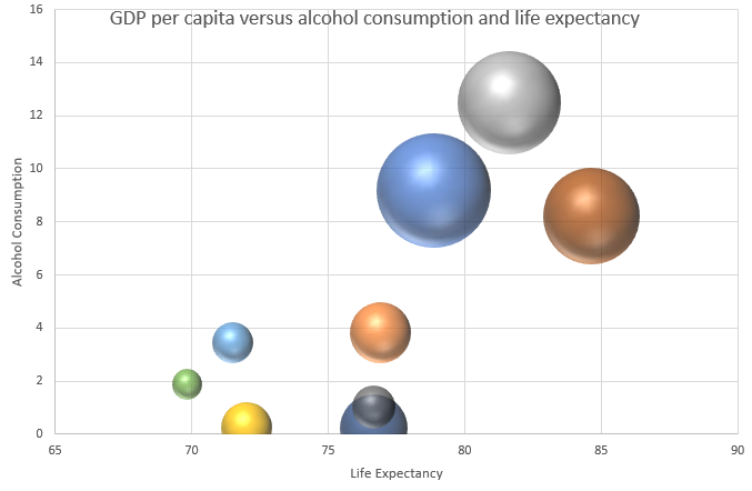
Regular 2D charts in Excel can be useful if you want to compare two metrics. But if you want a third, that’s where knowing how to make 3D bubble charts can be incredibly effective. It can allow you to pile in a lot of data into just a single visual. It can take a bit longer to set up the chart just how you want to, but it can pay off in the end. Here’s how to do it.
Determining which values to plot where
In a 3D bubble chart, you have an X and Y axis, plus you can also specify the size of the bubble. The field that contains the largest variances will probably be the most appropriate one to use as the bubble size, since that will make it easier to differentiate large values from smaller ones.
In my example, I have country data that shows GDP per capita, life expectancy, and alcohol consumption per capita. I suspect the biggest variances might be in GDP per capita, and so that’s what I’m going to use as my bubble. Then for the X and Y axis, I’ll plot life expectancy against alcohol consumption. Here’s an excerpt of what my data looks like:

Be selecting in choosing which values to plot
In a 3D chart, the size of the bubbles can get large, and that means there can be limited space to work with. For that reason, it’s important not to plot dozens of different data points. In my data set, I have more than 160 countries, which is far too many to plot on a 3D chart.
One way to filter a large data set like this is by creating a separate table, one that utilizes a lookup to extract the same values. This can be a useful way to dynamically update your data. You can use the VLOOKUP function to extract the data. And rather than doing it one by one, you can use VLOOKUP to extract multiple columns through just a single formula. My filtered data set has the following countries in it:

Plotting the data onto a 3D bubble chart
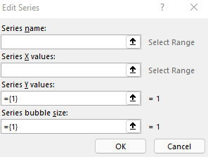
The next step no involves creating the bubble chart itself. For this, go to the Insert tab and select the bubble chart from the X Y (Scatter) section. Initially, it may not look correct, but that’s fine. Remove all the series and start adding them one by one. To modify the data, right-click on the chart and click on Select Data. Click on Add to add a new series, where you will see the following places to enter data:

In my example, here’s how I will fill it out:
- Series Name is the name of the country
- X values will relate to the life expectancy
- Y values will relate to the alcohol consumption per capita.
- Series bubble size is the GDP per capita
Repeat these steps for each of the data points you want to add to your chart. Although this may be cumbersome, by using the VLOOKUP, these values can quickly be updated and changed by simply changing the lookup value (in my example, it’s the country name).

If you liked this post on How to Make 3D Bubble Charts in Excel, please give this site a like on Facebook and also be sure to check out some of the many templates that we have available for download. You can also follow us on Twitter and YouTube.


Add a Comment
You must be logged in to post a comment