
Whether you’re managing projects or working towards a goal, visualizing progress is important to ensure you’re on track for meeting your target. And by using charts in Excel, you can easily track your progress, making it easy for you to view and share it with your stakeholders. This post will walk you through the steps to create insightful progress charts in Excel.
Using a bar chart to track progress
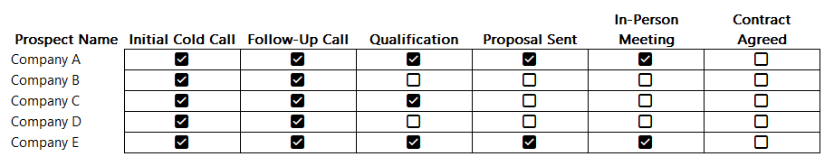
One example where you might want to track progress is if you’re tracking how much progress a sales rep may be making with a customer account. You may have various stages in the process, such as making an initial contact, obtaining an in-person interview with management, all the way to getting a signed and approved contract. Rather than having someone verbally track this progress for you, you can use a combination of checkboxes and charts to help visualize progress.
With the help of Excel’s checkboxes, we can create a table which looks like this, making it easy to simply tick off boxes to indicate progress by prospect:
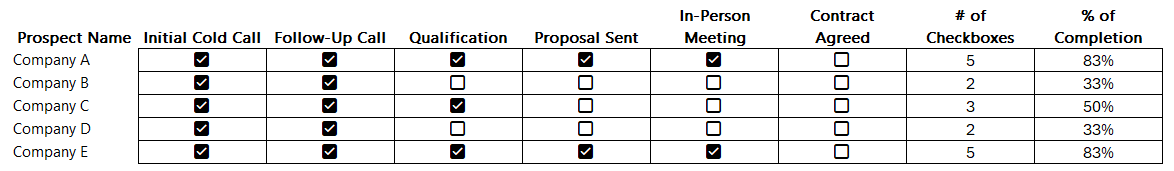
This table, while it’s helpful, isn’t easy to visualize the progress. Using a COUNTIF function, we can count the number of times a checkbox is set to TRUE. With 6 possible values, if there are 6 checkboxes ticked off, that tells us the sales rep has fully completed all the stages in the funnel and the deal is now closed. By then dividing this number by 6, we can numerically display the percentage of completion:
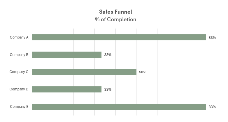
Now, this data can be put into a chart, which displays those percentages.
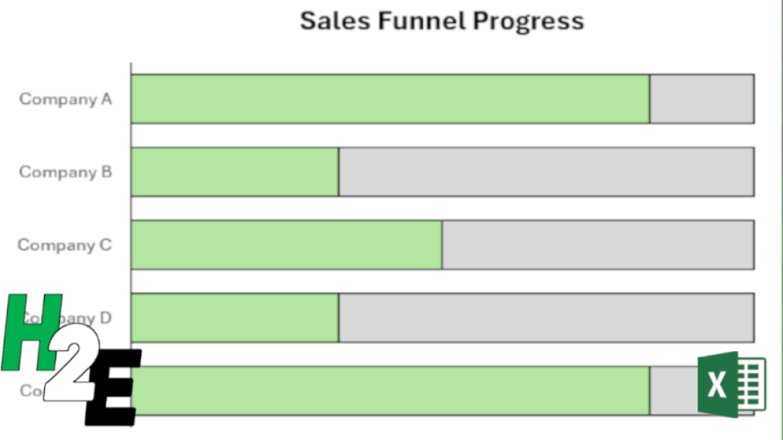
Another way to display this progress is by adding another field, simply to show the total number of stages. Then, we can plot on a chart the # of checkboxes that have been ticked off, along with the number of total stages.
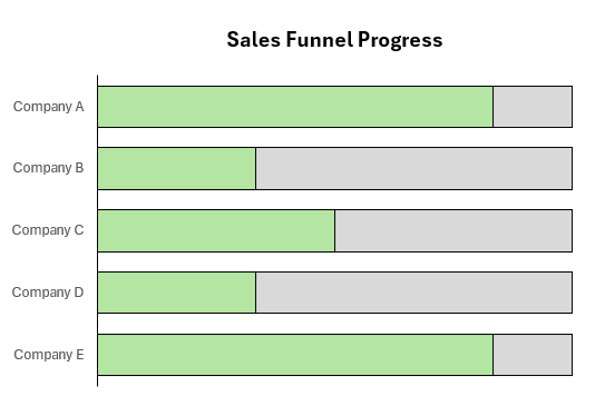
To make this work, make sure you do the following:
- Select both the series for the # of checkboxes ticked off, and total stages. When selecting the data, make sure that the the field which contains the total is on top, in the legend entries.
- Format the data series and ensure that series overlap is set to 100%. This way the bar charts will completely overlap with one another.
Creating a circle progress chart
Bar charts can be effective when you want to track multiple projects and tasks at once. But if you want to track just one project individually, or your overall total progress, then a circle chart may be more effective for that purpose.
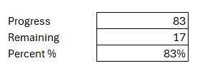
Going back to the previous example, let’s suppose we want to track the progress of one prospect at a time. Company A is at 83%. Here’s how we could show that on a circle chart. We can display the information in the following way, to show what the progress is, in both raw numbers and as a percentage
By setting it up this way, we can now create the following donut chart in Excel:
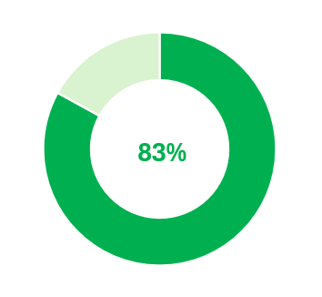
With the percent %, I used that as a data label to put within the middle of this chart.
Using a donut chart, you can easily set up progress for one particular project. But it doesn’t have to be for just one particular item; this can also be part of a greater set of key performance indicators.
If you like this post on How to Create Progress Charts in Excel, please give this site a like on Facebook and also be sure to check out some of the many templates that we have available for download. You can also follow me on Twitter and YouTube. Also, please consider buying me a coffee if you find my website helpful and would like to support it.