A pie chart can be a great way to show percentages, such as how much significant an individual’s product sales are to the total number. However, if you’re dealing with more than 10 items, a pie chart can start to get a bit messy. But there is a way to address that, and that’s with a second pie chart. In this post, I’ll show you how to make a pie of a pie chat so that it’s easier to display more items.
At what point should you consider another chart?
There’s no magic number as to how many items is the limit for a pie chart. It will ultimately depending on how big your slices are, and the size of your text. For my example, I’m going to use data from healthcare company Pfizer‘s most recent quarterly results to show sales of its top-selling products. For the third quarter of 2021, the revenue of its top products were as follows:
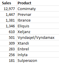
If I were to create a pie chart using this data, this is how it would look like:
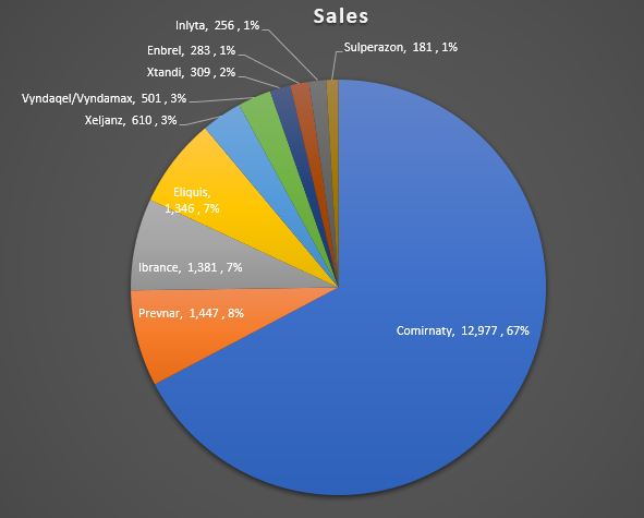
Since there are many small items accounting for 3% or less of revenue, a case could be made for creating a second pie chart here. You don’t have to do so, but it could help make the visual more readable for users.
Creating a second pie chart
To add a second pie chart, what I need to do is select the chart. Then, go into the Chart Design tab and select the Change Chart Type option. From there, I will select the Pie of pie chart:
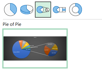
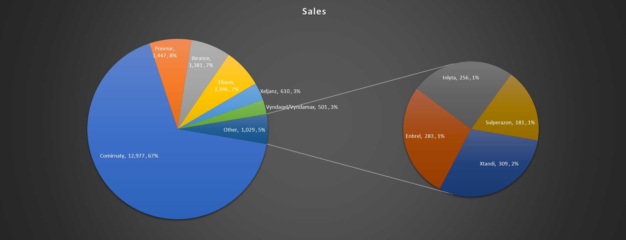
Upon making the selection, I now get a second chart that offloads some of the items onto there:
Customizing the size of the pie chart
By default the smallest slices will be on to the second pie chart. However, you can specify how you want to split the charts. If you right-click and select Format Data Series, you can specify the number of items that show in the second chart:
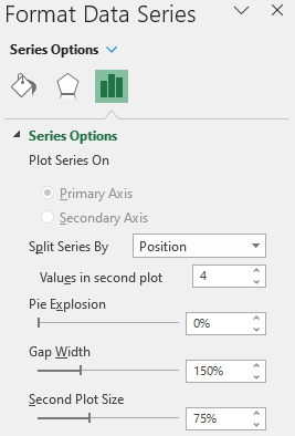
In the above example, there are 4 values in the second chart. But you can change this higher or lower and ultimately that will be discretionary; it will depend on how you want your data to look. If you have many small items in your summary that you want to show in a smaller pie chart, then you may want to increase the number of values in the second plot. If that’s not the case, you could opt for a smaller number.
This may seem a bit arbitrary and there are other rules you can apply instead. For example, you can select to Split Series By value:
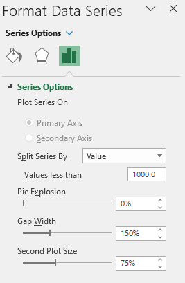
In this case, any value that’s less than 1,000 will be moved off to the second pie chart. Here’s what that looks like:
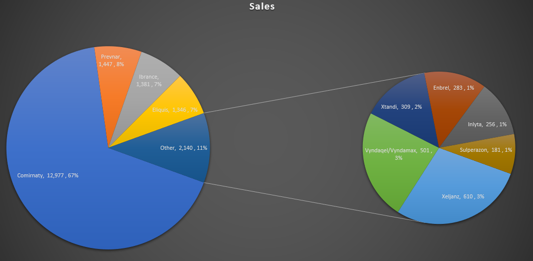
Another option is to split the chart based on the percentage of each slice:
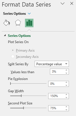
In the above example, I’ve selected any items that account for les than 3% of the total, they will be pushed onto the second pie chart:
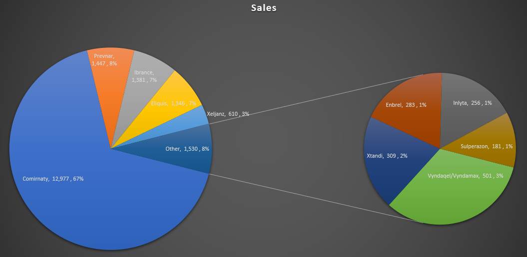
If you want to manually move items from one chart to the other, you can also change the Split Series By option to ‘Custom’ and then click on a slice you want to move. You’ll see an option there to set whether it belongs to the Second Plot or to the First Plot.
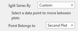
Making these changes will move the slice to either the first pie chart or the second one.
If you liked this post on How to Make a Pie of a Pie Chart, please give this site a like on Facebook and also be sure to check out some of the many templates that we have available for download. You can also follow us on Twitter and YouTube.


Add a Comment
You must be logged in to post a comment