

Conditional formatting in Excel can help you do a lot of things. If you have a range of data, using colors can help show where the high values are and where the low ones are. It can also be used for more complex analysis, especially since you can also use formulas in conditional formatting. In this post, I’ll show you how you can use it to analyze a company’s financial data.
Use conditional formatting to find changes in values
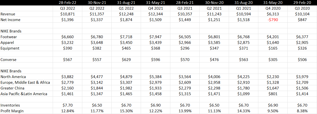
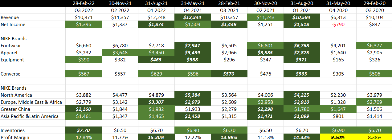
In this spreadsheet, I have some key financial numbers from Nike’s recent quarterly results;
You may be tempted to create additional columns or rows or even another sheet to help calculate the percentage changes and differences from prior periods. But instead of doing that, you can use conditional formatting to highlight important movements. For example, I’m going to create a conditional formatting rule to highlight cells that are higher than the previous period. That will allow me to easily see values that are increasing. And at the same time, a lack of formatting would suggest that they are declining.
To set this up, I’ll select the rows I want to analyze (in this case, anything from row 3 down), and under the Conditional Formatting drop down on the Home tab, I’ll create a new rule. I’ll select the option to use a formula to determine which cells to format:
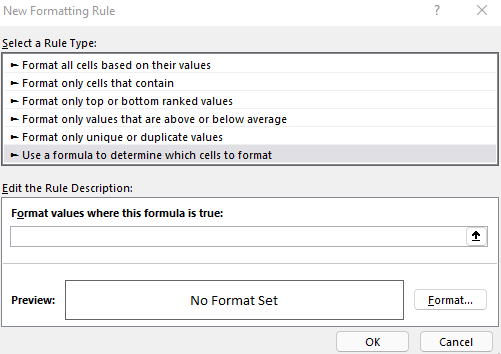
I have a place to enter my formula. Since the first value in the range I selected was cell B3 (I started from the third row, second column), everything in my formula will be relative to that starting point. If I want to see if there has been an increase in value from the previous period, I’ll use the following formula:
=B3>C3It’s a simple formula that checks if the current value is greater than the cell next to it. And because it’s relative, when the rule is applied to cell C3, it will look at whether C3 is greater than D3. It will then adjust for all the other cells. If I apply a green background and white text formatting for this rule, then my spreadsheet now looks like this after applying the conditional formatting:
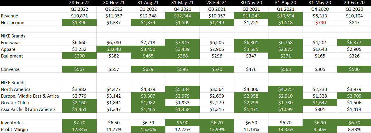
Right away, you can spot the green-highlighted cells that show values that increased from the previous period. And any that aren’t highlighted in green, we can see have been declining. For example, we can see that the company’s sales for the past three quarters aren’t highlighted in green. That tells us sales have been falling for three straight periods. In the Apparel row, before this most recent quarter, sales were increasing for three straight periods as shown by the three consecutive green-highlighted cells.
We can apply more complex highlighting than this. For instance, let’s also emphasize any values that jumped by more than 10% just to make it even more evident when the company had a strong performance. To do this, I’ll again create a new conditional formatting rule. But this time, I’ll use the following formula:
=B3>(1.1*C3)If the current cell is more than 10% of the cell next to it, then I will highlight a darker green formatting, italicize, and bold the value. Here’s what that looks like after adding that rule:
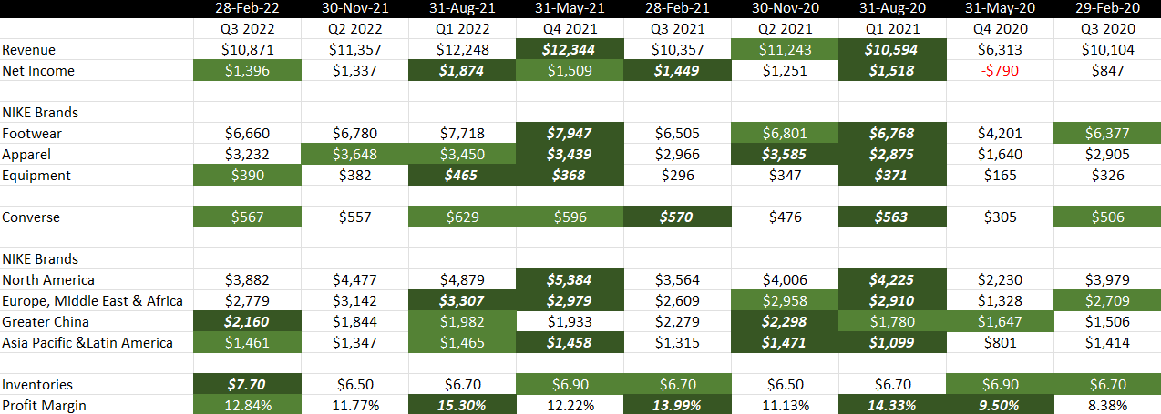
Now, it’s easier to see large changes in values. For example, there was a significant increase in sales in Greater China in Q3, and the level of inventories also moved by more than 10% compared to the previous period. We can see both rules being applied, both the 10% increases and the non-10% increases that were positive.
Another rule I’ll also add is to strictly look at the profit margin (row 20) and to highlight any values that are less than 10%, as Nike normally generates profits that are higher than that. So this will help highlight any periods that weren’t terribly strong. My formula for this rule is as follows:
=B20<0.1When applied, now my data looks like this:
There’s even more formatting now. And the inevitable problem with adding too many rules is that they may end up overlapping one another. For example, the 9.5% profit margin, while below 10% and highlighted in yellow, was also higher than the 8.38% profit margin in the previous period. Technically, multiple rules apply. This is where it’s important to manage your hierarchy.
How to rank the priority for conditional formatting rules
To determine which rule gets more importance, you’ll need to go to the Conditional Formatting drop down again and go to the Manage Rules section. If you don’t see all of them there, make sure you have the entire worksheet selected:
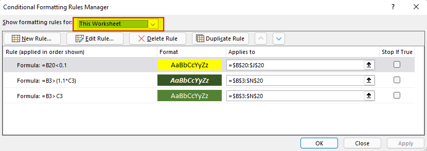
Once you see all the rules, you can use the arrow keys to move them up and down. By default, the more recent ones go to the top. But let’s suppose I want the profit margin rule to be last in terms of importance. I can move that one down so my hierarchy is now as follows:
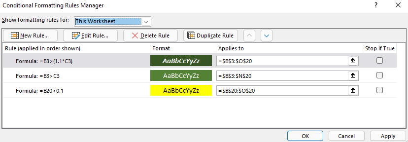
With this hierarchy, now I only see one cell highlighted in yellow:
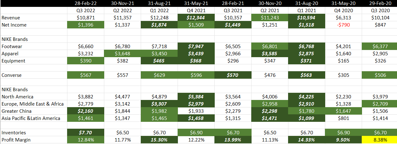
Since the 9.5% profit margin was a 10% increase from the previous period, the first conditional formatting rule applies and takes priority over the others.
If you liked this post on How Conditional Formatting Can Help Analyze Financial Data in Seconds, please give this site a like on Facebook and also be sure to check out some of the many templates that we have available for download. You can also follow us on Twitter and YouTube.
Add a Comment
You must be logged in to post a comment