The bulk of Excel users will likely stick to 2D charts that just have an x and y axis. But if you want to add a third element and give your visuals a bit more context, you can create a 3D bubble chart in Excel. Below, I’ll show you how to do just that.
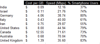
In the following example, I’m going to compare the average mobile data cost in select countries versus their average speeds. I’ll also include what percentage of their populations are smartphone users. Often you hear about one of these metrics but not all three. This is a good example of how adding in more data can provide more context and a more complete picture.
For instance, Canada has one of the highest costs per GB while India has the lowest. But how does that stack up when you consider speed and how much of the country actually uses a smartphone. Using a 3D bubble chart, I can easily add that extra context.
Setting up the data
I pulled in these numbers from a variety of sources to make this work (there were some gaps that I also had to estimate based on older data) and using a series of vlookup formulas I connected them all together.
As far as setting up the data for a chart goes, it’s not much different than what I would do for a 2D chart. Enter the headers and then all of the values. Here’s a summary of what the table looks like with all three data points per country:
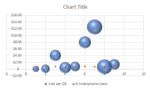
Unfortunately, if I try to just create a 3D chart the way I normally would a 2D chart, I’d get a bit of a mess:
Setting up the chart
As you can see, this initial set up isn’t very intuitive. There’s a bit more manual entry involved when setting up a 3D bubble chart in Excel for the first time. What I’m actually going to do is remove all the default data and delete all these items.
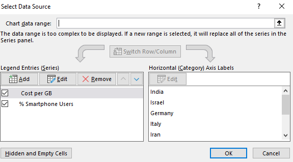
You’ll get the above dialog box if you right-click on the chart and click Select Data. I then click remove from all the Legend Entries until it’s all empty:
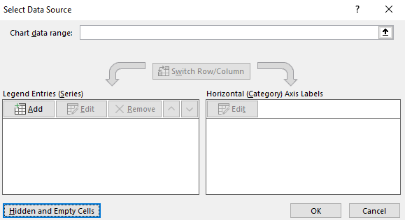
Now, I’ll click on the Add button to add each entry individually to ensure my data’s pulling correctly:
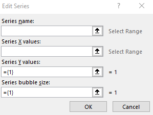
Here’s an example of one that’s filled out:
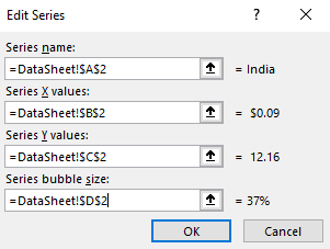
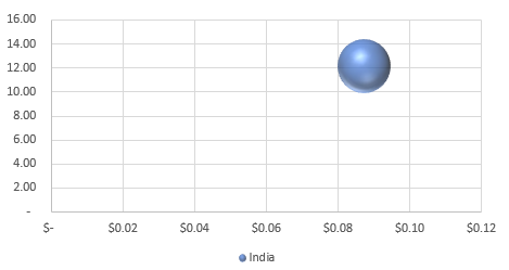
After clicking on OK, then I’ll start to see a bubble chart forming:
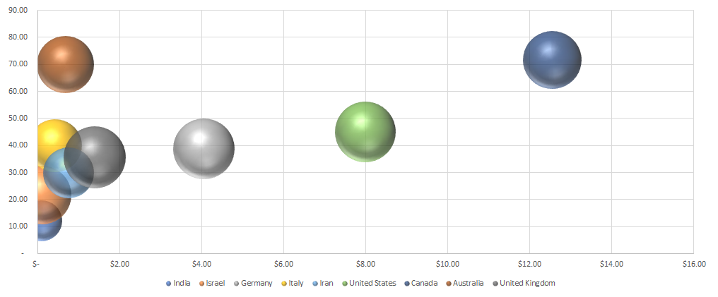
As I repeat and continue adding more items, my bubble chart ends up looking like this:
What the chart tells us
India went from being in the top-right quadrant to the bottom left. This incidates that while it’s low cost per GB, it’s average speed is the slowest of the countries on this list. And its relatively small bubble also tells us that a small fraction of the population uses smartphones compared to the other countries here.
It also confirms Canada’s still the most expensive. Australia offers much cheaper rates while having similar speeds and a similar portion of the population using smartphones.
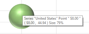
You can easily see the details of each individual bubble. If you hover over any one of these bubbles you’ll now get information showing all the values related to them. Here’s the U.S. one:
It may seem like a painstaking effort to create all the bubbles but once you’ve got it set up you don’t have to repeat these steps. You can change the values and the 3D bubble chart will automatically update. The problem is that Excel doesn’t make it easy to set it up initially. But once you’ve selected which values you want to pull, then it gets easier to update the information and use the format again.
The big advantage of using a bubble chart in Excel is that it provides much more information in just one snapshot than a simple 2D chart would give you. Using a 2D chart, I’d only be able to display two data points for each country. A 3D chart allows me to add even more information into a single chart. And that makes it much more useful to the reader.
If you liked this post on how to create a 3D bubble chart in Excel, please give this site a like on Facebook and also be sure to check out some of the many templates that we have available for download. You can also follow us on Twitter and YouTube.


Add a Comment
You must be logged in to post a comment