
A chart in Excel can be a quick and easy way to display information. In this example, I’m going to use a bar chart to show a range of values, displaying both the highs and lows. Whether you want to show the range of a stock price’s highs and lows over the past year, or just a range between possible prices of something, this can apply to either one of those approaches.
In this example, I’m going to use first-time dog expenses, which can be very broad, with some items costing as little as $10 while others being well into the hundreds.
Creating the charts
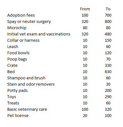
First off, I’ll download the data into a spreadsheet. Here’s how it looks:
This format can easily be converted into bar charts. However, I don’t want two different bar charts, and so I’ll use the option to create a Stacked Bar Chart instead.
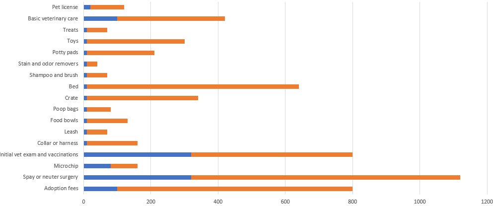
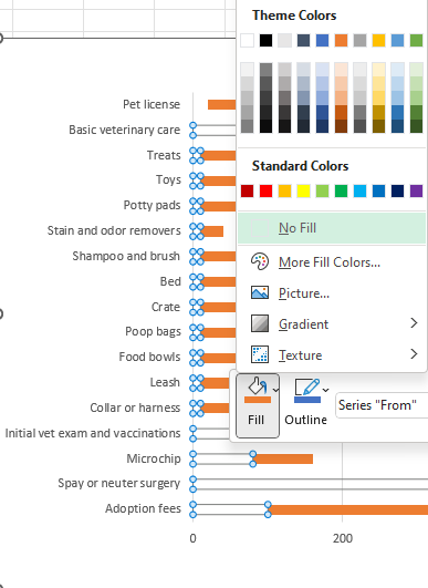
This doesn’t at first look like the chart that I want to create since this is adding both the highs and lows together. What I can do to make this work is by making the bar chart for the low amount to be invisible. To do this, I’ll right-click on one of the blue bar charts and select the fill option to No Fill
Upon doing this, that first bar chart disappears:
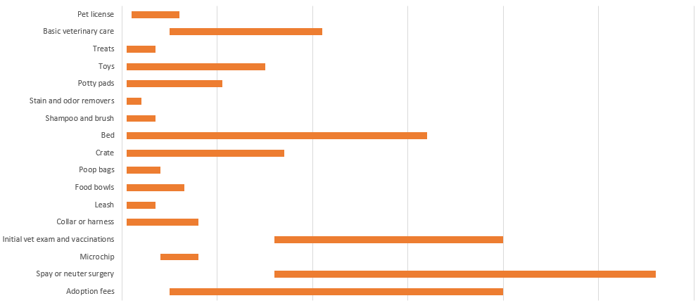
Without a scale, it doesn’t matter that the ranges are stacked since it effectively only shows the difference from the end of the first bar chart (which would be the start of the range) to the end of the second bar chart (this would cover the difference in value between the first bar chart and the second one). What I will do at this point is get rid of any legends and values along the x-axis.
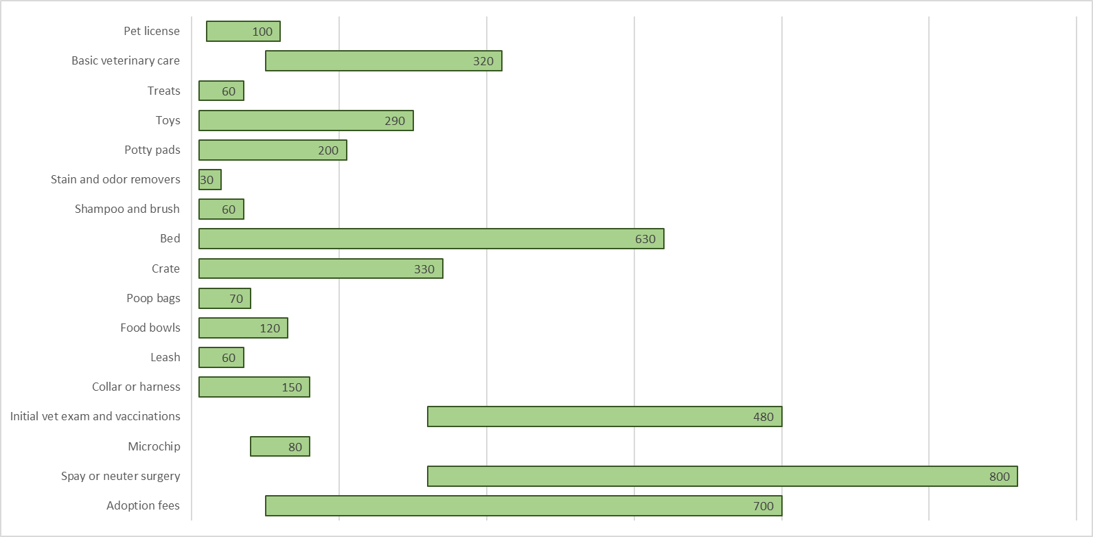
To more effectively display the data, I’ll also add data labels. For the second bar chart, which is highlighted in orange, I’ll right-click and select Add Data Labels. By default, it’ll put the value in the middle. However, I’ll adjust it so that it goes towards the end of the bar chart. To change the appearance of the labels, simply right-click on any of them and select Format Data Labels. And under Label Position, pick the option to show Inside End. This will now move the data label to the end of the bar chart. After modifying some of the colors, this is what my chart looks like now:
You could also remove some of the gridlines. And you may want to add data labels for the first bar chart to show where the starting point is. But given that some of these bar charts are small, they may not be large enough to accommodate both values.
If you liked this post on How to Create a Chart Showing a Range of Values, please give this site a like on Facebook and also be sure to check out some of the many templates that we have available for download. You can also follow us on Twitter and YouTube.
Add a Comment
You must be logged in to post a comment