

Comparison charts are invaluable tools in Excel, widely used across business, education, and research to visually represent data. These charts not only simplify complex information but also highlight key trends and comparisons. A comparison chart in Excel is a visual representation that allows users to compare different items or datasets. These charts are crucial when you need to show differences or similarities between values, track changes over time, or illustrate part-to-whole relationships.
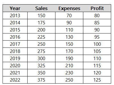
In this article, we’ll compare a company’s sales, expenses, and overall profits by year. Here is some sample data:
Types of Comparison Charts in Excel
There are many types of charts you can use in Excel to compare data. Here are a few examples of common charts you might use when comparing data, and how they look:
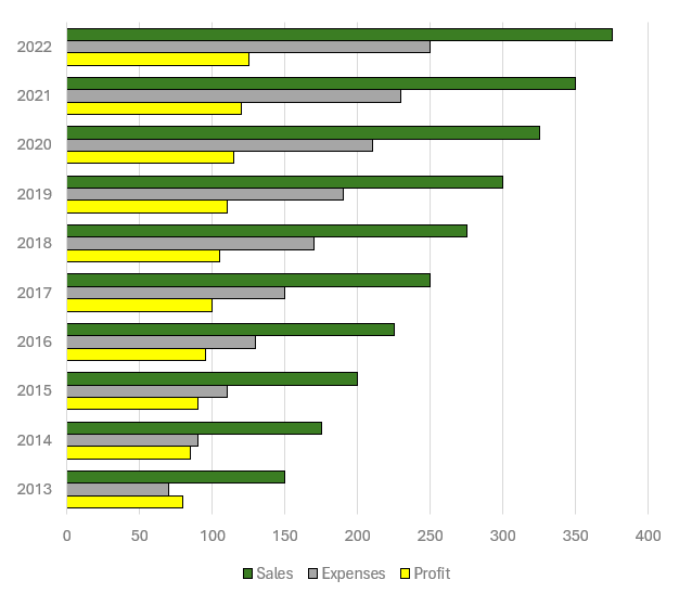
- Bar Chart:
Creating a bar chart in Excel starts with selecting your data and choosing the ‘Bar Chart’ option from the ‘Insert’ tab. Bar charts are particularly useful for comparing individual items or categories. To enhance readability, consider adjusting the bar colors and adding data labels. In the bar chart below, you can easily compare sales versus expenses versus profits, and also compare those values by year.
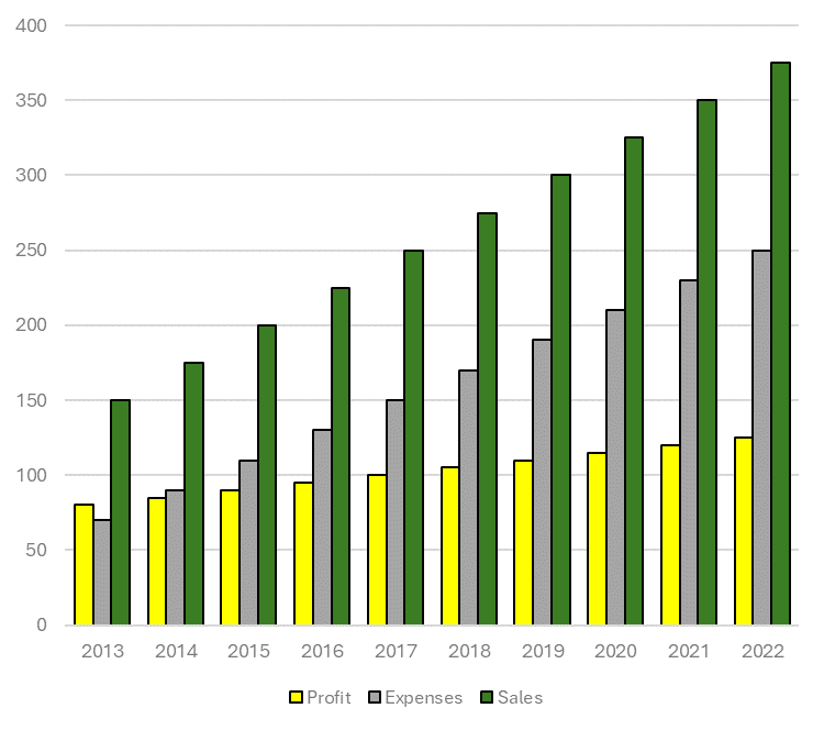
- Column Chart:
Similar to bar charts but oriented vertically, column charts are ideal for showing changes over time. After selecting your data, choose ‘Column Chart’ from the ‘Insert’ tab. Play with colors and axes to make your chart stand out. Whether you prefer to go with a column chart or a bar chart may simply come down to your preference.
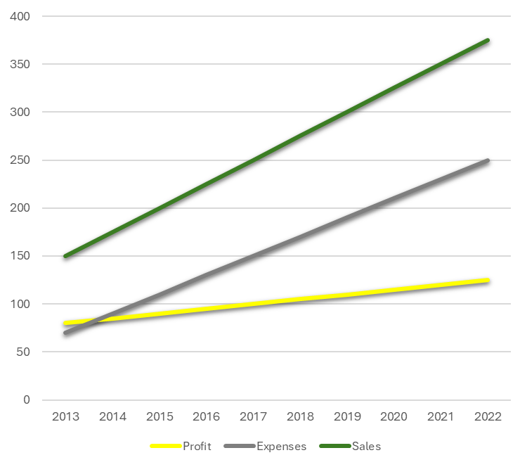
- Line Chart:
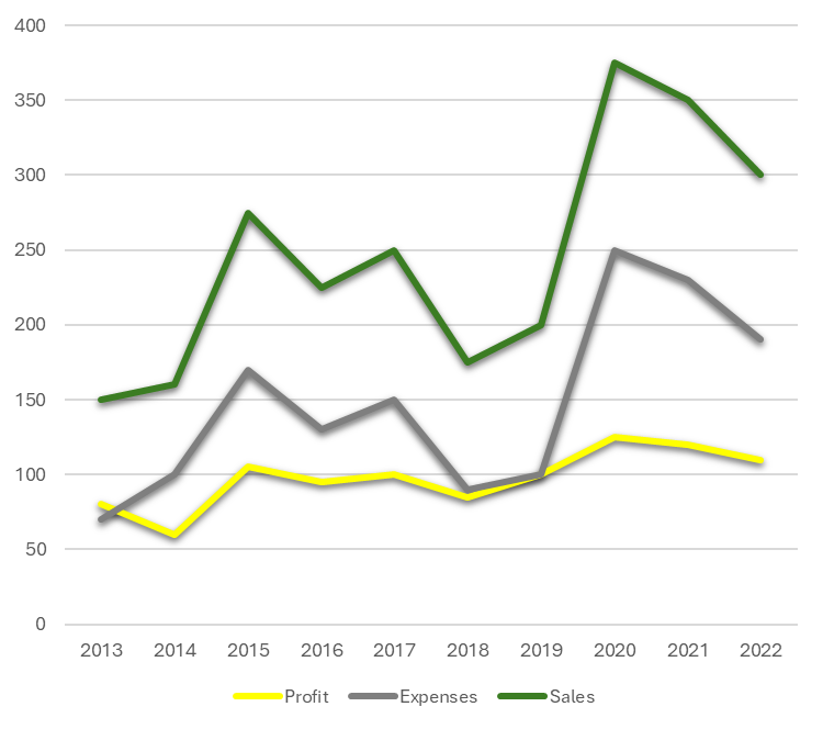
Line charts are perfect for tracking trends over periods. Select your data, click ‘Insert’, and then ‘Line Chart’. Customize your line chart by changing line styles and adding markers for key data points. Line charts may be more useful when there are fluctuations that you want to plot. Here is the chart based on the current sample data:
Here’s a look at the chart when there are greater fluctuations in the data:
- Pie Chart:
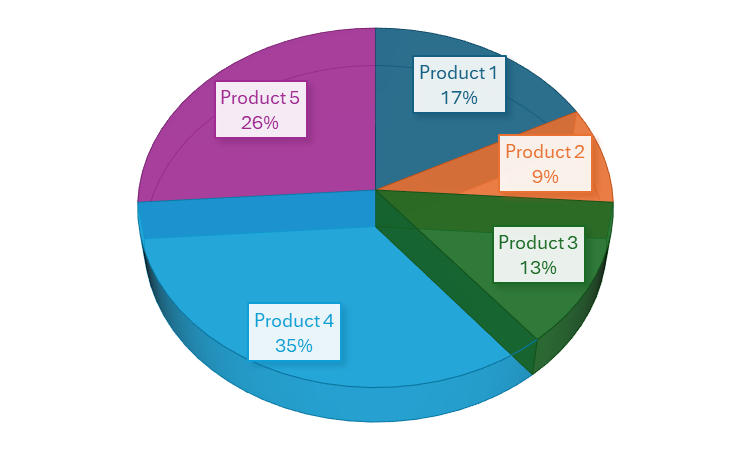
For part-to-whole comparisons, pie charts are your go-to option. After selecting the data, find ‘Pie Chart’ under the ‘Insert’ tab. Enhance your pie chart by experimenting with different slice colors and adding a legend for clarity. This is ideal when you want to compare individual parts of a greater total. Suppose you wanted to analyze what made up the company’s sales. This is where a pie chart might be most appropriate:
Excel has many more charts available for you to use, but these are good starting options when doing analysis. After you’ve selected the right chart, there are further enhancements you can focus on.
Tips for creating effective comparison charts
Here are some tips and things you can focus on to make your charts even better:
- Simplify and Focus: Avoid cluttering your chart with too much information. Focus on the key data points you want to compare. This can sometimes mean creating multiple charts instead of trying to fit everything into one.
- Use Appropriate Scale and Axes: Ensure that your axes are scaled properly to accurately reflect the differences in data. Misleading scales can lead to incorrect interpretations.
- Color and Design: Use color effectively to differentiate data sets and draw attention to key points. However, be mindful of color blindness and avoid using colors that might be hard to distinguish.
- Clear Labels and Legends: Use labels and legends that clearly describe what each part of your chart represents. Avoid jargon or abbreviations that might not be understood by all viewers.
- Consistent Formatting: Keep formatting like font size, color schemes, and line styles consistent across all charts, especially when they will be viewed together.
- Data Integrity: Ensure your data is accurate and up to date. Misleading or incorrect data can harm credibility.
- Accessibility: Make your charts accessible to everyone, including those with visual impairments. This can involve using larger text, high-contrast colors, and providing alternative text descriptions where necessary.
Checklist for creating comparison charts
[ ] Chart Type Selection: Choose the most appropriate chart type for your data. [ ] Data Accuracy: Verify the data for accuracy and relevance. [ ] Simplification: Remove unnecessary data or split into multiple charts if needed. [ ] Scaling and Axes: Check that axes are scaled properly to accurately represent the data. [ ] Color Usage: Use distinct colors to differentiate data sets; consider color blindness. [ ] Labels and Legends: Ensure all parts of the chart are clearly labeled. [ ] Consistent Formatting: Maintain consistent formatting across all elements. [ ] Review for Clarity: Check if the chart conveys the intended message clearly. [ ] Accessibility Compliance: Ensure the chart is accessible to all audiences. [ ] Feedback: If possible, get feedback from others to see if the chart is easily understandable.If you like this post on How to Create Effective Comparison Charts in Excel, please give this site a like on Facebook and also be sure to check out some of the many templates that we have available for download. You can also follow me on Twitter and YouTube. Also, please consider buying me a coffee if you find my website helpful and would like to support it.