
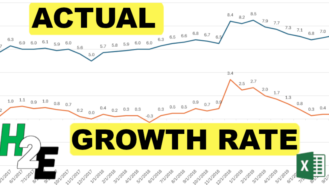
A line chart in Excel can be a great way to display a time series in Excel. But did you know that you can show a series’ actual values along with the year-over-year growth rate, or change? By using a second axis and adjusting the scales, I’ll show you how you can create this effect in Excel.
Setting up the data
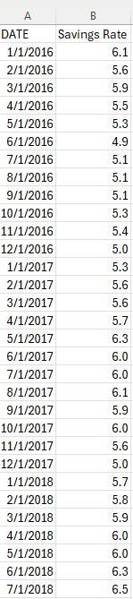
For this example, I’m going to use the personal savings rate as an example, specifically, to show what it was from 2017 until the end of 2019, and how much it changed. The raw data shows me the savings rate per month:
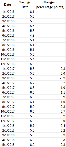
To calculate the year-over-year change, I’ll add a formula to determine the difference. In this case, I’m going to show the change in percentage points. To do this, all that’s necessary is to take the current month’s savings rate and deduct the savings rate from the same period last year.
Plotting the data into a line chart
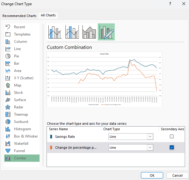
Next, after selecting one of the data points, I can go into the Insert tab to select a chart. To balance both of these line charts, it’s important to put each series on a different axis. When selecting a chart, got to the Combo section and have line charts selected for each series, but put one on a Secondary Axis.
Right now, the line charts are still a bit too close together:
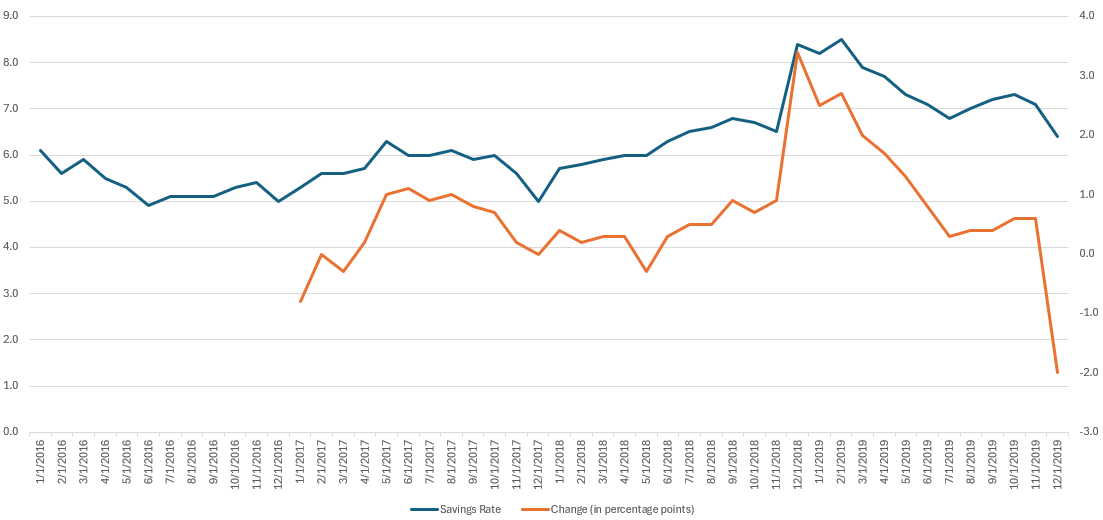
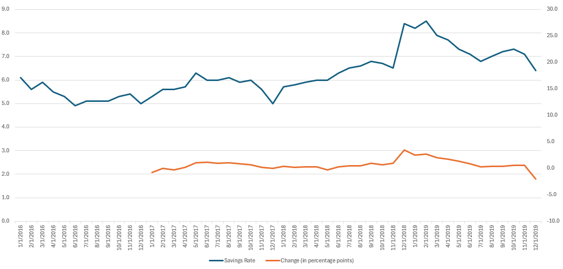
To create more a buffer, the next thing I’ll do is adjust the axis scales. This can be done by right-clicking on an axis and selecting the option to Format Axis. The key is to stretch one axis so that it doesn’t overlap with the other one. For the orange line chart (showing change), I can adjust the scale so its minimum value is -10 and the maximum is +30. This pushes the line chart down to within a fairly narrow range.
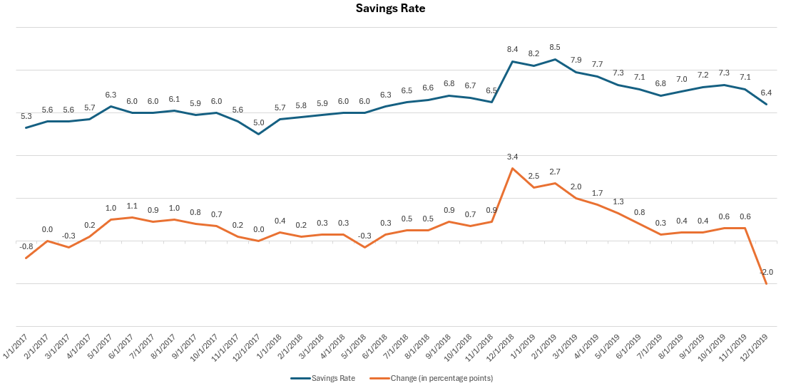
Next, I’ll add some data labels to show the values. I’ll also adjust the savings rate so it starts at the same point as the line showing the year-over-year change. Now, it’s easier to see both the actual savings rate and the change, displaying both the actual and the year-over-year change.
If you like this post on how to Create Multiple Line Charts in Excel Showing Actuals and Growth Rate please give this site a like on Facebook and also be sure to check out some of the many templates that we have available for download. You can also follow me on Twitter and YouTube. Also, please consider buying me a coffee if you find my website helpful and would like to support it.