EconomicDashboard

Create a Dashboard in Excel to Track Economic Indicators

Creating a dashboard can be an effective and efficient way to pool in many data points. In this post, I’ll show you how to create a dashboard that factors in several economic indicators, including inflation, interest rates, housing starts, GDP, unemployment, and the performance of the stock market. It will utilize power query and allow you to easily refresh the data.

Creating and collecting the data points

To make the data that I’m dynamic, I will also use a variable for the current date, so that the data will automatically update. In this example, it will be called todaysdate which is equal to the following formula:

=TEXT(TODAY(),"YYY-MM-DD")

Below are the sources for the data that I will use in creating this dashboard along with the Power Query links I will use (along with the variable for the date). I’ll also set up the Power Query links as named ranges in the Excel spreadsheet, making it easy to reference them within the queries.

Unemployment:

Named Range: unemployment

Source: https://www.bls.gov/charts/employment-situation/civilian-unemployment-rate.htm

Power Query: https://www.bls.gov/charts/employment-situation/civilian-unemployment-rate.htm

GDP:

Named Range: gdp

Source: https://fred.stlouisfed.org/series/A191RL1Q225SBEA

Power Query: https://fred.stlouisfed.org/graph/fredgraph.xls?drp=0&fo=open%20sans&mode=fred&ts=12&tts=12&width=1168&nt=0&thu=0&trc=0&id=A191RL1Q225SBEA&cosd=1947-04-01&coed=2022-12-07&mw=3&lw=2&ost=-99999&oet=99999&mma=0&fml=a&fq=Quarterly&fam=avg&fgst=lin&fgsnd=2020-02-01&line_index=1&transformation=lin&vintage_date=2022-12-07&revision_date=2022-12-07&nd=1947-04-01

Interest Rate:

Named Range: interest

Source: https://fred.stlouisfed.org/series/DFEDTARU

Power Query: https://fred.stlouisfed.org/graph/fredgraph.xls?bgcolor=%23e1e9f0&drp=0&fo=open%20sans&mode=fred&recession_bars=on&ts=12&tts=12&nt=0&thu=0&trc=0&id=DFEDTARU&cosd=2008-12-16&coed=2022-12-07&mw=3&lw=2&ost=-99999&oet=99999&mma=0&fml=a&fq=Daily%2C%207-Day&fam=avg&fgst=lin&fgsnd=2020-02-01&line_index=1&transformation=lin&vintage_date=2022-12-07&revision_date=2022-12-07&nd=2008-12-16

Inflation:

Named Range: inflation

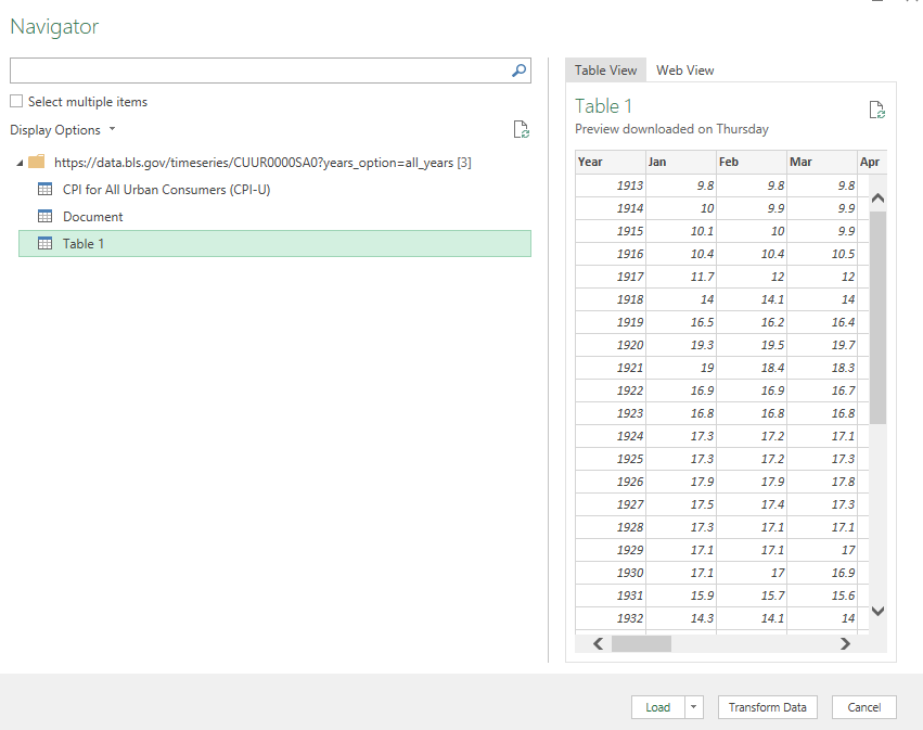
Source: https://data.bls.gov/timeseries/CUUR0000SA0?years_option=all_years

Power Query: https://data.bls.gov/timeseries/CUUR0000SA0?years_option=all_years

Housing Starts:

Named Range: housing

Source: https://fred.stlouisfed.org/series/HOUST

Power Query: https://fred.stlouisfed.org/graph/fredgraph.xls?bgcolor=%23e1e9f0&drp=0&fo=open%20sans&mode=fred&ts=12&tts=12&nt=0&thu=0&trc=0&id=HOUST&scale=left&cosd=1959-01-01&coed=2022-12-07&mw=3&lw=2&ost=-99999&oet=99999&mma=0&fml=a&fq=Monthly&fam=avg&fgst=lin&fgsnd=2020-02-01&line_index=1&transformation=lin&vintage_date=2022-12-07&revision_date=2022-12-07&nd=1959-01-01

Stock Market:

Named Range: stockmarket

Source: https://finance.yahoo.com/quote/%5EGSPC/history?p=%5EGSPC

Power Query: https://finance.yahoo.com/quote/%5EGSPC/history?p=%5EGSPC

Loading the data into Power Query

Note on named ranges

Using the links above, I’ll create the connections in Power Query and make adjustments where necessary. To reference a named range in Power Query, you can use the following code as an example:

NamedRange = Excel.CurrentWorkbook(){[Name="namedrange"]}[Content]{0}[Column1],

The name is case-sensitive so if you use a named range that is all in lowercase as I have done, then those references also need to be in lowercase in Power Query. However, for the purposes of this example, you don’t need to use named ranges and it is an optional step.

Creating the Power Query connections

To create a Power Query connection, I’m going to start by going into the Data tab and selecting From Web under the Get & Transform Data section. For the unemployment rate data, I’ll use the link for that:

Selecting the URL to create a power query connection from the web.

After click on OK, I’ll select the table that I want to use, which is the first one on the list:

Selecting the table to use in Power Query.

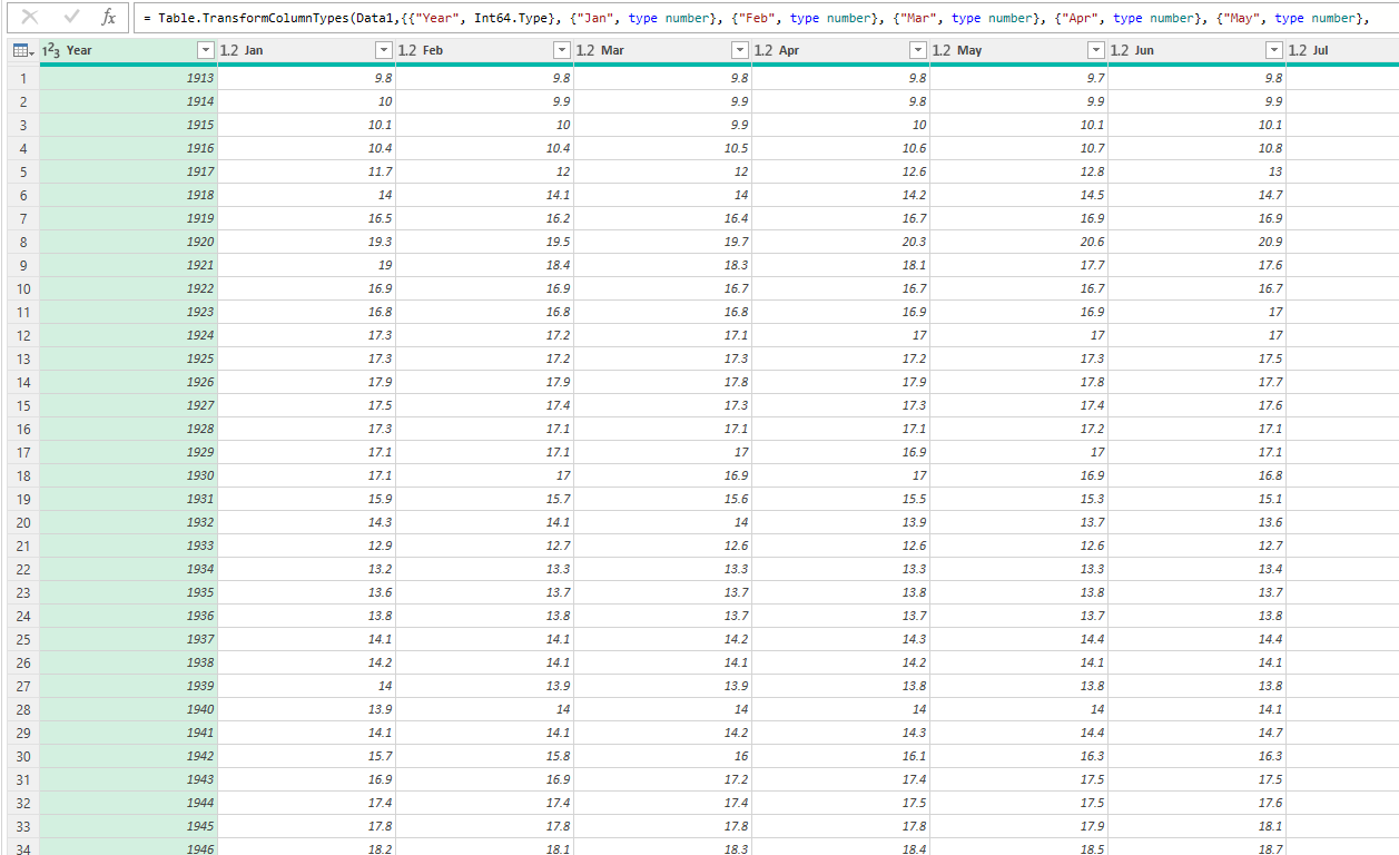
I’ll click on the Transform Data button before loading it. What I will do is split the Month column so that I have both a Month and Year field. To do this, I’ll select the column, right-click and select the option to Split by Delimiter and use a space. I’ll also use this opportunity to put in my named range for the data link. In the Power Query window, under the Home tab, there’s an option to click on the Advanced Editor. Here, I’ll enter my NamedRange variable and use that when referencing the Source:

Using the advanced editor in Power Query to reference a named range.

When you’re running a query for the first time, you may see a warning asking you about Privacy Levels. Set these to Public and select Save.

Setting the privacy levels in Power Query.

Now it’s time to repeat the steps for the other data sources.

Transforming the data in Power Query

There will be some adjustments that need to be made along the way when loading the data. For example, for the data that comes from the FRED website, there are some rows at the top that need to be removed:

Removing extra rows in Power Query that appear at the top.

In this case, I’ll need to click the Remove Rows button at the top, and specify that I want to Remove Top Rows and enter a value of 11, to remove the first 11.

For the housing and inflation data, I need to make additional adjustments since the data is raw and doesn’t show the percent change, which is what I want. Here are the steps I’m going to take for those queries:

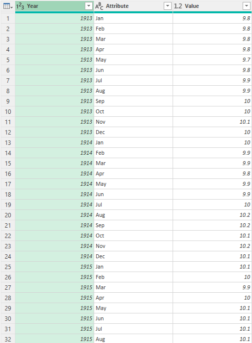
  • Unpivoting the data. This is important for the sake of making sure that months are not going across and are instead going vertically. Refer to this post on how to flip and unpivot data in Power Query.
Unpivoting data in Power Query.
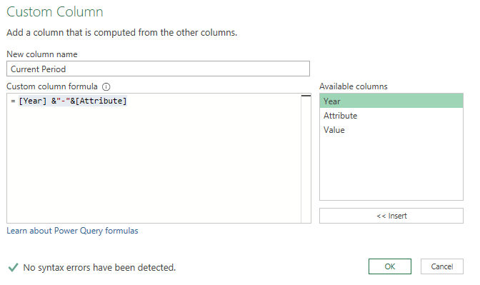
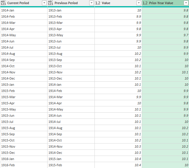
  • Generating previous and current period data. I’ll create a calculated column to calculate the current period and the previous period. After the current period column is created (by simply joining the month and year together), I’ll duplicate the query so that there is an additional table for the inflation data. As for the previous period, this involves subtracting 1 from the year to get the previous year’s values. Then, the year and month are concatenated:
Calculating the current and prior-year period dates in Power Query.
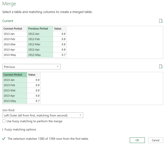
  • Doing a lookup of the prior-year period. I’ll now merge the query with the one I copied earlier (the other inflation period). This involves doing a lookup of the previous period on the other table’s current period. The goal here is to get the prior-year period’s value. Here’s an overview of how to merge queries in Power Query.
Merging queries in Power Query.
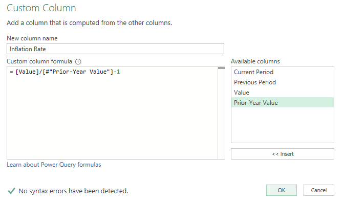
  • Calculating the percent change. Once the prior-year period’s value is loaded and on the same row, I can create a custom column to calculate the year-over-year change, which is just the new value / old value -1.
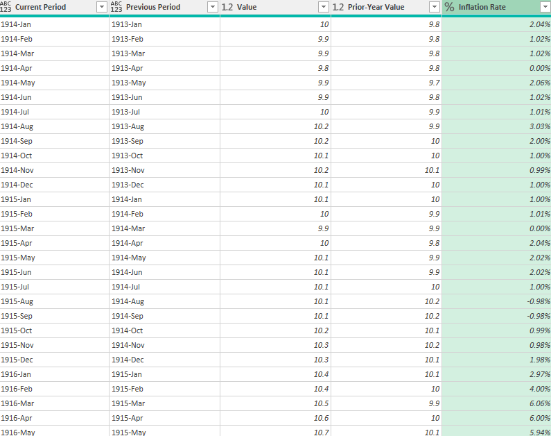
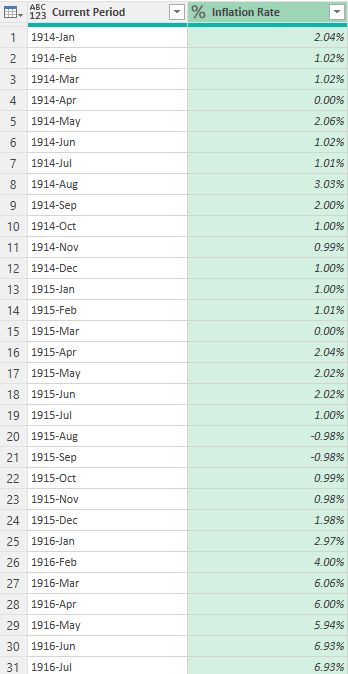
  • Removing unneeded values. The final steps involve removing any blank values from the inflation rate and removing and periods that contain the word “HALF” indicating half-year values. Lastly, I’ll split the columns back out so I again have the year and month broken out, this time, along with the inflation rate %:
Power Query table showing the inflation rate by month and year.

These steps will be similar for the housing data, except I won’t need to unpivot the data since it isn’t broken out by month and year.

Creating the pivot tables and linking to the data

Now that the data is loaded, the next step is to link to it or create pivot tables, to populate the dashboard. For the unemployment data, I will summarize the average by year:

Pivot table showing unemployment data averages by year.

For the GDP tab, I’ll pull in just the four most recent quarters. To do this, I can use the INDEX function and the COUNTA function to grab the furthest values. For the most recent period, I can use the following formula:

=INDEX(A:A,COUNTA(A:A),1)

For more recent periods, I’ll deduct 1, 2, and 3 from the COUNTA value:

The GDP growth rates in Excel for the past four quarters.

The interest rates I will leave as is as that data can chart smoothly given that there normally aren’t many interest rate changes.

For the inflation rate, I will again take the average annual rate using a pivot table but only looking at data since 2010:

Pivot table showing the average inflation rate by year.

On the housing tab, I will break out the average housing starts by quarter, again using a pivot table:

Pivot table in Excel showing housing starts by quarter.

Creating the dashboard

Now that the pivot tables are set up, I can start putting together the dashboard.

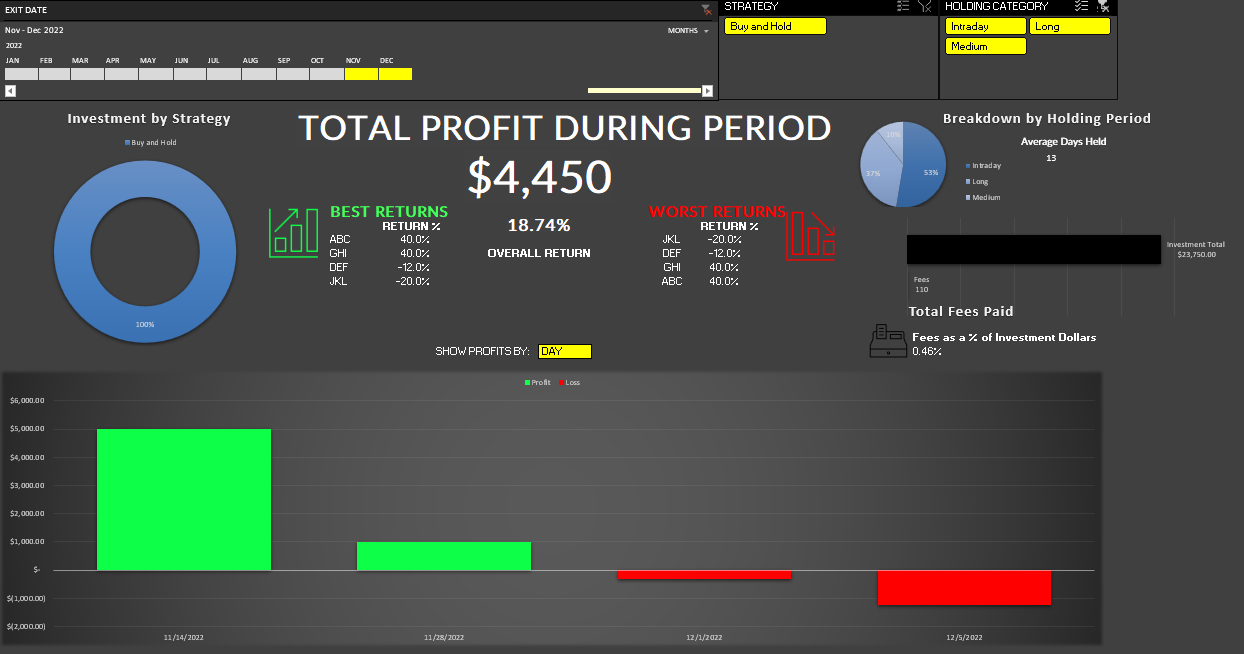
For starters, I’m going to go for a clear, dark background, setting it to black. I’m going to create headers for each of the different categories: Unemployment, GDP, Interest, Inflation, Housing Starts, and Stock Market. I’ll link to the key data, referencing the key metric that I want from each tab. Each header will take up three columns, with a space between each one:

Key economic indicators showing in Excel.

What I will also do is create some conditional formatting rules for these values so that they can appear green or red based on their values. Refer to this post for an in-depth overview on conditional formatting. Below the values, I will also extract the date of the most recent data and put it within a formula, to show when the data was last updated:

Economic indicators in Excel with conditional formatting applied to them.

Next, I’ll create the charts for the different pivot tables. This is really down to preference and style, but I’ll use a combination of bar, column, and line charts to display the data. Here’s how the dashboard looks after adding a title:

A dashboard showing economic indicators, using headers and charts.

And with the data all coming from the web and utilizing Power Query, you can simply just refresh the data to pull the latest numbers, making your dashboard dynamic and easily updateable.


If you liked this post on How to Create a Dashboard in Excel to Track Economic Indicators, please give this site a like on Facebook and also be sure to check out some of the many templates that we have available for download. You can also follow us on Twitter and YouTube.

DuplicateValuesGoogleSheets

How to Find Duplicates and Unique Values in Google Sheets

Duplicate and unique values can be difficult to find in a large data set. In this post, I’ll show you how you can find and highlight duplicate values, as well as how to extract unique values, in Google Sheets. In this example, I’m going to use a list that shows historical World Cup results, including the winners of past years.

List of past World Cup results.

Highlighting and finding duplicate values

There is a built-in function in Google Sheets that allows you to filter out unique values. Under the Data menu, there is a section for Data cleanup where you can select the option to Remove duplicates.

Removing duplicate values in Google Sheets.

However, by doing this, you will actually remove duplicates. And if you don’t want to remove data, this could lead to unintended results. If you simply want to find and highlight duplicate values, you’re better off using conditional formatting.

In this data set, I’m going to highlight the duplicate values in the champion field to identify repeat winners. To do this, I can create a conditional formatting rule in Google Sheets to apply formatting when criteria is met. My criteria will be to look at whether a value shows up more than once within a list. The formula utilizes the COUNTIF function:

=COUNTIF(B:B,B1)>1

This formula needs to be added when creating a conditional formatting rule. To set that up, I’ll select the entire column and under that Format menu, click on the option for Conditional formatting. In that section, there will be an option to Add another rule. And under the drop down for Format cells if…, I select the option that says Custom formula is. And in that box, I’ll enter in the above formula:

Creating a conditional formatting rule in Google Sheets.

I’ll leave the default highlighting options, and now it will highlight all the values that show up more than once in column B:

Table with conditional formatting rules applied.

As you can see, there are many repeat winners in this list. If I only wanted to see the winners that only won once, then I would adjust the formula so that it looks for a value of equal to one, as opposed to more than one.

=COUNTIF(B:B,B1)=1

By altering the formula, it will highlight only the values that show up once:

Conditional formatting showing only values that show up once.

You could also go further and make even more specific conditional rules, such as highlighting countries that have won two or more times. Through conditional formatting, you can make your highlight rules as specific as you need them to be.

Extracting and counting unique values

If instead of getting the duplicates you wanted to just get a list of unique values, that’s an even easier process in Google Sheets. Using the UNIQUE function, all you need to do is select your range, and Google Sheets will give you a list of the unique values:

=UNIQUE(B2:B22)

This formula results in the following list:

Using the Unique function in Google Sheets to extract a list of unique values.

There have only been eight countries that have won the World Cup heading into 2022. But suppose you only wanted to count the number of unique winners. For this, you can use the COUNTUNIQUE function, which takes the same range as the argument:

=COUNTUNIQUE(B2:B22)

The above formula returns a value of 8, which is the same if I were to count the number of values from the Unique formula. There’s also the COUNTUNIQUEIFS function that you can deploy which allows you to also apply an IF statement to the CountUnique function. Suppose I wanted to count the number of unique winners after 1980, that formula would be as follows:

=COUNTUNIQUEIFS(B2:B22,A2:A22,">1980")

Column A contains the year and this returns a value of 6, excluding the two countries that only won prior to 1980: England and Uruguay. Using this function, you can apply multiple criteria if you need to.


If you liked this post on How to Find Duplicates and Unique Values in Google Sheets, please give this site a like on Facebook and also be sure to check out some of the many templates that we have available for download. You can also follow us on Twitter and YouTube.

H2EKPIs

How to Create Key Performance Indicators (KPIs) in Excel Using Donut Charts

A key performance indicator (KPI) is a way to track how well you’re progressing towards a particular goal. Oftentimes, you might have many KPIs that you will want to track. You can create these visuals in Excel using donut charts, and below, I’ll show you how you can also have them change color based on whether you’re on track for hitting your goal or not.

Start by categorizing your results

One thing you should consider doing is to create different groups to categorize your results. For example, suppose a key metric was to ensure operating expenses were no more than $10,000 for the current period. If my actual expenses are at $9,000, I would want the chart to show green and to indicate I’m on track versus if my actuals were over $15,000 and I was way over budget.

I can classify these values based on how close they are to the target amount. Here are three categories I will set up and the rules for them:

On Target: If the actual amount is <= 100% of the target.

Slightly Over: If the actual amount is >100% and <=125%.

Well Over: If the actual amount is >125%.

One field I will also create to help track the progress will be % of Target where I take the actual and divide it by the target. Your rules could vary depending on KPI. With expenses, obviously the goal will be to come in under them whereas with sales the incentive will be to come in higher. So you don’t want to assume that your calculations will always be the same in every situation.

I also created a field called Remainder which will capture the unfilled part of the circle. Think of the top half of a circle adding to 1 and the bottom half to another 1, together they total 2. And for the remainder, I use the a formula that takes the maximum of 0 and 2 – the % of Target amount. The purpose of this is to ensure that the remaining amount isn’t negative and that everything adds up to 2.

By creating these classifications, it will be easier to set up the chart to show different colors based on which category a result falls into. Here’s an example of how this might look on Excel. These categories have been created using IF statements based on the rules noted earlier.

Table categorizing KPIs in Excel.

The key goal of creating these categories is by ensuring no result shows up in more than one place. For Expense 1, it was on target so that’s the only category it falls under. Expense 2 was 20% higher than the target, so it goes into the ‘slightly over’ category. And Expense 3, which was 50% higher, it falls into the ‘well over’ category.

Now that these categories are set up, I can go about and create the actual chart.

Creating the donut chart

Using the table shown above, I’ll create a donut chart for Expense 1.

Donut chart in Excel.

This includes all the categories I have set up, which isn’t what I want. There are multiple changes I’m going to make to this chart:

  1. Remove the unneeded fields.
  2. Apply different colors for the categories.
  3. Adjusting the chart so it goes from left to right.
  4. Adding some text boxes.

To remove the fields that aren’t needed, I’ll right-click on the chart and click on Select Data. Then, uncheck the first three field:

Selecting the fields to include in an Excel chart.

Next up, I’ll adjust the colors. The easiest way to do this is to click on the different colors in the legend box:

A chart legend showing different colors.

I’ll click on the blue box for ‘On Track’ series and select the color Green from the Home tab for that (note: you’ll first have to select the legend, and then click on the individual series). After setting all the different colors, this is what my chart looks like thus far:

Donut chart with green slice indicating progress.

I still need to adjust the starting point of the chart as the green slice starts from the middle, not the left. To fix this, I right-click on the chart and select Format Data Series. Then, I’ll change the angle of the first slice to 270:

The format data series settings for a chart in Excel.

Here you can also change the hole size. The smaller the hole, the larger the slices will be. If I adjust it down to 50%, here’s what my updated chart looks like:

A donut chart that starts from the left and that has a smaller hole size.

At this point, the legend really isn’t necessary anymore since the colors will do the job and I don’t really need the labels.

One final step you may want to consider is to use a text box instead of a label. Once you’ve added a text box, you can link it to the name of your metric (this can be done through the formula bar). Repeat the same steps for the Actual, and you can have both the name of the metric and the value to automatically update:

Donut chart with text boxes linking to the description and amount.

When using textboxes, I always format them to remove the background fill and remove the border. You can do this by right-clicking Format Shape and select No Fill and No Line

The format shape settings in Excel.

Now if I were to update the Actuals for Expense 1 to $15,000, pushing me into the ‘well over’ category, my chart would automatically update:


If you liked this post on How to Create and Track KPIs in Excel Using Donut Charts, please give this site a like on Facebook and also be sure to check out some of the many templates that we have available for download. You can also follow us on Twitter and YouTube.

H2Eadjustedclosingprice

How to Calculate Yahoo Finance’s Adjusted Closing Price

If you’ve ever looked up historical stock prices on Yahoo Finance, you know that there is both a closing price and an adjusted closing price. Sometimes the values are the same, but sometimes there’s a difference In this post, I’ll cover why that happens, and how you can calculate the difference yourself.

What is the difference between the two prices?

The adjusted closing price in Yahoo Finance factors in the impact of dividend payments. For stocks that pay dividends, the further back you go, the greater the difference there will be between the close and the adjusted closing price. With the closing price, you’ll just see the raw change in price, whereas the adjusted closing price will also factor in the dividend, and that can give you a better view of how the stock’s total returns have been over time, not just from the increase in share price. And thus, the longer of a duration you’re looking at and the more dividend income along the way, that creates more of a gap between the close and adjusted close.

For stocks that don’t pay dividends, there will be no difference between these two values.

How to calculate the difference

A difference between the two prices in Apple’s stock history doesn’t show up until the last time it issued a dividend, on Nov. 4. Technically the company didn’t pay the dividend on that day, but that was the date of record for the dividend, and so investors who owned the stock at that date were eligible for the dividend. The actual payment took place later, on Nov. 10.

Apple stock's historical stock prices.

To factor in for this difference, we need to take the amount of the dividend ($0.23) and divide it by the stock’s price immediately before this date. On Nov. 3, the stock price closed at $138.88. Taking $0.23 and dividing it by the stock price returns a value of 0.001656. If we take 1 minus that amount, that equals 0.99834389. That’s what the closing price needs to be multiplied by to arrive at the adjusted close. Here’s how it looks in the spreadsheet:

Spreadsheet showing the calculation of adjusted closing price per Yahoo Finance.

That ‘dividend impact’ factor will be applied to every value before the dividend. And when doing that, you arrive at the adjusted closing price. However, that’s not the end of this because if we go to the next dividend in August, the values are off again:

Apple's adjusted closing price in August 2022.

The issue here is that we need to factor in another dividend payment. It’s another payment of $0.23 and this time the stock price was $165.81. The discount factor is now 0.99861287. However, this needs to be multiplied by the first discount factor as well, in order to ensure we are adjusting for both dividend payments. And so the correct factor is 0.996959:

Adjusted closing price calculations for Apple's stock.

You would need to continue to make these adjustments the further back in time you go, and each time, taking into account all the dividend payments in-between today and the date of the stock price on that day. This is why over time, the difference gets larger.


If you liked this post on How to Calculate Yahoo Finance’s Adjusted Closing Price, please give this site a like on Facebook and also be sure to check out some of the many templates that we have available for download. You can also follow us on Twitter and YouTube.

StockTradingTemplate

Free Stock Trading and Tracking Template in Excel

***UPDATE: There is a newer version of this template available here****

For a limited time, I have a free stock trading template that is available for you to download in Excel. If you buy and sell stocks often, this is a template that will help you easily enter in your trades and track your performance.

How to use the template

There are three main buttons on this template that you will need to use, all of which are located within the ribbon, under the Trading Journal group:

Ribbon buttons on the stock trading template.

The Enter Transaction button will allow you to post and trades you make. Clicking on it will show the following pop up:

Dialog box allowing a user to enter a transaction.

At the very top there is a Date Picker button which will allow you to select the date of the transaction, rather than manually entering it. Here is an overview of the other fields;

  • Ticker: this is simply the name of the stock you are buying.
  • Action: indicate whether you are buying, selling, or adding to an existing position.
  • Strategy: select your strategy for this transaction. If you want to add or remove available strategies, click on the Update Strategies button.
  • Shares this is the number of shares you are buying or selling.
  • Price: this is the price per share for the transaction.
  • Fees: the amount of any fees you have incurred on the transaction.

Once all this is entered, click on the button to Post Transaction and the details of the transaction will be posted to the Log sheet and an entry will be opened up on the Transactions tab. The Transactions tab will show you a summary of your positions, including any profits and losses, and whether they are open or closed.

There is a Settings tab where you can manually adjust strategies. You can also specify different holding categories should you want to track that (e.g. what constitutes a short, medium, or long holding period).

Once you’ve entered some transactions, you can head over to the Summary tab which will give you a visual breakdown of your investments. To be sure the data is updated correctly, click on the Refresh button in the ribbon button (not the default refresh option in Excel).

Stock template showing a summary of performance.

You can use slicers in the report to filter by different dates, strategies, and holding periods.

You can download the Stock Trading Template here.


If you like this Stock Trading and Tracking Template, please give this site a like on Facebook and also be sure to check out some of the many templates that we have available for download. You can also follow us on Twitter and YouTube.

h2enewexcelfeaturesnov2022

3 New Excel Features You Need to Know in November 2022

Microsoft Excel has been around for decades but Microsoft continues to roll out new features to enhance its software. Today, I’ll cover three recently released features that you need to know to be a more efficient Excel user.

1. A new shortcut that allows you to paste values

If you’re copying and pasting values in Excel and just want to paste the values, up until now, you’ve had to take the extra step of right-clicking and selecting values.

Selecting paste values in Excel when copying data.

Although that doesn’t add a whole lot of time to the process, if there’s a more efficient way to do something, that’s what this website is all about. And the new way to copy as values requires just using the shortcut of CTRL+SHIFT+V when pasting. Whether you’re copying values from a website and don’t want to include formatting, or if you just want to copy a value from another cell and don’t want the formatting or formula, this new shortcut will be what you want to use.

2. The ability to search right from a menu

When Excel added the Ribbon, it grouped commands into different tabs. That can make it difficult to sometimes find commands because if you’re not on the right tab, you have to first navigate there before finding the command you want. One way around this has been to use the Quick Access Toolbar, where you can save your frequently used commands.

But even that isn’t ideal because you can’t add everything in there. The good news is that Excel has now added a search feature right into the default right-click menu. Simply right-click anywhere on your worksheet and you’ll now see a place to search for commands and functions:

3. An image function that allows you to pull in images from a URL

A new function that you can make use of in Excel will make it easier to load images into your spreadsheet. Rather than saving them and then uploading them into your workbook, all you need now is just the URL to the image you want to use. Then, within the new IMAGE function, just enter the URL in the first argument within quotation marks.

You can also specify an alt text and indicate whether you want the images to fit or fill the cell, or if you want to apply a custom height and width. In the below example, I use a URL that points to Netflix’s logo and have it fill in the cell. And as the cell expands, so too does the image:

Don’t have these options? Join the Office Insider program

These are the latest and greatest Excel features and so if you don’t have them and you’re using Microsoft 365, make sure you sign up for the Office Insider program. Through that program, you will have access to the newest features before the general public. Once joining, it may take a few days before you get the updates and start to see these features.


If you like this post on 3 New Excel Features You Need to Know in November 2022, please give this site a like on Facebook and also be sure to check out some of the many templates that we have available for download. You can also follow us on Twitter and YouTube.

H2Emultiplecriteria

How to Do a Lookup with Multiple Criteria in Excel

Most Excel users likely know how to do a simple VLOOKUP and pull in data where a single field is matched. But what about when you need to match multiple fields? That can be a bit more challenging to pull off and below I’ll show you a couple of ways you can achieve this.

In the following data set, there is information on airports and delay times by specific carriers. Given that there are so many fields here, a simple lookup wouldn’t be helpful here as you need to factor in multiple criteria.

Data showing carrier delays at airports across the world.

Using a consolidated unique key

If you are able to create an additional column in your data set, then one option you have available is to create a unique identifier. For example, if I concatenate the carrier code, airport code, month, and year, I can have a key that I could use in a lookup formula. Here’s how that key could look:

Creating a unique key for a data set.

The important thing to remember here is that your key should be unique enough so that there is only a single match. For example, if I didn’t include the year and my data includes multiple years, I could potentially have multiple matches for a combination of month, carrier, and airport code.

One way you can test for this is by using the COUNTIF function. This will tell you if there is more than 1 instance of a value. If my key is in column B, here is how that COUNTIF function could look:

=COUNTIF(B2,B:B)

If any of the formulas return a value of more than 1, then that will tell you there is a duplicate value:

Using the COUNTIF function to determine if a key is unique.

You can use filters to see if there are any values greater than 1 on this list. If there are, then you know you need to adjust your key to add additional criteria so that there are no duplicates. Once you have this accomplished, then you can use this within a VLOOKUP or a combination of INDEX & MATCH. You would just need to use a search criteria that follows the same construct.

Using multiple criteria in a SUMIFS function

Another way you can lookup multiple fields is by using SUMIFS. You can sum the data but you don’t have to. After all, if your criteria is unique, a SUMIFS function would only be summing a single value. And in that sense, it can work similar to a lookup. Using this approach, you don’t have to create any additional columns to make it work.

Here’s how a formula in my data set would look like if I wanted to extract the carrier_delay value for Delta Air Lines (carrier code DL) at the Atlanta airport (airport code ATL), for July 2022:

=SUMIFS(Q:Q,A:A,2022,B:B,7,C:C,"DL",E:E,"ATL")

Q is the value I’m extracting, column A relates to the year, column B to the month, column C to the carrier code, and column E to the airport code. Since there is only one corresponding value when filtering for all these combinations, I know my SUMIFS function is only pulling in a single value, and thus, working effectively as a lookup function.

With this approach there is some risk if you don’t first vet your criteria and to check for duplicates. And just to be safe, you’ll probably want to do a check for that before relying on this calculation.


If you like this post on How to Do a Lookup with Multiple Criteria in Excel, please give this site a like on Facebook and also be sure to check out some of the many templates that we have available for download. You can also follow us on Twitter and YouTube.

H2EExpenseTracker1

Free Expense Tracking Template in Google Sheets

Want an easy way to track your expenses? In this post, I’ll show you how you can use my free expense tracking template, which is based in Google Sheets. It makes copying and pasting expenses over simple, and you can quickly see reports that summarize your spending. No need for macros or even refreshing data.

How the expense tracker template works

There are just two tabs in the expense tracker template. One is Data tab where you enter all your expenses, and one is the Summary tab that has charts where no data entry is required.

Entering the data

On the Data tab, these are the following areas where you’ll enter in information:

  • Columns A & B are for the Vendor and Amount. Expenses should be positive and refunds are negative. This can just by copy and pasted from your bank or credit card statement downloads.

  • Column C is optional and only necessary if you don’t want an expense item to go to its default category. For example, you may have a one-time expense that throws off your budget for a spending category. You can check off the box for ‘Irregular’ and it will flow through to that category and bypass the default spending category.
Transactions entered on the expense tracking template.
  • Columns G and H are where you will set up your Vendors and which spending category they relate to. This is important so that when you enter your transaction data in columns A & B, the Category field (Column E) will automatically populate as well. Otherwise, everything will go into a “Not Categorized” bucket.
Vendor setup on the expense tracking template.
  • Column J (aside from the first row which is reserved for income) is where you will set up your spending categories. The spreadsheet accommodates 10 categories. Any more than that and the charts can become difficult to read.

  • In Cell K1 you can enter an income amount (if applicable). The other values in column K are simply a tally of the spending by category.

Once you have all your transactions entered, you can go to the Summary tab where you’ll see a summary of your spending.

The reports

There are three charts on the Summary tab:

  • A waterfall chart is the main chart that you’ll see on the page. It shows you your spending during the period. This starts with an income amount (this is entered on the Data tab) and every expense is negative afterwards, showing you how much of your income is left over. There are two totals, one before irregular expenses and one that includes everything. The purpose here is to show how your spending would have looked if not for one-time, irregular expenses, and how much of your income was left before and after those expenditures.
Waterfall chart showing income less expenses.
  • There is an Amount vs Vendor chart which shows you spending by Vendor.
Chart showing spending by vendor.
  • % of Expenses shows a breakdown of spending by the different categories. In the middle it shows the total spending during the period.
Pie chart showing spending by category.

There is no defined period for this template

There are no date fields in this template for the purpose of keeping it simple. Whether you want to look at one week, two weeks, a month, or several months, you can plug the data into here to see how much your spending was for that period. However, if you get past row 200, you will want to copy down the checkboxes and the formula in column E.

Download and use the template

The reports in the template don’t require a refresh and so as soon as you enter your data, you can begin viewing the Summary tab.

If you’d like to use the template, you can get a copy of it here.


If you like this Expense Tracking Template, please give this site a like on Facebook and also be sure to check out some of the many templates that we have available for download. You can also follow us on Twitter and YouTube.

H2EInflationRate WEBP

How to Calculate the Inflation Rate in Excel

Inflation has been on the rise and it’s a popular topic these days. In an earlier post, I showed you how to create an inflation calculator to determine what something would have cost in a different year. This time around, I’ll go over how to calculate the actual inflation rate in Excel, showing it as an actual percentage. Let’s get started.

How do you calculate the inflation rate?

If you follow this link to the U.S. Bureau of Labor Statistics, you’ll see a table that has all the latest inflation data. These are indexed values and so to calculate the inflation rate, all you really need to do is take the current index value and divide it by the prior year’s data. For example, September 2022’s inflation rate was 8.2%. To arrive at that, you can simply take the September 2022 index value of 296.808 and divide that by 274.31, which is the value from September 2021. The result is 1.082.

You could download this table into Excel and do a series of lookups to do these calculations. But that’s effectively what I did in the previous post. This time around, I’m going to make this much more automated and involve Power Query.

Download the data using Power Query

First, go to the Data tab in Excel, and click on the From Web button next to Get Data. Then, paste the URL from the link that has the inflation data. Then, you’ll see the Navigator page for Power Query, where you can select from the different tables that are found on the webpage:

Selecting a table from the Power Query Navigator window.

Table 1 is the one that contains the inflation data organized by month and year. Before loading this into my spreadsheet, I’m going to make some adjustments so that I can easily calculate the inflation rate right within Power Query. To do that, click on the Transform Data button.

Modifying the data in Power Query

By default the data shows in the following format:

Inflation data loaded into Power Query.

I want the years and months to both be in columns. That means I need to flip the months. To do this, I’ll right-click on the Year header and select Unpivot Other Columns. And then voila, my data is in a more manageable format:

Power Query table after unpivoting headers.

Since I want to compare to the previous year, I’ll also create another column for the previous year. To do this, I can just select the Year column and in the Add Column section, click on the Standard icon that shows different mathematical operators and select Subtract:

Using the standard button in Power Query to quickly apply calculations to a field.

The next screen will ask me for the number I want to subtract from each value, which will just be 1. After entering that and clicking OK, I will have a new field, which I will re-name to PreviousYear.

Next, I’m going to create a combined field for the year and month. First, I’ll convert the Year and PreviousYear fields to text. This can be done by clicking on the icon in their headers and selecting Text.

Then, under the Add Column section, I’m going to select Custom Column. From there, I can enter the following formula to concatenate the fields:

Creating a custom column in Power Query to join year and month.

I’m going to repeat these steps for the PreviousYear, and that column I’ll call the Previous Period.

Next, I’m going to split this table into two. I’ll rename the current table to Current. Then, I’m going to create a copy of it by right-clicking and selecting Duplicate, and I’m going to call the new table Previous. In the Current table, I’m only going to leave the following columns: Current Period, Previous Period, and Value. While on the Previous table, I’m only going to include the Current Period and the Value.

What I will do next is to merge the tables, where I’ll be looking up the prior period’s value. To do this, I’ll go to the Current table and under the Home tab, select the option to Merge Queries. I’m going to connect the queries with the Previous Period from the Current table to the Current Period in the Previous table. The goal here is to be looking up the prior-year period:

Merging tables in Power Query.

Next, I’ll click on the icon in the newly created column to expand the fields out:

New field created in Power Query after merging queries.

I’m only going to select the Value, as that is the prior value that I want. I’m going to rename that field the Prior-Year Value:

Power Query table after merging queries and extracting the prior-year period value.

These values shouldn’t be the same and you can easily check to make sure that they are correct. For example, 1914-Jan will show up in both the Current and Previous Periods. And those corresponding values both show 10. Now that I’ve got the current and previous values, the next step is to calculate the percent change. To do this, I’ll create another Custom Column, with this as my calculation:

Calculating the inflation rate in Power Query.

I’ll then convert the field so that it is in a percentage format, and here is what my inflation rate column looks like:

Power Query table with the inflation rate calculated.

The only thing left at this point is to clean up the Power Query table to remove any unnecessary columns and values. I will filter out any values that are empty. To do this, I’m going to click on the drop down for the Inflation Rate header and select Remove Empty. This will get rid of the values that didn’t have a prior year value. I’ll also remove all the columns except for the Current Period and the Inflation Rate.

Power Query table showing only the current period and the inflation rate.

Now that my transformations are complete, I can load this into Excel using the Close & Load button on the Home tab. It will load the Previous table as a new tab, but I can delete that so that I only have the Current table.

Now, moving forward, as the inflation rate data updates, I can just right-click on this table and click Refresh, and Power Query will load the data and calculate the latest inflation rate for me.


If you liked this post on How to Calculate the Inflation Rate in Excel, please give this site a like on Facebook and also be sure to check out some of the many templates that we have available for download. You can also follow us on Twitter and YouTube.

H2EWCTemplate

Free World Cup 2022 Prediction Template and Schedule

The World Cup is starting next month and I have a free template for you to use whether you want to track the matches or make predictions with a group of friends. The entire schedule is downloaded within the file, and you can enter the the scores — both actuals and predictions.

How the template works

There are four tabs on the template:

Actuals: This sheet name needs to remain intact as when comparing your predictions, this is the source data that the prediction results will compare against.

Prediction.Blank: This is a blank sheet that is the same as the actuals that you can use for making predictions.

Prediction.Results: This is where you should post your final prediction results. Column A (name) is for the name of the person whose predictions they are. In columns B:D, you just need to copy those fields from the Predction.Blank page for any predictions you or someone else makes. It’s important the values are in the correct fields for everything to be recorded correctly. Also, make sure to paste them as values to ensure the formulas aren’t being copied over.

I’ve also added a section below the main prediction table that shows the teams you predicted to advance to each elimination stage:

Predictions based on group stage.

This should also be copied over to the Prediction.Results tab. The stage should go in column B and the team will go in column C. I’ve left an example of how the Prediction.Results tab should be filled in within the template so that you can follow along. The table will automatically calculate and compare against the actuals.

Scoring.Rules: Here you can set up how points are allocated if the score, result, and total number of goals are correct. You can also specify if the teams need to be correct (applicable for knockout rounds) and how many points to assign if you’ve got the right team in the right elimination stage.

The basic idea is that you can make a copy of either the Actuals or Prediction.Blank sheet and give to someone to fill in. Once you get back their predictions, you can paste them into the Prediction.Results table. Then, once the tournament begins, you populate the Actuals. After that, it’s just a matter of updating the pivot table on the Prediction.Results page to see who has the most points.

Enter scores in the 0:0 format

One important item to note is that when entering scores, there should be a number followed by a colon, then by another number. There should be no spaces any no different characters, otherwise you will get an error and the value won’t be read properly.

In the case of shootouts and extra time, there is no extra field to enter these values in. For the purpose of minimizing the complexity of formulas, only one column is used for scores. The workaround for this is if a team wins in extra time or a penalty shootout, simply add 1 to their score so that instead of entering it as 1:1 (5:4) it would just be 2:1.

Tables will update automatically

The benefit of using the template is that the tables will automatically update based on your selections. This will help you in determining which teams play one another in the knockout rounds.

World cup group table results.

The template does factor in tiebreakers but in the event that a rare situation comes up where the tiebreaker doesn’t calculate correctly (e.g. it comes down to fair play points) then you have the option to override the values.

Next to the tables, there is another table for overrides:

World cup template override table.

In this example, I have overridden the results so that these will be the standings for Group B regardless of what the spreadsheet has calculated. You don’t need to list every team in a group and only need to list the teams that are tied. You also don’t need to specify the group letter.

Adjust the times for your time zone

Another feature that I’ve added here is to adjust the game times for your particular time zone. On the left-hand side you can specify how many hours you need to adjust for GMT. Remember that the value here will need to factor in for any daylight savings that may be in effect for your location (Qatar doesn’t adjust its time).

For example, in my region, my GMT adjustment is -7 but after factoring in for daylight savings in November, it becomes -8. So please remember to adjust for any daylight savings adjustment that might happen between now and the start of the tournament. For GMT -8, the local time would adjust by 11 hours (Qatar is +3), and so a match starting at 7pm local time would be playing at 8am in my time zone.

World Cup games show in local time.

Highlight teams with a Watchlist

You can also highlight teams you want to track on the schedule by adding them to a Watchlist next to the schedule. For example, suppose I want to follow any games involving Canada and the USA:

World cup schedule shown with matches highlighted.

Any values that are entered under the Watchlist will highlight corresponding matches on the schedule. For this to work, you need to enter the team names the same way that they are spelled out on the match schedule.

Download

This template is available free of charge, and you can download it here. It is locked to ensure that the formulas remain intact and nothing gets accidentally erased or overwritten.


If you like the Free World Cup 2022 Prediction Template, please give this site a like on Facebook and also be sure to check out some of the many templates that we have available for download. You can also follow us on Twitter and YouTube.