

In Excel, you can create quick and easy visuals with only a formula. You don’t need to insert charts or worry about if they are set up correctly. In this post, I’ll show you how you can quickly create both bar and column charts.
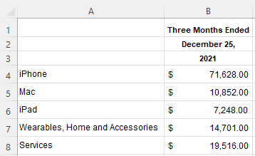
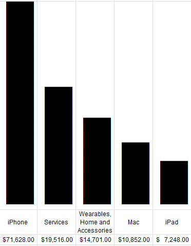
For this example, I’m going to use data from Apple’s most recent earnings report, to see the split between sales of its different categories. Here’s what the data looks like from its most recent filing:
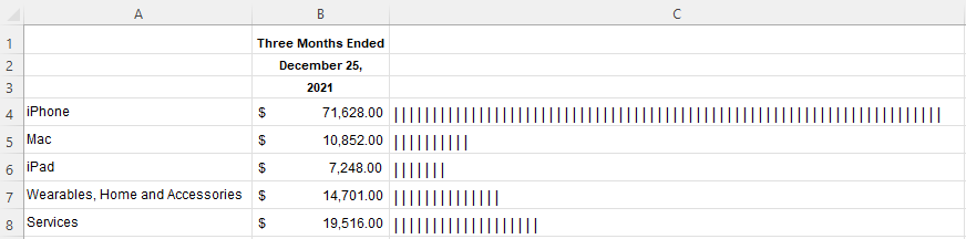
To create a simple bar chart, I’m going to use the REPT function, which allows me to repeat text. The character I’m going to repeat is the “|” line, which on most keyboards is the button above the enter key. Holding shift and that key should give you that line. The number of times I want to repeat the character will be the value in column B. But because it’s too large, I’m going to divide it by a factor of 100. Here’s how that formula will look:
=REPT("|",B4/1000)If I copy this down, my bar chart remains a work in progress:
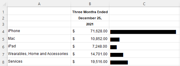
One way to make this look like more of a bar chart is by changing the font. In column C, I’m going to change it to Britannic Bold. And now, this looks like a proper bar chart:
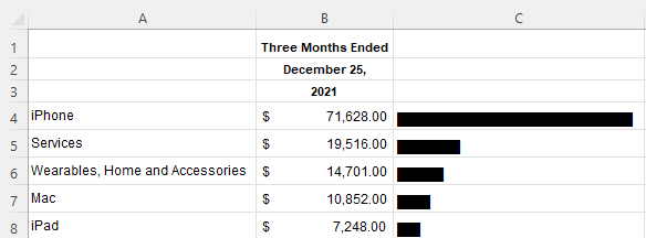
If I sort the values from largest to smallest, then it’s easier to see the progression:
This is good, but this is also still a bar chart. To convert this into a column chart, I need to make a couple of changes. The first thing is I need to arrange the data differently so that the fields and the values are going horizontally rather than vertically. To do this, you can just transpose the data. You can do this using the TRANSPOSE function. Now, my data is better suited for a column chart:

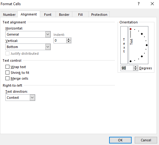
Now, I’ll add back the REPT function and use the same font. Except for this time, I will modify the cells so that the alignment is vertical:
Now, after compressing the columns, I have a column chart set up:
Here’s a quick video showing the steps:
If you liked this post on How to Create Column Charts in Excel With Just a Formula, please give this site a like on Facebook and also be sure to check out some of the many templates that we have available for download. You can also follow us on Twitter and YouTube.
Add a Comment
You must be logged in to post a comment