H2Eheadernames

Dealing With Tables With Changing Headers in Power Query

One of the more common errors you’ll run into when using Power Query is when your headers change names. If that happens, and you have a step in Power Query that alters the headers or relies on them in any way, you’ll end up with an error saying a header wasn’t found. This can happen if you are querying a table whose headers change or if you simply change the name of one of them yourself. Below, I’ll show you an effective strategy for dealing with tables with changing headers in Power Query so that even if the header names change, you can avoid running into these errors.

Changing headers in Power Query

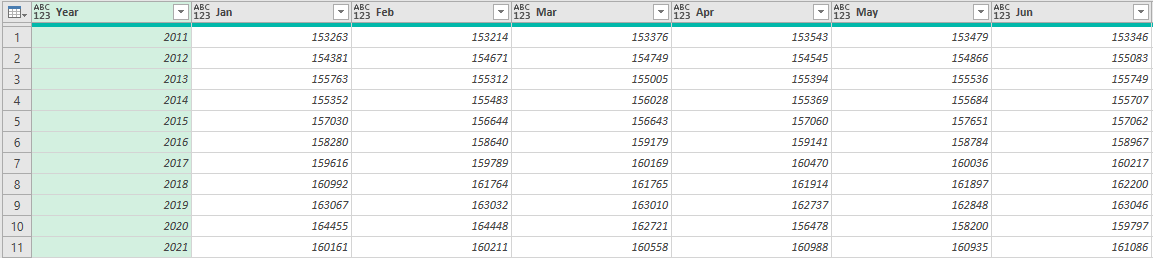
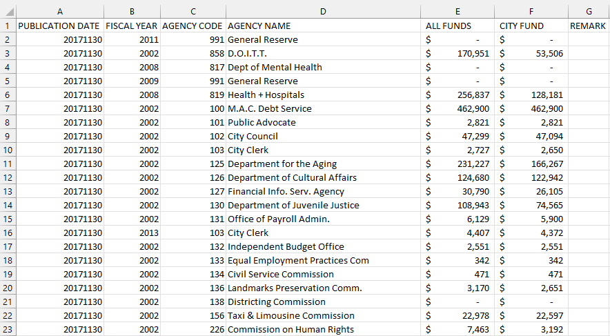
Let’s start with the basics of how you would normally create headers in Power Query. For this example, I’m going to use data from the City of New York Expenses, which you can download from here. This is what the data set looks like:

City of New York Expenses in Excel format.

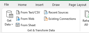
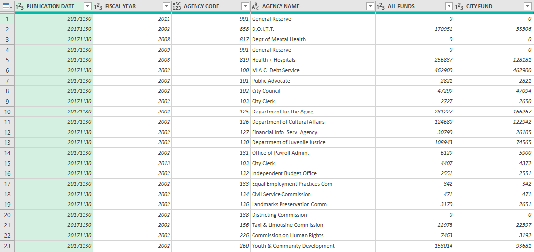
To launch this data into Power Query, go to the Data tab and click on From Sheet. Once the range is selected, click on OK. Once in Power Query, the data looks as follows:

Expense data that is populated in Power Query.

To change any header name in Power Query, all you need to do is double-click on the header. In this example, I’m going to change the first header so that rather than Publication Date, it will just say Date. Then, I’ll go in and click Close & Load to get out of Power Query.

The problem arises if the header in the table were to change. If I go back into the Expense_Actuals sheet (which Excel automatically created for me when I set up the table in Power Query), it shows these headers:

Header names in the expense table.

And if I change the first header so that it looks like this:

Table headers after changing the name of the first header.

I’m going to have a problem, because Power Query is going to be looking for Publication Date rather than just Date. Now, if I go under the Data tab and click Refresh All — which will update the query — I get the following error:

Power Query error showing that the column wasn't found.

This is the error that shows up when Power Query can’t find the header. If I modified the header name for Fiscal Year or any other column, then I wouldn’t get this error. The reason is the step of changing Publication Date to Date is hardcoded into Power Query and if it doesn’t find that header, it will give me the above error message.

The key to dealing with tables with changing headers in power query is to demote them, which I’ll cover next.

Promoting and demoting headers in Power Query

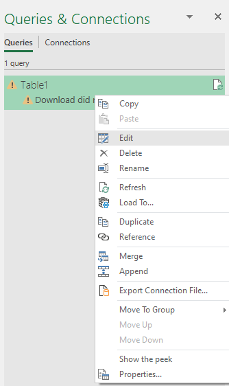
By default, Power Query will use the first row of your table as its headers. In my situation, this is a problem because if the header in the table is changing, I could run into errors. To eliminate this, I’m going to demote the headers. To start, I’ll go back to edit the query. To do this, you can go under the Queries & Connections table, right-click on the query and click on Edit:

Selecting the option to edit the query.

Then, select the first Power Query step (which will likely just be ‘Source’), and you should again see the table again:

Table in Power Query.

Then, under the Transform tab, in the Table section, click on the option to Use Headers as First Row:

Select the use headers as first row option in Power Query to demote headers.

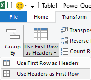
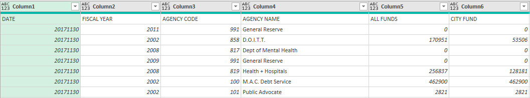
This has the effect of demoting the headers so that they are now rows. And upon doing so, the header names become just Column1, Column2, etc:

Power query table after demoting the headers.

The option above it to Use First Row as Headers is the exact opposite — it would promote the first row and make that the header for all the columns; it would undo the above step.

However, now with the plain column names, what you can do is go through and re-name each of the headers however you want, which now looks as follows:

Power Query table after changing the header names.

The one issue that remains here is that now we have the old header names in the first row. To get rid of them, go into the Home tab and click on Remove Rows and select the option to Remove Top Rows

Removing the top rows from Power Query.

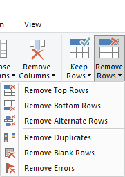
And then for the number of rows to remove, just enter 1 and click OK:

Removing the first row from the Power Query table.

And then, the updated Power Query table looks as follows:

You can remove any other steps that were previously in Power Query to avoid it looking for the old header names.

One thing to also remember is the Changed Type step which Power Query automatically generates and looks to convert each header into the correct data type. As you can see from the formula for that step, it will look for the hardcoded header names:

The changed type in Power Query also looks for exact header names and can cause issues as well if you haven't removed this step.

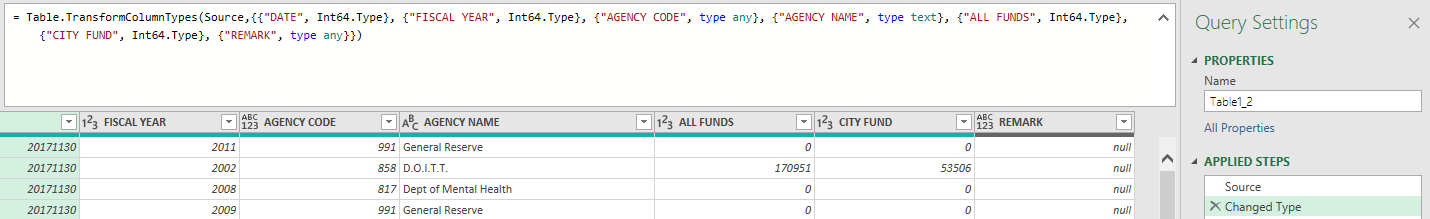
You can either modify the header names within the formula, or you can just remove the step entirely. But this too can cause issues if it is looking for a hardcoded header name. Once you’ve made the last step of removing or changing the Changed Type step, you should be good to go.

Now, when you go and refresh your query, even if you have modified the header names, your data will refresh correctly and put in the header names you have specified in Power Query.


If you liked this post on dealing with tables with changing headers in Power Query, please give this site a like on Facebook and also be sure to check out some of the many templates that we have available for download. You can also follow us on Twitter and YouTube.

H2Eboxplot

How to Make a Box Plot Chart in Excel

A box plot chart can show you lots of information in just one visual: the minimum, maximum, median, and interquartile range of a data set. It can be a great way to visualize your data to see its range and how narrow or broad the values are. In this post, I’ll show you a couple of ways to create a box plot. The first is through the box and whisker chart on newer versions of Excel, and also how you might create this just from a stacked chart.

For this data set, I am going to create some random test results to compare an easy test versus one that is average, and another that is difficult.

Creating the box and whisker chart

This is the sample data I’m going to work with for this example:

Exam results in Excel.

The way the data is formatted, it is already ready to use in a box and whiskers chart. Simply click anywhere on the data set and on the Insert tab, you can click on the pop out button for Charts or just click on the Recommended Charts:

The charts section in the insert tab on the ribbon.

Then, under the All Charts section, there is an option for Box & Whisker. Click on the only chart available in that section:

The box and whisker chart in Excel is selected.

And then that will put your data into a box plot:

Exam scores plotted on a box and whisker chart.

Besides adjusting the range so that it does not go higher than 100, the box and whiskers chart is ready to use immediately with minimal adjustments. From the above chart, we can see that the easy exam had the smallest range, highest min and max values, and a broader interquartile range than the moderate exam — this suggests more variability. The real value in box plots is in being able to compare them against other data sets.

Creating a box plot using a stacked chart

Another way to make a box plot in Excel is by using a stacked chart. This involves more steps but it allows you to make this work on older versions of Excel. If you have trouble following along, you can download the sheet I created for this purpose here.

First, we’ll need to organize the data by quartiles. A table is needed that starts off with the minimum value, and then the size of each quartile. For the minimum value, you can just use the MIN function and put in the entire range in there. The quartile functions may be a bit unfamiliar for many users but the calculations aren’t complex. The QUARTILE.INC function would look as follows if you want to pull in the first quartile:

=QUARTILE.INC(A1:A100,1)

If your range is in A1:A100, then the above formula would return the position of the first quartile. Changing the last argument to 2 and then 3 will give you the position of the remaining quartiles (you don’t need quartile 4 for this calculation). Once you have the value of each of the quartiles, then the next step is to calculate their respective sizes.

For the first quartile, you’ll take the first quartile and subtract the minimum value. The size of the next quartile will be the Median value (for this you can use the MEDIAN function) less the first quartile. The third quartile size will take the third quartile and subtract the median. Finally, the last quartile size will take the maximum value and subtract the third quartile.

Based on those calculations, the table that will be used in the stacked chart is as follows:

Table showing the different quartile sizes for the box plot.

If I go to create a stacked chart using that table, by default it will look like this:

Initial stacked chart created by Excel.

The first thing I need to do is flip the rows/columns. To do this, right-click on the chart and click Select Data. And then, click on the button that says Switch/Row Column, which will transform the chart into this:

Stacked chart with the rows and columns swapped.

This is a bit better but I still need to remove the min section out of sight. To do this, I can right-click on that part of the chart and change the fill color to be blank. Then, my chart starts from the minimum value, rather than from 0:

Stacked chart with the bottom section showing blank.

For the bottom (orange) series, I will do the same and change the fill colour to orange. I will also take an additional step afterwards and under the Chart Design tab, select Add Chart Element and click on Error Bars and then Standard Deviation:

Inserting an error bar into the chart.

That will create the following line leading up to the next quartile:

Error bar showing on the Excel chart.

However, this is not exactly what is desired since it should only start from the minimum value. To correct this, right-click on the error bar and click Format Error Bars and change the settings to the following:

  • Direction: Minus
  • End Style: No cap
  • Error Amount: Percentage: 100%
Error bar settings in Excel.

Now, the line starts from the minimum:

Chart with the error bar settings adjusted.

Follow the same steps for the blue quartile range at the top and then the chart will look as follows:

Error bars on both sides of the chart.

The last steps are really optional but I will get rid of the legend and also change the colors and outlines of the yellow and grey quartiles so they are all one color. My finished box plot looks as follows:

Finished box plot using stacked charts.

If you liked this post on How to Make a Box Plot in Excel, please give this site a like on Facebook and also be sure to check out some of the many templates that we have available for download. You can also follow us on Twitter and YouTube.

H2EcustomUIEditor

How to Customize the Excel Ribbon Using the Custom UI Editor

In a previous post, I covered how you can customize the Excel ribbon in what was a pretty manual process. The good news is there is a much easier way to make changes to the ribbon using the Custom UI Editor. Below, I’ll cover how you can add and remove both tabs and groups, how to add buttons, and how to even use your own images. The first thing you’ll want to do is to download the Custom UI Editor. There’s not a definitive place you can always find this tool at so your best bet is to do a Google search.

How the Custom UI Editor works

Once you have downloaded the Custom UI Editor, you can get to work and begin to customize the Excel ribbon. Unlike just a simple customization, when you modify the ribbon using the Custom UI Editor, you are making changes to the Excel file itself. That means when you send the file to someone, they will see the changes you have made. With just a ribbon customization, those changes only apply to your computer. But these changes will be saved within the file. The Custom UI Editor goes through the cumbersome process of attaching the XML code to the Excel file and makes it a lot easier to make changes to the ribbon.

When you first open the file, you’ll see a blank canvas such as this:

Custom UI Editor showing a blank page.

Start with clicking on the Folder icon to load up the Excel file that you want to modify. Any Excel file will do. Next, go to the Insert menu and click on Office 2010 Custom UI Part:

Insert menu on the Custom UI Editor.

This will create the xml file for Office 2010 and newer versions of the ribbon. If you want to ensure these ribbon modifications also work on Office 2007, then you will want to also insert the file for Office 2007 Custom UI Part. If the file isn’t going to be used on an older version of Excel, this isn’t necessary, but it also doesn’t require much additional effort.

The Custom UI Editor includes some sample code within it that you can automatically load so that you don’t have to start from scratch. With one of the xml files selected, let’s go back to the Insert menu, and this time click on Sample XML and Custom Tab.

Inserting sample XML from the Custom UI Editor.

This will insert some xml to get you started:

The Custom Tab XML code is loaded into the Custom UI Editor.

What the code has done is created a tab called Custom Tab and within that, created a Custom Group. Lastly, it has also added a button called Custom Button, which is a large size and uses a HappyFace icon that is built-in within Excel. Here’s what that looks like in the actual Excel file:

Custom button using the Happy Face icon.

The one thing that’s left to do is to link the button to some VBA code so that it does something when you click on it. I’ll cover that towards the end of this post.

If you wanted to run this same xml code for the older version of Excel (2007), then everything would work the same except for the very first line. Instead of this:

<customUI xmlns=”http://schemas.microsoft.com/office/2009/07/customui”>

You would use this:

<customUI xmlns=”http://schemas.microsoft.com/office/2006/01/customui”>

All you need to do is change 2009/07 to 2006/01.

To check that your code is correct, you can click on the red checkmark icon at the top:

Red checkmark button in the Custom UI Editor.

And if you get this message:

Custom UI message saying the XML is well formed.

Then your code is good to go and doesn’t contain any (obvious) errors.

Adding a custom button to the Home tab

Using the above example, you can customize the Excel ribbon to create a group and custom buttons inside of a new tab. However, I prefer simply adding any custom buttons on the Home tab to make them easy to find. Unless you have many buttons and macros, you probably don’t need to put them on an entirely separate tab of their own.

If you don’t want to create a new tab and just want to put your buttons in an existing tab, then you can use the following code to put them on the Home tab:

<tab idMso=”TabHome”>

When you use a reference of ‘Mso’ that means it is an existing Microsoft tab/group/image. You need to refer to the correct name (see further down for a list of groups and tabs) and then you can put your custom group or button in that tab rather than creating a new one. Here’s what the full code would look like by changing this one reference from the above example:

Custom UI Editor showing button group created within the Home tab.

In Excel, I still have my custom group, but now it isn’t on its own tab. Instead, it goes to the end of the tab:

Custom group showing at the end of the Home tab.

If it’s too far to the end what you can do is insert it before a certain group. Let’s say I want to put it just before the Alignment group. Then I just need to adjust the code slightly to add the insertBeforeMso (this is case-sensitive) attribute for the group tag:

<group id=”customGroup” insertBeforeMso=”GroupAlignmentExcel” label=”Custom Group”>

This is how the full code looks:

Custom UI Editor with custom group inserted before the Alignment group.

And now my custom tab shows up a lot earlier in the home tab:

Custom group and button showing on the home tab after the Font group.

Another thing I can do is also remove some groups. If I don’t want the font group, I can add the following line of code in the Custom UI Editor:

<group idMso=”GroupFont” visible=”false”/>

Here is the updated code:

Custom UI Editor that shows line removing the Font group.

And here’s what the ribbon looks like:

Excel ribbon without the Font group.

You could make all the Microsoft tabs and groups invisible if you wanted to and can control where you custom group goes. The key is knowing the correct names.

Names of the Microsoft tabs and groups

Here is a list of the Microsoft tabs and the reference you will want to use when modifying the ribbon:

Tab NameRibbonX Referenece
HomeTabHome
InsertTabInsert
DrawTabDrawInk
Page LayoutTabPageLayoutExcel
FormulasTabFormulas
DataTabData
ReviewTabReview
ViewTabView
DeveloperTabDeveloper

Here are the main groups from the Home tab:

Group NameRibbonX Reference
FontGroupFont
AlignmentGroupAlignmentExcel
NumberGroupNumber
StylesGroupStyles
CellsGroupCells
EditingGroupEditingExcel
ClipboardGroupClipboard
UndoGroupUndo

There are more groups (from other tabs) but for this purpose, I just included the most common ones.

Adding an image to a button

If you want to use an existing Microsoft image for your button, then you can view the imageMso gallery here. Once you find the image you want to use, just put that in place of the HappyFace image in the earlier code.

However, suppose you want to make a custom image. I’m going to create one using the Amazon logo to create a button that will open my browser to the Amazon.com website.

For starters, I need to get an image. For large ribbon buttons, you want to aim for a size of 32 x 32 and for smaller images, 16 x 16. As long as it’s a square image, however, you should be okay. Wide images will stretch and won’t look as good. This is the image I’m going to use:

Amazon logo.

I’m going to use just a simple code for creating the button, which looks as follows:

Custom UI Editor showing code for the Amazon button.

I haven’t associated an image to this button yet. To do that, I’m going to click on the xml file and go back to the Insert menu. This time, I’m going to select Icons. This will open up launch a dialog box where I can now select the image I want to use from my computer. Once I’ve selected it, it now shows up underneath my xml file:

Image file showing attached to the xml file.

I can right-click on the name ‘amazon’ to change the id to something else. Whatever if it is, that’s what I need to reference in my xml code. Since it’s not a Microsoft image, I just add the following attribute:

image=”amazon”

And here is my full code:

Custom UI Editor showing the code referencing the custom image.

If I open up Excel, this is what my custom button looks like:

Custom Amazon button on the ribbon.

But right now, my button doesn’t do anything. That leads us to the last section on how to customize the Excel ribbon: callbacks.

Setting up callback macros

A callback tells the button which code to run. So that means you need some VBA code to begin with, otherwise, the button isn’t going to do anything. I’m going to create a simple macro that will just open the Amazon.com website:

Sub Amazon()

ActiveWorkbook.FollowHyperlink (“https://www.amazon.com”)

End Sub

The callback function itself can be generated from the Custom UI Editor. If I click on the icon next to the checkmark that looks like a block of code:

Callback button on the Custom UI Editor.

The application will produce the VBA code I need to put into my Excel file:

Callback generated from the Custom UI Editor.

I’m going to copy and paste that back into VBA. However, I need to add a line in between as that code only sets up the macro, it doesn’t do anything yet. I need to reference the macro I created earlier. The full callback macro looks as follows:

‘Callback for btnAmazon onAction
Sub Callback(control As IRibbonControl)

Amazon

End Sub

Now when the button is pressed, the ‘Amazon’ macro will run, which opens the Amazon.com website. You can create a custom button for each macro you want to run and assign an image to each one. All you need to do is to use the callback macro to link the button to the code you want to run.


If you liked this post on How to Customize the Excel Ribbon Using the Custom UI Editor, please give this site a like on Facebook and also be sure to check out some of the many templates that we have available for download. You can also follow us on Twitter and YouTube.

H2EConditional

How to Make a Conditional If Statement in Power Query

In Excel, IF statements give you way to handle multiple scenarios. You can determine which result to return based on another value or input that a user makes. A common example is where a cell contains no value. You can create a formula to say if the value is blank, you return a result that is blank. And if it isn’t blank, you can perform a calculation. IF statements work similarly in Power Query although you can’t enter them in cells. Below, I’ll show you how you can create a conditional IF statement in Power Query and how you can use it in your data set.

In this example, I’m going to use data from the data.gov website on the Tuition Assistance Program. You can download the CSV data from here if you want to follow along.

Getting the data into Power Query

Once you have downloaded the data, the first step is to pull it into Power Query. For that step, just click anywhere on the data set and under the Data tab, click on the option to get data From Sheet:

The Get & Transform data tab in Excel.

The data is fine in the shape that it is right away so there is no need to make any changes when loading it into Power Query.

Creating a Conditional Column in Power Query

Suppose we wanted to just differentiate the data between whether the funding is related to the private sector or the public. You could do a pivot table but if you want to just have a column to pull in those amounts separately, you can create a conditional column. A conditional column works like an IF statement, only it is easier to set up.

One thing to remember with Power Query is if you want to just alter the current column, you want to stay on the Transform tab. But if you want to create a brand new column — which is what I’ll be doing in this example — you want to go onto the Add Column tab at the top:

The transform and add column sections in Power Query.

Once you are on the Add Column section, you will see an option for a Conditional Column right below it:

Add column options in Power Query.

Click on that button, and then you will see the following window:

Add conditional column window in Power Query.

For the column name at the top, I will call it Private Funding, since that is what I want to calculate. And the criteria is simple: I’m going to set it so that if the Sector Type column is equal to PRIVATE (this is case-sensitive in Power Query), then the output will be the TAP Recipient Dollars column. Otherwise, I want the value to be zero. Here is what that looks like:

Add conditional column window in Power Query with data filled in.

You’ll notice that on the output, value, and else fields, there is a down arrow. Clicking on this will allow you to switch between a column or a value. You can specify if you want to enter a value or reference a column. In this case, I want to reference an entire column if the criteria is met. And if it isn’t, I want to set it to a value — zero. For the operator, you also don’t need to look for an exact match, that too can give you various options:

Different operators in Power Query.

Once that is set up, I have a column called Private Funding in Power Query that is equal to the TAP Recipient Dollars if it is Private funding only. Otherwise, it is set to 0:

Private Funding conditional column set up in Power Query.

Now, I can repeat these steps for Public Funding and will now have a value in either private or public funding:

Additional columns created for private and public funding.

You may think this is a bit redundant but it saves having to create a pivot table if I wanted to do a summary (or a SUMIF function). One of the great things about Power Query is when I no longer need a column, I can just delete it. If I right-click on the original Sector Type column, there is an option to Remove from the shortcut menu:

Removing a column in Power Query.

This doesn’t impact my table because Power Query saves the steps I take and each time repeats the same order. This way it is safe to remove the unnecessary tab and avoid having redundant data that isn’t needed anymore.

Using the conditional column option is easy but if you want something more versatile to possibly include other Power Query functions, you can also use the Custom Column button, which I’ll cover next.

Creating an IF Statement Using a Custom Column

The option to create a Custom Column is also under the Add Column section:

Custom column option in Power Query under the Add Column section.

In this example, I will create a conditional column to look at if the TAP Level of Study column indicates at least a 4-year degree. By looking at the values there, we can see that the years are indicated in the first number:

Column in Power Query showing level of study.

If this was in a spreadsheet, I could just use the LEFT function to extract the first number. But in Power Query, I’m going to do it a little differently. Instead of the LEFT function, I am going to use the Text.Start function (these are also case-sensitive), which works the same way:

Text.Start([TAP Level of Study],1)

In this formula, I’m selecting the field, TAP Level of Study, and extracting just the first character from that. However, I still need to convert this into a number if I want to evaluate it as one. Next, I need to enclose this within the Number.FromText function. My formula looks like this:

Number.FromText(Text.Start([TAP Level of Study],1))

The next step is to evaluate it to see if the value returned is greater than or equal to 4:

Number.FromText(Text.Start([TAP Level of Study],1)) >= 4

If I am content with just getting back a series of TRUE or FALSE values, then I can stop here. But if I want to customize the values to say ‘YES’ or ‘NO’ then I will need to add to this formula by adding an ‘if’ statement at the beginning. I will also need to use the ‘then’ and ‘else’ keywords to tell Power Query what I want the results to be:

if Number.FromText(Text.Start([TAP Level of Study],1)) >= 4 then “Yes” else “No”

This is how it looks in the Power Query Custom Column window:

Creating a custom column formula in Power Query.

As you can see, going through the Custom Column approach will give you more flexibility as to what you can do with your conditional statements. While the Conditional Column is easy to use, it isn’t as flexible as you might need it to be. Now, when I click OK to create this column, I know have values that show either ‘Yes’ or ‘No’:

Column in Power Query that was created with Custom Column.

If you are looking for other Power Query functions, you can check out this page.


If you liked this post on How to Make a Conditional If Statement in Power Query, please give this site a like on Facebook and also be sure to check out some of the many templates that we have available for download. You can also follow us on Twitter and YouTube.

H2Etaxes1

How to Calculate Taxes in Excel

Want to estimate how much you might owe in taxes next year? If you are self-employed or have other income besides what you get from an employer, then you may find it useful to plan ahead of time and determine how much you might owe to ensure that you are putting aside enough money for taxes. It’s not a fun process but it can save some headaches later on. The good news is that Excel can make that process easy. Below, I’ll show you how you can calculate and estimate your taxes in Excel. And if you’d just prefer to download the file that I have created, scroll to the bottom of this page.

Determining your marginal tax rate

To estimate your taxable income and marginal tax rate, the first thing you’ll need is a table for the tax brackets. For this, I will use the schedule for federal income tax brackets 2021 found here.

I can’t simply copy the table into Excel as I will need to format it a little differently (the values contain text and won’t be helpful if I need to do a lookup). The table needs to be organized by income threshold rather than tax rate. This is how I have set it up in Excel:

Income tax brackets set up in Excel.

To make this table easier to reference to, I am going to create named ranges for these tax brackets plus the income I am going to enter in. This will make it easier to follow along.

If I want to look up the incremental tax bracket for a given level of income, I can accomplish this using a VLOOKUP formula. This is the formula I would use to accomplish that:

=VLOOKUP(Income,TaxBrackets,2)

What it is doing is taking the income number, and looking up the tax bracket table, and pulling in the second column (the tax rate). The VLOOKUP formula doesn’t look for an exact match (as I have left the last argument empty) and it will pull the closest number without going over. This is where it’s important to put in the numbers that the tax bracket start at, rather than a range. Using this formula, it correctly tells me that income of $100,000 would be at the 24% tax bracket as it does not yet reach the minimum amount for the next bracket — $164,926:

Determining the marginal tax rate in Excel.

That tells me the correct tax bracket but I still need to calculate the taxes that are due at each level, which I will cover in the next section.

Determine how much you owe at each tax bracket

For the first tax bracket, I will need to determine if the income level reaches the second tax bracket. If it does and the income is at least $9,951, then I can multiply that by the tax rate of 10% as that would be the maximum that can be taxed at the first bracket — 9,951 x 10%. If the income is not at least $9,951, then I just multiply the total income by the tax rate. Here is what the formula looks like using named ranges:

=IF(Income>=IncomeLevel2,IncomeLevel2-IncomeLevel1,Income)*TaxRate1

For the second tax bracket calculation, I can follow similar logic. I will multiply the difference between the start of the third and second income levels. Here’s how that calculation looks:

=IF(Income>=IncomeLevel3,IncomeLevel3-IncomeLevel2,MAX(0,Income-IncomeLevel2))*TaxRate2

I also use the MAX function just in case there is a negative number (where the income doesn’t even reach the next level). The same logic can now be applied for all of the remaining tax brackets except for the last one. Like the first one, it needs to be calculated differently. In that case, I just need to know if the income is above that threshold. And if it is, I take the difference between it and the total income, and multiply it by the highest rate:

=IF(Income>=IncomeLevel7,Income-IncomeLevel7,0)*TaxRate7

If the income isn’t above the last level, then I put a 0 and multiply that by the tax rate. Now, when I’m all finished, I can sum up the tax owing at each level and come to a total tax number that would be due based on a given income number:

Tax owing calculation in Excel.

At this stage, you could now decide to deduct how much you may have already paid in taxes and any deductions or credits that you are entitled to.

But I’m not going to go any deeper here because there are too many different variations from one country and jurisdiction to the next when it comes to taxes. However, this should at least give you a good starting point for doing the rest of your estimation, however detailed you want it to be. But by at least estimating the taxes owing and deducting how much you have already paid, you should have a good idea of how much you might owe come tax time, under a worst-case scenario.

If you’d like to just download the file that I created when making this post, you can do so here.


If you liked this post on How to Calculate Taxes in Excel, please give this site a like on Facebook and also be sure to check out some of the many templates that we have available for download. You can also follow us on Twitter and YouTube.

H2Eunpivot

How to Unpivot Data in Excel

Using pivot tables to summarize data can be a great way to display information quickly and total everything up. However, in some cases, data that you download is already in what you might call a pivot table format where it is summarized and you want to put it in more of a tabular format. In this post, I’ll show you how to unpivot data in Excel where you can turn a table like this:

Data in a summarized, table format.

into this:

Data that has been unpivoted.

Unpivot using Power Query

Rather than copying and pasting data into a tabular format and doing the process manually, you can just use Power Query to do it for you, all in a matter of seconds. First thing’s first, you need to get your summarized data into Power Query. To do that, click on one of the cells in the table and on the Data tab, click on the From Sheet button in the Get & Transform Data section:

Selecting the From Sheet button on the Get & Transform Data section.

Then, click OK on the default range and then the next screen will be Power Query:

Table showing in Power Query.

The key to making the unpivot work correctly is to determine which column(s) you don’t want to unpivot. In this case, it is only the Year field as I want to have the years listed out. With the Year column selected, I right-click on the header and select Unpivot Other Columns:

Select Unpivot Other Columns from the menu.

After clicking on that, the data is unpivoted and now it is in tabular format:

All that is left now is to press the Close & Load button in Power Query, which will then populate the data back into Excel:

You can repeat these steps for other, similar summarizes should you need to unpivot data.


If you liked this post on How to Unpivot Data in Excel, please give this site a like on Facebook and also be sure to check out some of the many templates that we have available for download. You can also follow us on Twitter and YouTube.

dashboardsgs

How to Make Dashboards in Google Sheets

A big advantage of using Google Sheets is that the data is readily accessible online and you don’t need to worry about if people are running different versions of it like you would with Excel. One of the areas where it may be lacking is in creating dashboards. Although you can incorporate slicers, they’re not as user-friendly or nice looking as what you would get in Excel. But in this post, I’ll go over how to make dashboards in Google Sheets quickly and easily.

Here is a sample of what my data set looks like. If you want to view the data plus the dashboard I created here, you can check out the Google Sheets file here.

Google Sheets data set.

Step one is to create some pivot tables. Like with Excel, I prefer to create a pivot table for each view that I want. I will set up four pivot tables, categorizing sales by:

  • Store
  • Salesperson
  • Product
  • Date

To keep things simple, you can put each one of those fields in the ROW section while the sales can be in the VALUES section:

Pivot table editor in Google Sheets.

When creating the pivot tables, be sure to un-check the option to Show totals (this is so that they don’t show up in the charts):

Show totals option in Google Sheets for pivot tables.

What you may want to do is create one pivot table and then copy and paste others, and just change the rows. One additional step you will need to do for the pivot table that contains the dates is to also group them by month. To do that, right-click on any of the dates and select Create Pivot Date Group:

Creating a pivot date group in Google Sheets.

Then, from the following menu, select Year-Month:

Different pivot date groups in Google Sheets.

This is how your pivot tables might look like once you are done:

Set of pivot tables in Google Sheets.

Where you put these pivot tables isn’t important. The key is leaving enough space between them so that they don’t potentially overlap should your data get bigger. Otherwise, you will run into errors and have difficulty updating your data. Since my pivot tables won’t get any wider based on the selections I’ll make, there doesn’t need to be any extra columns between any of them.

Now that the pivot tables are set up, the next step is to set up the different charts for each of them. For the sales by store, I will create a pie chart to show the split among the stores:

Pie chart showing sales by store in Google Sheets.

The one thing you will want to pay attention to for each chart is the range. Since your pivot table could expand, it’s a good idea to make the range bigger than it needs to be, even if it will contain blank values. For example, changing this:

Default date range for chart in Google Sheets.

To this:

Expanded data range for chart in Google Sheets.

This will ensure that additional data gets picked up by the chart should your pivot table get bigger. This is also why it is important to ensure you don’t place any other pivot tables below one another. Ideally, you’ll want to keep them side by side rather one on top of the other.

For the pivot table that shows sales by salesperson, I’ll use a bar chart since the names can be long:

Bar chart showing sales by salesperson.

For the product sales, I’ll mix it up and have those as column charts:

Column chart showing sales by product.

And for the sales by date, I will set those up as a line chart:

Line chart showing sales by month.

I will also add a scorecard chart, using any of the pivot tables. For this, I just want to pull the total sales:

Scorecard chart showing total sales.

Now that these charts all set up, it’s just a matter of organizing how you want to see them on your worksheet:

The one thing missing to make this dynamic: slicers. To add slicers to all these pivot tables, click on any of them and click on the Data tab and select the Add a Slicer button:

Adding a slicer to a Google Sheets pivot table.

Then, select the columns you want to filter by:

Selecting the column to use in a slicer.

As long as you are referencing the correct data range, then the slicer will apply to all the pivot tables correctly. And now, if I add a slicer for the stores and only select stores A and B, my dashboard updates as follows:

Dashboard filtered by slicers.

One thing to remember when you are applying changes: don’t forget to click on the green OK button on the bottom, otherwise your selections won’t be applied:

Applying filters for slicers in Google Sheets.

If you liked this post on How to Make Dashboards in Google Sheets, please give this site a like on Facebook and also be sure to check out some of the many templates that we have available for download. You can also follow us on Twitter and YouTube.

H2EconvertMonthNumber

How to Convert Month Number to Month Name in Excel

Do you have a report in Excel that lists the months as the numbers 1 through 12 and you want to convert that into the actual month names? Below, I’ll show you how you convert a month number into a month name in Excel.

Here’s an example of data that shows monthly sales but it only lists the number as opposed to the name:

Sales by month with the month number showing in digits.

If you had the entire date in a cell you could format it so that it showed the month. For instance, what I could do is type in =TEXT(A1,”MMM”) which would convert the value in cell A1 into a three-letter abbreviation for the month. But the numbers 1 through 12 will return values of “Jan” as Excel will think that you are referring to the first month of the year.

However, that changes once you get to the number 32. Since there are only 31 days in January, the number 32 will return a value of “Feb” if you were to continue on with that formula. And so the trick is to multiply these values all by a factor of 28. Since that’s the minimum number of days every month will have, it ensures that jumping by 28 each time will put you into each month of the year. This is what my values will look like:

Month numbers multiplied by 28.

To prove this out, here is which dates those days of the year would correspond to:

Day of the year along with the corresponding date.

In month 12, we barely make it in December using this approach but that’s good enough. And even in a leap year, multiplying by 28 still works. In this example, I include 2024, the next year that February gets an extra day:

Day of the year along with the corresponding date, including a leap year.

So now that we’ve confirmed that those numbers will fall within the correct months, we can use the TEXT formula noted above to convert those numbers into month dates, and this is what we end up with:

Month numbers converted into month names.

You can also multiply by 29 and this logic will still work. But if you use 27 then your months will be wrong by the time you hit September and if you use a multiple of 30, then in non-leap years you will be jumping too quickly and you will have two dates in March.


If you liked this post on How to Convert Month Number to Month Name in Excel, please give this site a like on Facebook and also be sure to check out some of the many templates that we have available for download. You can also follow us on Twitter and YouTube.

H2Etax

How to Calculate Tax Included in an Invoice

If you are creating an invoice and need to account for taxes, usually you just need to multiply the subtotal by the percentage due for taxes. However, it gets trickier when the tax amount is already included within the invoice total and you need to work out what the amount relating to tax is. This is important if you need to determine how much in taxes you need to claim on an expense or how much you need to collect if you’re the seller. Below, I’ll go over a sample invoice calculation to show how can determine the tax amount whether it is included in the total or not.

Calculating taxes on an invoice

Let’s start with the basic calculation. This is how you might normally determine the taxes on an invoice and the total invoice value:

Sample invoice calculation including taxes.

The calculation is straightforward as what you do is just take the subtotal, multiply that by the tax rate, and add that back to the subtotal. Another way is to just take the subtotal and multiply it by a factor of 1 + the tax rate. In this case, it would $100 x 1.10. But let’s pretend we don’t know the subtotal and just know that the invoice total is $110.00 and the tax rate is 10%. In order to calculate the pre-tax amount, we need to do the steps in the opposite order. To prove this out, let’s use a bit of algebra:

$100 + ($100 x 10%) = $110

This can be simplified as follows:

$100 (1 + 10%) = $110

Now let’s solve for $100 which I will assign a variable of ‘y’ to:

y (1 + 10%) = $110

To solve for y, all we need to do is move the factor of 1 + the tax rate and divide $110 by that:

y = $110/(1 + 10%)

Taking $110 and dividing by 1.1 will give us a value of $100. And so what our end result comes out to is essentially this:

invoice total / (1 + tax rate) = pre-tax amount

To calculate the tax, all that’s needed then is to take the total and subtract the pre-tax amount.

Now that the logic is set up, let’s convert this into an Excel formula:

Invoice calculation when the tax amount is included.

Similar to how multiplying by a factor of the pre-tax amount by 1.1 (when the tax rate is 10%) would get you to the invoice total, dividing the total by 1.1 would get you to the amount before taxes. If the tax rate were 5%, then you would use 1.05, etc.


If you liked this post on How to Calculate the Tax Amount When it Is Included in the Total, please give this site a like on Facebook and also be sure to check out some of the many templates that we have available for download. You can also follow us on Twitter and YouTube.

h2eVariances

How to Calculate Variances in Excel

In this post, I’m going to show you how you can easily calculate variances in Excel. I will also go over how to group variances and how using pivot tables, charts, and conditional formatting can help save you time in reviewing them.

For this example, I’m going to use data from the S&P 500 as stock prices frequently fluctuate. To start, I’m going to download the data from the past year. I’m going to remove everything except the closing values just to keep this example simple:

Download of the S&P 500 closing prices over the past 12 months.

Calculating the variances

The calculate the variance in these data points, what I need to do is to take the current closing price, and subtract the previous day’s closing price from it. That will tell me how much of a move there was that day. On June 7, for instance, the S&P 500 fell from 4,229.89 on June 4 (the previous trading day) to 4,226.52. If I minus the current day’s close from the previous, I get a value of -3.37.

But we can dig a lot deeper than just looking at the difference in price. Let’s also create a field to indicate whether these variances are positive or negative. To do that, I’ll create another column called ‘Direction.’ For this calculation, I will take a look at the value in column C (where my variance is) and create a simple IF formula:

=IF(C2>0,”Positive”,”Negative”)

Here’s what my sheet looks like now:

Table of variances showing positive and negative values.

Although you can determine whether it is positive or negative from the variance field, by creating another column you can quickly filter if you want to look at all the negative or positive values. Another column I’ll insert here is for the percentage change.

To do this, what I will do is take the variance amount and divide it by the previous day’s closing price. This will tell me how much the price has moved as a percentage of what its value was the day before — which is much more useful than just looking at the raw value. After inserting the column, I have the total variance, variance %, and which direction it went in:

Variances by raw amount, percentage, and positive or negative indicator.

I changed the variance % field to show percentages and I added a few decimal places since the percentages are fairly small. To add decimal places, go to the Numbers group on the Home tab and click the following button on the left:

Button to increase or decrease the number of decimal places.

The one on the left will add decimal places while the one on the right will remove them.

However, what if you don’t care about positives or negatives and are just interested in the absolute value of the changes? I’ll cover that next.

Calculating changes in absolute value

With absolute value, you remove the positive or negative indicator. And to calculate a variance this way, you just need to add a formula to the calculation in the variance field. Rather than this:

=B2-B3

You would enter this:

=ABS(B2-B3)

Now, my variances update and I no longer have a use for the Direction field since all the values will be positive:

Variance table when only calculating absolute values.

Alternatively, you could also just create another column specifically for the change in absolute value.

Now that the variances have been created, what you may want to do next is to group them.

Grouping variances

Why would you want to group variances? The big advantage in doing so is they can make it easier to analyze a large data set by showing you where the bulk of the variances are.

Rather than creating a bunch of IF statements, what I’ll do is create a table to show where the variances belong:

Table grouping the variances.

I’ve created a named range called VarianceTable for this. And now, all I need to is use a VLOOKUP formula to find which category a variance belongs in. Since I’m not using an exact match, I will set the last argument in the function to ‘TRUE’ :

=VLOOKUP(D2,VarianceTable,2,TRUE)

Now I have a category field instead of the Direction:

Table with variances grouped by category.

But this doesn’t tell me a whole lot. I could filter by the category. However, a better approach is to create a quick pivot table that shows me a summary of where the values fall:

A pivot table showing the count of the different variances groups.

And from that, I can quickly display these variances on a chart:

A chart showing variances by category.

Another way you can help identify extreme values in variances is by using conditional formatting. To apply conditional formatting, select either the variance column or the variance % column and under the Conditional Formatting button on the Home tab, you can select either Data Bars or Color Scales. I prefer using Data Bars since there are fewer colors:

Selecting data bars under the conditional formatting section.

Then, my variances are easier to visualize and to see where the highs and lows are:

When you are analyzing variances, using conditional formatting, pivot tables, and charts can help you summarize your findings.


If you liked this post on How to Calculate Variances in Excel, please give this site a like on Facebook and also be sure to check out some of the many templates that we have available for download. You can also follow us on Twitter and YouTube.