
Using a second Y-axis in Microsoft Excel can significantly enhance your data presentation, particularly when dealing with variables of differing scales. This guide will walk you through the steps to add a second Y-axis in Excel, helping you display your data more clearly and effectively.
Why Use a Second Y-Axis?
1. Scale Variation: When charting different types of data together, one variable might be significantly lower or higher in magnitude than the other. Using two Y-axes allows each variable to be scaled according to its own range, making the chart easier to read and interpret.
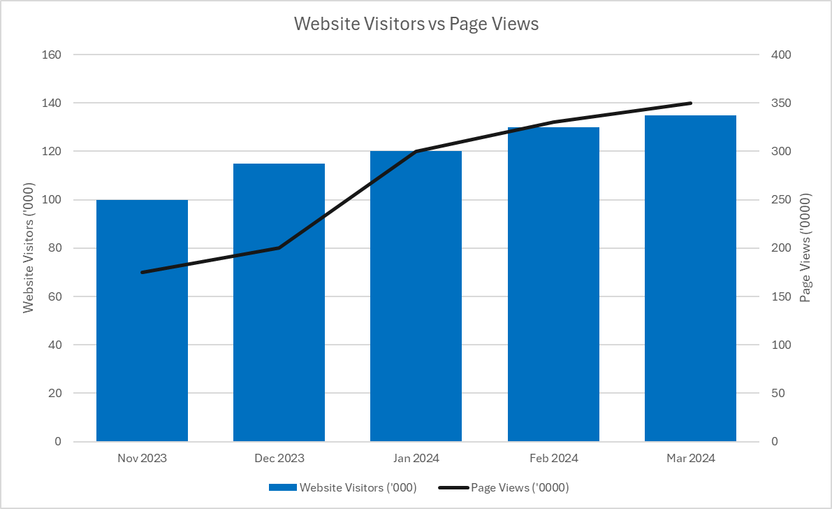
The above chart shows website visitors, which are measured in thousands, versus page views, which are in tens of thousands. By using a second axis, it makes it possible plot both of the values on the chart without making one series look far smaller than the other.
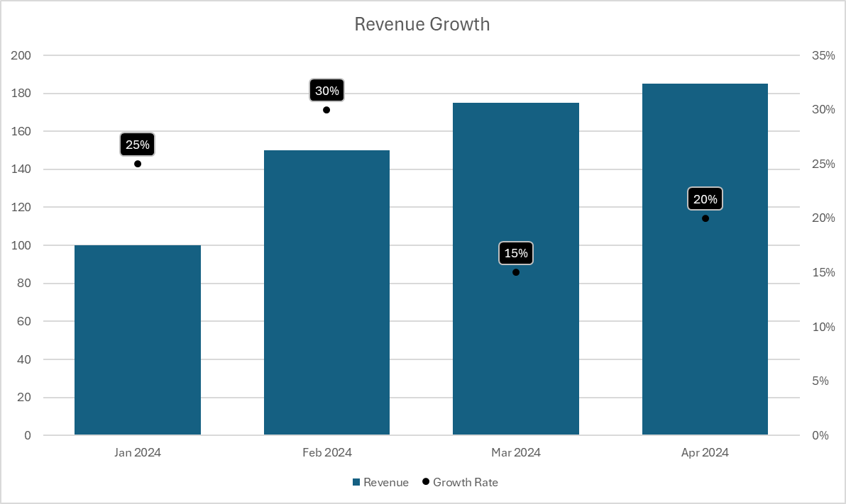
2. Different Units: If your data variables are measured in different units (e.g. dollars versus percentages), a second Y-axis can help represent each in an appropriate context without confusing the reader. A common example may be where you want to plot the revenue on one axis and the year-over-year growth rate on a separate axis, as is the case in the chart below.
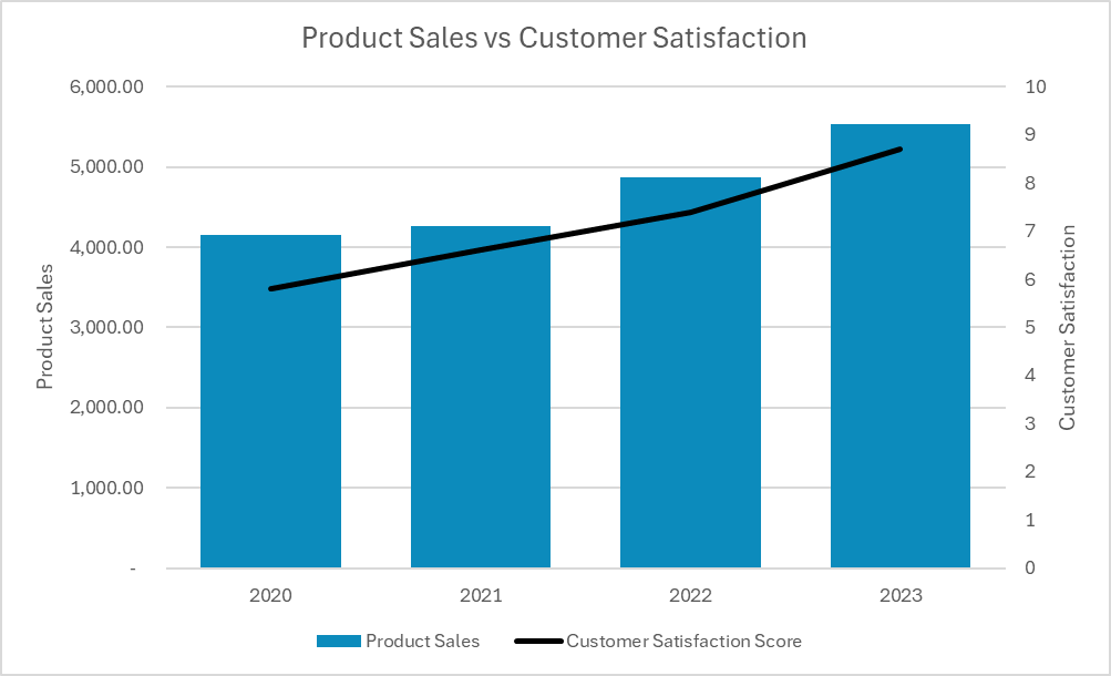
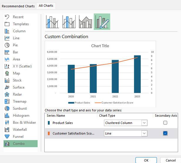
3. Clarity and Emphasis: Using a second Y-axis can help emphasize the relationship between two different variables, making your analysis clearer and more impactful. In the following example, it’s easy to see the relationship between a rising customer satisfaction score and higher product sales.
Step-by-Step Process to Add a Second Y-Axis
Here’s how you can add a second y-axis to your charts.
Step 1: Prepare Your Data
- Organize your data in Excel with your independent variable (e.g., time, dates, categories) in one column and the dependent variables in adjacent columns.
Step 2: Create a Combo Chart
- Highlight your data range.
- Go to the Insert tab.
- Click to expand the Charts section and select the Combo chart from the bottom.
Step 3: Add the Secondary Axis
- When selecting your chart types, check off the option for a Secondary Axis for at least one of the series.
- While it’s not necessary to use a different chart type, setting it up that way can be helpful to distinguish the values more easily from one another.
Step 4: Customize the Secondary Axis
- Once your chart is loaded into Excel, click on the secondary axis (now visible on the right) to select it.
- Right-click and choose Format Axis to open the Axis Options pane.
- Adjust scale options such as minimum and maximum values, tick mark spacing, and number formats to better align with the secondary data series.
- You can also add axis titles by selecting the chart and clicking the Add Chart Element option from the Ribbon (under the Chart Design tab). Then, select Axis Titles and either Secondary Vertical for the secondary axis or Primary Vertical for the primary axis.
Adding a second Y-axis in Excel can turn a confusing overlap of data into a clear and insightful visualization, perfect for presentations or in-depth analysis. By following these steps, you can master the use of dual Y-axes in your charts, making your reports and presentations more professional and effective.
If you like this post on How to Add a Second Y-Axis in Microsoft Excel please give this site a like on Facebook and also be sure to check out some of the many templates that we have available for download. You can also follow me on Twitter and YouTube. Also, please consider buying me a coffee if you find my website helpful and would like to support it.