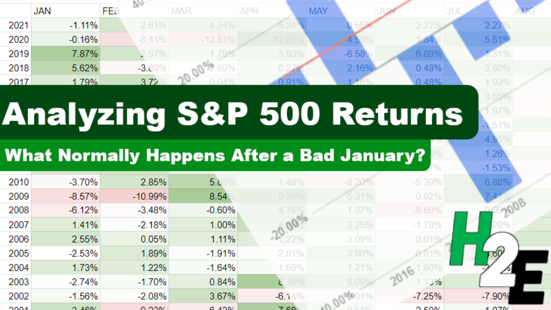
The stock market is off to a rough start to 2022, with the S&P 500 falling more than 5% in just one month. Using a spreadsheet, we can analyze historical trends and patterns to identify what normally happens after such bad starts. Below, I’ll use data from Google Sheets to pull in historical values and analyze how the index has performed afterward and whether this year is doomed to be a bad year, or if a recovery is likely and if now is a good time to invest in stocks.
Start with downloading the historical data
The first step is to get the S&P 500’s historical values in Google Sheets. This can be done using the GOOGLEFINANCE function. Using the .INX symbol, I can calculate the S&P 500 values going back to the 70s. Here’s a matrix showing the returns over the past 50 years, after applying some conditional formatting to the values:

Filtering the data
To zero on in just the largest January declines, I can use the Filter by condition option to specify January values where the percent change is less than negative 5%:

That leaves me with the years when the S&P 500 dropped by 5% or more in the first month:

Now that I have a list of the years I’m looking to analyze, I can start creating some charts.
Using charts to summarize the performances
The first visual I’m going to create will look at how the index has performed after January, after those bad starts. To do that, I need to take the year-end values and divide them by the values at the end of January. This tells me how much the index rose or declined in the remaining months. And when grouping those variances, this is what the data shows:

Of the 7 previous times when the S&P 500 dropped 5% in January, 3 times it would continue to drop in the following months and finish even lower. Only two times would the index rise by more than 10%. I can also average the results, comparing the down years versus the overall average:

This tells me that in a year where the S&P 500 typically tanks in the first month, the overall returns from the index are likely to be negative. However, to add a bit more context to this, I’ll look at the individual returns by year and compare them against the 50-year average, which is summarized in this table:

By keeping the average column constant, it creates a straight line for the chart and makes it easy to visualize the individual years’ returns and how they compare against it:

A few of the things that stand out from the data is that in three of the years (2000, 2008, 2009), the markets were either in the midst of a significant crash or recovering from it. It helps put into context some of these returns, suggesting that the other years might indicate more typical returns in a non-crash year. And if that’s the case, investors may expect fairly modest returns this year, possibly negative ones overall. Although it isn’t a large data set, it certainly suggests that the stock market may be facing a down year in 2022.
You can check my calculations in the Google Sheets file I used to create this data.
If you liked this post on the S&P 500’s Historical Returns, please give this site a like on Facebook and also be sure to check out some of the many templates that we have available for download. You can also follow us on Twitter and YouTube.


Add a Comment
You must be logged in to post a comment