Are you creating a chart that shows progress, with a certain goal in mind? In this post, I’ll show you how to create a chart with a target line so that you can see how close you are progressing toward your goal.
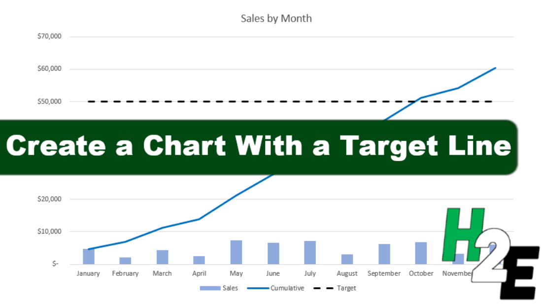
A common example for this type of chart is where you are reporting monthly sales and have a goal you want to reach for the year. Here’s a chart that shows the monthly revenue and has a cumulative total as well:

Creating the target line
To create a target line, I need to add another series to this chart. For example, let’s say your goal is for sales to hit $50,000 for the year. To do that, you just need to create another series. I’ll call it ‘Target’ and for each of the values, I’ll enter in $50,000:
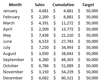
You don’t need to enter $50,000 manually into each cell. You could use the autofill to copy the values down. However, a more flexible way to do this is to enter $50,000 into the first cell, and use a formula to refer to that cell. That way, if you change your target amount, you only need to make the change in one cell.
If you’ve already created your chart and want to add the line to your chart, you’ll need to right-click on the chart and click Select Data. Then, adjust your chart range so that it includes the extra column, and then you’ll see your chart update with the line. If you are creating a chart from scratch, then you just have to select the correct range when first creating it.
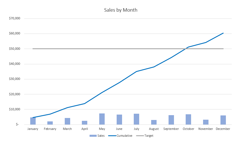
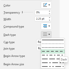
One additional thing you may want to do at this stage is to adjust the formatting of the target line. A good idea can be to make it look different from the other lines on your chart. One way you can do this is by using dashes. If you click on the target line, you will see a pane show up on the right-hand side showing you options to format the data series. Click on the paint bucket icon and you’ll see various settings for the line. There is one option for the Dash type which will allow you to show the line as breaking up as opposed to being solid:
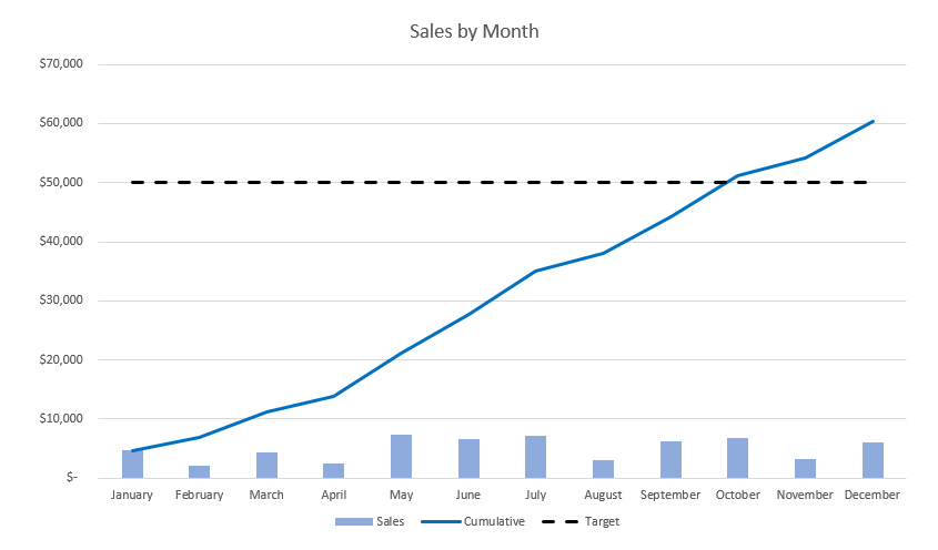
After also changing the color to a solid black, this is what my chart looks like with these changes:
If you like this post on How to Create a Chart With a Target Line, please give this site a like on Facebook and also be sure to check out some of the many templates that we have available for download. You can also follow us on Twitter and YouTube.

Add a Comment
You must be logged in to post a comment