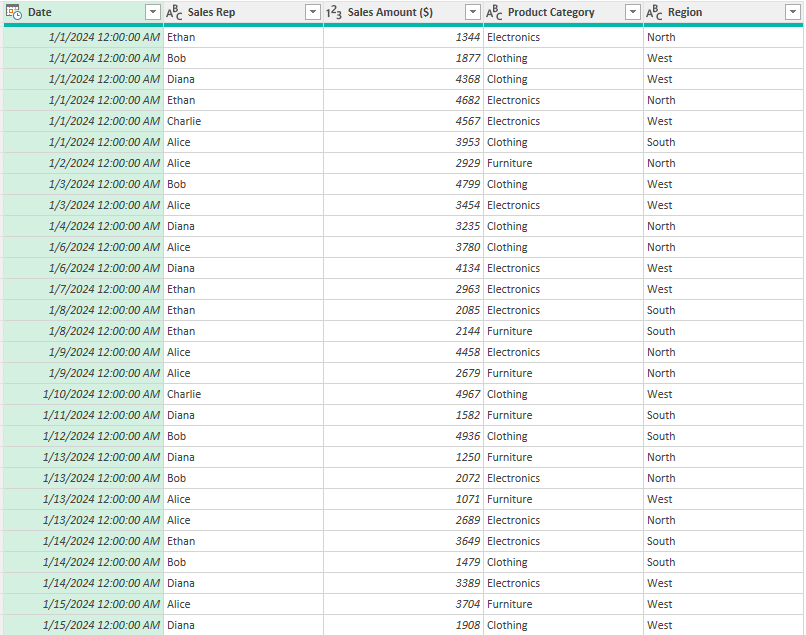
Have data in Power Query that you want to sum up and group by category? In this post, I’ll show you how you can sum up values in Power Query to help you analyze your information. In this example, I’m going to use daily sales values by different sales reps.
Getting a simple sum
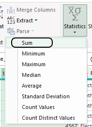
If you just want to calculate a sum in Power Query, select the column you want to sum, and then on the Transform tab, select Statistics, and select Sum.
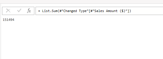
This will create a new step, where it will calculate the sum.
You could reference this step in other calculations. However, if you want to tally up sales by categories, there’s a better way to do this.
Summing values using Group By
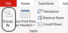
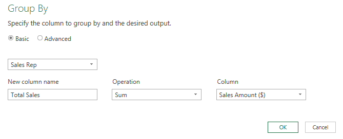
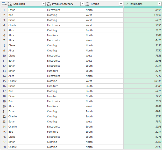
One way to both group and summarize your totals is by using the Group By method. To do this, select the column you want to group by. In this case, it’s going to be by the sales rep, since I want to see the total sales by rep. Then, on the Transform tab, I’ll click on the Group By button:
Then, I’ll enter a column name of Total Sales and for the operation, select Sum and select Sales Amount ($) as the column I want to sum.
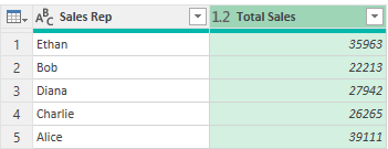
After pressing OK, I have a breakdown of sales by the different reps.
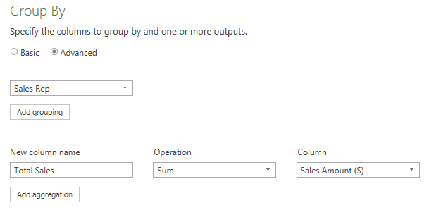
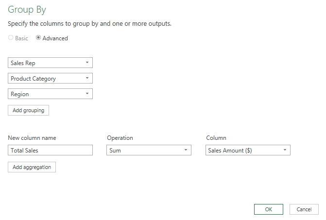
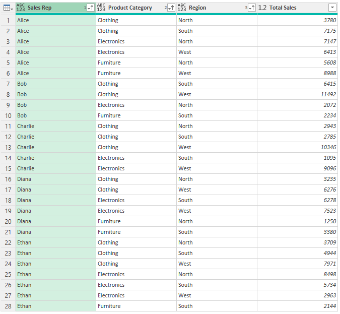
There are, however, more splits that you could do. Suppose you wanted to group sales rep sales by the type of product that was sold and the region. To split into more categories, select the Advanced option in the Group By dialog box. From there, you’ll have the ability to specify more levels to break sales down by.
I can click on Add grouping to add more layers, such as Product Category and Region.
Now I have summations based on those different splits.
One thing you may still want to do at this point is to organize the data so that it is in some sort of order. To apply a sort, select the column you want to sort by and on the Home tab, indicate whether you want it to be in ascending or descending order. In the below example, I have arranged the data by sales rep, then product category, and then by region.
If you liked this post on How to Sum and Group Values in Power Query, please give this site a like on Facebook and also be sure to check out some of the many templates that we have available for download. You can also follow us on Twitter and YouTube.
A common problem you might come across with data is that it may sometimes contain missing values. You can remove the data entirely or you can replace the values with something else. If you remove it, you might throw away other useful data related to that record in the process. If you replace it, you don’t want to just replace missing values with a zero, as that can impact your calculations. The optimal choice may be to replace it with the average of the other values. In this post, I’ll show you how you can easily do that in Power Query.
Calculating an average in Power Query
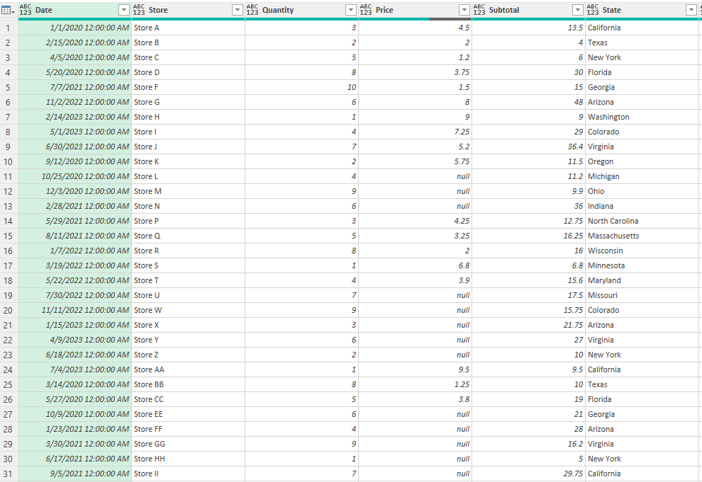
Here is the data set I’m starting with in Power Query, where you’ll see numerous null values in the Price field:
To calculate an average in Power Query, follow these steps:
Select the column you want to calculate the average for. On the Transform tab, select Statistics and select Average.
Power Query now creates a separate step for me which has calculated the average:
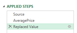
To easily reference this value later on, I’m going to rename this step as AveragePrice.
Replacing the values
Now that you have calculated the average, you can use it to replace the null values in your data set. To do this, you’ll again need to highlight the column which contains null values. Right-click and select Replace Values:
Enter ‘null’ as the value you want to replace and just enter ‘1’ as the value to replace it with. This will just be a temporary placeholder.
In the formula bar, replace the ‘1’ with the name of the step — AveragePrice:
You’ll get an error saying there is a circular reference:
To fix this, drag the new step you just created so that it comes after the AveragePrice calculation step.
This still results in an error, and that’s because the formula is now referencing the AveragePrice step. This needs to be adjusted so that it references the Source step — or the one which contains the data immediately before the average price calculation.
Now the field is correctly updated and the null values have been replaced with the average for the column:
In this situation, we now have eliminated the null values while being able to keep the other fields and simply replaced the empty values with averages.
If you liked this post on how to Replace Missing Values in Power Query With an Average, please give this site a like on Facebook and also be sure to check out some of the many templates that we have available for download. You can also follow us on Twitter and YouTube.
Do you want an easy way to pull in crypto prices for multiple coins? Using Power Query in Excel, you can accomplish this by connecting to a website such a coingecko.com and downloading the historical values. Below, I’ll show you how you can pull in historical prices for multiple coins at once, and how you can easily update the values in the future.
Here are the steps to download crypto prices and import them into Power Query from coingecko.com:
Connect to the data source using Power Query.
Download the files into a folder.
Combine and Transform the files in Power Query.
Modify the data to make it consistent.
Update the data.
Step 1: Connect to the data source using Power Query
In this example, I’m using coingecko.com as my source but the process may be similar for other sources. As long as the data as in a table format, there may not be a big difference in the process, however, there could be subtle changes in how you get data from one site versus another.
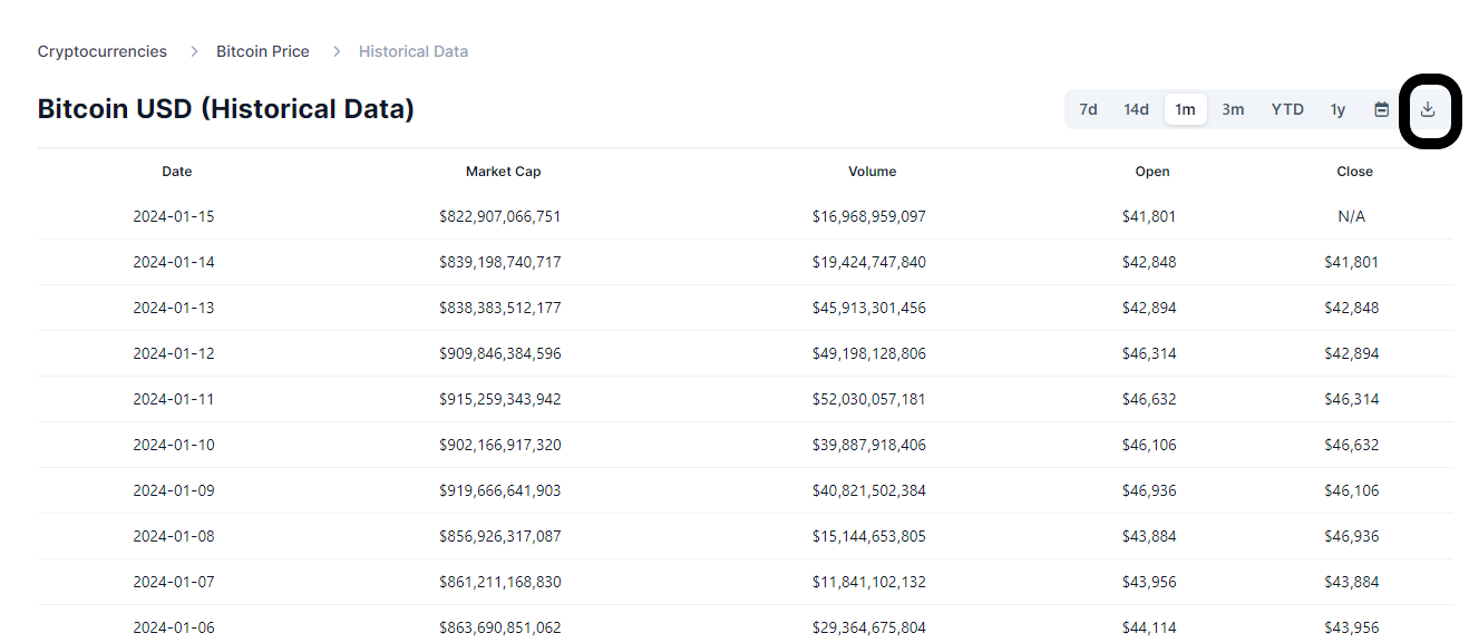
First, navigate to the coingecko.com website to the cryptocurrency’s price history that you want to download. On the historical data tab, there is a link to download the data:
Step 2: Download the files into a folder
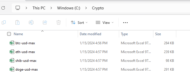
Download this file and save it into a folder. Repeat the process for any other cryptocurrencies that you want to track historical price information for. In this example, I’ve downloaded the price history for Bitcoin, Ethereum, Shiba Inu, and Dogecoin, and saved it within a folder called ‘Crypto’ on my computer:
Step 3: Combine and transform the files in Power Query
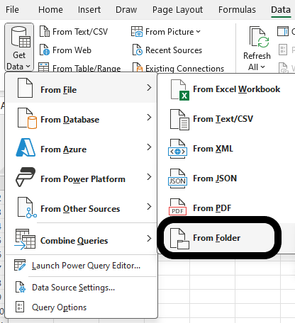
Now that all the files have been downloaded, I can use Power Query to consolidate them. With all the files in a folder, I can go and select to get data From Folder:
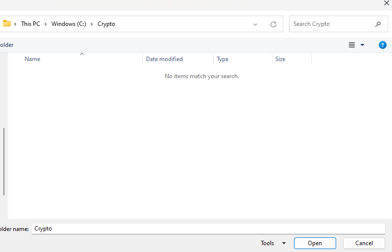
Then navigate to the folder which contains your downloads:
Since you are selecting a folder, you won’t see the individual Excel files that you have saved — this is fine. Only if you were selecting files would you see the actual files. Once you’ve selected the correct folder, click on the Open button.
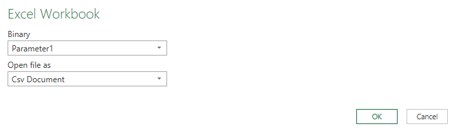
Next, select the option to Combine &Transform the files. If you get an error saying that it is an unexpected format, you may need to click on Edit on the next screen. This is because in this example, the data is in a comma-separated value format. After clicking edit, make sure you select the option for a CSV document:
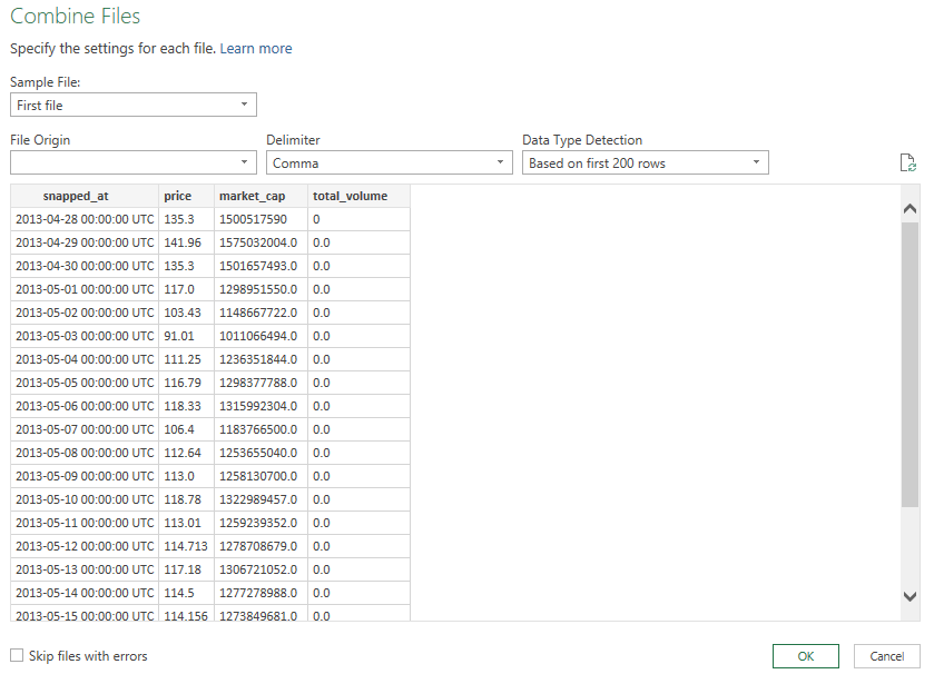
Then, at the next screen, you’ll see that the data has correctly been broken out into columns.
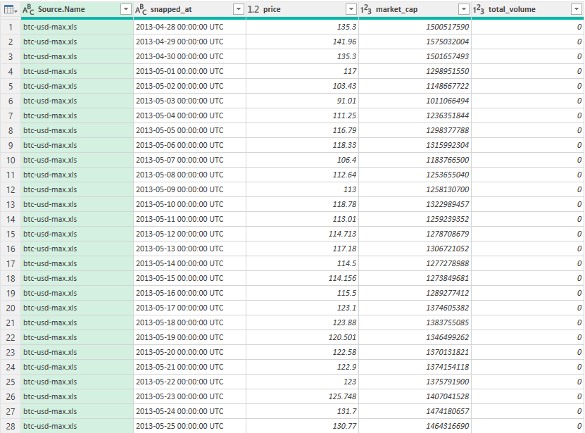
This is how the data looks loaded in Power Query:
Step 4: Modify the data to make it consistent
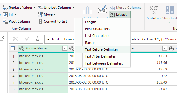
There are multiple changes that need to be made to the file. The first is to adjust the source.name field so that it reflects the coin and doesn’t include the full filename. To do this, click on the Transform tab and select the option to Extract Text Before Delimiter and use – as the delimiter.
Then, I’ll rename the first two headers to ‘symbol’ and ‘date’
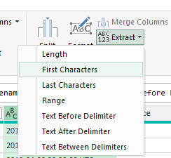
Next, to correctly parse out the date, I’m going to grab the first 10 characters in the field. To do this, select the date column, and on the Transform tab, select Extract and select First Characters:
Specify 10 for the number of characters, and Power Query will remove the rest:
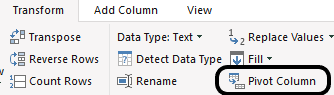
I’ll remove the market_cap and total_volume columns since they aren’t needed. The last step involves pivoting the data so that the crypto symbols are going across. To do that, select the symbol column, and on the Transform tab, click on the Pivot Column button:
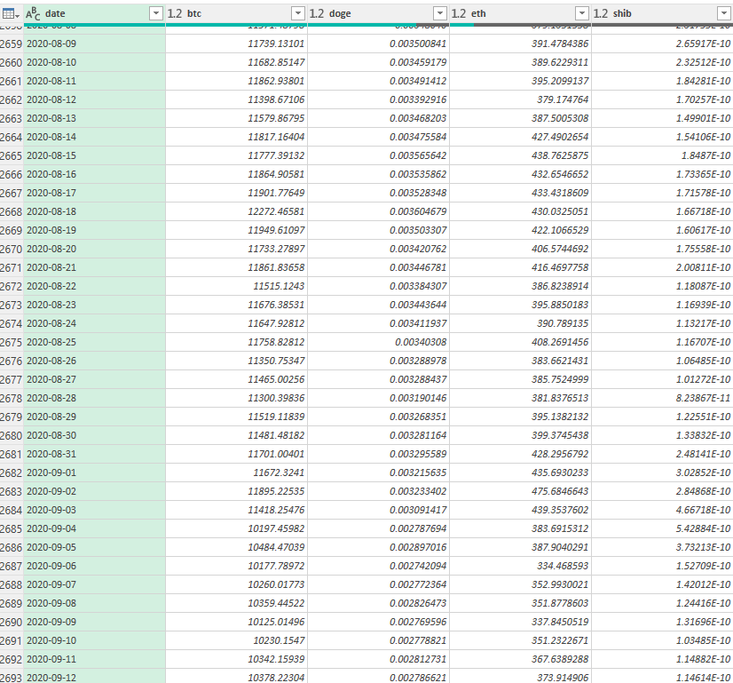
Select ‘price’ as the values column. Then, the end result should show the crypto prices going across:
Step 5: Update the data
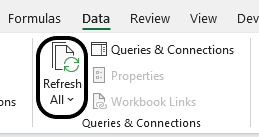
Now that the data is all entered in Power Query format, the process of updating it at a later date is fairly straightforward. Simply download the Excel files again, save them into the same folder (overwriting the previous files), and then click on the Refresh Data button on the Data tab:
Clicking the button will refresh all the queries and do all the transformations and adjustments that were made earlier. By setting this all up in Power Query, you can easily repeat the process. Just download the latest data, and then click Refresh All.
If you liked this post on Get Crypto Prices for Multiple Coins Into Excel Using Power Query, please give this site a like on Facebook and also be sure to check out some of the many templates that we have available for download. You can also follow us on Twitter and YouTube.
Crypto coin dominance is a vital metric in the cryptocurrency market, providing insights into the relative market strength of a particular cryptocurrency, compared to the overall market. It reflects the proportion of a specific cryptocurrency’s market capitalization in relation to the total market cap of all cryptocurrencies. This metric is particularly significant for investors as it indicates the level of risk, market sentiment, and the dominance of major players like Bitcoin and Ethereum.
Formula for calculating crypto coin dominance
To calculate crypto coin dominance, you the formula itself is fairly straightforward: divide the market capitalization of the cryptocurrency in question by the total market capitalization of all cryptocurrencies. Market capitalization, in this context, is calculated by multiplying the current price of the crypto coin by its total circulating supply.
For instance, if Bitcoin has a market cap of $700 billion and the total market cap of all cryptocurrencies is $2 trillion, Bitcoin’s dominance would be 35%.
Why is this useful for investors?
Crypto coin dominance helps investors understand the weight of a particular cryptocurrency in the market, aiding in diversification and risk assessment strategies. A high dominance might suggest a more stable investment but with potentially lower growth prospects, while a lower dominance could indicate a more volatile but possibly high-growth opportunity. Additionally, shifts in dominance can signal broader market trends, helping investors to anticipate and react to market movements.
Calculating crypto coin dominance in Excel is a practical way for investors to actively monitor these shifts and make informed decisions. By regularly updating the market cap data for various cryptocurrencies, investors can use Excel to quickly calculate and track changes in dominance, enabling them to identify trends and adjust their portfolios accordingly.
Pulling in crypto market caps into Excel
To calculate coin dominance in Excel, you can use Power Query. Through Power Query, you can pull in the data, and do calculations to determine the dominance percentage.
You can find a list of the top cryptos by market cap from the following URL in Yahoo! Finance: https://finance.yahoo.com/u/yahoo-finance/watchlists/crypto-top-market-cap/
To get this data into Excel, take the following steps:
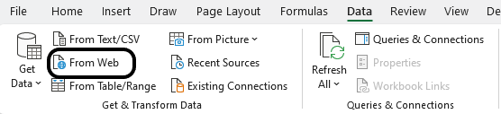
Go to the Data tab and select ‘From Web’
Paste the link the following prompt and click OK.
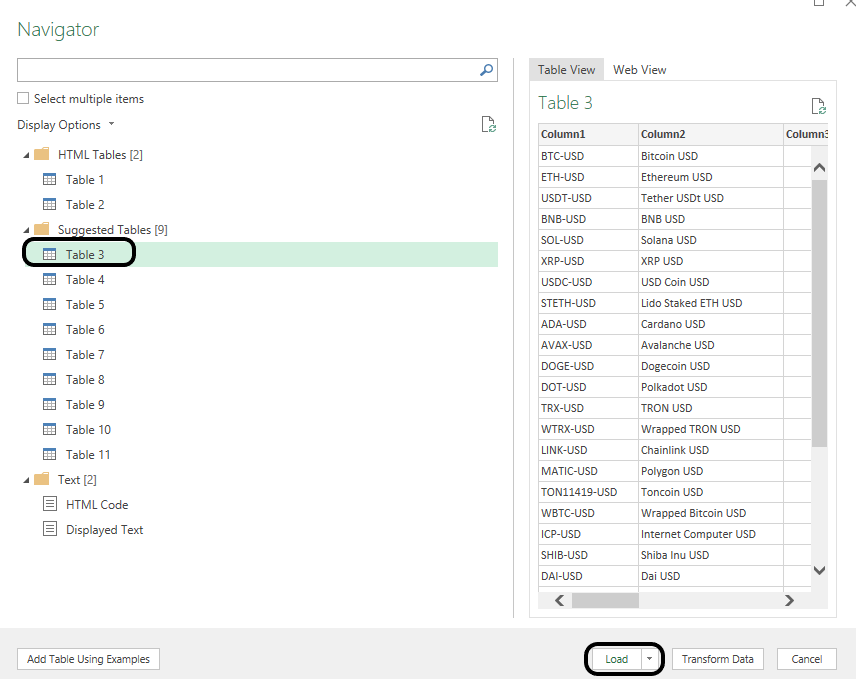
Select the table in Power Query which contains data on the crypto market caps. Then Load the data.
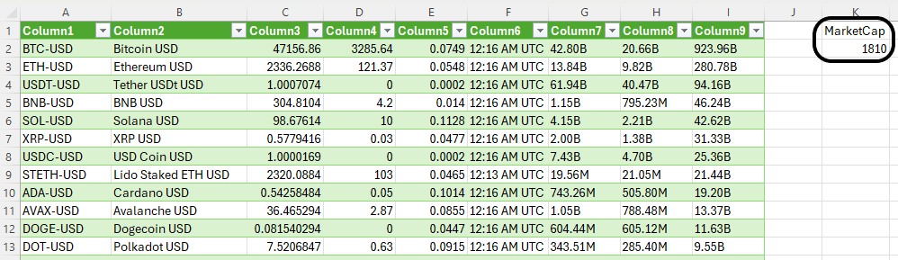
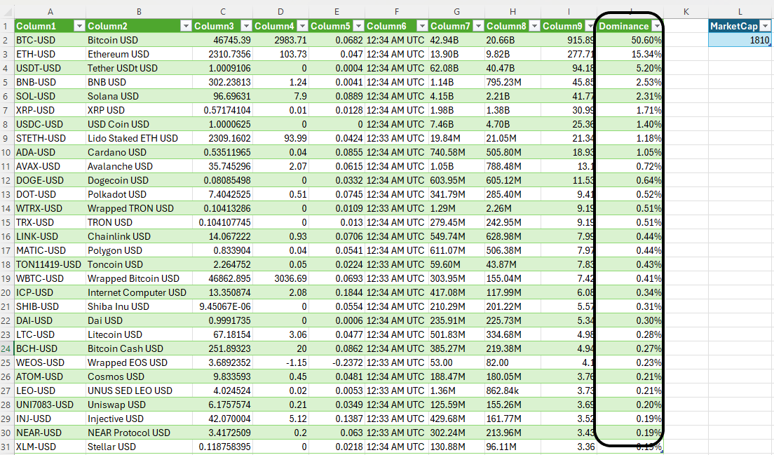
The data is now in Excel but there are no calculations happening just yet. To get this to work, we need the total crypto market cap. The table in Yahoo! Finance didn’t have this information readily available to pull into Power Query. Instead, I’ll leave a place in Excel where the data can easily be entered.
Currently, the crypto market cap is $1.8 trillion. Since the majority of crypto market caps are in billions, I’ll put this in the form of billions, as 1,810.
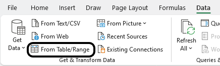
Next, I’ll load this into Power Query. With one of the cells selected, click on the Data tab again, this time, select From Table/Range
In Power Query, I’m going to rename this table MarketCap and the other one as YahooFinance.
Calculating coin dominance in Power Query
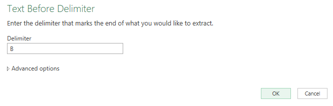
Before I start my calculations, I need to first convert the market caps from the YahooFinance in terms of billions, and remove the ‘B’ that comes after them. Currently, those values are reading as text, and they need to be numbers. In the YahooFinance table, highlight the column which contains the market cap. Then, on the Transform tab, click the Extract option and select Text Before Delimiter
Just enter the letter ‘B’ for the delimiter and press OK on the next screen.
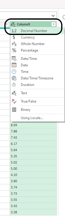
Then, it’s necessary to convert the text into numbers. For that, select the ABC indicator on the header for the market cap, and select DecimalNumber for the type.
After doing so, the data in the column aligns to the right, indicating the field is a number.
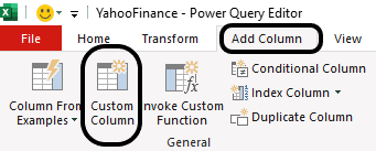
The last part involves creating a new column to calculate the market dominance percentage. For this, go onto the Add Column tab in Power Query. Then, select the option for a Custom Column.
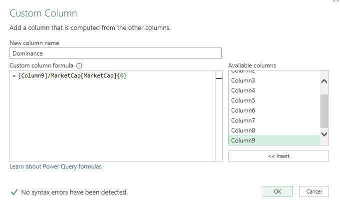
I’m going to name the column ‘Dominance’ and this is where I’ll need to enter my formula. The numerator will be market cap column, which in this case is Column9. I will divide this by the value in the MarketCap table. To reference that value, I need to use the following syntax: MarketCap[MarketCap](0}.
The table is called MarketCap, as is the field name, which is in parenthesis. Since I want the first value in the list, I use {0} since it is a 0-based index. That returns the total market cap I entered of 1,810. To put this all together, this is what the formula looks like in my Custom Column calculation:
After clicking OK, now my dominance column appears. Now I can load the data into Excel. All that’s left is to convert the column into a percentage.
Power Query will create another sheet for the MarketCap, but you can delete that as it isn’t necessary.
Updating the file
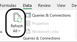
Moving forward, to update the calculations, all you need to do is update the MarketCap value. This is the only value that won’t pull in automatically from the Yahoo! Finance link. Then, click on the Refresh button on the Data tab and Power Query will pull in the updated market caps for the top cryptocurrencies, and then do the dominance percentage calculation.
Ideally, the total market cap could also be pulled in. However, given the vast number of cryptocurrencies, the list in Yahoo! Finance isn’t comprehensive enough; nor is there a table to pull just from market cap. If you do come across a better source for pulling in crypto market caps, let me know!
If you liked this post on How to Calculate Crypto Coin Dominance Using Power Query in Excel, please give this site a like on Facebook and also be sure to check out some of the many templates that we have available for download. You can also follow us on Twitter and YouTube.
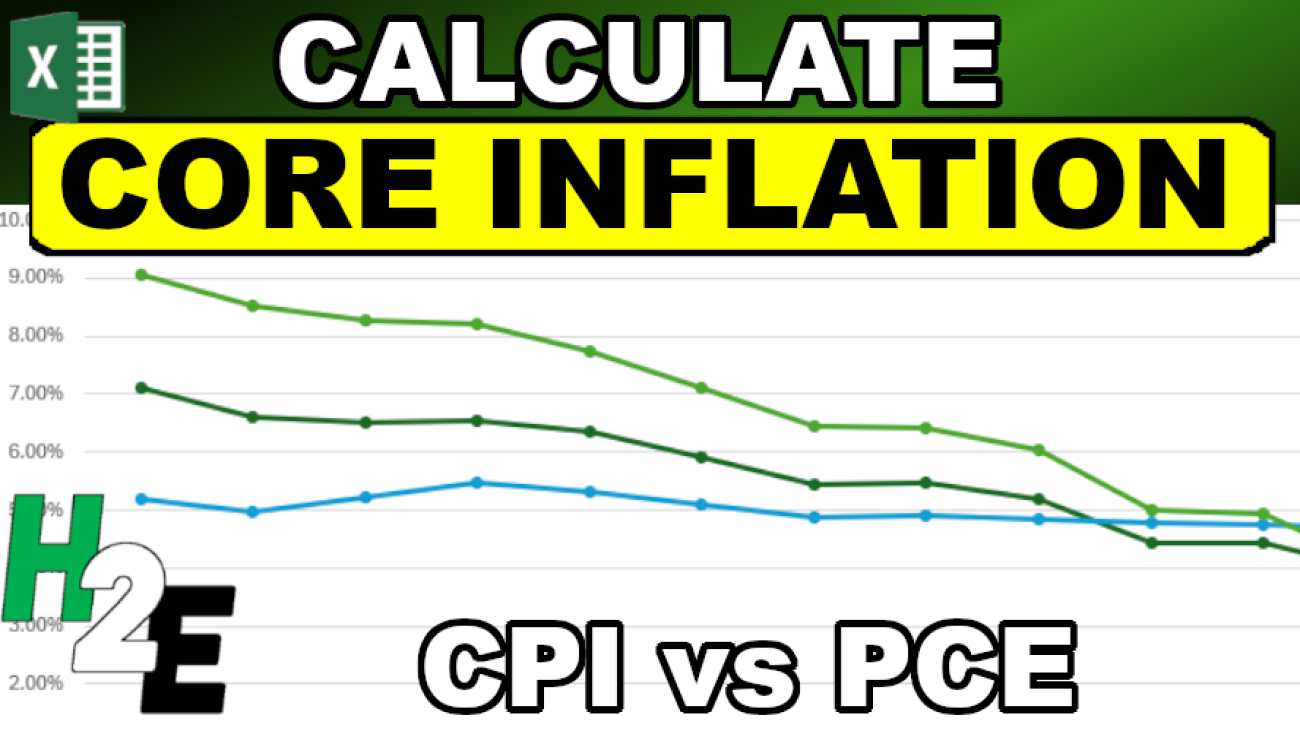
Inflation is a critical economic indicator, reflecting the rate at which the general level of prices for goods and services is rising, and subsequently, how that erodes the purchasing power of money. To gauge inflation accurately, economists and policymakers rely on various metrics, with the Consumer Price Index (CPI), the Personal Consumption Expenditures Price Index (PCE), and the Core PCE being the most prominent. Each of these measures has its unique methodology and scope, making them useful in different economic contexts.
Let’s start with breaking down how these different measures are calculated, and what their strengths and weaknesses are.
Consumer Price Index (CPI)
The CPI, published by the Bureau of Labor Statistics, is one of the most widely recognized measures of inflation. It calculates the average change over time in the prices paid by urban consumers for a basket of goods and services. This basket includes a wide range of items such as food, clothing, shelter, fuels, transportation fares, charges for doctors and dentists’ services, drugs, and the other goods and services that people buy for day-to-day living. Prices are collected monthly from about 75 urban areas across the country, from about 6,000 housing units and approximately 22,000 retail establishments.
The strength of the CPI lies in its detailed breakdown of expenditure categories, which makes it a useful tool for understanding the impact of inflation on consumers. However, it has its limitations. For instance, it does not account for changes in consumer behavior or substitutions they make in response to price changes. Also, the CPI focuses only on urban consumers and may not accurately represent the experience of people in rural areas.
Personal Consumption Expenditures Price Index (PCE)
The PCE, published by the Bureau of Economic Analysis, measures the prices that people living in the United States, or those buying on their behalf, pay for goods and services. Unlike the CPI, the PCE includes all goods and services consumed by households, including those paid for by third parties such as employer-provided healthcare. The PCE is calculated by using data on nearly all goods and services businesses sell to households and on the incomes that households receive from business and from government.
One key advantage of the PCE is its ability to reflect changes in consumer behavior and the substitutions they make, which the CPI does not fully capture. This makes the PCE a broader measure of inflation. However, its wide scope can sometimes dilute the impact of price changes in specific categories, which might be more apparent in the CPI.
Core PCE
The Core PCE Price Index is a version of the PCE index that excludes the more volatile and seasonal food and energy prices. By excluding these items, Core PCE provides a clearer picture of the underlying inflation trend and is less subject to short-term volatility. This makes Core PCE a preferred metric for policymakers, including the Federal Reserve, when making decisions about monetary policy. This metric is often referred to as ‘core inflation.’
The exclusion of food and energy prices can be both a strength and a weakness. While it offers a more stable view of inflation, it can sometimes underrepresent the actual burden on consumers, especially during periods when food and energy prices are rapidly changing.
Calculating CPI, PCE, and Core PCE
Now that we know what these metrics are, let’s grab that data and plot them in a chart, to see how they have been trending in recent periods.
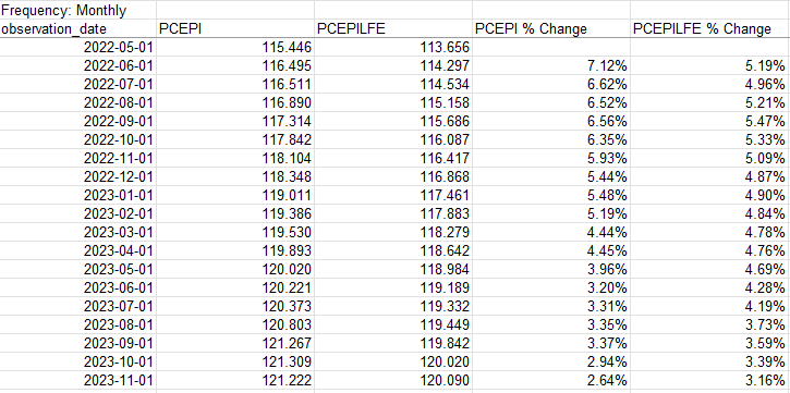
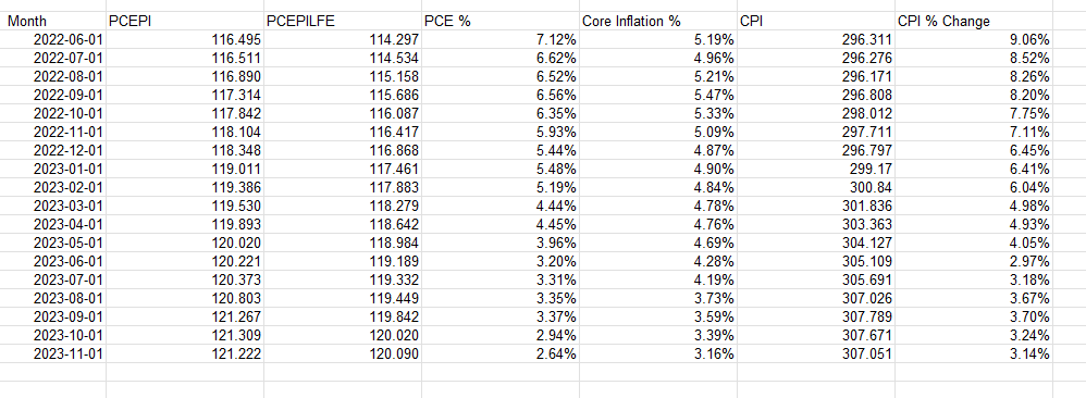
For the % change, take the current month value and divide it by the same value in the prior-year month and deduct 1. Here’s how all the data points and inflation rates look when compared against one another:
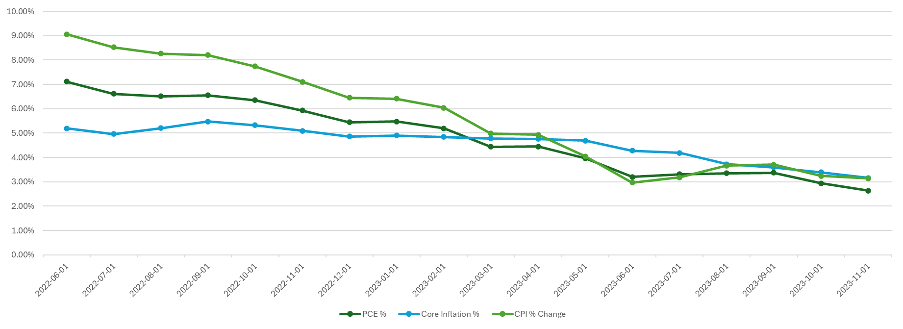
With that data set up, it’s now easy to plot the different inflation rates on a chart to see how they have varied and converged over the past year and a half:
If you liked this post on How to Calculate Inflation, Core Inflation, and CPI in Excel, please give this site a like on Facebook and also be sure to check out some of the many templates that we have available for download. You can also follow us on Twitter and YouTube.
Excel is a great program for data analysis. And one of the key tools that analysts can use within it is Power Query. While it can seem intimidating for novice users, this guide will walk you through how to use it and how it can help you analyze data.
Getting started with Power Query
Power Query is an Excel tool that enables users to connect, combine, and refine data sources easily. It’s especially useful for automating the data cleaning and preparation process. With Power Query, repetitive tasks like importing data, filtering, sorting, and other transformations become streamlined, saving valuable time.
Power Query was first introduced as an add-in for Excel in 2010 and 2013. However, it became a built-in feature starting from Excel 2016. In these later versions, it’s integrated into the Data tab in the Excel ribbon, offering a more seamless experience compared to the add-in version for earlier Excel releases. Users of Excel 2010 and 2013 can still access Power Query, but they need to download and install the add-in separately. In Microsoft 365 (formerly known as Office 365), Power Query is fully integrated into Excel.
How do I launch Power Query?
To launch Power Query and get started with it, you’ll first want a table or data set in mind that you want to work on. You could link to an external website, workbook, or just have a table or data set within your worksheet that you want to work on. Power Query, after all, is a tool for data analysis — you need data to start with. Here are some of the more common ways to launch Power Query:
1. Connecting to an External Workbook
Navigate to the Data Tab: Go to the Data tab in the Excel ribbon.
Get Data: Click on Get Data in the Get & Transform Data section.
Choose the Source: Select From File and then choose From Workbook.
Select the Workbook: Browse and select the external Excel workbook you want to connect to.
Load or Transform: Once you select the file, you can choose to either load the data directly into Excel or open the Power Query Editor to transform the data before loading.
2. Connecting to a Webpage
Navigate to the Data Tab: Go to the Data tab.
Get Data: Click on “Get Data” in the Get & Transform Data section.
Select Web as Source: Choose From Other Sources and then select From Web.
Enter the URL: Enter the URL of the webpage you want to import data from.
Load or Transform: After connecting to the webpage, you can choose to load the data directly or use the Power Query Editor for transformations.
3. Using a Range or Table Within the Existing Sheet
Create or Select a Range or Table: You don’t need to have your data formatted in a table for Power Query to load it, however, Excel will convert it to a table once you launch Power Query.
Navigate to the Data Tab: Go to the Data tab.
Get Data: Click on Get Data in the Get & Transform Data section.
Choose From Table/Range: Select From Table/Range.
Power Query Editor: This will open the Power Query Editor with the selected table data, ready for transformation.
Each of these methods serves a different purpose. Connecting to an external workbook is useful for consolidating or analyzing data spread across multiple Excel files. Connecting to a webpage allows for the import and analysis of data published online, such as tables on web pages. Using a table within the existing sheet is handy for quickly transforming or analyzing data already present in your workbook. In all cases, Power Query provides a robust set of tools for manipulating the data before loading it back into Excel for further use.
What can Power Query do?
Power Query can help adjust your data before loading it into Excel. Here are some of the key things you can do with it:
Transform data types
Handle missing data
Remove duplicates
Replace values
Filter data
Sort data
Concatenate columns
Split columns
Add conditional columns
Group and aggregate data
Want to follow along with these examples? Download the sample data set I will use here.
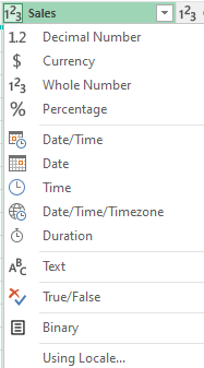
Transform data types
One of the first things Power Query does is it attempts to detect your data types. And when it does, it automatically adjusts them, so that numbers are formatted as numbers, and dates as dates. The Changed Type step appears automatically:
If, however, it hasn’t correctly applied a data type, you can make changes to it. You can specify many different data types, including:
Text
Whole Number
Decimal Number
Date
Time
Date/Time
Boolean
To change a data type, click on the header which shows the data type that it is, and then you’ll see a list of different options to choose from:
Handle missing data
Power Query in Excel is equipped with a variety of tools to effectively manage missing or null data, a common issue in data analysis. Ensuring accurate handling of missing data is crucial for the integrity of your analysis. Here are the ways Power Query can assist in managing missing data:
Highlight Null Values: Power Query visually represents null or missing values, making it straightforward to identify gaps in your dataset.
Remove or Keep Rows with Missing Values: You have the option to filter out rows that contain missing values in one or more columns, useful for analyzing complete records. Alternatively, you might want to focus specifically on rows with missing data.
Replace Nulls with Specific Values: Power Query allows for the replacement of missing values with a specified value, such as zero, a specific text string, or an average value. This is beneficial where a missing value has a logical default or substitute.
Fill Down or Up: Filling missing values with the value from the row above or below is possible, which is helpful in datasets where the missing value logically mirrors its neighbor.
Conditional Replacements: Implement logic to replace or handle missing values based on certain conditions, catering to different scenarios for different categories or columns.
Aggregate Functions: When performing functions like sums or averages, Power Query automatically accounts for null values, ensuring they don’t skew the results.
Merging with Missing Data: While merging tables, Power Query can be set up to handle missing values in key columns in various ways, such as including or excluding unmatched rows.
Data Type Impact: Changing data types might create missing values (like when a text can’t be converted to a number). Power Query helps in identifying and handling such cases effectively.
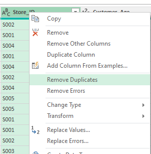
Removing duplicates
Removing duplicate values is an important part of the cleanup process when it comes to data analysis. If, for example, you’re working with a list of transactions or customer records, removing duplicates ensures that each record or transaction is unique and correctly represented in your analysis. And in Power Query, the process to remove duplicates is a fairly straightforward one. It’s as simple as selecting the column and selecting the option to Remove Duplicates.
You can also apply this for multiple columns at once. To select more than one column, just hold down the CTRL key while clicking on other column headers.
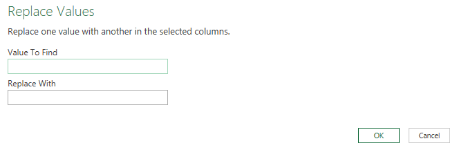
Replacing values
Replacing values in Power Query is a useful feature for cleaning and standardizing your data. It allows you to substitute specific values in your dataset with new ones, which is particularly helpful in correcting errors, standardizing terminology, or handling missing data. Think of it like using the Find and Replace feature in Excel. Here’s how it works:
Select the column you want to replace values on. Similar to with removing duplicates, you can select multiple columns.
Select the option to Replace Values.
In the next dialog box, select the value you want to find and what to replace it with.
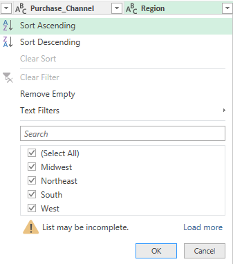
Filter data
Filtering data in Power Query is a fundamental aspect of data preparation and analysis, allowing you to narrow down your dataset to only the information relevant for your specific needs. The filtering process is similar to how you would do it in Excel. Here’s how it works:
Select the column you want to filter.
Click the drop-down arrow, and you can select how you want to apply your filter:
These are the same type of filters you can apply as in Excel, including criteria such as “contains”, “does not contain”, “starts with”, etc. For numeric columns, you can choose from number filters like “equals”, “greater than”, “less than”, and you can specify ranges. For date columns, you can filter by specific dates, before/after a certain date, or choose from a range of date filters.
After setting your filter criteria, Power Query will display only the rows that meet the criteria. You can apply multiple filters across different columns.
Filtering in Power Query is a versatile tool, allowing for basic operations like removing irrelevant rows, as well as more complex data segmentation, which is essential for detailed and accurate data analysis.
Sorting data
Sorting data in Power Query allows you to organize your dataset in a meaningful order, making it easier to analyze and understand. And by doing it in Power Query, when the data is loaded into Excel, your sorting rules have already been applied. Just like with filtering, the process for sorting data in Power Query is also comparable to how you would do it within your spreadsheet:
Choose the column to sort by.
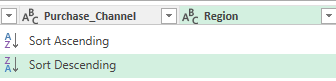
Select the sort order. For a simple, one-level sort, use the sort ascending (A to Z) or sort descending (Z to A) buttons in the Home tab of the Power Query ribbon. To sort ascending, click the small arrow in the column header and choose “Sort Ascending”. This will organize the data in that column from lowest to highest (e.g., A to Z, 0 to 9, earliest to latest date). To sort descending, click the arrow and choose “Sort Descending”. This will organize the data from highest to lowest (e.g., Z to A, 9 to 0, latest to earliest date).
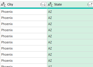
If you want to sort by multiple columns (for example, first by state, then by city), sort the most significant column first, and then sort by the next column. When you apply multiple sorting rules, you will see a number next to the sorting icon to show you its priority. In the screenshot below, the State field has a 1 next to the up arrow, indicating that the data is first sorted in ascending order by state. Then, it sorts the City field in descending order.
Concatenate columns
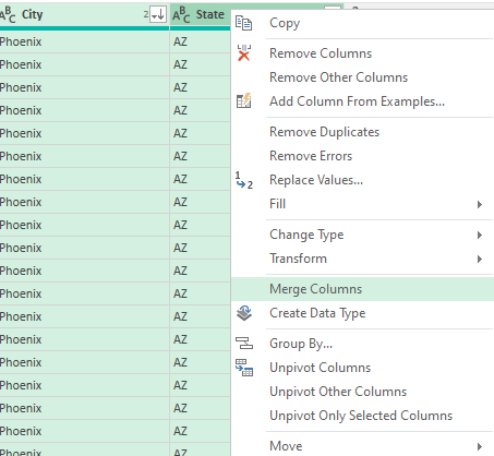
Concatenating fields (or columns) in Power Query involves combining the contents of two or more columns into a single column. This process is useful for creating unique identifiers, combining textual information, or formatting data in a more useful way. In this example, we’ll combine the State and City fields, by taking the following steps:
Select the two or more columns you want to concatenate or merge together. The order of your selection is important. If you want the City field first, then that is the one you need to select first.
Right-click and select the option to MergeColumns
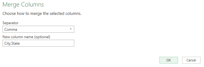
Specify if you want them to be separated in any way. In this example, we’ll use a comma so that it is in City,State format.
This results in a field that has grouped the two columns. Those two columns have now been replaced with the new merged column.
Split columns
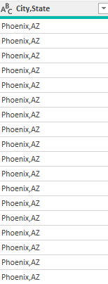
Splitting columns in Power Query is a handy feature that allows you to divide the contents of one column into multiple columns. This can be particularly useful when dealing with data that’s concatenated into a single column but needs to be separated for analysis or reporting. Here’s how we can undo the previous step, to break out the new City,State column back into separate columns:
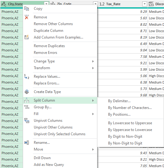
Start with selecting the column to split.
Right-click on the option to Split column. Then select how you want it to be split.
These are the ways you can split them:
By Delimiter: Split the column based on a specific character or symbol, such as a comma, space, or custom character. This is the most common method used when data in a column is separated by a consistent symbol.
By Number of Characters: Split the column into new columns each containing a specific number of characters.
By Text Length: Split the column at a specific character position.
Advanced Options: Allow for more complex splits, such as splitting at the first or last occurrence of the delimiter.
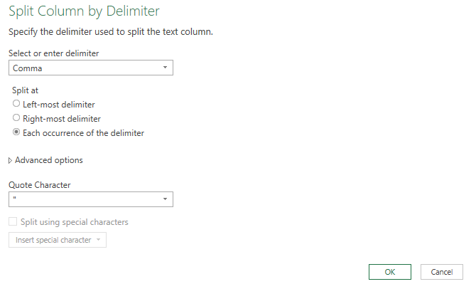
In the City,State field, we can split by delimiter — the comma. You can specify how it should be split. But in our example, the default options will suffice:
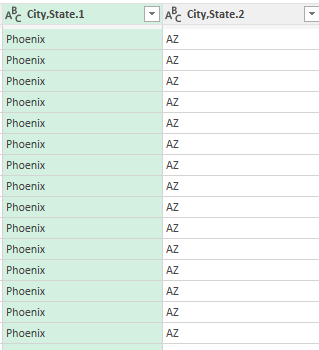
This will split the columns back into two:
The only thing that may be necessary to do is to rename the columns. To do that, just double-click on the headers and type in a new name for the columns.
Add conditional columns
Adding conditional columns in Power Query is a powerful way to create new columns based on conditions derived from other data in your table. It’s akin to using the IF function in Excel but allows for more complex and multiple conditions. Here’s how you can add a conditional column in Power Query:
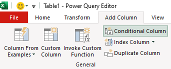
Select the Add Column tab on the ribbon.
Select the option to add a Conditional Column.
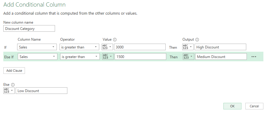
Next, you can create your conditions, and the column name. With the data set in this example, we can set up a column called Discount Category based on the sales price. This can tell us the type of discount a customer is eligible for. The conditions could be as follows:
If Sales > 3000, then “High Discount”
If Sales is between 1500 and 3000, then “Medium Discount”
Else, “Low Discount”
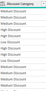
In the above example, the criteria is evaluated in order from top to bottom. This now creates a new column in the table:
Group and aggregate data
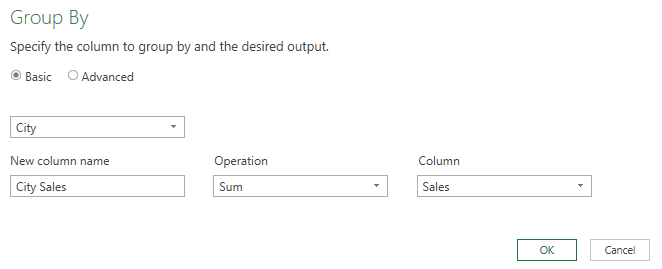
Grouping and aggregating data in Power Query is a crucial process in data analysis, allowing you to summarize and analyze large datasets efficiently. This feature is especially useful for finding averages, sums, counts, minimums, and maximums for different categories or groups in your data. In this example, let’s total the sales by city. Here’s how:
On the Home tab, click on the Group By button
Select City as the initial field. This is how the data will be grouped.
Then, enter a column name (City Sales), an operation (Sum), and specify the column to tabulate (Sales)
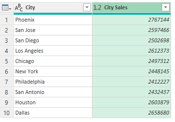
This now gives you a summary by city:
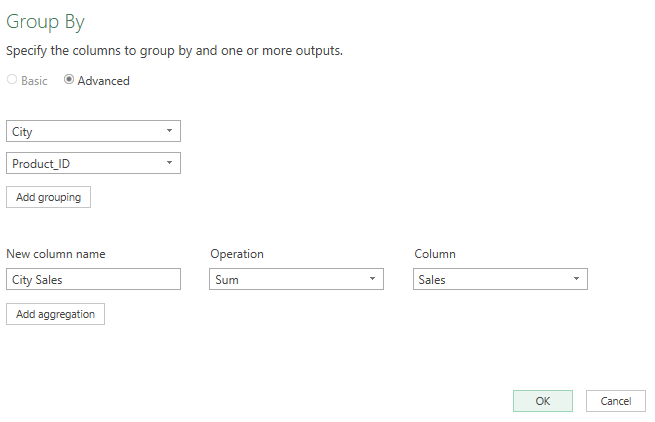
You can also do more complex grouping by more than one field. To do so, select the Advanced radio button when in the Group By dialog box. Then, select Add grouping. In this example, we can add the Product_ID field as another field to group by.
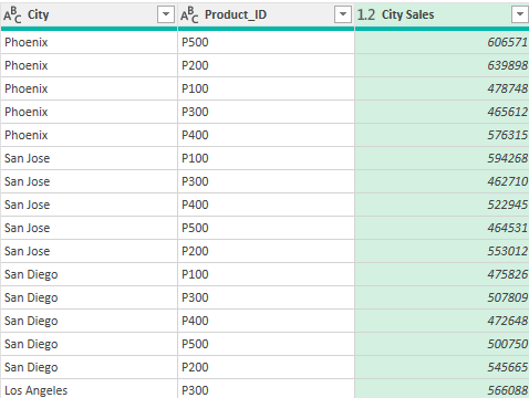
Now, when the grouping is completed, it breaks it down further:
Close & Load once you’re done making changes
Once you’ve finished making your changes in Power Query, you can select the option to Close & Load to get it into Excel.
What “Close & Load” Does:
Finalizes Changes: When you click “Close & Load”, Power Query applies all the transformations you’ve made to the dataset within the Power Query Editor.
Loads Data into Excel: After applying the changes, the transformed data is loaded into an Excel worksheet or data model. This can be a new sheet or table, depending on your settings and the nature of your task.
Creates a Connection: Power Query creates a connection between the source data and the Excel workbook. This connection is maintained, which means that you can refresh the data in Excel to reflect any updates in the source data or further transformations applied in Power Query.
Saves Transformations: The sequence of steps or transformations you applied in Power Query is saved. This allows for the data to be updated or reloaded with the same transformations applied automatically.
Why it’s beneficial to make changes in Power Query before loading it into your spreadsheet
You may be wondering why you wouldn’t just make all these changes in your spreadsheet. Why is there a need to make the changes in Power Query? Here’s why:
Data Size Management: Power Query can handle and process large datasets more efficiently than Excel. By filtering, reducing, and transforming data in Power Query, you minimize the load and improve performance in Excel.
Non-Destructive Data Manipulation: Changes made in Power Query don’t alter the original data source. This means you can experiment with and modify your data without the risk of corrupting the original dataset.
Automating Repetitive Tasks: Any sequence of steps you apply in Power Query is repeatable. If you regularly receive data in the same format, you can use the same query to process this data, saving time and effort.
Complex Transformations: Power Query offers more advanced data manipulation capabilities than standard Excel functions, including pivoting/unpivoting, advanced merging and appending, complex filtering, and more.
Data Cleansing and Preparation: It’s often necessary to clean and format data before analysis. Power Query provides a robust set of tools for handling common data issues like missing values, duplicates, and inconsistent formats.
Reduces Workbook Size: By transforming data in Power Query and loading only what’s needed, you reduce the overall size of the Excel workbook, leading to better performance and easier handling.
If you like this post on Power Query for Beginners: A Comprehensive Guide, please give this site a like on Facebook and also be sure to check out some of the many templates that we have available for download. You can also follow me on Twitter and YouTube. Also, please consider buying me a coffee if you find my website helpful and would like to support it.
Comparison charts are invaluable tools in Excel, widely used across business, education, and research to visually represent data. These charts not only simplify complex information but also highlight key trends and comparisons. A comparison chart in Excel is a visual representation that allows users to compare different items or datasets. These charts are crucial when you need to show differences or similarities between values, track changes over time, or illustrate part-to-whole relationships.
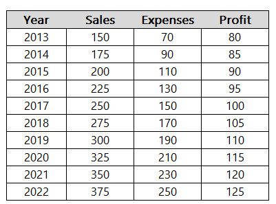
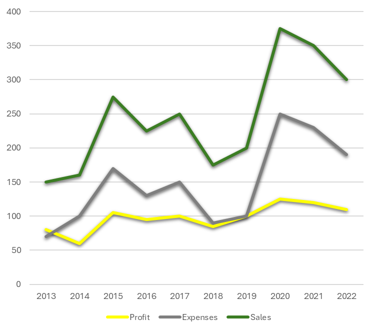
In this article, we’ll compare a company’s sales, expenses, and overall profits by year. Here is some sample data:
Types of Comparison Charts in Excel
There are many types of charts you can use in Excel to compare data. Here are a few examples of common charts you might use when comparing data, and how they look:
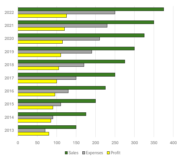
Bar Chart: Creating a bar chart in Excel starts with selecting your data and choosing the ‘Bar Chart’ option from the ‘Insert’ tab. Bar charts are particularly useful for comparing individual items or categories. To enhance readability, consider adjusting the bar colors and adding data labels. In the bar chart below, you can easily compare sales versus expenses versus profits, and also compare those values by year.
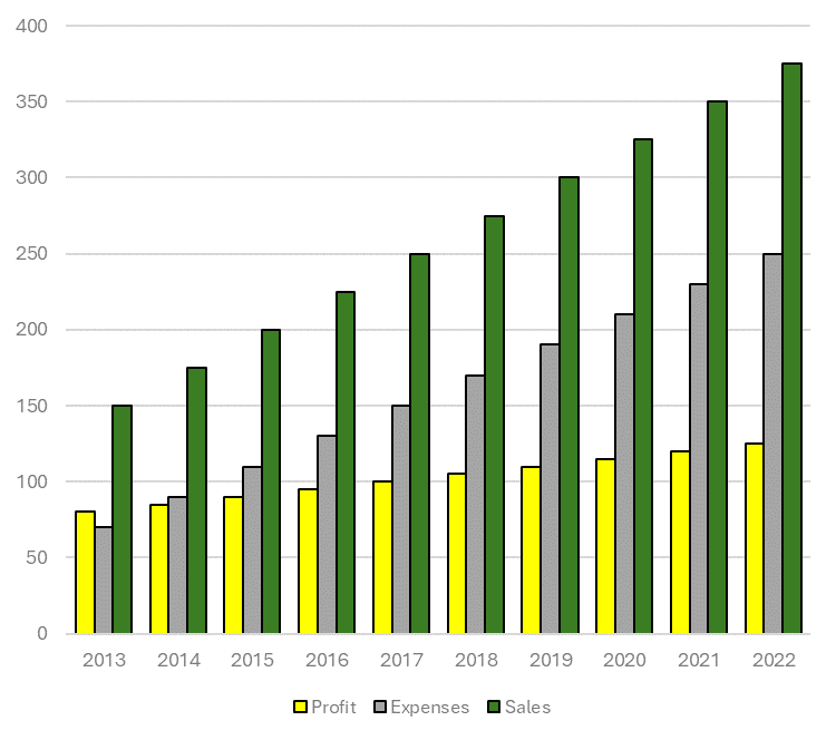
Column Chart: Similar to bar charts but oriented vertically, column charts are ideal for showing changes over time. After selecting your data, choose ‘Column Chart’ from the ‘Insert’ tab. Play with colors and axes to make your chart stand out. Whether you prefer to go with a column chart or a bar chart may simply come down to your preference.
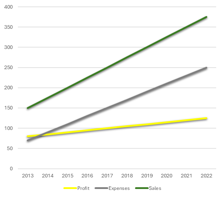
Line Chart: Line charts are perfect for tracking trends over periods. Select your data, click ‘Insert’, and then ‘Line Chart’. Customize your line chart by changing line styles and adding markers for key data points. Line charts may be more useful when there are fluctuations that you want to plot. Here is the chart based on the current sample data:
Here’s a look at the chart when there are greater fluctuations in the data:
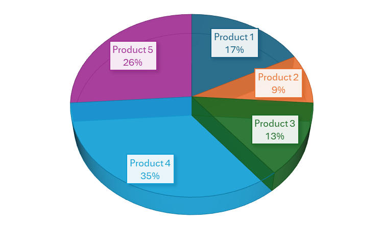
Pie Chart: For part-to-whole comparisons, pie charts are your go-to option. After selecting the data, find ‘Pie Chart’ under the ‘Insert’ tab. Enhance your pie chart by experimenting with different slice colors and adding a legend for clarity. This is ideal when you want to compare individual parts of a greater total. Suppose you wanted to analyze what made up the company’s sales. This is where a pie chart might be most appropriate:
Excel has many more charts available for you to use, but these are good starting options when doing analysis. After you’ve selected the right chart, there are further enhancements you can focus on.
Tips for creating effective comparison charts
Here are some tips and things you can focus on to make your charts even better:
Simplify and Focus: Avoid cluttering your chart with too much information. Focus on the key data points you want to compare. This can sometimes mean creating multiple charts instead of trying to fit everything into one.
Use Appropriate Scale and Axes: Ensure that your axes are scaled properly to accurately reflect the differences in data. Misleading scales can lead to incorrect interpretations.
Color and Design: Use color effectively to differentiate data sets and draw attention to key points. However, be mindful of color blindness and avoid using colors that might be hard to distinguish.
Clear Labels and Legends: Use labels and legends that clearly describe what each part of your chart represents. Avoid jargon or abbreviations that might not be understood by all viewers.
Consistent Formatting: Keep formatting like font size, color schemes, and line styles consistent across all charts, especially when they will be viewed together.
Data Integrity: Ensure your data is accurate and up to date. Misleading or incorrect data can harm credibility.
Accessibility: Make your charts accessible to everyone, including those with visual impairments. This can involve using larger text, high-contrast colors, and providing alternative text descriptions where necessary.
Checklist for creating comparison charts
[ ] Chart Type Selection: Choose the most appropriate chart type for your data. [ ] Data Accuracy: Verify the data for accuracy and relevance. [ ] Simplification: Remove unnecessary data or split into multiple charts if needed. [ ] Scaling and Axes: Check that axes are scaled properly to accurately represent the data. [ ] Color Usage: Use distinct colors to differentiate data sets; consider color blindness. [ ] Labels and Legends: Ensure all parts of the chart are clearly labeled. [ ] Consistent Formatting: Maintain consistent formatting across all elements. [ ] Review for Clarity: Check if the chart conveys the intended message clearly. [ ] Accessibility Compliance: Ensure the chart is accessible to all audiences. [ ] Feedback: If possible, get feedback from others to see if the chart is easily understandable.
If you like this post on How to Create Effective Comparison Charts in Excel, please give this site a like on Facebook and also be sure to check out some of the many templates that we have available for download. You can also follow me on Twitter and YouTube. Also, please consider buying me a coffee if you find my website helpful and would like to support it.
Do you have a spreadsheet that needs to track dates? Whether it’s a shipping log, an inventory tracker, a sales order template, or just something to track when the last change was made to a cell, there’s an easy way you can create a date stamp in Excel with VBA.
Use checkboxes to make your spreadsheet more user friendly
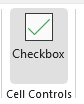
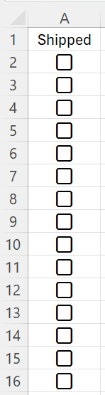
If you have a spreadsheet where you want to track statuses, using checkboxes can be helpful. This way, someone can check or uncheck the status of an order. This can indicate whether it has been shipped, ordered, or completed. Excel has made it easier to insert checkboxes with a recent update. If you’re using Microsoft 365, then on the Insert tab on the Ribbon, you should see an option to insert a Checkbox:
When you click on this button, it will insert a checkbox right into the active cell that you’re on. Want to insert checkboxes into multiple cells at once? Simply select a range of cell and then click on the button:
If a checkbox is checked, its value is TRUE. If it is unchecked, then the value is FALSE. This is important to know when creating formulas.
Populating the date using the NOW() function isn’t useful for date stamps
If you want to enter the current date into a cell, you can use the CTRL+; shortcut. The problem is that it won’t change if you go to uncheck and re-check a checkbox. It’s a stale value and it isn’t a formula.
What you may be tempted to use is the NOW() function. However, the limitation here is that anytime the cell recalculates, it will refresh with the current date and time. It won’t hold the existing date stamp. You can create a circular reference and adjust iterative calculations. But there’s an easier way you can create a date stamp in Excel with just a few lines of code using VBA.
Creating a custom function using VBA
You can create a custom function with VBA. To do, start by opening up your VBA editor using ALT+F11. On the Insert menu, select the option for Module. There, you’ll have an empty canvas to enter code on. The custom function can simply contain one argument — the cell that contains the checkbox. This is to determine whether it is checked (TRUE) or unchecked (FALSE). If it is checked, then the timestamp will be equal to the current date and time. If it’s unchecked, then the timestamp will be blank, and so will the cell value.
Here’s the full code for the function:
Function timestamp(checkbox As Boolean)

    If checkbox = True Then

        timestamp = Now()

    Else

        timestamp = ""

    End If


End Function
This function is now created. To use it within your spreadsheet, all you need to do is select a cell where you want the date and time to populate on. Then, assuming your checkbox is in cell A2, enter the following formula:
=timestamp(A2)
This will run through the VBA code to determine whether to populate the current date and time or not. Since there is no NOW() function present in this formula, it won’t recalculate with the current date.
Formatting your date and time
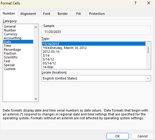
Even if the custom function work, you may notice that the value that it populates doesn’t look right. If you get a number or the time is missing from the date, then you’ll need to modify the cell format. To do that, select the cell and press CTRL+1. Then, select the Date category where you’ll see various date formats:
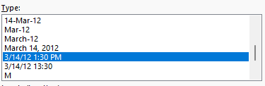
If you scroll down the list, there will be an option that shows the date and time:
If you use that format, then your date will now look correct, including both the date and time.
If you like this post on How to Create a Date and Time Stamp in Excel Using VBA, please give this site a like on Facebook and also be sure to check out some of the many templates that we have available for download. You can also follow me on Twitter and YouTube. Also, please consider buying me a coffee if you find my website helpful and would like to support it.
Google Sheets provides investors with a great way to pull in stock prices, ratios, and all sorts of information related to stocks. Pulling in a stock’s history, for example, can make it easy for you to calculate a stock’s relative strength index, or create a MACD chart. But doing any sort of analysis for multiple stocks at a time isn’t easy. One way around this is to create a macro using Google App script that can automate the process for you and cycle through multiple stocks. Don’t know how to do it? No problem, because below I’ll provide you with a setup and a code that you can use.
First, I’ll go through creating the file from scratch and how it works.
Setting up the template
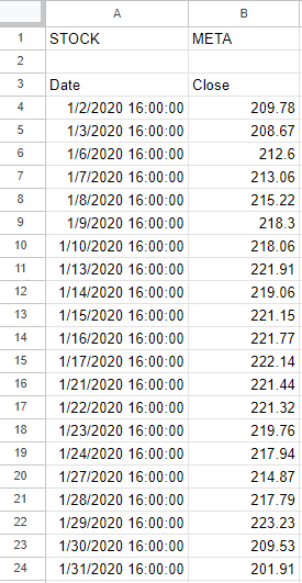
In this example, I’m going to find the stock’s largest value for a specific period. To start, I’m going to use the GOOGLEFINANCE function to get the stock history going back to Jan. 1, 2020. In the below example, I’ve got the price history for Meta Platforms, aka Facebook:
In cell B1 I’ve put a variable for the ticker symbol. This is to avoid hardcoding anything in the formula. This is important to make the process easy to update. In the macro, I’m going to cycle through ticker symbols. In Cell E2, I also have a formula that grabs the largest value in column B (the closing price):
=MAX(B:B)
However, this is where you can put your own formula or the results of your own calculation. Whether it’s a minimum, a maximum, or some other computation you want to do, you can put the results of that calculation here. This is the cell that will get copied during the macro.
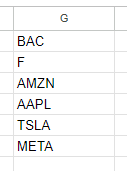
Then, in column G, I have a list of the stocks that I want the macro to cycle through:
As long as it’s a valid ticker symbol that the GOOGLEFINANCE function recognizes, you can enter it in this column. You can expand it as far as you like. However, if the macro goes on for too long then it will eventually time out and stop. If you want to cycle through every stock in the S&P 500, it is possible, but just be aware that you’ll likely have to do it in chunks. When testing it myself, I estimated I could do somewhere in the neighborhood of 200+ stocks in a single run. Once done, I copied the values onto another place on the spreadsheet with the values, and then replaced the stocks in column G with the next batch.
In Cell J1, I also have a variable called tickercount. This is a helper calculation to make the macro efficient. Instead of it having to count the number of stocks in my list, I provide it for the macro — anything to make it run quicker.
The Apps Script Code
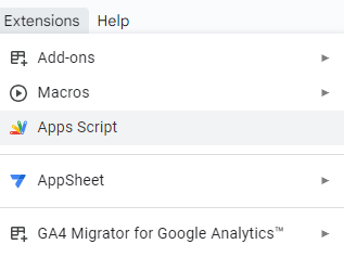
Now it’s time for the code to make this all work. To add code to your Google Sheet, select the Extensions menu and select Apps Script
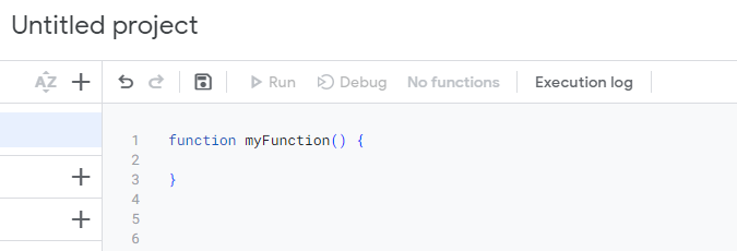
Once in Apps Script, you can setup a new function. You should see the following:
Here’s the entire code that you can use based on my setup:
function myFunction() {

var sht = SpreadsheetApp.getActiveSheet();
var lastrow = sht.getRange("tickercount").getValue();

for (i=1; i<=lastrow;i++) {

  //change ticker
  sht.getRange('B1').setValue(sht.getRange('G' + i).getValue());

  //copy maximum value
  var result = sht.getRange('result').getValue();

  sht.getRange('H' + i).setValue(result);


}
}
Here’s a brief explanation of how the code works:
It begins by selecting the active sheet.
It determines the last value based on the ‘tickercount’ named range.
It loops through the values in column G.
It takes the value in column G and pastes it into cell B1 (the ticker variable).
The macro then gets the value from cell E1 (it has a named range called ‘result’)
It pastes the value of the result into column H, to the same row that the stock ticker was on.
If you leave my setup the way it is, what you can do is do any of your desired calculations on another part of the worksheet. As long as it doesn’t interfere with the ticker list or any of the ranges used in the macro, then you’re fine. You can also adjust where the cells are if that makes it easier. For example, you could move the ‘result’ named range from E1 to somewhere else in the spreadsheet. With a named range, you don’t need to worry about updating the cell reference.
Running the macro
A final part of this macro is actually running it. You need a way to trigger it. In my example, I’m using a button. This makes it easy to see what you need to click on for the macro to run. Here’s how you can create a button in Google Sheets and assign a macro to it:
1. Go to Insert and select Drawing
2. Create a shape, add text to it, and whatever colors/formatting you want. Then click Save and Close.
3. Select the button and click on the three dots on the right-hand side, where you will see an option to Assign Script.
4. In the following dialog box, enter the name of your function (don’t include the parentheses). The default function in Apps Script is called myFunction() and if that’s the macro you want to use, then you would just enter myFunction and click on OK.
If everything works, now when you click on your button, the macro will run. Check for any error messages to see if you run into any issues. If you need to edit the button afterwards, right-click on it first so that you don’t accidentally trigger the macro.
One thing to note is that when you run a macro on a Google Sheets file for the first time, you’ll be given a warning about doing so:
Click on Review permissions and select your Google account. You’ll get the next warning, saying that Google hasn’t verified this app and you’ll need to click on Advanced to continue despite the warnings. This is similar to the warnings you encounter in Microsoft Excel when enabling macros. Once you proceed and click on Allow, the macro will proceed to run.
Here’s how it looks in action:
Download my loop macro template
If you’ve gone through this post and run into issues or it is too complicated for you, feel free to download my loop macro template. Since it’ll create a copy for your use, you can modify it however you like to suit your needs.
If you like this post on Loop Through Stocks in Google Sheets With a Macro, please give this site a like on Facebook and also be sure to check out some of the many templates that we have available for download. You can also follow me on Twitter and YouTube. Also, please consider buying me a coffee if you find my website helpful and would like to support it.
Excel’s new functions help make it even easier to analyze and extract data efficiently and effectively. One example is extracting a list of unique values from a list. What you can also do is sort that list. Plus, you can then put all those values into a single cell, with each value separated by a comma. Data in the form of a comma-separated value (CSV) can make it easy to compile data into one place, without taking on too much space. In this article, I’ll show you how we can combine all this Excel functionality into one supercharged Excel formula that can do everything I’ve mentioned thus far. Let’s get started.
How to create a list of unique values for a specific criteria
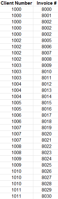
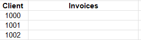
For starters, let’s get a list of unique values that meet a certain criteria. While pulling unique values isn’t terribly difficult in excel and there many ways to pull unique values, I’m going to show you how we can extract unique values that meet a given criteria. Here’s the data set I’ll be working with for this example:
It’s a straightforward list that includes a client number (column A) along with invoices (column B). But if I want to include just a list of the unique values relating to client 1000, the UNIQUE function on its own won’t help me with that. I need to apply a criteria first. To do this, I’ll first use the FILTER function. Using that function, here’s how I can grab all the values relating to client 1000:
=FILTER(B:B,A:A=1000)
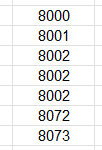
The first argument in the formula is where I want to extract values from. The second argument pertains to my criteria, which is based on the values in column A. With this formula, this is my result:
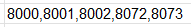
I get a list of values. But the problem is I have repeating values — invoice #8002 shows up multiple times. But I can put that formula to generate that list within the UNIQUE function:
=UNIQUE(FILTER(B:B,A:A=1000))
Now I have a condensed list which only includes unique values:
If your data isn’t sorted, you can also put this within the SORT function:
=SORT(UNIQUE(FILTER(B:B,A:A=1000)))
Now you have a formula that filters out data, grabs the unique values, and sorts them. It’s a busy formula. But it’s about to do even more.
Putting the list into a CSV format
As of now, the data is in a list. That’s not a convenient format because the danger is that you may have clients which have only a few invoices, perhaps none at all. Others, meanwhile, might have a dozen invoices. If you are creating arrays, they will inevitably vary in size, and the you’re left with a spreadsheet that doesn’t have much consistency to it.
To get around that, you can put your data in a CSV format. By doing so, you can ensure all of your data is contained within just a single cell.
Here’s the step-by-step process as to how you can put your data into a CSV format:
1. Use the TEXTJOIN function and use a “,” as you first argument. The first argument of this function tells you how you want to separate your data. By indicating a comma, you’re already setting up the result to be in a CSV format.
2. Set the next argument to TRUE. The second argument is whether you want to ignore empty values. You’ll likely want to ignore them, otherwise, you will have blank spaces between your commas.
3. Include your list of values. This is the data that you want to convert into a CSV.
Here is what the complete formula looks like, with step 3 relating to the formula we created at the end of the previous section:
The list of unique invoice numbers is now within just a single cell. And each invoice is separated by a comma.
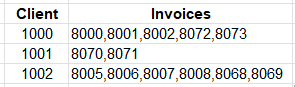
But let’s make this formula more dynamic. It should be able to generate a list based on each client, in the following table:
With the client values in column D, starting with cell D3, this is how I can adjust the formula so that it is not referencing a hardcoded invoice number:
Using that formula, the table will now populate the list of unique invoices for each client:
If you like this post on How to Extract and List Unique Values in Excel Into CSV Format, please give this site a like on Facebook and also be sure to check out some of the many templates that we have available for download. You can also follow me on Twitter and YouTube. Also, please consider buying me a coffee if you find my website helpful and would like to support it.