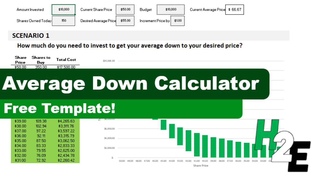
If a stock you invested in dropped in price, it could be a good opportunity to buy more shares and bring your average down. You can use the average down calculator on this page to do a quick what-if calculation to determine how many more shares you would need to be. However, you can also use this template, which will allow you to run through the same scenarios within Excel.
This is how much money you have already invested into the stock.
Shares owned
The number of shares that you own.
Current share price
What the share price is.
Desired average price
What price you want to average down to.
Budget
How much money you can afford to invest.
Increment price by
This is for the sensitivity analysis and determines by how much you want it to move by. The default is set to $0.50.
Once you’ve entered that data, the rest of the template will populate. Here are the two scenarios that it will show you:
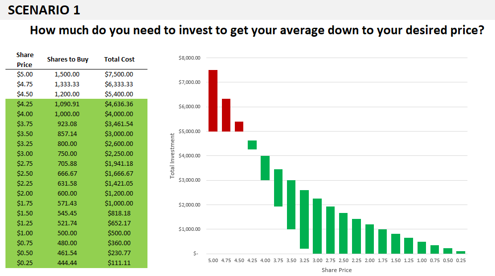
1. Getting to your desired average price
In this scenario, the template will show you how much to invest at different price points to get your average down to your desired average price. You will see up to 20 different data points to show you if the price continues to get lower, how many shares you will need to buy to reach the average price you are targeting.
And any scenarios that fall within your budget will be highlighted in green, and so will the corresponding chart:
If all the data points aren’t filled in or it looks like the chart doesn’t go all the way to the right, this is a sign you need to fix your Increment Price by value. Enter a smaller price increment and you’ll see more data points and a more complete chart.
2. How low you can get your average
The second scenario ignores the desired average price and simply tells you the different average prices you can average down to if you buy at the current price. This is good if you don’t have a specific average in mind and just want to see how low you might be able to go.
You’ll notice on the x-axis it refers to the average price rather than the share price in the earlier chart.
Please note that the template is locked down and this is to prevent overwriting formulas which could lead to errors in the calculations and the charts.
Download the file
You can download the file for free, from here. The free version is limited to five price points. On the full version, there are 20 different prices, no ads, and there are more scenarios:
If you liked this Average Down Calculator Template, please give this site a like on Facebook and also be sure to check out some of the many templates that we have available for download. You can also follow us on Twitter and YouTube.
In an old post, I went over how to parse data using various different functions. This time around, I’m going to show you how much easier it is do that in Power Query. If you’re not comfortable using LEN or MID functions, then this will make your life a whole lot easier. And to keep things simple, I’m going to use the same data set as I did in the previous post, which you can download from here.
Setting up the query
The first step involves copying the data from the webpage and then just pasting it into cell A1. With no adjustments, my data just contains the raw data:
The one thing I’m going to do is remove the blank rows just so that Excel recognizes the full data set without having to adjust it. I can remove the blank rows in Power Query, but I’m going to do it at this stage so I don’t need to worry about finding what row number I need the range to go down to. To remove blanks, I will select column A, press F5, special, blanks, and then right-click delete on one of the cells. Now that there are no gaps in my data, I can set up the query.
To do that, I’ll go into the Data tab, and in the Get & Transform Data section, click on the From Sheet button.
Excel should now autodetect the entire range. Click OK and the query will be created:
Right now, it looks the same as what it was before, except it’s in the Power Query window. Next, I’ll actually start making the transformations.
Parsing the data using delimiters
Just like in the older post, I am going to set up fields for Country, City, and Population. But this time, you won’t have to fumble around and worry about setting up complex formulas. In the Power Query Editor, I’ll select the Add Column tab. And in there, I’m going to select the Extract drop-down selection and choose Text Before Delimiter:
I’m going to use the colon (:) as the delimiter and then click OK
That nicely parses out the countries:
I can double-click on the header where it says Text Before Delimiter and change it say ‘Country’
Next, let’s parse out the City field. I need to make sure that Column1 remains selected. This time, I’m going to select Extract under the Add Column tab and then select Text Between Delimiters. I’m going to set my start delimiter as a colon. And the end delimiter will be the opening bracket:
And after re-naming the field to City, this is why my Power Query Editor looks like:
The last column to parse out is the Population. For this, I’m going to follow a similar step as above except I’m going to extract the text within the brackets. But in some instances, there is data within brackets that doesn’t relate to the population. But one consistency is that the population always comes at the end. So in this case, I’m going to use the Advanced options and specify that I want to start searching from the end of the string. I have left the other options the same:
Now, my fields look pretty good:
The one thing I still need to do is remove the headers for the different letters. Since there is nothing in brackets, I can filter for any blank value in the City field. To do, this, I will click on the drop-down arrow for that field and select the option to Remove Empty:
Now, the data looks good and ready to import back into the worksheet:
I technically don’t need that first column anymore. It’s done its job and one of the great things about Power Query is I can delete it, and it won’t impact everything else I’ve done. I’m going to right-click and delete that column so that all I’m left with are the fields I actually need:
All that’s left now is to load the data into the spreadsheet. To do this, click on the Close & Load button in the top-left corner. It will now put that into a new tab by default:
And just like that, you’ve parsed the data without having to go a painstaking effort of figuring out the correct formulas. But as easy as this was, there is an even easier way of parsing the data out (most of the time).
Parsing the data using examples
I’m going to re-do the previous step, this time taking a different approach, without the use of delimiters. This time, I’m going to the Add Column tab and select the Column From Examples button. This will generate another column on the right-hand-side:
What I’m going to do in Column2 is give Power Query some examples of what I want this field to contain. Since it is the Country field, I’m going to start by typing out a country name. Even after just entering the first one, Power Query has figured out the pattern and does the rest for me:
You’ll notice at the top it has the Text Before Delimiter which is what I used when I did this manually. The less complicated the data, the quicker and easier it will be for Power Query to predict what I’m trying to do.
I’ll repeat the step for the City field. This time when I enter just one value, it hasn’t figured out the rest of the values:
Instead of La Paz at the bottom of the above screenshot, it only pulls ‘La’ and so what I will do is correct that entry manually. Upon doing that it updates the calculations, but they still aren’t quite right. For Bosnia and Herzegovina, it is including part of the country name:
I will manually update that value to just enter Sarajevo, and once I do that it now looks correct:
And if I look at the formula that it has generate, it now is the same as what I did manually with selecting the delimiters:
The last column, Population, was the most challenging to set up because I needed to use the Advanced settings. Let’s see how well Power Query is able to extract this one using examples. Again, I’ll start with entering in the first value:
It doesn’t look too bad except for La Paz, it pulls in ‘seat of government’ which is in brackets, as opposed to the population. I’ll manually correct this one, and upon doing so this is what my column looks like:
Now the problem is the n/a values aren’t picking up correctly. Once I correct them, the column looks to be correct, except for Delhi:
After making a few more adjustments, the column looks to be correct:
One of the challenges with doing it this way is if a field isn’t easy to predict for Power Query, it may take some manual entry before it is able to get it just right. And even then, you may not be certain that you’ve accounted for all the possible variations. While this method can make it really easy for simple data parsing, for more advanced ones you will likely want to familiarize yourself with how to use the different Extract options.
If you liked this post on How to Parse Data in Excel Using Power Query, please give this site a like on Facebook and also be sure to check out some of the many templates that we have available for download. You can also follow us on Twitter and YouTube.
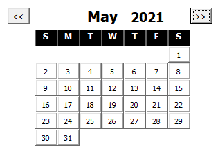
Are you looking for an easy way to add a date to your Excel spreadsheet? You can download my free date picker add-in for Excel. It is useful if you have a form and you want people to select dates or if you just want an easy way to enter a date without worrying about whether it is in the right format.
***Please note on an earlier version of this add-in (and as reflected in the video), the calendar was designed to pop up next to the active cell. However, due to many issues related to scrolling and possible zooming, and multiple screens, it is now set to open at the top (and in the middle) of the screen***
How the date picker add-in works
To launch the add-in, click on CTRL+SHIFT+Z, which will trigger the following calendar to pop up:
By default, it will jump to the current month. Clicking on any of the dates will enter the date value into the active cell. You can use the arrow keys on the left or right side to change the months. If you want to jump by years, double-click on the year and just enter the desired year. The calendar will automatically adjust, which will be quicker than if you were to just continue pressing the arrow buttons.
Right now the add-in is a stand-alone but look for it to be included as part of a larger add-in package. If you have any suggestions for other features to include in an add-in, feel free to contact us.
How to install an add-in
You can download the date picker add-in here. Once you’ve saved it, go into Excel and select File -> Options -> Add-ins and then depending on your version, you may see an option at the bottom to go to manager Excel Add-ins:
Click on the Go button and then you will have a list of add-ins you can install. If you didn’t save the add-in into the default folder where the rest of the Excel add-ins are, you just click the Browse button to find where you saved the file. Then, make sure the add-in is checked off and click OK and it will be ready to go.
If you liked the Date Picker Add-in, please give this site a like on Facebook and also be sure to check out some of the many templates that we have available for download. You can also follow us on Twitter and YouTube.
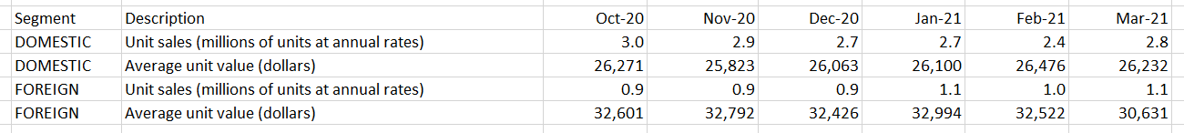
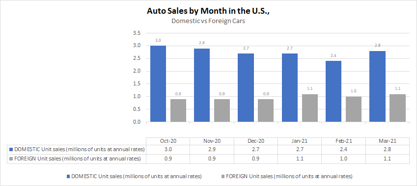
An Excel chart can provide lots of useful information but if it isn’t easy to read, people may skip over its contents. There are many simple things you can do that can quickly add to the visual to make it fit seamlessly within a presentation and that makes it more effective in conveying data. If you want to follow along, in this example, I am going to use data from the Bureau of Economic Analysis. In particular, I am pulling data on automobile sales both in units and average dollars. Here is what my data set looks like right now:
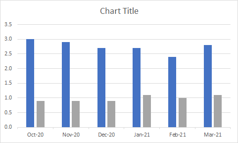
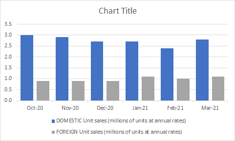
And this is my chart, which shows unit sales by month:
It’s a pretty basic chart that can show me the breakdown between the sales. These are the following changes I can make to improve the look and feel of it:
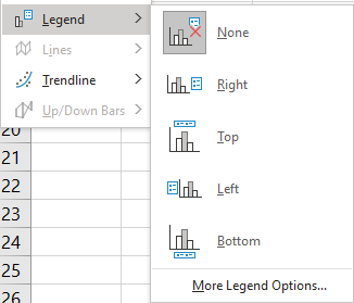
1. Add a legend
Unless you are just charting one item, most visuals will benefit from a legend. Otherwise, it will be difficult to know which data is represented where. To add a legend, all you need to do is select the chart and go into the Chart Design tab and select the Add Chart Element button, there you will see an option to determine where you want it to show up:
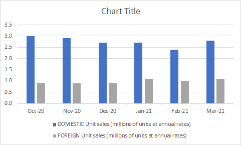
In most cases, you’ll probably want this on the top or bottom as that will help make it blend in easier with the chart. Here’s how it look after I add the legend:
Since my descriptions are long, putting them at the bottom will make more sense. Now I can easily see which bars relate to the foreign sales and which ones relate to domestic.
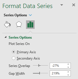
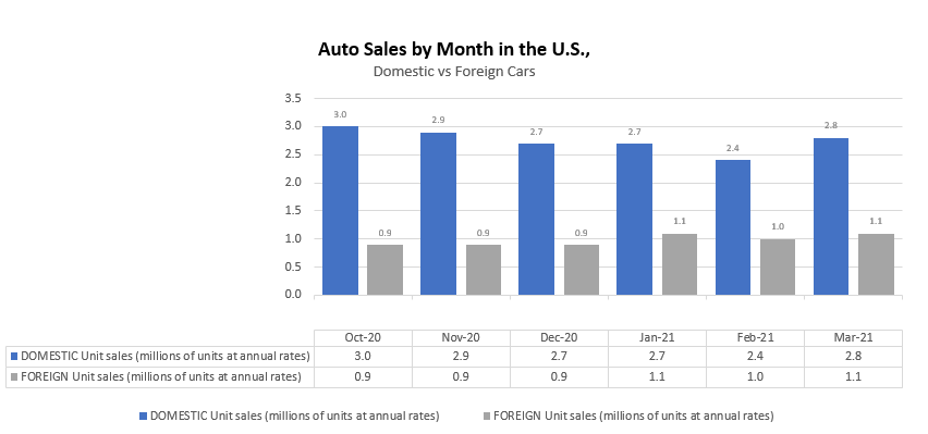
2. Shrink the gaps (for column charts)
If you have column charts, it can help to shrink the space in-between the bars. That will eliminate white space plus you can fit more items in your chart. To adjust the gaps, right-click on any of the bars and select Format Data Series.
I normally set the Gap Width to 50%. Upon doing so, my chart changes to the following:
3. Adding a descriptive title and subheader
I haven’t set a title for my chart and that’s one thing you shouldn’t overlook doing. Although it may not seem necessary, doing so can help ensure that your chart can stand on its own and not have to rely on the context it is used in to give the reader the right information. A good example in this case can be as follows:
The main title is bolded and shows the reader what the chart is about. And the subheading further distinguishes the different groups of data.
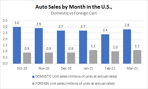
4. Adding data labels
You may want to consider adding data labels to make it easy for the reader to see the exact numbers your chart is showing. This prevents having to make any estimates or rounding off and quoting an incorrect number. To insert data labels, right-click on one of the column charts and select Add Data Labels. Do this for each data series you want to add labels for. This is how my chart looks, with labels:
You can modify the labels if you want to add more information besides just the value. This will depend on the type of chart you have and how much space is available. In this example, you probably wouldn’t want to add more information. However, what I will do is shrink the text size so that it is a bit smaller and so that everything looks less cluttered. To do that, I just click on any of the data labels and under the Home tab, make changes to the font size or color the way I normally would with any other data in Excel. After shrinking the font to size 7 and making it grey, here’ show it looks:
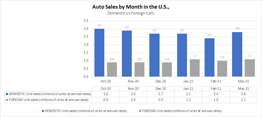
5. Adding a data table
If you don’t want to add data labels, another thing you can do is add a data table. This avoids putting any numbers or labels over top of your data series and still gives the user a helpful table summary. This is a great alternative if you don’t want to crowd too much information into one place and prevent your chart from looking too busy. To add a data table, just go back to the Add Chart Element drop-down option and select Data Table, where you can specify if you want to include the legend key or not. This is how the chart looks with the table:
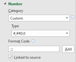
If you want to avoid the repetition in the axis labels without deleting them and losing those headers, one thing you can do is to change the text format. To do that, right-click on any of the axis labels and select Format Axis. Then, in the Number section, enter three semicolons in the Format Code section and click the Add button:
The three semicolons will remove any formatting and now the axis and data table wouldn’t double up on the names:
6. Remove the border
If you are using the chart in a Word document, presentation, or even Excel, eliminating the border around it can make it blend much easily with the background and other information. To remove the border, right-click on the chart, select Format ChartArea, and under the Border section, select No line. After making the change, this is what my chart looks like now:
With my gridlines turned off, you can no longer see the lines that show where the chart starts and ends.
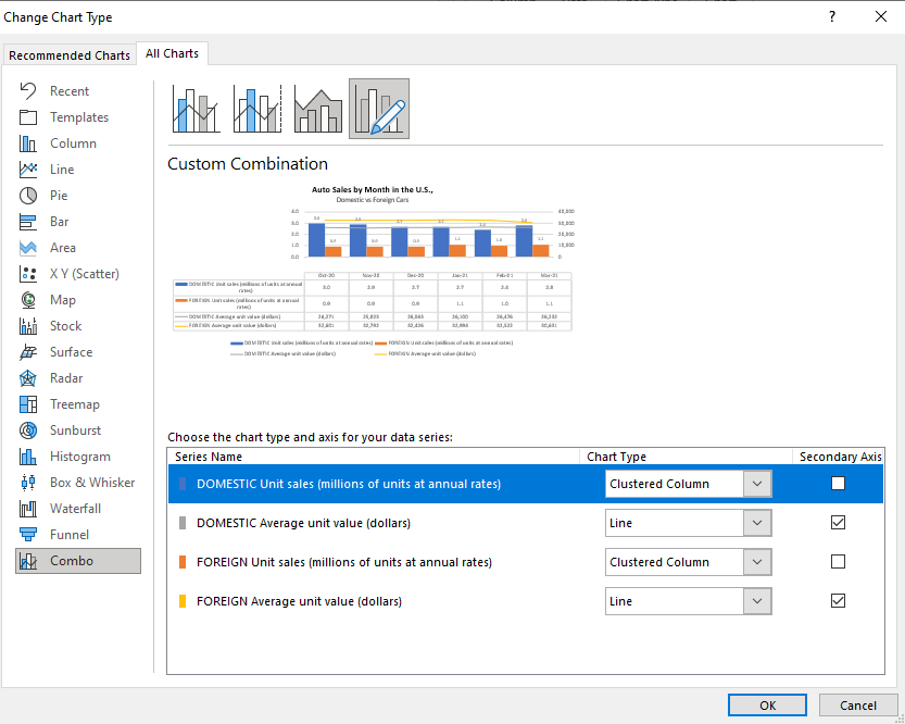
7. Use a secondary axis with multiple chart types
So far, I’ve only used column charts to show the number of units sold. However, now, I will also include the average selling price. But because the selling price can be in the thousands, I’ll want to move this onto another axis. Otherwise, the number of units sold, which are in millions, won’t show up because of the scale as it will need to accommodate values that are in the tens of thousands.
When you want to put a data series onto another axis, you will need to go to where you select the chart type. If you go to the bottom, select the Combo option. There, you can specify which chart type should be used for each data series. That’s also where you can specify which one should be on a secondary axis. In this example, I’m going to use a line chart for the average price and continue using a column chart for the number of units sold. It doesn’t matter which data set I put on the secondary axis. However, note that the one that is secondary will be on the right-hand-side of the chart.
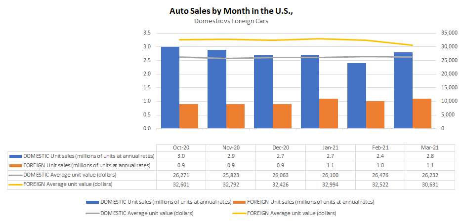
This is what my updated chart looks like:
In this case, I’ve gotten rid of the data labels for the column charts so that it doesn’t interfere with the line charts.
8.Move the axis categories down
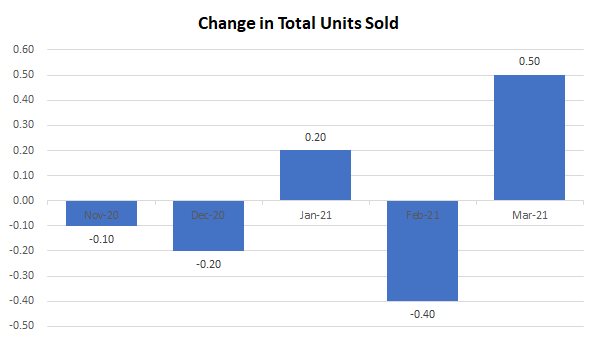
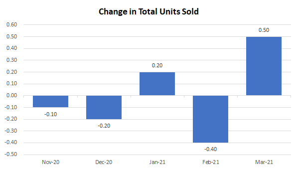
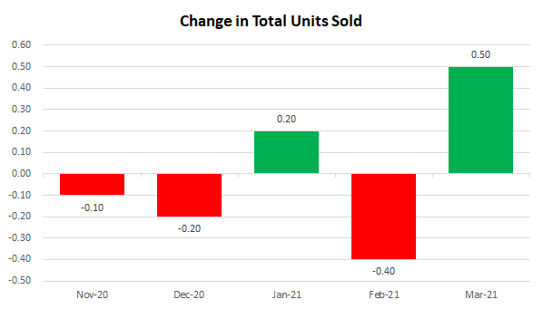
In the examples thus far, I haven’t had any negative values. However, suppose I change my data to now show the change in units sold from one month to the next:
For this example, I combined the data so that it totals both domestic and foreign cars. The above chart shows the month-over-month change. But one problem you’ll notice is that the date labels run along the middle of the chart. This makes it difficult to read when there are negative values.
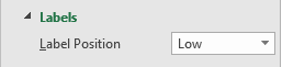
To make this easier to read, I am going to move the axis labels to the bottom This is useful when dealing with negatives. To make this change, right-click on the axis and select Format Axis. Then, under the Labels section, set the Label Position to Low.
Now, when my chart is updated it looks like this:
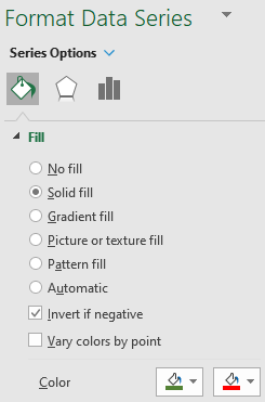
9. Showing negative values in a different color
One other change that is going to be helpful when dealing with negatives is to change the color depending on if the value is positive or negative. All you need to do to make this work is to right-click on the column chart, select Format Data Series and switch over to the Fill section. There, you will want to check off the box that says Invert if negative:
Once you do that, you should see two different colors you can set aside for the color section. If you don’t, try and setting one color first, and then toggling the Invert if negative box. With the two different colors, my chart looks as follows:
While you can obviously tell if a chart is going up or down, adding some color to differentiate between positives and negatives just makes the chart all that more readable.
If you liked this post on 9 Things You Can Do to Make Your Charts Easier to Read, please give this site a like on Facebook and also be sure to check out some of the many templates that we have available for download. You can also follow us on Twitter and YouTube.
Do you want to learn how to quickly count the number of cells that meet certain criteria? How about partial matches using wildcards? Below, I’ll show you how you can do this using the COUNTIF function in Excel along with similar tasks.
How does the COUNTIF function work?
As the name suggests, the COUNTIF function in Excel will count the values in a range if they meet certain criteria. It is not case-sensitive and in most cases, people use it for entire matches. However, you can also use it if you want partial matches.
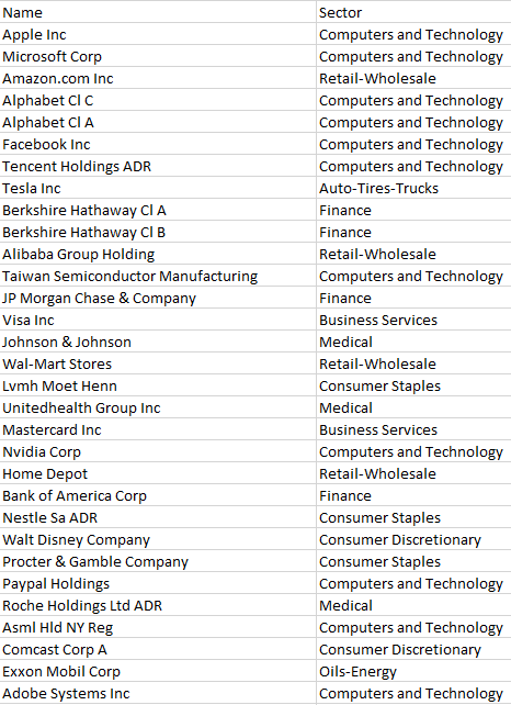
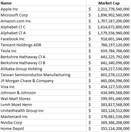
In the data sample below, I have a list of the largest stocks on the North American markets along with the sectors that they are in:
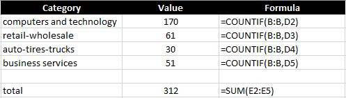
In total, my list contains 1,000 companies. To count the number that are in the Computers and Technology sector, I can do the following formula:
=COUNTIF(B:B,”computers and technology”)
Column B is where the sector name is. The above formula returns a value of 170. You’ll notice in the formula I didn’t bother matching the case because it isn’t case-sensitive and doesn’t matter how you enter the criteria in.
A better way to set this up is to reference an actual cell rather than hard-coding the criteria. This can help prevent errors and you don’t have to go into the cell to see what it is searching for. Here’s what the formulas look like:
I also added a SUM function at the bottom to see how many of the sectors are accounted for. With these formulas in place, I can easily copy down these functions to accommodate more sectors if I need more. This is what the COUNTIF function looks like in its simplest form. Next, let’s use wildcards to take it to the next level.
Using wildcards in a COUNTIF formula
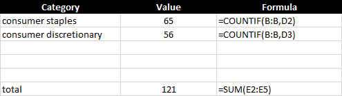
There are two sectors in this data set that are similar — consumer discretionary and consumer staples. If I use the approach above, I would need to create COUNTIF formulas for both of them and then total them up:
This isn’t optimal and since the word ‘consumer’ is in both sectors, I can just have the COUNTIF function look for that, rather than creating two separate formulas and then a third to total them. To accomplish this, I’m going to use a wildcard to just look for the word ‘consumer’ :
=COUNTIF(B:B,”consumer*”)
You’ll notice the asterisk at the end of the word ‘consumer’ which will ensure that it will also include any text that comes after it. But how can this work to make the formula dynamic and reference a cell? To do that, I’ll use the & to connect the string to the asterisk:
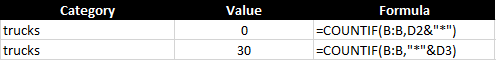
D2 is where the consumer value is, and by linking that with the asterisk (*) it still allows the cell to be dynamic. In the following example, I put the asterisk at the end of the text but you can also put it at the beginning if you want the value to end with the word:
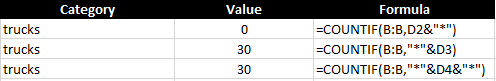
In my data, there is nothing that starts with trucks, but there are 30 values that end with it. The second formula counts those that end with the value. But what if you don’t care and just want to count every instance, regardless of where it is in the text? In that case, just add the asterisk before and after the criteria:
Suppose I just wanted to count all the sectors that included the letter ‘s’ :
A total of 709 sectors include the letter ‘s’ in their descriptions.
Using COUNTIF with blanks
You may also want to calculate how many of the cells are blank, nonblank, or don’t contain anything. Let’s cover those sections below:
Counting blanks cells
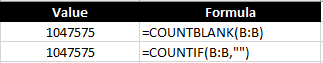
To count all the blank values you have two options. You can use the COUNTIF along with an empty string (“”) or you can use the COUNTBLANK function if it is available on your version of Excel. Both can generate the same results:
Since I’m looking at the entire column, there are many blank cells in my entire range.
Counting nonblank cells
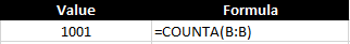
If you want to count the cells that have values in them, this is what the COUNTA function is used for:
My data set had 1,000 values in it and with the header, and so the formula returns a correct result of 1,001.
Using COUNTIF to count numbers
So far, I’ve covered how you can use the COUNTIF function in Excel with text. But you may also want to count numerical values as well. In this example, I am going to pull in the market capitalization of each of the stocks listed earlier. Here’s what that looks like:
You can use the COUNTIF function like with text but exact matches aren’t as useful when it comes to numbers. Neither are wildcards. Using the greater than (>) or less than (<) operations will be much more helpful in this situation.
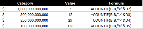
Let’s start with a scenario where I want to count all the stocks that are worth more than $1 trillion. To do this, my formula looks as follows:
=COUNTIF(B:B,”>1000000000000″)
Like with the wildcard, the greater than sign goes within the quotes, as does the number. You can also connect this to a cell using the & sign to make it more dynamic:
By referencing a cell and applying a number format, it is also easier to read the value than having to rely on counting the right number of zeroes within the formula. This formula correctly returns the number 5, indicating the number of stocks on the list with valuations of more than $1 trillion. I can copy this formula down and apply it to other valuations as well:
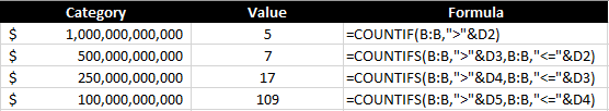
Each threshold tells me the number of stocks that are worth at least that value. But what if I don’t want to overlap and just want to know the number of companies between $500 million and $1 trillion? To do this, you will want to use the COUNTIFS function, which allows you to enter multiple criteria. It works similar to the COUNTIF function and you just continuing adding a pair of arguments (one for the range, the other for the criteria) until you are done. To count the number of companies that fall within $500 million and $1 trillion, my formula would look as follows:
In this example, I also included the equals ‘=’ operator so that it includes values that are less than or equal to $1 trillion.
This is how it might look in a table where you want the values to update dynamically:
In the first row, the COUNTIFS function isn’t needed since that is only looking at one criterion. But for the other calculations, it is pulling in only the values that fall within that range ensuring that they don’t overlap with other categories.
If you liked this post on how to use COUNTIF in Excel, please give this site a like on Facebook and also be sure to check out some of the many templates that we have available for download. You can also follow us on Twitter and YouTube.
A stock screener allows you to filter through stocks that meet your investment criteria. It can help you find undervalued stocks and great dividend investments. But sometimes it can be cumbersome to always go back to a website and re-apply filters, even if you save them. In this post, I’ll go over how you can populate a list of stock data into Excel and then run your own filters on it, and thus, creating a screener you can easily access from within your own spreadsheet.
Step 1: Populating the list
The one thing you’ll want to do before you can create the screener in Excel is to download an array of stock data from a database. Personally, I like using Barchart because it has lots of useful information on there and you can get a wide range of data, and it is easily downloadable into an Excel format. It lets you do five free downloads each day and you can download 1,000 rows at a time. That’s thousands of stocks you can add. Using that in conjunction with the STOCKHISTORY function, and you can create a pretty versatile template. After all, since data like earnings, dividends, and other fields won’t often change, downloading a snapshot from Barchart once a month or even less frequently shouldn’t be a big issue. You can obviously use other databases but I’m going to use a free example for the purpose of this post.
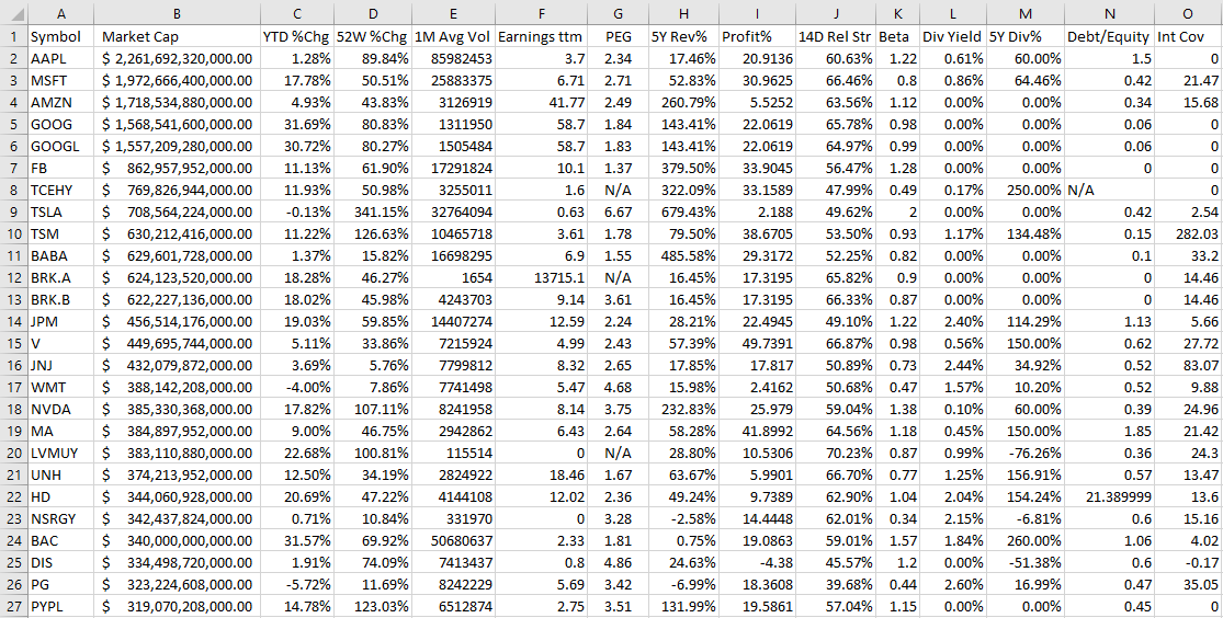
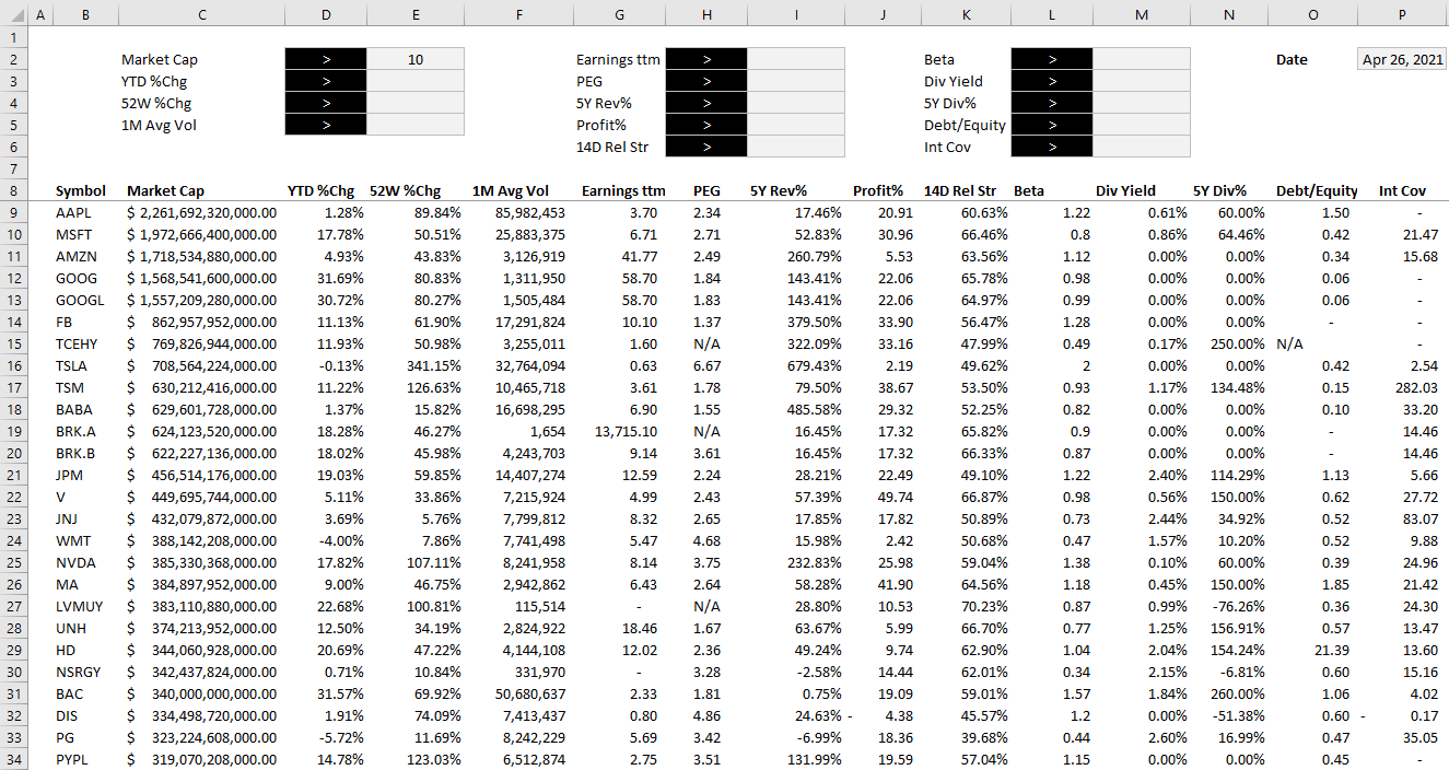
On Barchart, I’ve customized the fields I want to use for my downloads, and this allows me to re-use them again and make subsequent downloads easier. To keep it simple, I am going to download just the top 1,000 North American stocks based on market cap. This is what my download looks like in Excel:
Now that the data is loaded, the next step is to create the layout.
Step 2: Organizing the stock screener and setting up the fields
I find it most convenient to always put any inputs on a spreadsheet on the top of the page, and the results below. This way, you can freeze panes to make it easy to scroll through all the rows while seeing your selections.
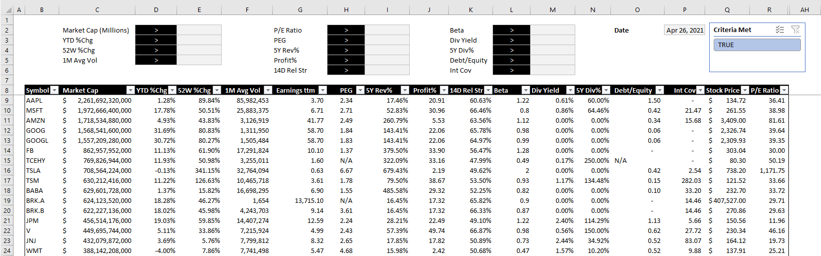
To start, I will create a field for each major field I have downloaded. After formatting some of my values, this is how my screener looks thus far:
Off to the right, I’ve added a date field because I am going to utilize Excel’s STOCKHISTORY function to pull in the price. This will allow me to calculate the current price to earnings ratio without having to download it from the screener as that multiple will change every day based on the stock’s price.
When downloading so many stock prices, it may take a while for the formulas to update. But once they are loaded, then I can calculate the P/E ratio by just taking the stock price and dividing it by the earnings per share.
Step 3: Creating the formulas to evaluate the criteria
The part that will take the most time is to now evaluate each of the criteria to determine if a stock meets all of it and whether it should be included in the results. Rather than trying to do this in one large formula, I’m going to break this up into one formula per field. I’m going to name these fields exactly the same so that it is easy to reference them.
For the first criteria, Market Cap, my formula looks as follows:
D2 is where I have the dropdown for the > or < symbol and E2 is the value that I want to filter for market cap. C9 is the first row of data. My goal here is to evaluate to either a TRUE or FALSE value. I also divide the value in C9 by 1,000,000 just to make it easier to filter the market cap by millions.
For the % change calculations, I will do a similar calculation. Except this time I don’t need to divide by 1,000,000 and so it looks a lot simpler:
=IF(E3=””,TRUE,IF(D3=”>”,D9>E3,D9<E3))
D3 is my > or < dropdown while E3 is the percent change I am entering. Since I will enter a percentage here, I don’t need to make any special calculations. This is the same format that I will follow for the other fields.
Once I have set up all my calculations for the various criteria, I’m going to add one column that will check to see if the stock meets all of them. This is a simple formula where I can multiple all the values. A TRUE value will compute as 1 and a FALSE will be 0. And so even if there is one FALSE value, the entire result will return FALSE and not meet the criteria. The formula looks as follows:
The final step is a simple one but it’s also important to make this sheet work smoothly. Select anywhere on the data set and on the Insert tab, click on Table. Hit OK and now you should see Excel’s default table applied to your data.
The reason for converting this into a table is that now we can apply slicers to it. And really, only one is needed here. If you go to the Table Design tab, there is a button to Insert Slicer. Click on it and select the one for the field that checks all the other criteria. In my example, it is called Criteria Met.
After hiding all the criteria fields, changing some of the formatting and adding the slicer, this is now how my screener looks like:
The beauty of this stock screener is that by clicking on the TRUE button in the slicer, you are automatically refreshing the data in Excel and updating your filters based on the selections. All this is done without macros and it makes the screener easy to change with the press of a button.
You can download my completed template here. Please note that if you do not have STOCKHISTORY available on your version of Excel, some of the values will not populate.
If you liked this post on creating a stock screener in Excel, please give this site a like on Facebook and also be sure to check out some of the many templates that we have available for download. You can also follow us on Twitter and YouTube.
In a previous post, I covered how to create a form in Excel. Although I didn’t go over drop down lists specifically, they are one element you could incorporate into them. The problem is that your list can change over time, getting bigger or smaller. And that can make it difficult to maintain if your list isn’t dynamic as it will involve you always having to manually change the range of your drop down list. Otherwise, it could be incomplete or contain blanks. Below, I’ll show you how you can manually change your drop down list in excel and create it without blanks while also making it dynamic so that you don’t need to worry about whether it changes over time.
Setting up the drop down list
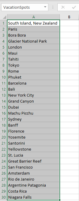
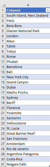
First, let’s start with the basics — creating the list. To create a drop down list in Excel, you just need a series of options to choose from. My list is going to be made up of the top 30 places to visit. I’m just going to put those names in a list.
After entering in the list of places into Excel, the next thing I will do is select all the values, and create a named range. This is as simple as just entering a value next to the formula bar, where you see the cell location. I will call this range VacationSpots:
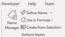
There is no need to add headers or anything else. Just select the values, enter in a name for the list, and hit enter. A longer approach would be to go to the Formula tab and select Name Manager:
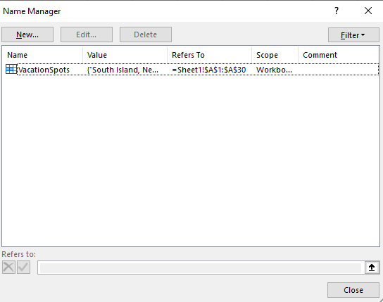
Clicking this will show you all of the named ranges in the workbook:
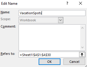
It shows you the named range I created. However, I could also create one from this screen and also Edit my existing range. This is where you would go to make the change manually. Clicking on the Edit button would give you this screen:
As you can, here I can manually change the address as needed in case the list changes. However, this is obviously not optimal as it can be a tedious process if your list changes frequently.
Creating the drop down
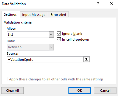
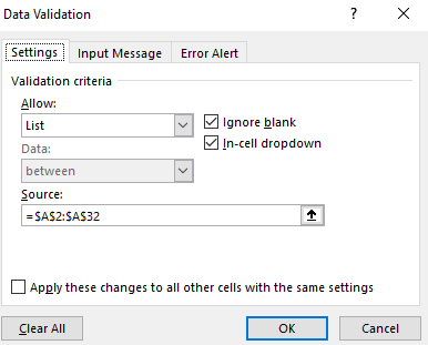
Now that my list has been created, I can set up the actual drop down. To do this, I’m going to select a cell and under the Data tab, click on Data Validation. Here, there is a place to enter your list of values:
Under the Allow section, I choose List. And for the Source, I enter the ‘=’ sign followed by my named range, VacationSpots. Now, when I click OK and go to the cell that contains the data validation, this is what I see when I select it:
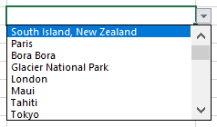
Clicking on the drop down arrow will show me my list of options, in the same order that they appear in my list:
I can select any of the values and my cell will update accordingly. This is great, but what if I decided to add more items to my list, perhaps 10 or 20 more locations I want to visit? Next, I’ll go the different ways you can create drop down lists in Excel without blanks.
Option 1: Create extra spaces in your drop down list at the very end
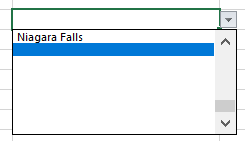
Technically this step involves blank spaces, which is not what this post is supposed to be about. However, I just wanted to show you how this could work. If your list has dozens of items, then having extra blanks may not be that big of a deal. For example, say I edit my named range so that it goes to 50 rows. If you do that and include empty cells, this is the biggest problem you’ll face:
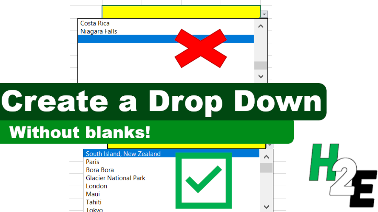
My list no longer starts from the top, it goes to the first blank cell. This can be an annoying problem because now it looks like all of my options aren’t there (they are, but I have to scroll up every time). This is probably the main reason people want to avoid having blank values in their lists. If the blank values simply came after all of your selections, that might be more tolerable. But because they impact where your drop down list begins from, it can be a nuisance.
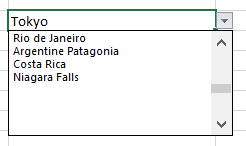
The good news is there is a simple way to get around this. For all your empty cells, enter just a single empty character. Select a cell, hit the space bar, get out of the cell, and copy that value down. Now, your empty cells technically aren’t empty because they contain a space. And by doing so, the drop down list now starts from the top again. You will still have blank values, but this time they will show at the bottom of your drop down list:
If this is acceptable then you can stop here. If you are still intent on getting rid of any possible blank value whatsoever, then head over to the next option.
Option 2: Creating a table to create a nonblank list
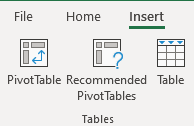
This option is the easiest method for getting rid of blank values. What you need to do here is convert your list into a table. Select a cell on your list, click on the Insert tab and then click Table:
Leave the option for headers unchecked and then click OK. You should see something like this:
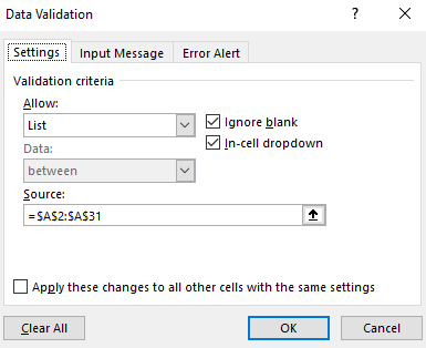
By default, Excel will apply its formatting and design but you can change the look of it to make it blend in more with your spreadsheet. You can also re-name the header from Column1. Either way, you can now create a new drop down list from this table. Since the values are in range A2:A31 in my spreadsheet, that is what I will enter for my new Data Validation list:
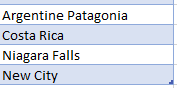
You can either select the range, or enter it in yourself. But if you enter it, you need to include the $ signs otherwise it will not auto-update properly. Now, I’ll go to my list add ‘New City’ to the bottom of the table. When I do that, the table automatically expands which you can notice because I haven’t changed the design and so the colors change:
And if I go back to the Data Validation settings, my source has automatically been updated:
This is a really easy way to make your drop-down list automatically update without the need for any formulas.
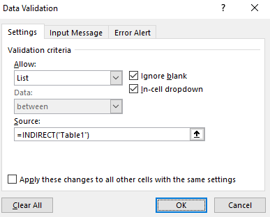
If the table you are referencing isn’t on the same sheet as your drop-down list, then you will need to use the INDIRECT function reference it. For instance, if you have created a table called Table1 (which should contain just one column for your list) on a different sheet, you can reference it the following way:
This will allow you to reference the list even if it is on a different sheet.
Option 3: Using a formula to remove the blanks in your drop down list
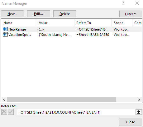
If for whatever reason creating a table isn’t an option for you, you can still create a dynamic list using a formula. Here, I’ll go back to creating a named range. Except rather than selecting a fixed set of cells, I will rely on a single formula. First, I’ll go back to the Name Manger. I’ll create a new named range. The formula for this can look a bit complex so I will break it down into parts.
First, I’m going to use the OFFSET function. This is because it can allow me to specify a height and width, which is crucial to making this work. My data starts in cell A1, and that’s where my formula will begin:
=OFFSET(A1,0,0
A1 is my starting point and that is the first argument. The next two arguments are whether I want to offset and move to any adjacent rows or columns. Since I don’t, I leave those values as zeros. It is the next argument that is critical, as it relates to the height. Here is where I will use a COUNTA function. I want to count the number of nonblank values in my list. My formula looks as follows:
=COUNTA(A:A)
I will embed this within my previous formula:
=OFFSET(A1,0,0,COUNTA(A:A)
For the width, I will set the last argument to 1, since I don’t want to include any extra columns. Here is my completed formula:
You always want to used $ signs in named ranges so that they don’t move on you. Now that this is set up, I can use this NewRange as my Data Validation source. And just like with a table, whether the list gets bigger or smaller, my named range and the drop down list will automatically update.
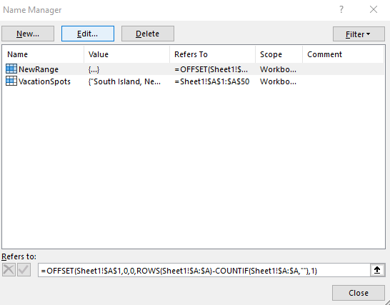
However, what if your list contains some formulas that look blank but really aren’t? Formulas are a great example of cells that can look empty even if they aren’t. The COUNTA function will count these values and you could again be back to square one with additional blank values. One way you can get around this is by counting the cells that are blanks, and subtracting that from the total rows. The formula would look as follows:
=ROWS(A:A)-COUNTIF(A:A,””)
Using this, you should correctly arrive at the number of cells that contain text and that aren’t blank as a result of a formula You can then insert that formula in your named range, in place of the COUNTA formula:
As you can see, this method isn’t the easiest and that is why I left it for the end. However, there are multiple different ways you can create a drop down list in excel without blanks. But it’s important because by removing blanks, it will make your form or spreadsheet look more polished by not having blank values in them.
If you liked this post on how to create a drop down list in Excel without blanks, please give this site a like on Facebook and also be sure to check out some of the many templates that we have available for download. You can also follow us on Twitter and YouTube.
Charts can be great tools to help visualize data. And sometimes, you will want to combine different types of information in one place. That can be tricky because if the scales are different, information may not display the way you would like it to. If something is shown in percentages while another value is in thousands, it isn’t going to be helpful to show that all on the same axis. That is where having a secondary axis can help you show all of that information on just one visual.
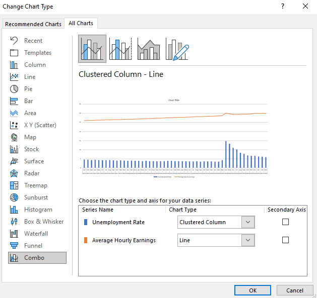
Below, I’ll go over how to do that using data from the Bureau of Labor Statistics. I will plot the unemployment rate against the average hourly earnings.
Creating the chart
The first step involves putting all the data together. If you want to follow along, you can download my data file here. This is an excerpt of what my DATA tab looks like:
Next up, I’ll create a Bar Chart by clicking on the data set, selecting the Insert tab and then choosing the option for a clustered column. At first glance, the chart doesn’t look terribly easy to read:
Since the hourly earnings are always above 25, those bar charts aren’t terribly helpful as they make it more difficult for the unemployment rate numbers to stand out. One thing I can do to make this a bit easier to read is to change the chart types.
Use a combo chart and a secondary axis to help display the data more effectively
Before I add another axis, I will first change up the look of these charts by using a combination. Rather than using bar charts for both data series, I’ll use a line chart for the average hourly earnings. Since those values are higher than the unemployment rate, it will help separate the data.
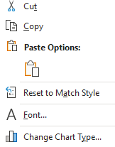
To change the chart type, right-click on the chart and select Change Chart Type
Select Combo on the bottom and off to the right you will see the an area where you can choose the chart type you want for each data series:
By default, Excel has determined I probably want to use a line chart for the average hourly earnings, which is correct. However, I could change it to something else altogether. You will notice this is also where you can check off to use a secondary axis.
While the chart will work fine even without this option, you can see from the preview there is a big gap between the bar graph and the line chart. In the interest of minimizing white space, I will check off the secondary axis for the average hourly earnings. Once I do that and click OK, my chart looks as follows:
You can see the chart now tells a much different story and shows that in the early months of the pandemic, the average hourly earnings spiked. This could possibly be due to a combination of higher-paid earners being less impacted by layoffs and being able to work from home and at the same time, low-wage workers who weren’t laid off may have received bonus pay if they worked in some retail stores. Either way, it definitely shows a much different story than if I didn’t use the secondary axis.
The axis to the left is the primary axis and relates to the unemployment rate. The one on the right is the secondary one and is for the average hourly earnings. This is an important distinction to keep in mind as you can easily be confused if you are not sure which axis relates to which chart. But having the secondary axis makes a big difference to my chart. This is what it would have looked like if everything was just on a single axis:
As you can see, it’s not as easy to visualize the data because of that big gap between the two chart types and them sharing the same scale. As a result, the spike in average hourly earnings is less pronounced than when using a secondary axis.
If you have yet another data series, you can also decide whether to plot that on the primary or secondary axis as multiple charts can be plotted on a single axis. However, if neither one is a good fit then that may be a sign that it is time to consider making a separate chart altogether.
If you liked this post on how to add a secondary axis in Excel, please give this site a like on Facebook and also be sure to check out some of the many templates that we have available for download. You can also follow us on Twitter and YouTube.
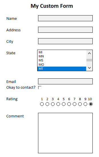
In a previous post, I covered how to add checkboxes. Now, I’m going to go a step further and show you how you can create a form in Excel from start to finish. And at the bottom of the page, you can download a file that you can use for your own custom forms. It will incorporate, list boxes, checkboxes, validation rules, and allow you to move the data onto a separate sheet. For now, let’s start from scratch.
Step 1: Determine the data you want and how it should be entered
The first step in creating a form in Excel is determining what information you want to collect. In this example, I’m just going to include name, address, city, state, email, a checkbox to confirm if it is okay to contact the person, a rating, and an area for comments. It is also important to determine how users should enter these values. While it’s easy to leave everything as text, that can make it difficult to ensure someone doesn’t enter invalid data. And if the data is not useful, it will defeat the purpose of the form.
Here are the types of inputs I’m going to use for my fields:
Name: Text
Address: Text
City: Text
State: List box
Email: Text
Contact confirmation: Checkbox
Rating: Radio button
Comments: Text
Next, let’s work on the form’s design.
Step 2: Designing the form and creating the inputs
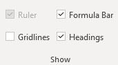
One thing I did to help make the form cleaner from the beginning was to turn off gridlines. You can do that by going to the View tab and unchecking Gridlines under the Show group:
This will make your form look more like a form and less like a regular Excel sheet. Another thing you can do is in that same section, unselect the Formula Bar and Headings, which will add more white space and are unnecessary if someone is just filling in a form. However, you may want to save this for the end when your form is done.
Since an Excel form can come in all shapes and sizes, the one thing that may help you in the design process is to set every column to a width of 2. This way, it will be easier to maneuver in case one field needs to be bigger than another without having to try and force everything to be a similar length.
As for the input fields, there are a few things you will want to do:
Make sure they are long enough. A good way to test this is by entering a long value, or what you might think will be the longest value into each field and then adjusting its length so that everything displays correctly.
Assign a named range. This is useful to keep things organized and it will make it easier for you to refer back to the field later on if you only have to remember its name, as opposed to its cell reference.
Now, let’s move on to creating the fields in the Excel form. What you can do for text entries is to just add some outlining and highlighting to existing cells. A subtle light grey can be a good way to indicate that is an input value. And I’ll also add a border to help make these fields stand out. If you set the column width to 2, you’ll also need to merge the cells as needed.
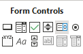
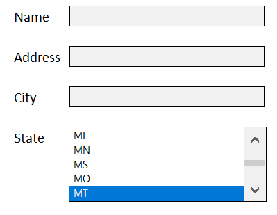
For the State field, I’ll go back to the Developer tab where I will select the option for a List Box from the Form Control section — which is next to the Radio Button on the right. When in doubt, you can hover over each control to see what it is.
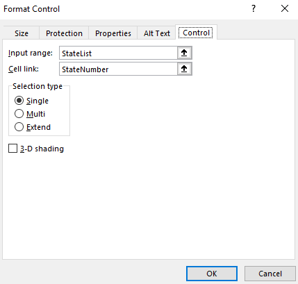
After creating the List Box, I need to populate the list plus link to a cell where the selected value should go. I’ll start with creating a range of cells for all 50 states and then assign a named range for them called StateList.
Then, I will set up a named range called StateNumber for the linked cell. Here is what the List Box control shows when I go into Format Controls and select the Controls tab:
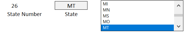
But this is not enough as the list box returns a number, not the state’s initials. I will need another cell to pull that in. I created a named range for State and here is what my sheet looks like:
In the list box, I selected MT, which returns a value of 26 in the StateNumber range. To extract the state’s initials, I need to use a formula to get that. Since I’m getting the data from one column, I’m just going to use the INDEX function. Here is what the formula in the State named range looks like:
=INDEX(StateList,StateNumber,1)
It is looking at the StateList and pulling out the row that relates to the StateNumber. Since MT is the 26th selection, that is the value that gets returned. So now my List Box is working correctly. What I like to do with these named ranges is to hide them so that the user doesn’t see all these intermediate steps. All it takes is to just move the List Box over top of these cells:
And just like that, the user only sees their selection and not the calculations afterwards. You could certainly use a drop-down list for states but I thought I would try something different and more user-friendly for this example.
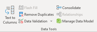
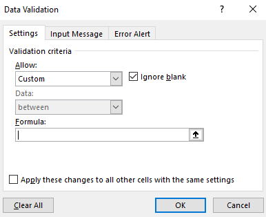
Next, let’s go to the email field. This can be tricky because although you want this to be text, you also want to control what a user enters to avoid a possible error. You can’t guarantee the email will be correct but you can take steps to at least prevent some errors. The key here is going to be to create a data validation rule. There are two things that should be present in email addresses: the @ sign and a period. To create a data validation rule, select on the cell and click on Data Validation under the Data tab:
There are many rules you can set up such as limiting the entry to fall within certain dates, making sure it is a whole number, or that it is from a drop-down list. But this situation is unique and will require a custom formula.
To check for both the period and the @ sign, I will need to use the FIND function and check that the value is a number (which means that it was found). Here’s how that looks inside of an AND function:
Since I set the field to a named range of ‘Email’ it is easy to reference it without worrying about whether I have selected the right cell. If I put this calculation in the formula section, now you won’t be able to enter a value that doesn’t include both a period and an @ sign. In addition, you can also specify the error alert and determine what pops up if someone enters something different that violates these rules. However, that’s not necessary as they will get an error anyway.
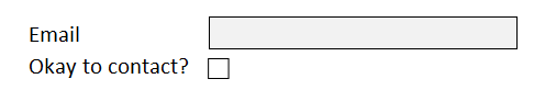
Now, I’ll add the checkbox for the email. This again comes from Excel’s Developer tab and the Form Control section. Simply select the checkbox and set up a linked cell. If you want more details on this, refer to the link at the top of this post for a more detailed outline of how to add checkboxes. I have positioned the checkbox right below the email field:
Next, I’ll add some radio buttons to allow someone to leave a rating. These are useful if you want to specify a number. Here I will go back to the Developer tab and create some radio buttons and re-size them so they don’t take up much space. Unlike the other controls, you will want them to all have the same linked cell; the purpose of radio buttons is that there is only one selection. Here is how I added them, just below the numbers that they refer to:
The radio buttons will automatically increment on their own so if you don’t pay attention to what order you’ve added them in you may get some unexpected results.
Lastly, I will add a large comment box where people can leave detailed comments. This can just be a large merged cell that takes up more space.
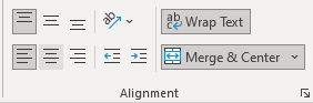
But the one thing you will want to do is make sure that Wrap Text is selected so that the comment fits in the box. And you will probably want to align it so that it is in the top left corner of the cell:
Then, when I enter the text it looks correct:
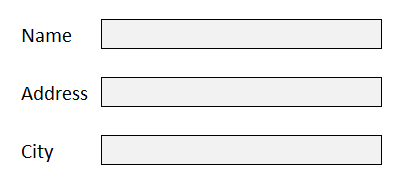
Here is what my completed form looks like:
It looks good, but we are still not done. Something needs to happen with these inputs otherwise the information goes nowhere. Let’s go over that next.
Step 3: Storing the data from the form in an Excel sheet
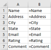
If you are sending just a single form over for someone to enter data in, what you can do is create an output page that will link to these values. Since they are all named ranges, you can easily reference back to them as such:
=Name
In the above example, if you created a named range called Name for the first field, it will pull in the data from there. On an output sheet, you might have formulas and values that look like this:
In column B I am showing the formulas. You can keep this tab hidden if you want it out of sight. You can even go one step further and make them very hidden.
Not sure whether your fields should go horizontally or vertically? In most cases, you’ll actually want them going across the top. When in doubt, consider the number of fields you have versus how much data you will be entering into the sheet. If you will have dozens of results that you will need to populate (or more), you probably don’t want to be cycling through that many columns; rows are easier to scroll through and that’s why it will probably make more sense for the fields to go across the top.
Once you have your output tab set up, you can copy the values you get back from these forms and start populating a database.
But what if you are doing data entry and need to make these entries multiple times and need the data to push to the output tab automatically after each entry? This is where you will need to set up a macro and need a button to trigger this movement onto the output tab. If you’d like to see how that code might work or just want a ready-to-use file that you don’t have to mess around with, you can download this free template.
The template will grab the input values and based on the named ranges, it will populate them in the output tab once you click the Post button on the main page. If there isn’t a named range that matches to a header on row 1 on the output tab, the data just won’t get copied over. Give it a try!
One additional step you may want to consider is locking down the form in Excel to make sure people don’t accidentally move things around or delete any formulas. You can protect the workbook and the individual sheets do that. Click here for information on how to lock cells.
If you liked this post on how to create a form in Excel, please give this site a like on Facebook and also be sure to check out some of the many templates that we have available for download. You can also follow us on Twitter and YouTube.
One way you can make a form in Excel more user-friendly is by adding checkboxes to it. There are a few different ways you can do this which I’ll cover and I will also show you how you might incorporate this into a sample pricing sheet.
What you need to do first before you can add checkboxes
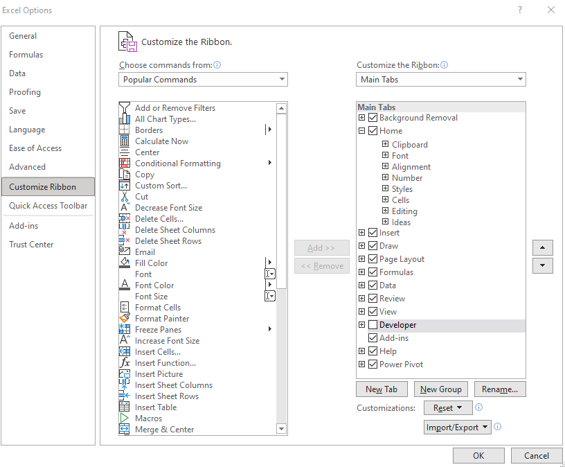
Before you can access the necessary form controls, you first need to ensure that the Developer tab is enabled on Excel. If you already have it enabled, you can skip to the next section. If you don’t see it on the Ribbon, then you will need to first go into Excel Options (on Office 365, you’ll find this on the File tab and then at the bottom there will be an Options button; other versions will vary). Once there, you’ll want to select the Customize Ribbon button. Off on the right, you will see a checkbox for the Developer tab:
Once you click OK, you should see the Developer tab on your Ribbon. If you’ve left it at the default position, it should be right next to the View tab.
Next, let’s set up add some checkboxes in Excel!
Method 1: Using ActiveX Controls
On the Developer tab, you’ll see a section for Controls and by clicking the Insert button you’ll see two areas: one for Form Controls and the other for ActiveX. There are checkboxes for both. First, I’ll cover how to use the ActiveX checkbox.
Once you click on the checkbox, your mouse will turn into a cross and what you will need to do is drag and create a rectangle/box for your checkbox to go in:
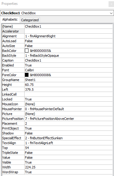
To modify the checkbox, you will need to right-click on it and select Properties. There, you will have the following options:
There are a lot of fields here but the main ones to focus on for now include the Caption field and LinkedCell. The caption is what shows up next to the checkbox. To keep things clean, I suggest leaving this blank as that will allow you to make the size of the checkbox control smaller. It will be easier to fit it inside of a cell and prevent it from taking up much room. The LinkedCell value is which cell you want to update once you click on the checkbox. There, it will return a True/False value depending on if the checkbox has been ticked or not.
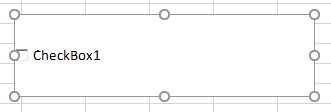
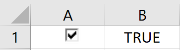
In my example, I have cleared the value of the caption and set my LinkedCell to B1 — the checkbox has been shrunk down to fix into cell A1.
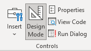
But before you can interact with the checkbox, you need to get out of Design Mode. When you first start inserting the ActiveX control, Excel puts in you this mode so that you don’t accidentally trigger the control. This is also found on the Developer tab, and you will just need to click it so that it is unselected. This is what it looks like if you are in Design Mode:
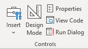
And this is with it off:
Now that it is turned off, you can test your checkbox. Initially, it may show a greyed out image like this:
This is because your linked cell doesn’t contain a true or false value yet but that will change once you click it:
If you decide you want to change how your checkbox looks, you’ll need to go back into Design Mode, otherwise clicking it will just toggle it from checked to unchecked. If you want more checkboxes, just follow these steps (or copy the existing checkbox) and reference a different linked cell. This is important because if you just copy the checkbox without entering a new cell to link to, they will all link to the same one.
Next, let’s go over the other way to insert checkboxes.
Method 2: Using Form Controls
To create a checkbox using a form control, you will again go to the Developer tab except this time you will select the checkbox from the form controls section. The process will be similar in that your cursor will convert to a crosshair and you can expand the control to be as large or as small as you need it to be.
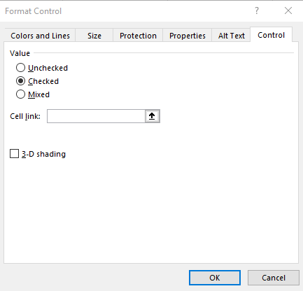
One main difference you’ll notice with the form controls — they don’t put you into design mode immediately. This means your checkbox is live right away. To set the properties, right-click on the control and click on Format Control. Here, you will want to go under the Control tab, where you will see the following:
The only thing you will need to worry about here is selecting the cell you want the checkbox to link to. You can type it in or click on the up arrow to select the cell. The 3-D shading option will make the control look more like the ActiveX checkbox, which looks sunken. Otherwise, the default form control checkbox looks as follows:
As for the caption that shows up next to the checkbox, if you want to change that, right-click on the checkbox and select Edit Text.
Overall, there isn’t a huge difference in which check box you decide to use. The form control may be preferable only because you don’t have to fumble around with the Design Mode. But either one can get the job done for you.
Using the checkboxes in a pricing template in Excel
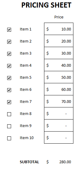
Now that you know how you can create the controls, I’ll show you an example of how you might implement them in a spreadsheet. A good one is a pricing list that you might give a customer to determine which options they want to choose. Here’s an example of what that might look like:
The way the template works is by having the linked values hidden; I don’t want the user to see a series of true/false values. And then using IF statements, I can do a lookup on a pricing table to say that if something is checked off, the price gets pulled into the pricing sheet. Since you can’t alter the linked cell without impacting the checkbox itself, using another cell to bridge the gap helps bring everything together.
If you liked this post on how to add checkboxes in Excel, please give this site a like on Facebook and also be sure to check out some of the many templates that we have available for download. You can also follow us on Twitter and YouTube.