Waterfall charts are an effective way to display data visually. They are particularly useful if you’re analyzing an income statement and want to see which parts accounted for the bulk of the change in profitability from one period to the next. In this example, I’m going to use Amazon’s first-quarter earnings of 2022, which saw the company’s bottom line fall into the red for the first time since 2015. Using a waterfall chart, we can quickly analyze what were the big drivers behind the drop in profitability — and the results may surprise you.
Step 1: Preparing the data for a waterfall chart
In a waterfall chart, you want to calculate the change in values. To start with, I’ve entered all the main income statement line items from Amazon’s Q1 earnings for 2022 and 2021, side by side:
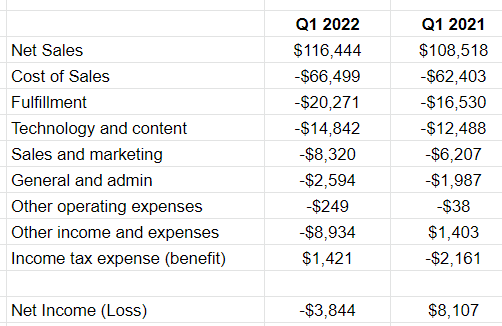
I’ve grouped some expenses together for the sake of not having too many items. With waterfall charts, there are a couple of dangers. The first is that your descriptions run too long and it’s hard to display the line items. The second is that you have too many items and your chart needs to become excessively wide to accommodate all the changes.
One thing you’ll notice here is that at the bottom I have the net income (loss) line. This is a summation of the above items to ensure that it correctly ties out to the profit or loss that the company reported. This is an important step to make sure that you’ve entered your data correctly. Expenses should be negative (outflows) while income should be positive (inflows).
The next step is to now calculate the difference between the two periods, which can be done in a change column that takes the current value and subtracts from it the prior period’s value:
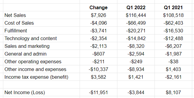
At the bottom, I’ve summed up all the changes. These figures are in millions, and so this is a significant $11.951 billion change in net income from a profit of $8.1 billion in the prior-year period to a loss of $3.8 billion.
Now that the data looks correct, the next step is to plot these values on a waterfall chart.
Step 2: Plotting the waterfall chart
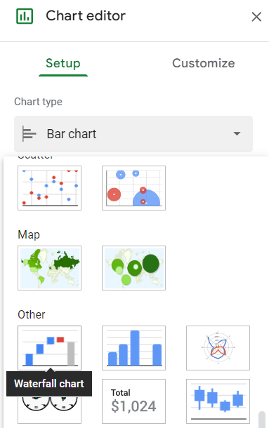
To create the chart, I’ll select the data in the change column along with the related headers. From there I can either click on the image of a chart in the menu bar or I can go to the Insert menu and select Chart. If it doesn’t detect which chart I want to use, then I can select the image of waterfall chart from the Chart type drop-down option in the Setup tab:
Now it will show this:
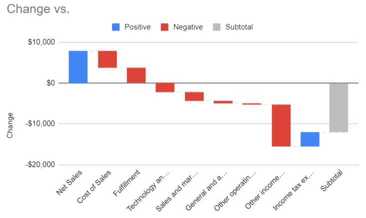
The chart looks correct, however there are multiple changes we can make to help this look better.
Step 3: Modifying the waterfall chart
To start with, I’m going to modify the colors. While red makes sense for negatives, I’m going to change the blue to green, to better reflect a positive inflow of cash. This can be done by double-clicking on the chart and in the Chart Editor, going to the Series section, and scrolling to the Positive label. There, I can change the fill color:
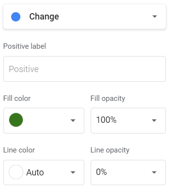
This also gives me the option to change the line color and transparency using the opacity percentages. At this point, I’ll remove the legend since the green and red values are sufficient to tell you whether it was a positive or negative change.
The next thing I’ll change is the grey subtotal bar at the end. Ideally, you would have a starting and ending point on the chart to better show where one period started and where the other ended. But by default, the subtotal just adds up the sum of the change. To adjust this, I’m going to add a row to my table above Net Sales, called Q1 2021 Net Income. In the change column, I will simply put the amount, no change. This is what my updated table looks like:
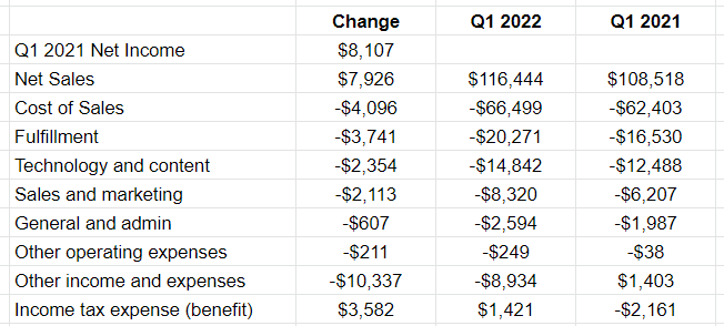
If the chart doesn’t automatically update, you may need to update the range. This can be done by double-clicking on the chart and in the Setup section, modifying the range for the Series and/or the X-axis. But the bar charts for the totals still need adjusting. The first one shows green. To fix this, I’ll double-click on the chart to edit it and under the Series section, select the box to Use first value as a subtotal. Now the first bar chart will turn grey.
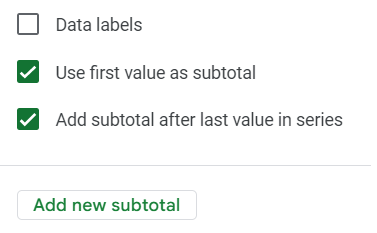
In the same section, I’ll also uncheck the box that says Add subtotal after last value in series. That will remove the last bar chart. Then, I’ll click on the option to Add new subtotal. Select to add it after the last item. By doing this, I can now specify the name of that total, as opposed to just showing ‘Subtotal.’ In this space, I’ll enter Q1 2022 Net Loss.
The only thing left now is to adjust the chart and stretch it out sufficiently so that the labels display horizontally. And I’ll also add a title — this can be done in the Customize section and under the Chart & Axis Titles area. Here is my completed waterfall chart in Google Sheets:
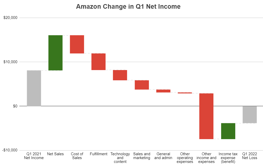
Now, from looking at this, you can see that Amazon was still at a profit until it reached the other income and expenses line. This would still require additional digging to see the reason for the loss, but it would point us in the right direction. And Amazon’s breakdown of these other expense items tells us that it incured a $7.6 billion loss on its investment in Rivian Automotive — the key reason its net profit from a year ago turned into a loss. While other expenses increased, they alone weren’t enough to pull the company into a net loss position.
If you liked this post on How to Make a Waterfall Chart in Google Sheets, please give this site a like on Facebook and also be sure to check out some of the many templates that we have available for download. You can also follow us on Twitter and YouTube.


Add a Comment
You must be logged in to post a comment