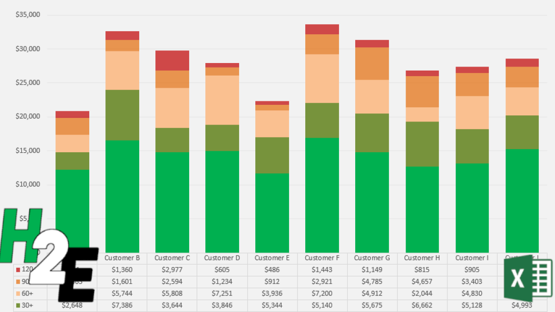
An aged accounts receivable (AR) report can help you identify accounts with overdue receivables. It can help you stay on top of your AR to ensure that you are prioritizing collection efforts based on their relative ages.
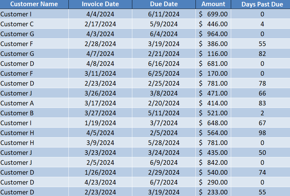
Here’s a sample of what your AR data might look like, showing customers, invoice dates, due dates, and amounts:
Using a pivot table, we can summarize these details to determine how old the AR is, and create a report to help us stay on top of overdue accounts.
Creating the accounts receivable table
First, I’ll convert this data into a table, and call it tblAR. By creating a table, it will make it easy to add to the data and update it, and for the pivot table to refresh easily as new data is entered. Next, I’ll add a column to calculate the number of days past due. The formula for that is as follows:
=IF([@[Due Date]]>TODAY(),0,TODAY()-[@[Due Date]])
Now my table shows the number of days past due. And since it uses the TODAY() function, it will automatically update.
Next, I need to create a lookup table for the aging, which I’ve setup as follows:
Then, I’ll create a lookup formula to determine what the description should be based on how old the receivable is. In my spreadsheet, the lookup table is in columns H and I. The following formula will pull in the ‘description’ field:
=VLOOKUP([@[Days Past Due]],H:I,2,TRUE)
Now I have a complete table that shows the correct aging category based on the days past due:
Setting up the pivot table
Once the data is ready to go, the next step is to create the pivot table. When putting the Aging Category in the Rows section and the Amount in the Values section, this is what the pivot table looks like:
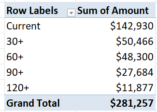
This gives me a broad high-level overview of the overall aging. However, I can also set this up so that it breaks it down by customer. For that setup, I can put the Customer Name field in the Rows section, and the Aging Category going across in columns:
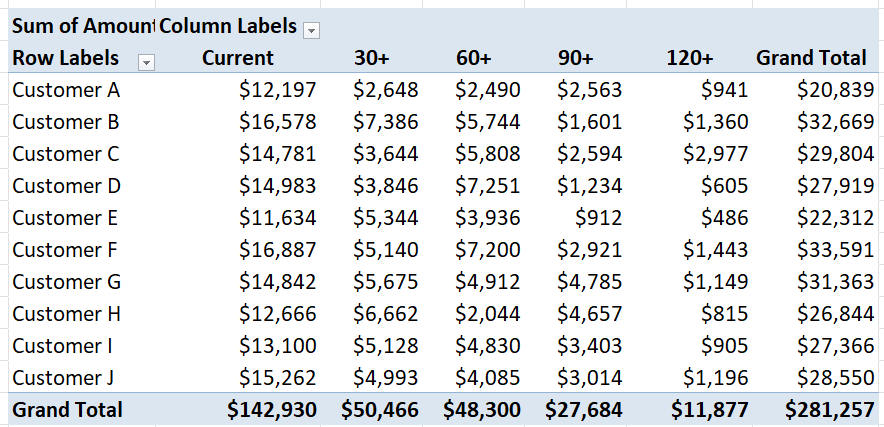
I have dragged the ‘Current’ value to the front to ensure that the text value is at the start. Next, I will create a chart to help visually show the aged AR data. Since there are multiple aging categories per customer, a stacked column chart is ideal in this situation. Then, after applying custom formatting colors to each aging category, I have a visual representation of the AR aging chart:
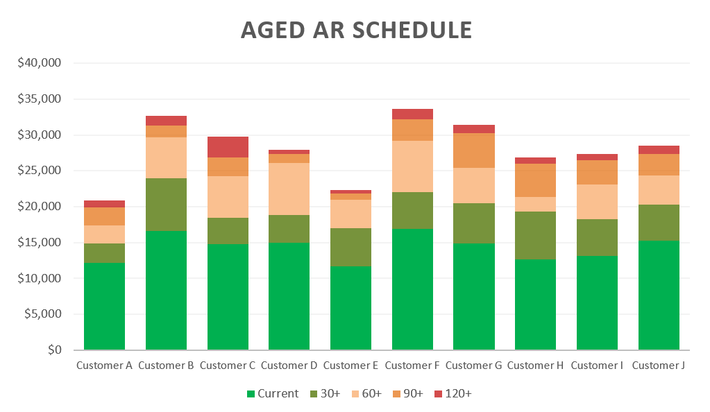
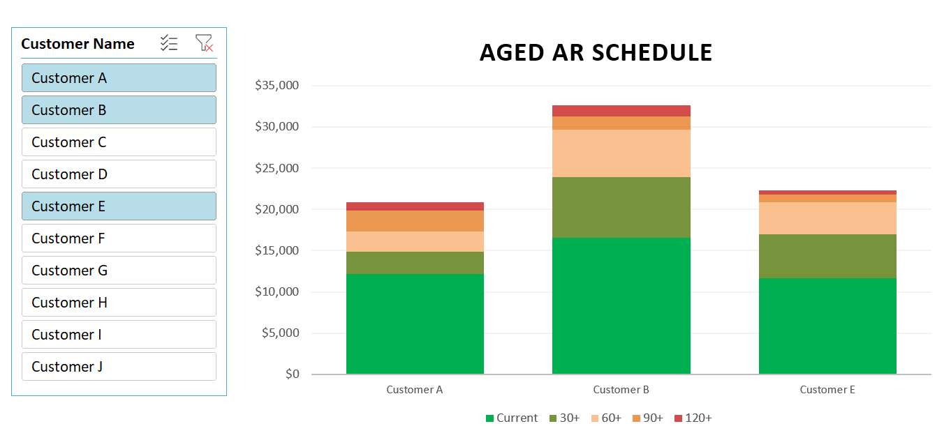
If you have a lot of customers and can’t fit all of them on a single chart, you could insert a slicer to make it easy to select one or multiple customers.
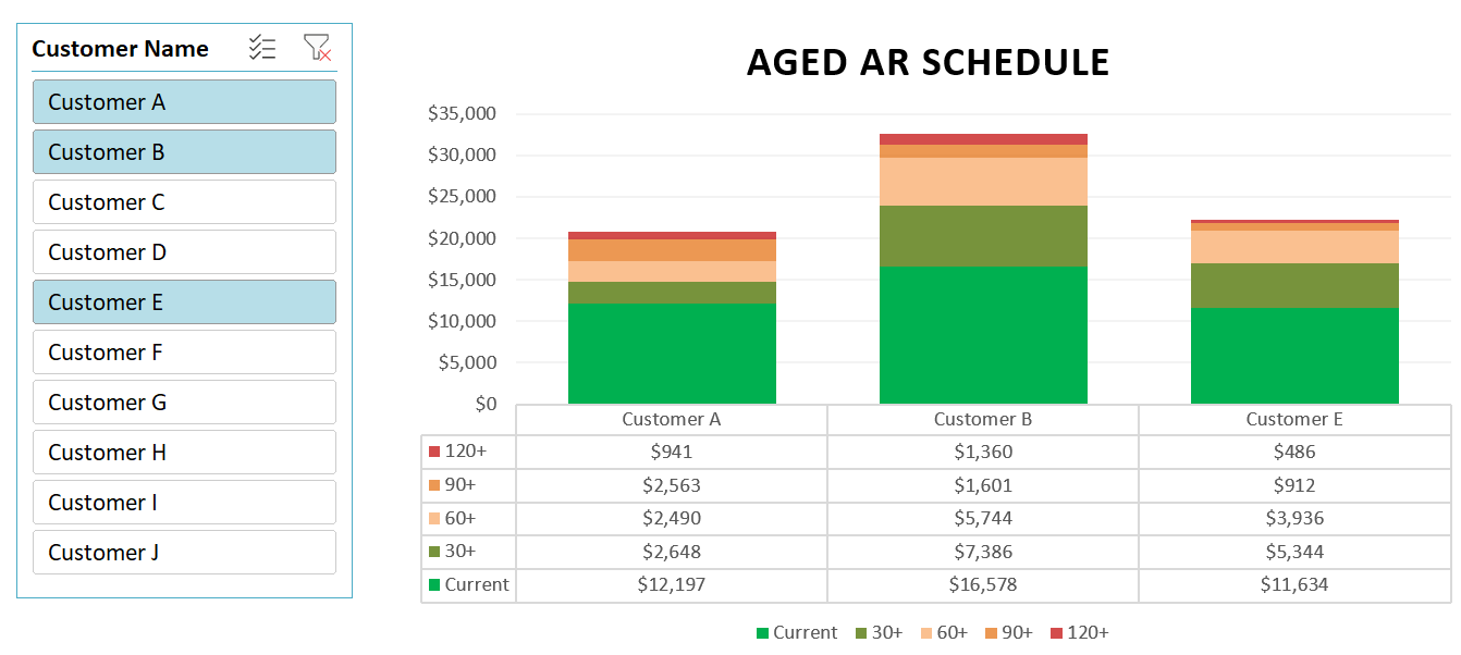
To help visualize this further, I can also add a data table that shows the breakdown of the different aging categories. To enable this, select the chart, click on the Design tab, select Add Chart Element and select a Data Table With Legend Keys:
If you like this post on How to Create an Accounts Receivable Aging Report in Excel please give this site a like on Facebook and also be sure to check out some of the many templates that we have available for download. You can also follow me on Twitter and YouTube. Also, please consider buying me a coffee if you find my website helpful and would like to support it.

