Creating charts and graphs is a great way to display data visually and make it easier for users to read and understand it. However, in some cases, you don’t want or need a big chart, and something smaller would be more useful. This is where sparklines can come in to play and help you get your point across without a big chart in the way. Below, I’ll show you how to quickly and easily make sparklines in Excel that can quickly add context to your data.
*Please note that sparklines were a new feature of Excel 2010. If you’re running an older version of Excel, you won’t have these options available*
Getting the data set ready
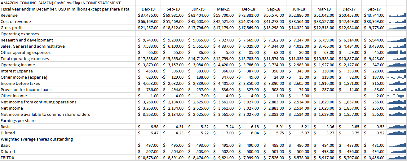
I’ll show you how to create sparklines using my data, which is a download of Amazon’s income statement over the past 10 quarters. Here’s what it looks like:
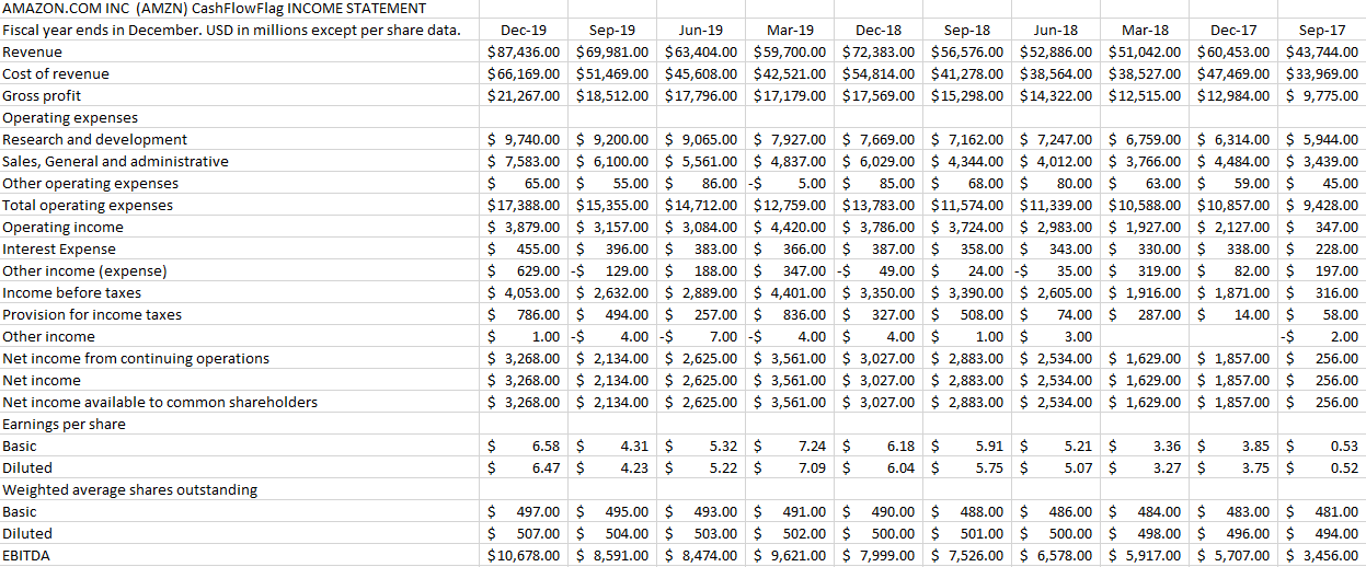
From afar, it’s not the easiest thing to analyze to identify any trending. And ideally, we’d like to have some trending shown for each major income and expense category. Adding a chart just isn’t useful in this case, and this is where sparklines can help.
Creating sparklines in just one click
I’ll start by selecting the row that has revenue and then on the Insert tab and under the Sparklines category I’ll select the Line button:

It will then show me the range that I’ve selected and it will allow me to select where I want to place my sparklines:
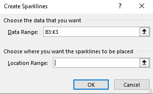
In most cases, you’ll probably want this right next to your data. And that’s what I’m going to do — put it in the next cell to the right of the data, L3. Now it’s created my sparkline:

But there’s just one problem:

The sparkline is showing a downward trend. Amazon’s revenue has been increasing, not decreasing. One solution is to re-arrange my data, but that’s not necessary. To fix this, I select the sparkline and then under the Sparklines tab I click on Axis and select the option that says Plot Data Right-to-Left:
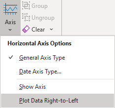
Now my sparkline looks a lot better:

This is an optional step and it depends on which direction you want your sparkline to go in.
Applying sparklines to other rows
Now that I’ve got one sparkline setup, it’s time to set up the sparklines for the rest of the income statement line items as well. Surprisingly, this is as easy as just dragging the sparkline down and copying it down to the other rows:
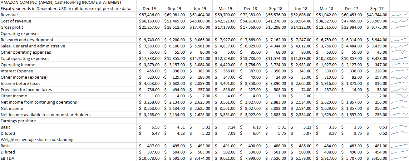
One of the cool features of sparklines is you can quickly add trending to every item without having to add a separate chart or graph for each row. And even for the rows where there was no data, it doesn’t result in an error, either.
If you prefer a column chart to a line chart, then you can easily make the change as well in the Sparklines menu:

It will quickly change the format of the charts:
There’s also a win-loss chart that you can use if you have negative and positive values. However, in most situations, you’re going to use either line or column charts, especially when you’re looking to show trending. But
You can change the color and other features of the sparklines just like with other charts. And all those options are available from within the Sparklines tab.
If you liked this post on how to create a drop-down list in Excel, please give this site a like on Facebook and also be sure to check out some of the many templates that we have available for download. You can also follow us on Twitter and YouTube.


Add a Comment
You must be logged in to post a comment