In a previous post, I showed how to make a forecast chart in Excel with a dotted line. This time around, I’m going to go one step further and show you how to create a chart that shows a range of possible values. This is useful in the event that you want to show some flexibility in your forecast and where providing a range might be a more realistic option.
For this example, I’m going to project a company’s future dividend payment. Below, I have a a record of the past dividend payments along with the annual rate of increase:
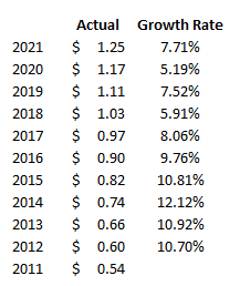
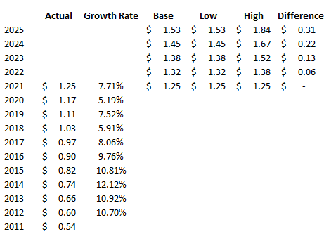
In order to create a range, I’m going to set both a high rate of growth and a low one. Since the company has made 10% increases in the past, I’m going to use that as the high. And for the low rate of growth, that will be 5%. Using those different rates, I can set up additional columns for what the dividend would be if the low rate were used and if the high one were applied. I will also create a column to calculate the difference between the high and low amounts, as well as one for a base amount — which will just be equal to the low amount. This will be used for stacking the difference on top of it to create the desired area chart:
Creating the chart
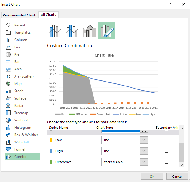
Now that the data is set up, I’m going to start creating the chart. Using a combination approach, I’ll set a line chart for the actual, low, and high columns. And for the base and difference amounts, I will set those to be stacked area charts. The growth rate I’ll leave as is because I will remove that once the chart is created:
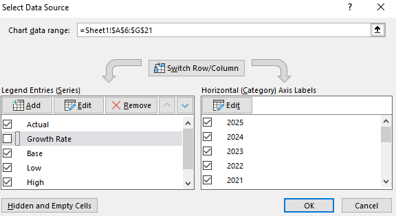
Next, I’ll right-click on the chart and click on Select Data. From the next screen, I will untick the box for the Growth Rate:
Then, I will right-click on the x-axis, select Format Axis and select the option to put Categories in reverse order. Now my chart looks as follows:
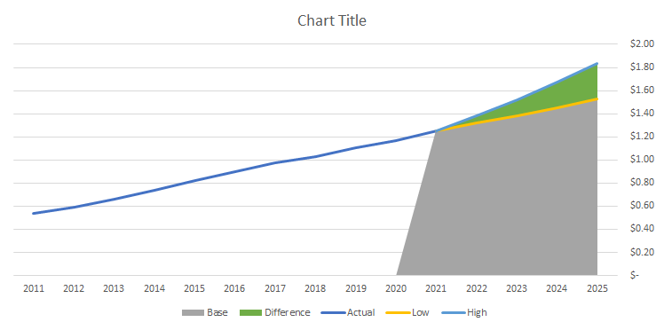
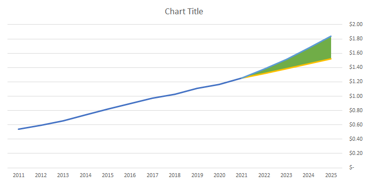
Now, I’ll remove the legend and format the base color, which is currently grey, to a blank fill color:
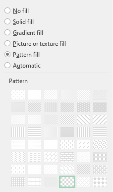
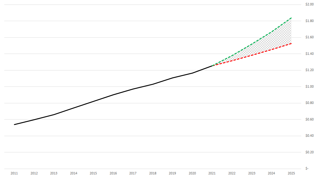
I’ll change the line color for the high amount to green, the low amount to red, and apply dashed lines to both. For the actuals, I’ll set that to a black line. And for the area chart that is in green right now, I will apply a Pattern Fill and use a checkered pattern:
With all those changes, my updated forecast chart now looks like this:
If you liked this post on How to Make a Forecast Chart in Excel With a Dotted Line, please give this site a like on Facebook and also be sure to check out some of the many templates that we have available for download. You can also follow us on Twitter and YouTube.


Add a Comment
You must be logged in to post a comment