In Excel, there are multiple different stock charts you can create. All you need is some combination of the date, opening price, high price, low price, closing price, and volume to generate what you need. In this post, I’ll show you how you can utilize Power Query to pull that data in and transform it, without having to apply any manual changes to it every time. For an overview, you can check out this post on How to Get Stock Quotes From Yahoo Finance Using Power Query. I’m not going to repeat those steps and will assume that you’re familiar with that process.
In this example, I’ve downloaded the stock prices for Apple (NASDAQ:AAPL) for the month of October 2021:
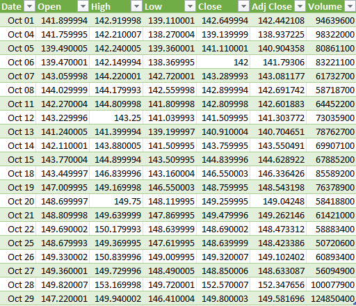
This already has all the data that is needed to create the four types of stock charts in Excel:
- High-Low-Close
- Open-High-Low-Close
- Volume-High-Low-Close
- Volume-Open-High-Low-Close
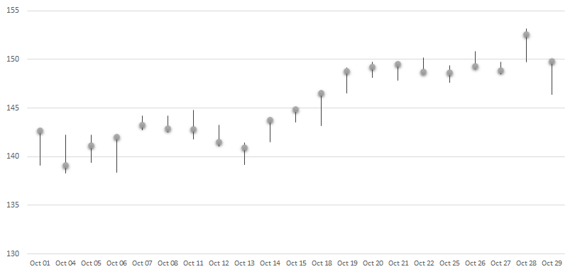
The key to making these different charts is just ensuring that you’ve got the correct fields in your download, and in the right order. For the High-Low-Close chart, you only need three fields to generate the following chart:
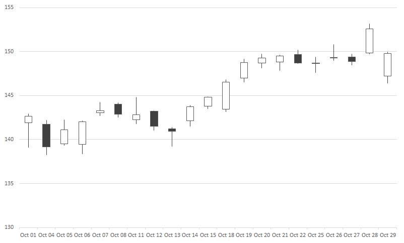
If you’re creating the open-high-low-close chart, all you need is to add the open field to the data set:
And for the volume-high-low-close chart, it’s just the volume instead of the open that goes at the start, and then you get something that looks like this:
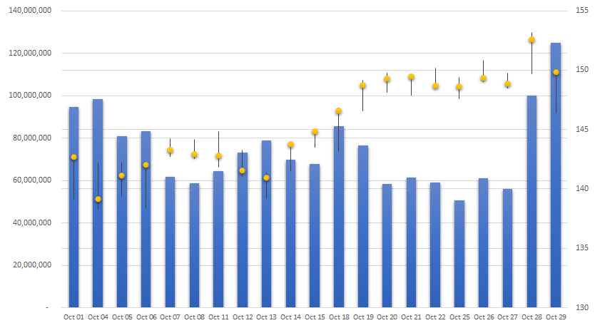
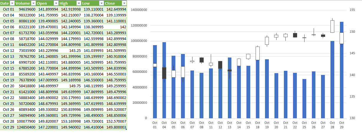
The last chart includes both the volume and the open before the high, low, and close values:
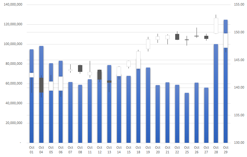
These charts are fairly straightforward to generate once your data is in the right order. But rather than moving around different fields, you can make all the changes within Power Query so that right when your data loads, it’s in the correct format.
Using Power Query to adjust your download
To modify an existing query, go to the Data tab and select Queries & Connections. Off to the right, you should see your query, where you can right-click and Edit it:
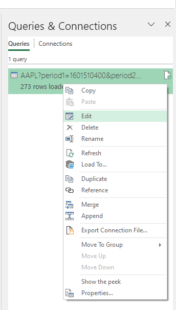
The first thing I’ll edit is the date range. In my earlier post, I just downloaded the full year of data. But if I want to filter only for October, then I can click on the drop-down for the Date field and select Date Filters to filter Between a range of dates.
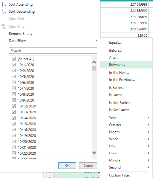
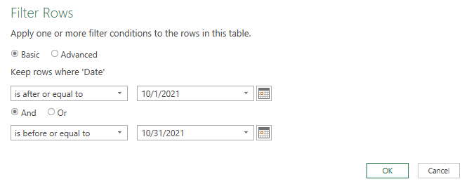
Using the calendar icon, I can specify the range of dates I want to include in my download:
Next, if I want to just include the data for the most basic chart, the high-low-close chart, I’ll right-click on the Open, Adj Close, and Volume columns to remove them. Then, I’m left with the following:
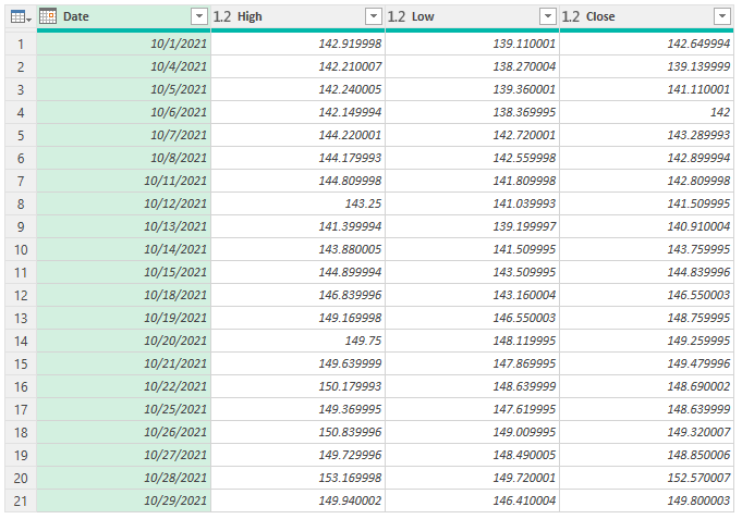
Now, if I were to load the data in Excel, I would already have all the columns I need to create the chart:
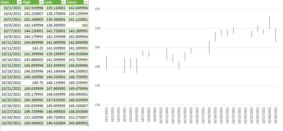
Note: if you want to get rid of the gap in dates on the chart, click on Format Axis and for the Axis Type, select Text axis:
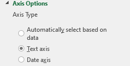
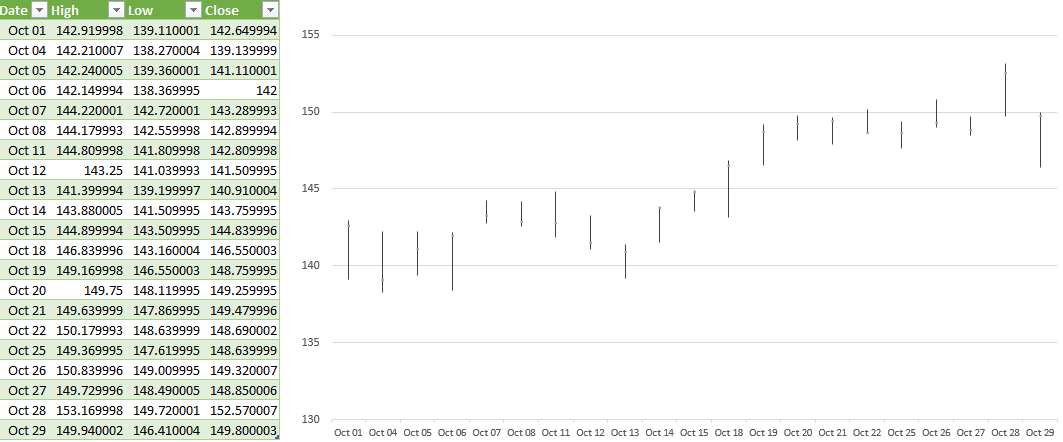
This prevents Excel from trying to fill in any missing dates from your data set Another thing you may want to do is format the date field so that it is a custom format showing MMM DD so that it saves space:
Now, let’s go back into Power Query and this time create the more complex download, for the volume-open-high-low-close chart. I’ll start by removing the last step I applied which removed more columns than I need for this current download. To remove any steps in Power Query, click on the ‘X’ next to it:
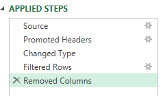
In this example, it’s just the Removed Columns step I will eliminate. The only column I need to remove from the download this time around is the Adj Close. So that’s what I’ll do, right-click and remove that column. However, my table still is not in the correct order:
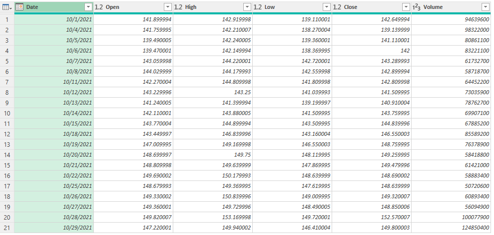
The Volume column needs to go before the Open column. This is as easy as just dragging the column and putting it in front:
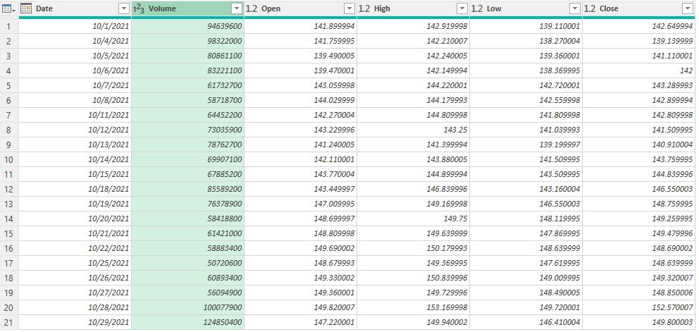
Now that it’s in the right order, I can load and close this into Excel. And now, the volume-open-high-low-close chart can easily generate:
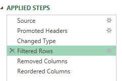
Suppose I want to adjust my chart to include data from September as well. Again, I can go back to edit my query. This time, I’ll select the gear icon next to the Filtered Rows step:
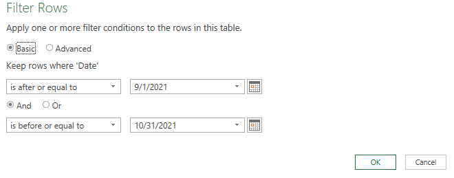
There, I can just modify my date range using the calendar:
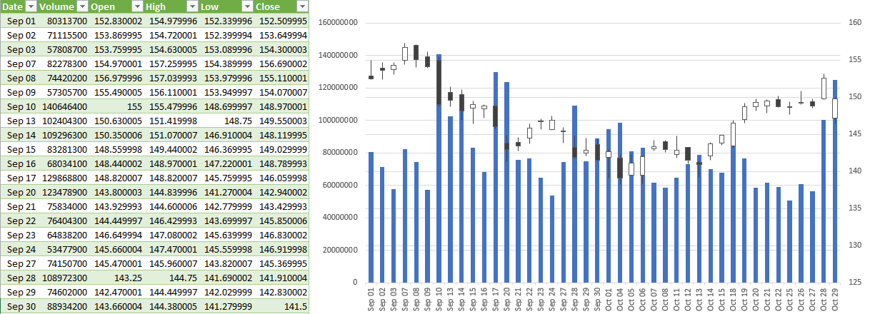
Now, re-loading the data into Excel automatically updates my chart with a simple refresh:
The beauty of this is this query will update with new data and your chart will also update, taking out the manual steps of having to make any changes yourself. And if you incorporate named ranges like in my post covering pulling stock prices, then the data will easily refresh based on the variables that you’ve entered.
If you liked this post on How to Create Stock Charts in Excel Using Power Query, please give this site a like on Facebook and also be sure to check out some of the many templates that we have available for download. You can also follow us on Twitter and YouTube.


Add a Comment
You must be logged in to post a comment