Conditional formatting cells can be an effective way to highlight values so that they can easily stand out. You can apply similar logic to charts, and in this post, I’ll show you how you can use conditional formatting with Excel charts. By doing so, you can highlight gaps and key numbers.
Create more than one series to categorize your results
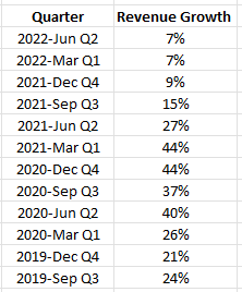
Excel’s conditional formatting isn’t designed to work on charts. But one way you can still achieve the same results is by categorizing results, and creating a series for each category. Here’s an example, using Amazon’s sales growth. Below are the year-over-year growth rates it has achieved over the past 12 quarters:
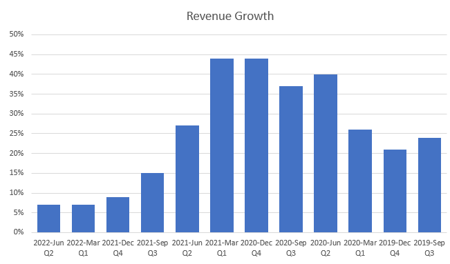
Charting the data out would show the highs and lows effectively:
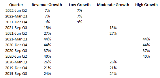
However, suppose you wanted to highlight the high-growth periods (30% or more), with the more moderate ones (15%), and the quarters which were below that. To do that, I’m going to add a few more columns and use IF statements to populate the columns based on the growth rate.
Now, if I populate these values on a chart, they shows up like this:
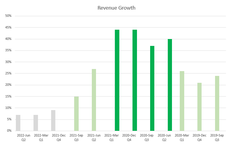
These column charts are skinnier and that’s because they are taking up more space as there are three different series for each quarter. To get around this, I can just change the charts so that they are stacked. Since only one of these columns will ever contain a value, there’s no danger they will actually ever stack. But by changing the chart type, they won’t take up as much space.
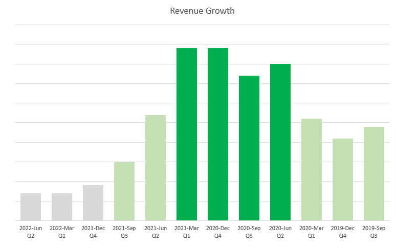
The advantage of this approach is that you don’t even need to rely on the axis to determine what range the growth rate falls within. Although you have to create additional columns by doing this, you can hide any columns that you don’t need to see. You can apply this type of logic to other types of charts as well.
If you like this post on How to Apply Conditional Formatting to a Chart in Excel, please give this site a like on Facebook and also be sure to check out some of the many templates that we have available for download. You can also follow us on Twitter and YouTube.


Add a Comment
You must be logged in to post a comment