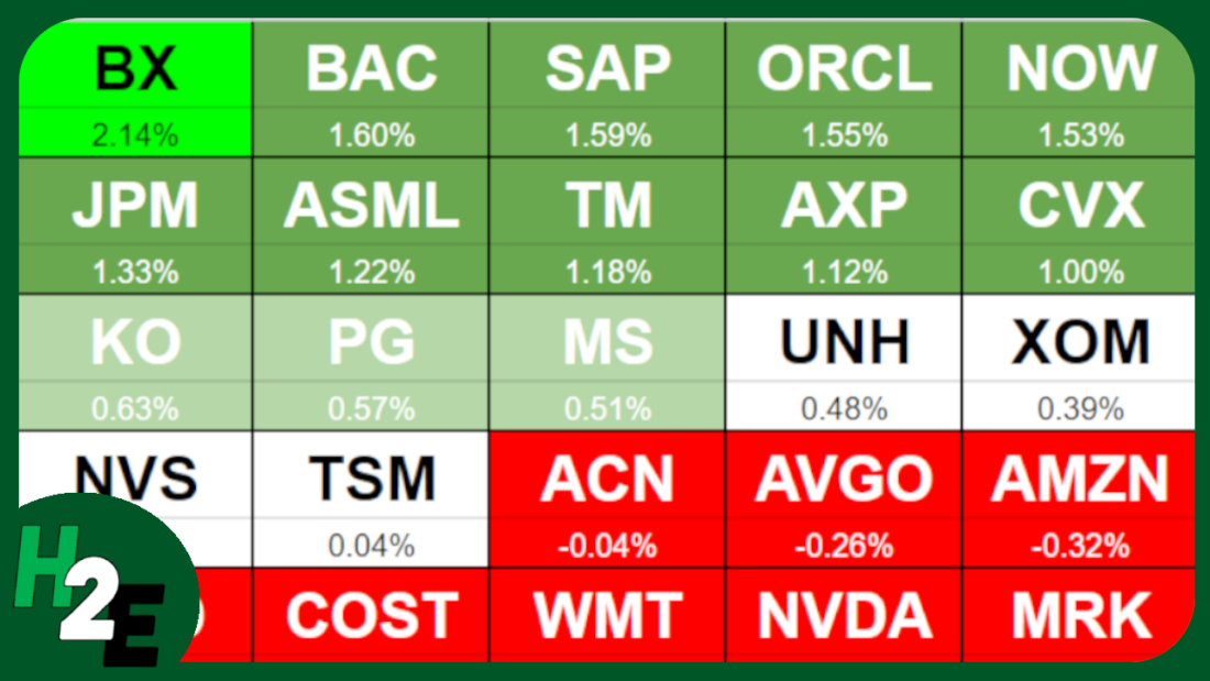
Heat maps can help you easily identify high and low values. You’ll often find them to display stock prices to show which stocks did well, and which ones didn’t. They can also make it easy to see whether it was a good or bad day on the markets when looking at a list of stocks. In this post, I’ll show you how to create a heat map in Google Sheets to do this.
Step 1: Populating your list of stocks
To start with, I’m going to need a list of stocks to track. I’m going to use the top 20 most valuable stocks as of today’s date and put them into a list:

Step 2: Calculate the percentage change
Next, I’ll need to setup the percentage change. This can be either the percent change from the previous day, or I could calculate how a stock has done over a specific timeframe, such as a 12-month period. In Google Sheets, you can use the GOOGLEFINANACE function to track the percent change from the previous day. Here’s what that formula would look like, assuming I want to calculate this for the ticker symbol in cell A2:
=GOOGLEFINANCE(A2,”changepct”)
This will return a value to display the percent change.
I’m going to use a more complicated example, however, to show how the stock has performed over the past year. First, I’ll pull in the current stock price, using the following formula:
=GOOGLEFINANCE(A2,”price”)
The trickier part is to pull in the price from a year ago. To go back 365 days, I can set the start date equal to today’s date minus 365 days:
=GOOGLEFINANCE(A2,”price”,TODAY()-365)
The problem is that this returns a table, occupying two rows and columns:

To ensure I’m just pulling in the closing price, I’ll use the INDEX function to grab the value from the second row and second column:
=INDEX(GOOGLEFINANCE(A2,”price”,TODAY()-365),2,2)
Now, to calculate the percent change, I will take the current price and divide it by the historical price:
=GOOGLEFINANCE(A2,”price”)/INDEX(GOOGLEFINANCE(A2,”price”,TODAY()-365),2,2)-1
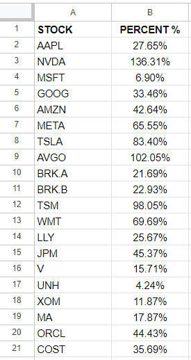
I add the -1 at the end to get just the percent change. Now, if I format my values in percentages, I can see how the stocks have performed over the past 12 months:
Step 3: Ranking the values
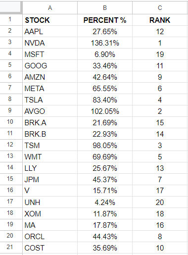
Using the RANK function in Google Sheets, I can easily determine which stocks were the best and worst performers in the range. The following formula just takes the percentage value in column B and compares it against all the values in that column:
=RANK(B2,B:B)
By copying this formula down, I can now see a ranking of all the values:
Step 4: Populate the stocks in order of their performances
Now that the data is setup, I can start arranging the values in order of largest to smallest. To do this, I’m going to use the INDEX function along with the MATCH function to extract the stocks based on their performances. Here is what the first formula will be:
=INDEX($A:$A,MATCH(COLUMN(A1),$C:$C,FALSE),1)
I use the COLUMN function because what I am going to do is drag this formula to the right, so that my largest values go from left to right. And as I copy the formula, A1 will become B1, then C1, and so on. The purpose of this is to increment the function to get the next value. Here is what my table looks like for the first five values:

These were the five best-performing stocks that were in my list. Below these values, I’m going to also pull in the percentages. This is accomplished through the following formula:
=INDEX($B:$B,MATCH(COLUMN(A1),$C:$C,FALSE),1)
Now I have a list of the top ticker symbols and their percentage gains:

Step 5: Creating conditional formatting rules
I have the values setup and next I’ll need to create conditional formatting rules to display different colors based on their relative performances. I’ll use a bright green for the best performance, and gradually show a white color when the values are close to zero, and red when they are negative.
I’m going to setup a table which shows the different thresholds I want to track, so it’s easy to change these conditional formatting rules right on the spreadsheet:
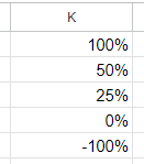
This is my table of values in column K. To setup the rules, I’m going to select the ticker symbols which I ranked in step 4, and create the following conditional formatting rule to start with:
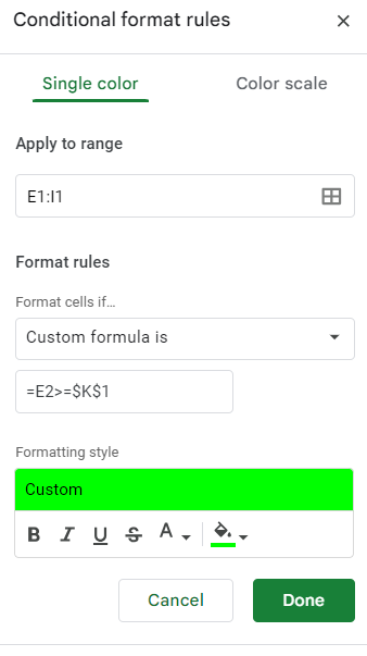
I’m going to repeat these steps for the values in K2, K3, K4, and K5. I’ll adjust the colors to differentiate between the colors ranges I specified earlier. I use the same formula but simply adjust the cell I’m comparing to:
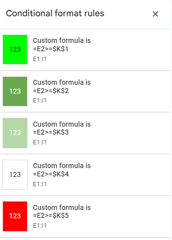
One thing to note here is that the value I’m using as my comparison is in row two, which is where my percentages are. This means for the conditional formatting rules in the first row, Google Sheets is looking the row below, which contains the percentages.
I’ll need to create another set of conditional formatting rules for the actual percentages themselves in row two. In order to avoid disrupting the formulas and the logic for the first row, I’ll need to create these rules from scratch again. It’s important not to just copy the formatting rules as Google Sheets will end up misinterpreting what I want it to do.
After selecting the values in E2:I2, I create the same conditional formatting rules. The one key difference is that this time I’m referencing the values in row two, not the row below. Once that’s setup, you should now see the same conditional formatting rules applied to both rows:

Step 6: Create borders and setup additional formatting
Before I copy over the formulas and conditional formatting to more rows, I’m going to setup additional formatting and borders. I’m going to make the ticker font larger and bold. And I’ll also outline a border for each stock and its percent change. Here’s what my tickers look like after making these changes:

Step 7: Copying the formatting rules and formulas to accommodate more stocks
I created a row of top 5 stocks but I’m going to expand this so that I have four rows of five stocks each, so that I’m capturing all 20 stocks in my list. To do this, I’m going to copy the cells in E1:I2 multiple times:
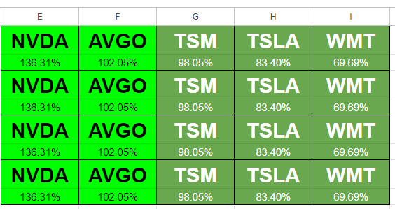
I’ve copied the formulas but I need to adjust them so that they aren’t all starting from the top-ranking stock all over again. Here’s how I’m going to adjust this. For the formulas in cells E3:E4, I’m going to add five so that they start at the sixth value. This is the updated formula in E3:
=INDEX($A:$A,MATCH(COLUMN(A3)+5,$C:$C,FALSE),1)
Now I’m going to do the same thing for cell E4. Once I’m done, I’ll copy the formulas across and now my second row is updated to show the stocks in the 6th, 7th, 8th, 9th, and 10th positions:

For the next row, I’ll add 10 to the formulas in column E. Then copy those across. Repeat the same process for the next set of rows and add 15, and do the same. Here’s what my updated table looks like:
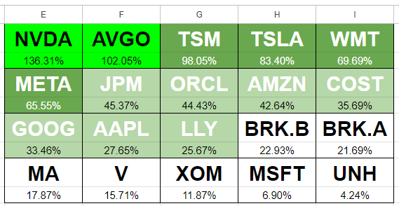
Now my heat map is setup to show the percent changes. But as you can see, there’s not a lot of variability here. I’m going to change my values in column K as follows: 100%, 60%, 30%, 20%, -100%. I always leave the last one to -100% to ensure it captures everything else. With the updated rules, now my heat map looks as follows:
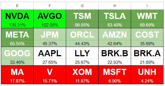
Although the values in red are not negative, based on the rules I’ve set out, it highlights the lowest-performing stocks in this list as red, and thus, the sheet follows the rules correctly. You can expand this to include more stocks or to track daily changes or other values.
If you like this post on How to Create a Stock Heat Map in Google Sheets, please give this site a like on Facebook and also be sure to check out some of the many templates that we have available for download. You can also follow me on Twitter and YouTube. Also, please consider buying me a coffee if you find my website helpful and would like to support it.

