3dbubblechart

How to Make 3D Bubble Charts in Excel

Regular 2D charts in Excel can be useful if you want to compare two metrics. But if you want a third, that’s where knowing how to make 3D bubble charts can be incredibly effective. It can allow you to pile in a lot of data into just a single visual. It can take a bit longer to set up the chart just how you want to, but it can pay off in the end. Here’s how to do it.

Determining which values to plot where

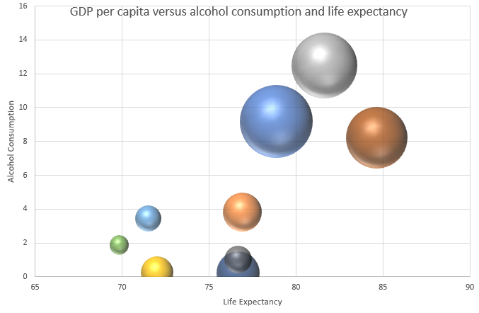
In a 3D bubble chart, you have an X and Y axis, plus you can also specify the size of the bubble. The field that contains the largest variances will probably be the most appropriate one to use as the bubble size, since that will make it easier to differentiate large values from smaller ones.

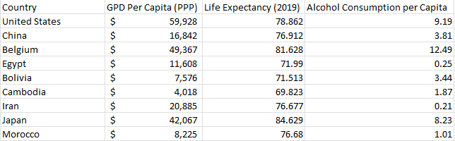
In my example, I have country data that shows GDP per capita, life expectancy, and alcohol consumption per capita. I suspect the biggest variances might be in GDP per capita, and so that’s what I’m going to use as my bubble. Then for the X and Y axis, I’ll plot life expectancy against alcohol consumption. Here’s an excerpt of what my data looks like:

Country data loaded into Excel showing GDP per capita, life expectancy, and alcohol consumption.

Be selecting in choosing which values to plot

In a 3D chart, the size of the bubbles can get large, and that means there can be limited space to work with. For that reason, it’s important not to plot dozens of different data points. In my data set, I have more than 160 countries, which is far too many to plot on a 3D chart.

One way to filter a large data set like this is by creating a separate table, one that utilizes a lookup to extract the same values. This can be a useful way to dynamically update your data. You can use the VLOOKUP function to extract the data. And rather than doing it one by one, you can use VLOOKUP to extract multiple columns through just a single formula. My filtered data set has the following countries in it:

Filtered table showing country GDP, life expectancy, and alcohol consumption.

Plotting the data onto a 3D bubble chart

The next step no involves creating the bubble chart itself. For this, go to the Insert tab and select the bubble chart from the X Y (Scatter) section. Initially, it may not look correct, but that’s fine. Remove all the series and start adding them one by one. To modify the data, right-click on the chart and click on Select Data. Click on Add to add a new series, where you will see the following places to enter data:

Adding a data series to a 3D bubble chart in Excel.

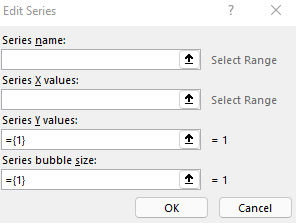
In my example, here’s how I will fill it out:

  • Series Name is the name of the country
  • X values will relate to the life expectancy
  • Y values will relate to the alcohol consumption per capita.
  • Series bubble size is the GDP per capita

Repeat these steps for each of the data points you want to add to your chart. Although this may be cumbersome, by using the VLOOKUP, these values can quickly be updated and changed by simply changing the lookup value (in my example, it’s the country name).

3D bubble chart in Excel.

If you liked this post on How to Make 3D Bubble Charts in Excel, please give this site a like on Facebook and also be sure to check out some of the many templates that we have available for download. You can also follow us on Twitter and YouTube.

H2E GoogleTrends

How to Get Google Trends Data Into Excel

Want to find the latest trending items on Google? You could go to trends.google.com, or you could import that data into your Excel file. In this post, I’ll show you how.

To get the latest trending topics on Google, you can go to https://trends.google.com/trends/trendingsearches/daily?geo=US. You can adjust the string at the end if you want to see trends from a different country, but the link I’m using here is for the U.S.

Use Power Query to import the data

One of the most effective ways of getting data into Excel from an external site is by using Power Query. The key is finding the right link. On the Trending Searches page in Google, there’s an RSS button that you’ll want to click on:

RSS button on the Google Trends page.

Then, you should see the following URL:

https://trends.google.com/trends/trendingsearches/daily/rss?geo=US

That is the URL you’ll need to use in Power Query. Back in Excel, go to the Data tab and select the From Web button. Put that link in the following box:

Entering the web location for a new Power Query session.

When the Power Query window loads up, you might be tricked into thinking there is nothing there:

Power Query showing only one table.

Expanding the data

The data is there, it’s just contained within a table. Click on Transform Data at the bottom of the Power Query window. Then, click on the icon in the channel field that shows that there are items within there that you can expand:

Selecting the icon to expand a table in Power Query.

Click on the OK button in the following dialog box where you can specify all the columns you can add. There are many embedded tables here and if you want to see what’s contained within them, simply click on one of them that says Table. For example, if I click on the Table shown under the channel.item field, I see all the values contained within that table:

Power Query showing a preview of an embedded table.

Within here, I can see that there are still multiple tables that I can expand, and there’s also a title column that looks to contain the actual trending item name. You can continue expanding depending on the fields you want to see. You can expand everything, and then at the end select which columns you want to keep. If you do expand everything, you’ll end up with some unnecessary columns such as channel.link which contains the same repeating value. To remove a column, simply right-click it and click on Remove:

Removing a column from Power Query.

Repeat this step for all columns you want to eliminate. Alternatively, you can select the columns you want to keep, and then select the option to Remove Other Columns. Either approach will work the same. The columns that I’ve chosen to keep include the title, the number of searches, the two description columns, as well as the time of publication:

Power Query window after removing several columns.

Cleaning up the table

There are a few items I can clean up to make this import nicer into Excel. The first is to make those numbers actually read as numbers. Because of the + sign at the end, I can’t convert them into whole numbers. What I will do is select the entire column, and then click on the Repace Values button under the Transform section in Power Query. Then I am effectively doing a find and replace, to swap the + signs with nothing:

Replacing values in Power Query.

Now, the format of that column can be changed to a whole number. I can do that by clicking on the ABC letters (indicating it is a text field) and selecting the option for Whole Number:

Converting a field in Power Query to a Whole Number.

Upon doing so, you’ll notice the values align to the right, meaning they are now being read as numbers. Now they can be sorted in descending order so that the most popular items are at the top.

Another change I will make is to replace some more values in the two description fields:

  • Replace ' with an apostrophe (‘)
  • Replace   with a space (‘ ‘)
  • Replace " with quotation marks (“)

There are also some duplicate items in the title field that I’ll remove. To do that, right-click on the field name and select Remove Duplicates. The last thing I’ll do is re-name the headers.

This is what my Power Query table looks like after all these changes:

Power Query window after removing duplicates.

Now I can click on Close & Load to get the data into Excel:

Power Query data loaded in Excel.

Now, all you need to do to load the latest trending data into Excel is just to refresh the query.


If you liked this post on How to Get Google Trends Data Into Excel, please give this site a like on Facebook and also be sure to check out some of the many templates that we have available for download. You can also follow us on Twitter and YouTube.

H2ENamedRangePQ

How to Use Named Ranges in Power Query

Power Query is a useful way to pull in data and make changes to it. The steps get recorded as you make them to your data set. But by doing so, you can also be hardcoding some of those steps along the way. That’s a no-no. When possible, you should make your formulas, macros, and templates as dynamic as possible. One way you can do that in Power Query is by using named ranges. In this post, I’ll show you how you to do that.

Start with creating a regular named range

In this example, I’m going to use a named range to make it easy to change the markup on products. Here is a list of some generic products and prices:

Excel table showing products and costs.

In Cell E2, I have my markup percentage. I’m going to create a named range called ‘markup’ for this cell.

Assigning that named range in Power Query

Next, I’ll create a Power Query connection by selecting any of the values above in columns A or B. Under the Data tab, selecting From Table/Range under the Get & Transform Data section will launch Power Query. From that screen, you can launch the Advanced Editor under the Query section of the Home tab. That will open up a new window where the code is stored:

Advanced Editor window in Power Query.

There is not a whole lot there right now just because the only thing I’ve done thus far is just link to the Excel table. Above the Source line, I’m going to add my named range. I’ll call this Markup as well. The formula to reference my cell is as follows:

Markup = Excel.CurrentWorkbook(){[Name="markup"]}[Content]{0}[Column1]

As you can see the named range of ‘markup’ is referenced and it’s important it is spelled exactly the same way as the code in Power Query is case-sensitive. The above code creates a table and by referencing {0}[Column1] I’m directing it to the value in the first row, and first column. It’s an important part of the code, otherwise, you will get something that Power Query doesn’t recognize as being a single value. Add the above line, along with a comma after it in the code. Here’s how it should look:

Advanced Editor in Power Query with a named range referencing markup.

When I close out of that and go back into the main Power Query window, there’s a new step called Markup where I’ve assigned my named range. Now all that’s left is to do something with this named range.

Create a custom column to use a named range in a calculation

On the Add Column tab in Power Query, there’s an option to create a Custom Column. If you click on that, you’ll see the following window, where you can create a formula:

Creating a custom column in Power Query.

You can double-click the available columns off on the right to insert them into the formula. This will be a fairly straightforward formula where I’ll take the cost and multiply it by 1 plus the Markup variable I created earlier:

Custom column created in Power Query to calculate price.

Now a new column has been created:

Power Query after adding a price column.

And that’s it. Now I can hit Close & Load to get back into the worksheet, where I’ll now have a price column. Changing the markup value in the sheet and then refreshing the data will update the price column to reflect the new markup percentage.


If you liked this post on How to Use Named Ranges in Power Query, please give this site a like on Facebook and also be sure to check out some of the many templates that we have available for download. You can also follow us on Twitter and YouTube.

H2ELambda

How to Create Lambda Functions

A new feature Excel has recently rolled out is the ability to create Lambda functions. In short, this is a way to create custom functions within Excel that utilize variables. Previously, you would have needed to use VBA to accomplish this. But as long as you’re running Microsoft 365 and have the latest version of Excel, you can do that yourself. Here’s a quick overview of how it works.

Creating a simple Lambda function

Similar to how you might create named ranges, you can easily create a new Lambda function within the name manager in Excel. Click on the Formulas tab and then click on the Name Manager button:

The name manager button in Excel.

Then, click on the New button, which will then give you the following dialog box:

Creating a new named range in Excel.

I’ll set the name equal to times5 because what I want to do is take a value and multiply it by 5. In a Lambda function, I need to specify any variables, and then, what I want the function to do. I’ll use x as my variable and multiply it by 5 in this formula:

=LAMBDA(x,x*5)

I’ll plug that into the named range so that it is filled out as follows:

Lambda function created as a named range.

When I click OK, the function is created. Now I can go into Excel and reference the function by using its name:

=times5(10)

That will return a value of 50 as it will take the x value (10) and multiply it by 5.

Creating a Lambda function with multiple variables

Let’s move on to a more complex function. This time, I will calculate the compounded annual growth rate. For this, I will need a percent change and the number of years over which it will happen. Let’s say an investment grew by 200% over a period of 10 years. I want to know how much it would have averaged each year to compound to such a return. The formula to calculate compounded annual growth rate is as follows:

(1 + percent change)  ^ ( 1 / # of Years) - 1

The calculation in this case ends up being 3^(1/10)-1 which returns a value of 0.116, or 11.6% after converting the value into a percentage.

To convert this into a function, I’ll set the percent change as x and the # of years as y:

=LAMBDA(x,y,(1+x)^(1/y)-1)

The first two arguments are variables as there is no calculation taking place. But the Lambda function recognizes that what follows afterward is the actual computation that needs to happen. I’ll create this as another named range, using CAGR as the name of this function:

Creating a Lambda function in Excel to calculate compounded annual growth rate.

Now, to reference this within Excel, I’ll call the function as follows:

=cagr(2,10)

Where 2 refers to the percent change (200%) and 10 is the number of years. This returns the same value of 11.6% as when doing it manually through the calculation. The benefit of using a Lambda function is that it can easily be reused within the workbook without having to regenerate the formula over and over again.


If you liked this post on What Are Lambda Functions, please give this site a like on Facebook and also be sure to check out some of the many templates that we have available for download. You can also follow us on Twitter and YouTube.

H2Efinancialdataconditionalformatting

How Conditional Formatting Can Analyze Financial Data in Seconds

Conditional formatting in Excel can help you do a lot of things. If you have a range of data, using colors can help show where the high values are and where the low ones are. It can also be used for more complex analysis, especially since you can also use formulas in conditional formatting. In this post, I’ll show you how you can use it to analyze a company’s financial data.

Use conditional formatting to find changes in values

In this spreadsheet, I have some key financial numbers from Nike’s recent quarterly results;

Nike's key financial data for the past two years.

You may be tempted to create additional columns or rows or even another sheet to help calculate the percentage changes and differences from prior periods. But instead of doing that, you can use conditional formatting to highlight important movements. For example, I’m going to create a conditional formatting rule to highlight cells that are higher than the previous period. That will allow me to easily see values that are increasing. And at the same time, a lack of formatting would suggest that they are declining.

To set this up, I’ll select the rows I want to analyze (in this case, anything from row 3 down), and under the Conditional Formatting drop down on the Home tab, I’ll create a new rule. I’ll select the option to use a formula to determine which cells to format:

Creating a new conditional formatting rule using a formula.

I have a place to enter my formula. Since the first value in the range I selected was cell B3 (I started from the third row, second column), everything in my formula will be relative to that starting point. If I want to see if there has been an increase in value from the previous period, I’ll use the following formula:

=B3>C3

It’s a simple formula that checks if the current value is greater than the cell next to it. And because it’s relative, when the rule is applied to cell C3, it will look at whether C3 is greater than D3. It will then adjust for all the other cells. If I apply a green background and white text formatting for this rule, then my spreadsheet now looks like this after applying the conditional formatting:

Nike's financial data after apply a conditional formatting rule.

Right away, you can spot the green-highlighted cells that show values that increased from the previous period. And any that aren’t highlighted in green, we can see have been declining. For example, we can see that the company’s sales for the past three quarters aren’t highlighted in green. That tells us sales have been falling for three straight periods. In the Apparel row, before this most recent quarter, sales were increasing for three straight periods as shown by the three consecutive green-highlighted cells.

We can apply more complex highlighting than this. For instance, let’s also emphasize any values that jumped by more than 10% just to make it even more evident when the company had a strong performance. To do this, I’ll again create a new conditional formatting rule. But this time, I’ll use the following formula:

=B3>(1.1*C3)

If the current cell is more than 10% of the cell next to it, then I will highlight a darker green formatting, italicize, and bold the value. Here’s what that looks like after adding that rule:

Multiple conditional formatting rules are applied to financial data.

Now, it’s easier to see large changes in values. For example, there was a significant increase in sales in Greater China in Q3, and the level of inventories also moved by more than 10% compared to the previous period. We can see both rules being applied, both the 10% increases and the non-10% increases that were positive.

Another rule I’ll also add is to strictly look at the profit margin (row 20) and to highlight any values that are less than 10%, as Nike normally generates profits that are higher than that. So this will help highlight any periods that weren’t terribly strong. My formula for this rule is as follows:

=B20<0.1

When applied, now my data looks like this:

Three conditional formatting rules applied to Nike's financial data.

There’s even more formatting now. And the inevitable problem with adding too many rules is that they may end up overlapping one another. For example, the 9.5% profit margin, while below 10% and highlighted in yellow, was also higher than the 8.38% profit margin in the previous period. Technically, multiple rules apply. This is where it’s important to manage your hierarchy.

How to rank the priority for conditional formatting rules

To determine which rule gets more importance, you’ll need to go to the Conditional Formatting drop down again and go to the Manage Rules section. If you don’t see all of them there, make sure you have the entire worksheet selected:

Managing conditional formatting rules in Excel.

Once you see all the rules, you can use the arrow keys to move them up and down. By default, the more recent ones go to the top. But let’s suppose I want the profit margin rule to be last in terms of importance. I can move that one down so my hierarchy is now as follows:

Moving conditional formatting rules up and down to change their priority.

With this hierarchy, now I only see one cell highlighted in yellow:

Financial data showing multiple conditional formatting rules applied to it.

Since the 9.5% profit margin was a 10% increase from the previous period, the first conditional formatting rule applies and takes priority over the others.


If you liked this post on How Conditional Formatting Can Help Analyze Financial Data in Seconds, please give this site a like on Facebook and also be sure to check out some of the many templates that we have available for download. You can also follow us on Twitter and YouTube.

H2EnewTEXT

Excel’s New Text Functions Make Data Parsing a Breeze

Parsing data in Excel can be complicated, using a combination of functions ranging from LEFT, RIGHT, MID, and FIND. However, with the help of a few new functions that are available in Excel, the process is a whole lot easier for users. In this post, I’ll look at how you could parse out a date that is formatted as text using the new functions and comparing that with how you might have done it using the old functions.

In this example, I’m going to try parse out the numbers I need to convert the following value, which is reading as text:

This date is April 19, 2022. But because my regional settings are set to month/day/year this value doesn’t compute properly since it would be looking for a 19th month.

Pulling the day value (data before the delimiter)

The old method

The first number in the date value above relates to the day of the month. Using the LEFT function in Excel, you could use something like this:

=LEFT(X,2)

Where X is the cell value. That will pull the first two characters in the string. But in some cases there might only be one day for the date. And for that reason, I’m not going to hardcode the number of characters. The best approach (under the old method) is by using the FIND function to locate where the delimiter (“/”) is. The more versatile formula would look as follows:

=LEFT(X,FIND("/",X,1)-1)

The new method

One of Excel’s new text functions is called TEXTBEFORE. And as the name suggests, it will extract all the text that comes before a delimiter. Without needing the FIND function, I can simply do this to extract the day value:

 =TEXTBEFORE(X,"/")

Pulling the year value (data after the delimiter)

The old method

To grab the year in the date I could cheat and use the RIGHT function and just grab the last four numbers. But that wouldn’t be flexible enough in the event that I might have 2 digits instead of 4 as the year. This can get messy as now I have to use multiple FIND functions in order to determine the length. The key is to take the length of the function and subtract from that the position of the second delimiter. Here’s what that looks like:

=RIGHT(X,LEN(X)-FIND("/",X,FIND("/",X,1)+1))

The nested FIND functions can get a bit complicated. Here you’ll see even more efficiency with Excel’s new functions.

The new method

The TEXTAFTER function can greatly simplify this action because you can specify after which delimiter you want to pull the characters; there is no need to have nested functions with this:

=TEXTAFTER(X,"/",2)

In this formula, the characters after the second “/” will be extracted. Note: both the TEXTBEFORE and TEXTAFTER functions allow you to specify the instance of the delimiter (i.e. it doesn’t always need to be the first one).

Pulling the month value (data between delimiters)

The old method

The most challenging part of this process is undoubtedly to pull the data between delimiters. In this example, I’ll need to use the MID function and use nested FIND functions to determine the space in-between the delimiters. It’s an ugly formula if you don’t rely on hardcoding:

=MID(X,FIND("/",X,1)+1,FIND("/",X,FIND("/",X,1)+1)-FIND("/",X,1)-1)

That’s four FIND functions in one formula. You can quickly see how parsing out this information can be a challenge. But with the new Excel functions, it’s much easier to do this.

The new method

There isn’t a new function that specifically pulls the values between delimiters. But by using both the TEXTAFTER and TEXTBEFORE functions, you can do exactly that. Let’s start with just grabbing everything after the first delimiter:

TEXTAFTER(X,"/")

This will give us the following result: 4/2022. Obviously that’s not what I want. But now, I can nest this within the TEXTBEFORE function, and grab the value before that other “/” with the following formula:

=TEXTBEFORE(TEXTAFTER(X,"/"),"/")

We are still dealing with a nested function here, but this is no doubt easier than all those FIND functions under the old method.

Using an array function

Another option that you can use is to extract all the values between the delimiters using the TEXTSPLIT function. Simply enter the following formula:

=TEXTSPLIT(X,"/")

Then the values will be extracted into three cells, one for the day, month, and year:

The benefit of this approach is you can quickly pull everything from the cell you’re parsing data from.

Regardless of which option you choose, Excel has given its users some new tools that can make the parsing much easier and less complicated than it was before.


If you liked this post on Excel’s New Text Functions, please give this site a like on Facebook and also be sure to check out some of the many templates that we have available for download. You can also follow us on Twitter and YouTube.

H2ESecReport

How to Convert a Table From an SEC Report Into Excel

If you want to download a company’s financial statements or data, the easiest place is often straight from the source: the Securities & Exchange Commission (SEC). You can download financials in Excel format if there is an interactive option within the SEC filing, but that won’t give you all the tables contained in an earnings report. In this example, I’m going to use Adobe’s most recent earnings report to show you how to get a table into Excel

Downloading the data

Adobe’s earnings report is found here, with the following financials on page 4:

Adobe's income statement for the quarter ending March 4.

Copying it into Excel

Copy the table and then go to paste it data into Excel. But when you right-click in Excel, make sure to select the option to paste it so it matches the formatting on the sheet, as shown below:

Paste with a format matching the spreadsheet.

Now, the data pastes without any of the colors and formatting onto my Input sheet:

Adobe's earnings report downloaded into Excel.

If when you paste it doesn’t show up like this and it looks like just a few lines, re-try copying the data. It may help not to include the header that says “three months ended” and simply start copying from the first line item (“revenue” in the above example”) to ensure that Excel picks it up as a table.

Formatting the data

It looks pretty good except that I have many extra columns. And numbers that have dollar signs have been pushed out by one column. What I will do here is create a template in a separate sheet that will automatically pull in what is needed. The new tab, called Output, will be where I create my formulas. My assumption is that the spacing will be consistent and that the current period values are in columns D and E, and the ones from the prior-year period are in columns J and K.

Starting in cell A1, I’ll create a simple formula that checks if the same value on the other sheet is blank. If it isn’t, then it will pull in the value, otherwise, it will remain blank:

=IF(Input!A1="","",Input!A1)

I will do the same thing for column B, except this time I am looking at values from the Input tab in column D. And I will need to adjust for if there is a $ sign. If there is, I need to pull the value from column E instead. Here’s what that formula looks like:

=IF(Input!D1="","",IF(Input!D1="$",Input!E1,Input!D1))

That gets me a bit closer to where I want to get to:

Financial figures pulled into a separate tab with formatting applied.

There are still a couple of issues. The first is that on row 30, there is a symbol that isn’t a dash that I need to remove. This is character code #151. And there’s also a trailing blank space behind the numbers that needs to be removed. This isn’t your ordinary blank space and it is character code #160. I need a couple of SUBSTITUTE functions to remove those character codes:

=IF(Input!D1="","",SUBSTITUTE(SUBSTITUTE(IF(Input!D1="$",Input!E1,Input!D1),CHAR(160),""),CHAR(151),0))

For character 151, I want to replace this with a 0 value since that’s what the symbol is in place of. Next, I need to convert these values to numbers. I can do this by multiplying them by a factor of 1. I’m going to use the IFERROR function as well so that in case it’s text, it will return the original value in column D. Here’s my completed formula:

=IF(Input!D1="","",IFERROR(1*SUBSTITUTE(SUBSTITUTE(IF(Input!D1="$",Input!E1,Input!D1),CHAR(160),""),CHAR(151),0),Input!D1))

Now, I can repeat this formula in the adjacent column. Except this time instead of referencing D and E, I’ll refer to columns J and K. Now, my output tab looks as follows, after applying some formatting to it:

Financial statement formatted in Excel.

This can be re-used over for other tables in an SEC report, as they generally follow the same pattern. For example, this is Adobe’s table showing sales by segment:

Adobe's sales broken out by segment.

By dropping this into my Input tab, this is what my Output now shows:

Output tab in Excel showing Adobe's segmented financial information.

All that I needed to do was to copy the formulas and just adjust the columns they referenced on the Input tab. If you’d like to use the file I’ve created for your own use, you can download it for free, from here.


If you liked this post on How to Convert a Table From an SEC Report Into Excel, please give this site a like on Facebook and also be sure to check out some of the many templates that we have available for download. You can also follow us on Twitter and YouTube.

H2EOrganizeTabs

Free Add-In to Organize Your Tabs

Do you have a spreadsheet that has more than 10 tabs? If so, you probably know it can be challenging and time-consuming to organize and move all those sheets around if you want to re-arrange them. Oftentimes it’s just easier to leave them as they are. In this post, I’ll share with you a free Excel add-in I’ve been working on that will make it easy to move tabs around and alphabetize them.

Download and install the add-in

You can download the add-in from this link. Once you’ve downloaded it, go into Excel and select File and then Excel Options. There, you’ll see a section for Add-ins. Click on that and click on the Go button next to Manage Excel Add-ins near the bottom:

Manage excel add-ins button.

You should see a list of available add-ins. To add the one you just downloaded, click on the Browse button on the right-hand side and then select the add-in that you just downloaded. Then you should see it added to your list and the box should be checked off. Once you press OK, you should see the add-in within your Excel spreadsheet, in the middle of your Home tab:

Excel ribbon with the Tab Manager Add-In installed.

The add-in will now be available on all of the Excel files that you open.

Using the add-in

To start using the add-in, click on the Tab Manager button. A form will populate that displays all the tabs in your spreadsheet:

The tab manager launched and ready to use.

To move sheets around, select a sheet and use the arrow keys on the right to move them either up or down. Once you have the order you want, click on the button to Update List and your sheets will be re-arranged.

There’s also an option at the top of the form to Alphabetize the list. Clicking on the button will arrange the sheets in alphabetical order. You can make changes afterward, or you can click on Update List. The point of the add-in is to make it easy to make changes before running the update. If you don’t want to make any changes, simply click on the ‘X’ in the top-right-hand corner.

If you are moving a sheet far enough on the form that you end up moving onto another page/view and notice that the tab names don’t appear to be refreshed, simply click the up and down arrows to refresh the list.

Don’t need the add-in anymore or want to uninstall it?

If you just wanted to try out the add-in or only needed it for one use and want to uninstall it, you can easily do that. Repeat the steps you took to install the add-in, except this time, since it’s already available, simply uncheck the box for the Tabmanager. This will make it unavailable and it will no longer show up on the ribbon.


If you liked this Free Add-In to Organize Your Tabs, please give this site a like on Facebook and also be sure to check out some of the many templates that we have available for download. You can also follow us on Twitter and YouTube.

H2Ecalcstreaks

How to Calculate Streaks in Excel

Do you want to calculate how long a team’s winning streak is, or how many cells in a row meet certain criteria? In this post, I’ll show you how you can calculate streaks in Excel. Unlike a simple count function, this will require being able to reset your count and go back to zero. I’ll show how this can be done using an easy approach that involves a helper column, and a more challenging way that doesn’t require one.

The easy way to calculate streaks

Here are some results, showing wins (W), losses (L), and ties (T).

Game results on a spreadsheet showing wins, losses, and ties.

The helper column I’m going to create will evaluate the criteria. And the criteria, in this case, will be whether the result is a win. For this, all that’s required is a simple IF statement checking if the value is a W:

=IF(A2="W",1,0)

If the result is a W, the formula will return a value of 1, otherwise, it will be 0:

Criteria column showing a 1 value for W and 0 for L.

Next to that column, I will create another one for the actual streak. This formula will look at the criteria column, and if it equals 0, then the streak is 0. If it’s a value of 1, then it will add on to the previous value in the streak column, and thus, add on to it. The formula is as follows:

=IF(B2=0,0,B2+C3)

And that results in the following calculations:

Result, Criteria, and Streak columns for calculating streaks in Excel.

The assumption here is that the earlier results are at the bottom and the most recent games are at the top.

If you wanted to calculate how many games were either won or tied in a row, and thus, an undefeated streak, all you need to do here is to adjust the criteria column. The updated formula would be this:

=IF(OR(A2="W",A2="T"),1,0)

And now the streak values change:

Calculating an undefeated streak in Excel with a helper column.

The difficult approach, without helper columns

If you don’t want to use a helper column, calculating streaks is a bit more challenging. You will be using an IF function and checking for criteria, but this time you’ll need to always adjust your starting point (i.e where the streak is 0). And that will need to be within a SUM function to ensure that the values are added. The key to making this work is using the INDIRECT function so that you have control over the exact range you want to include.

Inside that function, I’ll start with column A and use the current row the cell is on, which can be done using the ROW function. Here’s how it starts:

INDIRECT("A"&ROW(B2)&":A"

B2 reflects the first cell in the streak calculation, and it will return a value of 2. The last cell needs to be the last time the streak was broken — when the team recorded a loss. This involves using the MATCH function and searching for an “L”. That formula is as follows:

MATCH("L",INDIRECT("A"&ROW(B2)&":A15"),0)

Here again, I use the ROW function and as my ending cell, I put A15, which is the last cell in the range. This could be adjusted to use a MAX function to make it variable. Since the MATCH function will return a number corresponding to its position within the range (e.g. it won’t return the actual row), I will adjust for the row number immediately above the first cell to be searched. In this case, since I’m searching cells A2:A15, I need to add 1 to ensure I get the row number and adjust for the fact that the MATCH function doesn’t begin from the very first row. I will add all this together into my earlier formula:

INDIRECT("A"&ROW(B2)&":A"&MATCH("L",INDIRECT("A"&ROW(B2)&":A15"),0)+ROW(B1))

Now I have to enclose this within the IF function and check to see if the result is a W:

IF(INDIRECT("A"&ROW(B2)&":A"&MATCH("L",INDIRECT("A"&ROW(B2)&":A15"),0)+ROW(B1))="W",1,0)

Then, I put that all within a SUM function:

SUM(IF(INDIRECT("A"&ROW(B2)&":A"&MATCH("L",INDIRECT("A"&ROW(B2)&":A15"),0)+ROW(B1))="W",1,0))

The one last adjustment that’s necessary is to account for if there is no loss found and the team starts on a winning streak. For this, I’ll add an IFERROR function just before the MATCH function so that if it evaluates to a 0 (after adding the 1), then it will default to the last row (15):

IFERROR(MATCH("L",INDIRECT("A"&ROW(B2)&":A15"),0)+ROW(B1),15)

The full formula for calculating the win streak is the following:

=SUM(IF(INDIRECT("A"&ROW(B2)&":A"&IFERROR(MATCH("L",INDIRECT("A"&ROW(B2)&":A15"),0)+ROW(B1),15))="W",1,0))

Given how complex this formula is, it can get messy if you create too many conditions in it. And if you do have multiple criteria you’re dealing with, then the first approach may be the more practical one to use in that case.


If you liked this post on How to Calculate Streaks in Excel, please give this site a like on Facebook and also be sure to check out some of the many templates that we have available for download. You can also follow us on Twitter and YouTube.

CCPaymentCalculator

Free Credit Card Payment Calculator Template in Excel

Are you wondering how much you should put down on your credit card each month to ensure you aren’t taking decades to pay off your balance? With this free credit card payment calculator template, you can plug in your balance, interest rate, and your expected monthly payment (either fixed or as a percentage of the balance) to determine just how long it may take you to pay off your debt.

How the template works

The cells that require data entry are highlighted in yellow on the template. At a minimum, the balance, interest rate, starting date, and one of the two fields for the monthly payment need to be entered in:

Empty credit card payment calculator template.

For the monthly payment field, you can enter in both a fixed dollar amount and a percentage of the balance. How it works is that if you enter in both values, the higher payment calculation will be used.

For example, if you had a $10,000 balance and planned to pay 5% of it, the monthly payment would be $500 and decline along with the balance. If you also set a fixed payment of $400, then that would ensure your monthly payment would never fall below $400, even as the balance declines. In effect, the payment will be the greater of these two values. If you only enter a percentage of the balance, then only a percentage will be used. Similarly, if you only have a value for the fixed amount, then that’s what your payment will remain at.

Once you’ve entered in these fields, the rest of the template will populate. This includes calculations on how many years it will take for you to pay off your balance, the end date, how much your payments will total, and the amount of interest you will have paid:

Credit card payment calculator template with fields filled in.

If you enter a payment that is so small it won’t even cover your interest, then the payment amount will be highlighted in red:

Credit card payment calculator where the payment is insufficient to cover the interest.

In the above example, the years and end date will not be accurate since, under this example, the balance will grow rather than decline over time, and thus, will never be paid off.


If you liked this free Free Credit Card Payment Calculator Template, please give this site a like on Facebook and also be sure to check out some of the many templates that we have available for download. You can also follow us on Twitter and YouTube.