Dashboards in Excel can update when a user makes a selection on a slicer or refreshes data. You can even use macros to automatically update a chart or dashboard for you. In this post, I’ll share with you a template that I’ve created that will allow you to effectively play your dashboard, updating it from one period to the next, and showing the change in the chart over time. Here it is in action:
The template has three sections: one for pivot tables, one for the data, and one for the dashboard. You can set the file up however you want, the main area that needs to remain largely the same is the dashboard sheet. Every chart on this sheet only will automatically get updated. And for it to work properly, all the charts need to be linked to the one timeline chart in here (i.e. there cannot be more than one). For information on how to set up your timeline (or any other slicer for that matter) so that you can link it to multiple charts, you’ll need to learn about how to adjust Report Connections in this post.
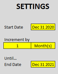
Once you’ve got the charts you want to be connected to the timeline, then it’s a matter of just updating the settings section on the Dashboard tab. This is off to the left, with the values that you need to enter/update highlighted in yellow.
These simply specify what date you want to start from, where you want to end at, and by which interval you want to jump (e.g. x days/months/years). Depending on the frequency you select, your dashboard can either play very quickly, or very slowly.
The last step is to just click the Animate Dashboard button at the end of the home tab:
Upon clicking this, the timeline will jump by the intervals you specified. No other changes will be made to any filters or slicers you have selected. The only changes will take place to the timeline, at which point, you should see something similar to the video posted at the top of this post.
If you liked this free template that helps you animate your dashboards, please give this site a like on Facebook and also be sure to check out some of the many templates that we have available for download. You can also follow us on Twitter and YouTube.
In this article, I’ll show you how you can download the latest prices for cryptocurrencies, along with percent and volume changes. The data will be downloaded via an API from coinmarketcap.com. Once you’ve set up the API, it becomes a breeze to pull crypto prices and data into Excel, in just a matter of seconds.
Getting an API Key
One of the first things you’ll want to do is go onto the website https://coinmarketcap.com/api/ where you can request an API key, which you’ll need if you want to query the data. Once you have the key, you can begin pulling in values. You don’t need to worry about saving or remembering your API key because once you’re logged into the site, you’ll see an Overview section that shows you where you can copy your API key by hovering over that section. On this page, you will also see how many credits you have used today and this month versus how many are available on your plan.
Setting up the connection in Power Query
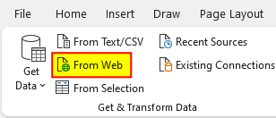
Once you’ve got your API key copied, you can go into Excel and create a Power Query connection. To do this, go under the Data tab and select the From Web button:
Then, you’ll enter the URL for the API connection, which is https://pro-api.coinmarketcap.com. On the documentation page, you’ll also see a list of possible endpoint paths. Under the basic plan, not all endpoints will be available. In this example, I’m just going to retrieve the latest market data. And for that, the URL is as follows:
I’ll put that into the Power Query URL. However, because the connection requires authentication, I need to check off the option for Advanced rather than just leave the default to Basic. In the section for HTTP request header parameters, you need to enter X-CMC_PRO_API_KEY (you’ll find this on the documentation page) and your API key. Here’s how that looks:
Then, click on OK and Power Query will go to work on creating your connection.
Formatting the data in Power Query
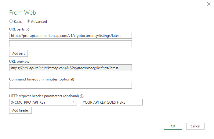
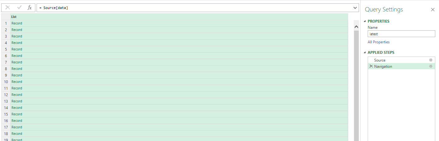
Once loaded into Power Query, you’ll see this:
If you click on the List button next to data, then you will get a series of records:
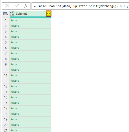
On the top-left-hand corner, there is an option to convert this To Table. Click on that button, leave the default options on the next window as they are, and then click on OK. We’re still left with a long list of records. For this step, click on the icon highlighted below, at the top of the column:
When the next screen pops up showing you all the columns that will be expanded, click OK. Now you have something that looks a lot more useable:
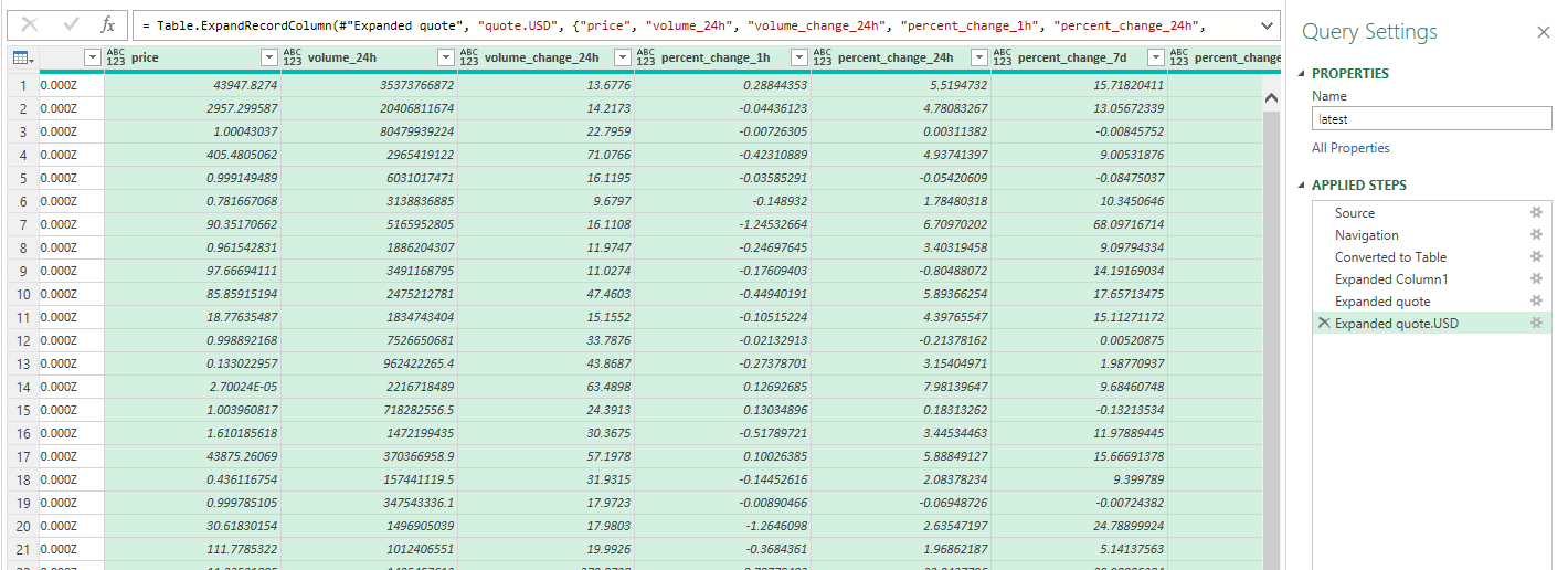
But there’s still more information that can be extracted. Scroll over to the last column, which should contain the word ‘quote’ in its name. Here there will be a list of records again. And using that button at the top of the field, this can also be expanded. It only has a USD field and once expanded, it looks like nothing has changed. Click on the header button once more, and now you’ll see fields showing volumes and price changes.
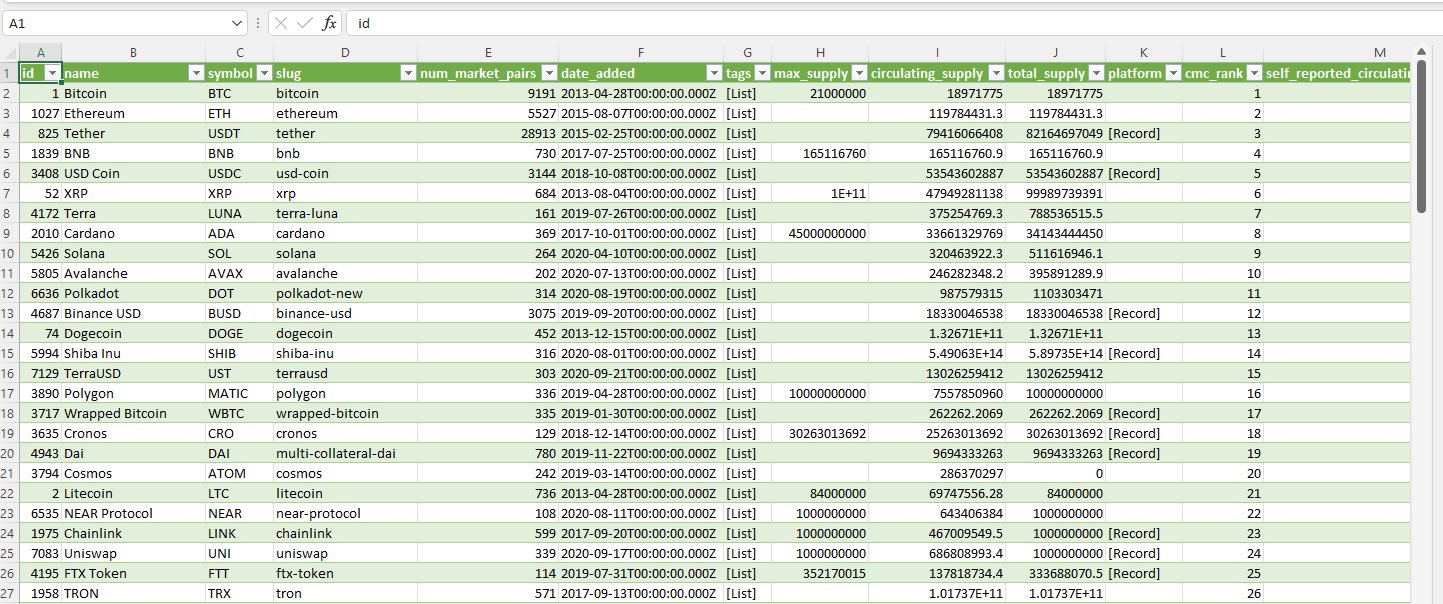
Now, you can load the data into Excel by clicking on the Close & Load button. You should now see it populate in your spreadsheet:
Now you can do a refresh at any point in time and your query will pull in the latest data from coinmarketcap.com.
If you liked this post on How to Pull Crypto Prices and Data Into Excel, please give this site a like on Facebook and also be sure to check out some of the many templates that we have available for download. You can also follow us on Twitter and YouTube.
In Excel, you can create quick and easy visuals with only a formula. You don’t need to insert charts or worry about if they are set up correctly. In this post, I’ll show you how you can quickly create both bar and column charts.
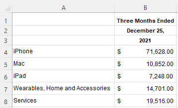
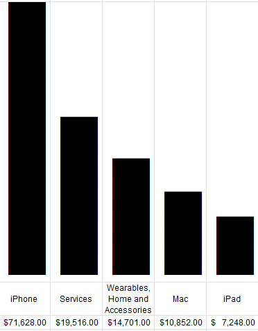
For this example, I’m going to use data from Apple’s most recent earnings report, to see the split between sales of its different categories. Here’s what the data looks like from its most recent filing:
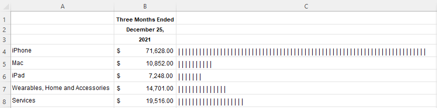
To create a simple bar chart, I’m going to use the REPT function, which allows me to repeat text. The character I’m going to repeat is the “|” line, which on most keyboards is the button above the enter key. Holding shift and that key should give you that line. The number of times I want to repeat the character will be the value in column B. But because it’s too large, I’m going to divide it by a factor of 100. Here’s how that formula will look:
=REPT("|",B4/1000)
If I copy this down, my bar chart remains a work in progress:
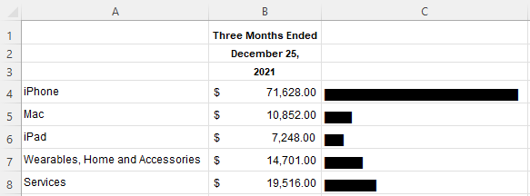
One way to make this look like more of a bar chart is by changing the font. In column C, I’m going to change it to Britannic Bold. And now, this looks like a proper bar chart:
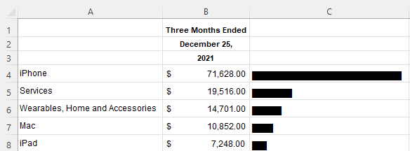
If I sort the values from largest to smallest, then it’s easier to see the progression:
This is good, but this is also still a bar chart. To convert this into a column chart, I need to make a couple of changes. The first thing is I need to arrange the data differently so that the fields and the values are going horizontally rather than vertically. To do this, you can just transpose the data. You can do this using the TRANSPOSE function. Now, my data is better suited for a column chart:
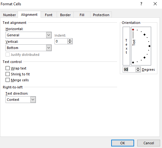
Now, I’ll add back the REPT function and use the same font. Except for this time, I will modify the cells so that the alignment is vertical:
Now, after compressing the columns, I have a column chart set up:
Here’s a quick video showing the steps:
If you liked this post on How to Create Column Charts in Excel With Just a Formula, please give this site a like on Facebook and also be sure to check out some of the many templates that we have available for download. You can also follow us on Twitter and YouTube.
When displaying data, using percentages isn’t always optimal, especially if you’re dealing with a very tiny number. In those cases, it may be more effective to display data as a rate per 100,000 or per 1 million, depending on how small of a number you have. Below, I’ll show you how you can move between percentages and rates.
Converting between percentages and rates
To convert percentages into rates, it’s as simple as multiplying the percent by the population you’re trying to calculate a rate for. Some common examples are calculating rates per 10,000, per 100,000, or per 1 million.
Let’s start with a simple stat: there are approximately 50 million Microsoft 365 subscribers in the world. Out of a global population of 7.9 billion people, that is 0.6% of the total population. Let’s frame this a different way, as a rate. To do this, I can multiply that percentage by 100,000, which returns a value of 633. That tells us that for every 100,000 people, 633 of them have Microsoft 365 subscriptions. You can multiply this by 10 to say that for every 1 million people, more than 6,300 will be subscribers.
Now let’ do the reverse. The odds of winning the Powerball jackpot are approximately 1 in 292 million. To convert this into percentages, we’ll need to divide 1 by 292,200,000. The result is a very tiny value of 0.0000000034. As you can see, this isn’t very helpful in using this as a percentage. And this is why using a rate is more appropriate.
Calculating 1 per a larger base
If you’re working with that incredibly small value, you can convert that into a rate of 1 per some larger number. All you need to do is calculate the inverse. To do that, take 1 and divide it by the value. In the above example, it would be 1/0.0000000034, which would return a value of 292 million.
Creating a quick template
If you have some small percentages you want to convert into percentages, you can create a quick template to help you determine which rate you may want to use. In some cases, you may not want to just use 1 per x but instead x per 100,000, or some larger figure. You’re communicating the same value, it’s just a matter of how you decide to do it.
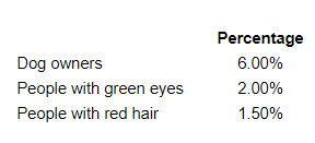
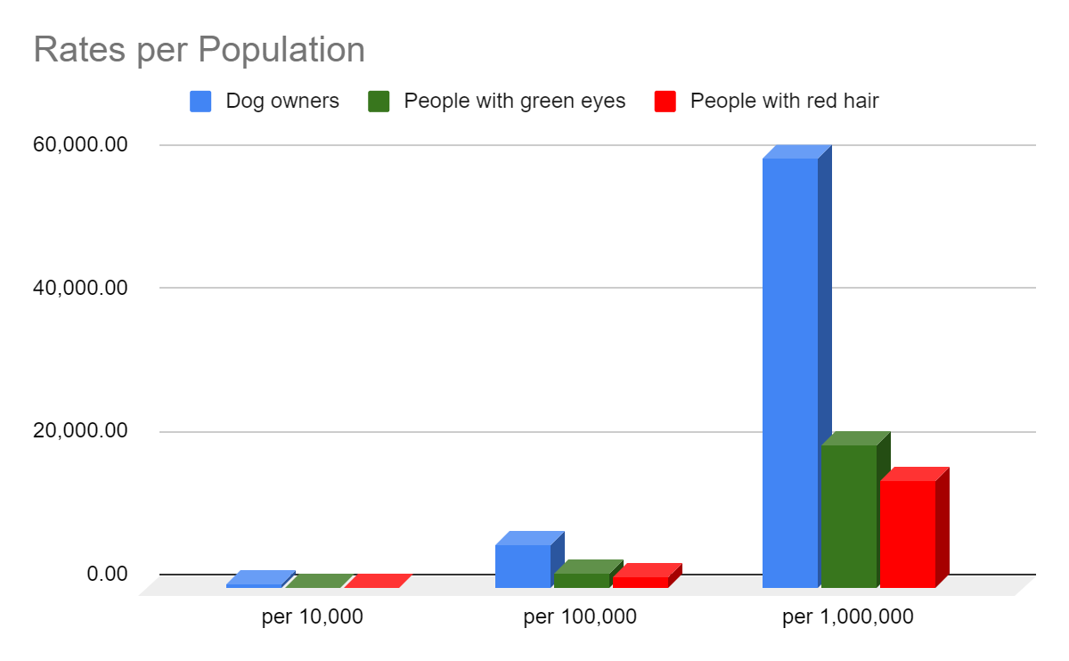
Below, I’ve collected some data showing the percentage of dog owners in the world, the percentage of people who have green eyes, and the percentage of people with red hair:
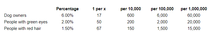
I’m going to create four additional columns, one to calculate the inverse (1 per x), rate per 10,000, rate per 100,000, and per 1,000,000. For the last three columns, all you need to do is to multiply the percentage by those base numbers. And here’s what the results will look like:
A quick way to check these results is by calculating the percentages. 60,000/1,000,000 is equal to 6%, 20,000/1,000,000 is 2%, and 15,000/1,000,000 is 1.5%.
The advantage of using the larger population number is that your results will stand out more and can be easier to visualize on a chart:
If you liked this post on How to Show Percentages as Rates Per 100,000, please give this site a like on Facebook and also be sure to check out some of the many templates that we have available for download. You can also follow us on Twitter and YouTube.
The stock market is off to a rough start to 2022, with the S&P 500 falling more than 5% in just one month. Using a spreadsheet, we can analyze historical trends and patterns to identify what normally happens after such bad starts. Below, I’ll use data from Google Sheets to pull in historical values and analyze how the index has performed afterward and whether this year is doomed to be a bad year, or if a recovery is likely and if now is a good time to invest in stocks.
Start with downloading the historical data
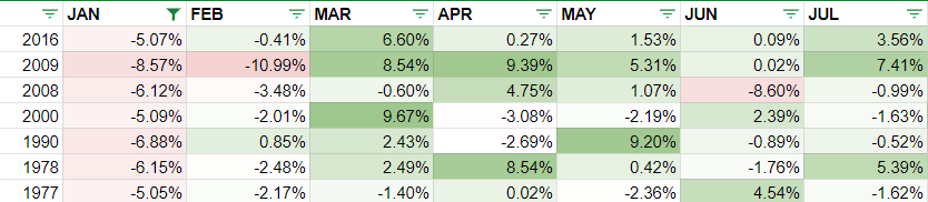
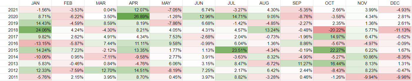
The first step is to get the S&P 500’s historical values in Google Sheets. This can be done using the GOOGLEFINANCE function. Using the .INX symbol, I can calculate the S&P 500 values going back to the 70s. Here’s a matrix showing the returns over the past 50 years, after applying some conditional formatting to the values:
Filtering the data
To zero on in just the largest January declines, I can use the Filter by condition option to specify January values where the percent change is less than negative 5%:
That leaves me with the years when the S&P 500 dropped by 5% or more in the first month:
Now that I have a list of the years I’m looking to analyze, I can start creating some charts.
Using charts to summarize the performances
The first visual I’m going to create will look at how the index has performed after January, after those bad starts. To do that, I need to take the year-end values and divide them by the values at the end of January. This tells me how much the index rose or declined in the remaining months. And when grouping those variances, this is what the data shows:
Of the 7 previous times when the S&P 500 dropped 5% in January, 3 times it would continue to drop in the following months and finish even lower. Only two times would the index rise by more than 10%. I can also average the results, comparing the down years versus the overall average:
This tells me that in a year where the S&P 500 typically tanks in the first month, the overall returns from the index are likely to be negative. However, to add a bit more context to this, I’ll look at the individual returns by year and compare them against the 50-year average, which is summarized in this table:
By keeping the average column constant, it creates a straight line for the chart and makes it easy to visualize the individual years’ returns and how they compare against it:
A few of the things that stand out from the data is that in three of the years (2000, 2008, 2009), the markets were either in the midst of a significant crash or recovering from it. It helps put into context some of these returns, suggesting that the other years might indicate more typical returns in a non-crash year. And if that’s the case, investors may expect fairly modest returns this year, possibly negative ones overall. Although it isn’t a large data set, it certainly suggests that the stock market may be facing a down year in 2022.
If you liked this post on the S&P 500’s Historical Returns, please give this site a like on Facebook and also be sure to check out some of the many templates that we have available for download. You can also follow us on Twitter and YouTube.
Have you ever wondered how a stock has typically performed month over month? Using a spreadsheet, you can calculate monthly returns and identify patterns of which months are traditionally strong for a stock, and which ones aren’t. In this example, I’m going to use Google Sheets to pull in stock prices and calculate historical stock returns by month.
Start with pulling in historical stock prices
To get started, I’ll need to extract a stock’s price history. This can be done using Google Sheets’ GOOGLEFINANCE function. The key is in setting a start date that goes far enough back to ensure you get enough historical data to use in your calculations. A good function to use within that is the TODAY() function which ensures you will always be counting backward from today’s date and don’t need to hardcode a date. If I want to go back to 2008, for example, I can set my formula to deduct about 5,000 days.
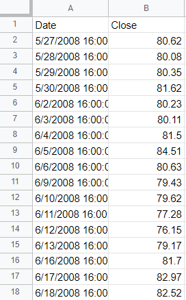
To pull Amazon’s stock price going back that far, this is what my formula would look like in Google Sheets:
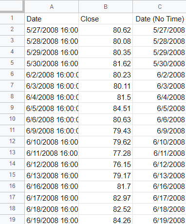
The one problem here is that the date values contain the time, 16:00:00, which represents the 4 pm closing time of the stock market. I only want the actual date since I’m going to be doing a lookup and don’t want to include time. To extract just the date, I can use the DATE() function and use the YEAR(), MONTH() and DAY() functions to refer back to the values in column A. For example:
=DATE(YEAR(A2),MONTH(A2),DAY(A2))
The above formula would give me the date in column A without the time. I’ll add an IF statement at the start so that in case the value in column A is blank, my formula simply won’t compute anything:
=if(A2="","",DATE(YEAR(A2),MONTH(A2),DAY(A2)))
Now I have a table that has just date values without any time:
Creating a date matrix
Next, what I’m going to do is create a matrix that has years going vertically and months going across:
I’m going to fill in these values with the stock’s returns in each of those months. The key to making this work is by using the DATEVALUE() function which allows me to enter a date. For example, if I entered the following formula:
=DATEVALUE("Jan 1, 2022")
It would result in the following output:
1/1/2022
In the first cell of my matrix, for the JAN 2021, I’ll combine the month abbreviation (JAN) with the year (2021) and the first day (1). Here’s how that would work if the month name is in cell F1 and the year is in E2:
=DATEVALUE(F$1&" 1, "&$E2)
However, let’s assume I don’t want to pull the first day of the month and instead want to pull the ending month’s value. For that, I can use the EOMONTH() function. And then I would enclose the current formula within that:
=EOMONTH(DATEVALUE(F$1&" 1, "&$E2),0)
The 0 value at the end indicates how many months I want to jump by. And since I just want the end of the current month, I don’t need to jump by any months, which is why I set it to 0. At this point, I have a date, and now I can use this inside of a MATCH() function to find the row that matches this date. Assuming the date values in are column C, here is the formula:
Now the formula will pull in the price for a given month. But if I want the month-over-month return, I need to take the month-end price and divide it by the previous month’s ending value. To get the previous month’s price, I use the same formula except instead of a 0, I’ll enter -1 for the number of months:
I’ll combine the two formulas now, taking the current month-end price and dividing it by the previous month’s value and also deduct -1 at the end to adjust for it being a percent-change calculation:
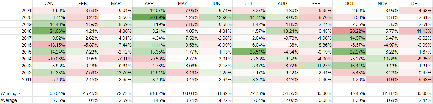
Now, copying this formula across the entire matrix, I can see the stock’s historical returns by month. I’ve added some conditional formatting to contrast the good months from the bad ones:
Besides relying on colors, I can also add a win rate % where I can count the times where the return was more than 0% (i.e. a ‘win’) and divide this by the total number of values. In column F, for January, the formula looks like this:
=COUNTIF(F2:F12,">0")/COUNTA(F2:F12)
I’ll also average the returns so that it’s easier to see the best and worst-performing months:
Judging from this, April looks to be the best time to own Amazon’s stock. It normally returns a positive return and its average over the past 11 years has been a gain of just under 8.5%. To re-create this analysis for other stocks, simply change the ticker symbol.
If you liked this post on How to Calculate Historical Stock Returns by Month, please give this site a like on Facebook and also be sure to check out some of the many templates that we have available for download. You can also follow us on Twitter and YouTube.
Excel’s WEEKNUM function can return the specific week that a date falls in. But to do the reverse is a bit more challenging. In this post, I’ll show you how you can get the first and last day of a week (as well as anything in-between).
Setting up some variables
You can make this into a large and complex formula, but I’m going to make it a bit more organized by utilizing named ranges. The two names ranges I’m going to set up are for the day of the week (DAYNUMBER) that I want to calculate for, and the first day of the year (FIRSTDAY).
I’m going to use Monday as the day of the week my week starts on. On my regional settings, that is weekday #2. If you’re not sure about yours, you can use the WEEKDAY function on a day that is a Monday (or whichever day you wish to use) to determine the number associated with that.
Calculating the difference between the first day and your desired day of the week
The day the year begins on serves as an important starting point. This year began on a Saturday. If my desired day is Monday, then I need to calculate the difference between those days of the week. The formula for that would be as follows:
=DAYNUMBER - WEEKDAY(FIRSTDAY)
This returns a value of -5. If I wanted to know when the first Monday of the year was, I couldn’t just deduct 5 from the first day or I’d end up in the wrong year. What I need to do is to set up an IF function to say that if the difference is negative, I will add 7 to adjust for that fact. And if it isn’t negative, then I can just add to the starting date. Here is my formula thus far:
Using the above formula, Excel tells me that Jan. 3, 2022, was the first Monday of the year, which is correct. But I need to adjust the formula to ensure the calculation puts me in the correct week.
Adjusting for the week number
The above formula works if I want the first week. If I want it to be more flexible than that, I need to include the week number in my calculation. For that, I’m going to create a named range called WEEK. The key is in adjusting the +7 calculation. In the first argument of my formula, when it was negative, I added 7. If I want the second week, then I need to add it by another factor of 7. Here’s how that part of the formula would look:
WEEK-WEEKDAY(FIRSTDAY)+(7*WEEK)
I also need to add that part to the second argument, which currently doesn’t adjust for the week number:
Now I can adjust the calculation for different days of the week and different week numbers. And so whether you’re looking at the first day of the week or the last day of the week, you can just adjust the day number you’re looking for.
Here’s what the formula would look like without named ranges if the year was the current year and it was pulling the Monday of the 50th week of the year:
If you liked this post on How to Calculate the First Day and Last Day of the Week, please give this site a like on Facebook and also be sure to check out some of the many templates that we have available for download. You can also follow us on Twitter and YouTube.
The MACD line and chart is a popular tool for technical analysts who buy and sell stocks. And in this post, I’ll show you how you can create it from start to finish. In my example, I’ve downloaded Apple’s stock price history for the past year from Yahoo Finance, and I’ll use that to calculate its MACD line. Here’s a sample of what I’m starting with:
Calculating the exponential moving averages
To calculate the MACD line, I’ll need to create multiple exponential moving averages (EMAs). One for 9 days, 12 days, and for 26 days. The logic will be the same so I can start with creating a formula for the 9-day EMA and then apply that to the others.
I’m going to create a couple of variables. The first being the n for the number of days. And the second one is for the weighting that you’ll apply to more recent values, and thus, turning it from a simple moving average into an exponential one. The weighting is calculated as follows:
=2/(1+n)
I’ll start my formulas to calculate the 9-day EMA by first checking to see if I have at least 10 data points. If I don’t, then I’m only calculating a simple moving average. Here’s how the start of that formula looks, assuming my closing stock prices start from cell B5 and my variable n is in cell C1:
IF(COUNTA($B$5:$B5)<=C$1,AVERAGE($B$5:$B5)
A key part of the formula is freezing cells properly. Cell $B$5 won’t move, but $B5 will as I drag it down. And this allows me to calculate the cumulative number of data points, and the corresponding average. The next part of the formula is what happens if I have more than nine data points. In that case, I will take the weighting (this is cell C2) on my sheet, and multiply that by the difference between the most recent stock price and the previous EMA. This will then get added to the previous day’s EMA:
C$2*($B5-$C4)+$C4
Column C is the one that contains the EMAs. My complete formula is as follows:
I can now copy this logic across multiple columns to calculate the 12 and 26 day EMAs as well:
Now, I’ll set up the calculations for the final three columns:
MACD: This involves taking the 12-day EMA and subtracting the 26-day EMA from that.
Signal Line: This is a 9-day EMA of the MACD line.
Histogram: This is calculated as the difference between the MACD line and the Signal line.
With all those columns set up, here is my completed table:
Creating the charts
With all the columns set up, the next part is to put the key data into a chart to illustrate the MACD line, Signal line, and Histogram. To make the chart look like a typical MACD chart, I’ll need to set the MACD line and Signal line to be line charts, and for the Histogram to be a column chart.
Initially, when the chart is created, there’s too much data in there since the data set is bigger than it needs to be:
To fix this, I right-click on the chart and click Select Data. Then, I remove all the series except for the last three: MACD line, Signal line, and Histogram. My updated chart looks as follows:
There are still a few more changes that I am going to make here. The first is to fix the axis, as there are gaps between the column charts. That’s because Excel is recognizing the axis as a date axis. And while that’s correct, that means there will be gaps since stocks don’t trade every day of the week, and thus, those gaps, are weekends. To fix this, right-click on the axis and click Format Axis. And then, change the Axis Type so that it is a Text axis:
And then, under the Labels section, I set the position so that it is Low and at the bottom of the chart. My updated chart looks a bit better:
The last change you may want to consider is adjusting the column chart gap, to shrink it so the chart looks more like a histogram. If you right-click on them and click Format Data Series, there’s an option to change the Gap Width. I find that setting this to 50% normally results in a good gap size::
And now we’ve got a chart that resembles what you might find on major finance sites when looking at MACD. If you want to follow along with the sheet that I’ve created, you can download my MACD chart template here.
If you liked this post on How to Create a MACD Chart, please give this site a like on Facebook and also be sure to check out some of the many templates that we have available for download. You can also follow us on Twitter and YouTube.
Correlations can be helpful in determining if there is a pattern or relationship between two sets of data. It can be useful when looking at stocks as those that are highly correlated may move together in the same direction (note: this doesn’t mean their returns will be the same). And if you want to diversify, that’s not what you’ll want to accomplish. Instead, negatively correlated investments or ones that aren’t correlated at all may be more preferable in that situation. Below, I’ll show you how you can easily calculate correlations between multiple stocks from data that you can download from a source like Yahoo Finance.
Downloading the data
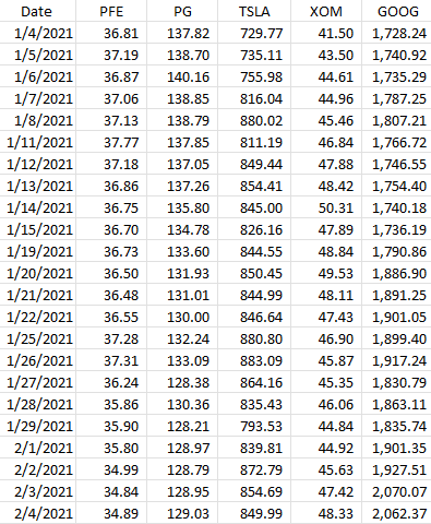
The first thing that’s needed when running correlations is to download at least two sets of data. In this example, I’ll download data for five stocks: Pfizer, Procter & Gamble, Tesla, Exxon Mobil, and Alphabet. None of those stocks is terribly similar to one another so there should be some decent diversification there.
Below, I’ve downloaded all the closing prices from Yahoo Finance for all of 2021. Here’s what that data looks like:
The key is you want to make sure that the data is the same; you don’t want to have one stock showing a price at a different date than the other. They all need the same baseline. And that’s what the date field serves to do here. It itself isn’t necessary for the correlation calculation, but it’s just there to ensure that when you’re downloading and matching up data, everything lines up correctly to the right date.
The CORREL() funciton is useful for doing just a quick correlation calculation
Using Excel’s CORREL function, you can quickly calculate the correlation between two stocks. Pfizer is in column B and Procter & Gamble is in column C. If I wanted to quickly calculate their price correlation, my formula would be as follows:
=CORREL(B:B,C:C)
It doesn’t matter which order the data is in but there are only two ranges that are used as arguments in this function. This formula tells me there is a 94% correlation between these two stocks, at least, over the past year. That’s incredibly high and it could be because these are two fairly safe, value-oriented investments. Now, I could repeat this process for the other stocks here but there’s a quicker way to do that.
Using the Data Analysis option
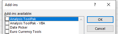
Excel has some built-in Add-ins that you can enable that can quickly do tasks like this for you. You can access the Excel Add-ins from the Developer tab or by going through File->Options->Add-ins->Excel Add-ins. Either approach will get you to the same place. And once you’re there, you just need to check off the option for the Analysis Toolpak:
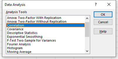
Once enabled, you will see the Data Analysis option on the Data tab. Clicking on that will give you many different options, including to do a Correlation:
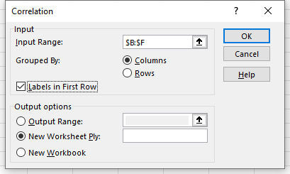
On the next screen, I’ll have the option to select an Input Range. Here, I can select more than just two columns:
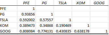
After clicking OK, Excel generates the correlation matrix for me in a new tab, saving me the time of doing all the calculations myself:
The lowest correlation noted here is between Tesla and Exxon Mobil, while the highest is between Pfizer and Procter & Gamble.
If you liked this post on How to Calculate Correlations Between Stocks, please give this site a like on Facebook and also be sure to check out some of the many templates that we have available for download. You can also follow us on Twitter and YouTube.
A lookup is one of the more common things you can do in Excel. Whether you’re using VLOOKUP, a combination of INDEX and MATCH, or the new XLOOKUP, there are no shortage of ways to accomplish it. However, in this post, I’ll go over how you can do a lookup that involves pulling in a picture. It’s a bit more complicated to set up but once you’ve figured it out, it should be a breeze.
Step 1: Create a table of the images you would like to use
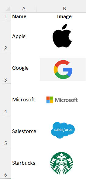
I’m going to create a tab for images that has two columns — one for the name of the image, while the other will hold the image itself. I’m going to make the rows wide, with a height of 60 just to make sure the cell can fit the entire image. In this example, I’m using some popular corporate logos:
Step 2: Setup the named ranges
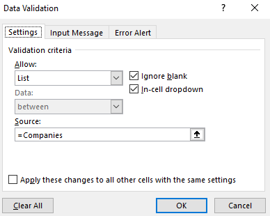
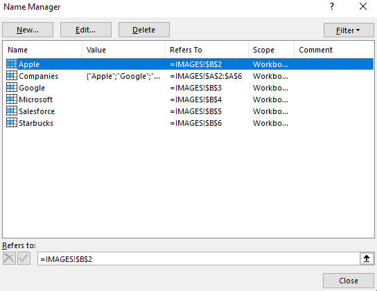
Next, I’ll create named ranges in column B that match the values in column A. In the example above I don’t have any spaces but if I did, I would replace them with an underscore to make sure there are no gaps. In addition to creating a named range for each individual logo, I will also create a named range that contains all the values in column A. This way, I can use this as a dropdown later on to select which logo I want to select.
I’ll create a named range called ‘Companies’ for these options. When using data validation, I’ll just enter the following as my list options:
I’ll add this on to another sheet. My selection here will determine which image to pull.
Step 3: Creating another image for the lookup
I also need to create a picture that will pull the desired image. To do this, I can just copy any one of the images I inserted in the first step.
Step 4: Creating a named range for the selection
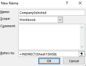
I’m going to create another named range, this time, I won’t be selecting a cell but I will go through the Formulas tab and select Name Manager where I’ll see all the named ranges I have set up thus far:
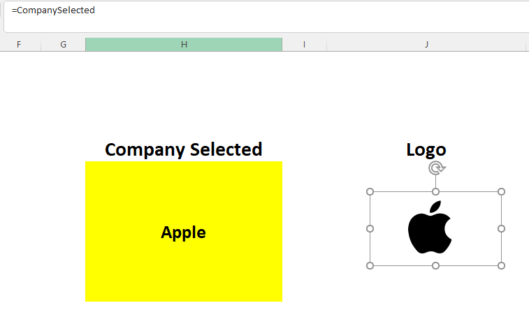
Click on the New button. And here, I’ll need to use the INDIRECT function to reference the cell that contains the company value that was selected through the dropdown. In my example, that is cell H8. My named range, which I’ll call, ‘CompanySelected’ will look as follows:
Now, for the picture that is acting as your lookup, select it, and set the cell equal to the named range of ‘CompanySelected’ :
I can adjust the size as large as necessary. And now, when I change my dropdown option, the image will automatically update:
If you liked this post on How to Do a Picture Lookup in Excel, please give this site a like on Facebook and also be sure to check out some of the many templates that we have available for download. You can also follow us on Twitter and YouTube.