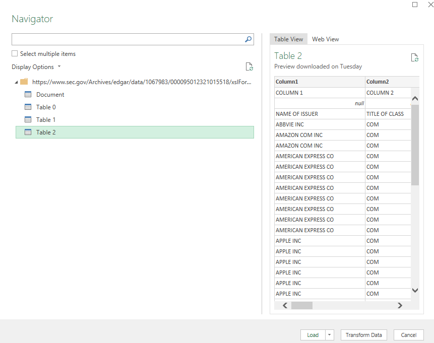
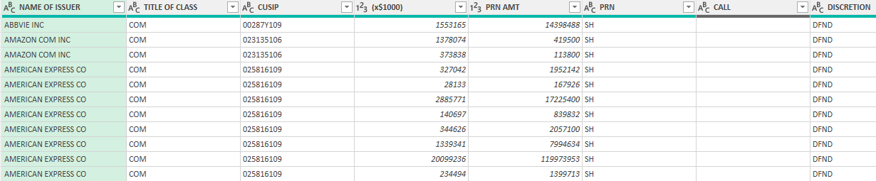
Oftentimes when you’re working with a large range of values, it can be useful to add letters such as ‘B’ to indicate billions or ‘M’ to show millions. It can save space and be easier to read without too many zeroes. But if you want to perform any analysis, you’ll need to ensure that you’re working with numbers, not string. Here’s a download from Yahoo Finance that shows cryptocurrencies by their market caps:
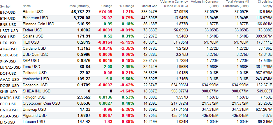
In this example, I’m going to extract the numbers from the circulating supply column, which contains millions, billions, and trillions.
Using the Substitute Function
If you want to remove the same text over and over again, an easy option for that is the SUBSTITUTE function. How it works is you select the string, the text you want to replace, and what you want to replace it with. Here’s how I would substitute out the ‘M’ for millions and replace it with a blank value in its place (assuming A1 was the cell that contained the text mixed in with a numerical value):
=SUBSTITUTE(A1,"M","")The one limitation here is I’m only substituting out one letter. If I wanted to also replace the letter “B” then I would wrap the above formula inside of another SUBSTITUTE function, as such:
=SUBSTITUTE(SUBSTITUTE(A1,"M",""),"B","")And, since there are also trillions in this data set, I will need to make another adjustment for the values containing the letter ‘T’ :
=SUBSTITUTE(SUBSTITUTE(SUBSTITUTE(A1,"M",""),"B",""),"T","")Now this formulas has gotten pretty lengthy. And as you can see, it can get even longer if there are more text values that you want to substitute out. The only thing left is to multiply this entire value by a value of 1 to convert the text into a number. My complete formula in this example, to pull out the numbers from text, is as follows:
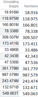
=SUBSTITUTE(SUBSTITUTE(SUBSTITUTE(A1,"M",""),"B",""),"T","")*1Now, all the letters from those values are gone:
Since you’re dealing with different units in this case, the one other thing you may want to do is add some logic to multiply it by a factor so you’re not mixing in millions with billions and trillions. However, with these now being numerical values, it’s possible to do with with just an IF statement.
Parsing Out Using Mid Functions
A more flexible way of pulling numbers out from text in this case is by using a combination of two functions — LEN and LEFT. With the LEFT function, you’re extracting out the characters at the start of a string. The key here is in knowing how many characters you want. This is where the LEN function comes in, as it counts the number of characters that are in a cell.
In the following formula, this would extract everything that’s in cell A1:
=LEFT(A1,LEN(A1))This wouldn’t be a terribly useful formula since it would be the same as referencing A1. However, if I want to extract every character except the last one, as in the example above, I just need to adjust the second argument so that I deduct 1 from the length:
=LEFT(A1,LEN(A1)-1)The only thing left to get the same results as in the example of the nested SUBSTITUTE functions is to just multiply this formula by 1. The advantage here is that I don’t have to worry about which specific letters to replace and I’m always going to be extracting all the characters except the last one.
There are more complicated examples of extracting numbers out of text and for those you might need to use the MID or RIGHT functions. Here’s an overview of how you can parse data out in Excel, which goes over more complicated examples than the ones noted here.
If you liked this post on How to Extract Numbers From a String of Text, please give this site a like on Facebook and also be sure to check out some of the many templates that we have available for download. You can also follow us on Twitter and YouTube.