Conditional formatting rules can help highlight values and identify when certain criteria is met. You can also create advanced rules that include formulas. And I’ll walk you through how to to do so in a way where it’s easy to test your logic and ensure you setup your rules correctly.
Start with creating a formula in your spreadsheet
You might be tempted to jump right into the conditional formatting settings and create your rules. But you’re probably better off not doing that, because if you need to make an adjustment later on, it can be challenging to try to tweak the formula there.
Instead, start with creating a formula within your spreadsheet. The goal is to setup a formula so that it results in either a TRUE or FALSE result. If it’s TRUE, then your conditional formatting will get applied. Otherwise, it won’t.
In the below example, I’m using the NFL prediction template I created earlier. If you want to follow along, download that template and delete the conditional formatting rules that are already there.
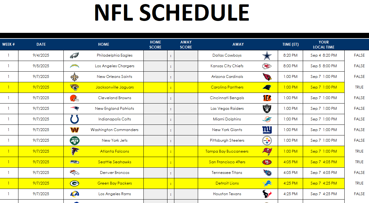
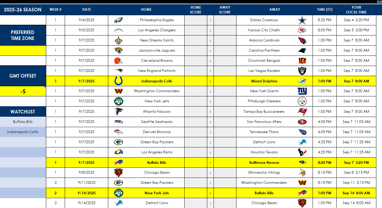
I’m going to create a rule to track if teams I’m interested in are playing. If they are, I want to highlight those games.
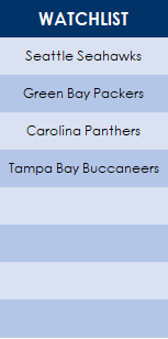
In this template, I have a section for a watchlist, starting in row 14. I’m going to select a few teams I want to track.
This watchlist is in the range A14:A21. I need to create a conditional formatting rule that meets two conditions:
If the home team is found in the watchlist, or
If the away team is found in the watchlist.
While this doesn’t sound complex, creating the conditional formatting rule for this can be a bit of a challenge. A good way to set this up is to create a formula in an adjacent column to see if it is calculating correctly.
Let’s start by using the MATCH function. This function will search through the watchlist to see if it finds the lookup value.
=MATCH($E4,$A$14:$A$21,0)>0
Column E is where the home team is listed. I’ve frozen column E since the search criteria shouldn’t change, regardless of which cell I’m in. This is important to ensure the entire row is highlighted.
Currently, how this formula works is if a value is found on the watchlist, it will result in a value of 1 or more, and that will return a value of TRUE. However, if the team isn’t found, then the formula results in an #N/A error. To fix this, I’m going to put the entire formula within the IFERROR function:
=IFERROR(MATCH($E4,$A$14:$A$21,0)>0,0)
Next, I need to also setup the formula to check if the away team is found in the watchlist. This is the exact same formula, except instead of referencing column E I’m referencing column I, which is where the away team is listed.
=IFERROR(MATCH($I4,$A$14:$A$21,0)>0,0)
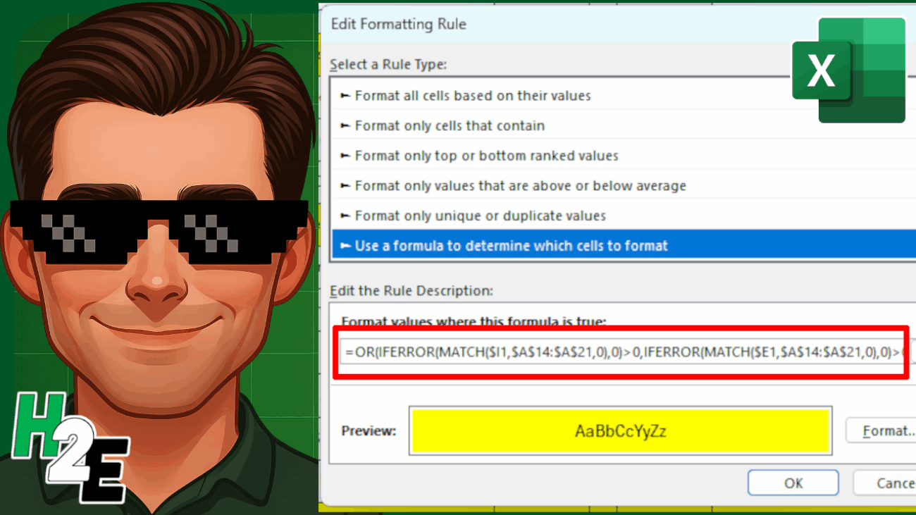
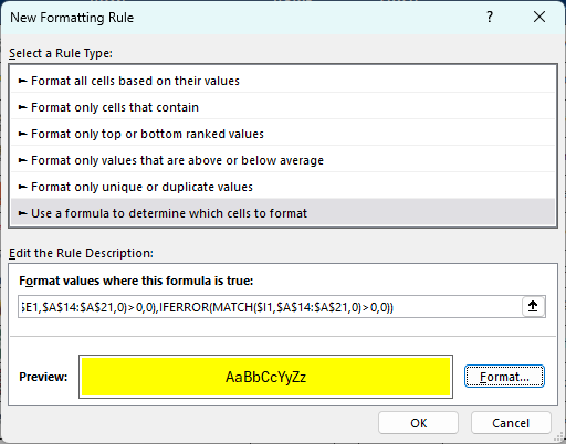
Now, I’ll combine the two formulas within the OR function:
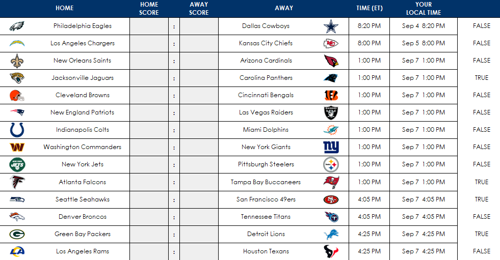
Now, I’m going to copy this formula down to confirm it is calculating correctly:
On the right-hand side, you can see the values being returned as either TRUE or FALSE. And the TRUE values are showing for the teams in my watchlist (Carolina, Tampa Bay, Seattle, and Green Bay). This confirms that the conditional formatting rules are setup correctly.
Adjust the starting range for your conditional formatting formula
When I initially setup the conditional formatting rules I referenced row 4, since that was where the first game was. But when I setup my conditional formatting rule, I need to change it to row 1, since I’m going to select columns B:L, and thus, I need to start from row 1 to ensure my conditional formatting is not being offset by any number of rows.
Thus, the formula I’m going to copy into the conditional formatting is as follows:
With columns B:L selected, I’m going to go into the Conditional Formatting menu and select New Rule. And I’m going to select the option to use a formula, which is where I will paste the above formula into:
I have also set the formatting so that the fill color is yellow and the font color is black. Now, I’ll click on OK. Initially, it looks as though my conditional formatting rules are incorrectly applied:
Double-check your conditional formatting rule and change it if necessary
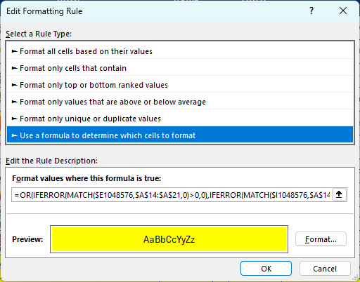
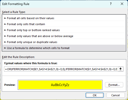
I’m going to go back into the conditional formatting settings, where I see Excel has modified my starting row:
Since I selected the entire columns, Excel has selected the very last row, 1048576, which is clearly not what I wanted. This can happen when you select an entire column and so it’s always important to go back in and double check the formatting once it has been setup. I’m going to have to manually go into here and adjust the formula so the first cells in the MATCH functions are $E1 and $I1 again.
This is a one-time fix that’s necessary. And after doing so, now I can see that my conditional formatting is correctly applied, and the values that show TRUE in the far right column are indeed highlighted.
With the conditional formatting correctly applied, I can now clear the formulas I setup earlier in the column that is checking if the condition is met (where the TRUE and FALSE values are showing).
To use formulas in conditional formatting, it’s a good idea to first test your logic within your spreadsheet. That way, it’s easier to confirm it’s evaluating correctly and easier to make adjustments as necessary.
If you liked this post on How to Setup Advanced Conditional Formatting Rules in Excel Using Formulas, please give this site a like on Facebook and also be sure to check out some of the many templates that we have available for download. You can also follow me on Twitter and YouTube. Also, please consider buying me a coffee if you find my website helpful and would like to support it.
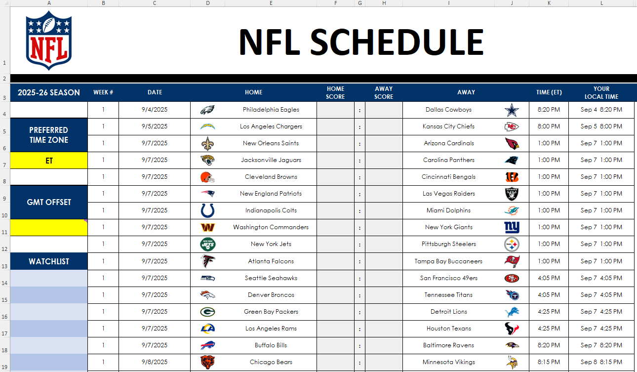
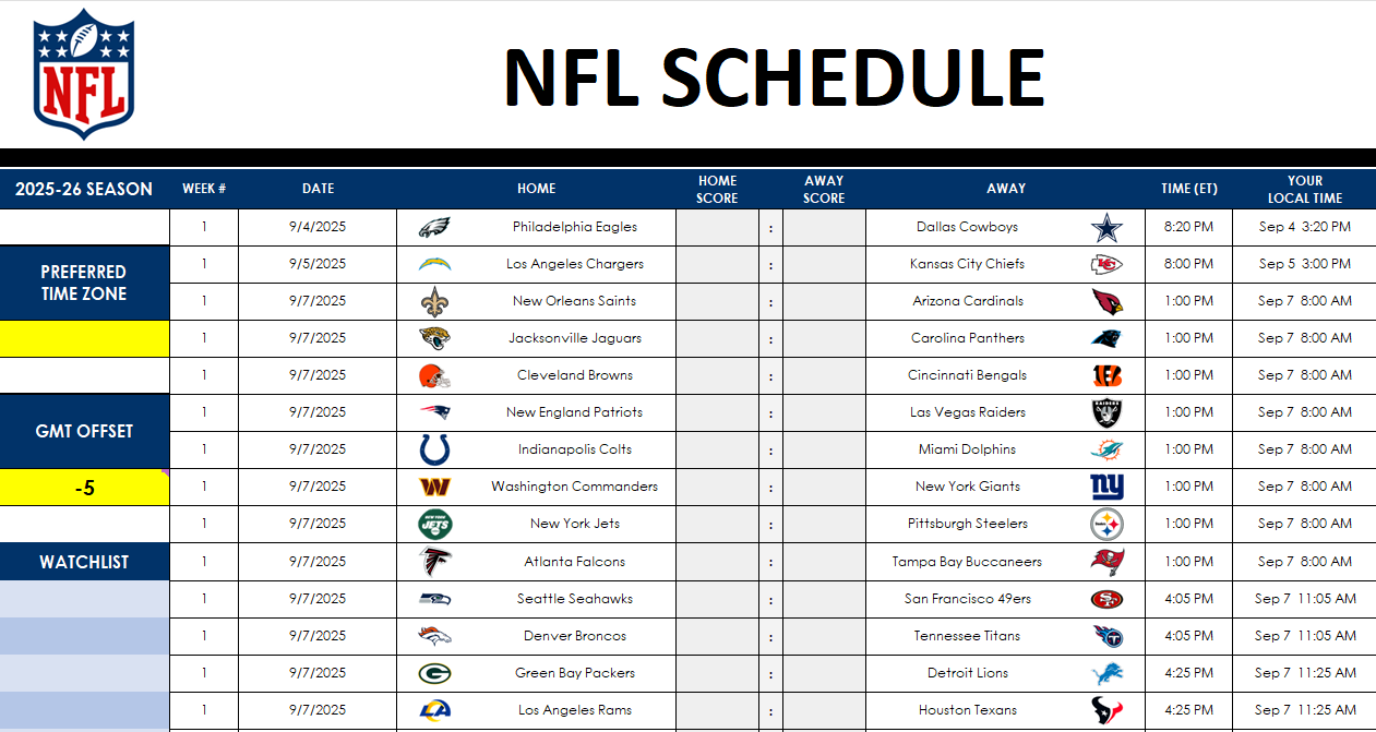
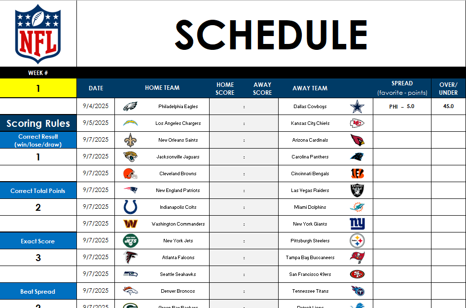
The NFL season is approaching and I have created a free template in Excel that will make it easy to keep track of your favorite teams. You can also use it to make predictions and compete against your friends and colleagues. Here’s a look at how the template works.
Updating scores, the schedule, and your time zone
On the Master.Schedule tab, you’ll see a list of games for the NFL season. As the games are played, this is where you can update the scores. You can also update the schedule. Currently the Week 18 schedule is still to be determined, and while the matchups are known, the dates and times of those games won’t be set until towards the end of the season, after Week 17.
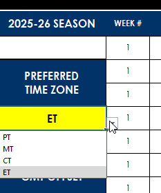
There is a time field showing when all the games are scheduled, which by default is set to ET. However, if you’re in a different time zone you can select your preferred time zone from the drop-down option on the left. You can change to PT, MT, or CT.
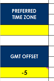
If your time zone isn’t listed here, then you can delete the selection, and change the time zone in the GMT offset section below:
This value will only apply if the preferred time zone is cleared out. After updating your time zone settings, you’ll see that in the Your Local Time field, the time of the games will be updated to reflect your local time zone.
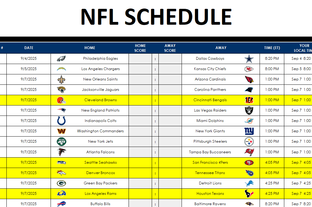
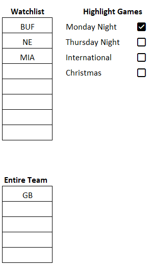
You can also specify a watchlist of teams you’re interested in following. You can select multiple teams, and upon doing so, the schedule will update to highlight the games they are involved in:
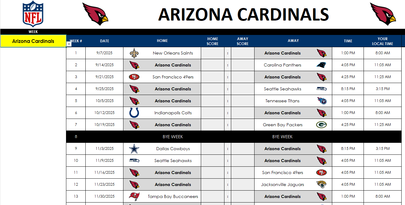
Viewing a complete schedule for a full team
If you just want to track the games involving a specific team, you can do that on the Team.Schedule tab. From the drop-down on the left-hand side, you can select the team you’re interested in, and their schedule will update, including their bye week.
This page is formatted to make it easy to print out on a single sheet of paper, in landscape mode.
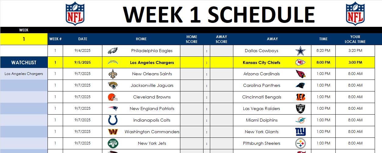
Viewing the full week schedule
If you prefer to see the list of games for the full week, you can utilize the Weekly.Schedule tab to do that. Similar to the team tab, here you’ll update the week with the Week number. You can also use the watchlist to track teams you are interested in, just as on the Master.Schedule tab.
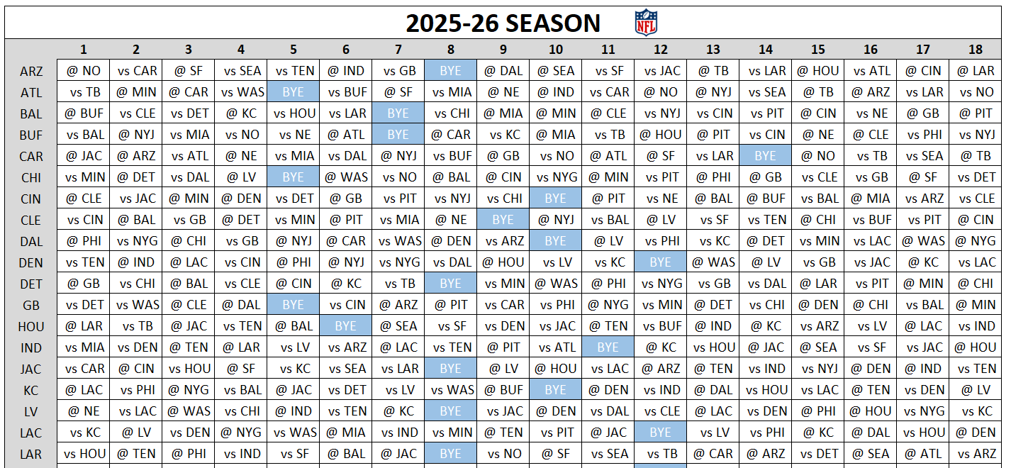
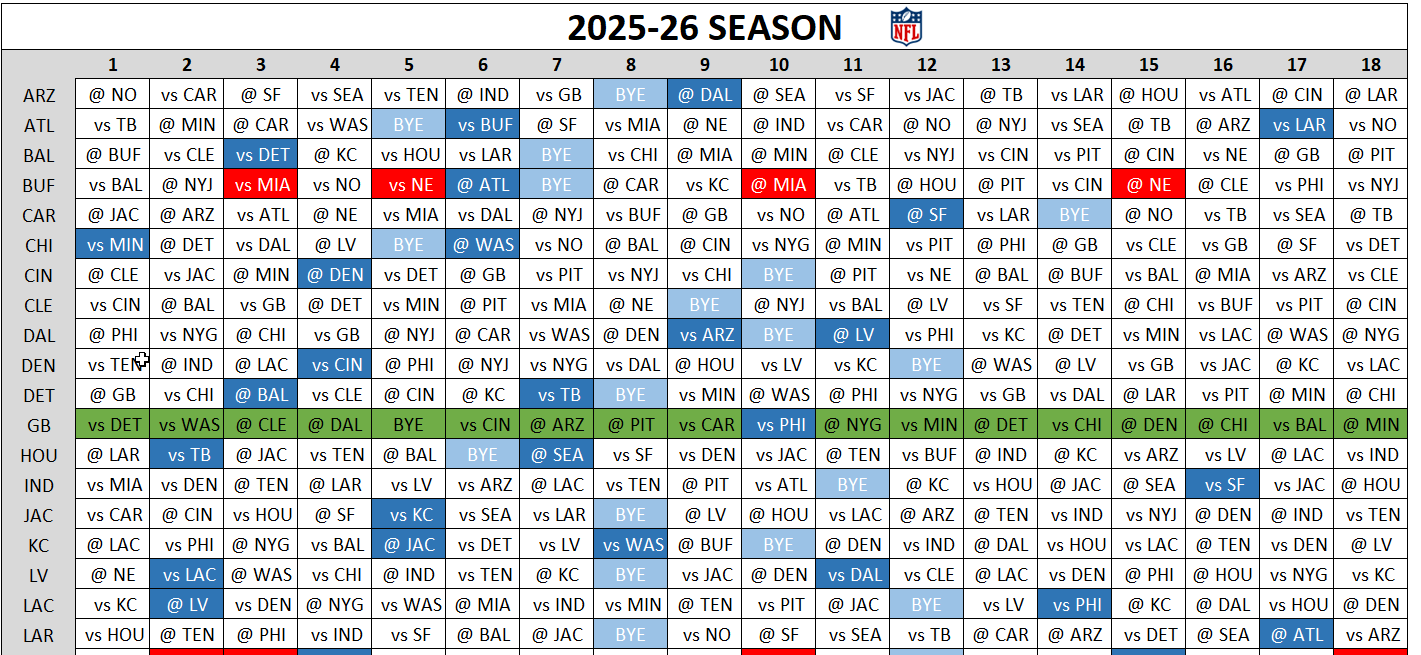
Viewing the entire NFL season on a grid format
On the Schedule.Grid tab, you have a list of the entire games by team, for the entire season. Here, you can see the opponents they are playing, as well as their bye weeks.
There are also different settings you can apply, such as a watchlist to show any key matchups you are interested in. You can highlight the schedule for an entire team, highlight Monday night games, Thursday night games, international games, and Christmas Day games. Below, I’ve flagged games involving Buffalo, New England, and Miami. I’ve also highlighted the full schedule for Green Bay, and have checked off the option for any Monday night games.
This results in various cells being highlighted on the grid:
The red highlighted cells are for any games involving the teams on the watchlist. These cells will only highlight if two of the teams from the watchlist are playing. In this example, any games involving a combination of Buffalo, New England, and Miami will be highlighted. It won’t simply highlight any games involving them.
The dark blue highlighted cells are for Monday night games. And the cells are green when an entire team is selected. Yellow highlighting will apply for Thursday night games, while cells will highlight in purple if you want to see international games. Christmas Day games will highlight in green with a red font color.
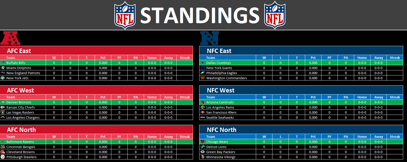
Standings will update as you enter results
As you update the scores on the Master.Schedule tab, the Standings tab will also update, showing you the ranking of each division.
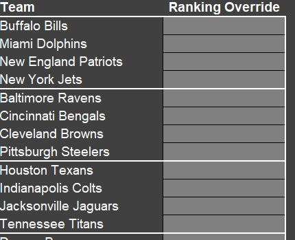
If at the end of the season, the standings are very tight and tiebreakers need to be applied, you may need to use the Override tab to manually put the correct standings. This is only if the positioning is incorrect on the Standings tab. While some tiebreakers are factored in, it won’t account for every possible scenario.
By entering values 1 through 4 on the Ranking Override column, you will assign specifically where those teams should rank. They are grouped by division. As the column name suggests, it will override the rankings here. To ensure no issues, if you use this column, enter all the rankings for any division where the standings are not correct.
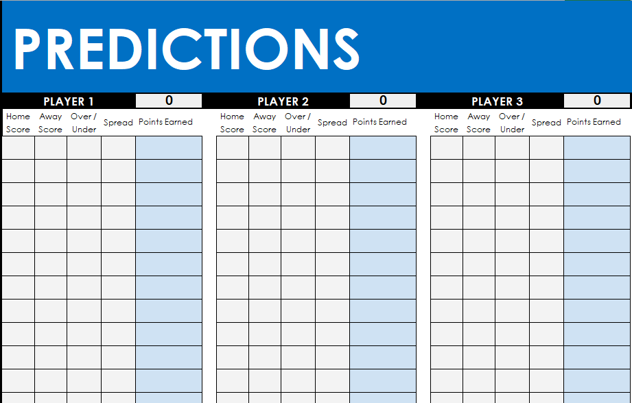
Making predictions on the NFL template
On the Weekly.Predictions tab, you’ll see a list of the week’s games, similar to the Weekly.Schedule tab. But in addition to the schedule, you’ll also have an area to determine scoring rules for your predictions. You can specify the number of points awarded for a correct result, correct # of total points, if the exact score is correct, if the person beat the spread, if they got the over/under correct, and if there was a push on either the spread or the over/under.
If you are making predictions based on the spread and the over/under, you will need to manually update those columns .
On the other side of the sheet, there is an area for players to make their predictions for each game.
You can change the names from Player 1, Player 2, etc. to the actual names of the people making the predictions. The sheet supports up to 25 players. If you don’t need that many, simply delete the values in those cells for the names.
The points will total once both predictions are made and there are actuals that have been entered on the Master.Schedule tab (those values will populate on the Weekly.Prediction tab).
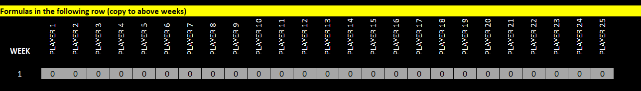
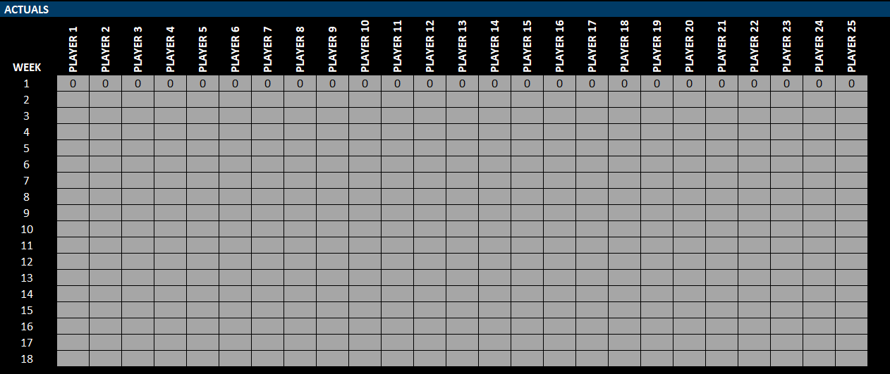
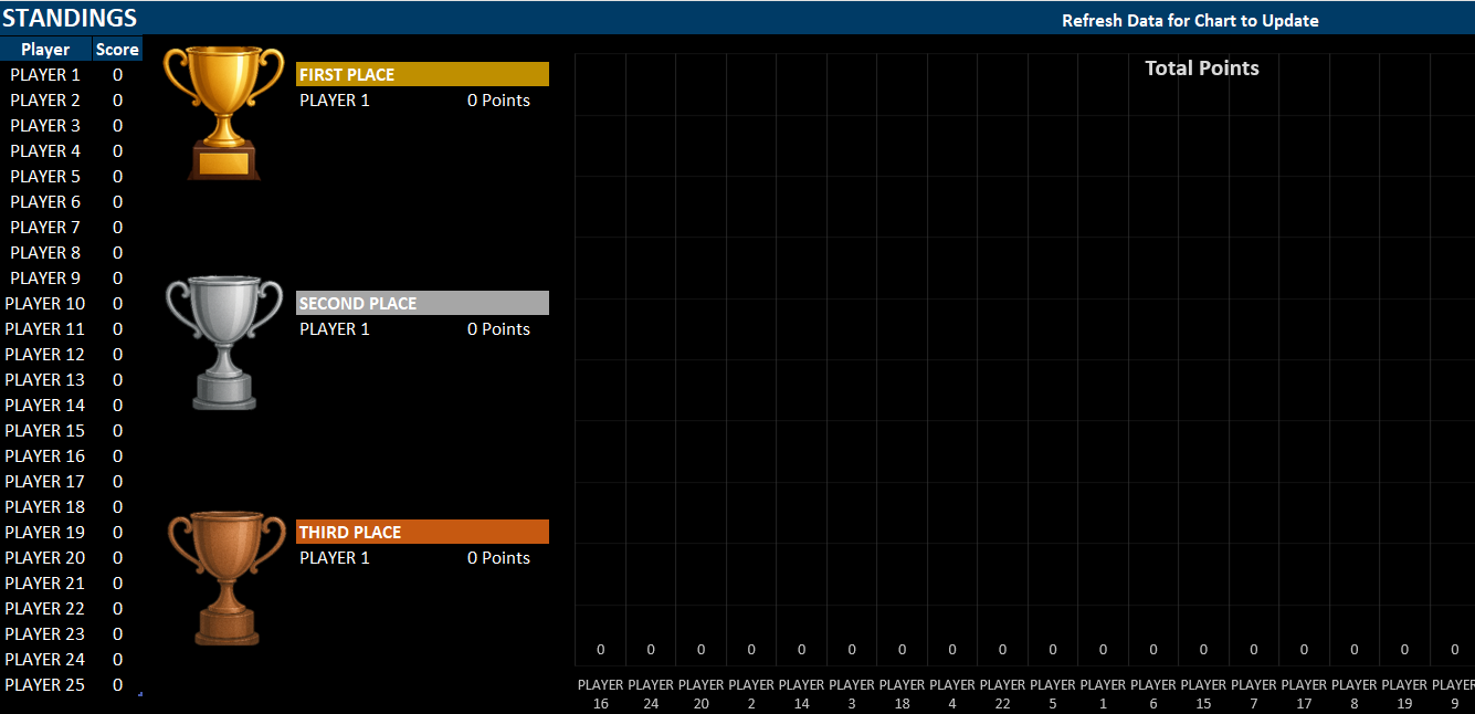
Lastly, on the Leaderboard tab, you can copy the results for the current week into the actuals section. The current week’s scores will populate below the row highlighted in yellow, which indicates that there are formulas below:
Copy these values above to the corresponding week, in the Actuals section:
As data is entered and updated, the cumulative results and chart at the top will update. However, to update the chart, you will need to refresh the data. This can be done by going into the Data tab and clicking Refresh Data.
Try out the NFL prediction and schedule template today!
If you have any feedback or suggestions on the template, I’m always happy to hear them as I’m always lookin for ways to make the template as best as it can be!
If you liked this NFL Schedule and Prediction Template, please give this site a like on Facebook and also be sure to check out some of the many templates that we have available for download. You can also follow me on Twitter and YouTube. Also, please consider buying me a coffee if you find my website helpful and would like to support it.
A Pareto chart is a useful tool for identifying the most significant factors in a dataset. It’s based on the Pareto principle—also known as the 80/20 rule—which suggests that roughly 80% of outcomes come from 20% of causes. While that may not always be the case, the chart can help you focus your efforts on the most important items in your data.
Start with preparing your data
To begin, you’ll need a dataset with categories and their frequency or values. In the table below, there are various customer issues, and the frequency of them.
You should aim to sort the data in descending order for frequency, as that will make it easier to read and interpet the chart.
Insert the Pareto chart from the Histogram section
With your data prepared, you can now go ahead and create the chart. Start by selecting one of the values from your data and go to the Insert tab. Click on the small arrow to open up all the available charts to choose from. Then, under the All Charts tab, navigate to Histogram section and select Pareto, which shows column charts and a red line going across.
This now produces the following chart:
The red line chart represents the cumulative count of all the frequency items, starting from left to right. This is the advantage of sorting the data beforehand, as it makes it easier to identify the major issues. From this chart, we can see that the five largest issues (shipping errors, damaged items, wrong product, late delivery, and missing parts) account for 80% of the total issues. This analysis can help focus your efforts on the issues which come up the most often.
Create a Pareto chart to track sales
We can do a similar analysis when looking at sales. In the following table, we have a list of highest-selling products, also sorted in descending order.
By creating a Pareto chart from this, data, we can see the following trend:
This chart shows similar information, but rather than frequency, it displays cumulative sales, telling that roughly 60% of sales come from four items.
If you liked this post on How to Make a Pareto Chart in Excel, please give this site a like on Facebook and also be sure to check out some of the many templates that we have available for download. You can also follow me on Twitter and YouTube. Also, please consider buying me a coffee if you find my website helpful and would like to support it.
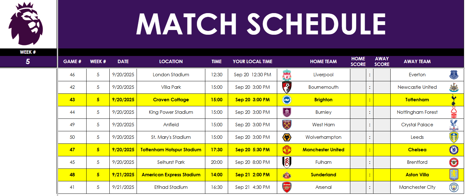
Are you looking for a free English Premier League Prediction Template to track matches, make weekly predictions, and see how your forecasts stack up against your friends’? This all-in-one spreadsheet is perfect for EPL fans who want an easy way to manage the 2025–26 season.
What’s Included in the EPL Template?
This English Premier League prediction spreadsheet has five tabs:
Master.Schedule
Team.Schedule
Weekly.Schedule
Weekly.Predictions
Leaderboard
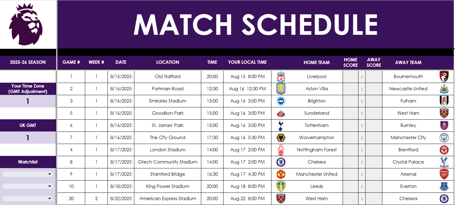
Master.Schedule: The Core of the EPL Template
This is the main tab where you manage all fixtures and results. Update scores in columns J and L, and adjust for your time zone using the fields in column A if you want the time and date to update in columnG for the schedule.
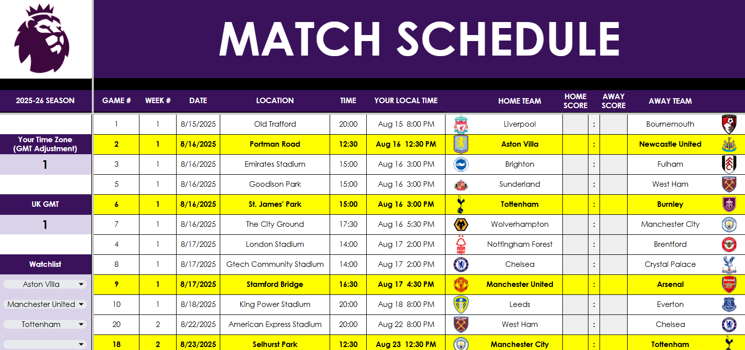
Want to follow your favorite clubs? Use the watchlist starting at cell A12 to highlight one or more teams. This affects other tabs like Weekly.Schedule, helping you quickly spot the matches that matter most to you.
As you update the results, the standings update automatically in columns AF:AI. If necessary, you can manually set tiebreaker positions in column AK, should the tiebreakers get to that point.
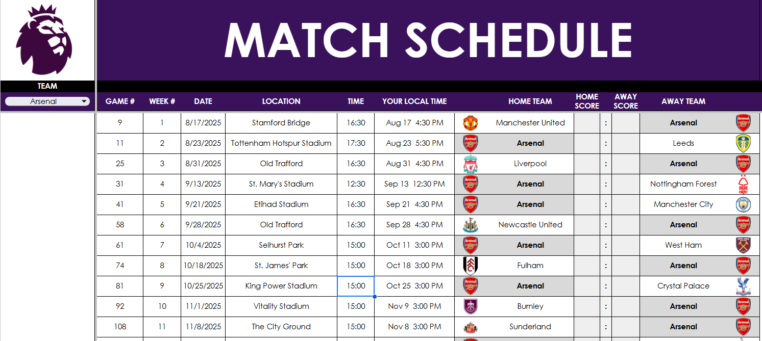
Team.Schedule: View Fixtures for a Single Team
In this tab, pick your team from the dropdown in cell A3, and their schedule auto-populates in columns B:N. It’s a clean, filtered view for tracking just one EPL team. The team is highlighted in grey, and no manual editing is required—this tab pulls directly from the master schedule tab.
Weekly.Schedule: Focus on One Week at a Time
In this tab, enter a week number in cell A3, and the tab displays all fixtures for that week. Matches involving any teams in your watchlist are highlighted for quick reference. Again, no need to manually enter anything—scores flow from the master tab.
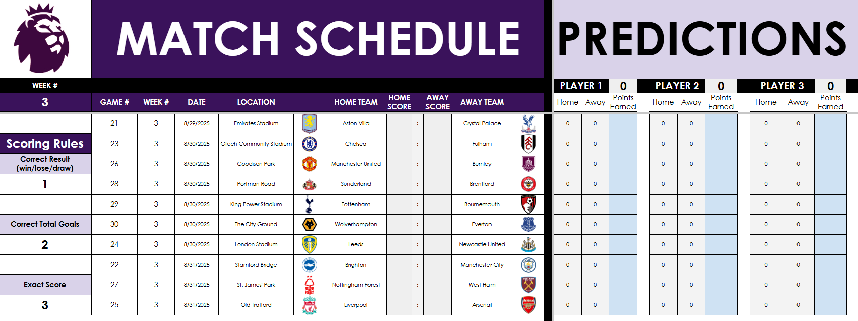
Weekly.Predictions: Compete with Friends
Want to run a weekly EPL prediction game? This tab lets up to 10 players make predictions and earn points. And with this, you can specify the week you want to make predictions for — there’s no worry if you start late or haven’t been making predictions since the start.
Enter the week number in cell A3.
Customize the scoring system (e.g., 1 point for the correct result, 2 for correct goals, 3 for exact score).
Add player names in row 2 and enter predictions starting in column P. There is room for 25 players. If you don’t need them, just delete the names, and they won’t populate on the leaderboard tab.
Scores will auto-update based on the scores from Master.Schedule – do not make changes and enter actual results on this sheet.
Leaderboard: Track Your Prediction Results
The current week’s results will populate on the leaderboard, in row 72:
When the week is complete, copy the values to the table above, which is where you can update the points per week, in the actuals section.
In the above example, I’ve filled in values 1 through 25 for each of the players. You will override this with your own prediction results for week 1. And then as the following week completes, copy the scores (from row 72) to the correct section on the actuals.
The data will then populate above, giving you a cumulative score for each player, along with a chart, showing the results visually.
On the Google Sheets version, the chart will automatically update. However, on Excel, since a pivot table is used to show only the active players, you will need to Refresh the data (from the Data tab). Otherwise, the chart will not update. There is a reminder on the Excel workbook to do this refresh.
Updated scores will now update via Power Query and Google Sheets
8/20 Update: With the latest file, you no longer have to manually input the scores anymore. I have a file that will update with the latest scores, and that will flow through to the Google Sheets and Excel files. For Excel, you will need to refresh the query to get the latest data, it will not pull in automatically. To do this, go to the Data tab and click on Refresh Data. By doing this, the file will download the scores.
Please note the scores are not live or up to the minute. I’m using AI to periodically update the data, and while I will attempt to update it by at least the end of each day that there is a game, I cannot guarantee that will always be the case. If you prefer not to wait, you can still update the scores and override the formulas within the file. But at the very least, you won’t have to input all the scores anymore.
Download the English Premier League Prediction Template
If you’re ready to go and want to give the template a try, you can get started right now:
When you click on the link, you’ll be prompted to make a copy of the file. This is to ensure that you have your own unique version of the file to work with.
This Premier League Prediction Template for Excel and Google Sheets is completely free to use and customize.
If you have any comments, questions, or suggestions about the template, please contact me!
If you liked this English Premier League Prediction Template for Excel and Google Sheets, please give this site a like on Facebook and also be sure to check out some of the many other templates that we have available for download. You can also follow me on Twitter and YouTube. Also, please consider buying me a coffee if you find my website helpful and would like to support it.
The Altman Z Score is a financial formula that evaluates a company’s financial health by analyzing key balance sheet and income statement ratios. In simple terms, it produces a single number (“Z-score”) that helps predict the probability that a company will go bankrupt.
A low Z-score can alert you that a company is at high risk of insolvency before obvious signs of distress appear. Since it relies on objective financial data, the Z-score offers an unbiased measure of a company’s stability.
What are the five key ratios in the Altman Z Score Formula?
The Altman Z Score is calculated from five financial ratios, each capturing a different aspect of a firm’s financial health:
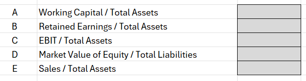
A: Working Capital / Total Assets: This measures liquidity by comparing net working capital (current assets minus current liabilities) to total assets. It indicates the company’s short-term financial stability and ability to cover its short-term obligations. A higher ratio means the firm has more liquid assets relative to its size, which is a positive sign.
B: Retained Earnings / Total Assets: This profitability ratio shows the cumulative profits that a company has retained (not paid out as dividends) relative to its total assets. It reflects the company’s long-term earning power and age – older, profitable firms will have large retained earnings.
C: EBIT / Total Assets: EBIT stands for Earnings Before Interest and Taxes, essentially the operating profit. This ratio measures operating efficiency – how effectively the company’s assets generate earnings. Higher values mean the company’s core business operations are very profitable relative to its asset base.
D: Market Value of Equity / Total Liabilities: This leverage ratio compares the company’s market capitalization (market value of all shares) to its total liabilities. It introduces a market perspective on leverage. A larger value suggests investors value the company’s equity highly relative to its debts, implying more of a buffer to absorb losses.
E: Sales / Total Assets: This is an asset turnover ratio indicating how efficiently the company generates revenue from its assets. It varies by industry, but generally a higher Sales/Assets ratio means the company is using assets effectively to drive sales.
Each of these five ratios captures one dimension of financial performance – liquidity, retained profitability, operating performance, market leverage, and asset productivity respectively. Altman’s insight was that a weighted combination of these ratios could reliably distinguish healthy firms from those likely to fail.
What the different Z-score values mean
Once you calculate a company’s Z-score, it falls into one of three risk categories (zones) originally defined by Altman:
Z > 2.99 – “Safe” Zone: A score above 2.99 is considered safe. The company is likely in solid financial health and at low risk of bankruptcy in the near term. Investors can take comfort if a firm’s Z-score is around 3 or higher – it suggests the business is financially stable.
1.81 <= Z <= 2.99 – “Grey” Zone: A score between 1.81 and 2.99 falls into a grey zone. This is an ambiguous middle range indicating some moderate risk. The company isn’t obviously about to fail, but there are enough warning signs that it’s not completely safe either. Investors should be cautious and perhaps investigate further – the firm could go either way over time.
Z < 1.81 – “Distress” Zone: A score below 1.81 signals the company is in distress and has a high risk of bankruptcy. In Altman’s study, companies with Z < 1.81 often did go bankrupt within a couple of years. Such a low score is a glaring red flag for investors to be extremely careful – it suggests the company’s financial foundations are very weak.
Setting up the Altman Z Score Calculation in Excel
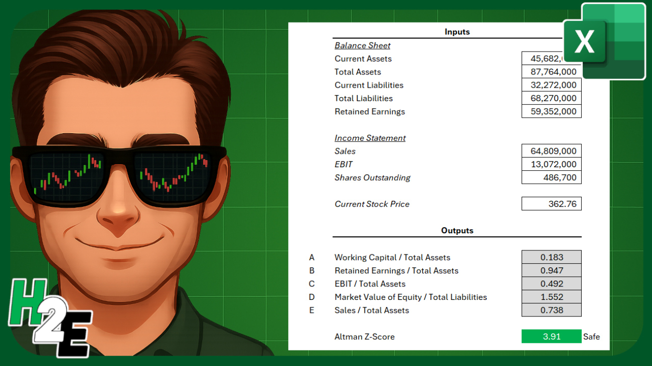
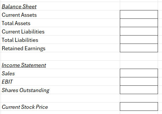
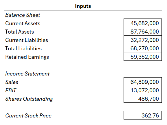
To calculate the Altman Z Score in Excel, we can set up some inputs to make it easy to enter data. And from there, formulas can be setup to take care of the remaining calculations. We’ll need inputs for the balance sheet, income statement, along with the current share price. Here’s a look at what the inputs look like on my sheet:
The point of these inputs is for the user to easily plug in values from the income statement and balance sheet, without having to worry about setting up the formulas. Those will be done on the following cells:
For item A, the working capital balance will be calculated by taking the current assets and deducting the current liabilities, and then taking that result and dividing it by the total assets.
For item D, we need to multiply the shares outstanding by the stock price to get the market value of the equity, and then dividing that by total liabilities.
For all other items, the calculations should be self explanatory as they are referencing different values from the input cells.
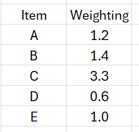
There is also a weighting that gets applied (multiplied) to the cells, and this lookup table can also be setup on the worksheet:
The Altman Z Score weighting is designed primarily for manufacturing companies but there are other variations. And by setting a place where you can change the weighting, you can easily customize the weighting should you need to.
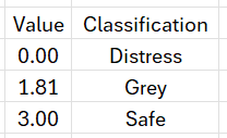
Let’s also setup a lookup table for the different thresholds. If the Z-score is below 1.81, for instance, then the business is in distress. If it’s 3.00 or more, then it’s considered safe. Anything else falls into the Grey zone. The following lookup table will enable us to do a lookup to determine which zone a company falls within:
The above table can be used with a VLOOKUP function and by setting it up for approximate matches (rather than exact ones), it will ensure the correct classification is applied based on the Z-score value.
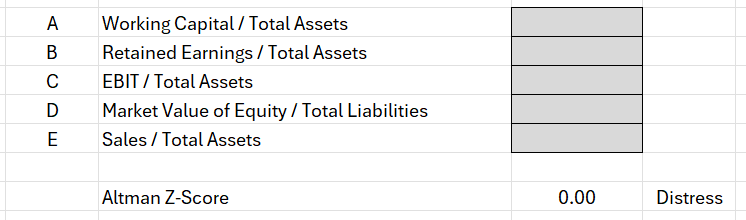
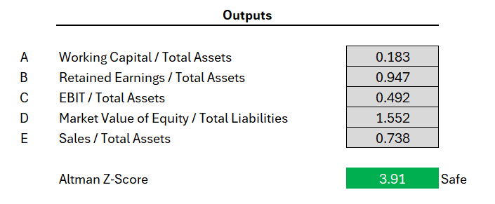
Now, to pull it all together, what we need to do is to calculate the Z-score. And this can be done by tallying up the calculated fields. And next to the output, I’ll setup a VLOOKUP formula to determine which classification it falls under: distress, grey, or safe.
Now, let’s try it out by entering the following values for a manufacturing company, Caterpillar. These values are pulled from Yahoo Finance for 2024:
Based on my Excel spreadsheet, this produces the following values and related Z-Score:
If you liked this post on How to Calculate the Altman Z Score in Excel, please give this site a like on Facebook and also be sure to check out some of the many templates that we have available for download. You can also follow me on Twitter and YouTube. Also, please consider buying me a coffee if you find my website helpful and would like to support it.
Marketers know that typically 80% of sales come from just 20% of customers, and by focusing on that group, you can gain valuable insights into your data. With the help of Excel, it’s easy to determine not only who your top 80% of customers are, but also how much revenue they’re actually bringing in. In the example below, we’re going to go over how to do such an analysis, and identify how much your top 20% and bottom 20% of customers generate.
And you can also do further analysis by looking at the top 10% or whatever cutoff points you want. In this example, we’ll create a spreadsheet which will allow you to set these different cutoff points however you want.
This is the data set that I’m going to use for this example.
Step 1: Convert the data into a pivot table
The first thing we’ll want to do is to convert this into a pivot table. By doing this, we can sum up the totals by individual customers. We don’t want to apply the analysis on raw numbers as that will only give us the top invoices when instead, we’re looking at sales by customers.
If you select a cell on the data and go to the Insert tab, you can click on the button to create a Pivot Table. Then, pull the sales data into the fields section and the customer field into the Rows section. This now creates a summary by customer.
Step 2: Calculate the cutoff points
Now that the data is grouped by customer, we can start to calculate the sales by different percentiles. If you want to determine the top 20%, then we need to get the 80% percentile. At that level, the values will be higher than 80% of the rest of the data, and thus, leave us with the cutoff for the remainder, the top 20%.
With the sales data in column B, we can use the following formula to get this cutoff point:
=PERCENTILE(B:B,0.8)
The 0.8 indicates the 80% percentile, which means that the value returned is higher than 80% of the values in the data set. In my data set, this returns a value of 276.34. Any customer whose total is at or above this cutoff point means that they are part of the top 20%.
To get the cutoff value for the bottom 20%, the same formula is used, except now for the second argument, the value is set to 0.2. This returns a value of 101.90. In this situation, we’ll be focusing on values at or below this cutoff.
Step 3: Calculate the sales that fall within the top and bottom 20%
Now, let’s calculate the total dollar amount of the sales that fall in the top and bottom 20% ranges. For the top 20%, we’ll need to sum up all the values that are equal to or greater than that cutoff point of 276.34. With that value in cell B3, my formula is as follows:
=SUMIF($B$9:$B$1000,”>=”&$B3)
The pivot table sales field is in column B. This calculation returns a value of $35,072. That is the total dollars that my top 20% of customers have generated.
To calculate the bottom 20%, we can use the following formula, assuming that the cutoff point for 101.90 is in cell B4:
=SUMIF($B$9:$B$1000,”<=”&$B4)
The total of this value is 7,894, and that indicates how much revenue the bottom 20% have brought in.
We can visualize these data points by plotting them on a column chart:
If you want to calculate different percentiles and cutoff points, you just need to adjust the second argument in the percentile formula.
If you liked this post on How to Do an 80/20 Sales Analysis in Excel, please give this site a like on Facebook and also be sure to check out some of the many templates that we have available for download. You can also follow me on Twitter and YouTube. Also, please consider buying me a coffee if you find my website helpful and would like to support it.
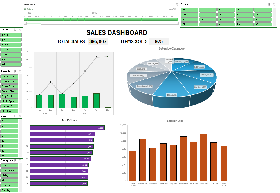
In this post, I’m going to walk you through the steps of creating a dashboard in Excel, from start to finish. You can use the sample data file to follow along with my example, which is not based on any real information but it represents a realistic data set. Here is an overview of it:
We’ll first start with preparing the data by creating pivot tables, then turning those pivot tables into charts, formatting the charts, and linking the relevant pivot tables together using slicers. We’ll also add some data that isn’t connect to any pivot tables but which can summarize the overall data set.
Step 1: Plan your dashboard and the key metrics you want to track
An important step in any dashboard creation is first thinking what data you want to track. This is crucial because if you can’t think of at least four metrics you want to plot on charts, then you may not have enough relevant data to create a useful dashboard. You may need to pull in more data. A dashboard that has just a few key data points is not going to be all that useful. For many users, the whole point of a dashboard is being able to easily stay on top various metrics and track trends and gain multiple insights in just a single page.
The sample data above has customer name, city, state, shoe model, category, size, and color. Those are a lot of useful metrics. Some easy metrics to track could include sales by date, by state, by category, and by model. That gives us a lot of things to track. You can add more but at the very minimum, you should be able to think of at least four charts you can create from your data set. Any less than that, and you might want to consider adding to your data set.
Step 2: Make sure your data is in a table
If you data isn’t already in a table, make sure to convert it into one. This is useful because when you create a table, you can setup an easy name to remember when creating your pivot tables. Rather than having to remember the sheet name and a specific range, you can just use a named range such as tblData.
To turn the data set into a table, click anywhere on your data and use the CTRL+T shortcut. Excel should automatically detect your range. If it doesn’t, make sure to adjust it. And then once it is correct, click on OK and you can set your table name in the top-left-hand corner, by simply typing tblData.
Another benefit of using a table is that if you add to your data set over time, you don’t have to worry about adjusting the range you’re referencing. If you use tblData as your range when creating your pivot table, you can confidently know that it will include new rows added to your data set (as long as there are no gaps).
Step 3: Create multiple pivot tables
I create a pivot table for every chart I want to track on a dashboard. This makes it easy to ensure everything is pulling from the same data source. To create a pivot table quickly, you can use the ALT+N+V+T shortcut. I prefer to put all the pivot tables on a separate sheet, which I’ll call the PT tab in this example.
Setup each pivot table with the metrics you want to track (e.g. shoe model in rows, sales in the values section). Repeat this for each metric you want to show on your dashboard.
Here are the pivot tables I’ve setup:
PivotTable 1: Rows: Shoe Model; Values: Sales
PivotTable 2: Rows: Category; Values: Sales
PivotTable 3: Rows: State; Values: Sales
PivotTable 4: Rows: Date; Values: Sales
PRO Tip: create one pivot table, then copy and paste it multiple times. Afterwards, adjust your fields. There is no need to go back to the data set each time and create a new one.
Step 4: Customize your pivot tables (optional)
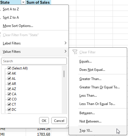
For Pivot Tables 3 and 4, I’m going to make some additional adjustments. Since there are 50 possible states that can appear in my pivot table, this is not going to be useful to display on a chart; it will get very cluttered. Instead, what I will do is display the top 10 states.
To do this, select the drop-down option for the State field and choose Value Filters and Top 10.
By leaving the default selection, it will leave the top 10 items by sales. We can also sort the data from largest to smallest, by right-clicking on any of the items and selecting Sort and Sort Largest to Smallest
This now shows us the top 10 states, sorted from largest to smallest in terms of sales.
Next, for Pivot Table 4, which contains dates, we need to setup the correct grouping, as it may simply show the ungrouped dates. This may not be the case in your version of Excel, and that will ultimately depend on your settings.
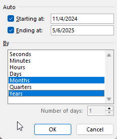
To group this, right-click on any of the dates and select Group, where you’ll see the following options for grouping your dates:
Let’s select months and years for the grouping. This avoids the potential issue of including multiple months together, which can be problematic if you have multiple years (e.g. you don’t want January 2025 and January 2024 being added together).
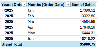
Now, we have a more organized data set by year and month.
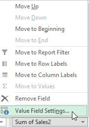
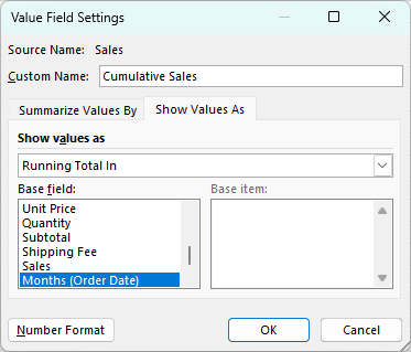
But let’s also show current monthly values as well as cumulative values. To do this, simply drag the sales field a second time into the values section. The data will look identical, but if you select the drop-down arrow for the field, you can select Value Field Settings which will allow you to change how the data is displayed.
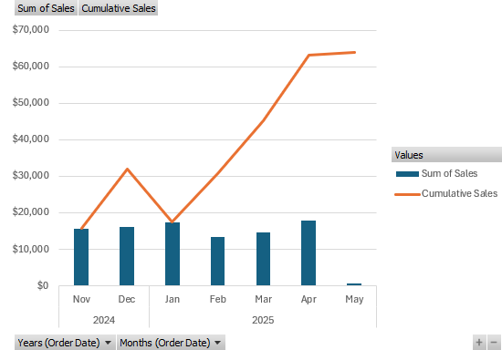
In the Show Values As tab, there will be an option to show values as Running Total In. There, you can select Months (Order Date). We can also rename the field to say Cumulative Sales:
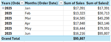
This now gives us multiple views for the sales data: a monthly view, as well as a cumulative view. You’ll notice since it is based on month, the cumulative values don’t reset and continue adding on.
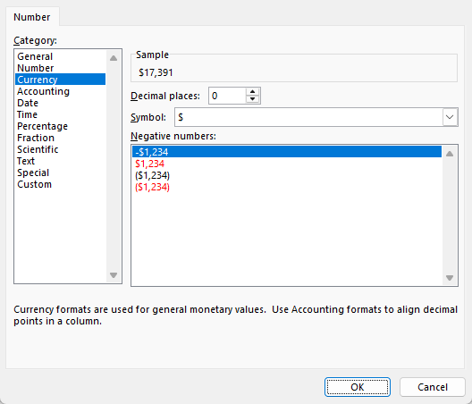
Step 5: Format your value fields
Before moving on to the next step, now is a good time to adjust the different field settings for all your pivot tables, to ensure the values are formatted properly as numbers. This will make them easy to display on your dashboard. By going into each of the different fields in your value section and selecting Value Field Settings, you can adjust the Number Formatting. Let’s set the format to Currency and remove any decimal places, to minimize the space the values take up, while also making it clearing they are dollars (you can also adjust the symbol to your local currency):
Repeat these steps for all of your different value fields in your pivot tables.
Step 6: Create the charts
With the pivot tables setup, the next step is to actually start creating the different charts. Here again, you’ll want to consider planning out your charts as well. You don’t want to create a boring dashboard which just has the same column or bar charts over and over again.
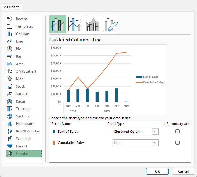
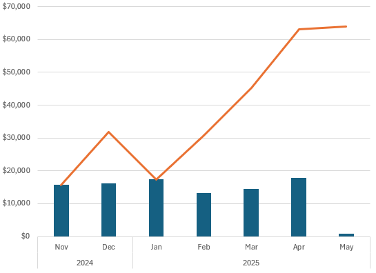
For the pivot table which shows dates, let’s use a combination that displays both column charts and line charts. To set this up, ensure you select Combo when choosing a chart type.
This creates the following chart:
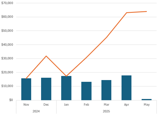
To clean this chart up, I’m going to remove the drop-down options and also the legend for values. For the latter, just select the legend and click the delete button. And to turn off the drop-down buttons, go into the PivotChart Analyze tab and press the Field Buttons option so it no longer shows that it is pressed:
This now creates a cleaner look for the chart:
One optional change you may want to consider is to shrink the gap width to minimize the white space in the chart. By right-clicking on the chart and selecting Format Data Series, you’ll see an option to modify the gap width.
By changing the gap width to 100%, this makes the columns wider:
At this stage, it’s just a matter of customizing the chart to how you want it to look and feel. The changes I’ve applied are as follows:
Setting the columns to a green fill color.
Setting the line chart to grey with black data points.
Adding vertical lines to the chart.
Setting the plot area to a grey color.
Adding a border to the plot area.
This results in the following chart:
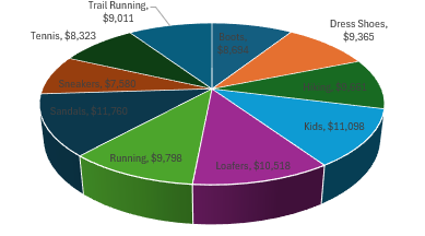
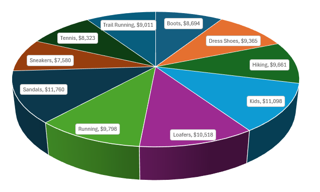
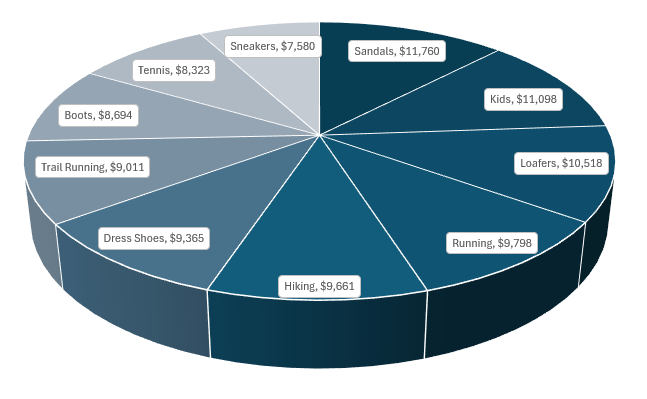
The next chart to create is for sales by category. For this one, let’s create a pie chart. The 3D pie chart in particular, looks like a good option for this pivot table:
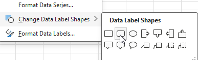
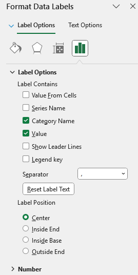
Let’s remove the legend and the field buttons again with this template. However, without legends, it’s hard to read and understand this chart. To get around this, let’s add labels. This can be done by clicking on any of the pie chart slices and selecting Add Data Labels. You can then right-click on any of the labels and select Format Data Labels where you can specify to include both the value and the Category Name. This, unfortunately is still a bit difficult to read:
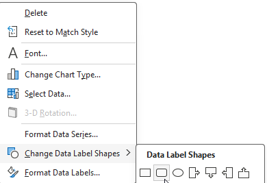
To make this easier to read, right-click on any of data labels and select Change Data Label Shapes and select the rounded rectangle.
After shrinking the font for the labels, it’s now easy to see them:
Let’s also make the following changes:
Sort the pivot table so that the values in arranged from highest to lowest. This is helpful in reading a pie chart by seeing the largest values first.
Adjust the colors of the pie chart so that they are more gradual. On the Design tab, let’s adjust the colors so that they are different shades of blue.
Now, here is my finished 3D pie chart:
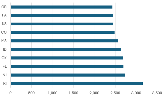
Next, let’s create a chart for the top 10 states. This one will be a simple, clustered bar chart. Here is how it initially looks:
For this chart, I’ll make the following changes:
Reduce the gap width for the bar charts to 50%.
Change the color to purple.
Add data labels.
Lastly, I’ll setup the chart to show sales by shoe model. This will be just a simple clustered column chart that will be set orange:
PRO TIP: If you want to expedite the process of setting up your charts, you can select your chart and on the Design tab select a pre-defined style to apply to your dashboard. You can still make adjustments afterwards, but this can give you a good starting point.
Step 7: Add totals and headers
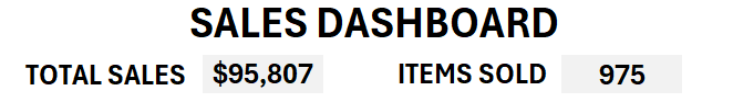
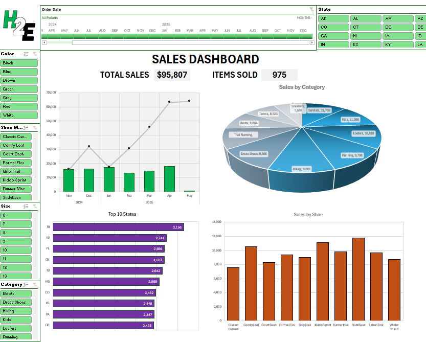
In addition to creating pivot charts, let’s also incorporate metrics, such as total sales and items sold. We can position these metrics above the main charts and slightly below the header. For now, let’s just refer to this as ‘Sales Dashboard’ for the sake of keeping it simple.
Let’s also merge cells and create a title for the metrics. One will be called ‘total sales’ and another will be ‘items sold’. This can be helpful to always show these totals, regardless of which filters are applied to pivot tables. Let’s also create a grey background color for these items to allow them to stand out more easily.
To generate these totals, all we need to do is sum up the sales from the main data table, which will be used for the Total Sales metric. And for the total items sold, we’ll need to total the quantity field from the data sheet.
With these metrics, these numbers will not change even if the pivot table values change. This can be useful to just get a quick snapshot of everything that’s important.
Step 8: Add slicers and a timeline
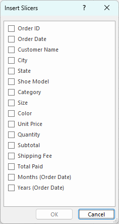
To make this dashboard dynamic, it’s important to also add slicers. By doing this, someone can quickly apply multiple filters to all the pivot tables at once. To add slicers, select any of the pivot tables and click on the Insert tab and click Slicer. This will give you a list of all the fields which you can add as slicers:
These are the fields to add which may be ideal for this dashboard:
Category
Color
Shoe Model
Size
State
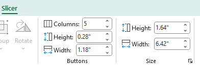
Let’s add all that slicers on the left-hand-side of the page, with the exception of the state slicer, which can go across the top. For that slicer, since there are so many different options, we can select the slicer and change the number of columns to 5.
This now produces a slicer that’s easier to scroll through:
For fields where the items are short in length, setting up multiple columns can be ideal in this situation.
Since we have a date field, we can also add a timeline to this dashboard. Similar to adding slicers, select any pivot table, and on the insert tab, select the Timeline button.
There is only one date field to select. Choose that and click OK, which will add the timeline.
At this stage a key part is to organize your slicers in a way that’s easy to read the options and scroll through them all. You can also apply custom formatting to all of them. In my example, I’ve applied a green color to the slicers. Here is how they are organized:
Step 9: Link slicers and timelines to all pivot tables
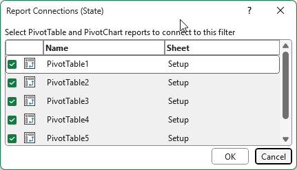
You might think you’re done after the last step, but and important thing to do is to link all your slicers to all your pivot tables. This is key to ensure that all your charts updated based on a slicer or timeline selection. To do this, go through your slicers and the timeline created, and right click on them to select Report Connections. Upon doing so, you’ll see a list of all the different pivot tables that you can link to. Check them all off.
If you do this for all of the slicers and timelines you’ve setup, clicking any one of them will now link to all of your charts. Now, any slicers you select will impact all of the charts on your dashboard.
Step 10: Personalize your dashboard with a logo
You can structure your dashboard in a way that your slicers intersect in the top-left-hand corner, which can leave a space for a logo. This can allow you to easily insert an image for a company’s logo. You can go to the Insert tab and select Place Over Cells and This Device, if you want to select an item from your computer.
I’ve inserted my logo, which ties in well the green theme of my slicers.
You can also follow this video tutorial to help walk you through the process of creating this dashboard.
If you liked this post on How to Create a Dashboard in Excel to Summarize Sales Data, please give this site a like on Facebook and also be sure to check out some of the many templates that we have available for download. You can also follow me on Twitter and YouTube. Also, please consider buying me a coffee if you find my website helpful and would like to support it.
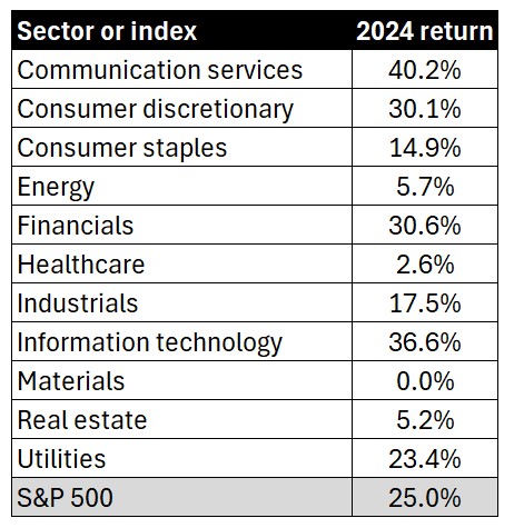
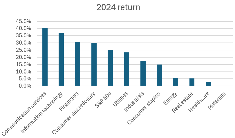
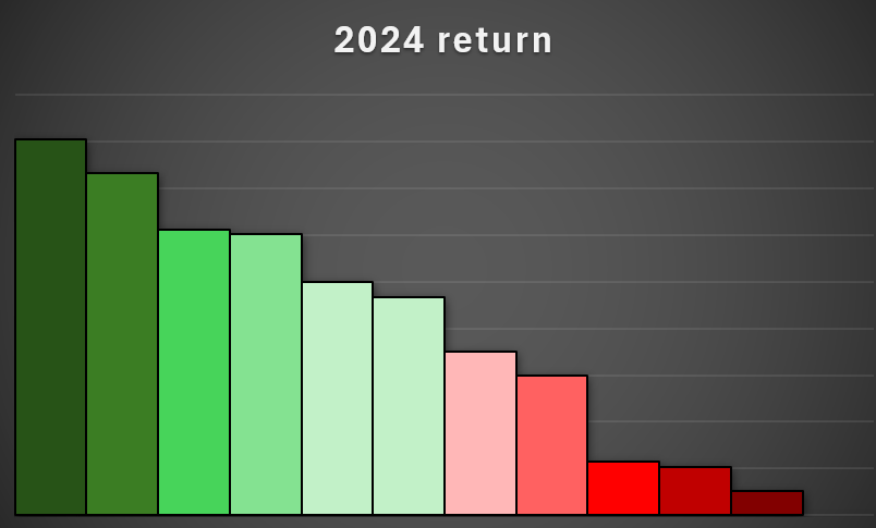
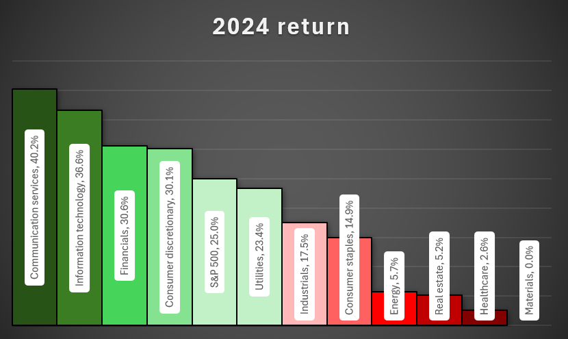
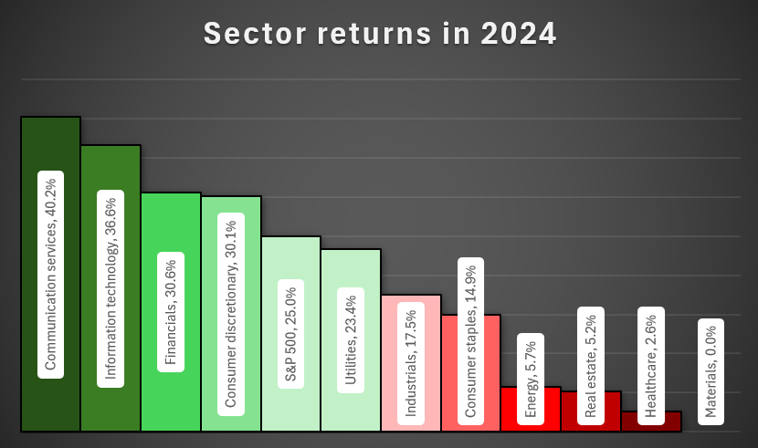
Charts can be an effective way to convey data, as opposed to just tables. By visualizing numbers, readers can easily see the highs and lows, and just how much of a variance exists between them. In this example, I’m going to show you how to turn a table summarizing S&P 500 sector performance into a chart.
The data we’re going to use for this example is as follows:
Let’s turn this into a more helpful visual, which will sort these values from highest to lowest. Here are the steps you can take to do that:
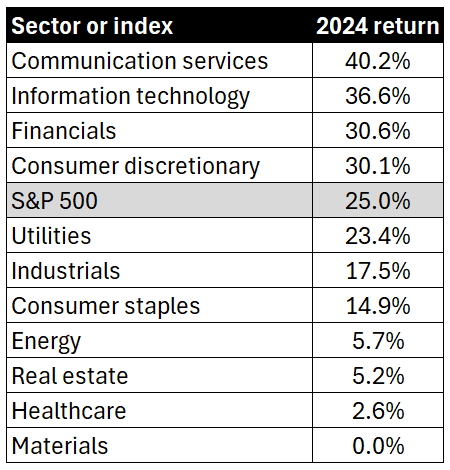
1. Sort the list from largest to smallest
This can be done by simply selecting the 2024 return header and clicking on the sort descending button. The table is now re-arranged as follows:
2. Create a column chart
By selecting the data and choosing to create a column chart, you can create a visual that now displays the returns, from highest to lowest.
3. Select a chart style
If you select the chart and click on the Chart Design tab, there will be many different styles to choose from. This can save you the time from making multiple adjustments yourself.
Let’s select the dark one on the bottom-left corner.
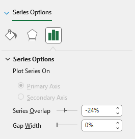
4. Remove gaps
To make the column chart more snug, you can remove the gaps between them. To do this, right-click on the chart and select Format Data Series. Adjust the Gap Width to 0%.
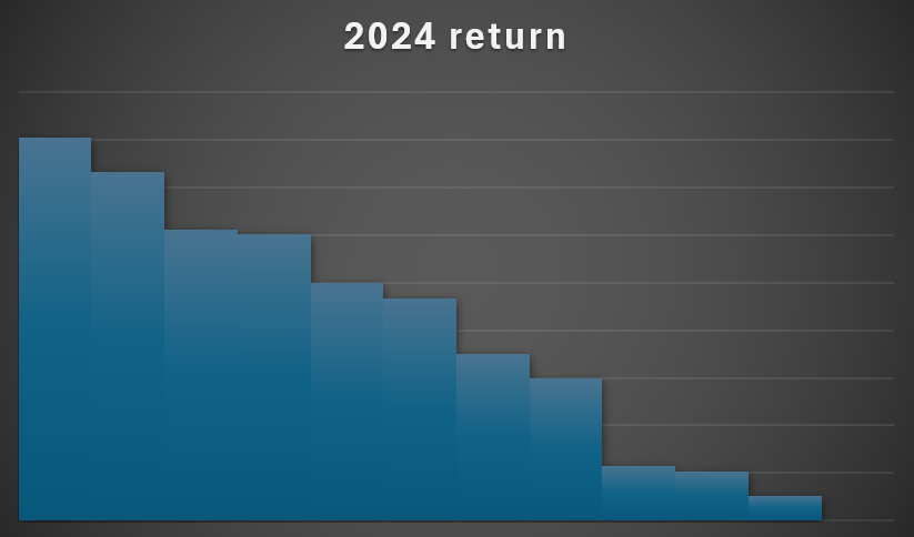
5. Remove axis labels
Since we’re going to incorporate the labels into the actual chart, you can remove the axis labels themselves. To do this, simply click on each axis and click on the delete key. You’ll now have a chart that looks like this:
6. Setup the color formatting for the column charts
To help display the largest and worst-performing sectors, let’s apply different colors to each column. Starting with the first column chart, set that to a dark green color and apply a black border around it. Then, proceed to the next one, by clicking on ctrl + right arrow. This avoids having to manually select each item. If you need to go back in the opposite direction, you can use ctrl + left arrow.
Here’s how I’ve setup my chart so it gradually goes from a dark green to a lighter green, to light red, and dark red.
7. Add labels
If you right-click on any of the columns, there will be an option to Add Data Labels. Once added, you can also right-click on them to select Format Data Labels. Let’s select the option to show the value along with the category name, and set the label position to Center.
What we can also do is setup a data label shape, so that it’s easy to see. To do this, right-click on any of the labels and select Change Data Label Shapes. Let’s choose a rounded rectangle.
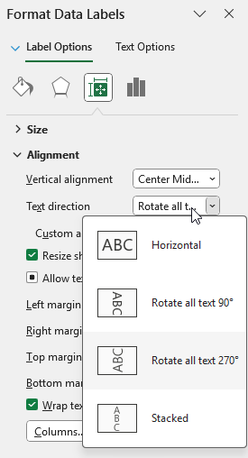
Next, on the alignment section, let’s also set the text direction to rotate all text 270 degrees.
This now results in the following chart:
8. Add a title
The last step is simply to update the title, to more accurately reflect the data. Let’s rename it by double-clicking on the title, and setting the name to ‘Sector returns in 2024’
If you liked this post on How to Analyze S&P 500 Sector Performance Using an Excel Bar Chart, please give this site a like on Facebook and also be sure to check out some of the many templates that we have available for download. You can also follow me on Twitter and YouTube. Also, please consider buying me a coffee if you find my website helpful and would like to support it.
Creating a pivot table is not difficult to do. If you just go to the Insert menu in Excel, there is an option to select a Pivot Table. As long as you have your data selected, Excel goes to work and creates the table. But making a good pivot table is an entirely different story. And that’s the real challenge — making your pivot table easy to read and understand, and not cumbersome to update. To help you with that process, here, I’ll list 10 of the most common mistakes you can make when creating a pivot table, and how you can avoid them!
1. Not cleaning your data beforehand
The old adage of “garbage in, garbage out” is true when it comes to data analysis, and pivot tables are no exception. If you have data that has incorrect values, then there’s no sense in creating a report on it. Take the time to check and review your formulas, make sure you don’t have any blank or missing values (or at least keep them to a minimum), and also check for spelling inconsistencies. That last one can be an easy one to miss. If you have a value with an extra space, that won’t be the same as a value without one.
If you spend the time of cleaning up and reviewing your data before you create a pivot table, you’ll save yourself some headaches and possible embarrassment later on; no one wants to provide their boss with a report that is incorrect.
2. Forgetting to use an Excel table
To convert your data into a table is easy — just use the CTRL+T shortcut. By doing so, you’ll ensure that your table will automatically expand and your formulas will copy down as you add new entries and rows. And as long as you pivot table references your table, then you won’t have to worry about re-adjusting the range later on. Otherwise, if you’re referencing a static range, the danger is that you forget to include new data as you add on to it. And in that situation, your report may once again be incorrect.
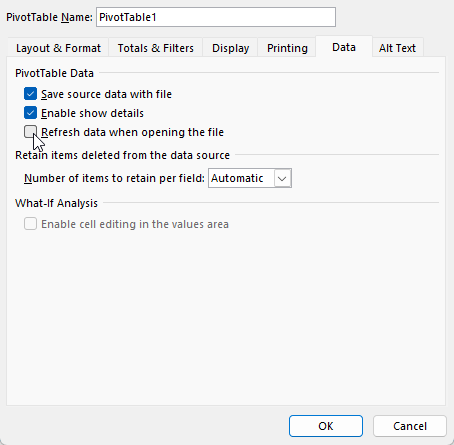
3. Not refreshing after data changes
Even if you’re using a table, you still need to ensure that your pivot table is refreshed. Unless you have a macro setup, this is a process you’ll need to do manually. By right-clicking on your pivot table and clicking Refresh, your data will update. You can also go to the Data tab and select Refresh from there.
Alternatively, if you right-click and select Pivot Table Options, under the Data tab, you can choose to Refresh data when opening the file, which will do a refresh when first opening the file.
4. Using merged cells in source data
Merged cells can cause lots of issues in Excel, including with pivot tables as that can cause problems when grouping your data. If you have merged cells, that can also mean that values are missing from certain fields. Merged cells should generally be avoided in Excel, and even if you want to spread a title across multiple cells, as you might with a header, there’s an easy way to look as though you’re merging a value without actually merging the cells.
5. Dragging text fields into the values area
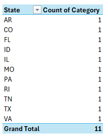
If your pivot table looks like this, where you have a count of values when you’re expecting to see a summation or an average, it’s likely that you’ve put a text value in the values section:
This happens because Excel doesn’t know what to do with these values since it can’t add them. In the above example, a text field (category) has been placed in values section and upon doing so, Excel simply does a count of them. To fix this, ensure that you are correctly organizing your pivot table and not putting any text fields into the values section.
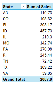
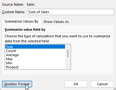
6. Not renaming field labels
When creating a pivot table, you might be tempted to leave the default names when setting it up. However, that can lead to unnecessarily long titles such as Count of Category or Sum of Sales.
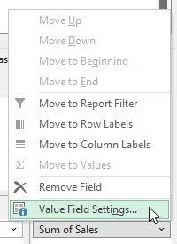
You can fix this by selecting the arrow next to the pivot table field and clicking on Value Field Settings:
You might be frustrated that you can’t change the name to the same label. If I were to change the field to simply say ‘Sales’ then I would get an error stating that it’s already in use since that is the source name. However, an easy workaround is to just add an extra space. By renaming it to ‘Sales ‘ it no longer triggers an error and in the pivot table, it will look as though I’ve used the same name as the source. It also saves space and can make your field names more meaningful; there’s no reason you have to use the defaults.
7. Using Inconsistent Date Formats
If your dates are not entered as dates, and some are reading as text, or perhaps are entered as day/month/year rather than month/day/year, this can be another problem, because it can mean your data isn’t being grouped correctly.
This can be a harder issue to catch and that’s where doing a spot check of your pivot table after it has been created is helpful. You can clean your data beforehand, but errors like this are more difficult to spot. This is why it’s always a good idea to review your pivot table, and make sure it makes sense. If you have sales in a future month, for example, that can be an easy way to spot that you have a possible problem with your dates.
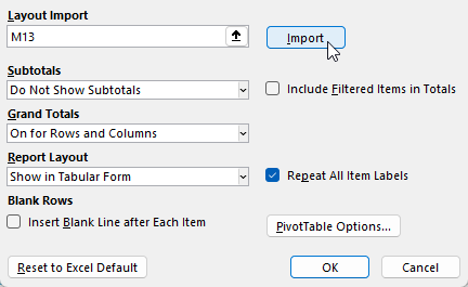
8. Repeating the same layout changes over and over again
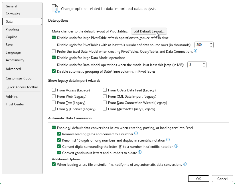
When you first setup a pivot table, the default layout may not be what you want. But instead of making the same changes over and over again, why not simply save them as your new default? Once you’ve made the changes that you want, such as repeating labels and/or displaying the pivot table in a tabular format, you can save your pivot table layout as a default. This can be done by going to File-> Options -> Data and selecting Edit Default Layout for your pivot table.
You can import the layout by just selecting the pivot table you’ve modified and clicking on the Import button.
9. Making changes to individual cells rather than fields
One frustrating and easy-to-make mistake is to format pivot tables the way you might regular tables and other data in Excel. You might be tempted to select an entire column and change the formatting to how you want it. The problem? Once your pivot table refreshes, the data reverts back to its previous form. This is happening because you aren’t adjusting the underlying field settings.
To adjust the actual field, select it from your pivot table layout and go into Value Field Settings. Once there, go into the Number Format option and make any formatting changes there.
Now once you make the changes, they will remain intact, even after you update your pivot table.
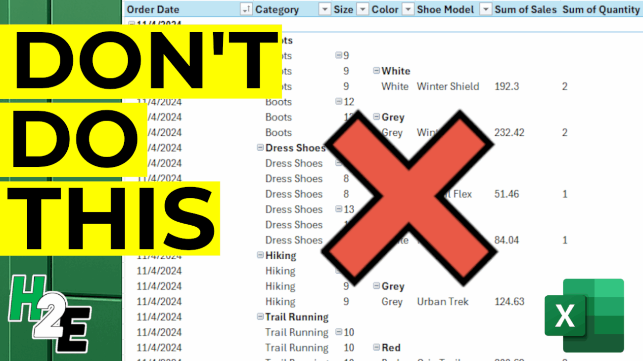
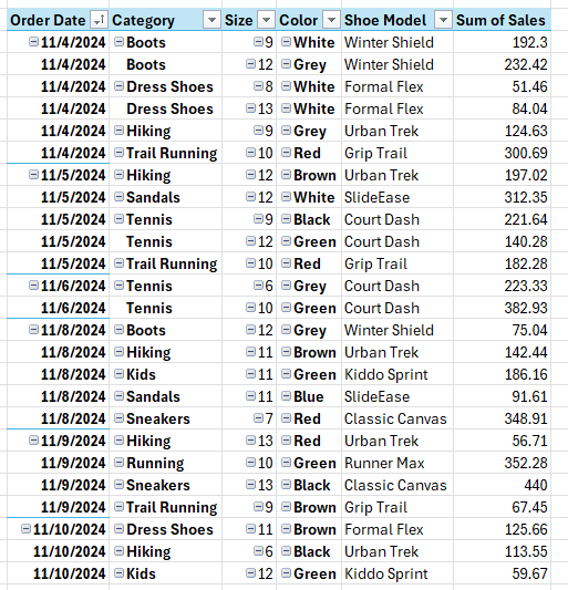
10. Overcomplicating the Layout
As easy mistake to make with a pivot table is by cluttering it up with too many fields. In the below example, I have too many fields listed in the Rows section, and they’re in an order which isn’t logical, going from category->size->color->shoe model.
This doesn’t make the pivot table easy to read and understand. I have almost recreated the original table by setting it up this way. A good mix involves putting some fields in the rows section and some in the columns. And a good rule of thumb to follow is to use the fields which contain the most number of items in the rows section, rather than columns. This is because it’s a lot easier to scroll up and down with a mouse wheel versus horizontally and having to drag the scroll bar.
If you liked this post on 10 Pivot Table Mistakes to Avoid, please give this site a like on Facebook and also be sure to check out some of the many templates that we have available for download. You can also follow me on X and YouTube. Also, please consider buying me a coffee if you find my website helpful and would like to support it.
When it comes to working with Excel, mastering the various built-in functions can save you time, increase your efficiency, and unlock new ways to analyze your data. One such function, often underutilized but incredibly powerful, is the CHOOSE function, which is available in Excel 2016 and newer versions. In this guide, I’ll explain what the CHOOSE function does, how to use it, and provide you with practical, real-world examples to help you become an Excel power user.
What is the CHOOSE Function in Excel?
The CHOOSE function in Excel allows you to select a value from a list of options based on a given index number. It’s like a simplified version of a lookup function: you specify a number, and Excel returns the corresponding value from a set of choices you provide.
Why Use the CHOOSE Function?
Quickly pick from a list of options without complicated formulas.
Useful for creating drop-down dependent formulas, simple scenarios, or mock data.
Combines well with other functions to create flexible, dynamic formulas.
CHOOSE Function Syntax
The syntax of the CHOOSE function is as follows:
=CHOOSE(index_num, value1, [value2], …)
index_num: The position number in the list of values you want to return. This must be a number between 1 and 254.
value1, value2, …: The possible choices (up to 254 in total).
Example:
=CHOOSE(2, “Red”, “Blue”, “Green”)
Result: Blue
Explanation: The index number is 2, so Excel picks the second value, which is “Blue”.
Basic Examples of the CHOOSE Function
Let’s start with some simple use cases to help you understand how CHOOSE works.
Example 1: Picking a Day of the Week
Suppose you have a number between 1 and 7 and want to return the corresponding weekday.
If cell A1 contains 1, the formula returns “Sun”
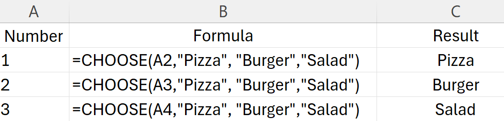
Example 2: Creating a Simple Menu
You want to return a meal based on a number.
Practical Uses for CHOOSE in Excel
Now that you’ve seen the basics, let’s explore how the CHOOSE function can help you solve real-world Excel problems.
1. Simulating a VLOOKUP with CHOOSE
Although VLOOKUP is often used to look up values, you can use CHOOSE to create a two-way lookup, especially for dynamic scenarios.
Example: Dynamic Lookup Table
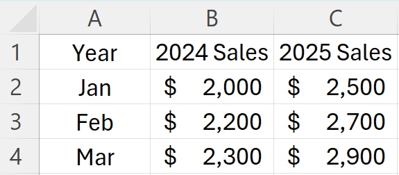
Suppose you have sales data for two years in columns:
You want to pick which year’s sales to show based on a cell (say, cell D1: 1 for 2024, 2 for 2025).
Formula in cell D2:
=CHOOSE($D$1, B2, C2)
If D1 = 1, you see sales for 2024.
If D1 = 2, you see sales for 2025.
2. Generating Random Items from a List
Combine CHOOSE with the RANDBETWEEN function to randomly pick an item.
Each time you recalculate, Excel picks one fruit at random.
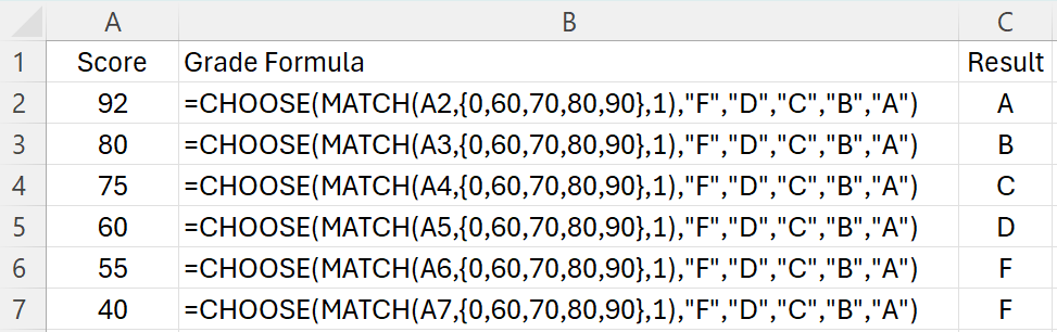
3. Creating Conditional Labels
Suppose you have a grading system:
MATCH returns a number 1-5, which CHOOSE uses to assign “F”, “D”, “C”, “B”, or “A”.
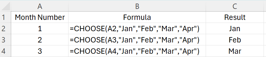
4. Working with Dates
Pick the correct month, quarter, or label based on a number.
Combining CHOOSE with Other Functions
The true power of CHOOSE comes when you combine it with other functions for advanced scenarios.
Example: Dynamic Chart Series
You have two data series and want to switch which series your chart displays using a dropdown (Data Validation).
Set up your options in a cell (1 = Sales, 2 = Profits).
Use CHOOSE to dynamically reference your data:
=CHOOSE($B$1, SalesRange, ProfitsRange)
Where SalesRange and ProfitsRange are named ranges.
Example: Returning Ranges
You can return entire ranges with CHOOSE (useful in array formulas or dynamic charts).
=SUM(CHOOSE(2, B2:B10, C2:C10, D2:D10))
Returns the sum of column C.
Common Errors and Troubleshooting
1. #VALUE! Error
Reason: The index number (index_num) is less than 1 or greater than the number of choices.
Solution: Check that your index number is within the valid range.
2. #REF! Error
Reason: You are trying to reference a range outside of what is available (for example, referencing a column that doesn’t exist).
Solution: Double-check your value references.
3. Non-integer Index
Reason: Index number is not an integer.
Solution: Ensure the index is a whole number.
CHOOSE vs. INDEX vs. SWITCH: Which to Use?
CHOOSE: Best for a small, fixed list of options, or when returning ranges or arrays.
INDEX: Better for large lists, dynamic lookups, or when referencing ranges based on a row/column number.
SWITCH: Great for exact matching of values.
Example:
Use CHOOSE when you want =CHOOSE(2, “Apple”, “Banana”, “Cherry”) for simple selection.
Use INDEX when you have a table and want =INDEX(A2:A100, 5).
Use SWITCH for matching exact values: =SWITCH(A1, “A”, 1, “B”, 2, “C”, 3, “Other”).
Frequently Asked Questions
Q: Can CHOOSE be used with arrays? A: Yes, you can use CHOOSE in array formulas, especially to select between ranges for dynamic charts or calculations.
Q: What is the maximum number of choices in CHOOSE? A: Up to 254 values can be specified.
Q: Can CHOOSE be used with text, numbers, ranges, and formulas? A: Yes, you can use CHOOSE to return text, numbers, cell references, ranges, or even calculations.
The CHOOSE function in Excel is a versatile, easy-to-use tool that can simplify many tasks, from random selections to dynamic reporting. While it may not replace more advanced lookup functions in every situation, it shines when you need to pick from a small set of options or return specific ranges dynamically.
By mastering CHOOSE, you add another valuable skill to your Excel toolkit, helping you work smarter and faster.
If you liked this post on How to Use the CHOOSE Function in Excel: A Comprehensive Guide, please give this site a like on Facebook and also be sure to check out some of the many templates that we have available for download. You can also follow me on Twitter and YouTube. Also, please consider buying me a coffee if you find my website helpful and would like to support it.