VisualizeText1

How to Create a Word Cloud in Excel With Python

In Microsoft 365, you can now use python to help you analyze and summarize data. And one of the cool things you can do is to create a word cloud. A word cloud allows you to visualize data, specifically words, to see which ones appear most often. It can be an effective way to identify trending topics and keywords from a series of text.

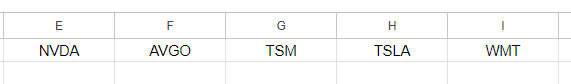
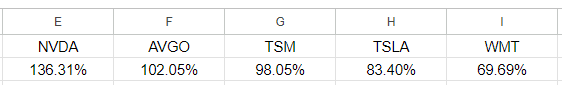
For the example below, I’m going to use a word cloud to visualize Nvidia’s most recent earnings transcript, to determine which words were most prominent on the tech company’s latest earnings call. In particular, I’m going to pull the text from the question and answer section of the earnings transcript to see what analysts and management were talking about, to get an idea of which words were used more often.

The text can be grabbed in its entirety and pasted into a single cell in Excel. To get the Word Cloud to display properly, I’ll need to create the python code. I’ll break down the full code and share it with you, which you can use in your own spreadsheet.

How do you enter python code in Excel?

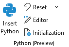
First thing’s first, you’ll need to enter python code properly in Excel. This isn’t just entering a regular formula that starts with an = sign. Instead, go to the Formulas tab, and there, you’ll see an option to Insert Python:

Inserting python code in Excel.

Once you click on that, you’ll see a change to your formula bar with a green column with the letters PY in it:

Entering python code in Excel.

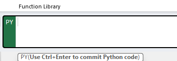
You can now enter python code in the formula bar, and Excel will understand what you’re trying to do. And as you can see from the message below the formula bar, you’ll also need to hit Ctrl+Enter when you’re done. This will run the code. Otherwise, just pressing enter will move down a line within the python code.

Populating the code

Next, it’s time to actually put the code into the formula bar. Here’s a brief breakdown of how the code functions.

First, for the code to work, I need to import the necessary libraries and modules, which includes wordcloud and matplotlib. I also need to ensure the data is pulling from a specified cell, which in my example will be cell A1 in Sheet1.

In order to avoid commonly used words, I’ll also use a list of predefined stopwords, which can exclude common words that wouldn’t be useful in analyzing text. I’ll also add a custom list of stopwords which I can add to exclude even more words that I might not find helpful.

The last part involves creating the word cloud and visualizing it. You can adjust the height and width and background color to your preference. Here is the full code you can use in your spreadsheet:


from wordcloud import WordCloud, STOPWORDS
import matplotlib.pyplot as plt

def visualize_text_trends():

    # Get the text from cell A1
    Dataframe = xl("Sheet!A1")
    

    # Define stopwords to exclude common articles and words
    stopwords = set(STOPWORDS)

    # Add custom stopwords
    custom_stopwords = {"will", "new", "going", "use", "thank", "operator", "question", "really", "come"} 
    
    stopwords.update(custom_stopwords)
    
    # Generate the word cloud
    wordcloud = WordCloud(stopwords=stopwords, background_color='white', width=800, height=400).generate(Dataframe)

    # Display the word cloud
    plt.figure(figsize=(10, 5))
    plt.imshow(wordcloud, interpolation='bilinear')
    plt.axis('off')  # Hide axes
    plt.show()


# Run the function
visualize_text_trends()

You can see the custom stopwords I added and you can modify it to suit your individual analysis. Since there are a lot of questions and answers on an earnings transcript and an operator is involved, I’ve excluded the words ‘operator’ and ‘question’ along with other words that you may prefer to keep.

After committing the above code, it produces the following in cell B1 (which is where I’ve entered it):

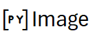
To convert this into an actual word cloud, I’ll enter the following in cell C1:

=B1.image

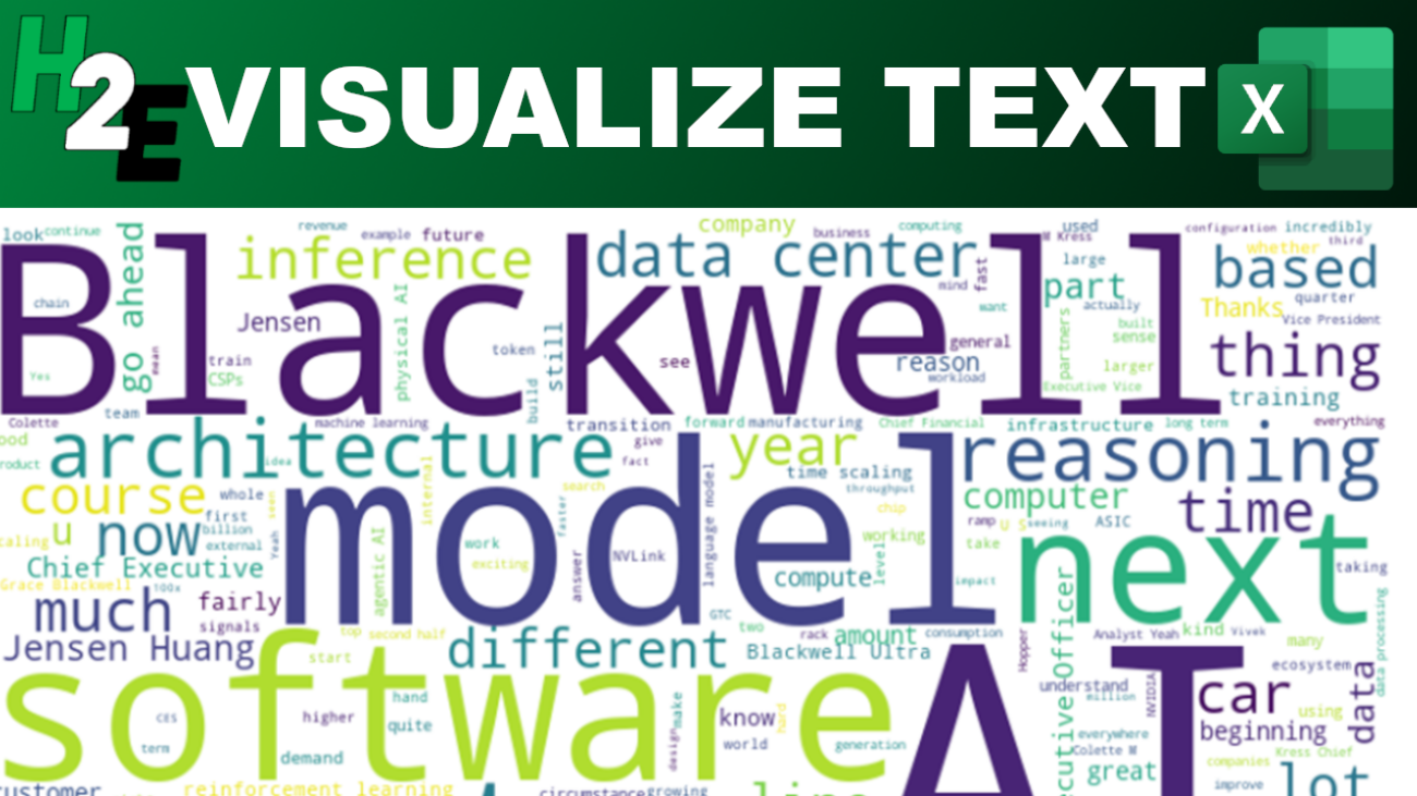
The data is then converted into the following:

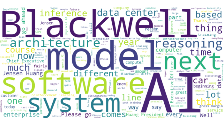
Unsurprisingly, AI is one of the most common words on the earnings call. Blackwell, Nvidia’s AI chips, are also referred to often. Software, model, and system also are prominent words based on this analysis.


If you like this post on How to Create a Word Cloud in Excel With Python, please give this site a like on Facebook and also be sure to check out some of the many templates that we have available for download. You can also follow me on Twitter and YouTube. Also, please consider buying me a coffee if you find my website helpful and would like to support it.

VisualizeTrends

Highlight the Largest Values in Excel With Conditional Formatting

Microsoft Excel can help you analyze data, even without having to do any computations. By simply setting up conditional formatting rules, you can easily visualize data and identify trends. Doing that can help focus your attention on key numbers and make your analysis process much more efficient. In the following data set, I have a list of investment returns by year. I’ll show you how you can setup a rule to highlight which return was larger in each year:

Investment returns by year in an Excel table.

Creating the conditional formatting rule

To create a conditional formatting rule to highlight the largest values, I’m going to select column B. Then, I’m going to go into the Conditional Formatting menu on the Home tab and will click on New Rule.

Creating a new conditional formatting rule.

Under the option for the rule type, I’m going to select use a formula to determine which cells to format, and I’ll enter the following formula:

=B1>C1

Then I’ll adjust the format so that the cell has a dark grey color and a white, bolded text.

Conditional formatting rule in Excel comparing values.

After clicking apply, the formatting will take effect:

Conditional formatting rules applied to an Excel spreadsheet, highlighting the largest amount.

A similar rule needs to be setup for column C. And in this case, I’ll highlight the values in blue.

Setting up a conditional formatting rule to check if a value is greater than another.

Now there is highlighting applied to both columns:

Conditional formatting rules applied to an Excel spreadsheet, highlighting the largest amount in multiple columns.

However, the header is also highlighted in column C. To fix this, I’ll add a condition to check to make sure that it is a number:

Setting up a conditional formatting rule to check if a value is greater than another and that it is also a number.

Now the conditional formatting is properly applied, and ignores the header row.

Conditional formatting rules applied to an Excel spreadsheet, highlighting the largest amount in multiple columns.

If you like this post on How to Highlight the Largest Values in Excel With Conditional Formatting, please give this site a like on Facebook and also be sure to check out some of the many templates that we have available for download. You can also follow me on Twitter and YouTube. Also, please consider buying me a coffee if you find my website helpful and would like to support it.

StockTradingTemplate2025

2025 Stock Trading Template

If you want to track your investments and stay on top stocks in a watchlist, I’ve created a template which will make that easy to do. My 2025 Stock Trading Template is a free template in Google Sheets that you can use for that purpose. It will give you a place to enter trades, populate a watchlist, and visually see how your investments are doing on a dashboard. Below, I’ll go over how the template works and how you can access it.

Entering in stock trades on the template

The template contains an Activity tab where you can enter any buy and sell transactions. You can also specify cash-only transactions if you make a deposit or withdrawal. It’s also possible to enter both a trade and a cash transaction on the same line.

In the screenshot below, you’ll see a cash-only transaction on the first row, and the one below has a stock purchase along with cash deposit amount. Any withdrawals should be entered as negative values in column D. This is for the purpose of tracking both the value of your investments and cash in your portfolio.

Activity tab on the 2025 stock trading template in Google Sheets.

You’ll want to reconcile your cash balance in the last column to ensure that it is properly accounted for. The current value of your holdings will pull into Google Sheets using the most recent stock prices; there’s no need to update the current price.

The only columns you need to populate in this table are A:G. The others will calculate automatically.

Keeping track of a watchlist

If you want to also track certain stocks, you can do so using the Watchlist tab. Simply enter the ticker symbol in column A and the value in column B will populate, which shows the stock’s percent change for the most recent trading day.

You only need to enter data in column A. The rest of the values will populate on their own and display on the summary tab.

List of stocks to watch on the 2025 stock trading template in Google Sheets.

View your holdings and watchlist on the summary tab

Once you’ve entered your holdings and the stocks you want to track, you can head over to the Summary tab which will summarize your financial position. Here you’ll see the current value of your investments, your gains and losses, and your return over the trailing 12 months (TTM) as well as how stocks have been performing in individual months.

Below the headers, in row 4, you’ll also see your watchlist, sorted in order of highest to lowest returns for that day. It will cut off after 300 characters so you may not see all of them on there if you have a large watchlist.

2025 stock trading template showing the dashboard in Google Sheets.

Download the template

You can access the Google Sheets template in the link below, which will prompt you to make a copy of it. I have entered some sample data for you to see how it works, and you can overwrite it with your own entries.

2025 Stock Trading Template

If you have any feedback, comments, or suggestions for improvement on the template, please feel free to contact me and let me know.


If you like the 2025 Stock Trading Template, please give this site a like on Facebook and also be sure to check out some of the many templates that we have available for download. You can also follow me on Twitter and YouTube. Also, please consider buying me a coffee if you find my website helpful and would like to support it.

DynamicConditionalFormatting

Dynamic Conditional Formatting: How to Link Rules to Specific Cells

If you want to create conditional formatting rules but want to easily change the cutoff values for them, you can link your rules to specific cells, to make that process easy. Below, I’ll show you how to make your conditional formatting rules dynamic. Rather than going into the settings each time, you can just update specific cells, which will change your cutoff points.

Creating conditional formatting rules for changes in stock prices

A common example where you might want to adjust the cutoff values for conditional formatting rules is when dealing with stock prices. Suppose you want to highlight stocks when they have risen by more than 5%. But in other cases, such as when you’re looking at a long time frame, you may want the threshold to be much higher than that. This is where linking conditional formatting rules can be advantageous, by making the update process easier.

In the spreadsheet below, I have a list of stocks and their respective returns between December 31, 2024 and January 31, 2025. I have pulled in their performances using Excel’s STOCKHISTORY function.

Stock returns for the magnificent seven, between Dec. 31, 2024 and Jan. 31, 2025.

In this scenario, I may want to highlight stocks which have returns of more than 5% as green, and those which are down by 5% in red. I’ll create two conditional formatting rules to highlight both the return and the stock. Here’s how one of the rules looks:

Conditional formatting rule highlighting a value if it is greater than 5%.

The downside of this rule is that the 0.05 value is hardcoded. If I want to change the threshold, I would need to go back into the conditional formatting rules and modify it. There is an easier way around this, and that’s by just linking to a specific cell.

Custom conditional formatting thresholds setup in Excel.

In the above example, I’ve entered the values that I want to link my conditional formatting rules to. In the case of a green highlight, I’m going to link to cell E2. And when I’m formatting the cells red, I’ll link to cell E3. Here’s how my updated conditional formatting rule will look:

Conditional formatting rule which links to a specific cell.

Now, I’ve removed the hardcoded value and my conditional formatting rule now points to a specific cell, which is frozen and doesn’t change. To do the same thing for my red highlight rule, when the values are down 5%, I do the same thing, except flip the sign and refer to cell $E$3:

Conditional formatting rules for negative returns.

My conditional formatting rules are correctly applied to my data set, highlighting returns of more than 5% in green, and returns of less than negative 5% in red:

Conditional formatting rules applied using cells in Excel.

The advantage here is I can easily update my thresholds by just modifying the values in column E. If I change them to 10% for green and -10% for red, I simply make the changes in those cells and my conditional formatting updates immediately:

Updated conditional formatting rules for returns of greater than 10% and less than negative 10%.

By setting up my conditional formatting rules this way, it’s easy to update the process in seconds and at the same time, I can see what my threshold are.


If you like this post on How to Apply Dynamic Conditional Formatting and Link Rules to Specific Cells, please give this site a like on Facebook and also be sure to check out some of the many templates that we have available for download. You can also follow me on Twitter and YouTube. Also, please consider buying me a coffee if you find my website helpful and would like to support it.

maxresdefault

Use Excel’s Image Function to Populate Logos

The IMAGE function in Excel is one of the newer ones you can use. And it can make importing images into your spreadsheet a whole lot simpler than saving, uploading, and then inserting them. I’ll also show you how to setup a template where you can dynamically import logos from a website.

How the Image function works

The main ingredient for the IMAGE function is the URL of the image you want to use. This means you no longer have to save an image you want to use. All you need to do is to point to where it is found online. Suppose, for example, I want to insert Netflix’s logo into my sheet. I can look for the logo online, and then copy the URL into the formula’s first argument:

=IMAGE(“https://upload.wikimedia.org/wikipedia/commons/thumb/7/7a/Logonetflix.png/1200px-Logonetflix.png”)

This will now display the Netflix logo in the cell:

Netflix logo displayed on an Excel spreadsheet using the IMAGE function.

By expanding the cell, the image will automatically expand. It will do so in accordance with its dimensions.

Netflix logo expanded to fit the cell.

Other arguments in the IMAGE function include the following:

  • Alt_Text: this is what will show if the image cannot be displayed.
  • Sizing: this determines how the image should be displayed and contains the following options:
    • Fit Cell: This is the same as the default behavior, where it will expand based on the size of the cell, while maintaining its true dimensions.
    • Fill Cell: This will fill the cell as much as possible and may result in the image stretching.
    • Original Size: This will be based on the original image’s size; no scaling will take place and if the image is very large, it may not fully display in the cell.
    • Custom Size: A custom size needs to be set in the height and width arguments.

The simplest option is to simply leave the default options, allowing the image to automatically expand based on the size of the cell. This ensures the image is not stretched out and gives you a lot of control over how it is displayed, without worrying about setting custom dimensions.

Creating a formula to populate logos

You can create a formula which will dynamically adjust based on your inputs, and pull in different images accordingly. Suppose you wanted to pull in logos for companies. You could do that by using a website such as logo.clearbit.com. The site has links to images based on their domains. While it may not work in the future, the way it’s linked gives you an idea of how this can be setup.

For example, the URL https://logo.clearbit.com/netflix.com will link to an image for Netflix. Different domains will show different images. If I setup a formula which connects the IMAGE function and starting URL along with a domain, I can make this dynamic so that the logos will update based on the domains I input.

=IMAGE(“https://logo.clearbit.com/”&B1)

The above formula will use the IMAGE function and combine the clearbit URL along with what I have entered in cell B1. And if that’s set to a domain, the image will update accordingly. Here’s how the formula works with multiple examples:

Image function in Excel pulling in different logos based on their domains.

The formulas are in column A and rely on the values in column B to create the full URL, which includes the clearbit site along with the domain. The end result is an easily updatable function which pulls in images based on my entries in column B.

You can create a similar type of setup if you host images on a site. By creating consistent names for your images, you can use them within the function so that you can easily point to the images you want.


If you like this post on How to Use Excel’s Image Function to Populate Logos, please give this site a like on Facebook and also be sure to check out some of the many templates that we have available for download. You can also follow me on Twitter and YouTube. Also, please consider buying me a coffee if you find my website helpful and would like to support it.

ExcelChartGaps1

How to Create Excel Charts to Visualize Variances in Stock Performance

If you want to compare and contrast between two sets of values, a chart can help you accomplish that. In this post, I’m going to show you how you can compare multiple investment returns, and using a chart to not only map them but to also display the variances. For this example, I’m going to compare the historical returns of the S&P 500 against the S&P TSX 60.

Step 1: Setting up the table

The first thing to do is to plot the values into a table format, making it easy to compare the differences. Below, I have multiple columns for the year, S&P 500 returns, and the S&P TSX 60 returns.

Table in Excel comparing investment returns.

Step 2: Calculating the differences and starting point values

The goal of this chart is going to be to not just plot the values of these returns but to also show the gap between them. This can be a little tricky since the value scan be both positive and negative. It’s important to determine where the starting point for the column chart needs to be, and where it finishes.

The first calculated column I’m going to create is for the starting point. If the two returns are both negative, then it will take the largest value (i.e. smallest negative number). Otherwise, it will take the smallest positive value. The formula for the first set of values in row 2 looks as follows:

=IF(AND(B2<0,C2<0),MAX(B2:C2),MIN(B2:C2))

Next, it’s necessary to calculate the gap for when there are both positive and negative returns, and when a crossover needs to happen to get to 0. This column, called crossover, will check to see if the returns are both positive or both negative. And if they are, then it will remain 0 since no crossover is needed. Otherwise, it will return the starting value. The formula for this column is as follows:

=IF((B2*C2)>0,0,D2)

By multiplying the values for both returns, it checks to see if there is a mix of positive values. If there is, then the value will be negative. If they aren’t, then it will return a 0 value.

Lastly, there is a column for the final difference field. First, it checks whether there is a value in the crossover field. If there is, it takes the maximum value in column B or C, which will be the other part of the gap to be filled in . If there isn’t a crossover value, then it looks at the starting value. If the starting value is positive, then it takes the largest value and subtracts the positive one. Otherwise, if the starting value is negative, then it takes the lowest value and subtracts the largest. This is what the formula looks like:

=IF(E2<>0,MAX(B2:C2),IF(D2>0,MAX(B2:C2)-MIN(B2:C2),MIN(B2:C2)-MAX(B2:C2)))

And here is the table, with the values calculated:

Table comparing investment returns in Excel.

Step 3: Creating the chart

Now that the data is setup, the next step is to plot the values on a chart. This requires the use of a combination chart. To create it, make sure a cell on the data set is selected, click on the Insert tab and select the button to pop out more Charts. Go to the All Charts tab and select Combo. The S&P 500 and S&P TSX 60 fields, select the option for Line with Markers and for the others, choose Stacked Column.

Initially, the chart is likely going to look incorrect and may include the date field. To fix this, right-click on the chart and click on Select Data. Remove the Year field if it is there. For the other fields, adjust the Horizontal Axis labels to ensure they are reflecting the year:

Modifying the data source for a chart in Excel.

The chart still has a lot to fix in terms of formatting:

Chart in Excel showing a range of values and variances.

For the line charts, right-click on them and select Format Data Series. Since only the data point is necessary, I will go under the fill bucket tab and under the Line category, select No Line.

Next, the the starting value column, format the data series and for the fill bucket, set the Fill option to No Fill. Then, change the fill color for the difference and crossover columns so that they are the same color. I’ll use grey in this example.

To ensure the column charts stack properly, you’ll also want to modify the order of the series. Right-click to select the data, and ensure that Crossover field comes before the Starting field, followed by the Difference field. Here’s how the chart looks at this stage:

Excel chart showing a range of values.

To clean up the chart a bit, I will move the labels to the bottom. This can be done by right-clicking on the years and selecting Format Axis. Under the Labels section, set the Label Position to Low. I’ll also delete the legend labels for the Crossover, Starting, and Difference fields. The last change is to set a chart title. This is what the final result looks like:

Excel chart comparing the returns of the S&P 500 versus the S&P TSX 60.

If you like this post on How to Create a Chart to Show a Range of Differences, please give this site a like on Facebook and also be sure to check out some of the many templates that we have available for download. You can also follow me on Twitter and YouTube. Also, please consider buying me a coffee if you find my website helpful and would like to support it.

GoogleSheetsHeatMap

How to Create a Stock Heat Map in Google Sheets

Heat maps can help you easily identify high and low values. You’ll often find them to display stock prices to show which stocks did well, and which ones didn’t. They can also make it easy to see whether it was a good or bad day on the markets when looking at a list of stocks. In this post, I’ll show you how to create a heat map in Google Sheets to do this.

Step 1: Populating your list of stocks

To start with, I’m going to need a list of stocks to track. I’m going to use the top 20 most valuable stocks as of today’s date and put them into a list:

List of the 20 most valuable stocks in Google Sheets.

Step 2: Calculate the percentage change

Next, I’ll need to setup the percentage change. This can be either the percent change from the previous day, or I could calculate how a stock has done over a specific timeframe, such as a 12-month period. In Google Sheets, you can use the GOOGLEFINANACE function to track the percent change from the previous day. Here’s what that formula would look like, assuming I want to calculate this for the ticker symbol in cell A2:

=GOOGLEFINANCE(A2,”changepct”)

This will return a value to display the percent change.

I’m going to use a more complicated example, however, to show how the stock has performed over the past year. First, I’ll pull in the current stock price, using the following formula:

=GOOGLEFINANCE(A2,”price”)

The trickier part is to pull in the price from a year ago. To go back 365 days, I can set the start date equal to today’s date minus 365 days:

=GOOGLEFINANCE(A2,”price”,TODAY()-365)

The problem is that this returns a table, occupying two rows and columns:

Apple's stock price a year ago.

To ensure I’m just pulling in the closing price, I’ll use the INDEX function to grab the value from the second row and second column:

=INDEX(GOOGLEFINANCE(A2,”price”,TODAY()-365),2,2)

Now, to calculate the percent change, I will take the current price and divide it by the historical price:

=GOOGLEFINANCE(A2,”price”)/INDEX(GOOGLEFINANCE(A2,”price”,TODAY()-365),2,2)-1

I add the -1 at the end to get just the percent change. Now, if I format my values in percentages, I can see how the stocks have performed over the past 12 months:

Google sheets chart showing stock performance.

Step 3: Ranking the values

Using the RANK function in Google Sheets, I can easily determine which stocks were the best and worst performers in the range. The following formula just takes the percentage value in column B and compares it against all the values in that column:

=RANK(B2,B:B)

By copying this formula down, I can now see a ranking of all the values:

Google sheets showing stock performance and ranking.

Step 4: Populate the stocks in order of their performances

Now that the data is setup, I can start arranging the values in order of largest to smallest. To do this, I’m going to use the INDEX function along with the MATCH function to extract the stocks based on their performances. Here is what the first formula will be:

=INDEX($A:$A,MATCH(COLUMN(A1),$C:$C,FALSE),1)

I use the COLUMN function because what I am going to do is drag this formula to the right, so that my largest values go from left to right. And as I copy the formula, A1 will become B1, then C1, and so on. The purpose of this is to increment the function to get the next value. Here is what my table looks like for the first five values:

Top-performing stocks listed in Google Sheets.

These were the five best-performing stocks that were in my list. Below these values, I’m going to also pull in the percentages. This is accomplished through the following formula:

=INDEX($B:$B,MATCH(COLUMN(A1),$C:$C,FALSE),1)

Now I have a list of the top ticker symbols and their percentage gains:

Top-performing stocks listed in Google Sheets along with their changes in value from a year ago.

Step 5: Creating conditional formatting rules

I have the values setup and next I’ll need to create conditional formatting rules to display different colors based on their relative performances. I’ll use a bright green for the best performance, and gradually show a white color when the values are close to zero, and red when they are negative.

I’m going to setup a table which shows the different thresholds I want to track, so it’s easy to change these conditional formatting rules right on the spreadsheet:

Table of conditional formatting thresholds in Google Sheets.

This is my table of values in column K. To setup the rules, I’m going to select the ticker symbols which I ranked in step 4, and create the following conditional formatting rule to start with:

Setting up a conditional formatting rule in Google Sheets.

I’m going to repeat these steps for the values in K2, K3, K4, and K5. I’ll adjust the colors to differentiate between the colors ranges I specified earlier. I use the same formula but simply adjust the cell I’m comparing to:

One thing to note here is that the value I’m using as my comparison is in row two, which is where my percentages are. This means for the conditional formatting rules in the first row, Google Sheets is looking the row below, which contains the percentages.

I’ll need to create another set of conditional formatting rules for the actual percentages themselves in row two. In order to avoid disrupting the formulas and the logic for the first row, I’ll need to create these rules from scratch again. It’s important not to just copy the formatting rules as Google Sheets will end up misinterpreting what I want it to do.

After selecting the values in E2:I2, I create the same conditional formatting rules. The one key difference is that this time I’m referencing the values in row two, not the row below. Once that’s setup, you should now see the same conditional formatting rules applied to both rows:

Heat map conditional formatting rules setup in Google Sheets for multiple stocks.

Step 6: Create borders and setup additional formatting

Before I copy over the formulas and conditional formatting to more rows, I’m going to setup additional formatting and borders. I’m going to make the ticker font larger and bold. And I’ll also outline a border for each stock and its percent change. Here’s what my tickers look like after making these changes:

Heat map conditional formatting rules setup in Google Sheets for multiple stocks.

Step 7: Copying the formatting rules and formulas to accommodate more stocks

I created a row of top 5 stocks but I’m going to expand this so that I have four rows of five stocks each, so that I’m capturing all 20 stocks in my list. To do this, I’m going to copy the cells in E1:I2 multiple times:

Heat map conditional formatting rules setup in Google Sheets for 20 stocks.

I’ve copied the formulas but I need to adjust them so that they aren’t all starting from the top-ranking stock all over again. Here’s how I’m going to adjust this. For the formulas in cells E3:E4, I’m going to add five so that they start at the sixth value. This is the updated formula in E3:

=INDEX($A:$A,MATCH(COLUMN(A3)+5,$C:$C,FALSE),1)

Now I’m going to do the same thing for cell E4. Once I’m done, I’ll copy the formulas across and now my second row is updated to show the stocks in the 6th, 7th, 8th, 9th, and 10th positions:

Heat map conditional formatting rules setup in Google Sheets for 10 stocks.

For the next row, I’ll add 10 to the formulas in column E. Then copy those across. Repeat the same process for the next set of rows and add 15, and do the same. Here’s what my updated table looks like:

Heat map conditional formatting rules setup in Google Sheets for 20 stocks.

Now my heat map is setup to show the percent changes. But as you can see, there’s not a lot of variability here. I’m going to change my values in column K as follows: 100%, 60%, 30%, 20%, -100%. I always leave the last one to -100% to ensure it captures everything else. With the updated rules, now my heat map looks as follows:

Heat map conditional formatting rules setup in Google Sheets for 20 stocks, showing red highlights for the poorest-performing stocks.

Although the values in red are not negative, based on the rules I’ve set out, it highlights the lowest-performing stocks in this list as red, and thus, the sheet follows the rules correctly. You can expand this to include more stocks or to track daily changes or other values.


If you like this post on How to Create a Stock Heat Map in Google Sheets, please give this site a like on Facebook and also be sure to check out some of the many templates that we have available for download. You can also follow me on Twitter and YouTube. Also, please consider buying me a coffee if you find my website helpful and would like to support it.

TaskCalendarTemplate

Free Calendar and Task Manager Template

It’s a new year and with the help of a good calendar, you can ensure you stay on top of not only your deadlines and tasks but goals as well. I have a free template which you can download and use for such purposes. With just a few clicks, you can populate a new month, select a custom image, and also have key dates and deadlines appear. And all this is available in a format which is easy to print out.

How the calendar template works

The calendar will populate the days of the month you specify, including the days before and after the end (these dates will be highlighted in grey). You can change the picture for the month and adjust its size depending on how big or small you want it to be. To do this, you can just right-click on the picture and select Change Picture. I’ve also left an area off to the left as blank, giving you room to make any notes.

Default calendar layout.

If you want to change the month, year, or the day that the week starts (either Monday or Sunday), go to the Inputs tab where you can modify those settings.

Inputs to determine the settings for the calendar template.

This is also the tab where you can enter any tasks or deadlines you want to track. They don’t have to be for the current month. Suppose, for example, you have a property tax bill that’s due in July. You can put that task there along with any others you want to track:

Important dates tracked in the calendar template.

These dates will show on the calendar depending on the month selected. If January 2025 is selected, then only dates related to that month will appear.

Dates and deadlines showing for January 2025.

The advantage with this template is that you can enter all your tasks and deadlines for the year and they will show only for the month you specify. This can make it easier to stay on top of tasks without having to remember to enter them all in for that specific month; you can enter them ahead of time and setup recurring ones as well. There is room to accommodate up to five tasks/deadlines for each day.

You can download the free template from here.


If you like this Free Calendar and Task Manager Template, please give this site a like on Facebook and also be sure to check out some of the many templates that we have available for download. You can also follow me on Twitter and YouTube. Also, please consider buying me a coffee if you find my website helpful and would like to support it.

FillinPatterns

How to Autofill in Excel: A Step-by-Step Guide

Autofill is one of Excel’s most powerful tools, helping you quickly and efficiently populate cells with data, formulas, or patterns. Whether you’re entering dates, numbers, or repetitive text, learning how to autofill in Excel will save you time and reduce errors.

In this article, I’ll walk through the basics of using Excel’s autofill feature, along with practical examples to help you master this essential tool.

What Is Autofill in Excel?

Autofill allows you to copy or extend data in Excel by dragging the fill handle (a small square in the bottom-right corner of a cell). Excel automatically identifies patterns and fills adjacent cells with the desired data, saving you from manually entering information.

How to Autofill in Excel: Step-by-Step

1. Basic Autofill for Numbers and Text

  • Step 1: Enter a value in a cell.
  • Step 2: Select the cell. You’ll see a small square (the “fill handle”) in the bottom-right corner.
  • Step 3: Hover your mouse over the fill handle until the cursor changes to a black plus sign (+).
  • Step 4: Click and drag the fill handle down or across to the cells you want to fill.
  • Step 5: Release the mouse. Excel will autofill the cells based on the first value.

In the example below, I’m using the autofill to fill in the remaining months of the year.

Using autofill to fill in months of the year.

2. Autofill a Sequence of Numbers

If you want Excel to create a sequence (e.g., 1, 2, 3…), follow these steps:

  • Step 1: Enter the first few numbers in adjacent cells.
  • Step 2: Select multiple cells. The more complex the pattern, the more cells you may need to select.
  • Step 3: Hover over the fill handle, click, and drag it down or across.
  • Step 4: Excel will automatically identify the pattern and fill the cells with the sequence.
Using autofill to continue a sequence in Excel.

3. Autofill for Dates

You can quickly autofill dates to save time.

  • Step 1: Enter a date in a cell (e.g., 01/01/2024).
  • Step 2: Drag the fill handle.
  • Step 3: Excel will autofill with consecutive dates.
Using autofill to fill in dates.

Custom Intervals:
To autofill dates in increments (e.g., every 7 days), follow these steps:

  1. Enter the first two dates (e.g., 01/01/2024 and 01/08/2024).
  2. Select both cells.
  3. Drag the fill handle to extend the sequence.
Autofilling dates in Excel and jumping by one week at a time.

4. Autofill Formulas

Excel can also autofill formulas for quick calculations.

  • Step 1: Enter a formula in a cell (e.g. price x quantity).
  • Step 2: Select the cell with the formula.
  • Step 3: Drag the fill handle down or across to apply the formula to other cells.

Excel will automatically adjust the cell references and fill in the formulas for you. If there is already data which extends as far down as you need to, you can double-click on the fill handle rather than dragging it down, and Excel will automatically go as far down as the rest of the data.

5. Autofill Custom List

If you frequently use custom lists (like days of the week or month names), Excel can autofill these automatically.

For example:

  • Enter Monday in a cell.
  • Drag the fill handle down.
  • Excel will autofill with Tuesday, Wednesday, etc.
Autofilling days of the week in Excel.

Tip: You can create your own custom lists:

  1. Go to File > Options > Advanced.
  2. Scroll down and click Edit Custom Lists.
  3. Add your list, save it, and use autofill as usual.

How to Autofill Without Dragging

If you have a large dataset, dragging the fill handle can be time-consuming. Here’s how to autofill using shortcuts:

  1. Enter the value or formula in the first cell.
  2. Select the range you want to fill (including the starting cell).
  3. Press Ctrl + D to autofill down or Ctrl + R to autofill right.

Common Autofill Issues and Solutions

  • Problem: Autofill copies the same value instead of creating a sequence.
    • Solution: Enter the first two values of the sequence and drag again.
  • Problem: Autofill doesn’t recognize a pattern.
    • Solution: Double-check your entries and use clear patterns like 2, 4, 6 or Monday, Tuesday.
  • Problem: Fill handle is missing.
    • Solution: Go to File > Options > Advanced and ensure the “Enable fill handle” option is checked.

If you like this post on How to Autofill in Excel: A Step-by-Step Guide, please give this site a like on Facebook and also be sure to check out some of the many templates that we have available for download. You can also follow me on Twitter and YouTube. Also, please consider buying me a coffee if you find my website helpful and would like to support it.

FixNAErrors

How to Fix #N/A Errors in Excel

Excel is a powerful tool, but even the most experienced users encounter errors like #N/A from time to time. This error can be frustrating, but it’s actually Excel’s way of saying it can’t find the information it’s looking for. Let’s break down why this error happens, and how to fix it.

What does #N/A mean?

The #N/A error occurs when a formula cannot find a value it’s supposed to look up. This commonly happens with lookup functions like VLOOKUP, HLOOKUP, INDEX and MATCH, or XLOOKUP.

Common Reasons for #N/A Errors

When a value isn’t found in your lookup formula, there are multiple possible reasons why that might happen. Here are some of the most common issues:

The value isn’t in the lookup range. The simplest reason is that the value simply isn’t there. Perhaps the value you’re looking for is spelled differently than what you’re searching for, or it just isn’t contained within the data set. An easy way to check for this is to use the CTRL+F shortcut and manually search for the value. If it isn’t found, you’ll get a message saying the value isn’t found. If it is, then it’s likely one of the other reasons that’s causing the error.

An error stating that a value isn't found within a range.

In the above error, ‘Microsoft Corporation’ isn’t found because the text in the range is just ‘Microsoft Corp’

The range or table being searched is incorrect. In this situation, your value exists but it can be that you’re looking in the wrong place. For example, if your data set is in columns A:B but you’re looking at values in C:D, then the value won’t be found. The only way to catch this is to manually look at your formula. By clicking into the formula, it will highlight the range it’s looking at. If it doesn’t look like you’ve selected the right area, that can explain why you are encountering an error.

A VLOOKUP formula which is searching in the incorrect range.

The data types are not the same. In this situation, you may be searching for a numerical value of 1 but the actual value is a text value of 1. This can be a more challenging issue to uncover. However, by using the CTRL+F function you can confirm if the value is indeed found. And if it is found, what you can do is use a formula to check if the values are an exact match. Suppose your lookup value is in cell A1 and the matching value is in cell D100. You can enter the following formula below, to confirm whether it is an exact match:

=A1=D100

If there is an error, that means the data is not the same. At this stage, you may want to do a closer analysis of the values to see if there are any extra characters. You may also want to use the ISNUMBER function to check whether one value is reading as a number and the other as text, as that could be resulting in the #N/A error as well.

The ISNUMBER function in Excel.

If the result of the ISNUMBER formula is FALSE, that tells us that the value is not a number despite it appearing to be.

There are trailing spaces. If your data type is the same and it looks like everything should be matching, then it may be an issue that you have a trailing space, either in your lookup value or the value which it should be matching to. An easy way to check for trailing spaces is by using the RIGHT function. If you don’t specify the number of characters you want to extract from the right, it will by default grab the last one. Then, if you see the formula returning characters, you know there are no trailing spaces. If, however, there is a blank value, this would be confirmation that a blank space exists at the end, and it could be interfering with your lookup.

Checking the last character in a range of cells.

In the above example, column C shows the last character. While there are letters and punctuation, there are no blank values shown.

How to use formulas to suppress #N/A errors

If all else fails and you can’t find the reason for the #N/A error, or it’s not possible to eliminate it without drastically changing your spreadsheet, or you simply don’t have the time to look through all the possible reasons, then you can use formulas to suppress the errors for the sake of eliminating them. There are two options here.

IFNA

The IFNA function can replace the error value with a different value of your choosing. You may want to simply have an empty value, perhaps a 0, or just a different message altogether. In the following formula, I’m using the IFNA function to return a text value of “Not Found” if the value in F4 is not found within column A:

=IFNA(VLOOKUP(F4,A:B,2,FALSE),”Not Found”)

If you encounter any other error, then you’ll still see an error. This function will only suppress #N/A errors.

IFERROR

The IFERROR function works similarly to the IFNA function but the key difference is it will suppress any and all errors. You can deploy it in the same way as you would the formula above:

=IFERROR(VLOOKUP(F4,A:B,2,FALSE),”Not Found”)

The advantage of using this function is it will remove any errors. But that can also be a drawback because if there are different issue causing the error, it won’t be evident, and that can mask other problems within the spreadsheet.


If you like this post on How to Fix #N/A Errors in Excel, please give this site a like on Facebook and also be sure to check out some of the many templates that we have available for download. You can also follow me on Twitter and YouTube. Also, please consider buying me a coffee if you find my website helpful and would like to support it.