Excel offers you the tools you need to create some great, effective dashboards. In addition to holding plenty of useful data, a dashboard also adds aesthetic appeal, and can attract users with the way it looks. The default settings, however, can be relatively plain and unoriginal. But you can go beyond that. And one way to spice up your dashboard is by using a custom background which can help make it pop. In this article, I’ll show you how you can create a distinctive dashboard background in Excel, with a spotlight on theme alteration, and how to use images.
Changing the Theme
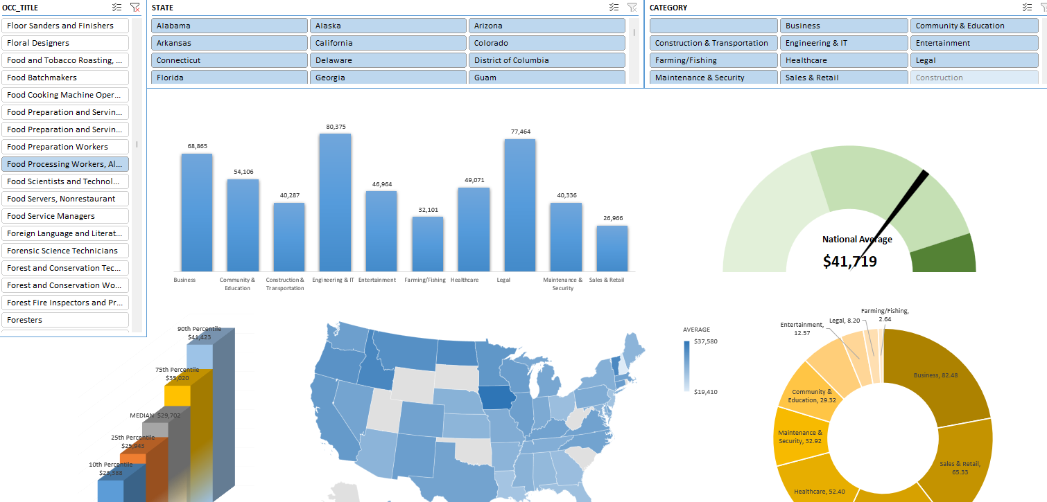
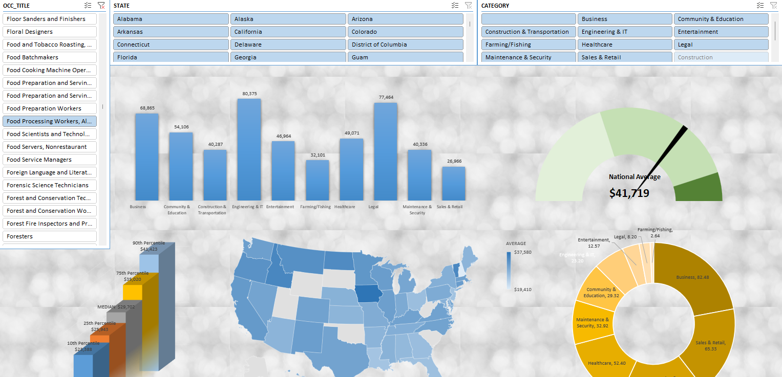
One of the easiest ways to change the look and feel of your dashboard is by changing the theme. Here’s a sample of a dashboard in Microsoft 365:
It’s a good dashboard that does the job. But it also looks like many others. You could go in and change the color of each chart, one by one. However, there’s an easier way to customize the look of your charts, and that’s by changing the theme.
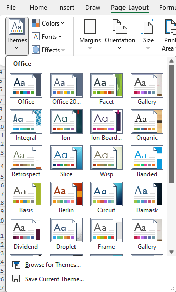
You can change the theme by going to the Page Layout tab. There, on the left-hand-side, you’ll see an option to select Themes:
You can hover over the different options to see how your dashboard will look when applying the effects:
Simply pick the theme you like. If there’s still a chart you would look changed, you can manually change the style. But by applying one of the pre-set options, you can save a lot of time by getting a consistent look and feel to your dashboard.
Adding a background image to your theme
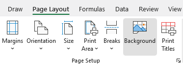
By default, you have a solid white background for your dashboard. It’s minimalistic but it can be a bit boring, nonetheless. You can, however, choose different background. To do this, go back to the Page Layout tab and under Page Setup area, click on the Background icon:
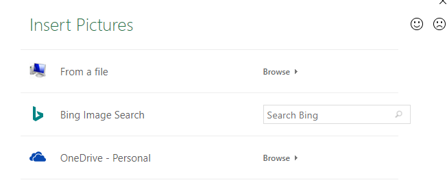
Then, you’ll see the following options from where you can select an image:
If you have already created and saved your file on your computer or on OneDrive, then you can select the Browse button from either the From a file section or OneDrive. At that point, you can just select the image that you already have.
But you can also use an image by searching through Bing. If I search for a ‘white background’ I get many various options to choose from:
By selecting one of them and clicking on Insert, I can load the background into my spreadsheet:
Here I’ve used one of the images from the search results. If you don’t like the image, you can press on the Delete Background button, which takes place of the Background button once you’ve selected an image.
There are some things to consider when selecting an image to use as your background:
You should consider the color. If you choose a dark color such as purple or black, you may need to change the text color on your so that it is readable.
Try to avoid complex images. In the above example, I chose an image that didn’t have a lot going on. If I chose something with a lot of different images and colors, or people, it might be different to make it blend in well with the dashboard.
Consider editing your photo before importing it into your dashboard. If you do have an image you really want to use but the color isn’t right or it does have too many components to it, then consider editing it beforehand. What you can do is try lightening the color or making the image partially transparent. By doing that, you can make it more suitable as a background. The key is for the background to be subtle, and not for it to take over your dashboard.
Keep in mind the size of the image you are using. A large file can make your Excel file a lot bigger than it otherwise would be, which may not make it optimal for sharing or sending through email.
Adding a background image can make your dashboard stand out but it’s important not to overdo it, either. The focal point should still be your charts and data, not the background picture.
If you like this post on How to Add Custom Backgrounds to Your Dashboards in Excel, please give this site a like on Facebook and also be sure to check out some of the many templates that we have available for download. You can also follow me on Twitter and YouTube. Also, please consider buying me a coffee if you find my website helpful and would like to support it.
Did you know that you can quickly change the look of your data in Excel with Custom Views? No need for pivot tables or having to change your file’s settings and view over and over again. If you don’t use tables but frequently change the look of your file, Custom Views can save you time.
What are Custom Views?
Custom Views in Excel allow users to save specific display settings (like column widths or cell formatting) and print settings for a worksheet. This becomes especially useful when you have a single Excel sheet but require multiple ways to interpret or present the data. Rather than manually adjusting settings each time, you can quickly switch between different Custom Views.
How do Custom Views work?
Here’s how you can create Custom Views in Excel.
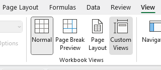
First, what you may want to do is create a default view with no changes applied to it. Go to the View tab and click on Custom Views.
Then select Add and just call it Default.
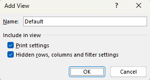
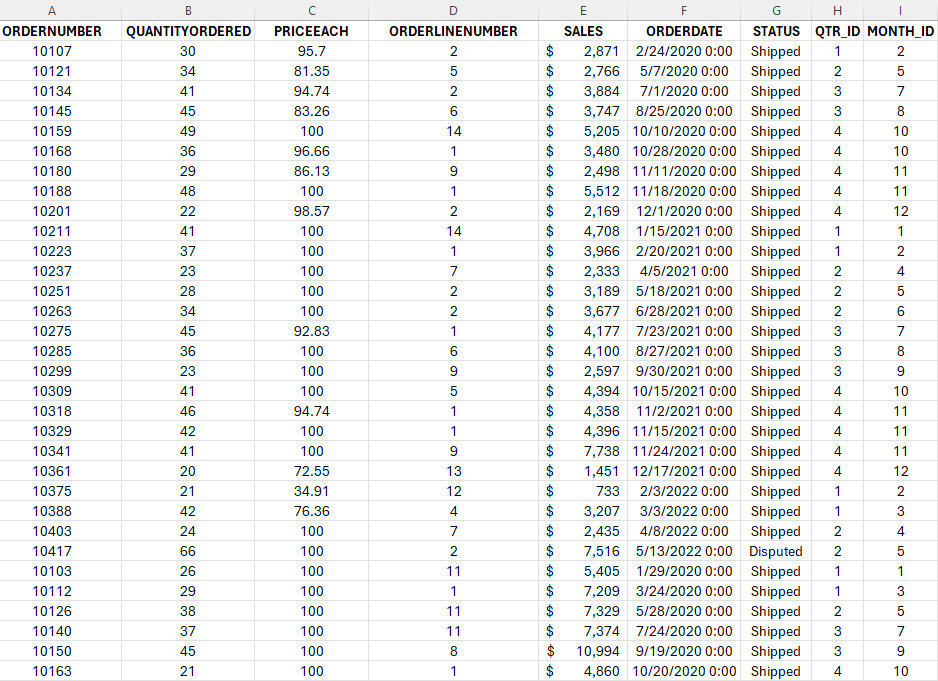
Now, I’m going to make some changes to my data set. Here’s how it looks right now:
I’m going to apply the following changes: hide all the columns that come after Sales and filter the Quantity Ordered Field so that it only shows orders of more than 30.
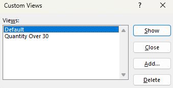
Now, I’m going to repeat the steps for creating a view and this call I will call it Quantity Over 30. Now that it’s saved. I can revert back and forth between the different views. In the Custom Views page, there’s a list of the views that have been created:
I can choose to Show, Add, or Delete the different views. I can also close the dialog box. If I click on Show while my Default view is selected, I’ll now get my original view, with no changes made:
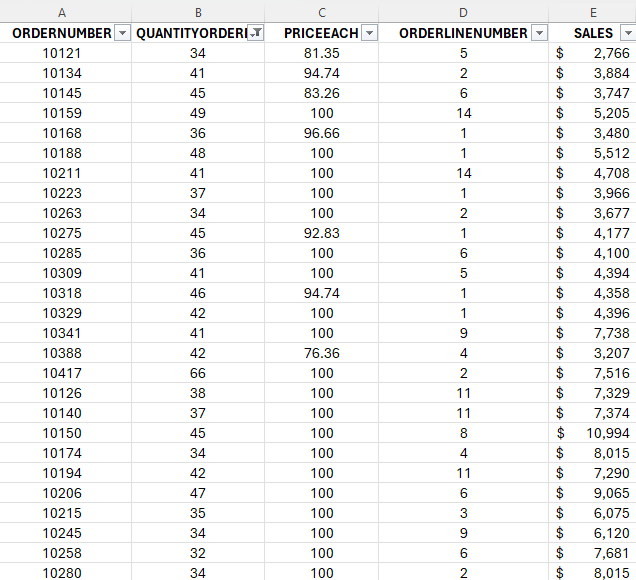
But if I go back to my Custom Views and select Quantity Over 30, then I’ll see only a list of the orders that have more than 30 in the QuantityOrdered field. I will also no longer see those extra columns beyond Sales:
What you’ll notice is that not only have those columns been hidden, but it has also applied a filter to my data. In addition, the view will save your cell position and if you scrolled on your page. So if you happen to scroll halfway down the page and then save your view, when you go to show that view, it will do the same.
TIP: If you want to quickly access Custom Views, you can use the following shortcut: ALT+W+C. You can also right-click on the option and select Add to Quick Access Toolbar. If you do this, it’ll be added to the top of your Workbook.
When should you use Custom Views?
The biggest reason to use Custom Views is they allow you to easily filter or change the look of your data without the need for tables. This can be helpful if you’re sending the file to another user. They can just change the view and quickly see whatever they need to see. That can include filters so they only see a certain region. Or perhaps have different print settings applied so that they will work with their specific printer setup.
You can’t, however, use Custom Views if you have a table. Even if the table is on a different sheet, the Custom Views option will be unavailable. You won’t be able to use it. You may also want to avoid using Custom Views if you expect that the structure of your sheet will change. If that happens, and you haven’t created new views to reflect those changes, you may see a different view than what you expected.
If you like this post on How to Use Custom Views in Excel, please give this site a like on Facebook and also be sure to check out some of the many templates that we have available for download. You can also follow me on Twitter and YouTube. Also, please consider buying me a coffee if you find my website helpful and would like to support it.
Staying on top of your credit cards is an important goal when trying to get from out of debt. A credit card payment calculator is a valuable tool that can help you do just that, helping you to become debt-free sooner. The credit card payment calculator template I’ll go over in this post is free and user-friendly as well, designed to be simple to use, even for novice Excel users.
How to use the credit card payment calculator
The credit card payment calculator template in Excel is designed to provide a clear picture of your credit card debt and help you with developing a strategy to pay it off. All the fields in yellow require user input:
For the monthly payment, you need to enter at least a minimum balance. This is if you plan to pay the same amount every month. You can also specify a percentage of the balance you want to pay down each month. However, if you enter a percentage, you’ll also want to enter a minimum. Otherwise, your balance will never end up going to zero.
What’s new in this template compared to the previous version of the calculator are a couple of things. The first is the ability to add an extra payment:
As with the yellow input fields, you can enter any one-off payments in the extra payment field. This will get applied directly to your balance and reduce your principal. It will also update the rest of your payment schedule.
Another new feature of this template is the ability to enter a goal for when you want to pay the credit card off by:
In the above example, I have entered a date of Jan. 1, 2025. And based on my starting dating of Oct. 1, 2023, it calculates that I will need to make a monthly payment of at least $344.55 to have the credit card balance paid off by that date. Now, if I go back and enter this as my minimum payment, this is what the calculator looks like:
There’s only a minimal balance remaining by the end of Dec. 2024 based on the new minimum payment but it is effectively paid off by that point.
Why managing your credit card balances is important
One of the pillars of personal finance is understanding and managing debt effectively. Credit cards, while useful, can become a financial problem when not handled effectively. This calculator highlights how much in total interest you will pay based on your payment schedule, to help show just how much the debt is costing you. And the greater the debt and the higher the rate of interest, the more costly it will be.
For instance, consider a credit card balance of $20,000 with an annual interest rate of 15%. With a monthly payment of $300, it would take approximately 12 years to pay off the debt, accruing more than $23,300 in interest — that’s more than the initial balance. If you increased the payment by just $50, that would mean paying off the credit card in about 8.4 years and the interest costs would drop to $15,330. And if you paid $400 per month, you would pay off the card in less than seven years, while incurring interest costs of $11,600. You can do all these calculations right within this calculator. You can see that even with a $50 increase you can drastically speed up your repayment schedule.
Credit card debt can be a significant hurdle when aspiring to larger financial goals like purchasing a home. Lenders scrutinize your debt-to-income ratio, and a high ratio could result in unfavorable loan terms or even disqualification. By using the credit card payment calculator to expedite your debt payoff, you enhance your credit profile, bringing you a step closer to home ownership and other financial goals.
Tailoring your payoff strategy
The what-if scenario feature can be especially useful, allowing you to determine a strategy that aligns with your financial objectives so that you know how much you need to pay every month. Whether you aim to be debt-free before a significant life event or simply wish to reduce the interest burden, this calculator lays the groundwork for a well-informed plan.
The credit card payment calculator template is more than just a tool—it’s a catalyst for proactive debt management. It nudges you to think beyond the minimum payment, encouraging a more aggressive approach towards debt elimination. By visualizing the impact of your payment strategy, you are better positioned to make choices that propel you towards financial freedom faster.
If you like this Free Credit Card Payment Calculator template, please give this site a like on Facebook and also be sure to check out some of the many templates that we have available for download. You can also follow me on Twitter and YouTube. Also, please consider buying me a coffee if you find my website helpful and would like to support it.
Credit card interest is a cost that cardholders incur when they carry a balance beyond the grace period, which is typically between 25 to 30 days after a billing cycle ends. This interest is calculated based on the Annual Percentage Rate (APR) provided by the credit card issuer. Understanding how this interest is computed is vital for managing financial liabilities and making informed decisions. This article goes over how to calculate credit card interest in Excel, in a step-by-step process.
Getting the correct rate
Before we get started, they key is finding out what your APR is. This is a yearly interest rate which is provided by credit card companies. It tells you how much you’ll be paying. The APR is usually stated in the credit card agreement or on the credit card statement. It’s essential to note that different transactions may have varying APRs; for instance, cash advances often have higher APRs compared to purchases. If you have cash advances to consider that are at difference rates, then you may need to break this out into two separate calculations.
Once you have APR, you need to convert that into a daily rate as credit card interest is usually calculated on a daily basis. To calculate the Daily Periodic Rate (DPR), this involves taking the APR and dividing it by 365.
DPR = APR / 365.
This can involve a lot of decimal places so you may need to do some rounding. But if you do this in Excel, you don’t have to, and that means a more precise calculation.
Calculating your average daily balance
To determine your interest expense, you’ll also need to determine what your balance was during each day that fell within your billing cycle. To calculate the Average Daily Balance (ADB), sum up the total of those daily balances and divide it by the number of days. The formula is the same as if you were to calculate any average:
ADB = Sum of daily balances / Number of days in billing cycle
It’s important to note that you’ll also need to carry over any balance from your last bill if it was unpaid. And you’ll also want to deduct any payments you make from the balance and add any purchases to ensure the balance is always correct and up to date.
Calculating the interest charge
To get your daily interest charge, simply multiply the two variables, DPR and ADB by one another.
Daily interest charge: DPR x ADB
And if you want to calculate the monthly charge, then you take the daily charge and multiply it by the number of days in your billing cycle.
Monthly interest charge = Daily Interest * Number of days in billing cycle
Creating a template to calculate monthly interest costs in Excel
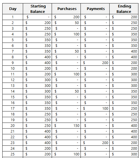
Now it’s time to create a template in Excel which will make it easy to adjust for different scenarios. First off, we need to get the daily balances in a table format. Ideally, there should be a column for the starting balance, the day, purchases, payments, and the ending daily balance. This way, you can easily account for purchases and payments should you want to determine what your balances and interest expenses will be ahead of time.
The formula for the ending balance will be as follows:
In the above example, the assumption is you start with a starting balance of 0. However, if you’re carrying over a balance from the previous period, then you can enter it in the starting balance.
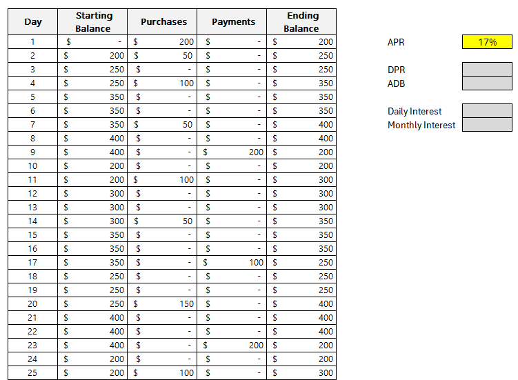
Next, we need to enter the APR. Refer to this page on how to calculate APR. In this example, I’m going to use a rate of 17%. Here’s how my template looks thus far:
The values highlighted in dark grey are reserved formulas while the yellow cell pertaining to APR indicates that this is value that requires manual entry.
The formula for DPR just needs to reference the APR and divide it by 365:
DPR = APR/365
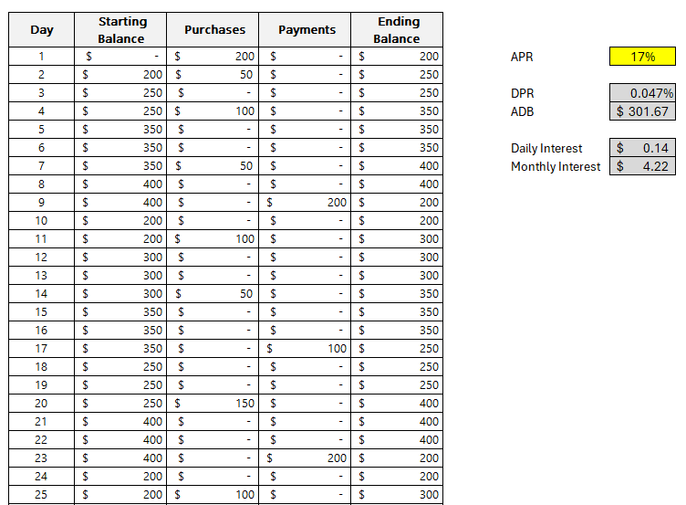
This returns a value of approximately 0.047%.
This will also have a named range of DPR to make it easier to reference later on. The benefit of using Excel for these calculations is that they will be more accurate; there’s no need to do any rounding.
For the ADB, a simple AVERAGE function can be used on column F, which in my spreadsheet, contains the ending balances.
ADB = AVERAGE(F:F)
The average in my spreadsheet is a value of $301.67.
Since there is nothing else in column F, we can just average everything that’s in there. The function will ignore any blank values. This will be another named range, ADB.
To calculate the daily interest, the formula will should look familiar, this time, it’s within Excel as this involves named ranges:
Daily Interest = DPR * ADB
This returns a value of $0.14 (rounded).
Lastly, to collect monthly interest we take the Daily Interest and multiply it by the number of days. For this example, I’ve set a named range of DailyInterest. And to calculate the number of days, I can use the following MAX formula to get the largest value in column B, which has the day numbers:
=MAX(B:B)
There are 30 days within the billing period in my example.
Then, this gets multiplied by the DailyInterest named range to arrive at the total monthly interest cost. Here is the full formula within the cell for Monthly Interest:
Monthly Interest =MAX(B:B)*DailyInterest
The monthly interest in my example computes to $4.22.
Understanding this process sheds light on the significance of the APR and how maintaining a lower balance or paying off the balance before the end of the grace period can mitigate the interest charges. It also underscores the importance of being aware of the different APRs for various types of transactions.
Many credit card issuers offer a grace period during which no interest is charged on new purchases if the previous month’s balance was paid in full. Utilizing such grace periods effectively can lead to substantial savings on interest charges.
If you liked this post on How to Calculate Credit Card Interest, please give this site a like on Facebook and also be sure to check out some of the many templates that we have available for download. You can also follow me on Twitter and YouTube. Also, please consider buying me a coffee if you find my website helpful and would like to support it.
Do you ever wonder how much of a return on an investment you would have made if you invested money into a stock or major index? In this post, I’ll show you how you can create a template to calculate those returns in Google Sheets. You can also download the one that I’ve made.
Setting up the inputs
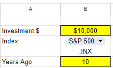
To make a template like this versatile and dynamic, it’s important to create cells for inputs so that the values can easily be updated. One cell should be for the investment amount. Another should be for the index or ticker, and the last option should be for the # of years in the past that you want to look back.
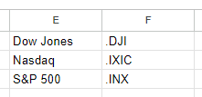
In Google Sheets, if you want to lookup the values for the S&P 500, Nasdaq, or Dow Jones, you’ll need to use the following symbols:
Dow Jones: .DJI
Nasdaq: .IXIC
S&P 500: .INX
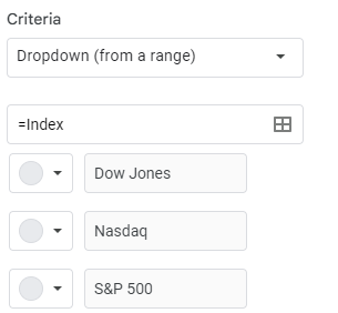
There is a period before each symbol. Regular stock symbols, such as GOOG for Alphabet are entered normally without any periods. But for an index, you need to add a period before the symbol. And as you can see from the symbols, they aren’t obvious as the S&P 500 uses INX while for the Nasdaq, it’s IXIC. Rather than entering in these symbols, it may be easier create a lookup list, which you can then use in data validation. For example, I have the list of related values posted in E1:F3
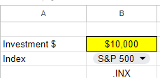
I can then use this lookup so that the user selects Dow Jones, Nasdaq, or S&P 500 and then the corresponding symbol will populate:
To create a drop-down list in Google Sheets, select a cell and click on Data and press Data Validation. From there, you can either manually enter your options, or you can reference a named range. In my example, I’ve referenced a named range called Index, which holds these values.
Next, there’s the field for the # of years you want to look back. This will be used in calculating the stock or index’s previous value. That is the final input that I will use for this template:
Calculating the return
To calculate the return from the investment, we need today’s value and the value from the past. To get the current value is simple and just requires the following formula:
=GOOGLEFINANCE(symbol,”price”)
In my file, I’ve created a named range called symbol which relates to the .INX value in the above screenshot. When no dates are entered, the formula will pull in the latest value for the symbol.
To get the previous value takes a bit more work. The formula will start off the same but I need to adjust the date so that it factors in the number of years I want to go back. To do this, I will use the DATE function and specify the year, month, and date values. Assuming I want the exact same date and only adjust the year, here is how I would adjust the formula:
In this formula, yearsback is the named range relating to the # of years I want to go back. In my example, it is set to 10. By adjusting the year argument in the date function by the number of years I want to go back, that will adjust the year and nothing else. The TODAY function returns the current date and acts as a starting point. For the last argument in the GOOGLEFINANCE function I set the value to 1, since I only want the value from a single day.
The formula will now grab the second row and second column, which relates to the value I want. Now that I have my current previous values, I can calculate the return. For this calculation, I only need to take the current value, divide it by the previous value, and subtract 1:
=currentvalue/previousvalue-1
Here again, I’m using named ranges to easily refer to those values and so it’s easy to see what I’m referencing. The result of this formula is a % change.
Lastly, I need to calculate the value of the investment today. This involves taking the original investment and multiplying it by 1 plus the return. This formula uses named ranges once more:
=originalinvestment*(pctreturn+1)
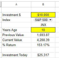
Here’s what my spreadsheet looks like now when I calculate what a $10,000 investment in the S&P 500 would be worth 10 years ago today:
You can see both the % return as well as the dollar amount of that investment. With the cells highlighted in yellow and a drop-down option, it makes it easy to see the fields that can be adjusted. If you prefer to use this calculation for just stocks, you can do away with the lookup and instead just enter the ticker symbol directly. If you’d like to download my version of the template, you can access a copy of it here.
If you liked this post on How Much Money Would You Have if You Invested in the S&P 500 10, 20, and 30 Years Ago, please give this site a like on Facebook and also be sure to check out some of the many templates that we have available for download. You can also follow me on Twitter and YouTube. Also, please consider buying me a coffee if you find my website helpful and would like to support it.
A good way to gauge the strength of the U.S. economy and how well it is returning to normal level is by looking at Las Vegas’ visitor data. The Las Vegas Convention and Visitors Authority (LVCVA) has plenty of important metrics that it tracks on its website. From the number of visitors to the city to occupancy levels to daily room rates, and other key performance indicators (KPIs). Using data from that website, which you can find here, I’ll guide you through the step-by-stop process as to how you can build a dashboard to track some of those key metrics.
Step 1. Preparing and consolidating the data
One of the most important parts of data analysis is to clean up your data from the beginning. By doing this, you’ll avoid headaches later on. It’ll also make it easier for you to do analysis in the first place. To get a proper glimpse of how Las Vegas is doing now, it’ll be useful to track multiple years. On the LVCVA website, you can download data for multiple years. For this example, I’m going to download data from 2019 through to 2023 YTD.
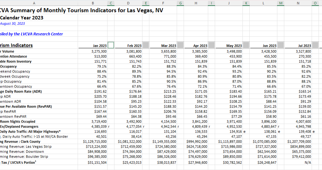
This is what one of the files looks like:
As of writing this article, data for 2023 is available up until the end of July. Since the data is organized in the same format on all of the files I’m downloading, I can just copy and paste one year after another. The key is for the rows to line up.
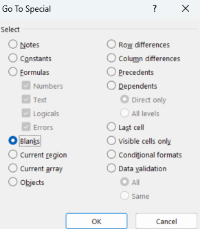
But I still need to clean up this data. One problem is that there are gaps between the months. Once I’ve loaded all the years together, I’ll remove those blank columns. The easiest way to do this is the highlight the top row. Then, press F5 and select Special. There will be an option to select Blanks:
Then, all those gaps are selected:
If your right-click on any one of them, select Delete, choose Entire Column, and press OK. Now those columns are gone:
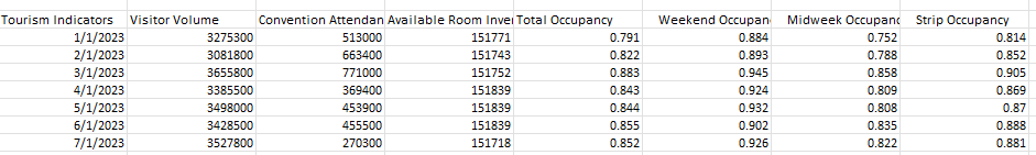
There’s still one problem here. The way the data is structured right now isn’t useful when creating pivot tables. And if you’re creating a dashboard, you’ll want to be able to create pivot tables easily. Doing so can make it easy to create reports on the fly and easy to make changes. It’s easier to have dates going vertically than horizontally to scroll through data. So what I will do is use the TRANSPOSE function to flip it. All that’s necessary here is to use the function and select your entire data set. Then, voila:
Before I make any further changes, I want to convert this into values. Since I used the TRANSPOSE function, it’s sitting as an array. To change this, I’ll select the entire data set, press CTRL+C, and then press CTRL+SHIFT+V to paste as values. If you don’t have that functionality on your version of Microsoft Excel, right-click and select Paste Special and click on Values.
I will also add a few more columns to make the analysis easier. I’ll create a column for the month and year. This will involve using the MONTH and YEAR functions. The only argument that is needed is the original date, which in the screenshot above, appears under ‘Tourism Indicators.’
And since I want to compare 2023 to 2019, I’ll add a column for ‘Current Period’ and ‘Comparable Period.’ The point of this is to make sure that I can filter the current YTD values against the same values from 2019. Since I have data up until July, any comparisons should also run up until July 2019. For the Current Period, I’m using the MAXIFS function to grab the maximum value for the Month field for the current year (I can use the TODAY function to make it dynamically pull in the current year). Then, for the Comparable Period column, I can compare the Month field to see if it is less than or equal to the Current Period. If it is, then I’ll set the value as a “Y” to indicate it falls in the comparable period or “N” if it doesn’t. This way, if I come across month 8 and my current period only goes up to 7, it will mark that as an “N” which will allow me to easily filter out those results.
Lastly, I will convert all this data into a table. The purpose of this is so that I can easily reference the different fields later on, without having to remember column letters. To convert this into a table, select Insert and click on Table. Then, on the Table Design tab, you can name the table something that’s easy to remember. In my example, I’ll refer to it as tblConsolidated.
Step 2: Identifying the KPIs to track
Before rushing out to create the pivot tables, it’s important to know what you want to track. You don’t want to create a pivot table and track everything possible, otherwise it won’t be a useful summary, which is what a good dashboard should aim to do. That’s why you should devote some time to identify what some of your KPIs should be.
There are a lot of metrics on here and these are the ones that I am going to use, which will help gauge how active and busy Las Vegas is:
Visitor volume. Obviously the number of people visiting the city is a great indication of how many people there are.
Occupancy levels. If hotels are booked up, that’s another positive sign that the city is busy.
RevPAR. This takes the room revenue divided by the number of available rooms. It shows how well a hotel is filling up its rooms at a given rate.
Average Daily Rate. This is partly reflected in RevPAR but it can be a useful indicator as people are more familiar with room prices than they are with RevPAR, especially those who visit Las Vegas often.
En/Deplaned Passengers. This is a helpful metric to know how much out-of-town traffic there is coming to the city.
Average Daily Auto Traffic. With this metric, readers can see how busy the roads are.
Gaming Revenue (Las Vegas Strip). This is another important KPI because it tracks how much people are spending at casinos.
Step 3: Creating the pivot tables
Now it’s on to creating a pivot table for each KPI you want to track. To make this process easier, just create a pivot table one time, and then copy it for as many charts that you want to create. This way, you don’t have to go back and select Insert->Pivot Table over and over again. Just make sure to leave enough room so that they don’t overlap, otherwise you’ll encounter errors.
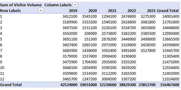
It’s also a good idea to label your pivot tables by going into the PivotTable Analyze tab. For a pivot table to track visitor volume, you might want to call that ptVisitorvolume, for example. This will be helpful later on if you want to change charts and aren’t sure what PivotTable1 relates to. You’ll also likely want to change the default formatting for a pivot table:
To change the format, don’t just highlight the cells and make the changes, otherwise they’ll revert back once you update the data. Instead, right-click on one of the values and select Value Field Settings. Then, select Number Format and apply the formatting you want to apply to that field.
What I also like to do is put all the pivot tables on a separate tab to keep them organized, while all the charts will go on a main tab dedicated for the dashboard.
Step 4: Creating the charts
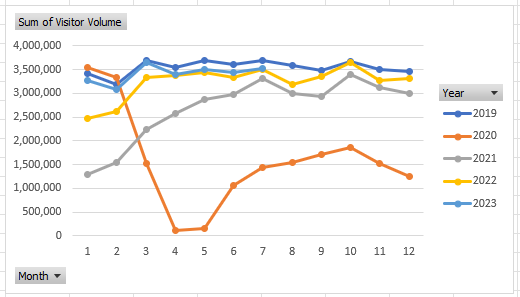
When creating your charts, one thing to consider is how you want the data to be visualized. You can do this as part of the stage to identify KPIs. For visitor volume, for example, I’ll use a line chart since I want to see the month-over-month progression. This will also make it easy to compare against multiple years.
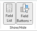
Since these are charts created from pivot tables, they are pivot charts, and they come with drop-down options:
They aren’t terribly appealing and to get rid of them, click on the chart, select the PivotChart Analyze tab and unselect the option for Field Buttons:
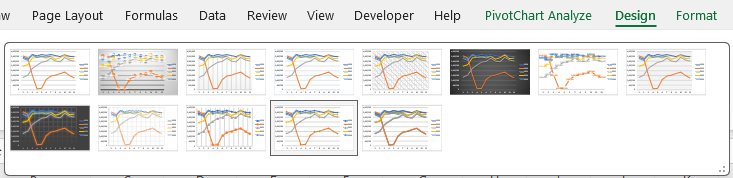
One thing that can help with creating charts is by using Excel’s existing Chart Styles, which are on the Design tab (which is visible if the chart is selected):
This can be an easy way to customize your charts without having to do so manually.
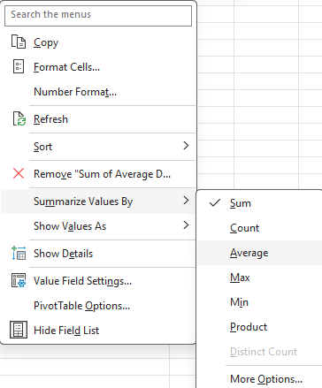
You may also want to adjust how the data is displayed. Visitor volume, for example, may make sense to leave as the default, which is a summation. But when looking at ADR or RevPAR, you wouldn’t want to sum those values up. Instead, you may want to calculate the average instead. To do that, right-click on one of the fields and select Summarize Values By and select Average
Now, you’ll see an average based on period, which makes more sense than summing up prices.
At this point, it comes down to your personal preferences as to how you want to design the charts, and it would be far too deep to try and get into all those options here. However, I’d suggest mixing up a bit of bar and column charts and also changing up the colors so your dashboard doesn’t look like the same item over and over.
Some additional things you may want to consider are:
Adding data labels. And if you do use them, consider not using axis labels;
Using legends where and when make sense to do so;
Adding background images to your charts to have a different look and feel to them;
Having descriptive titles to help summarize what the chart is displaying;
Not plotting too much on on chart. You may want to consider plotting years instead of months;
Not using a border color so that your charts blend in with the background.
Here are a couple of charts I created with images in the background to make it clear what they are showing:
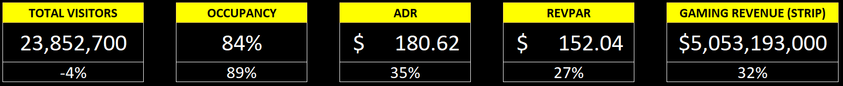
Step 5: Adding key numbers at the top for further emphasis
Charts are good, but what can also be useful is to put key numbers right at the top so that readers don’t have to spend much time looking for the most important metrics. For example, using formulas, you can pull in the total number of visitors for the period, the occupancy rate, the ADR, RevPAR, and other items, based on the latest information.
While these can be good to include in charts, by making them big and allowing them to stand out as soon as you open up the dashboard, it can help drive the point home even further.
In the example above, I have a list of the current metrics along with the growth rate or comparable percentage from 2019, to help show how the metric is doing compared to that year. You could also add conditional formatting to this to highlight where there is an improvement and where things may have worsened.
Step 6: Finishing touches
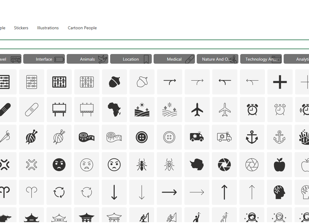
Once you’ve got your charts and metrics all on there, the last piece of the puzzle is to add a title as well as any icons or images that may be relevant to help give some added pop to your dashboard. If you go to the Insert tab, you can use that to pull in pictures from the internet. Excel also has built-in icons and stock images that you can use, just by doing a search:
This can be an easy way to help your dashboard stand out even further. Here’s a snapshot of the dashboard I created:
If you liked this post on How to Create a Dashboard to Track Las Vegas’ Visitor Data, please give this site a like on Facebook and also be sure to check out some of the many templates that we have available for download. You can also follow me on Twitter and YouTube. Also, please consider buying me a coffee if you find my website helpful and would like to support it.
If you have young kids who could use some math practice, I’ve got you covered. What’s great about Excel is that by using the random number generator, you can create an infinite number of worksheets for use over and over again. I’ve created a worksheet that includes addition, subtraction, multiplication, division, and other types of math work.
How the template works
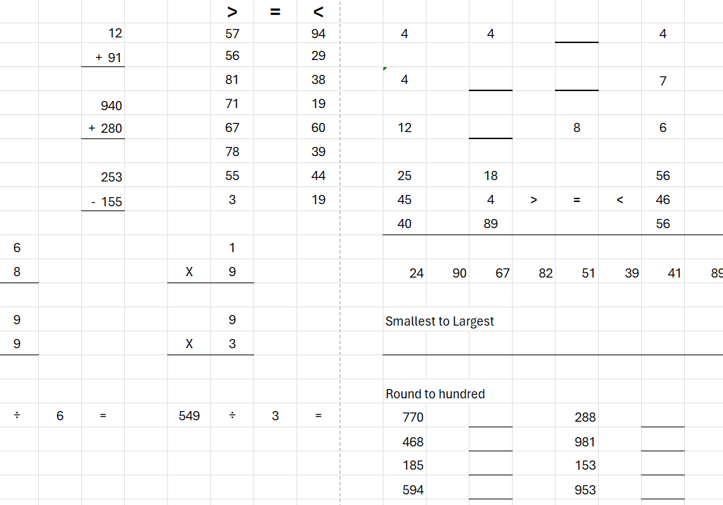
Unlike other templates, you don’t need to enter any data for this one to work. It comes ready to go. It’s simply a matter of removing or hiding whatever you don’t need. The template has 22 pages in total. There are pages that are for addition, subtraction, multiplication, division, patterns, rounding, greater than and equal comparisons, and ordering number in ascending and descending order.
If you view the workbook in Page Break Preview (this option is available from the View tab), this can help you decide where you want to hide/delete unneeded columns:
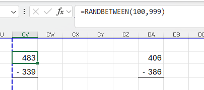
For many of the values, they use the RANDBETWEEN function. If you’re comfortable with modifying the formulas, feel free to do so.
In the example above, the formula finds a random number between 100 and 999. You could modify this to 1000 and 9999 if you wanted questions that are in the thousands.
The last two pages in this spreadsheet I’ve decided to covering a bit of everything. This can be helpful if you just want to print out a single double-sided page that can go over everything rather than printing out multiple pages.
Creating an endless number of worksheets!
What makes this template useful is that by simply triggering a recalculation, all the random numbers will change. So if you don’t like the numbers on a certain page, you can easily generate another set of numbers within a second. The easiest way to trigger a recalculation is to just select an empty cell on the sheet and press the delete key. Just make sure you’ve selected a cell that doesn’t contain a formula otherwise deleting it will remove it. If there’s nothing there, nothing gets deleted but the spreadsheet will recalculate.
Download the file
If you’d like to use the file, you can download it here. It’s completely free to use. I will add to it in the future and if you have any suggestions, please feel free to send them my way.
If you liked this Free Math Worksheet and Template for Elementary School, please give this site a like on Facebook and also be sure to check out some of the many templates that we have available for download. You can also follow me on Twitter and YouTube. Also, please consider buying me a coffee if you find my website helpful and would like to support it.
Replacing values can be an important part of cleaning up your data and preparing it for data analysis. Below, I’ll outline the steps to take to replace a value in Power Query. I’ll also show you how you can create a formula in Power Query to make it easy to replace multiple values at once.
Replacing a single value in Power Query
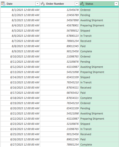
In the following data set, I have a list of orders. There are dates, order numbers, and statuses. Some of the statuses may be a bit similar so to reduce the number of them, it can make sense to replace values.
I am going to replace to the ‘Awaiting Authorization’ status to ‘Pending’.
Here are the steps needed to take to replace a value in Power Query:
1. Load your data into Power Query.
2. Right-Click on the column where you want to replace values and select Replace Values
3. Enter the value to find and what to replace it with, and then click OK.
Now, Power Query will replace the value for you:
This isn’t an ideal solution, however, because doing it this way would require you to repeat these steps over and over again. Instead, there’s another way to do this.
Replacing multiple values in Power Query at once
If you want to replace multiple values in a single step in Power Query, you can accomplish that through a formula. The Table.ReplaceValue function allows you to specify the values you want to replace. For instance, to replace just a single value, this would be the formula:
Where #”Changed Type” is the name of the preceding step. In this formula, any instance of ‘Awaiting Authorization’ is replaced with ‘Pending’.
If you want to replace multiple values, then you can use if statements to check for multiple conditions:
= Table.ReplaceValue(#"Changed Type",each [Status], each if [Status] = "Awaiting Authorization" then "Pending" else if [Status] = "Awaiting Shipment" then "Pending" else [Status], Replacer.ReplaceText,{"Status"})
The same function is used. However, by using the ‘each’ keyword, it will now cycle through the values in the [Status] field. It will do the original search for ‘Awaiting Authorization’ and replace it with ‘Pending’. There is also an else if statement which allows the formula to go even further and also replace ‘Awaiting Shipment’ with ‘Pending’. Finally, if there are no matches for either of those terms, then it will just leave the value that is already in the ‘Status’ field.
You can even add more else if statements to replace more values if necessary. By doing this, you can make the process even more efficient by swapping out even more values through a single step.
If you liked this post on How to Replace Multiple Values in Power Query, please give this site a like on Facebook and also be sure to check out some of the many templates that we have available for download. You can also follow me on Twitter and YouTube. Also, please consider buying me a coffee if you find my website helpful and would like to support it.
Conditional formatting in Excel allows you to automatically format and highlight cells based on their values. You may want to apply custom rules to values that are too high or too low. You may also want to use conditional formatting for budgeting purposes, to show when something is overbudget. Users typically use colors when applying custom formatting. A cell with a high value might be highlighted red versus a lighter color when it is low.
What you can also do is add symbols, including flags, to your conditional formatting rules. This can add another element to make your conditional formatting stand out even more.
Creating conditional formatting rules
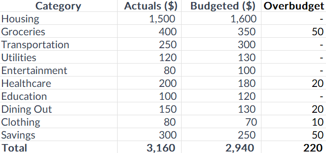
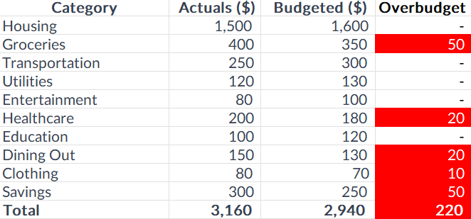
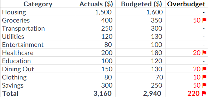
In the following example, I have some expense categories, budgeted amounts, actuals, and a field to show when an expense has run overbudget.
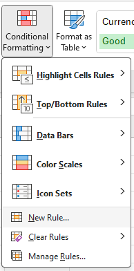
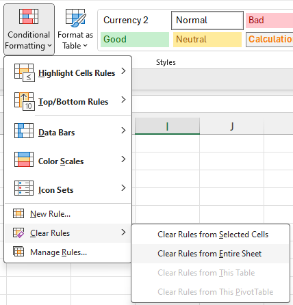
To create conditional formatting rules for this table, you’ll first need to select the cells you want to apply the formatting to. In this case, I’m going to select the Overbudget field and select all the values there. Next, I’ll select the Conditional Formatting button on the Home Screen and click on the option to create a New Rule:
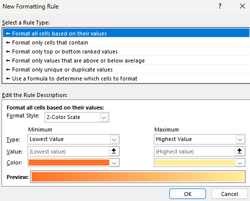
On the next screen, there are many different options for creating rules:
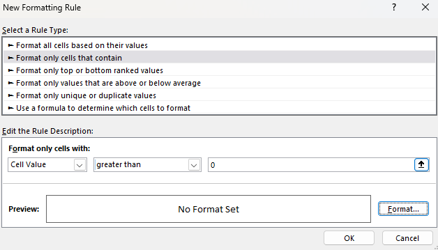
I’m going to select the following option: Format only cells that contain. This allows me to specify a criteria, and then apply formatting to any cells that meet that criteria. Since I’m interested in values that are overbudget, I can create a rule for when the cell value is greater than 0:
Next, I’ll click on the Format button to determine what I want the cells that meet the criteria to look like. If I set the highlighting color to be red and the text to be white, here’s what my table will look like:
It’s a simple and effective way to alert your eyes to amounts that show a category is overbudget. But you don’t have to be limited to just changing colors.
Adding symbols to your conditional formatting
Instead of changing cell and text colors, I’ll simply add a red flag next to an amount when it is overbudget. First, I’ll clear off the conditional formatting rules I’ve already created. You can remove rules one by one or you can just delete all of them. To do that, go to the Conditional Formatting button and this time select the option to Clear Rules and to Clear Rules From Entire Sheet.
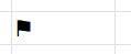
Now the conditional formatting is gone and I can start over. But before I do that, I need to find the symbol that I want to use in the custom formatting. If you go to the Insert tab, off to the right there is an option for Symbols.
By clicking on that, you’ll see many different symbols you can insert into your spreadsheet. If you scroll around you can find symbols that look like flags, which is what I’m going to use.
The one that I have highlighted above is for a Black Flag. I can click on Insert to put it into my spreadsheet.
To get this symbol into my custom format, I first need to copy it. To do that, double-click on the cell so that you are editing it, and then select the flag, and then press CTRL+C to copy. While it’s copied and in the clipboard, now is the time to setup the conditional formatting rules. The process is the same as before.
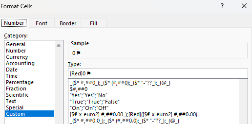
Except this time, when it comes to applying the custom formatting, go to the Number section, and select Custom. Then, enter a value of 0 and then paste the flag symbol. If you want to also highlight everything in red, you can add [Red] in front. Here’s what that custom number format could look like:
After applying the rule, now the table looks like this, with the custom formatting:
This is a bit of a cleaner format that you can use rather than having to highlight the entire cells. You can use this approach for other symbols in Excel. The key is just to find the symbol you want to use and then copy and paste it into your custom format.
If you liked this post on How to Add Flags to Conditional Formatting Rules, please give this site a like on Facebook and also be sure to check out some of the many templates that we have available for download. You can also follow me on Twitter and YouTube. Also, please consider buying me a coffee if you find my website helpful and would like to support it.
If you’ve got a big, complex spreadsheet with lots of formulas, it can be slow to run. In those situations, turning off calculations can be a life saver. But the downside of doing so, is that you might forget that those calculations haven’t been updated. Relying on stale values can be risky and lead to poor decision making and analysis.
Thankfully, there’s a new feature in Excel that now helps you find and identify those values easily.
Finding stale values
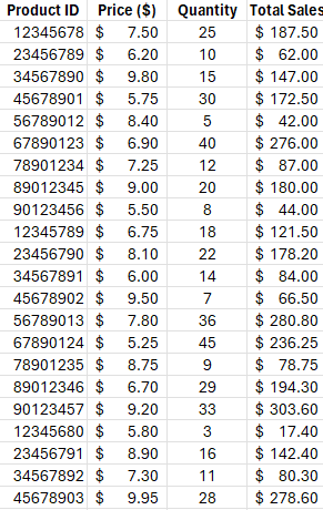
For this example, I’m going to use a simple table. It shows product IDs, prices, quantities, and total sales.
The only calculation that happens here is in the total sales column, where price is multiplied by quantity. If the calculations are on, changing either the price or quantity fields will change the value in the total sales field automatically. But if I turn on Manual Calculations, then the calculation won’t happen until I either set the calculations to Automatic, or to manually force calculations (e.g. by pressing F9).
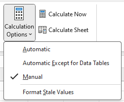
To turn off calculations in Excel, go to the Formulas tab and select Calculations Options, where you’ll see the following options:
The one danger is that if you set your calculations to Manual, it will change the setting for all the workbooks you currently have open. This change isn’t just set to one sheet or workbook.
In the above screenshot, the calculations are set to Manual. And if you’ve updated to the latest version of Excel, you’ll see the option at the bottom: Format Stale Values. If you check this off, you will now see different formatting for calculations that Excel hasn’t updated.
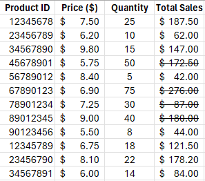
After checking that off and making changes to some of the quantities in my table, some of the values in the total sales column haven’t updated. And it’s easy to see which ones those are:
There are now strikethroughs showing for the values which aren’t updated. This tells you that those values are no longer accurate. As you can see from the value of $172.50 where the corresponding quantity is 50 and the price is $5.75, the total sales based on that calculation should be $287.50. Without applying the formatting for stale values, it would be difficult to notice that the value of $172.50 is incorrect.
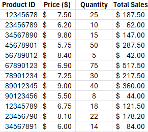
Once the values are recalculated, either by manually triggering them (F9) or by changing them back to automatic, then the strikethrough goes away. And that’s because the value has also been updated:
If you never turn your calculations off and set them to manual, you’ll never need to use this feature of stale formatting. But if you do occasionally turn off calculations, then it can be valuable to you as it can help you avoid errors and making incorrect decisions based on outdated information.
If you don’t see this option available yet then it may not be available on your version of Excel. You need Microsoft/Office 365 and for the latest beta updates to be installed. Eventually, however, it will be rolled out to all 365 users.. But if you want new features as soon as they are available, be sure to sign up for the (free) Office Insiders Program to ensure that you get them earlier than the general rollout.
If you liked this post on How to Find Stale Values in Excel, please give this site a like on Facebook and also be sure to check out some of the many templates that we have available for download. You can also follow me on Twitter and YouTube. Also, please consider buying me a coffee if you find my website helpful and would like to support it.