Nowadays, everything is available on a subscription. Even BMW now offers heated seats on a recurring subscription. It can be a challenge to keep on track of all your subscriptions, including when they renew and when trials end. However, I have a free template just for these purposes. With my free template, you can stay on top of your subscriptions and see just how much you are spending on them on a monthly and annual basis.
How the subscription manager template works
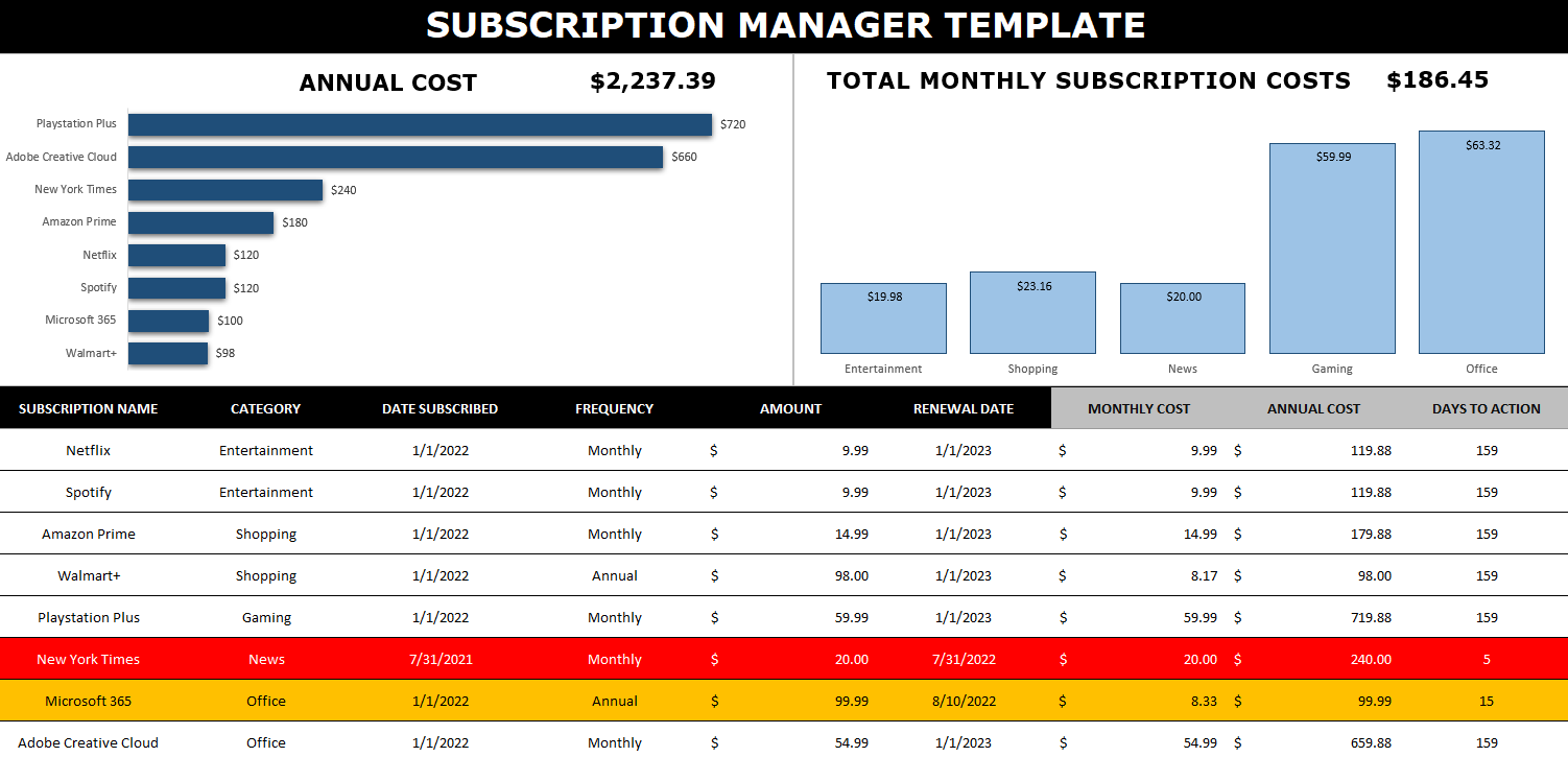
This template has no macros and is designed to be easy to update and track. Here’s how it looks:
There are multiple charts to show you the annualized cost of your subscriptions and the monthly cost (which is shown by category). This can be effective for budgeting purposes to know how much all of these subscriptions are costing you.
To add a subscription, simply add it to the bottom of the table. You can enter a category name, a frequency, amount, as well as subscription and renewal dates. The columns that have headers highlighted in grey don’t need to be updated as there are formulas there. This is where the amounts for the monthly and annual costs get calculated. Whether your subscription is paid monthly or annually, these columns will work out the calculation to determine what it costs you both on an monthly and annual basis. That way, you don’t need to worry about grouping monthly and annual subscriptions separately.
There’s also another column called Days to Action — this will calculate the days between today’s date and the renewal date. It will highlight in yellow when you are within 30 days of the renewal date, and it will turn red when you’re within two weeks of it. The point here is to give you a warning that a renewal is coming up (or a trial is ending). This can help you prevent forgetting about it and incurring a surprise fee. If you don’t care to track this, you can just leave the renewal date blank.
Updating the data in the template
When you enter a new line for a subscription or want to make modifications to one, the charts won’t automatically update as there are no macros within the file. In order to trigger an update, go to the Data tab and click on the Refresh All button. Upon doing so, your charts will be updated.
If you want to remove a subscription, simply right-click on the row and delete it. If you’re within the table, then while you’re on the row, right-click and select Delete. You’ll see an option to remove Table Rows. Either method will work fine.
If you like the Subscription Manager Template, please give this site a like on Facebook and also be sure to check out some of the many templates that we have available for download. You can also follow us on Twitter and YouTube.
Do you want to calculate how quickly it will take for something to double in value? In this post, I’ll show you how to calculate that using the doubling time formula. By utilizing variables, it can also be easily updated in Excel to factor in different growth rates, making it easy to do what-if calculations.
What is the doubling time formula?
The doubling time formula utilizes logarithms and takes an assumed growth rate to determine how long it will take for a value to double in value. For example, if your investment were to rise at a rate of 10% per year for 10 years, it would be worth roughly 2.59 times what it is now. But rather than doing trial and error to try and determine exactly at what point it will double in value, you can use a formula to do that for you.
In essence, all the doubling time formula involves is taking the logarithm of the change in value you’re trying to get to (e.g. 2) and dividing that by the logarithm of the current growth rate plus 1 (e.g. 1 + 0.1 = 1.1). By doing this calculation, you get an answer of 7.27 for this example. You can plug that into the following formula to check:
1.1^7.27
And the result will 1.9995. The more decimal places you keep in the above calculation, the closer you will get to precisely 2. This formula can also be adapted if you want to calculate how long it will take to triple, or quadruple. In those cases, you can just change the numerator so that instead of taking log 2, you’re taking log 3 or log 4, if you want to calculate tripling or quadrupling time, respectively.
Setting up the formula in Excel
As you can see, this isn’t a terribly complex formula. The key is really just using logarithmic functions in Excel. And whether you use a natural log or not doesn’t matter, your results will be the same. You can use the LOG function for these purposes. In Excel, the earlier formula would be calculated as follows:
=LOG(2)/LOG(1.1)
To make it more versatile, I’ll also add some variables here. One for the current growth rate, and one for the target growth (this is where you can specify if you want to double, triple, quadruple, etc.). Here’s how that looks:
A value of 2 will read as 200% in Excel. The formula to calculate the years to double will simply need to be adjusted to factor in for these variables, which I’ve named TargetGrowth and GrowthRate in my file:
=LOG(TargetGrowth)/LOG(1+GrowthRate)
By utilizing these variables, I can now easily update my calculations.
Creating a LAMBDA function to make it even easier
Another thing you can do is to create your own LAMBDA function. If you’re on the latest version of Excel, these are custom functions you can ease, without the need to even set up a template and separate cells. All this involves is going to the Name Manager in Excel as if you were creating a new named range (the long way). Except when you create it, the name you’re assigning is the name of the function. And rather than referencing cells, you’re entering in a formula.
This particular function should contain two variables, one for the current growth rate, and one for the target. It will then plug them into the formula I referenced above. Here’s what the formula will need to look like within the Name Manager:
You’ll notice it needs the LAMBDA prefix so that Excel knows to treat this differently. Here’s how it looks within the Name Manager:
I called it DoublingTime even though it can do more than just calculate that. You can of course call it whatever you prefer. Now, this formula can be used in Excel to do the exact same calculation as above, without the need for extra cells:
You’ll notice here I’m just entering in raw values as opposed to percentages. This is just because of how I structured the formula and to keep it as simple as possible.
If you liked this post on Calculating the Doubling Time Formula in Excel Functions, please give this site a like on Facebook and also be sure to check out some of the many templates that we have available for download. You can also follow us on Twitter and YouTube.
Sorting data in Excel is relatively easy, and can be done with a click of just a button. However, it can be a bit more challenging when you’re trying to sort data by multiple columns. Once you’re familiar with the process, it’s not a whole lot more difficult. In this post, I’ll show you how you can do that.
How to sort just one field or column
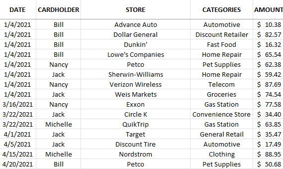
In this data set, I have multiple fields that I can sort by:
To sort by any field, it’s as easy as clicking on any column and clicking either the ascending button (the first button below) or the descending button (the second one shown):
The ascending order button will sort values from A->Z, lowest to highest, or oldest date to newest date. The descending order button will do the reverse, and sort values from Z->A while amounts will go from highest to lowest. Doing this will sort one column at a time. If I sorted the data above by dates in ascending order, this is how it would look:
This shows me the data from oldest to newest entries.
How to sort multiple columns in Excel
If I wanted to sort by date and then by store. I would need to apply multiple sorting rules. Even if I wanted them all to be in ascending order, I can’t just go and click on each column and click the ascending order button. If I did that, this is how my data would be sorted:
The data isn’t sorted by date anymore. You can see that only the store names are sorted properly. This is because it’s the most recent sort that has been applied. And the last field I clicked on to sort was store, so that’s what it will be sorted by. There are a couple of ways I can fix this.
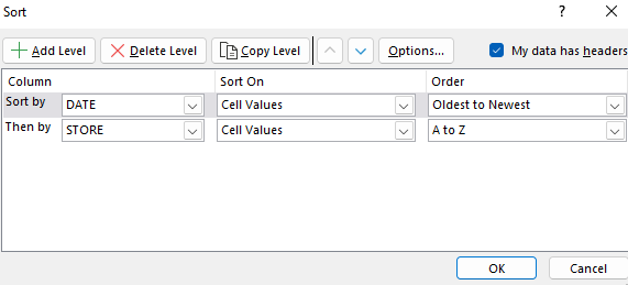
The first method is by going in reverse. Since the last column that I click in is what I’m sorting by at the top, that needs to be the first one I click on, not the last. If I click and sort (by ascending order) Store and then the Date field, this is what the data set will look like:
Another way you can accomplish this is by clicking the Sort button:
Then, you’ll have the ability to specify your sorting rules. To accomplish the same sort as above, you would set it up as follows:
The advantage of this approach is you don’t have to work backwards. It can be simpler to plan out how you want to sort your data without having to worry about remembering the sorting rules in reverse. For larger, more complex sorting rules, using the Sort button is going to be easier. If, however, you only have a few fields you want to sort, it may not make a difference which method you choose.
If you liked this post on How to Sort Data by Multiple Columns in Excel, please give this site a like on Facebook and also be sure to check out some of the many templates that we have available for download. You can also follow us on Twitter and YouTube.
Do you want to do a lookup in Power Query, or just join multiple tables together? In this post, I’ll show you how you can do that. The first thing you need to do is set up each individual query so that it is accessible in Power Query.
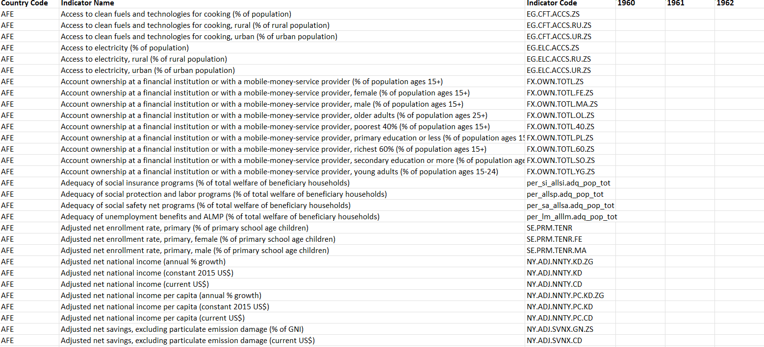
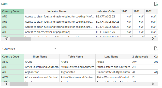
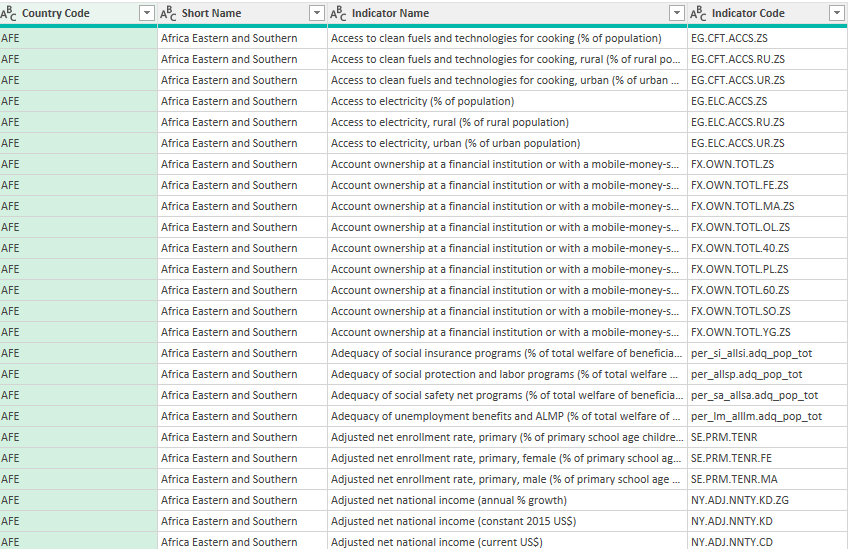
In my data set, I have various indicators for countries across the world. In one table, I have the data and the country code:
On another table, I have a list of those country codes and more detailed information about which parts of the world they relate to:
Naturally, I want to combine this information. It’s the equivalent of doing a lookup, except within Power Query. I can do a lookup before populating the data into Power Query, but I can also just merge the queries.
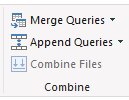
Once you have the queries loaded in Power Query, you can go ahead and start merging them. There is a Merge Queries button on the Home Tab, in the Combine section:
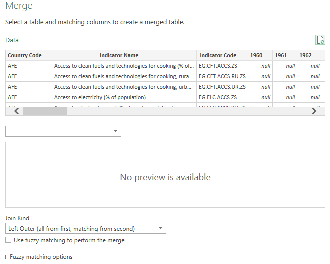
For best practices, you should switch to your main query, the one that holds the data you’ll primarily be using, and then click on the button. By doing this, you can avoid having to adjust the join type. Once you press the Merge Queries button, you’ll see the following options:
The Data query is the initial one that shows up as that is the one I was on when clicking the merge button. I’ll have to select a table I want to merge with (in this case, it will be the one with the country information). After selecting the table to merge with, I’ll also need to highlight the columns that connects the two queries. In this case, it is the Country Code, which I’ve highlighted in both tables:
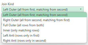
It doesn’t need to be a one-to-one relationship but if it isn’t, then a single row will end up expanding into more for each match that’s found. The last thing you need to specify before deploying the merge is determining the join kind. There are several options for this:
If you don’t want to lose any data from your main table, then you’ll want to look at one of the first three options. In this situation, where you’re adding data from another table, you’ll either use the Left Outer or Right Outer join. This is where first selecting your main table before clicking on the merge button will make this easier for you. That’s because since it would be the first table, a Left Outer join (the default option) would suffice. In a Left Outer join, you’re keeping all the records from the initial table and only adding matching ones from the second. If your first table is the main one you’ll want to be using, then the Left Outer join will work best. If you didn’t do that, then the Right Outer will be what you want.
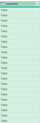
When in doubt, look at the description in parentheses to guide your decision to see what each join will do. Once you’ve selected the join type, click on OK. Now, you should see a new column that contains tables for each row:
To expand these tables, you can click on the button in the Countries header, which shows two arrows going in opposite directions:
When you click on that, you’ll be able to select all the fields that you want to extract from the other table:
For this purpose, I’ll only leave the Short Name checked off since I don’t want to make my query unnecessarily large. I’ll also uncheck the tick box at the bottom that by default will leave the original column name as a prefix. After clicking OK, I now have the short name populated in my main query. All that’s left is to move the short name back to the beginning, next to the country code. Now my merge looks complete:
If you liked this post on How to Merge Queries in Power Query, please give this site a like on Facebook and also be sure to check out some of the many templates that we have available for download. You can also follow us on Twitter and YouTube.
Waterfall charts are an effective way to display data visually. They are particularly useful if you’re analyzing an income statement and want to see which parts accounted for the bulk of the change in profitability from one period to the next. In this example, I’m going to use Amazon’s first-quarter earnings of 2022, which saw the company’s bottom line fall into the red for the first time since 2015. Using a waterfall chart, we can quickly analyze what were the big drivers behind the drop in profitability — and the results may surprise you.
Step 1: Preparing the data for a waterfall chart
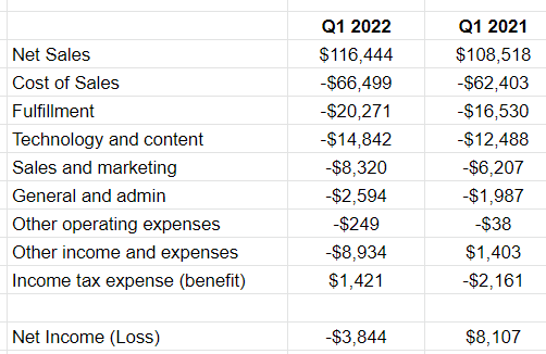
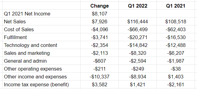
In a waterfall chart, you want to calculate the change in values. To start with, I’ve entered all the main income statement line items from Amazon’s Q1 earnings for 2022 and 2021, side by side:
I’ve grouped some expenses together for the sake of not having too many items. With waterfall charts, there are a couple of dangers. The first is that your descriptions run too long and it’s hard to display the line items. The second is that you have too many items and your chart needs to become excessively wide to accommodate all the changes.
One thing you’ll notice here is that at the bottom I have the net income (loss) line. This is a summation of the above items to ensure that it correctly ties out to the profit or loss that the company reported. This is an important step to make sure that you’ve entered your data correctly. Expenses should be negative (outflows) while income should be positive (inflows).
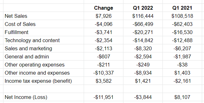
The next step is to now calculate the difference between the two periods, which can be done in a change column that takes the current value and subtracts from it the prior period’s value:
At the bottom, I’ve summed up all the changes. These figures are in millions, and so this is a significant $11.951 billion change in net income from a profit of $8.1 billion in the prior-year period to a loss of $3.8 billion.
Now that the data looks correct, the next step is to plot these values on a waterfall chart.
Step 2: Plotting the waterfall chart
To create the chart, I’ll select the data in the change column along with the related headers. From there I can either click on the image of a chart in the menu bar or I can go to the Insert menu and select Chart. If it doesn’t detect which chart I want to use, then I can select the image of waterfall chart from the Chart type drop-down option in the Setup tab:
Now it will show this:
The chart looks correct, however there are multiple changes we can make to help this look better.
Step 3: Modifying the waterfall chart
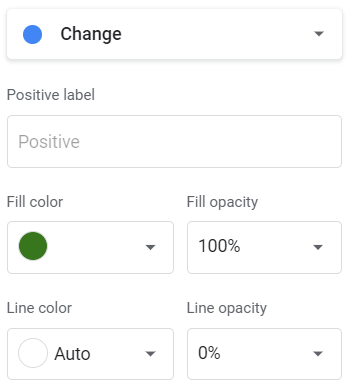
To start with, I’m going to modify the colors. While red makes sense for negatives, I’m going to change the blue to green, to better reflect a positive inflow of cash. This can be done by double-clicking on the chart and in the Chart Editor, going to the Series section, and scrolling to the Positive label. There, I can change the fill color:
This also gives me the option to change the line color and transparency using the opacity percentages. At this point, I’ll remove the legend since the green and red values are sufficient to tell you whether it was a positive or negative change.
The next thing I’ll change is the grey subtotal bar at the end. Ideally, you would have a starting and ending point on the chart to better show where one period started and where the other ended. But by default, the subtotal just adds up the sum of the change. To adjust this, I’m going to add a row to my table above Net Sales, called Q1 2021 Net Income. In the change column, I will simply put the amount, no change. This is what my updated table looks like:
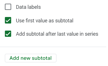
If the chart doesn’t automatically update, you may need to update the range. This can be done by double-clicking on the chart and in the Setup section, modifying the range for the Series and/or the X-axis. But the bar charts for the totals still need adjusting. The first one shows green. To fix this, I’ll double-click on the chart to edit it and under the Series section, select the box to Use first value as a subtotal. Now the first bar chart will turn grey.
In the same section, I’ll also uncheck the box that says Add subtotal after last value in series. That will remove the last bar chart. Then, I’ll click on the option to Add new subtotal. Select to add it after the last item. By doing this, I can now specify the name of that total, as opposed to just showing ‘Subtotal.’ In this space, I’ll enter Q1 2022 Net Loss.
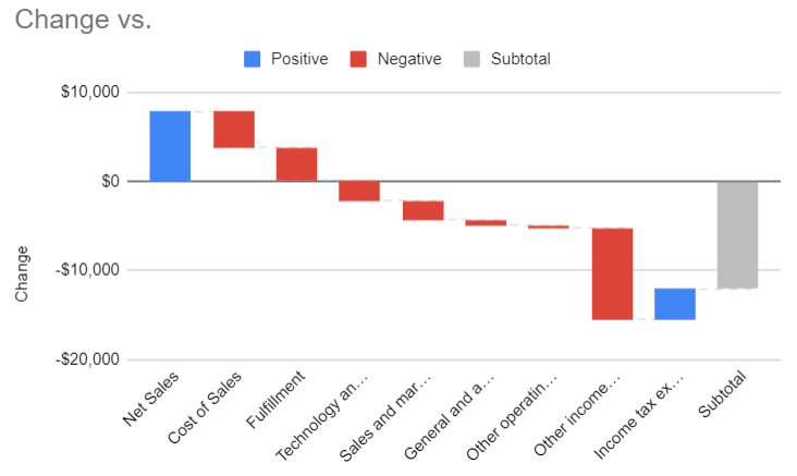
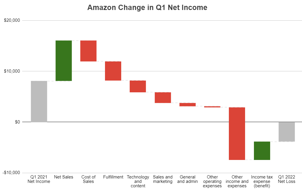
The only thing left now is to adjust the chart and stretch it out sufficiently so that the labels display horizontally. And I’ll also add a title — this can be done in the Customize section and under the Chart & Axis Titles area. Here is my completed waterfall chart in Google Sheets:
Now, from looking at this, you can see that Amazon was still at a profit until it reached the other income and expenses line. This would still require additional digging to see the reason for the loss, but it would point us in the right direction. And Amazon’s breakdown of these other expense items tells us that it incured a $7.6 billion loss on its investment in Rivian Automotive — the key reason its net profit from a year ago turned into a loss. While other expenses increased, they alone weren’t enough to pull the company into a net loss position.
If you liked this post on How to Make a Waterfall Chart in Google Sheets, please give this site a like on Facebook and also be sure to check out some of the many templates that we have available for download. You can also follow us on Twitter and YouTube.
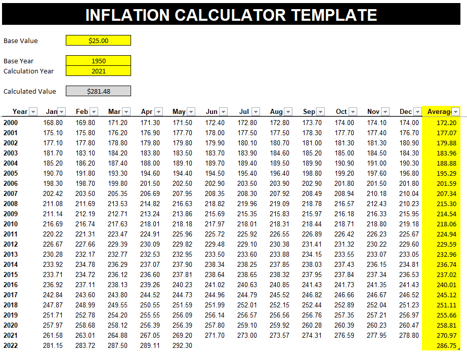
Want to know how much something was worth decades ago? Or how much something costs in today’s dollars? Using inflation data, you can estimate that. And in this post, I’ll show you how you can create your own inflation calculator template in Excel. I’ll also provide you with my free template.
Getting the data
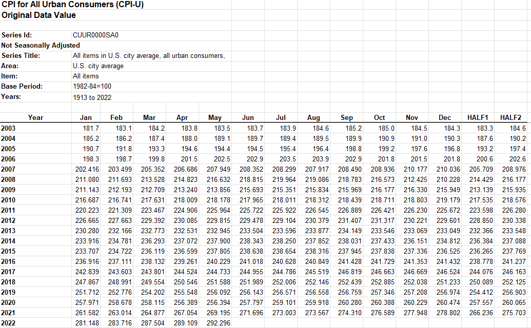
You can get inflation data going back to 1913 from the U.S. bureau of Labor Statistics. There’s an xlsx file there that I’m going use that will be the source for my calculations.
Once in Excel, you’ll see the data is neatly formatted by both year and month:
This data will get updated so over time you may want to get the latest figures so that your calculations are as accurate as they can be. The data has 1st half and 2nd half numbers but one thing I will do is also add the 12-month average. I’ll add a new column so that it just averages the values. In most cases, you’re probably just going to want to compare data from one year to another.
Next, I’ll convert the data into a table. To do this, click anywhere on the data set and under the Insert tab, click on the Table button. Excel should auto-detect the range but if it doesn’t, you can adjust it. In my template, I’ve named this table tblInflation. It includes the average, which will auto-update as new data is included.
Setting up the calculations
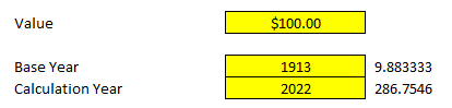
The next step involves creating the inputs, doing the lookups, and then calculating the value. There are three inputs I’ll set up: the base value, base year, and the calculation year. The base year and value will act as the starting points and will convert to a calculated value based on what the calculation year is.
To determine the impact of inflation, I’ll use the base and calculation years to find their respective index values. To do that, I’m going to use a formula that includes INDEX & MATCH. Here’s what it looks like for the base year:
In the table, I’m extracting the value from the Average column and I will be matching the BaseYear (the named range for my input) against the values in the Year column. I’ll use a similar formula to extract the index value for the calculation year. I’ve put these index values next to my inputs but will hide them later:
In 1913, the index average was 9.9 and for 2022 it was around 286.8 (based on the data that’s available thus far). If I take the index value from the calculation year and divide it by the index value from the base year, that tells me the prices are approximately 29 times what they were back then. That comes out to a percentage change of 2,797%. This leads me to the next part of the equation: determining the new price, or as I’ve referred to it in my template, the ‘Calculated Value.’ The formula for this output is as follows:
=CalculationIndex/BaseIndex*BaseValue
In the case of the above inputs, it’s doing the following calculation:
=9.88/286.75*100
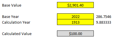
This gives me a value of $2,901.40. That means something that was worth $100 in 1913 would be worth $2,901.40 in 2022. I can also do the reverse calculation. I can work backward and answer the question of how much would something in today’s dollars be worth back then. To do that, I would enter the following inputs:
The calculated value is the $100 that I started with in the previous calculation.
My templates is complete and all that’s left at this point is just to add a header and modify some formatting:
If you liked this post on How to Create an Inflation Calculator in Excel, please give this site a like on Facebook and also be sure to check out some of the many templates that we have available for download. You can also follow us on Twitter and YouTube.
A VLOOKUP function is simple: you enter criteria and select a range that it should extract values from. However, there are multiple reasons why your VLOOKUP cannot find the correct value. Below are seven common reasons your formula may not be working as you expect it to.
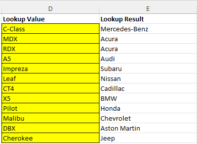
In this example, I’m going to use the following list of automobile makes and models:
I’m going to use a lookup formula to find a model and identify the make. The model and make values are in columns A and B on my sheet, respectively. And my lookup value is cell D2. The correct formula would be as follows:
=VLOOKUP(D2,A:B,2,false)
There are four arguments, and here are some of the common ways you could mess this formula up:
1. You didn’t enter the correct range
=VLOOKUP(D2,A1:B100,2,false)
A common error is that you enter a range that doesn’t cover the area that you need. For example, in the above example, the formula goes only to row 100. But if the value you want is on row 101, the lookup formula won’t work and you’ll get an #N/A error.
Another issue could be the following:
=VLOOKUP(D2,B:C,2,false)
In this situation, the formula is starting at column B but the model list is in column A. That all but guarantees that it won’t find the right value. In a VLOOKUP formula, you are looking up the leftmost column in your range. If the model values are in column A, that’s where the formula needs to start from. In the above formula, it will be looking for the values in column B, which isn’t correct.
2. You are extracting values from the wrong column
=VLOOKUP(D2,A:B,3,false)
The range is fixed in this situation but the problem here is that you’re looking for the value in the third column. There are only two that are in the formula. In this instance, you’ll get an error because you’re trying to access a value that’s outside of the range you provided.
=VLOOKUP(D2,A:B,1,false)
The range is correct but here the problem is now you’re referencing the first column. Although you’ll get a value, it will be the same one you input, since the formula is looking at column 1.
One of the common issues with lookup formulas is that people are referencing column numbers that can change over time as they expand their data set. Those numbers won’t automatically adjust when you insert new columns.
There are a couple of workarounds for this. One is to use convert your data set to a table and reference an actual table column. Another is to use the MATCH function to find the column number that you’re looking for. Alternatively, you could use a combination of INDEX & MATCH.
3. You misspelled the value you’re looking up
One of the easier mistakes to spot is when you’ve misspelled the name of what you’re looking up. If in your lookup formula you want to find “Accord” but instead type in “Accorrd” then you’ll end up with another #N/A error. However, if you have a data set where the lookup values could be similar, the danger there is that you could potentially not get an error and instead return the value that relates to a different lookup value. The best way around this is to avoid hardcoding your lookup values. That way, it can be easier to spot errors and it’ll be easier to adjust them.
The reverse is also a problem: if your lookup column contains a misspelling. In that situation, even though the value you’ve looked up is spelled correctly, your lookup could still fail.
4. Your value has extra spaces
One of the trickiest mistakes is where your data isn’t misspelled but contains an extra space somewhere. Just by looking at a cell, you may be able to spot when there’s a leading space. But if there’s a trailing space, that’s tougher and you may not notice until you actually go in and try to edit the value. Whether it’s an extra space or the value is misspelled, that can impact your ability to find a match.
The way to check your data is by using the RIGHT function (or the LEFT function if you want to confirm the first character). If you enter the following formula to reference D2 (the lookup value), it will return the last character in the cell:
=RIGHT(D2)
If it returns a blank value, you’ve found your problem. Similarly, you can use this formula on your lookup list to see if any values have extra spaces. This is something you’ll want to do before creating your lookup formula. Making sure your data is good to go and clean with no trailing spaces can save you from encountering these issues later on.
Removing blank spaces can be easy but sometimes it can be tricky as not all blank values are the same.
5. Your value is reading as the wrong data type
In this example, the lookup is a text value. However, one potential error happens when you’re looking up a number that is stored as text. That can also result in no match being found. A good way to spot this error is to see if your data aligns to the left or the right by default. If you have no formatting applied, text should align to the left, while numbers will shift to the right. Another way you can check if something is reading as text or a number is to use the ISTEXT function. To convert a number stored as text into a number, multiply it by 1.
6. You search for an approximate match when you want an exact match
In most cases, you’ll probably want an exact match from your lookup formula (i.e. you’ll set the last argument to FALSE). The one exception I’ve found to be most useful is when you’re dealing with numbers and ranges. With tax brackets, for example, you’d be looking to see what range a value falls into versus an exact match.
In error #1 on this list, if you set the last argument to TRUE and looked for an approximate match, you would get a result, it just may not be the one you were hoping for.
7. You’ve sorted your formulas and they’re not correct anymore
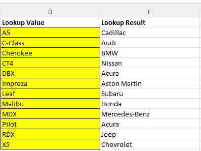
A frustrating problem can be when you’ve entered your formula correctly but when you sort your formulas, they’re now referencing the wrong cells. In this case, you’re dealing with multiple lookups at a time. For example:
The lookup values are correct but if they get re-sorted, they’re now referencing the wrong values and the lookup results are incorrect:
After sorting column D in ascending order, the formula is incorrectly saying that Acura makes the Pilot and that there’s a BMW Cherokee. Here’s what the formula looks like in cell E2 before sorting:
=VLOOKUP(Sheet1!D2,A:B,2,FALSE)
The error is in the sheet reference. Since it’s including Sheet1!D2 instead of just D2, the value isn’t automatically updating when resorting. Excel automatically inserts the sheet referencing if you’re editing a formula and jumping from one sheet to another. The formula is locking that value in place, even when you sort. Getting rid of the sheet references fixes the error.
If you liked this post on 7 Reasons Why VLOOKUP Cannot Find the Right Value, please give this site a like on Facebook and also be sure to check out some of the many templates that we have available for download. You can also follow us on Twitter and YouTube.
Did you know that you can easily add checkboxes to Google Sheets? In this post, I’ll show you how you can do that. Plus, I’ll share a google sheets script that can automatically update other cells when you tick and untick checkboxes in Google Sheets.
Adding checkboxes to Google Sheets
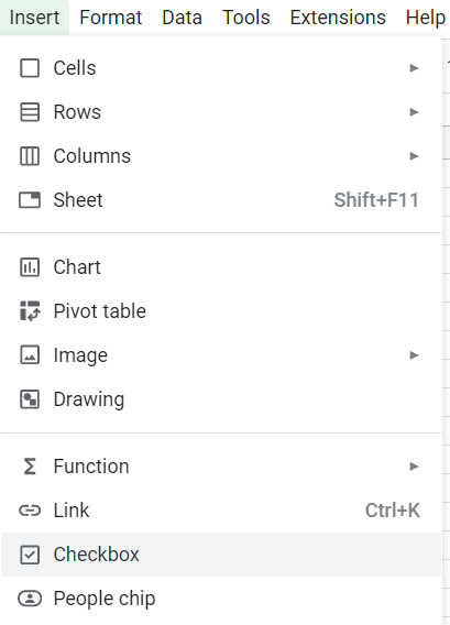
In Google Sheets, all you need to to do add a checkbox to your sheet is to go to the Insert tab and click on the Checkbox button:
Clicking the button will add a checkbox to the active cell. By default it is unchecked, and selecting the cell will show a value of FALSE in the formula bar. When the checkbox is ticked, then the value changes to TRUE.
Using checkboxes to trigger other calculations
Ticking a checkbox or unticking it doesn’t on its own accomplish anything. However, it could trigger another calculation, with the value being used in a formula. For example, suppose you have a checkbox in cell A1. You could create another formula that looks at if the value is TRUE or FALSE (checked vs unchecked):
=if(A1=TRUE,1,0)
In the above formula, if the checkbox is selected, the formula will return a value of 1. Otherwise, it will be 0. This formula could be modified to do a summation or other something more complex.
Using Google Scripts with checkboxes
Another way you can use checkboxes is with a script that runs when they are checked. Suppose for example you had an inventory sheet and wanted to check off when an item was shipped or received. Clicking the checkbox could populate the date when you checked off the box. With a formula, you wouldn’t have that capability since it would always recalculate. But with a script, it could lock in that value every time the checkbox is ticked or unticked.
To create a script in Google Sheets, you need to go to the Extensions menu and select App Script. The following script will look for changes in the 2nd column (Column B) and if a value is set to TRUE, it will populate the date in the 1st column (Column A). If it’s set to FALSE, then it will clear the value in column A:
function onEdit(e) {
  let range=e.range;
  let activeRow = range.getRow();
  let activeColumn = range.getColumn();
  let cellValue = range.getValue();
  let sheet = SpreadsheetApp.getActiveSheet();


    if (activeColumn == 2) {
      if (cellValue == false) {
          sheet.getRange(activeRow,1).clearContent();
      } else {
          sheet.getRange(activeRow,1).setValue(new Date());
      }
    }
}
Copy that code in its entirety as a new function in the app script. Then, click on the Save button. Now you can go into the spreadsheet and try it out. If you want to change any of the columns, you can change either the active column from B (replace the number 2 in the code above) or where the date value gets populated (see the lines of code that reference activeRow,1, which corresponds to the first column, column A).
If you liked this post on How to Use Checkboxes in Google Sheets, please give this site a like on Facebook and also be sure to check out some of the many templates that we have available for download. You can also follow us on Twitter and YouTube.
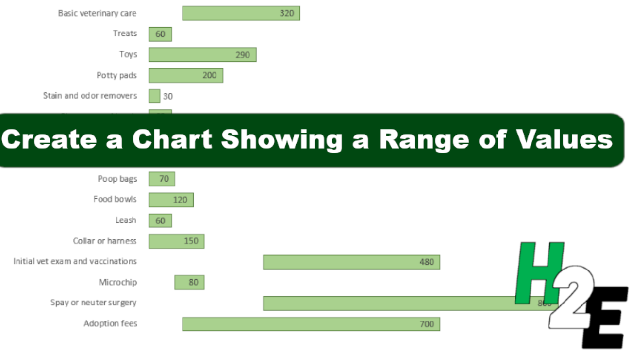
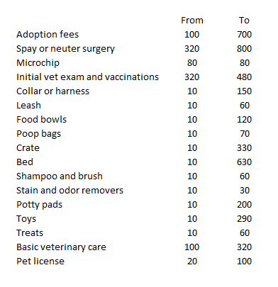
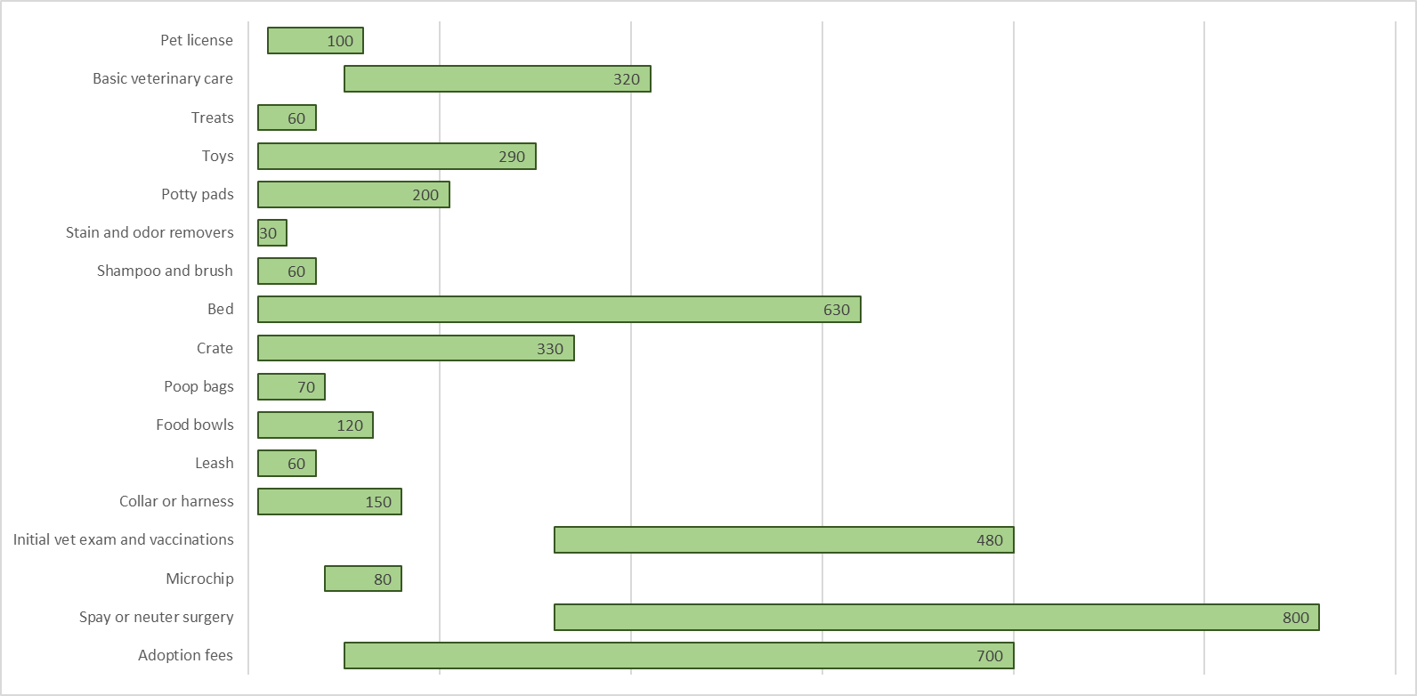
A chart in Excel can be a quick and easy way to display information. In this example, I’m going to use a bar chart to show a range of values, displaying both the highs and lows. Whether you want to show the range of a stock price’s highs and lows over the past year, or just a range between possible prices of something, this can apply to either one of those approaches.
In this example, I’m going to use first-time dog expenses, which can be very broad, with some items costing as little as $10 while others being well into the hundreds.
Creating the charts
First off, I’ll download the data into a spreadsheet. Here’s how it looks:
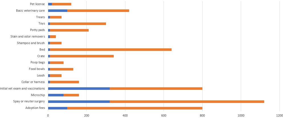
This format can easily be converted into bar charts. However, I don’t want two different bar charts, and so I’ll use the option to create a Stacked Bar Chart instead.
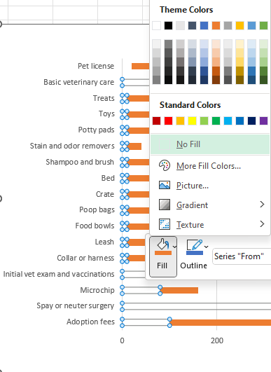
This doesn’t at first look like the chart that I want to create since this is adding both the highs and lows together. What I can do to make this work is by making the bar chart for the low amount to be invisible. To do this, I’ll right-click on one of the blue bar charts and select the fill option to No Fill
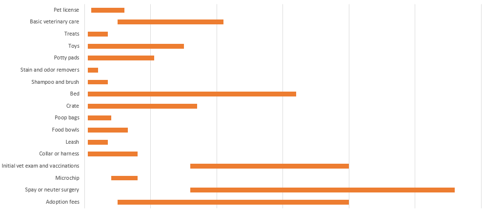
Upon doing this, that first bar chart disappears:
Without a scale, it doesn’t matter that the ranges are stacked since it effectively only shows the difference from the end of the first bar chart (which would be the start of the range) to the end of the second bar chart (this would cover the difference in value between the first bar chart and the second one). What I will do at this point is get rid of any legends and values along the x-axis.
To more effectively display the data, I’ll also add data labels. For the second bar chart, which is highlighted in orange, I’ll right-click and select Add Data Labels. By default, it’ll put the value in the middle. However, I’ll adjust it so that it goes towards the end of the bar chart. To change the appearance of the labels, simply right-click on any of them and select Format Data Labels. And under Label Position, pick the option to show Inside End. This will now move the data label to the end of the bar chart. After modifying some of the colors, this is what my chart looks like now:
You could also remove some of the gridlines. And you may want to add data labels for the first bar chart to show where the starting point is. But given that some of these bar charts are small, they may not be large enough to accommodate both values.
If you liked this post on How to Create a Chart Showing a Range of Values, please give this site a like on Facebook and also be sure to check out some of the many templates that we have available for download. You can also follow us on Twitter and YouTube.
Power Query can allow you to easily import data from another spreadsheet. But did you know that you can load multiple files from a folder at once? All you need to do is load the files you want to import into a folder, and Power Query can do the rest. In this article, I’ll show you how you can do this with stock prices and how you can import multiple ticker files from Yahoo Finance into Power Query at once.
Put all the files into a single folder
Whatever type of files you want to import, the key thing is that their format is consistent. This is because Power Query will follow a similar process when importing them. If, for example, you always remove certain columns from a file, then you want to make sure that every file you import has those columns. If there’s a discrepancy, then Power Query may struggle to load the files properly.
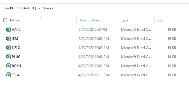
In this example, I’m going to use CSV files from Yahoo Finance. Let’s say I want to download data for multiple stock tickers. If I go to Apple’s stock ticker page, there’s a link to download the latest stock prices. In a previous post, I went over how to download stock prices for a single ticker. This time around, I’ll show you how you can do it for as many as you want. If I want to download multiple tickers, I’ll start by downloading all the different CSV files for them and putting them into just a single folder:
Here I’ve got multiple tickers downloaded, including Apple’s. This is now the folder I will reference when extracting the data from Power Query.
Importing the files Into Power Query
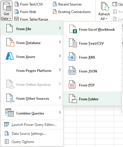
In Excel, the next step is to simply download the data. Under the Data tab, click on the Get Data button and select the option for From Folder:
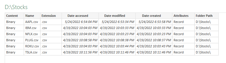
Then, navigate to the folder where your files are stored and click on Open. Now the Power Query window will load and you should see something like this:
Here I see all the files from my folder. There are three different options I can take at this point:
Transform Data. Clicking on this option will allow me to transform the table above.
Load. If I don’t want to make any transformations and just load the table above, this is what I’ll select. But like the above option, this will not combine the data, so this is not what I want.
Combine. This is the option that I will choose as it will combine all these files together. From here, you’ll have the option to Combine and Transform or to just Transform and Load (e.g. if you don’t need to make any adjustments).
On the next screen, you can click on OK and the combined data will be loaded. To make the process as seamless as possible, you’ll want to ensure that your files follow the same format. Otherwise, it can be more difficult to get the desired results.
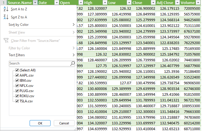
After clicking on OK, now the data loads, and all my stock data from Yahoo Finance is downloaded, with all the different tickers:
Now, you can add more downloads from Yahoo Finance for different tickers, put them in the same folder, and then just refresh the query. Your spreadsheet will now automatically update based on the CSV files within the folder.
If you liked this post on How to Import Multiple Stock Tickers Into Excel Using Power Query, please give this site a like on Facebook and also be sure to check out some of the many templates that we have available for download. You can also follow us on Twitter and YouTube.