Regression analysis is a statistical method used to model the relationship between a dependent variable (the outcome you want to predict, like house price) and one or more independent variables (the factors used for prediction, like house size). Its main goal is to find the mathematical “line of best fit” that describes how the dependent variable changes when an independent variable changes.
This is extremely useful for two key reasons: first, it helps you understand the strength and nature of these relationships (e.g., “How much does size actually impact the price?”), and second, it allows you to make educated predictions or forecasts about future outcomes based on new data (e.g., “What is the likely price for a new 2,000 sq. ft. house?”).
There are two ways to do a regression analysis in Excel. One is through the Data Analysis Toolpak, and the other is through a formula. I’ll start with the first approach. Here are the steps to do a regression analysis in Excel using the Data Analysis ToolPak:
Step 1: Enable the Data Analysis ToolPak
First, you need to make sure the necessary add-in is active.
Go to the Data tab on the ribbon.
Look for a Data Analysis button on the far right.
If you don’t see it:
Go to File > Options > Add-ins.
At the bottom, next to “Manage,” make sure Excel Add-ins is selected and click Go
Check the box for Analysis ToolPak and click OK. The Data Analysis button will now appear on your Data tab.
Step 2: Set Up Your Data
Organize your data into two columns. The independent variable (the one you use to predict) should be in one column, and the dependent variable (the one you want to predict) should be in another. In the following data set, the house size is the independent variable, and it is in column A. The house price is the dependent variable, since it is dependent on the house size, and it is in column B.
Step 3: Run the Regression Tool
Now you’re ready to perform the analysis.
Click on the Data tab.
Click on Data Analysis.
In the pop-up window, scroll down and select Regression, then click OK.
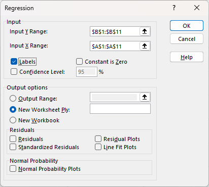
Step 4: Configure the Regression
A dialog box will appear which will allow you to specify the input ranges for the regression analysis, and whether it includes labels.
Step 5: Interpreting and reviewing the results
After you click OK, it will create the following output, summarizing the regression analysis:
The most important numbers from the table above are the R Square and the two Coefficients. Let’s break down what they mean:
R Square: This tells you what percentage of the movement in the dependent variable can be explained by the independent variable. In this example, it tells you how much of the change in house prices is explained by square footage. The higher the value, the better the overall goodness of fit is. And generally you want higher values. Anything above 0.7 indicates a strong goodness of fit. An amount above 0.5 would indicate a moderate relationship. Meanwhile, an R Square below 0.5 would suggest there isn’t a strong relationship based on the independent variable.
Coefficients: To produce the y = mx+b linear equation, you need these data points. The intercept of 191,405 is the b in the equation. And the 213.8399 is the m. The linear equation becomes the following:
=213.8399(x) + 191,405
You would substitute x for the independent variable (square footage), to estimate what the price might be.
Optional: Testing your equation
Let’s put the linear equation to work in Excel, alongside the actual results. This will help show how good of a job it does at predicting the values. Column C is the result of plugging in the x values into the mx+b formula defined above.
It may also be helpful to map this out visually, on a chart.
The square footage is going across the x-axis, with the actual prices showing in green, while the estimated values based on the linear equation are in grey.
Creating the linear equation with just a formula
If you don’t want all the data analysis that comes with the regression tool that’s available via the Excel add-in, then you can generate the linear equation through just a single formula in Excel. With the LINEST function, you can just enter your known y and known x values as follows:
=LINEST(B2:B11,A2:A11)
This returns results in an array:
The first value returned is the m value while the second is the b. With this formula, you can still setup the same mx+b formula for the line estimate: =213.8399(x) + 191,405.
If you liked this post on How to Do a Regression Analysis in Excel, please give this site a like on Facebook and also be sure to check out some of the many templates that we have available for download. You can also follow me on Twitter and YouTube. Also, please consider buying me a coffee if you find my website helpful and would like to support it.
An NFL Squares game can make watching NFL games more interesting and fun with friends. And in this post, I’m going to share with you a free template I’ve created that will make it easy to set it up. Whether you’re putting any money on the line or just having a friendly competition, this template is fairly easy to setup. There are two versions of the file, one which is entirely based on user inputs and another which contains macros.
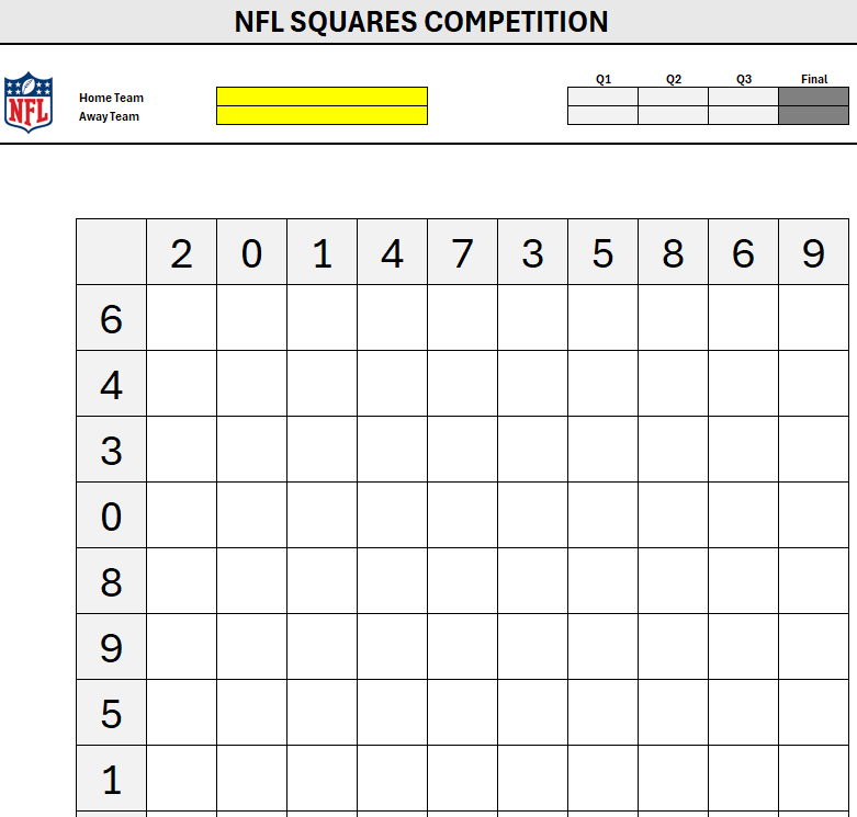
Here’s how the template looks:
How the game works is the winner is determined by who has the correct winning combination. In the above matchup, the final score was 28 for Seattle and 26 for New York. The squares game looks at the last digit for each team, which would be 8 for Seattle and 6 for New York. Whichever player has that square is the winner. You can also determine winners by individual quarters, rather than just the final score.
How to use the NFL Squares template
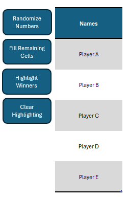
To use this template, start by entering in your own title and selecting the individual teams from the yellow drop-down fields. In the macro file, you can either select which player gets each square, or you can randomize the picks — this can be useful if you want to avoid picking every possible square or having blank ones. Off to the right, there is an option to enter the player names and then you can press a button to Fill Remaining Cells.
As the button’s name suggests, it will go through all player names and randomly assign them to the remaining squares. For this to work and to ensure fairness, however, there needs to be an equal number of cells available to fill in for each player. If there five players, the remaining spots available need to add up to a multiple of five. For example, if there are only 9 spaces, and extra space would need to be cleared out before the macro can run.
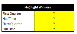
Other buttons include the option to randomize numbers, highlight winners (based on the score), and to also clear highlighting. The highlighting will be based on the score that is entered in the top half of the template:
Upon clicking the Highlight Winners button, the template will highlight all the winning squares, for each quarter, and the total:
You can also specify if you want to highlight winners for every quarter and/or the final score:
If you make any changes, you’ll need to clear any highlighting and re-run the Highlight Winners button to display the updated highlighting.
If you prefer not to use macros, you can use a more basic version of this template you can download here. Since there are no macros in here, the main difference is that there is no automatic highlighting or randomization. Instead, you’ll have to enter all the values yourself, as well as do any highlighting.
If you liked this Free NFL Squares Template for Excel, please give this site a like on Facebook and also be sure to check out some of the many templates that we have available for download. You can also follow me on Twitter and YouTube. Also, please consider buying me a coffee if you find my website helpful and would like to support it.
Wildcards in Excel are special characters that can stand in for other characters in a text string. They are incredibly useful for finding, filtering, or matching data when you only have a partial match. Think of them as “jokers” you can use in your formulas.
Excel has three wildcard characters, and they only work with text, not numbers.
The 3 Excel Wildcards
Asterisk (*)
What it does: Represents any number of characters, including zero characters.
Example:"Sm*" would match “Smith”, “Smythe”, or even just “Sm”.
Example:"*sales*" would match “Total Sales”, “Sales-Q1”, or “Sales”.
Question Mark (?)
What it does: Represents exactly one character in a specific position.
Example:"Sm?th" would match “Smith” and “Smyth” but not “Smythe”.
Example:"??-100" would match “US-100”, “CA-100”, and “MX-100” but not “USA-100”.
Tilde (~)
What it does: This is the “escape” character. It tells Excel to treat the next character as a normal character, not a wildcard. You use this when you are actually searching for a literal asterisk or question mark.
Example:"FY25~*" would find the exact text “FY25*” (and would not treat the * as a wildcard).
Example:"What~?" would find the exact text “What?”
How to Use Wildcards in Excel Functions
Wildcards don’t work in all Excel functions, but they work in many of the most popular ones, including COUNTIF, SUMIF, AVERAGEIF, VLOOKUP, HLOOKUP, XLOOKUP, MATCH, and SEARCH.
Important: When using wildcards in a function, the criteria (the part with the wildcard) must always be enclosed in double quotation marks (" ").
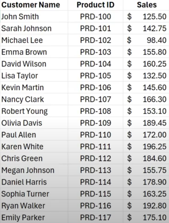
Let’s go over an example using the data set below, which shows customer name, product ID, and sales.
Using VLOOKUP with wildcards
I can use the VLOOKUP function to find a value that Starts with ‘John S’ and this can be done by adding a wildcard afterwards. With my table in columns A:C, this is how I setup my formula:
=VLOOKUP("John S*",A:C,3,false)
This returns a value of $125.50, which is the first customer in the list, John Smith.
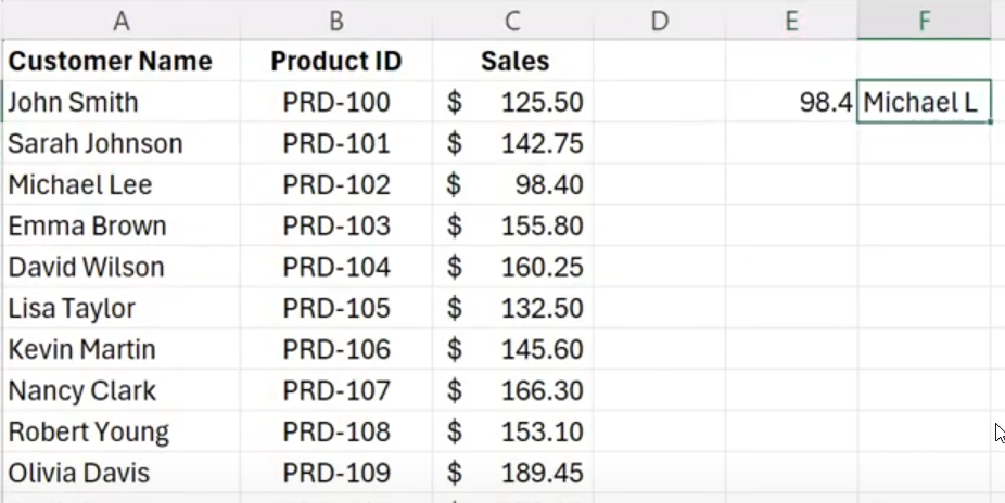
Let’s suppose I don’t want to hardcode my search values. Instead, let’s link to a cell and add the asterisk afterwards. In the below example, I have the lookup value showing in cell F2.
If I want to look up any value that starts with Michael L, I would setup my formulas as follows:
=VLOOKUP(F2&"*",A:C,3,false)
The key here is to use the & to connect the lookup value with the wildcard, and this is the same as manually hardcoding the lookup value with the wildcard. But by linking it to a specific cell, it can make your search criteria more dynamic. You can just change the cell in F2 without changing anything else in your formula.
Using XLOOKUP with wildcards
XLOOKUP works in a similar way to VLOOKUP but there are a couple of key differences to consider. The first is that the order of the arguments is different. The other is that by default, wildcards are not enabled. You need to specify in the second-last argument (search mode), that you want to use wildcards. That argument needs to be set to a value of 2. Here is how you would setup the same wildcard lookup with XLOOKUP:
=XLOOKUP(F2&"*",A:A,C:C,,2)
This produces the same result as in the previous VLOOKUP formula.
Using wildcards to sum up partial matches
Another way you can use wildcards is to sum or average values when a criteria is met. In the example above, I’m going to sum all the amounts where the name contains “Johnson” somewhere in the text. Here’s how that would work within a SUMIF function:
=SUMIF(A:A,"*Johnson*",C:C)
This formula uses two asterisks, one before and one after Johnson. As long as it is somewhere within the text, it will be summed up. The formula returns a value of $419.25, the total of all the values that contain Johnson.
In some cases, you may not want to use the asterisk but instead use a wildcard for just a single character. This is when you might use the ? symbol. In the following example, I’m going to sum up all the product IDs that start with PRD-11, but I am only searching for one additional character:
=SUMIF(B:B,”PRD-11?”,C:C)
This adds up to 1,748.60. It will sum up all product IDs between PRD-110 through to PRD-119. But if I had a product ID that went a character longer, such as PRD-1100, that would not be included since that would be more than one additional character. With the ? wildcard, it specifies how many additional characters I am looking for. Each ? represents one character. This is a more specific wildcard search than simply using the asterisk.
If you liked this post on How to Use Wildcards in Excel, please give this site a like on Facebook and also be sure to check out some of the many templates that we have available for download. You can also follow me on Twitter and YouTube. Also, please consider buying me a coffee if you find my website helpful and would like to support it.
If you find yourself performing the same steps over and over in Excel, whether it’s formatting reports, importing data, cleaning up columns, or just about anything else, the Macro Recorder can save you a ton of time. It’s one of Excel’s most powerful automation tools, yet many users overlook it because they think it requires coding knowledge. The truth is, you can create useful macros without writing a single line of VBA code.
In this guide, I’ll cover how to use the Macro Recorder, what you can (and can’t) do with it, and why it’s a great first step into Excel automation.
What Is the Macro Recorder?
A macrois a series of recorded actions in Excel that can be played back to repeat those steps automatically. The Macro Recorder captures your keystrokes, menu selections, and formatting actions in VBA (Visual Basic for Applications) code behind the scenes. It records everything you do in Excel, and then can replay them as a macro later.
How to Turn On the Developer Tab
Before you start recording, you’ll need access to the Developer tab, which is hidden by default. It’s on this tab where you’ll see the button for the macro record and other VBA and developer-related settings.
Go to File → Options → Customize Ribbon.
On the right side, check the box for Developer.
Click OK.
You’ll now see the Developer tab appear on the Ribbon.
How to Record a Macro
Now that you have the Developer tab, enabled, you can easily start using the macro recorder.
Go to Developer → Record Macro.
In the Record Macro window, give your macro a name (no spaces allowed).
Choose where to store it:
This Workbook (saves only in the current file)
Personal Macro Workbook (available across all Excel workbooks)
Optionally, assign a keyboard shortcut (e.g., Ctrl + Shift + R). But be careful to avoid overwriting existing shortcuts.
Add a description so you’ll remember what it does.
Click OK. The recording begins immediately.
Now perform the actions you want Excel to repeat, for example:
Apply formatting to cells
Insert a formula
Create a chart
Copy and paste data
When you’re finished, click on Developer → Stop Recording.
How to Run a Macro
Once you’ve saved your macro, you can easily run it by following either one of these steps:
Press the assigned shortcut key, or
Go to Developer → Macros, select your macro, and click Run.
Excel now repeats every step you recorded, instantly.
PRO TIP: You can also create your own button that launches your recorded macro. To do this, Go to Insert → Shapes, where you can draw your shape or image. After you’re done, right-click on it ,and select the option to Assign Macro. Select your macro. Now, anytime you click the button, the macro will run.
How to View and Edit Your Recorded Macro
All recorded macros are stored in VBA. To see what Excel recorded:
Go to Developer → Macros.
Select your macro and click Edit.
This opens the VBA Editor, showing the code Excel generated. Even if you don’t know VBA yet, this is a great way to learn how your actions translate into code. You might notice patterns like:
With a bit of practice, you can tweak this code to make your macro even more powerful, by adding loops, conditions, or user inputs.
The macro recorder can also be a useful way to find out what the specific syntax is for certain items, such as changing pivot table settings and formatting.
Benefits of Using the Macro Recorder
These are the big advantages of using the macro recorder in Excel:
Saves Time on Repetitive Tasks
Whether you’re formatting monthly reports or importing data, one click can now replace many manual steps.
No Coding Knowledge Required
The recorder handles all the VBA work for you, making it perfect for beginners.
Great Learning Tool
By examining the generated code, you can gradually learn VBA syntax and logic in a real-world context.
Consistency and Accuracy
Recorded macros ensure that repetitive tasks are done exactly the same way every time; no human error, no missed steps.
Drawbacks and Limitations of the Macro Recorder
While the Macro Recorder is powerful, it’s not perfect:
It Records Everything, Even Mistakes
If you make a wrong click, Excel records that too. You’ll either need to start over or clean the code manually later. Code that has used a macro recorder is easy to spot since there will be many unnecessary lines.
Absolute References
By default, macros record exact cell references (e.g., A1, B2). That means if you want the same steps applied to a different range, the macro might not behave as expected.
You can change this by turning on Relative References under the Developer tab before recording.
Limited Flexibility
Macros can’t make decisions or apply complex logic and apply if statements. For that, you’ll need to edit the VBA code directly.
Security Restrictions
Because macros contain code, Excel often disables them by default. Anyone who uses the file will need to enable Macro Settings under File → Options → Trust Center to run them safely.
When to Use the Macro Recorder vs. VBA
Situation
Best Option
You want to automate a short, repetitive sequence (e.g., format a report, clean a dataset)
Macro Recorder
You need logic (loops, conditions, user input) or flexibility
Write or edit VBA manually
You’re just starting to learn automation
Macro Recorder
You want scalable, reusable automation
VBA coding
If you liked this post on How to Use the Macro Recorder in Excel, please give this site a like on Facebook and also be sure to check out some of the many templates that we have available for download. You can also follow me on Twitter and YouTube. Also, please consider buying me a coffee if you find my website helpful and would like to support it.
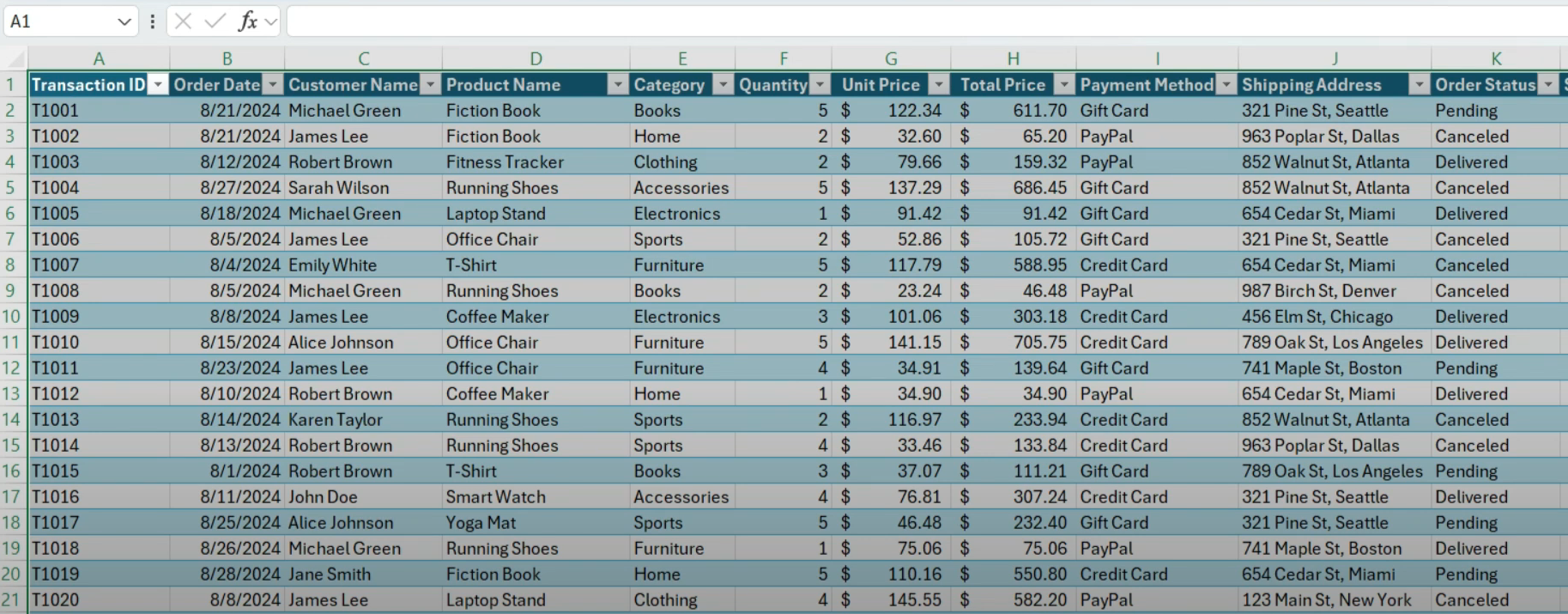
Is your pivot table not updating even though you’re refreshing the data? If that’s the case, that usually means there’s a problem with the data that your pivot table is referencing. Here’s how you can troubleshoot and fix the issue. Note: If your pivot table is linked to power query, you’ll want to first review that your query is updating correctly before moving forward.
Check your pivot table’s data source
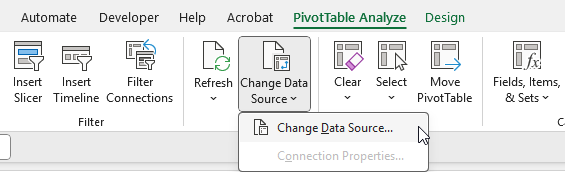
The first thing you’ll want to do when you’re looking into problems with your pivot table’s data, is to start by going straight to the source. Click anywhere on your pivot table, as doing so will display the PivotTable Analyze tab on the ribbon. If you click in here, you’ll see an option to Change Data Source. Even though you may not necessarily want to change the data source, this is where you can see where your pivot table is pulling data from.
When you click on the button to change the source, you’ll see the table or range that your pivot table is referencing. In this example, it’s referencing the range A1:L150 in the Sales_Transactions tab:
If your data goes beyond the range, that’s where your problem exists. In my example above, the pivot table range only goes to row 150, but my data goes all the way to row 201.
Since the pivot table has a hardcoded range, anytime I add data beyond row 150, this pivot table will not include it, even if I do a refresh. The band-aid solution is to simply update the range to go to row 201. I could set a larger number for the row to give myself more of a buffer, but the danger is always that the pivot table may not be optimally sized, and the risk is that not all of the data will be included even when a refresh is done.
When creating pivot tables, the ideal solution is to put your data in a table
To avoid the issue of a pivot table refresh not updating your data, the best option is to put your data into a table. Once in a table, your range will automatically update, and you no longer need to worry about how many columns or rows to include; the table will expand as you add more data.
To create a table, click anywhere on your data set, and go to the Insert tab, where you’ll see a button for Table. By clicking this button, Excel will create a table and auto-detect your range. By default, it’ll also applying some formatting so that you’ll recognize it’s in a table format. But you can also change the color scheme of your table if you prefer.
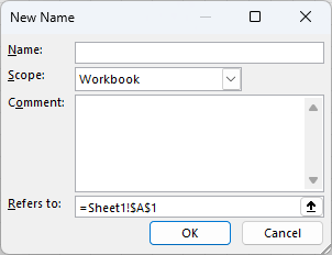
Once you create a table, Excel also assigns a name to it. If it’s the only table in your sheet, you might see a name such as Table1 in the Table Design tab, under the Table Name field:
This reference now becomes a named range that you can use when creating or updating a pivot table. Rather than a fix ranged of cells, the pivot table can simply reference the table. And after making this change, any data that is added to the table will be included when the pivot table refreshes.
Creating a named range without a table
You don’t have to create a table to setup a dynamic named range for your data set, but it’s the easiest option. Another way is to create a named range that uses the OFFSET Function, which can automatically adjust based the number of rows and columns.
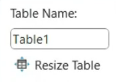
This is a more complicated setup, but how it works involves setting up a named range. Start by going to the Formulas tab and clicking on Name Manager. Then, click on the button for New, which will allow you to create a new name, and specify what range it refers to.
For the OFFSET function, you’ll need to also use the COUNTA function to count the number of non-blank rows and columns. Start by setting cell A1 as your starting position, and here is what the full formula will look like:
=OFFSET(A1,0,0,COUNTA(A:A),COUNTA(1:1))
This formula starts in cell A1 (which is where the pivot table begins in my example), doesn’t offset any rows or columns (the first two zero values indicate this), and then it counts the number of non-blank rows and columns, ensuring that it automatically expands. If you’re using this approach, you’ll want to make sure you have no other tables or data on the sheet, to ensure the COUNTA function is not picking up additional columns or rows, and expanding your range too far. And to keep it simple, I suggest putting your pivot table in cell A1.
Once you’ve created this named range, you can now use it as the data source for your pivot table, and it will do the same job as the table in that it will automatically expand as you add data.
If you liked this post on How to Fix a Pivot Table That Is Not Refreshing, please give this site a like on Facebook and also be sure to check out some of the many templates that we have available for download. You can also follow me on Twitter and YouTube. Also, please consider buying me a coffee if you find my website helpful and would like to support it.
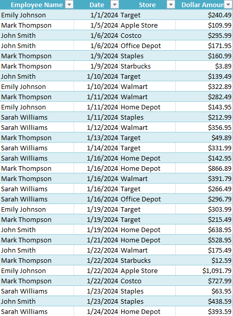
A VLOOKUP function in Excel can be an effective and easy way to pull in a value from a list. But what if you needed to base your lookup on multiple values? You could use helper columns to try and achieve that, but there’s another way you can do so, and it involves the LOOKUP function, which is similar to VLOOKUP, but it gives you a bit more flexibility.
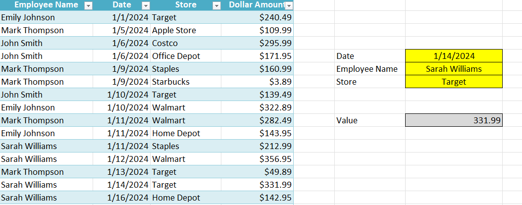
For this example, I’m going to use the following data set, which has a list of expenses by employee.
The LOOKUP function takes the following arguments:
lookup_value
lookup_vector
results_vector
I’m going to create a couple of lookup fields, specifically for the employee name, date, and store. My formula is going to check the table against each one of these fields, with the goal being that any time the criteria is a match, a value of 1 is returned. Here’s what my criteria will look like when I’m looking for a combination of date, employee name, and store:
Where employeefield, datefield, and storefield are the values in my spreadsheet that I’m looking up that pertain to these specific columns. If there is a match, a value of 1 is returned each time. And so if all the criteria are met, then it becomes 1 x 1 x 1 = 1. If any one of the criteria is not met, however, then 0 is returned since anything multiplied by a 0 is a 0.
But I don’t want to return 0s and instead I want the values to be errors so that they don’t affect the result. To do this, I’m going to take 1 and divide it by all the above criteria. That way, if there is a 0 value, it returns a #DIV/0! error. This is what this portion of my formula looks like at this point:
Finally, for the first part of the formula, is the actual lookup value. I’m going to be searching for a value of 2, since that will ensure it pulls in the last match (in case there are multiple), as all the values will either be errors or 1 values. This is what the complete formula looks like:
And here is how it all looks within my spreadsheet, with the input fields in yellow and the result in grey (which is where the above formula resides):
If you liked this post on How to Do a Lookup in Excel With Multiple Criteria, please give this site a like on Facebook and also be sure to check out some of the many templates that we have available for download. You can also follow me on Twitter and YouTube. Also, please consider buying me a coffee if you find my website helpful and would like to support it.
The MLB playoffs are approaching and I have created a template for you to track the games and also make predictions. The playoff picture and standings are as of today’s date, Sept. 26. However, I will update them at the end of the season and make any necessary changes, if necessary. This is how the template currently looks like:
If you don’t want to wait for my updated file and the standings do change, you can adjust them yourself. Next to the playoff tree, there is a section where you can update the seeding and wild card positions.
The division winners are highlighted in blue for the American League and red for the National League. The seeding will determine who plays who in the template.
As for making predictions, simply enter the number of games you are predicting each team to win. The team with more games will highlight in green as the winner, and they will be displayed as the team that advances to the next round. Since there is no re-seeding that takes place, the bracket remains unchanged.
This template can be useful if you want to make predictions with your friends and compare how you did. You can just create copies of each person’s predictions and then compare how you did at the end of the playoffs.
If you liked this Free 2025 MLB Playoff Template for Excel, please give this site a like on Facebook and also be sure to check out some of the many templates that we have available for download. You can also follow me on Twitter and YouTube. Also, please consider buying me a coffee if you find my website helpful and would like to support it.
Do you want to create conditional formatting rules in Google Sheets that are linked to specific cells? Below, I’ll show you how to do that, so that it’s easy to update, maintain, and see what conditional rules you have setup. This avoids having to set your values directly in the conditional formatting settings.
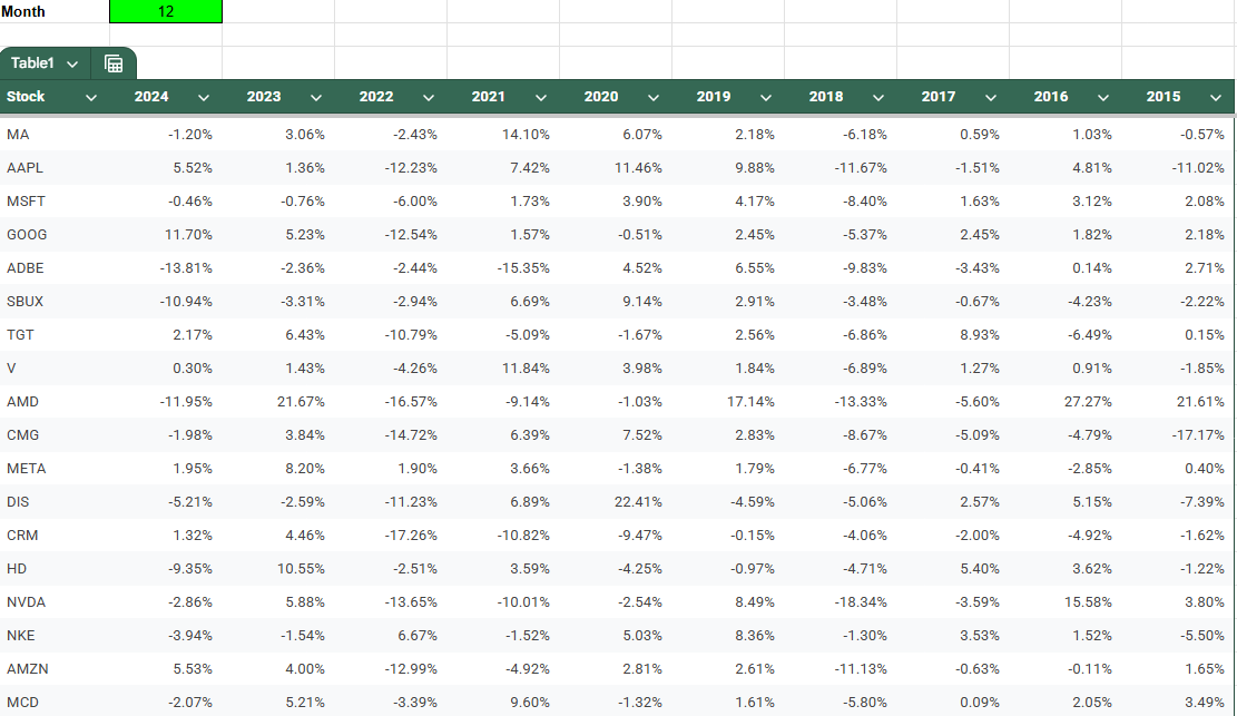
In this example, I have a list of stock tickers and their historical performances for a specific month of the year. I’m going to create rules to highlight cells based on their values.
You can follow along with my practice file here. Simply create a copy to see my conditional formatting settings or start from scratch.
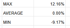
I will create three different cutoff points for my conditional formatting, a maximum value for the highest threshold, the average, and a minimum value for the lowest threshold. I’ll call refer to them as MAX, AVERAGE, and MIN.
For the MAX value, I’m going to set this to the third largest value, and multiply it by a factor of 0.5, just to ensure that the cutoff is low enough that it includes enough data points. My formula utilizes the LARGE function and is as follows:
=LARGE(Table1[[2024]:[2015]],3)*0.5
For the average, I’m going to simply calculate the average for the entire table:
=AVERAGE(Table1[[2024]:[2015]])
For the MIN value, I’ll use the same logic as for the largest value, except this time I’ll use the SMALL function so that I can get the third smallest value.
=SMALL(Table1[[2024]:[2015]],3)*0.5
You can obviously setup whatever cutoff points you want for your conditional formatting. But I just want to give you some ideas and ways where you can make your formatting rules a bit more dynamic, based on the data set. I have these cutoff points set up but I can adjust them as necessary:
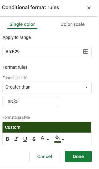
Now, we can go and setup the conditional formatting rules, linking them to these cells. To do this, start by selecting all the values to apply conditional formatting to. In this example, I’m going to select the entire table. Then, go to Format and select Conditional Formatting.
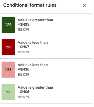
For the first rule, I’m going to check the option to format cells if they are Greater than a specified value. Here is where instead of entering a value, you can reference a specific cell. My max value of 12.16% is in cell N5, and I’m going to enter that in my conditional formatting rule. Note that it’s important to freeze the cell to ensure every cell is looking at this same value.
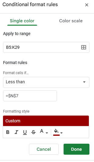
Next, click on the button below the conditional formatting rule that says + Add another rule. It will copy the settings and so now, for the next rule, all that’s necessary is to adjust the linked cell so that it’s referencing N7 (the minimum) rather than N5. And instead of greater then, I’ll select the option for Less than. I’ll also change the formatting so that it is red:
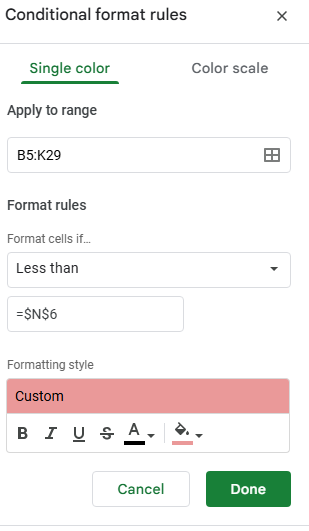
Now, let’s create another rule, this time for the average. This rule will look at if a value is below the average and apply a lighter shade of red:
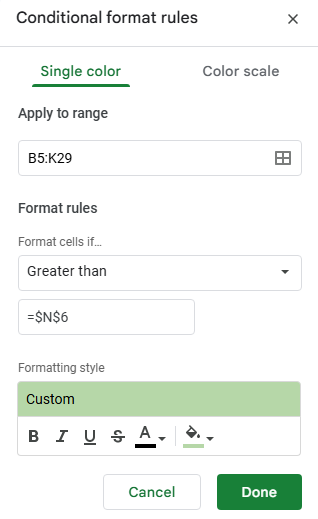
The last rule I’ll setup is if the value is greater than the average, and apply a light green highlighting:
In my example, the formatting rules are now applied based on which cutoff points they fall within:
At this stage, I’ve created four conditional formatting rules:
If your cells aren’t formatting properly, make sure to check the hierarchy. The most extreme rules which are greater than the maximum or lower then the minimum values should be at the top, followed by the ones that are simply higher or lower than the average. This order is important to ensure the rules are applied in the correct order.
If you liked this post on How to Create Google Sheets Conditional Formatting Rules Based on Another Cell, please give this site a like on Facebook and also be sure to check out some of the many templates that we have available for download. You can also follow me on Twitter and YouTube. Also, please consider buying me a coffee if you find my website helpful and would like to support it.
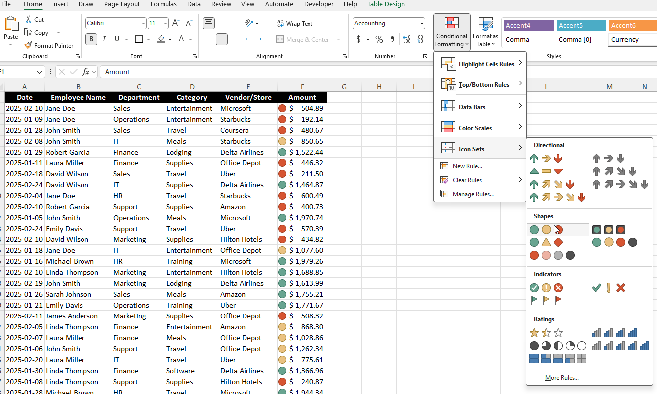
Conditional formatting in Excel is one of the most powerful tools for making your spreadsheets more insightful and easier to read. Instead of manually scanning rows of numbers or text, conditional formatting automatically highlights the most important parts of your data based on rules that you set. With just a few clicks, you can spot trends, identify outliers, or flag potential issues—all without adding a single formula to your worksheet.
For example, imagine managing a budget where any expense over $1,000 turns red, or tracking project deadlines where tasks due this week are highlighted in yellow. Conditional formatting allows you to create these kinds of dynamic visual cues, making your data tell a story at a glance. Whether you’re a beginner just learning Excel or an advanced user building dashboards, mastering conditional formatting can transform how you work with spreadsheets.
What is Conditional Formatting in Excel?
Conditional formatting in Excel is a feature that applies formatting (such as colors, icons, or data bars) to cells based on specific conditions or rules. This helps in:
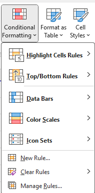
To access conditional formatting, navigate to Home > Conditional Formatting on the Excel ribbon.
General Conditional Formatting Rules in Excel
Excel provides several built-in conditional formatting rules, which can be applied with just a few clicks:
Highlight Cells Rules
These rules apply formatting to cells based on their values.
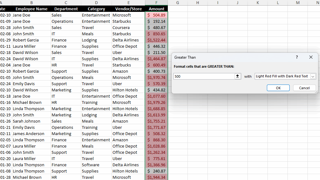
Greater Than / Less Than: Highlights numbers above or below a certain threshold. In the below data set, all the values that are greater than $500 are highlighted.
Equal To: Highlights cells that contain a specific value. In the example below, when the Vendor is equal to Office Depot, the cell is highlighted in yellow.
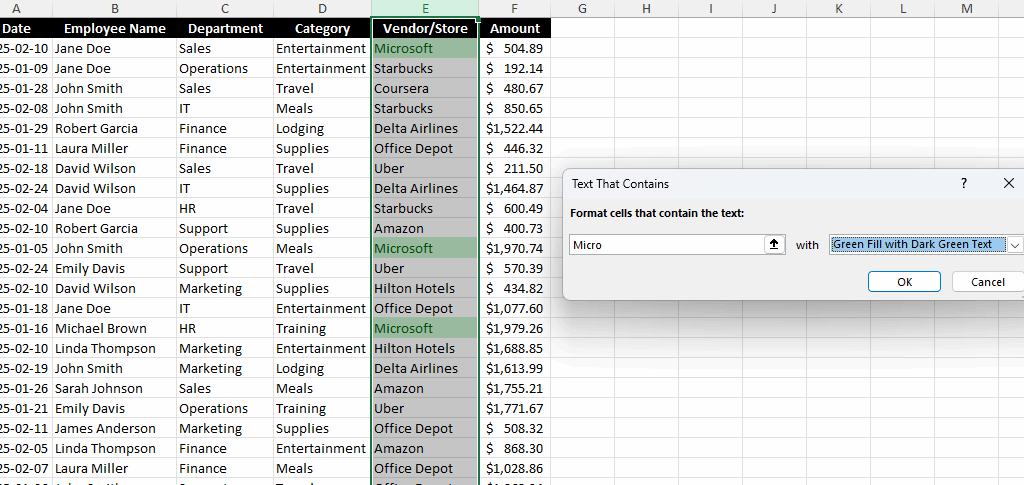
Text That Contains: Applies formatting to cells that contain certain text. This is useful if you are looking for partial matches. In the below example, any Vendor which contains the word ‘Micro’ is highlighted in green.
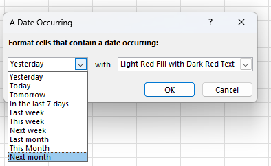
Dates Occurring: This is useful for highlighting recent, upcoming, or past dates. And the values are dynamic and will change based on the current date.
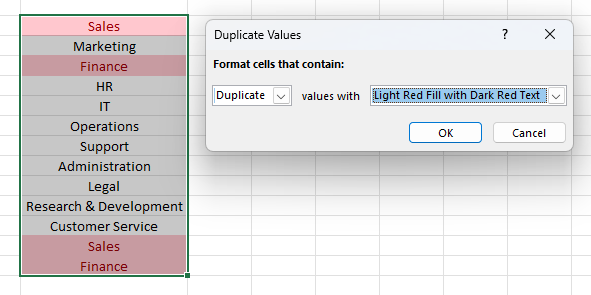
Duplicate Values: Conditional formatting can help with quickly identifying values in a range of data, showing when there are duplicates found. Below, I’ve highlighted any duplicate values in red.
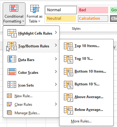
Top/Bottom Rules
In addition to just highlighting specific values, duplicates, or ranges of dates, you can also use conditional formatting to analyze data for you. Here are some of the pre-set options you can highlight:
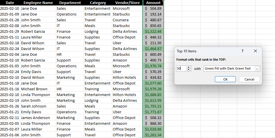
Top 10 Items / Bottom 10 Items: This option highlights the highest or lowest values in a dataset. While it says the top or bottom 10, this can be modified to show a different number. Below, I’ve highlighted the top 50 largest values in green.
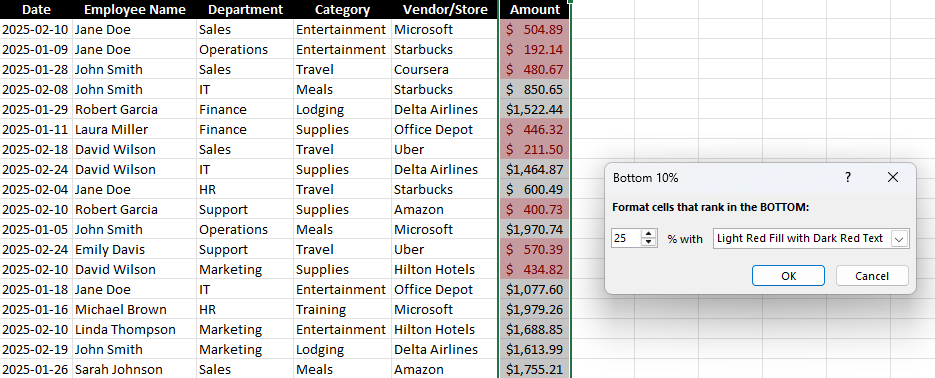
Top 10% / Bottom 10%: This highlights values that fall in the top or bottom 10%. While the default is to look at the top or bottom 10%, you can change this percentage to whatever cutoff point you want. In the below screenshot, I’ve set the cutoff to 25, to highlight the bottom 25% of values in the data set. By doing this, it’s easy to highlight the largest values without first having to calculate what that cutoff point is — Excel does it all.
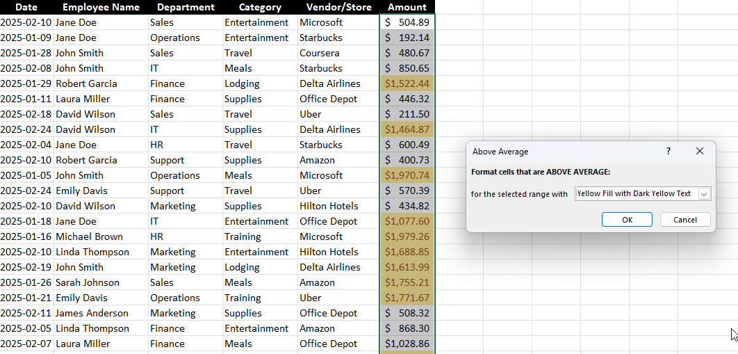
Above / Below Average: This highlights values above or below the dataset’s average. Below, all the values that are above average are highlighted in yellow. Here again, there’s no need to actually calculate what that cutoff point is. Excel determines the average and then highlights the values that are over that.
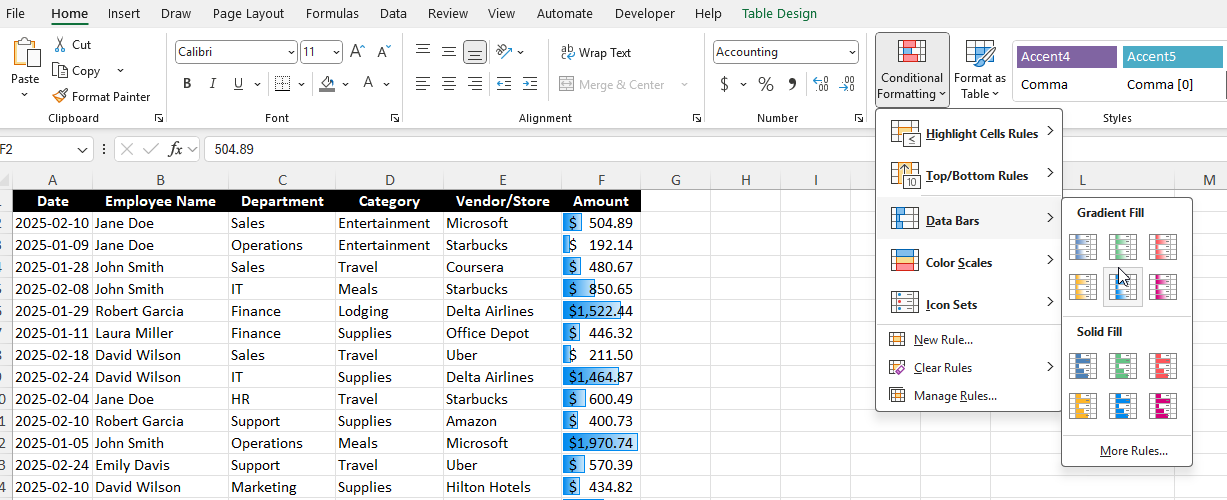
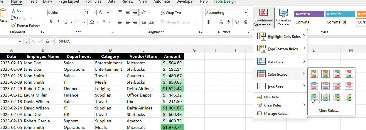
Data Bars, Color Scales, and Icon Sets
These options provide a graphical representation of data, and they can be a more powerful way to visualize your numbers.
Data Bars: Fill the cell with a bar proportional to its value. And with this conditional formatting, it’s easy to spot high and low values in relation to one another.
Color Scales: Apply a gradient of colors based on value distribution. You can use three different colors, or you can use shades of a color, where larger values will appear darker while smaller ones will be lighter in color.
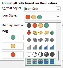
Icon Sets: Display different icons (arrows, checkmarks, etc.) based on value thresholds. This does a similar job as the other options, but now you can utilize icons instead of just colors.
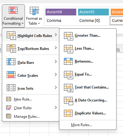
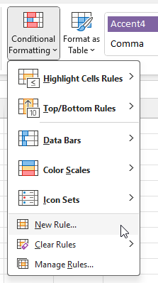
Creating your own rules
The pre-defined conditional formatting options can be useful, but you may prefer to make your own. By doing so, you can apply more customization to your rules. If you skip pass the first options on the conditional formatting menu, you’ll see an option to create a New Rule:
From here, you’ll get similar options as to the pre-defined ones, including formatting them based on their values, top or bottom rankings, above or below average, and so on.
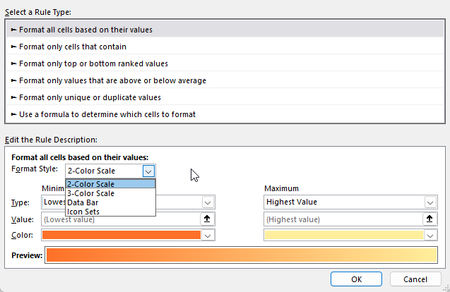
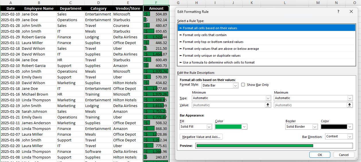
Formatting cells based on their values
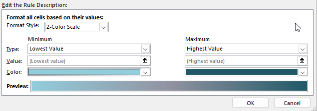
For this rule, you can specify the type of color scale you want to use (2 colors, 3 colors, data bars, or icons)
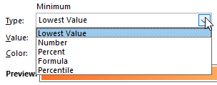
You can also change how the minimum and maximum values are determined, whether they are based on simply the lowest value in the range, a specific number, a percentage, formula, or percentile.
And you can also change the color scheme, to determine how you want the gradient to look, and how it will progress from the minimum to the maximum. By changing the drop downs, below I’ve changed the gradient to go from a light teal to a dark teal color.
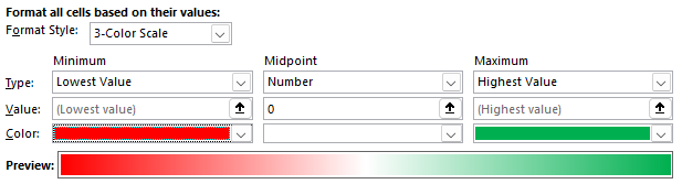
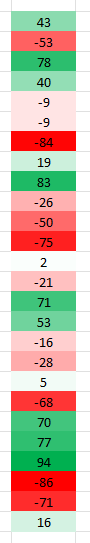
If you select a 3-color scale, you’ll notice you’ll also have a midpoint option, where you can have a third color. If you’re dealing with values that are positive and negative, you may want to use a 0 value for the midpoint and make the color white. This is how I’d set it up for high and low values when there are negatives. The largest negative values will be in red and the highest positive values will be green, while anything close to 0 will be white.
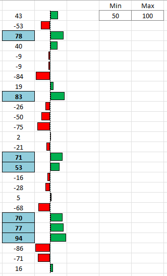
Here’s how this would look on a range of values between -100 and +100:
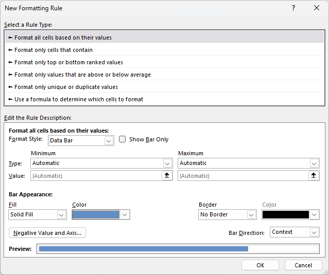
If you select a data bar as your option, you’ll notice different settings for that. Not only can you specify the minimum and maximum values, but you can also adjust the appearance of the bar:
In the below example, I’ve modified the data bar so that it is green with a black solid border:
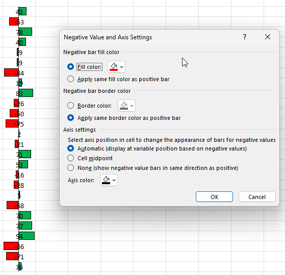
If you have negative values, you can click on the Negative Value and Axis to modify how those values will show. By default, if they are negative, the fill color is set to red, but this too can be changed.
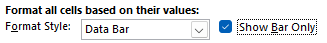
TIP: If you don’t like the look of the above formatting because it looks messy, consider copying the values in the next column. Then, create the same conditional formatting rules but select the option to Show Bar Only next to the Data Bar option:
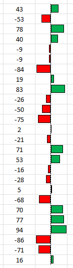
By doing this, you can have your values in one column, and then just the bar in the other column. When you show just the bar only, it doesn’t display the values anymore. In the below example, the values are in both columns, but with this formatting applied, they are no longer visible in the column on the right.
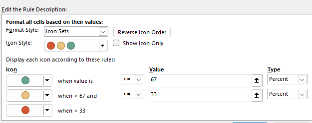
If you create a new rule using icon sets, you’ll get yet a different set of options:
There are many different types of icons you can choose from, allowing you to be creative in how you want the formatting to be applied.
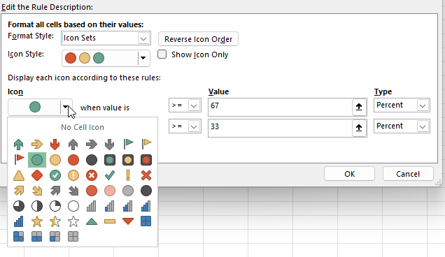
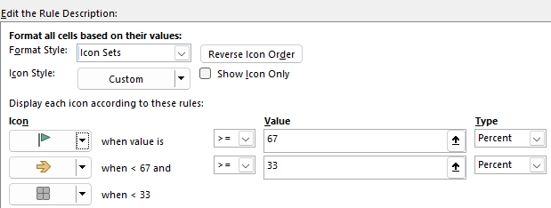
However, you can still mix and match. You aren’t locked into a specific set of icons. You can change the look of each icon by clicking on the drop-down option next to it.
Below, I’ve used a mix of various icons that don’t conform to any pre-defined style:
Although the default is to use a percent, you can also change this to formatting a value based on its numerical value, a formula, or a percentile.
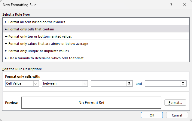
Format only cells that contain certain values or text
This next section is a bit simpler in that there are fewer options. You specify how you want to format them based on what they contain, and if they meet a certain criteria:
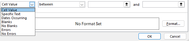
For the first drop-down option, you can specify if you’re looking for a certain value, text, date, or whether it’s a blank or error.
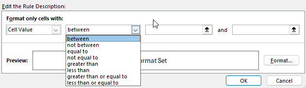
Depending on what you select, the next drop-down option may change. But if you leave it to the default cell value, then you can also specify whether it’s within a range of values, greater than, equal to, or less than a certain value.
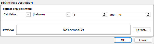
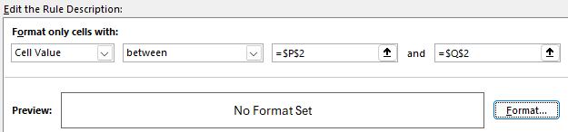
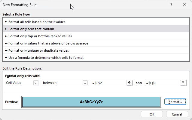
Since I’ve selected between, I need to enter multiple values, one being the start of the range and the other being the end. In the below example, I’m looking at values that are between 5 and 10.
TIP: Anytime you see the up arrows, that means you can specify a certain cell to link the rule to. And when you do so, your rule becomes dynamic. As the value changes in the cell that you’ve specified, the formatting rule will update. This can be helpful because you can easily change the value without having to go into the conditional formatting settings.
In the example below, I’m no longer specifying exact values but instead referencing ranges, P2 and Q2:
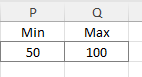
In my spreadsheet, I can setup these cells accordingly, so that I know they are my min and max values for my conditional formatting rule:
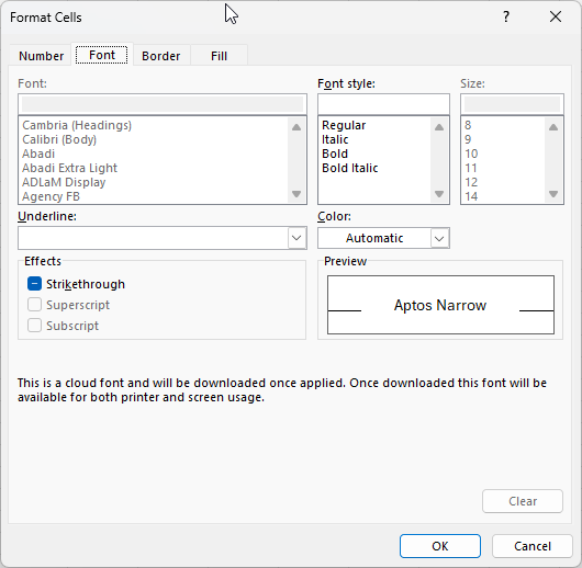
But before any conditional formatting gets applied, I need to specify the formatting I want. Since I’m creating a rule type from scratch and not relying on pre-defined rules, I also have to set my formatting. To do this, I need to click on the Format button, which opens up the Format Cells options. And just like when you’re formatting cells in Excel, you can specify how you want the cell to look, including its font style, number formatting, border, and fill color.
In my example, I’ve created the rule so that it will apply a blue fill color, with a solid black outline, and bolded black text.
This is how it has been applied to my range of values:
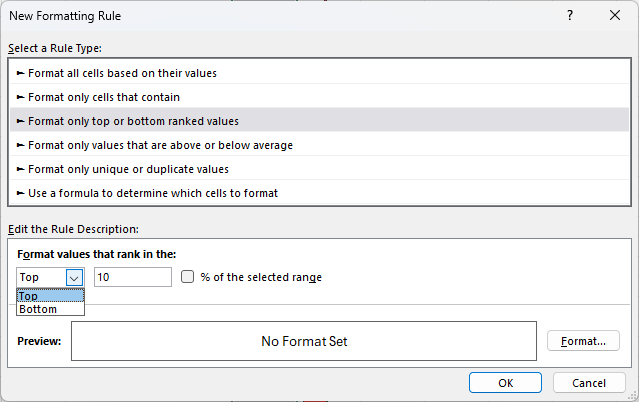
Format only top or bottom ranked values
This rule type is an even simpler one since we are only looking at the largest or smallest values. The first drop-down option allows you to choose from either Top or Bottom.
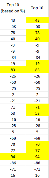
The next field is where you specify the number of items. If I leave it to 10, then it will grab the 10 largest items in the range I’ve selected. But if I check off the option to say % of the selected range, then it will grab the top 10% of the values. For example, if in my range I select 26 values, it will highlight only the two largest values since that will mark the top largest ones, based on the size of the range. Here’s the difference in the two approaches:
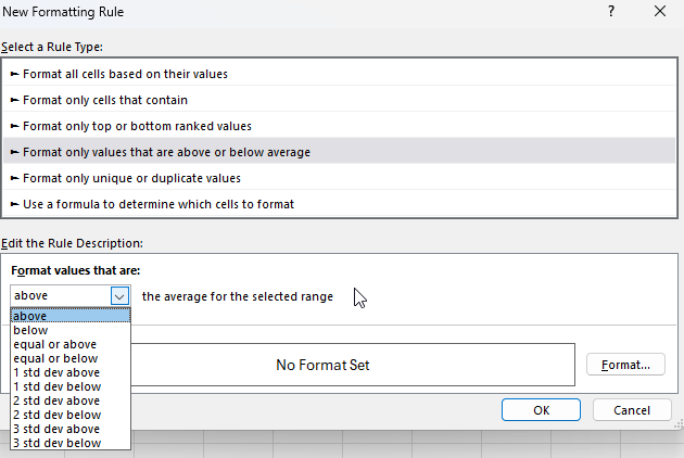
Format only values that are above or below average
This option is similar to the one in the pre-defined conditional formatting rules. However, you have a bit more flexibility here in being able to also format them based on how many standard deviations they are away from the average.
You will also need to set the formatting you want to apply. You could create one rule for if something is 1 standard deviation away and another one for if it is 2 standard deviations, etc.
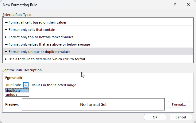
Format only unique or duplicate values
With this option, there are the fewest choices to select from. You can either highlight duplicate values or unique values. And as is the case with other conditional formatting rules you create from scratch, you also have to specify your own formatting.
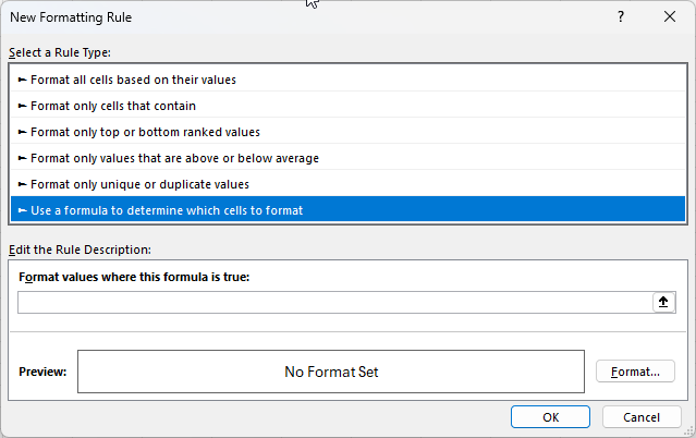
Using Formulas in Conditional Formatting
The last section is the one which can allow for the most customization. Here, you can create your own custom formulas. This allows dynamic formatting based on complex conditions.
The key thing to remember is that you want the formula result to be either a TRUE or a FALSE value in the end. That will determine whether the criteria is met. A good strategy here is to set up your formulas first in your spreadsheet, and then copy them into the conditional formatting formula. Follow this guide to setup advanced conditional formatting rules like a pro.
Here’s a quick overview of what you can do:
Highlight Cells Based on Another Cell’s Value.
To highlight cells in column B if the corresponding cell in column A is greater than 100: =A1>100
These are just a few examples of what you can do with formulas but you have many more options with this approach.
Common issues with conditional formatting rules in Excel
Here are some of the most common issues you may encounter when creating conditional formatting rules in Excel.
Why are my conditional formatting rules being applied to the wrong cells?
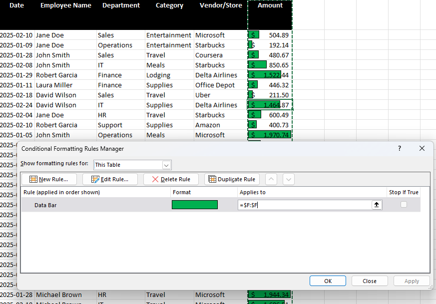
This can happen for a couple of reasons. The first is that you haven’t selected the correct range when setting up your rule. If you go into the Conditional Formatting menu and select Manage Rules, you will see all the ones that are applicable (to your current selection).
The current rule here applies to all the cells in column F. If I need to change that, I can either edit right within the Applies to box or I can click on the up arrow and select the range manually.
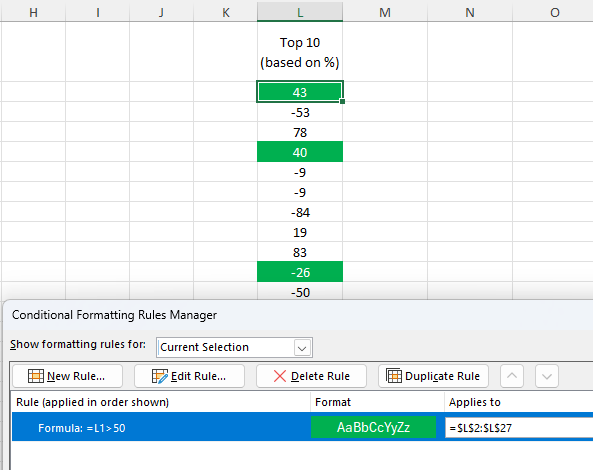
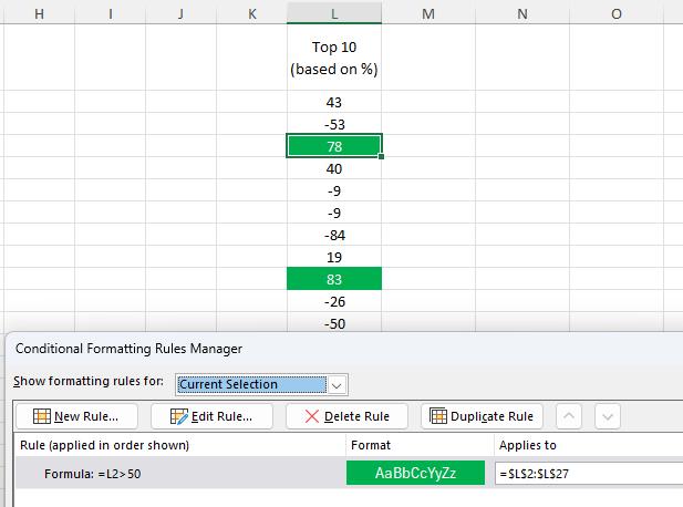
Another issue related to ranges can happen when there is a problem with the cells your formula is referencing. Take a look at the screenshot below and see if you can figure out why the formatting isn’t correctly applied. Even though the rule is simple and is just looking at whether the cell’s value is greater than 50, it is being applied to the wrong cells.
Although the column is correct, the problem is the range. Notice that the rule is L1>50 but it is being applied to $L$2:$L$27. The first cell is off by 1 row, so the formula will always be offset by 1 row. That means that when it’s evaluating L2, it will look at L1. And when it is looking at L3, it is looking at L2. In the above example, because there is a text value it is not a number and thus meets the criteria. And the value of 40 is highlighted because the formula is looking at the value above it (78).
If I modify the formula so that it is changed to L2>50, now the conditional formatting is applied correctly.
The rules won’t update, however, until you click the Apply button. This is necessary to do anytime you make changes to a conditional formatting rule.
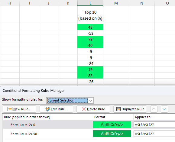
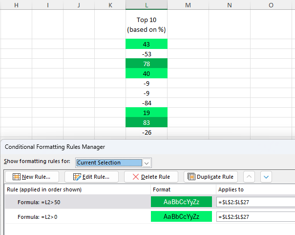
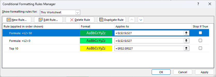
Why are the wrong conditional formatting rules being applied?
If you have multiple conditional formatting rules in place, you may encounter an issue where the wrong ones are being applied. Consider the below example, where I have created a rule when a value is greater than 0 to be highlighted light green, and another one so that it is dark green when it is greater than 50.
Since a cell can meet both criteria and be both higher than 50 and 0, it’s important to prioritize the rules correctly. To fix this issue, I need to select the bottom rule, and click on the up arrow to push it to the top. After doing this, and clicking apply, the values over 50 are filled in with the darker green color.
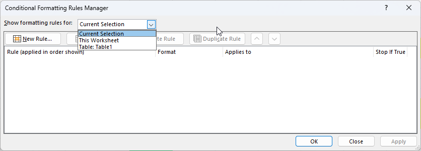
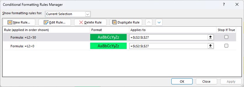
Why am I not able to find my conditional formatting rule?
If you’ve created a conditional formatting rule but can’t find it, it’s likely that you’ve selected a cell it isn’t applied to. If you go to the Conditional Formatting menu and select Mange Rules, you’ll see all the rules that you’ve created. But by default, this shows the rules that are applied to your current selection. You can, however, change the drop-down option to show rules for the entire sheet and anywhere else there are rules setup:
After changing it to This Worksheet, I now see all the rules that I’ve created on the worksheet.
How do I delete a conditional formatting rule?
In some cases, you may find that you have too many conditional formatting rules and want to get rid of some. In this case, go back to the conditional formatting rules manager where you’ll see a list of all the rules you have created.
From here, you can select any rules that you don’t need anymore, and click on the option to Delete Rule. Be sure to click on Apply afterwards to make sure your changes go into effect.
If you liked this post on How to Create Conditional Formatting Rules in Excel: The Ultimate Guide, please give this site a like on Facebook and also be sure to check out some of the many templates that we have available for download. You can also follow me on Twitter and YouTube. Also, please consider buying me a coffee if you find my website helpful and would like to support it.
Revenue per Available Room (RevPAR) is one of the most important metrics in the hospitality industry. It tells hotel owners and investors how efficiently a property is generating revenue from its available rooms. Whether you manage a small motel or analyze hotel stocks, knowing how to calculate and track RevPAR is an essential metric to know how a business is doing. It’s similar to the Average Daily Rate (ADR), but there are important differences to be aware of.
RevPAR stands for Revenue per Available Room. Unlike average daily rate (ADR), which only looks at occupied rooms, RevPAR takes into account all available rooms, giving you a more complete picture of overall performance.
The formula is as follows:
RevPAR = Room Revenue / Rooms Available
You can also calculate it an alternate way:
RevPAR = ADR x Occupancy Rate
Meanwhile, the formula for ADR is the following:
ADR = Room Revenue / Rooms Sold
As you can see, there is a close relationship between RevPAR and ADR, but each one gives you slightly different information.
A sample data set and calculation
In the below example, which is a sample projection, dates are filled in for 2026 with estimated rooms sold and room revenue. The hotel has 100 rooms available, which doesn’t change over the course of the year.
To calculate the ADR, we need to take the total room revenue and divide it by the number of rooms sold:
Now, to calculate RevPAR, we’ll take room revenue and divide it by rooms available:
An alternative way to calculate this would be to compute the occupancy rate for each date, and then multiply that by the ADR:
As you can see, unless there is full occupancy, the RevPAR will always be lower than the ADR, simply because its denominator is larger (rooms available versus rooms sold).
Analyzing the data
Now that you’ve setup a data set showing these metrics, you can analyze it in Excel in a couple of ways. One way is through the creation of a pivot table, where you can summarize data by months at a time. You can put the date in the Rows section and then group by months. And by putting the ADR, RevPAR, and Occupancy fields into the values section, and setting them to display the average (rather than the sum), you can have an easy way to summarize your key performance indicators:
In addition, you could create a chart to compare ADR, RevPAR, and Occupancy, to identify trends and patterns in the data set. In the chart below, I’ve plotted all three items on line charts. I’ve put the occupancy on a secondary axis and adjusted the scale so that it fits firmly below the ADR and RevPAR figures, ensuring there is no overlap.
If you liked this post on How to Calculate RevPAR in Excel Using a Formula, please give this site a like on Facebook and also be sure to check out some of the many templates that we have available for download. You can also follow me on Twitter and YouTube. Also, please consider buying me a coffee if you find my website helpful and would like to support it.