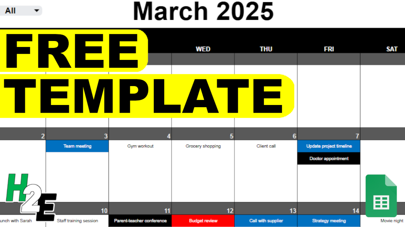
If you’ve ever worked with dynamic arrays in Excel, you’ve probably come across the #SPILL! error. This error message may seem confusing at first, but it’s actually Excel’s way of telling you that there’s a problem with how it’s trying to display an array of results.
In this post, I’ll walk you through:
- What causes the #SPILL! error
- Common reasons you might see it
- How to fix and prevent it
What Is the #SPILL! Error?
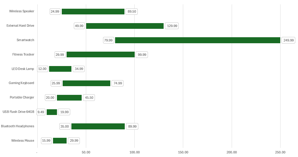
The #SPILL! error appears when a formula is trying to return multiple results, but Excel can’t display them all in the cells below or beside the formula. This happens when using dynamic array functions such as:
FILTER()SORT()SEQUENCE()UNIQUE()- Or any formula that returns more than one value
For example:
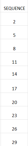
=SEQUENCE(5)
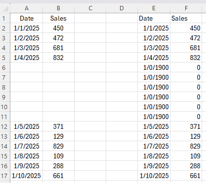
This function is supposed to generate a column with 5 numbers (1 to 5). But if something is blocking the spill range, Excel will return a #SPILL! error instead. Consider the following example:
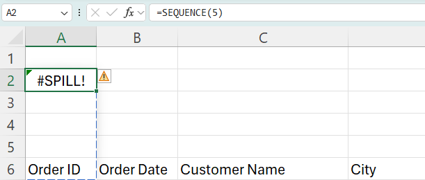
As you can see from the above image, there is a dashed line over the area that the formula wants to fill in. And one of those cells, A6, contains a value, which prevents the formula from entering a value there.
Common Reasons for #SPILL! Errors
Here are the most frequent causes for why you may encounter a #SPILL! error in Excel:
1. Blocked Spill Range
There’s data in one or more of the cells where the array wants to go. As in the example above, the formula can’t overwrite a value that’s already in a cell, and thus, it returns an error.
How to fix:
You can clear the cell(s) which are in the way of the array formula. Or, you can move your formula somewhere else in your file where it will have the room it needs for the results.
2. Merged Cells
Another issue that can arise is that even if one cell in the spill area is merged, Excel can’t write the array output.
How to fix:
You can either move your formula somewhere else, or else you’ll need to unmerge. To unmerge the cells in the spill range, first select them, and then follow these steps:
Home > Merge & Center > Unmerge Cells
3. Spill Range Goes Off the Sheet
If the array result is too large and extends beyond the edge of the worksheet, you’ll also get this error. In this case, you’ve probably made a mistake in your formula where you are returning too many rows or columns. In this situation, it’s probably a good thing that you’re getting an error, otherwise, you may end up with much more data than you anticipated, and that could slow down your spreadsheet.
How to fix:
Check if the result would go beyond column XFD or row 1,048,576. If so, reduce the size of your formula.
If you liked this post on How to Fix #SPILL! Errors in Excel, please give this site a like on Facebook and also be sure to check out some of the many templates that we have available for download. You can also follow me on Twitter and YouTube. Also, please consider buying me a coffee if you find my website helpful and would like to support it.