Conditional formatting is useful for highlighting cells or ranges if a condition is true. For example: highlighting negative values as red or positive ones as green. You can also do more complex formatting like highlighting an entire row if it meets a criteria.
Creating A New Rule
To get started with conditional formatting, you need to select new rule from the conditional formatting options which is under the Home tab:
You will then have quite a few options as to what you want to do:
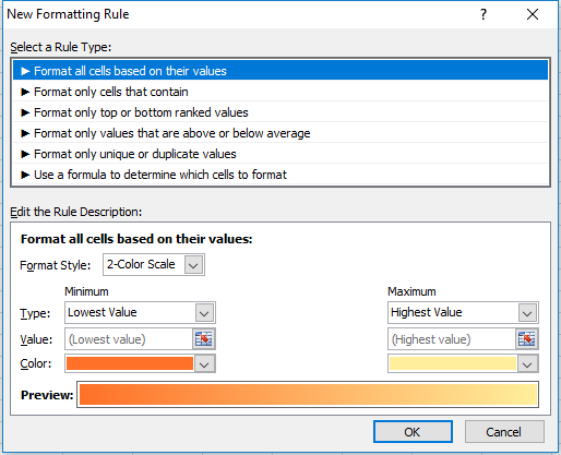
Format All Cells Based On Their Values
This is useful if you want to show some sort of progression from one value to the next, as one colour will fade into the next. Here is an example using this conditional formatting on a range of values from 1 to 5:
1 started from the dark orange and gradually got to a light yellow colour by the time it got to the number 5. You can change the colours involved or even the range. You also can change the values instead of using lowest to highest values you can hardcode figures, use percentages, or whatever else. In all likelihood it will show something very similar regardless what you select, so leaving it to the default setting here (low to max) is going to be sufficient in most situations.
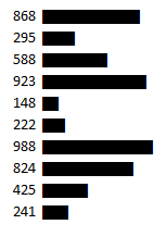
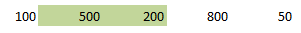
Another way you could use this formatting is if you wanted to compare a time-series. Assume the below are sales numbers and you wanted to highlight good and bad years.
You can see in this example there is no longer the smooth transition as in the prior example since I’ve assumed sales are bouncing up and down. The downside of using this type of conditional formatting as you could have a really colourful dataset if you did this.
You may like it initially but if you are dealing with lots of data it may not be all that helpful because you are dealing with many different shades of colours now and you may find yourself comparing different shades to see if one is darker than the next. And conditional formatting is most useful when you don’t have to spend time analyzing colours, and instead the colours help you do the analysis by easily standing out and highlighting what you want to see.
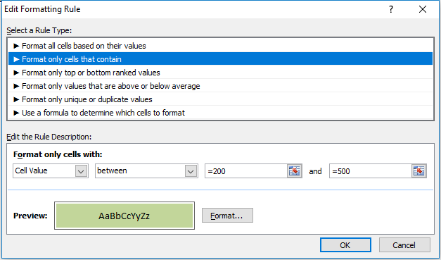
Format Only Cells That Contain
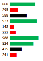
The next option on the formatting rules allows you to specifically look at the cell values. Keeping my sales numbers example from above I want to highlight cell values from 200 to 500. In this case I only need to select between and a low value of 200, and a high of 500.
Now unlike the format all cells example, the remaining conditional formatting rules require you to explicitly set what formatting you want to apply, it won’t just smooth colours from one to the other. And every cell in the range won’t have conditional formatting on it unless I explicitly state it. To set the formatting for I want cells that fall in this range to be I just click on the Format button below and apply what formatting I want. In this example I just set the cells to be highlighted in green.
(Note you do not need to put the = sign before the number, it automatically does this after you have already setup the conditional formatting.)
Below is my result
The cells that do not fall within this range do not have highlighting. If I wanted them to have highlighting I would have to change the rule, or add another rule for them. So what I will do is add another rule for any values under 200:
In this case I set the formatting to be light red.
Please note you still want to make sure your range is selected when you are adding a new rule so that it gets correctly applied to the range. Otherwise you will need to adjust the conditional formatting settings so that they are applied to the correct range.
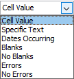
Both the drop downs that currently contain Cell Value and less then can be changed. Cell Value can be changed to the following:
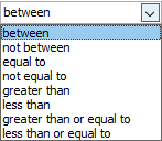
If you change this value then some of the options for the next drop down will change as well. Obviously you cannot choose less then or greater than operators when dealing with text. There are a lot of possibilities here so you can experiment with them by changing these drop down selections. Currently, for the Cell Value selection, these are the different operators available:
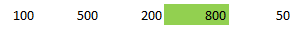
Going back to my example here, I selected the less than operator since I wanted to highlight values that were under 200. My result is the following output:
Now I have formatting for every number except 800. So I could make a similar rule and set that one to anything over 500.
The disadvantage of using the formatting based on values in the first example is that not all your values have conditional formatting on them. But this could be an advantage as well as it allows you to have more control over the exact type of formatting you want. Here I can have green and red which helps to quickly distinguish the results without having to closely look at the shading.
Format Only Top Or Bottom Ranked Values
This formatting option allows you to just highlight your top or bottom values.
I have selected the top 10 to be highlighted in green and as a result I get the following:
The problem here is I don’t have more than 10 values so everything will be highlighted. In fact, even if I were to select bottom 10 then that would apply to everything as well.
One way around this is to check the box for % of the selected range. now it will look at the top 10% rather than just the top 10 values.
Now my highlighting looks as follows:
What this effectively does now is look at the percentiles and pulls the top 10%. So if I had a data set of 20 values, it would highlight the highest two values.
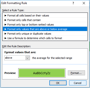
Format Only Values That Are Above Or Below Average
This option will just compare the value against the average.
If I select that it highlights anything above the average I will get the following result:
The average for this data set is 330, so it correctly has highlighted the values 500 and 800.
Format Only Unique Or Duplicate Values
This is probably the simplest formatting option where you have only one of two options – unique or duplicate.
In my example all of my values would be highlighted since none are duplicates.
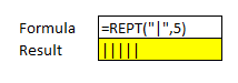
Use A Formula To Determine Which Cells To Format
This is the most versatile option for formatting. But also is the one that will take the most time to setup. In an
earlier post I showed how to use this option to create highlighting on alternate rows.
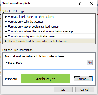
In this example I’ve downloaded Alphabet’s financials from Google Finance for the past five quarters. This is what it currently looks like:
I will start with setting up a rule to highlight every column where income after tax is more than 5,000. To do, I will select cell B11 and setup the following rule:
I have frozen row 11 since that is where the after tax numbers are, and I want these figures to change based on what column I am in, but not what row I am in. So for that reason I am freezing the row and not the column.
I selected cell B11 when entering this formula because I wanted to be in the same column because when I go to re-size the cells that I want this formatting to apply it to, it will adjust the formula. So if I was in column C and entered my formula as above (referencing column B) then if I change the range I want to apply it to, say columns B:F rather than just the cell I was in in column C, the cell it will be evaluating now will be A11, rather than B11. It will reflect the fact that my range has changed (unless of course I wanted to freeze the column as well but that would not be helpful in this situation).
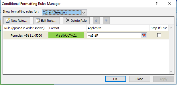
Which brings me to the next step: applying this to the relevant columns. Initially when you setup rules for conditional formatting it by default assumes you are applying them to the range you have selected. So I could have selected the range B:F but I can just go back into my conditional formatting rules and change the range:
Now this rule will apply to all the columns from B to F. As a result, my updated data set looks as follows:
Now every column where Income After Tax was more than 5,000 has been highlighted.
The easiest way to understand formulas in conditional formatting is this: treat it as an IF function, except start from the logical test argument and ignore the values that they will be if they are true or not. After all, if it is true, the formatting applies, if it is false, it will not apply. In the above example my IF function would have been something along the lines of this:
=IF(B$11>5000,X,Y)
Where X is the conditioning applies, and Y is that it doesn’t.
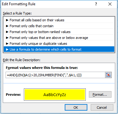
I will apply this logic to use a length (LEN) function. For no logical reason whatsoever, I am going to highlight all the rows that have descriptions in column A that are both longer than 20 characters and have a comma in them. If I were going to use an IF function, the formula would look as follows (in cell B1):
=IF(AND(LEN($A1)>20,ISNUMBER(FIND(“,”,$A1,1))),X,Y)
If I were to apply it to conditional formatting it will look as follows:
As you can see it’s a copy and paste from my IF function, just the logical test argument. I enter this in cell B1 just to make sure the referencing doesn’t change and then I apply it to columns B:F and my data set now looks as follows:
Managing Multiple Formatting Rules
I have an overlap now in rows 3 and 5 as they are highlighting the areas that were previously highlighted in green. If I wanted to change this to make those back to highlight in green I can change the hierarchy of my formatting rules. I can change this by going into Conditional Formatting -> Manage Rules.
If you do not see any rules even though you have set them up, make sure at the top where it says Show formatting rules for that This Worksheet is selected. See below:
If the range selected above is not correct then you may not see your conditional formatting rules.
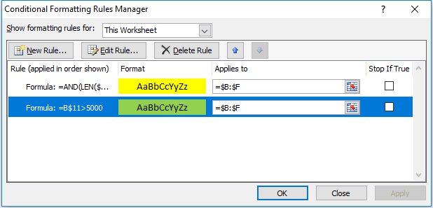
My rules look as follows:
I can change the hierarchy by selecting the green highlighting criteria and clicking on the up arrow to move it above the yellow highlighting criteria. That will mean the green highlighting rules will be applied first. That still won’t keep it green since it just means the yellow highlighting criteria will be applied afterward. This is also the screen where you can delete any formatting you no longer want.
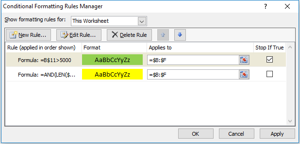
Instead, what needs to happen is for the Stop If True field to be ticked off for the green highlighting rules:
Now the green highlighting is first and if the condition is met the yellow highlighting rules will not run. Now my data set looks as follows:
The yellow highlighting rules have now only been applied to the columns where the green highlighting did was not. By using the Stop If True and setting your hierarchy for formatting you can prioritize what formatting you want to be applied.