pay-1036469_640

How to Use a Custom Number Format in Excel

There are many different options for formatting data in a spreadsheet. And there are even more available if you use a custom number format in Excel. That flexibility is important because it can be a bit frustrating if, for example, you want negative numbers to show up with a dollar sign as you have to use the currency format in that situation — which does not look very polished:

currency format microsoft excel

The positive and negative amounts look okay but I’d like to see a bit more spacing. But the bigger issue for me is the $0.00 formatting which can create a lot of noise if you’re looking at financials with lots of zeroes over the place (although I have a solution for this). It can divert your attention away from what you want to see — the cells that have non-zero values.

Creating a Custom Number Format

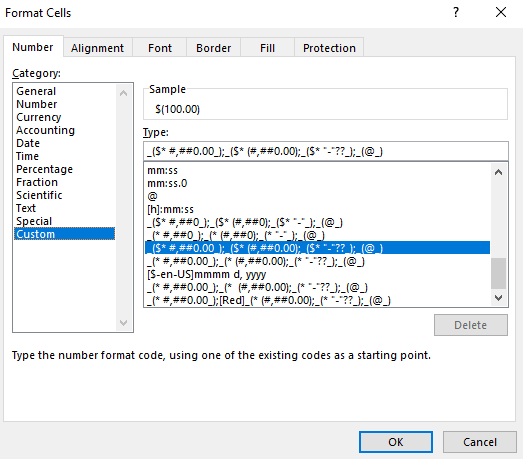
Although it may not be available by default, there is certainly a way to get a whole lot closer to the formatting that I want, and I’ll show you how. To start, you want to select the accounting format and then flip over to the Custom format (to do this right-click and select Format Cells). You’ll notice this is what the string looks like in the Type field:

The accounting format in microsoft excel.

This is what the accounting format looks like. The formatting is broken out into four main parts: positive, negative, zero, and text.

The string that appears until the first semi-colon is how the number will look when it is positive. Until the next semi-colon is the negative formatting, followed by if the value is zero and the last one is text.

Here is what the positive amount looks like in the accounting format:

_($* #,##0.00);(

The negative formatting looks very similar:

_($* (#,##0.00);

The main difference you’ll notice is the extra bracket “(” that is in the negative format. That is what puts the negative amounts in parentheses. Now, if I want to make this highlighted in red, all I would need to do is add [Red] right after the semicolon that indicates the end of the positive format:

($* #,##0.00);[Red]($* (#,##0.00);($* “-“??);(@_)

Upon doing that change, my number now comes up in red:

red accounting format microsoft excel

These are all the color options you can use:

  • Black
  • Blue
  • Cyan
  • Green
  • Magenta
  • Red
  • White
  • Yellow

There’s not any added customization you can do to these colors. And as you can imagine, many of these colors will be an eyesore on the default white background, and I’m not sure why you would even need to use the default black value. Blue, magenta, and red are the only ones that are easy to read and that won’t make you want to change the background color.

More Customization Options

For more complete customization, you’re better off looking at how to use conditional formatting.

If you need to make other tweaks to number formats what you can do is select the format and then switch over to the Custom section. Then you’ll see what that format looks like and you can test out what adjustments you’d like. Whether it’s adjusting the spacing or how the format looks like with a zero value, these are changes you can easily make and see what works through some trial and error.

If you’re interested in looking how to format dates, check out this post.


If you liked this How to Create a Custom Number Format in Excel, please give this site a like on Facebook and also be sure to check out some of the many templates that we have available for download. You can also follow us on Twitter and YouTube.

stacked1

Using Stacked Charts and Showing Totals


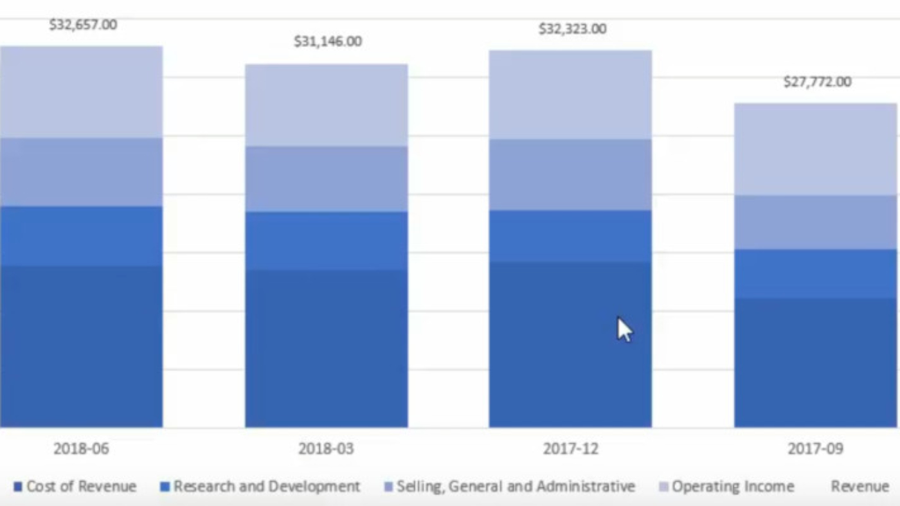
A stacked chart in Excel allows users to take advantage of the best of both worlds: a column chart that shows period-over-period totals and a pie chart that can show what made up those totals. It can be a very useful chart, but knowing how to structure it is half the battle.

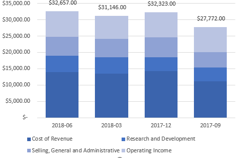
In my example, I pulled Alphabet’s earnings for the most recent four quarters. I wanted to show a) the period-over-period sales as well as where those sales went, and how much flowed through to the company’s operating income.

Below is the table that I used:

The key things is you want to make sure that all your categories add up to the amount that you’re trying to reconcile (in my case, it’s revenue).

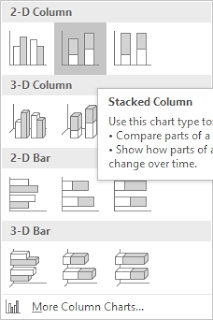
Once the data is ready, select the data and insert a Stacked Column

stacked column chart excel
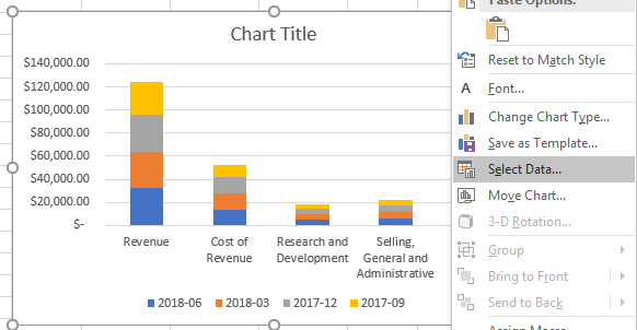
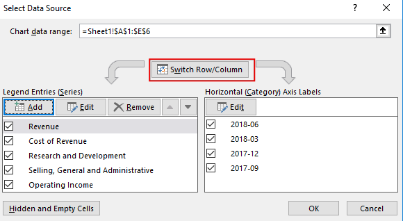
In my example, the categories showed on the horizontal axis, which is not what I wanted, so in order to fix that, right click on the chart and press Select Data
stacked column chart excel
From there, you want to hit the button to switch row/column:
chart switch row and column excel
This will give you a stacked chart. The problem, however, is that my total (revenue) is mixed into this, and that’s not going to give me the desired result. After all, I want to see where the revenue goes, not include the revenue in my categories.
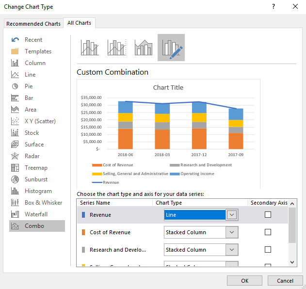
To fix this, you’ll want to right click on one of your column charts and select Change Series Chart Type

excel change series chart type

That should take you to the Combo section. If it doesn’t, make sure to select it. All your series should show a stacked chart. You’ll want to change the revenue series to a Line chart. By doing so, it will not contribute to the stacked chart and now it’ll simply be made up of the other categories. 
combo chart excel
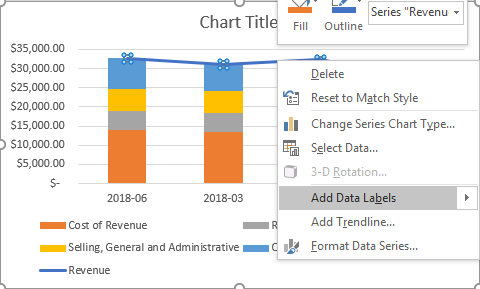
Next, add data labels for the line chart so now you’ll see the totals. To do this, right click on the line chart and click Add Data Labels


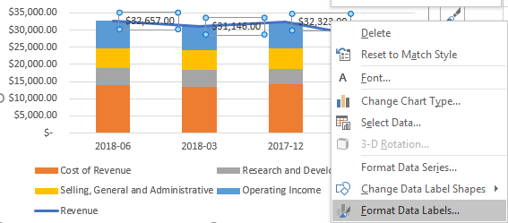
The problem is the labels show to the right, and it probably makes more sense for these labels to show above the stacked chart. Right click on any of the labels and select Format Data Labels

excel chart format data labels

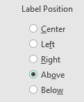
Make sure that for the label position, Above is selected
excel chart format data labels
Now my chart is starting to come together:
excel stacked line chart
Except I still have that line going over the top of the stacked charts. To get rid of the line, right click on the line chart and select Format Data Series

excel chart format data series

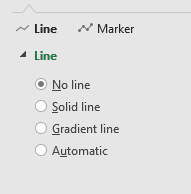
Select No line from the Line section
excel chart format line

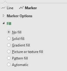
Now, select the Marker and make sure the fill option is set to No Fill
excel chart format marker
Now, I’ve gotten rid of the line completely:
excel stacked chart
At this point it just comes down to designing the chart how you want it. Some of the changes I made included:
  • Getting rid of ‘Revenue’ from the legend
  • Changing the color theme
  • Shrinking the gaps between the stacked charts
excel stacked chart
error1

Formatting and Removing Errors and Zero Values

Often times in a data set you’ll have to handle with errors that can wreck your data, especially if you need to do any analysis on it. There are several ways that you can handle errors so that they don’t show up in your data.

IFERROR

The first method is by using the IFERROR function, which allows you to easily replace the error with whatever you want in its place. If you want a numerical value, you may want to put in a 0, otherwise you can just leave it blank. 
I’ve purposely added various types of errors to my data set:
Here is one of the formulas that’s causing an error:
=VLOOKUP(D7,L:L,1,FALSE)
In the above example, I could use the formula =IFERROR(VLOOKUP(D7,L:L,1,FALSE),””) to replace the error with a blank. I could also put a 0 in its place instead of the “”. 
ISERROR

In older versions of Excel (2003 and earlier), the IFERROR function is not available. However, what you can use is a combination of the IF and ISERROR functions. To recreate the same formula as above, we can use the following:
=IF(ISERROR(VLOOKUP(D7,L:L,1,FALSE)),””,VLOOKUP(D7,L:L,1,FALSE)
The disadvantage of this method is you have to repeat your original argument. First, you are checking if the value is an error, if it isn’t, then you have to repeat the formula again to save the value. It’s not terribly efficient, and likely why we saw the IFERROR function introduced in newer versions of Excel.
Using the IFERROR or IF(ISERROR()) functions can be useful for eliminating errors, but sometimes it may not be helpful for dealing with specific ones. For example, if your cell is blank or it has an error and is made to look blank, you won’t be able to tell the difference just by looking at it. The danger is that you may assume it’s a different type of error.
ISNA

What you can also use is the ISNA() function, which can tell you if the cell returns the #N/A error. This way you can trap this error specifically, rather than everything that can be captured by the ISERROR() function.
Getting Rid of Zeros

If you’ve used a lot of error-handling functions and replace your errors with zeros, you could up with a lot of zero values on your spreadsheet:
The problem if you have a lot of zeros on your spreadsheet, is it can sometimes be a distraction away from what you really want to see – the non-zero values. There are two ways you can get rid of the eyesore:
1. Change the format to Accounting. Doing this will remove the zero values and replace them with a dash, which makes it a bit easier to skip over when doing a review:
However, you may not want to use the Accounting format, and that leads me to the other option:
2. Conditional Formatting. Refer to this post on how to setup rules for this. What I normally do in these cases is set the zero value cells to a light gray color font so that they do not attract your attention:
Common Types of Errors

Here’a list of some of the common types of errors you’ll find in Excel:
#REF: This is an error that you’ll incur if your range doesn’t go far enough and the error relates to your reference. For example, consider a VLOOKUP formula that extracts from column number five but you only specified a range that had four columns, that would result in a REF# error.
#N/A: You’ll get this error if your VLOOKUP or MATCH formula is correct, but the value you’re looking up isn’t found, and hence, not available. However, there’s other contexts it can apply to, and it just means that it wasn’t able to find the value you were looking for. 
#VALUE: This error normally shows up when there is an issue with your actual calculation. For instance, if you’re trying to multiply a number by a field that has text. 
These are just a few examples of the errors that you’ll encounter, but these are also likely the most common that you’ll come across.
excel-3661114_1280

Are Your Excel Files Too Big? 3 Ways You Can Bring Them Down in Size

If you’ve got a big Excel file (e.g. more than 10 mb) and you don’t have tens of thousands of rows, you may want to see what you can do about bringing that size down.
If you have lots of data, you may want to consider linking it using PowerPivot, although that’s a topic for a future post.
If your Excel file is unnecessarily large and you’re not sure why, there are three things you can do and check for to bring it down in size.
1. Check for objects

If you copied data from a webpage or somewhere that had images, you could have objects on your spreadsheet without ever realizing it. Many times they’ll appear invisible.
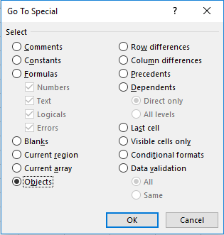
This has happened to me before and there’s a quick way to check and delete them if you do have them. Simply click F5, select Special, and then select Objects and hit OK. 
If there aren’t any in your sheet you’ll get a message that none were found. If you don’t get that message then clicking delete will remove those that are on the sheet.  
This will only look on the individual sheet you’re on so you may want to try this on all your sheets just to make sure.
2. Removing excess rows
This on many cases is the culprit. People move data around and formatting is left behind and Excel holds data sometimes until the very last row. Again, this is an invisible problem that you won’t easily spot.
What you can do to determine if you have this problem is click on a cell in your data set somewhere and click CTRL + END. This will take you to the very bottom of your data. If it stops where it should, then you’re fine. If it takes you several thousand rows farther than you expect, or worse – to the bottom, then there’s a good chance you’ve found what’s making your spreadsheet all that bigger.
To fix the problem, select the rows from the very bottom all the way up to your last row. Delete these rows and then click save. The file size won’t update until you click save.
Tip: if you have lots of worksheets to go through, user CTRL + PG UP/PG DOWN to cycle through the different sheets and then hit CTRL + END on each one and you can quickly see if any sheet has the problem.
3. Remove unneeded columns

If you really just have too much data, consider deleting excess columns. While in many cases people think of removing unneeded rows, they neglect the impact that columns have. If you’ve got tens of thousands of rows, even deleting one column will remove that many data points. Multiply that by how many columns are unnecessary and the data savings will quickly add up, and your file size will see a noticeable decrease.
These are three of the most common reasons your file might be bigger than it needs to be. Often times people think having a macro is going to do it, but that’s not the case. Usually it’s just having lots of data and doing calculations on all that data will take a big chunk of your computer’s resources
formatcharts.gif

Formatting Charts to Make Them More Appealing

Excel makes it easy to convert a data set into a chart. The problem is that often the default chart settings aren’t the greatest. Below I have some sample data that I will convert into a chart:

If I click on the data and go on the Insert tab and click on a new Column Chart it will create the following chart for me (this may vary based on which version of Excel you are using):

There are a number of things that don’t appeal to me here that I am going to change:
– Gridlines are a little darker and more prominent than they need to be
– Gridlines stretch past the axis
– The legend is off to the side, which takes up chart space
– The border around the chart itself
– The gaps are a bit big
– The flat look of the chart

These may appear minor issues but in terms of presentation they can make a big difference. First I will start with the grid lines.

Formatting Gridlines

If I click on any of the gridlines I can right-click and select Format Gridlines. Under Line Color, the color is set to Automatic. I can change this by selecting Solid line.

I am going to change the color to grey so that it does not stand out as much.

Next I will have to format the axis to stop the gridlines from going past the axis. To do this I click on one of the axis labels to select them and again right-click and select Format Axis

From there, under the Axis Options there is a drop-down option for Major tick mark type. By default it is set to Outside. I am going to change this to None in order to remove it.


I will also change the Line Color here to match the grey from the gridlines. I repeat these steps for the other axis to get rid of the tick marks there as well.

Formatting the Legend and Adding a Chart Title

Next, I will change the legend so that it shows at the bottom of the chart. This is an easy fix and all I need to do is select the Layout tab from under the Chart Tools section of the ribbon. From there I select Legend and choose Show Legend at Bottom.

To the left of the Legend drop down is a section for Chart Title. This is where you can select how you want your title to appear.

If you select Centered Overlay Title you don’t lose chart space but then your title is overlapping with your chart. Above Chart will put the title above the actual chart so that there is no overlap.

Removing the Border 

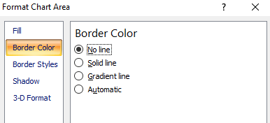
Next, I am going to remove the border around the chart itself. To do so, I need to right-click somewhere on the white space that isn’t on the plot area. Somewhere near an axis or the legend will work. Then I can select Format Chart Area.

If I select Border Color I can change the setting from Automatic to No line to remove the border.

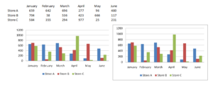
It may look a little odd if your gridlines are showing so you may want the outline. However unless you print with gridlines, then the chart will blend in better without them. Below is an example of the two charts with and without borders in print preview mode:

Shrinking the Gaps

Lastly, I will shrink the gaps in the chart. To do this I will right-click on any of the columns and select Format Data Series.

Under Series Options there is a section for Gap Width. The default is 150%. I normally set this to 50%.

Changing Colors/Effects

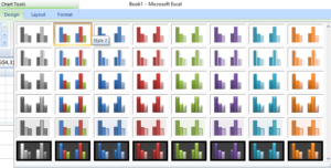
If you wanted to change the colors of the chart you can do so individually or just change the theme. To change the theme go under Chart Tools and this time select the Design tab.

Changing the theme will undo the changes I have made to the gridline colors so if you do those changes you will want to change the theme first.

You don’t have to select a theme, you can change colors one by one. To change the color of an individual series you can do so by right-clicking on one of the columns and select Format Data Series and change the fill color under the Fill section.

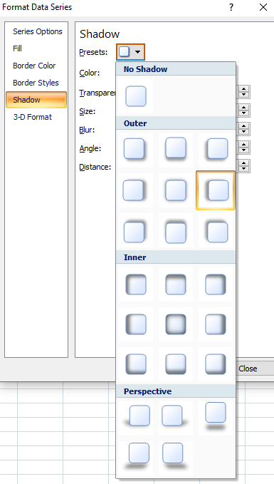
Instead, what I am going to do is adjust the shadows. Right now they look flat, and I want a bit of an elevated effect. While still in the above menu I can select the Shadow option. If I click on the drop down in the Presets field, I will have a number of shadow options. I don’t use the inner shadows since they make the columns a bit dark, and the outer ones leave too long of a shadow. In this case I select the Offset Left option.

This is what my chart looks like now after all the changes:

Saving a New Template

Rather than making these changes every time I can save my changes to a template. To do so, just click on Save As Template which is under the Design tab in Chart Tools. Then just assign a name and your template is saved.

If you want to use your template again simply when select chart types select the Templates folder and you will see it there.

conditional formatting new rule

How to Setup Conditional Formatting (including Formulas)

Conditional formatting is useful for highlighting cells or ranges if a condition is true. For example: highlighting negative values as red or positive ones as green. You can also do more complex formatting like highlighting an entire row if it meets a criteria.

Creating A New Rule

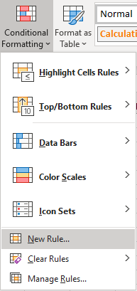
To get started with conditional formatting, you need to select new rule from the conditional formatting options which is under the Home tab:

conditional formatting new rule
You will then have quite a few options as to what you want to do:
conditional formatting all cells based on values

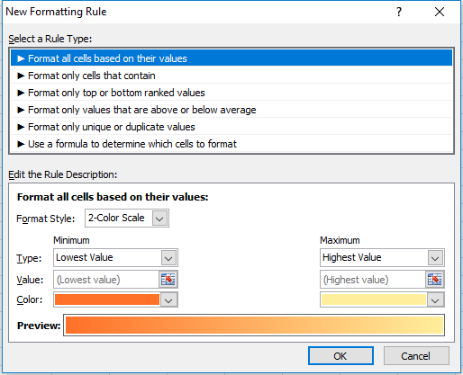
Format All Cells Based On Their Values

This is useful if you want to show some sort of progression from one value to the next, as one colour will fade into the next. Here is an example using this conditional formatting on a range of values from 1 to 5:
conditional formatting all cells based on values
1 started from the dark orange and gradually got to a light yellow colour by the time it got to the number 5. You can change the colours involved or even the range. You also can change the values instead of using lowest to highest values you can hardcode figures, use percentages, or whatever else. In all likelihood it will show something very similar regardless what you select, so leaving it to the default setting here (low to max) is going to be sufficient in most situations.
Another way you could use this formatting is if you wanted to compare a time-series. Assume the below are sales numbers and you wanted to highlight good and bad years. 
conditional formatting all cells based on values
You can see in this example there is no longer the smooth transition as in the prior example since I’ve assumed sales are bouncing up and down. The downside of using this type of conditional formatting as you could have a really colourful dataset if you did this. 
You may like it initially but if you are dealing with lots of data it may not be all that helpful because you are dealing with many different shades of colours now and you may find yourself comparing different shades to see if one is darker than the next. And conditional formatting is most useful when you don’t have to spend time analyzing colours, and instead the colours help you do the analysis by easily standing out and highlighting what you want to see.

Format Only Cells That Contain

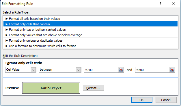
The next option on the formatting rules allows you to specifically look at the cell values. Keeping my sales numbers example from above I want to highlight cell values from 200 to 500. In this case I only need to select between and a low value of 200, and a high of 500. 
Now unlike the format all cells example, the remaining conditional formatting rules require you to explicitly set what formatting you want to apply, it won’t just smooth colours from one to the other. And every cell in the range won’t have conditional formatting on it unless I explicitly state it. To set the formatting for I want cells that fall in this range to be I just click on the Format button below and apply what formatting I want. In this example I just set the cells to be highlighted in green.
conditional formatting cells between

(Note you do not need to put the = sign before the number, it automatically does this after you have already setup the conditional formatting.)
Below is my result
conditional formatting cells between
The cells that do not fall within this range do not have highlighting. If I wanted them to have highlighting I would have to change the rule, or add another rule for them. So what I will do is add another rule for any values under 200:
conditional formatting cells less than
In this case I set the formatting to be light red. 
Please note you still want to make sure your range is selected when you are adding a new rule so that it gets correctly applied to the range. Otherwise you will need to adjust the conditional formatting settings so that they are applied to the correct range. 
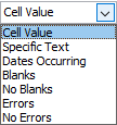
Both the drop downs that currently contain Cell Value and less then can be changed. Cell Value can be changed to the following:
conditional formatting cell value

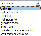
If you change this value then some of the options for the next drop down will change as well. Obviously you cannot choose less then or greater than operators when dealing with text. There are a lot of possibilities here so you can experiment with them by changing these drop down selections. Currently, for the Cell Value selection, these are the different operators available:

conditional formatting operators
Going back to my example here, I selected the less than operator since I wanted to highlight values that were under 200. My result is the following output:
conditional formatting between less than
Now I have formatting for every number except 800. So I could make a similar rule and set that one to anything over 500.
The disadvantage of using the formatting based on values in the first example is that not all your values have conditional formatting on them. But this could be an advantage as well as it allows you to have more control over the exact type of formatting you want. Here I can have green and red which helps to quickly distinguish the results without having to closely look at the shading.

Format Only Top Or Bottom Ranked Values

This formatting option allows you to just highlight your top or bottom values. 
conditional formatting top ranked values
I have selected the top 10 to be highlighted in green and as a result I get the following:
conditional formatting top ranked values
The problem here is I don’t have more than 10 values so everything will be highlighted. In fact, even if I were to select bottom 10 then that would apply to everything as well.
One way around this is to check the box for % of the selected range. now it will look at the top 10% rather than just the top 10 values.
conditional formatting top ranked values
Now my highlighting looks as follows:
conditional formatting top ranked values
What this effectively does now is look at the percentiles and pulls the top 10%. So if I had a data set of 20 values, it would highlight the highest two values.

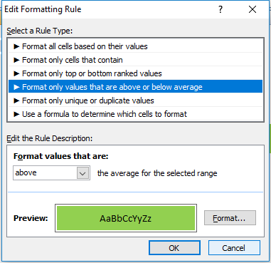
Format Only Values That Are Above Or Below Average

This option will just compare the value against the average. 
conditional formatting above below average
If I select that it highlights anything above the average I will get the following result:
conditional formatting above below average
The average for this data set is 330, so it correctly has highlighted the values 500 and 800.

Format Only Unique Or Duplicate Values

This is probably the simplest formatting option where you have only one of two options – unique or duplicate.
conditional formatting duplicate values
In my example all of my values would be highlighted since none are duplicates.

Use A Formula To Determine Which Cells To Format

This is the most versatile option for formatting. But also is the one that will take the most time to setup. In an earlier post I showed how to use this option to create highlighting on alternate rows.
In this example I’ve downloaded Alphabet’s financials from Google Finance for the past five quarters. This is what it currently looks like:
conditional formatting financials
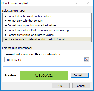
I will start with setting up a rule to highlight every column where income after tax is more than 5,000. To do, I will select cell B11 and setup the following rule:
conditional formatting formula
I have frozen row 11 since that is where the after tax numbers are, and I want these figures to change based on what column I am in, but not what row I am in. So for that reason I am freezing the row and not the column.
I selected cell B11 when entering this formula because I wanted to be in the same column because when I go to re-size the cells that I want this formatting to apply it to, it will adjust the formula. So if I was in column C and entered my formula as above (referencing column B) then if I change the range I want to apply it to, say columns B:F rather than just the cell I was in in column C, the cell it will be evaluating now will be A11, rather than B11. It will reflect the fact that my range has changed (unless of course I wanted to freeze the column as well but that would not be helpful in this situation).
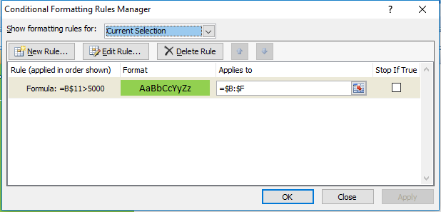
Which brings me to the next step: applying this to the relevant columns. Initially when you setup rules for conditional formatting it by default assumes you are applying them to the range you have selected. So I could have selected the range B:F but I can just go back into my conditional formatting rules and change the range:
conditional formatting manage
Now this rule will apply to all the columns from B to F. As a result, my updated data set looks as follows:
conditional formatting formula
Now every column where Income After Tax was more than 5,000 has been highlighted.
The easiest way to understand formulas in conditional formatting is this: treat it as an IF function, except start from the logical test argument and ignore the values that they will be if they are true or not. After all, if it is true, the formatting applies, if it is false, it will not apply. In the above example my IF function would have been something along the lines of this:
=IF(B$11>5000,X,Y)
Where X is the conditioning applies, and Y is that it doesn’t.
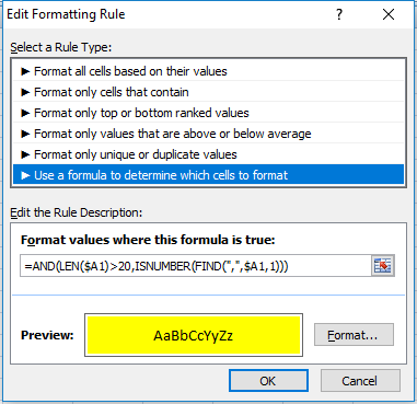
I will apply this logic to use a length (LEN) function. For no logical reason whatsoever, I am going to highlight all the rows that have descriptions in column A that are both longer than 20 characters and have a comma in them. If I were going to use an IF function, the formula would look as follows (in cell B1):
=IF(AND(LEN($A1)>20,ISNUMBER(FIND(“,”,$A1,1))),X,Y)
If I were to apply it to conditional formatting it will look as follows:
conditional formatting formula
As you can see it’s a copy and paste from my IF function, just the logical test argument. I enter this in cell B1 just to make sure the referencing doesn’t change and then I apply it to columns B:F and my data set now looks as follows:
conditional formatting formulas

Managing Multiple Formatting Rules

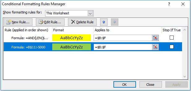
I have an overlap now in rows 3 and 5 as they are highlighting the areas that were previously highlighted in green. If I wanted to change this to make those back to highlight in green I can change the hierarchy of my formatting rules. I can change this by going into Conditional Formatting -> Manage Rules.
If you do not see any rules even though you have set them up, make sure at the top where it says Show formatting rules for that This Worksheet is selected. See below:
conditional formatting rules manager
If the range selected above is not correct then you may not see your conditional formatting rules. 
My rules look as follows:
conditional formatting rules manager
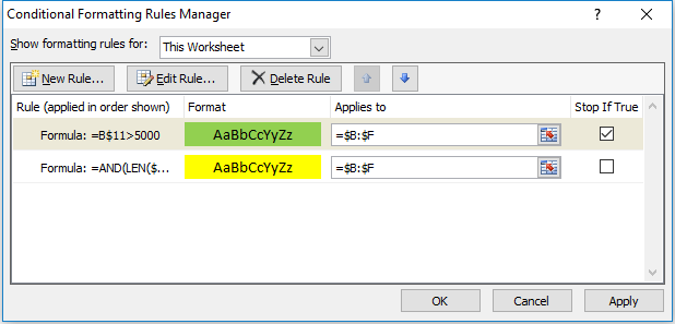
I can change the hierarchy by selecting the green highlighting criteria and clicking on the up arrow to move it above the yellow highlighting criteria. That will mean the green highlighting rules will be applied first. That still won’t keep it green since it just means the yellow highlighting criteria will be applied afterward. This is also the screen where you can delete any formatting you no longer want.
Instead, what needs to happen is for the Stop If True field to be ticked off for the green highlighting rules:
conditional formatting rules manager stop if true
Now the green highlighting is first and if the condition is met the yellow highlighting rules will not run. Now my data set looks as follows:
conditional formatting formulas table
The yellow highlighting rules have now only been applied to the columns where the green highlighting did was not. By using the Stop If True and setting your hierarchy for formatting you can prioritize what formatting you want to be applied.
Highlight Alternating Rows or Columns

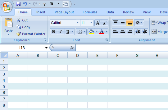
This post will show you how to create the effect of highlighting alternating rows, which sometimes makes it easier to read a data set.

In order to accomplish this, first select all the cells in the worksheet and then select New Rule under conditional formatting.

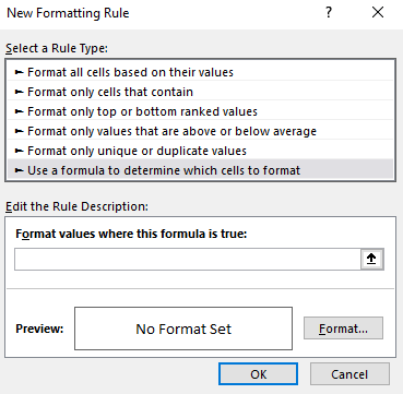
For the new rule you will need to select the last option to use a formula. The formula we will need to use is as follows:
=MOD(ROW(A1),2)=1
The MOD function calculates the remainder after division and has two arguments, the number to be divided into, and by what number. 
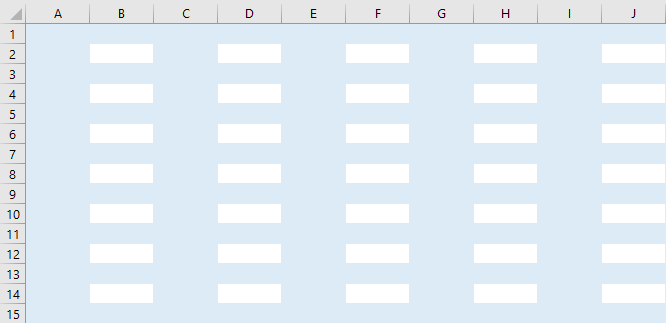
Using ROW(A1) means the reference will change depending on the location of the cell, meaning it will encompass every row in the selection. Using 2 as the divisor will help identify if the row is as odd number or even. If you’d rather highlight columns than rows, use the COLUMN function.
The formula will be true if the remainder is 1, meaning the row is an odd number (e.g. highlighting will start on the first row). If you want highlighting to start from row 2, just change the 1 to a 0, since even rows will have no remainder.
Once the formula is set, click on Format to determine the appearance of the alternating rows.
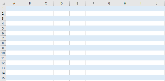
I select a light blue colour for the alternating rows
After I press OK this is the result of my conditional formatting:
If you don’t want to apply the formatting to all the cells or want to change the range, under conditional formatting select manage rules
There you will see a field where the formatting Applies to. Here you can change the range you want the formatting to apply to.