One way you can make a form in Excel more user-friendly is by adding checkboxes to it. There are a few different ways you can do this which I’ll cover and I will also show you how you might incorporate this into a sample pricing sheet.
What you need to do first before you can add checkboxes
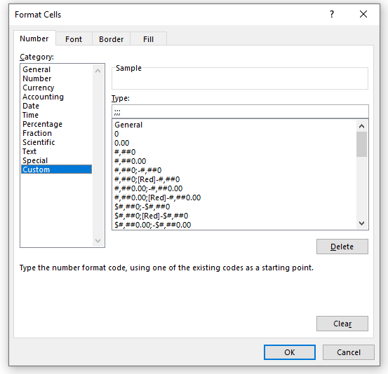
Before you can access the necessary form controls, you first need to ensure that the Developer tab is enabled on Excel. If you already have it enabled, you can skip to the next section. If you don’t see it on the Ribbon, then you will need to first go into Excel Options (on Office 365, you’ll find this on the File tab and then at the bottom there will be an Options button; other versions will vary). Once there, you’ll want to select the Customize Ribbon button. Off on the right, you will see a checkbox for the Developer tab:
Once you click OK, you should see the Developer tab on your Ribbon. If you’ve left it at the default position, it should be right next to the View tab.
Next, let’s set up add some checkboxes in Excel!
Method 1: Using ActiveX Controls
On the Developer tab, you’ll see a section for Controls and by clicking the Insert button you’ll see two areas: one for Form Controls and the other for ActiveX. There are checkboxes for both. First, I’ll cover how to use the ActiveX checkbox.
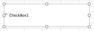
Once you click on the checkbox, your mouse will turn into a cross and what you will need to do is drag and create a rectangle/box for your checkbox to go in:
To modify the checkbox, you will need to right-click on it and select Properties. There, you will have the following options:
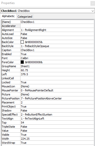
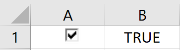
There are a lot of fields here but the main ones to focus on for now include the Caption field and LinkedCell. The caption is what shows up next to the checkbox. To keep things clean, I suggest leaving this blank as that will allow you to make the size of the checkbox control smaller. It will be easier to fit it inside of a cell and prevent it from taking up much room. The LinkedCell value is which cell you want to update once you click on the checkbox. There, it will return a True/False value depending on if the checkbox has been ticked or not.
In my example, I have cleared the value of the caption and set my LinkedCell to B1 — the checkbox has been shrunk down to fix into cell A1.
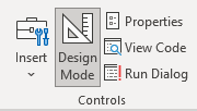
But before you can interact with the checkbox, you need to get out of Design Mode. When you first start inserting the ActiveX control, Excel puts in you this mode so that you don’t accidentally trigger the control. This is also found on the Developer tab, and you will just need to click it so that it is unselected. This is what it looks like if you are in Design Mode:
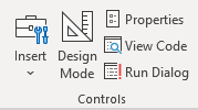
And this is with it off:
Now that it is turned off, you can test your checkbox. Initially, it may show a greyed out image like this:

This is because your linked cell doesn’t contain a true or false value yet but that will change once you click it:
If you decide you want to change how your checkbox looks, you’ll need to go back into Design Mode, otherwise clicking it will just toggle it from checked to unchecked. If you want more checkboxes, just follow these steps (or copy the existing checkbox) and reference a different linked cell. This is important because if you just copy the checkbox without entering a new cell to link to, they will all link to the same one.
Next, let’s go over the other way to insert checkboxes.
Method 2: Using Form Controls
To create a checkbox using a form control, you will again go to the Developer tab except this time you will select the checkbox from the form controls section. The process will be similar in that your cursor will convert to a crosshair and you can expand the control to be as large or as small as you need it to be.
One main difference you’ll notice with the form controls — they don’t put you into design mode immediately. This means your checkbox is live right away. To set the properties, right-click on the control and click on Format Control. Here, you will want to go under the Control tab, where you will see the following:
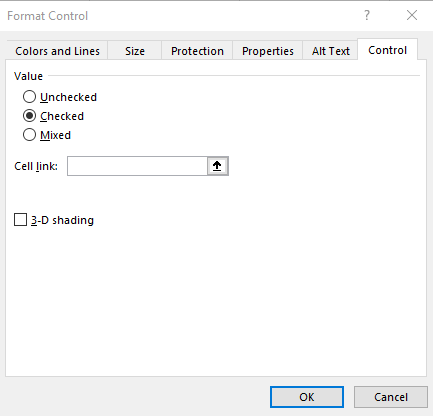
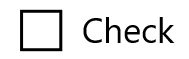
The only thing you will need to worry about here is selecting the cell you want the checkbox to link to. You can type it in or click on the up arrow to select the cell. The 3-D shading option will make the control look more like the ActiveX checkbox, which looks sunken. Otherwise, the default form control checkbox looks as follows:
As for the caption that shows up next to the checkbox, if you want to change that, right-click on the checkbox and select Edit Text.
Overall, there isn’t a huge difference in which check box you decide to use. The form control may be preferable only because you don’t have to fumble around with the Design Mode. But either one can get the job done for you.
Using the checkboxes in a pricing template in Excel
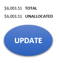
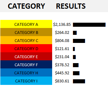
Now that you know how you can create the controls, I’ll show you an example of how you might implement them in a spreadsheet. A good one is a pricing list that you might give a customer to determine which options they want to choose. Here’s an example of what that might look like:
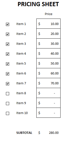
The way the template works is by having the linked values hidden; I don’t want the user to see a series of true/false values. And then using IF statements, I can do a lookup on a pricing table to say that if something is checked off, the price gets pulled into the pricing sheet. Since you can’t alter the linked cell without impacting the checkbox itself, using another cell to bridge the gap helps bring everything together.
You can download the sample template here.
If you liked this post on how to add checkboxes in Excel, please give this site a like on Facebook and also be sure to check out some of the many templates that we have available for download. You can also follow us on Twitter and YouTube.