If you’ve inherited or downloaded a data set, you know that sometimes you’ll need to combine data together to make it in the format that you want. A good example is a list of addresses where you may have the street information in one column and the zip or postal codes in another column. To get all the information in one cell would require combining the information. Below, I’ll show you multiples ways of how you can combine two or more columns in Excel.
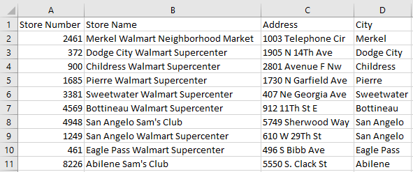
My data set for this example includes some sample address information on Sam’s Club and Walmart locations in the U.S. :
Using the ampersand to combine columns together
The easiest way is to join the cells through a simple formula. The easiest way to do so is by using the ampersand (&). In column D below, I’ve joined the cells and in column E is the formula that I’ve used:
This gets the job done but you’ll notice a small issue: there isn’t a space between the information. that makes the data a bit messy and it’s probably not what you want. But it’s an easy fix. It can be addressed by adding another ampersand between the cells and add open quotes ” ” to add a space. This is how my spreadsheet looks after I’ve made those changes:
This can be expanded to more than just two columns. If I wanted to add the store name field (column A) into the mix, then it’s just simple as adding another ampersand for the field and another one for another extra space. Here’s how the data looks like all three columns joined together:
This can start to become a bit cumbersome as you add more fields into one cell. An alternative way that you may find easier if you’re working with several columns is using the CONCATENATE function.
Using the CONCATENATE function
The CONCATENATE function works very similar to how the ampersand. However, it’s a bit cleaner in that you don’t have several ampersands in your formula. If you wanted to group cells A2, B2, and C2, your formula would look like this:
=CONCATENATE(A2,B2,C2)
If you want a space to be included between each of those fields, then it looks like this:
=CONCATENATE(A2,” “,B2,” “,C2)
Here’s how that would look if I applied it to my existing data set:
You can use commas to separate the data if you prefer and in that case, you would just use “,” instead of an empty quote. You can also add extra spaces in between quotes to space out your data even further.
But whether you choose to use the ampersand or the CONCATENATE function just comes down to preference. Either approach can get the job done.
If you liked this post on how to combine cells in excel, please give this site a like on Facebook and also be sure to check out some of the many templates that we have available for download. You can also follow us on Twitter and YouTube.
Whether you’re tracking sales or costs in excel, it’s important to capture not just your monthly totals but your cumulative year-to-date amounts as well. And to do that in excel, you’ll need to calculate a cumulative sum. Ideally, you’ll want to see a current month’s total alongside the year-to-date figure. Below, I’ll show you how to do that as well as how to make cumulative totals work with multiple years.
Calculating the current month and cumulative sums
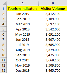
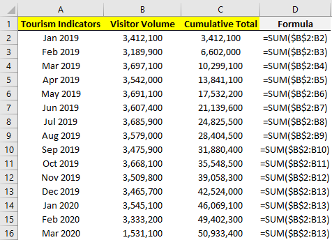
First thing’s first, let’s start with a data set. This time around, I’m going to pull the monthly tourist information for Las Vegas. This year, that could prove to be interesting given the impact of COVID-19 on tourism in the city. Here are what the numbers looked like for 2019:
If we wanted to calculate the total visitor volume it would be as simple as the following formula:
=SUM(B:B)
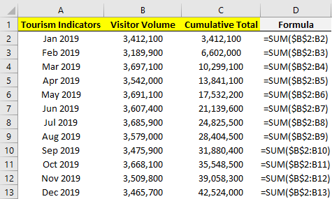
However, if we want the cumulative totals then we can’t just grab the entire column. Instead, we’ll need to add another column that has the cumulative amounts for each month. The formulas will still involve the SUM function but they will need to be from January up until the current row. Here’s what the formulas look like:
The formulas for column C are shown in column D. The key here is freezing the first cell (B2) so that as you copy the formula down in C2, it won’t move while the other cells will.
Calculating cumulative values isn’t too complicated, but it’s a bit trickier when your data set spans multiple years.
Calculating the cumulative sum when working with multiple years
The above scenario works well if you have just one year. But it won’t work if you decide to add next year’s data without resetting the formula. Here’s how it would look if we added the 2020 data:
As you can see, it just keeps on adding on to the previous year’s data, which is not what we want.
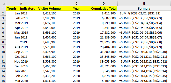
There are multiple ways that you can calculate the cumulative sum per year and so that the calculation resets on its own. Let’s start with the easiest route: adding an extra column for the year. Using the YEAR function we can extra what the year is in column A. Then, rather than using the SUM function, we will use the SUMIF function to do the cumulative count, but only if the year is the same:
The logic similar to the earlier formula, we’ve just added a condition where the year in column C has to match the year that specific row belongs to. That’s why once we hit 2020, it resets. For this to work, we still need the months to be in order.
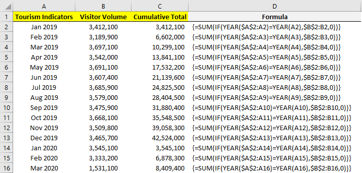
Another way that you can calculate the cumulative total without a helper column is by using an array:
We need to evaluate every cell to see if it relates to the correct year, and if it does, it gets included in the range to sum. The array allows us to do two calculations in one: an IF calculation embedded within a SUM calculation which doesn’t require the helper column.
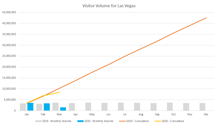
A big advantage of having multiple years on your data set rather than separating them out is then you can put them into a pivot table and create a pivot chart that helps plot both of them:
From this, we can see that there was a sharp drop off in March due to the outbreak of COVID-19 and that the cumulative figures are now well under 2019’s numbers. By having both cumulative and monthly totals available, we can display them both on one chart that helps to summarize the information quickly and easily.
If you liked this post on How to Calculate Cumulative and Year-to-Date Totals in Excel, please give this site a like on Facebook and also be sure to check out some of the many templates that we have available for download. You can also follow us on Twitter and YouTube.
Creating charts and graphs is a great way to display data visually and make it easier for users to read and understand it. However, in some cases, you don’t want or need a big chart, and something smaller would be more useful. This is where sparklines can come in to play and help you get your point across without a big chart in the way. Below, I’ll show you how to quickly and easily make sparklines in Excel that can quickly add context to your data.
*Please note that sparklines were a new feature of Excel 2010. If you’re running an older version of Excel, you won’t have these options available*
Getting the data set ready
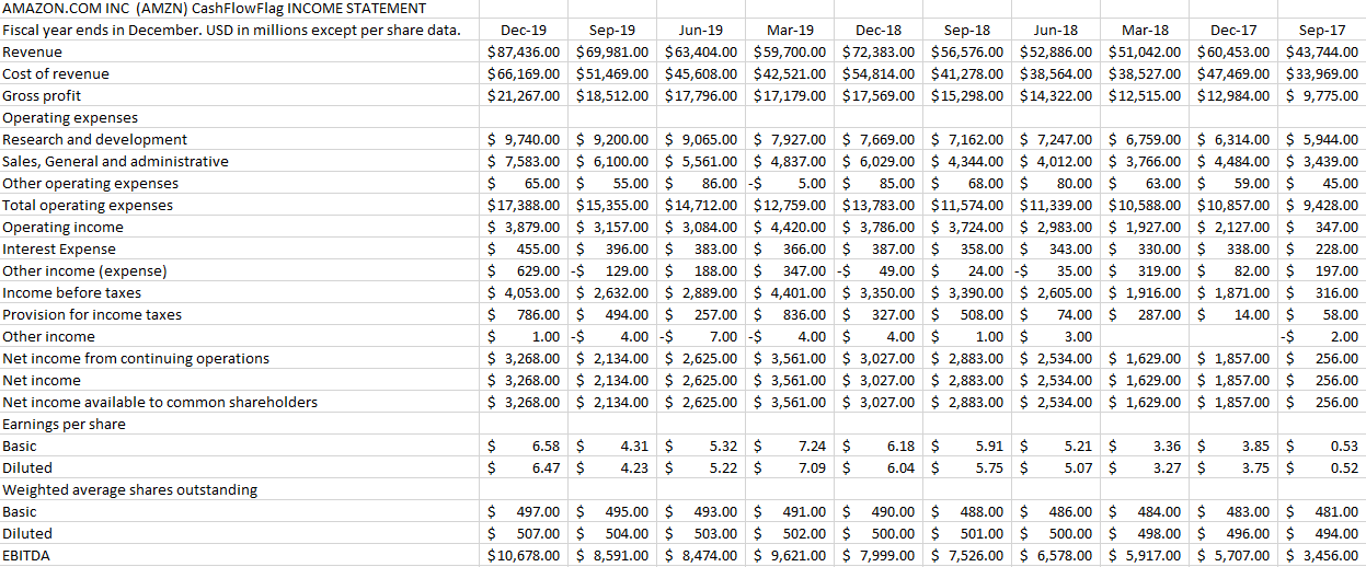
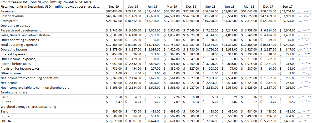
I’ll show you how to create sparklines using my data, which is a download of Amazon’s income statement over the past 10 quarters. Here’s what it looks like:
From afar, it’s not the easiest thing to analyze to identify any trending. And ideally, we’d like to have some trending shown for each major income and expense category. Adding a chart just isn’t useful in this case, and this is where sparklines can help.
Creating sparklines in just one click
I’ll start by selecting the row that has revenue and then on the Insert tab and under the Sparklines category I’ll select the Line button:
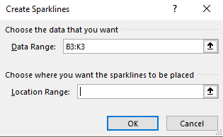
It will then show me the range that I’ve selected and it will allow me to select where I want to place my sparklines:
In most cases, you’ll probably want this right next to your data. And that’s what I’m going to do — put it in the next cell to the right of the data, L3. Now it’s created my sparkline:
But there’s just one problem:
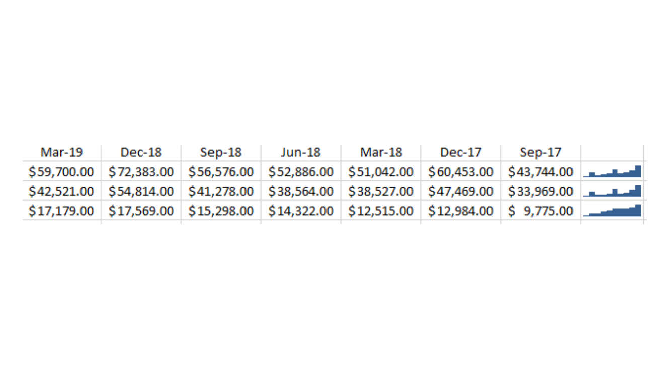
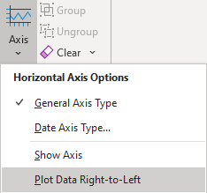
The sparkline is showing a downward trend. Amazon’s revenue has been increasing, not decreasing. One solution is to re-arrange my data, but that’s not necessary. To fix this, I select the sparkline and then under the Sparklines tab I click on Axis and select the option that says Plot Data Right-to-Left:
Now my sparkline looks a lot better:
This is an optional step and it depends on which direction you want your sparkline to go in.
Applying sparklines to other rows
Now that I’ve got one sparkline setup, it’s time to set up the sparklines for the rest of the income statement line items as well. Surprisingly, this is as easy as just dragging the sparkline down and copying it down to the other rows:
One of the cool features of sparklines is you can quickly add trending to every item without having to add a separate chart or graph for each row. And even for the rows where there was no data, it doesn’t result in an error, either.
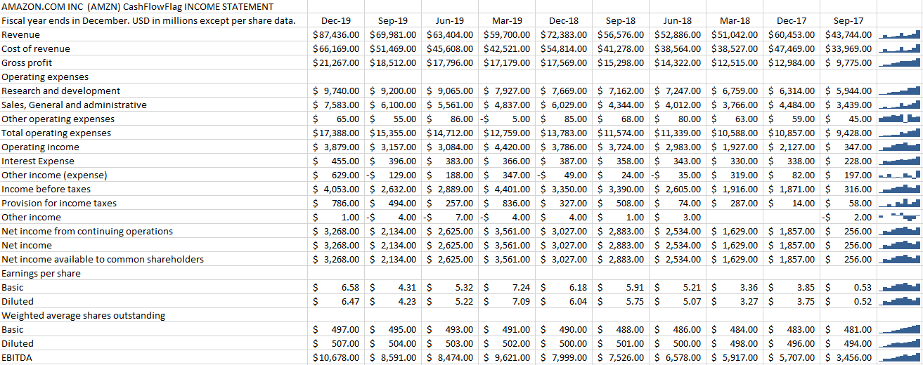
If you prefer a column chart to a line chart, then you can easily make the change as well in the Sparklines menu:
It will quickly change the format of the charts:
There’s also a win-loss chart that you can use if you have negative and positive values. However, in most situations, you’re going to use either line or column charts, especially when you’re looking to show trending. But
You can change the color and other features of the sparklines just like with other charts. And all those options are available from within the Sparklines tab.
If you liked this post on how to create a drop-down list in Excel, please give this site a like on Facebook and also be sure to check out some of the many templates that we have available for download. You can also follow us on Twitter and YouTube.
If your data contains date and time, and you only need the former, there are ways for you to remove time from the excel date. The first step, however, is in determining whether your data is in date format or whether the information is stored as text. Depending on which one it is, it will change how you will need to manipulate the data.
You can use the TYPE function to determine whether your data is in text or numeric format. The function evaluates a value and if it is numeric it will return 1 and if it is text the result will be 2. That will determine which path you need to focus on: converting a text date or just pulling the date values that you need. The latter is the easier of the two approaches.
Removing time from a date value
If the data is in date format, then it’s as easy as using the DATE function to pull out the fields you need. Let’s start with a date that shows the following:
2020-02-29 12:00:00 PM
It has more detail than we need with the time in there but it also has everything that’s needed—year, month, and day. The easiest way to pull out the date is using a formula as follows (where A1 is where the original data is):
=DATE(YEAR(A1),MONTH(A1),DAY(A1))
The DATE function takes three arguments: year, month, and day. By pulling these values out from the cell that has the time, we’re effectively creating a new value that has everything except the time. Now, if you don’t want this to remain a formula what you can do is copy the cell with the date and not the time, and paste it as values. Now, you’re left with hard-coded date values that do not contain the time.
As mentioned, this is the easy part of the process. The more difficult one is if your date is stored as text and where the DATE function results in an error if you try the above calculation. Let’s take a look at how to remove time from an Excel date when it’s in text format.
How to extract the date from a text field
If the same value above was stored as text, the formula involving the DATE function would result in an error. To pull the values that are needed to arrive at a proper date value, we’ll need to parse the data. Parsing can be a bit complicated but when you’re dealing with text, it’s the only way around getting the data you need.
In the above example, the date fields were separated by hyphens but it could be that slashes are used as well. Ultimately, it doesn’t matter, so long as there is some pattern that separates the month, day, and year fields. We will still use the DATE function. But in order to put the correct values in, pulling out the key information is going to be the challenging part.
Let’s start with pulling out the month, since in a month-day-year format, it’ll be the first value and thus, the easiest to extract. Here’s how the formula to pull the month would look, again, assuming A1 is where the data is:
=LEFT(A1,FIND(“-“,A1,1)-1)
Since the month is the first value, we use the LEFT function to pull the characters at the beginning of the cell. A1 is the cell we’re looking at, and the second argument is the length of the string to pull. Here, we’re looking for the dash(-) within the cell and subtracting one character so that the dash itself isn’t included in the extraction. This formula would produce a value of ’02’ and correctly return the month value.
To get the day is a bit trickier since it’s between dashes. It’s still possible to extract it but the formula is a bit more complex and requires using the MID function. Here’s the function with just the first two arguments filled in:
=MID(A1,FIND(“-“, A1 )+1,
The first part of the formula specifies the starting point. For here, we’re again using cell A1 but this time we’re looking for the dash using the FIND function to indicate where the second value begins. We add one to this value to ensure that we aren’t starting at the dash. Here’s what the next argument looks like, for the length of the value:
Here what we’re doing is using the FIND function to search for the dash but this time we aren’t starting from the first position but are starting from where the first dash was found, and adding a one to that. Then we subtract where the first dash was found, and the difference is the length of the string. It’s a complicated, nested function but it does what we need it to do. The completed formula for the day looks as follows:
The last part is to extract the year. And because this comes after the second dash, we’re going to need to nest two FIND functions, not just one. You could try and always start from a certain number, for example, the seventh character if your date format will always by mm-dd-yyyy. However, using the FIND function ensures you aren’t taking any assumptions (e.g. they may be leading spaces). I also avoid hardcoding numbers in formulas whenever possible. Here is the formula that remains for the year function:
The nested FIND functions are needed to ensure that I’m starting to search for the dash after the second instance was found. I use the number four for the last argument because rather than making this formula even more complicated, I figure the year will either be two characters or four, and it won’t deviate. If your data contains two characters for the year, then you can just change the final argument accordingly.
That leaves us with this long formula to extract the date for the mm-dd-yyyy:
It’s a complicated one so it may be easier to just copy and paste it rather than trying to reconstruct it yourself. If your original date is in dd-mm-yyyy format, here is a formula for that:
This just involves flpping around the formulas to grab the month and day. If your dates use “/” instead of “-“, then you can just to a find and replace in the formulas above to replace all the “-” with “/” or whatever else your system may use. Regardless how the data is separated, you can adapt the formula to how your data looks.
As you can see, having your data in the right format can make this process a whole lot easier. It’s once you get into text that it becomes much more challenging in pulling the date out. And again, once you’ve got the data you want, copying and pasting as values will ensure you don’t have to keep both the old and new data together.
If you liked this post on how to remove time from Excel date, please give this site a like on Facebook and also be sure to check out some of the many templates that we have available for download. You can also follow us on Twitter and YouTube.
Entering data into Excel isn’t much fun, especially if you’ve got a lot of it to enter. The good news is that there are plenty of ways that you can expedite the process so that it’s more efficient and takes less time. Here are eight ways that you can make data entry in Excel a whole lot quicker:
1. Using tab to cycle through your fields
If you’re entering fields across several columns, using the tab button can make it easier to enter data rather than using the arrow keys. And by hitting the TAB button, once you’re at your last column, you can hit the ENTER key and you’ll start from the beginning of the next line. As long as you keep tabbing over, Excel will remember which column you started from when you press ENTER.
Even if you accidentally tab over one or two fields too many, you still don’t have to use the arrow keys. All you have to do is press SHIFT+TAB and you will move in the opposite direction. It has the reverse effect of just pressing the TAB key. Similarly, the ENTER key will bring you down a row while SHIFT+ENTER will move you up a row.
Anytime you can avoid using the mouse or arrow keys, your data entry in Excel can go a lot quicker.
2. Using CTRL+D and CTRL+R to copy data
If you need to copy data from the cell directly above, you can use the CTRL+D shortcut and it will do just that. And if you want to copy data from the left, then you’ll use CTRL+R. This will work the same as if you were to drag the cells. That means that formulas will copy over as well.
3. Use Page Up and Page Down to cycle through tabs
This is another shortcut that can help you quickly jump through different tabs in your workbook. Page Down will cycle through the worksheets to the right, and Page Up will go through the worksheets that are to the left of your active sheet. If you’re entering a lot of data across many tabs, this will help you avoid having to use the mouse to switch tabs.
4. Entering data in multiple worksheets at once
If you have to enter the same data, the same formula, or if you just need to change the formatting so it’s the same across all worksheets, the good news is you don’t have to do one tab at a time. Instead, select all the sheets that you want to make the changes to and then enter the data or make the changes you need to make in any one of them. If the worksheets are all selected, the changes will be applied to all of them.
In the above screenshot, I’ve selected Sheet1, Sheet2, Sheet3, and Sheet4. The one I’m currently in is Sheet1. Any changes that I make in that sheet will carry over to the others.
Be careful, however, because if you make a change in cell A1, then A1 will change for all the worksheets that you’ve selected. If your data is structured slightly differently in the sheets, this may give you some unexpected results. This should only be used if your data is in the exact same structure. For formatting, however, it’s an easy way to apply formatting to many sheets at once. But when you’re entering data or formulas, you should double-check which cells you’ll be entering the data into to make sure that they’re correct and won’t cause issues across all the different sheets.
5. Moving quickly throughout your worksheets
Tabbing over can be helpful as you’re entering data, but it may not be of much help if you need to go to the end of your data set. For this, there are a couple of things you can do. If you want to go to the last row of your data, double click on the bottom of your active cell, which will send you to the last row where data is entered in that column. If you want to go to the furthest column to the right, double click on the right border of your current cell selection.
Alternatively, what you can do is use the CTRL key along with the arrow keys. For instance, if you want to go to the last row in the column that you’re in, use CTRL + DOWN. And if you want to go to the furthest column in the row that you’re in, use CTRL + RIGHT.
6. Make sure to freeze panes
When you’re entering data into many different columns, freezing the headers at the top can make it easy to ensure you’re entering the right information in the correct field. You may forget where you are if you’re working on many different fields and by freezing panes, you can ensure you have enough data to look at regardless of how many rows down you, and that can lead to wasted time. If you’re not familiar with freezing panes, this post can help give you a quick overview.
7. Maximize your white space
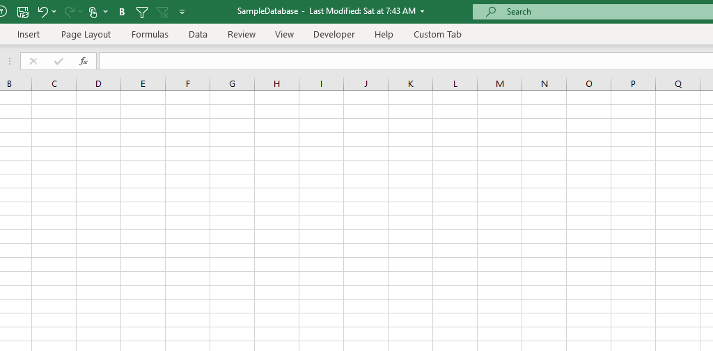
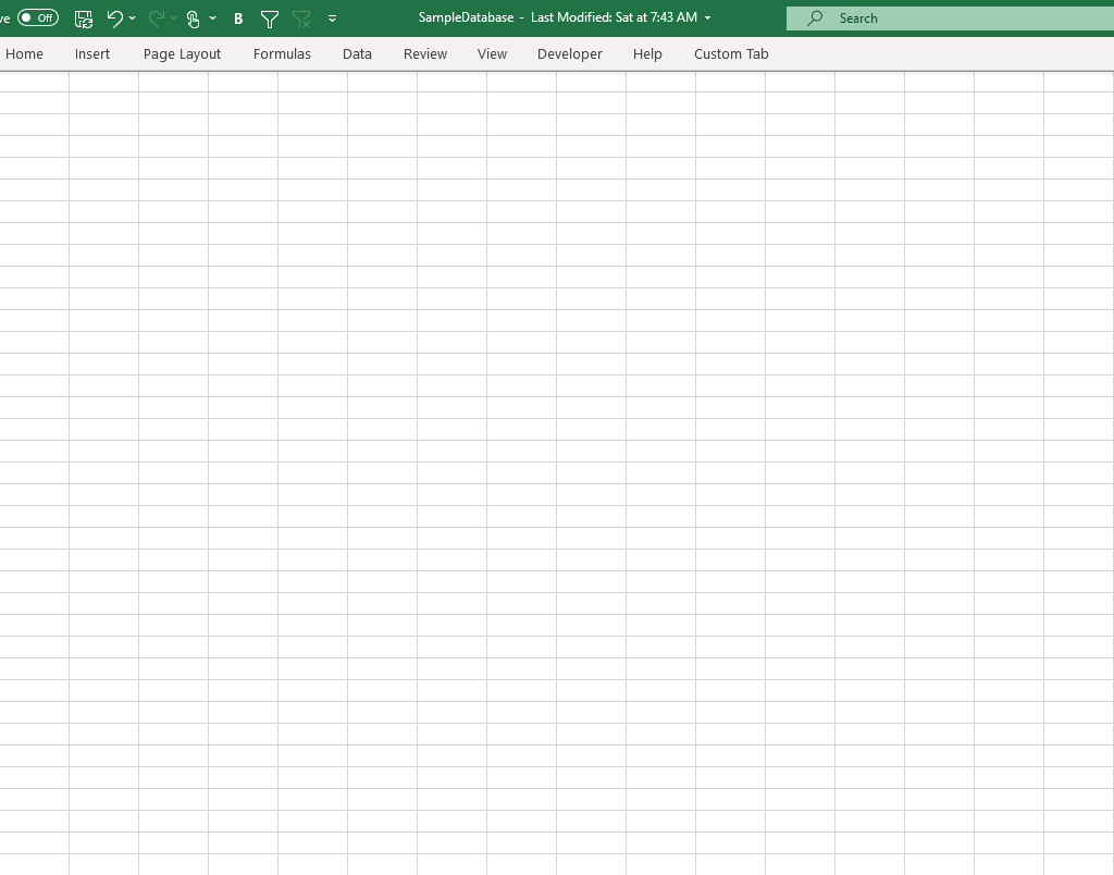
If you’re on a laptop or a small screen or just need to see a lot more data, you can hide some unneeded space in your spreadsheet. That can make it easier to enter data and minimize distractions. For starters, you can minimize the ribbon by double-clicking on any one of the heading names:
You can still use the ribbon and access it, but this way it gets out of your way unless you actually click on any of the headings again. To undo this, just double-click a header and you’ll get your full-sized ribbon back.
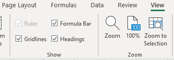
Next up, click on the View tab where you’ll see a few more things you can change:
Here you can uncheck the Formula Bar and even the Headings, assuming you don’t need to see this, of course.
At this rate, your spreadsheet is looking more like just some plain lined paper. And if you need any more white space, then maybe you’re better off simply investing in a bigger monitor or shrinking your resolution.
8. Use a second window
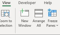
If you have a second monitor, and even if you don’t, you can create a second window within Excel. Whether you’re entering data into multiple different sheets or even if you just want to enter data into multiple areas within the same sheet, a second window can help. This way, you’ll avoid having to jump back and forth. To this, go back to the View tab where you’ll see an option to open a New Window:
From here, you can move your new window onto another monitor or you can just do a split-screen if you only have one. With Windows 10, you can snap windows to the left or right-side of your monitor, making it easy to see two Excel windows at once.
Got any other tips? Submit yours!
Have any tips of your own that use that improve your data-entry experience in Excel? Feel free to email [email protected] and let us know what you’ve found helpful and if we use it in an updated list, we’ll credit you.
If you liked this post on how to speed up data entry in Excel, please give this site a like on Facebook and also be sure to check out some of the many templates that we have available for download. You can also follow us on Twitter and YouTube.
If you’ve got a big spreadsheet with lots of numbers to look at, it can sometimes be a bit difficult to look at a large chunk of data. That’s where knowing how to hide zero values in Excel can be helpful in reading and analyzing data in Excel. By not seeing the zero values, you can easily focus your eyes on the more important numbers that may need more analysis.
However, it doesn’t have to be just zero values that you hide. Any number that’s insignificant for your analysis can also be hidden. For instance, you can be analyzing a company’s financial performance and choose to hide any movements that are less than 5%. The same principles apply as you would use to hiding zero values. Below, I’ll show you how you can hide not just zero values but any values that you don’t want showing up in your data while still factoring them into totals and any other calculations. You won’t be deleting anything, just masking the information.
First, let’s take a look at how to hide a potentially even bigger nuisance: errors.
How to hide errors on a spreadsheet
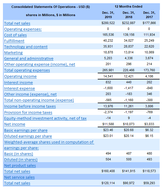
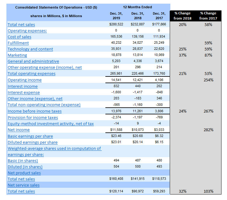
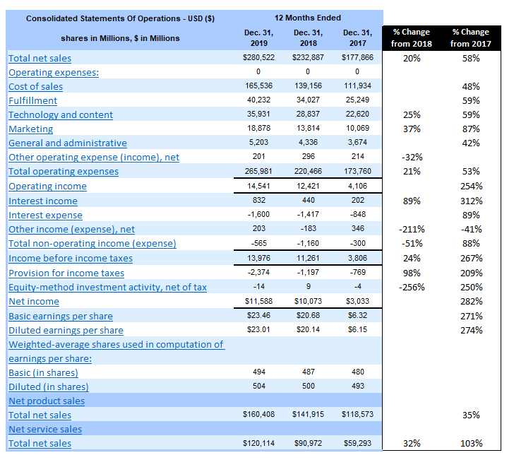
To help illustrate how to hide zeo values in Excel as well as other numbers, I’m going to use some real-world data — Amazon’s most recent annual earnings report, which the company released last month. Here’s the company’s income statement from the past three years:
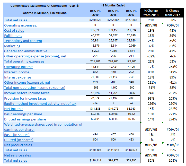
If you’d like to follow along, you can download the data from the SEC. First up, I’ll add a few columns showing the change from 2018 to 2019 and from 2017 to 2019. Here’s how it looks just copying the formulas straight down:
I have divide by zero errors as there are rows that have no data. I could just remove these cells but as with anything in Excel, it’s good to be consistent. Rather than deleting those error values, I can get rid of the errors in one of two ways.
The first is by using an IF statement to say that if the denominator is 0 or blank, to ignore the calculation. The second is just to use an IFERROR statement.
Here’s what my formula looks like for the 2018 to 2019 change:
=C5/D5-1
Where C5 is the 2019 data and D5 the 2018 numbers. I don’t need any parenthesis as order of operations ensures the formula will calculate properly. However, it doesn’t prevent me from getting a divide by zero error. Since the numerator can be blank or zero, what I’ll want to focus on is fixing the denominator in D5. To do this, I can add an IF function that looks at whether the denominator is a number. Here’s what my formula will need to look like to remove that error:
=IF(OR(D5=0,D5=””),””,C5/D5-1)
The formula now checks to see whether D5 is either a zero or blank, and if it is, it returns a blank value. Otherwise, it calculates as normal. Now I can copy this formula down and get rid of the error values.
An alternative way to fix this is by using IFERROR. Introduced in Excel 2007, the function can be an easy way to replace errors on your spreadsheet with another value. In this example, I’m going to use empty quotes (“”). The benefit is obvious: it’s a lot easier to use IFERROR than an IF statement, especially combined with an OR function as well. Here’s what my formula would look like with IFERROR:
=IFERROR(C5/D5-1,””)
It’s a whole lot easier and quicker. I don’t have to worry about the logic and all the reasons why the formula might error out. However, it’s not a perfect solution and here’s why: it will correct errors, but it’s possible they’ll be errors you’re not expecting. For instance, if I copied the data wrong or keyed something over and put text in a field where it should be a number, the IFERROR will correct that and you won’t be able to tell whether it’s blank because it is a divide by error problem or something else. That’s where it can be a little dangerous in using this one-size-fits-all approach to fixing error values. As long as you’re okay with that, it’s a perfectly good approach to fixing the divide by zero errors.
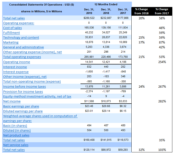
Here’s the data now that it’s been cleared of errors:
That looks a lot better but the problem is that it’s still a lot of percentages to look at and it’s difficult at a glance to see what are the big changes are from the prior year. This is where it’s also important to hide zero values in Excel, as well as low values that aren’t useful for analysis.
How to hide zero values in Excel and other numbers that you don’t want or need to see
In order to hide data, it’s useful to use conditional formatting. If you’re not familiar with how to use conditional formatting, check out this post. Conditional formatting won’t remove or erase any data, which makes it a good solution that will keep all the data and calculations intact.
In the Amazon example, there are some pretty large-moving items in the list. Removing zero values won’t do anything and the threshold needs to be big for it to be helpful in hiding the lower values. Let’s start by removing the percentages that are less than 20%. Here’s the formula that I will use in the conditional formatting to accomplish this:
=AND(F5<0.2,F5>-0.2)
Column F is where the % Change from 2018 values are. I need to use the AND function because if I just look at anything that’s less than 20% this will also capture negative movements that are more than 20%. And for now, I want to keep those. I want to remove anything that’s between -20% and +20%, which is what the above formula will capture. If I was only looking to remove the zero values then the formula would be as simple as F5=0.
The next step is to adjust the formatting so that the cell font is white. Changing the color is an easy way to hide a cell’s value if it’s on a white background. While that data is still there, it won’t be visible:
It creates a lot more white space, allowing me to see a lot more of the bigger values. The problem that I notice, however, is that there are some low values that are creating big movements in percentage. I can go a step further and create another conditional formatting rule that will also ignore the percent change for any item in 2019 that was less than $1 billion (1,000). This is how that formula will look:
=$C5<1000
I need to freeze column C because the conditional formatting will be used for the other change column as well and I don’t want the reference to move. Now, with this adjustment, it makes a much bigger difference and helps me narrow in on fewer items:
I can see that the significant changes from 2018, besides the totals, were in sales, technology and content, and marketing. However, since the growth rate from 2017 is even higher, I’ll need to adjust those percentages to also ignore anything that’s not at least a 50% improvement. Here’s how that formula will look (note that I’ll only apply it for the % Change from 2017 column):
=AND(G5>-0.5,G5<0.5)
Remember, since I’m analyzing percentages, these figures need to be in decimal point. Otherwise, I would be using whole numbers. With those changes, this is how my data looks:
Now I’ve also got a reasonable amount of items I can focus on for the % Change from 2017 column. In addition to the same items increasing from 2018, I notice that fulfillment costs have also shown a significant increase over two years.
The conditional formatting works great in clearing out numbers that I don’t want to see. However, there’s just one small problem…
If I change the color to anything that isn’t white, those numbers that I hid become visible again. That leads me to another all-important section:
How to hide values in Excel that are on different background colors
You can create conditional formatting rules to address other background colors but that’s just not practical. If you use lots of colors on your spreadsheet the last thing you want to do is create a rule for every different color and make sure the cells are hidden in the same font color. There’s also a problem if someone changes the color too.
That’s why using font color to hide values in Excel isn’t a good idea. The good news is that there’s a much easier way to hide values that doesn’t involve you having to try and match up the color.
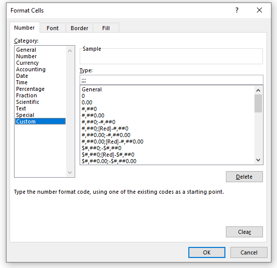
Rather than changing the color, what you should do is use a custom number format. Simply use three semi-colons and that will do the trick:
Without going into the details of the different formats you can use, by using three semi-colons you’re telling Excel that you want no formatting to be used whether the amount is positive or negative. Now, my hidden data remains hidden regardless of the background color:
Now you don’t have to worry about background colors and can easily hide your data in any context.
If you liked this post on how to hide zero values in Excel as well as other values, please give this site a like on Facebook and also be sure to check out some of the many templates that we have available for download. You can also follow us on Twitter and YouTube.
When using charts, sometimes you’ll want to highlight items differently depending on if they’re positive or negative, or may if they’re above or below a benchmark or average. While you can apply conditional formatting to cells, it’s not as easily done if you want to do the same to a bar chart. There’s no simple way without it involving a manual process. However, the good news is there is a workaround.
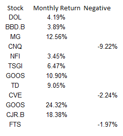
I’m going to use data from my 12 most recent stock picks on fool.ca and how they’ve done over the course of the month they were picked:
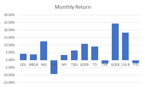
If I were to map the above table out in a bar graph, here’s how it would look:
Adding a column to add another series you can format
While the above chart is a good way to illustrate the performance, if I want to adjust the values so that they’re negative if they’re red, what I’ll want to do is add an extra column:
Then it’s just a matter of updating the chart so that the extra column is included, and changing the color of all the items on the negative series to red. This is also where you can apply whatever formatting you want to the specific series, and hence, conditionally format the results:
Make sure you’re using a stacked chart
The one thing that looks off in the above chart is that the red numbers are on the right-hand side and the blue (positive) numbers are off to the left. To fix this, I’m gonna the chart type to a stacked chart. Then my chart looks like this:
That looks a bit better and is more what I was hoping to achieve.
However, I can even take this a bit further and add more columns. As long as it’s in a stacked chart and only one number is filled in for a column, you can have a lot more customization.
Adding a column for above-average results to add more conditional formatting
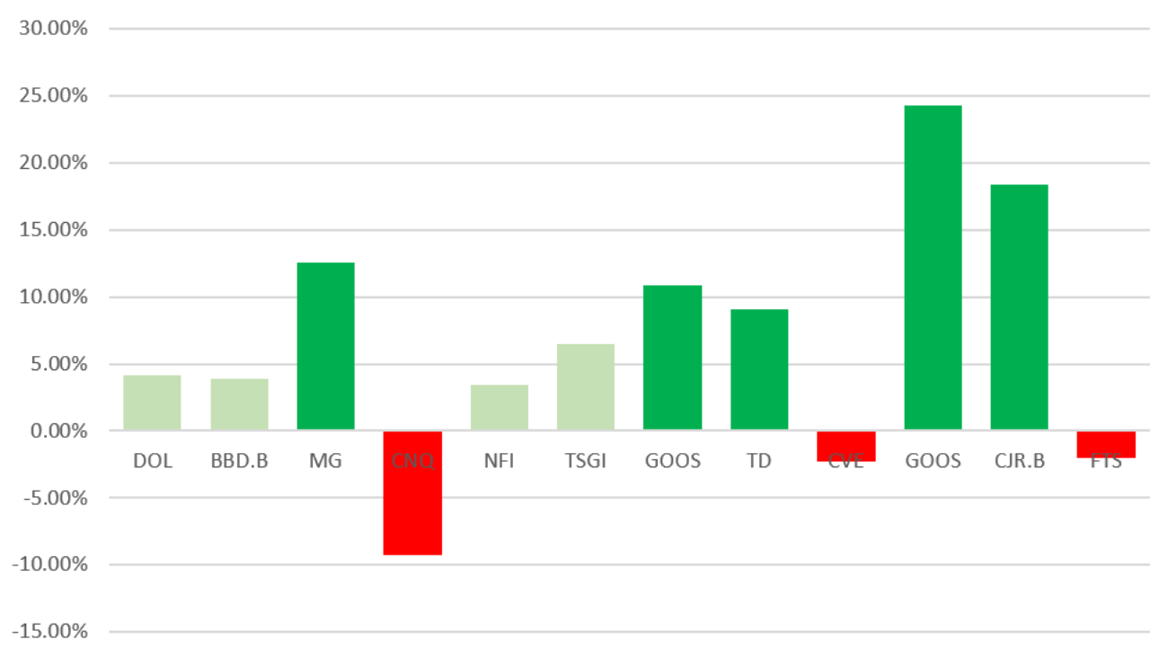
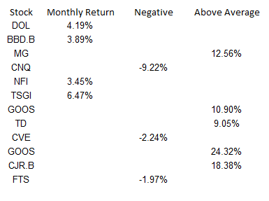
What I can do to help further differentiate the results is to create a column for above-average returns. To do this, I’ll add another column. I could do an if calculation to see if the number was greater than the average of 6.65%. You can have as many columns as you need to help get the number of groups you need. For example, you might have one column for the return, then a separate column for each group that you want to classify the numbers in. In this example, I just used three columns:
Note that what’s key here is that an amount only shows up in one of the three columns. If there’s any overlap, you’ll have multiple colors per item and then that will defeat the purpose of having only one color.
Below is what the chart looks like now, with bright green showing above average, red being negative, and anything else being light green:
Although conditional formatting isn’t very intuitive when it comes to a bar chart, there are ways around it that you can make it work.
If you liked this post on How to Apply Conditional Formatting to a Bar Chart, please give this site a like on Facebook and also be sure to check out some of the many templates that we have available for download. You can also follow us on Twitter and YouTube.
Do you use Excel charts in PowerPoint presentations or want to use them in some other programs? Then you probably know it’s not something that’s very intuitive and often when you save a chart from Excel it’s not the high resolution image that that you were hoping for. And embedding charts within PowerPoint is a whole separate headache altogether.
The good news is that there’s a fairly easy solution. In the past, I’ve used code to save a chart as an image file, but even that didn’t always work very well and it involves running a macro. Once you try stretching it out you’ll still likely see a bit of a reduction in quality.
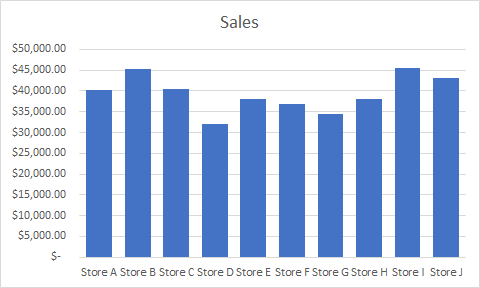
Let’s take this chart as an example:
If I use the method to save it as a chart using VBA, this is how it will look expanded:
The image starts to get a bit faded and it’s far from ideal.
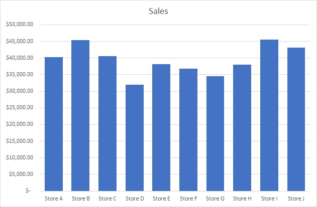
How do you get around that? Save the file in Microsoft Paint. Select the chart, copy it, and paste it into Paint and then save it as an image file. Besides cropping it, I don’t do any editing or special changes to the chart. However, the chart still needs to be a decent size in Excel so if it still looks faded, try making the chart bigger and then repeat the steps.
Here’s how the same chart looks, but using Paint:
It’s a higher quality image and the process is a bit easier unless you’ve got lots of charts that you want to save quickly. Visuals can be useful tools in presentations and I hope this has helped you learn how to save an excel chart as high resolution image.
If you liked this post on How to Save an Excel Chart As a High Resolution Image, please give this site a like on Facebook and also be sure to check out some of the many templates that we have available for download. You can also follow us on Twitter and YouTube.
If you’re looking to hire someone and want to know whether they know how to code in Excel using Visual Basic (VBA), it’s not too hard of a task to quickly evaluate whether they know it or not. The first step is to ask them to send you a sample of something that they’ve done that includes coding and that is not password protected.
Then you’ll want to test to see what it does. So you’ll want to ask how it works so you can see for yourself. If that code works and the macro does what it’s supposed to do, you might be thinking that will be enough. However, someone could simply use a macro recorder to try and generate the code. This is not the same as coding and anyone can do this with no knowledge of code whatsoever. But there’s an easy way to uncover this.
Finding the code
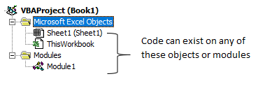
In the file that someone’s sent you, hit ALT+F11. This will send you into Excel’s backend and open up VBA. You should see something like this on the left-hand side:
Double click on each of those items – sheets, workbook, and any modules. Code can reside in any and all of those areas so you might need to cycle through to see where it is.
Once you find the code, that’s when you can start evaluating it.
Reviewing the code
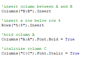
Below, I’ll show you the same macro, how it might look in VBA compared to how it looks using the macro recorder:
There are three things that should be clear from comparing the two examples above, which will help to identify whether someone’s just using the macro recorder or whether they’re actually coding properly using VBA.
1. Organization and spacing.
The macro recorder doesn’t care for spacing out the code and each line of code will come after the other. Especially when you’re looking at longer lines of code, it’ll get real messy real quick. Organization is important because if it looks like one big block of text it’s going to make it very difficult to audit or review later should you want to make changes.
2. No comments.
In the first example, there were lines in green that started with an apostrophe, called comments. They are optional but it ties back to the organization and putting notes along the way to help remind you what you were trying to do. It doesn’t have to accompany every line, but if you don’t see any comments at all, it could be a hint that someone just used a recorder. For a quick macro that’s only a couple lines long it probably wouldn’t be necessary, but for a lot of code you would certainly expect to see at least some comments.
3..Select.
In the second example, you’ll notice .select showing up multiples times. This makes it obvious that someone’s used the macro recorder. If you want to insert a column or bold it, you can just code it right away, you wouldn’t need to actually select it and then make the change. The macro recorder, however, records everything, including those selections. So seeing this should tell you right away that someone’s just used a recorder rather than coding it themselves.
There are other ways you could see whether the macro recorder was used or not but these three should suffice in helping you identify whether someone knows how to code or not.
Why does this matter?
If someone knows how to use the macro recorder, that’s good, but it’s not knowing how to code. The problem is that the macro recorder could do a small fraction of what is possible through actual coding. Coding through VBA opens up a lot more opportunities for automation and improving a spreadsheet. A macro recorder can be used by anyone but it lacks the sophistication to build much logic into it.
Knowing how to copy and paste is one of the most basic things you can learn to do in Excel. And while everyone is familiar with doing it, you might be surprised that there are several ways to do it, some more common than others.
Using Ctrl + C and Ctrl + V
This is definitely one of the more common ways that people are familiar with copying and pasting. It simply involves selecting the cells you want to copy, pressing Ctrl + C, and then selecting where you want to paste them, and then clicking Ctrl+ V.
Using the mouse to right-click copy and paste
Also another one of the more common ways to copy and paste. Here you’ll select what you want to copy, right-click and select copy. Then, select where you want to paste the data, then click right-click and paste. This way avoids having to use the keyboard but requires pulling up the menu with two mouse clicks.
Using the mouse and keyboard together
Hold down Ctrl while selecting the cell that you want to copy and drag it to your destination. Then, release the mouse button and your data will be copied.
Note, if you release the Ctrl button first, and then release the mouse button, then you will have moved the cell (the equivalent of Ctrl + X, Ctrl+V) instead of copying it. The advantage of this method is you don’t have to click as much and it’s useful if you’re quickly copying within the same area. The disadvantage is this method won’t work if you want to copy the data onto another tab or workbook.
Using right-click to copy and paste
Select a cell and hover over the borders until you see a crosshair appear. Then hold down on right click and drag it to where you want to copy it to, then release the button. You’ll be left with many options, including copying the cell or moving it. Technically this involves a second click, but you only have to bring up the menu once.
Using VBA
This is obviously not a method I’d suggest if you wanted to just copy cells over one time unless it was part of a larger macro you’re working on. But to copy data over in VBA it’s a fairly straightforward process that includes just one line of code:
Range(“A1”).copy Range(“A2”)
The first range (A1) is the cell you’re copying and in the above example, A2 is where you’re pasting it to.
If you liked this post on How to Copy and Paste in Excel (5 Different Ways), please give this site a like on Facebook and also be sure to check out some of the many templates that we have available for download. You can also follow us on Twitter and YouTube.