sddefault (1)

How to Add IF Statements to a Pivot Table

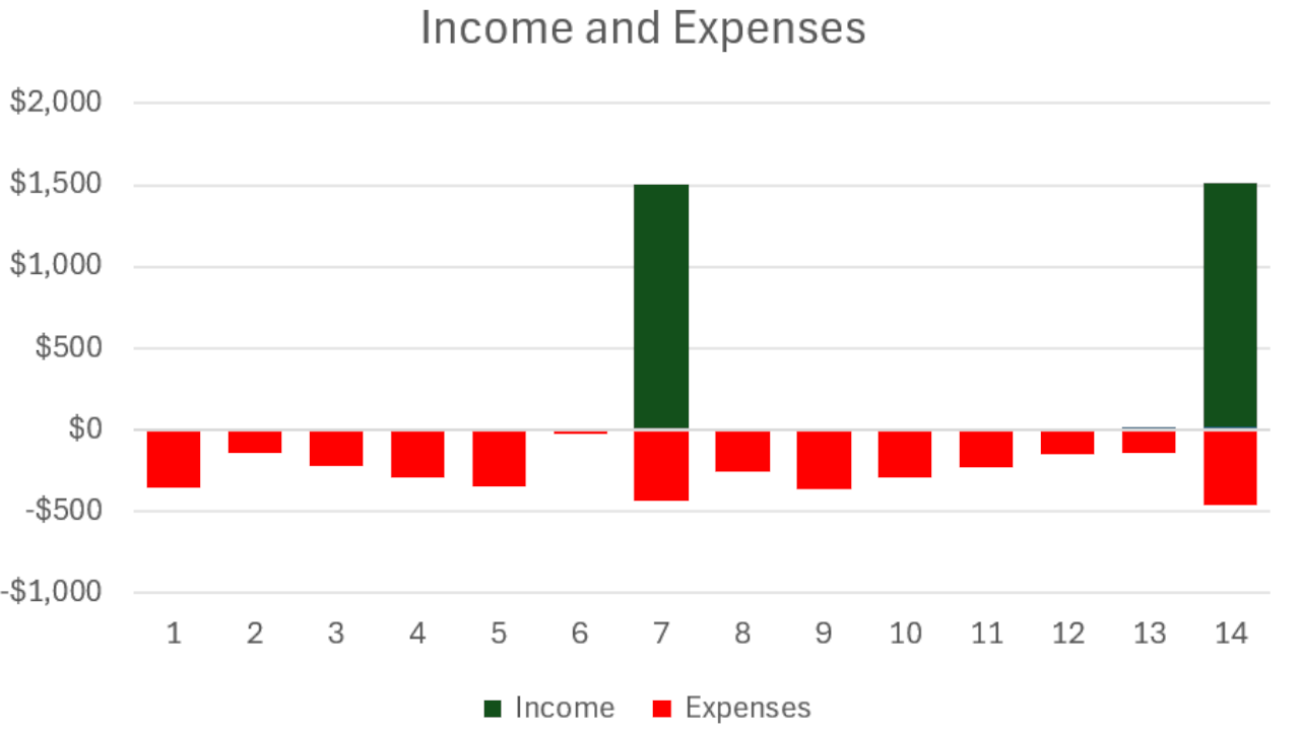
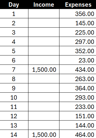
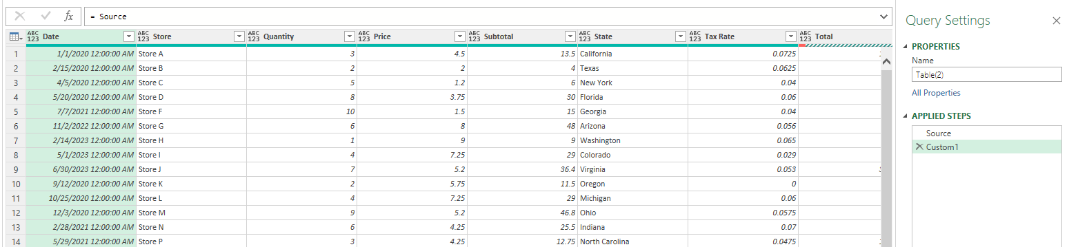
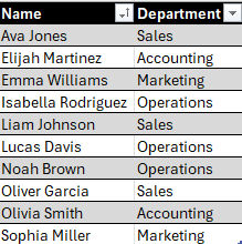
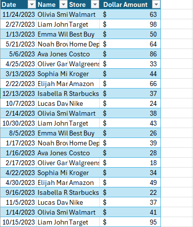
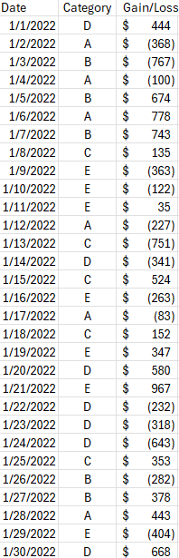
Pivot tables are a powerful feature in Excel that allow users to summarize, analyze, and visualize data. One of the more advanced features of pivot tables is the ability to add calculated fields. Calculated fields enable you to perform calculations on the data within your pivot table without modifying the original dataset. This can be incredibly useful for generating new insights and custom metrics. In this post, I’ll show you how you can take them a step forward and even incorporate IF statements within calculated fields. Here’s the data set that I’m going to use for this example:

A table of values showing dates, categories, and gains and losses.

How to add calculated fields in a pivot table

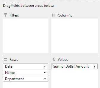
To add a calculated field to a pivot table, take the following steps:

1. Convert your data into a Pivot Table.

2. Click on any cell within your Pivot Table to activate the PivotTable Analyze tab on the ribbon.

3. On the PivotTable Analyze tab click on Fields, Items & sets and then select Calculated Field

4. Enter a name for your calculated field in the Name box.

5. Write out the formula you want to use in the Formula box. You can use existing fields (columns) from your dataset by double-clicking on the field names listed in the Fields box.

6. After you’ve completed writing your formula, click Add then press OK. Your calculated field will be added to the PivotTable, typically in the Values area.

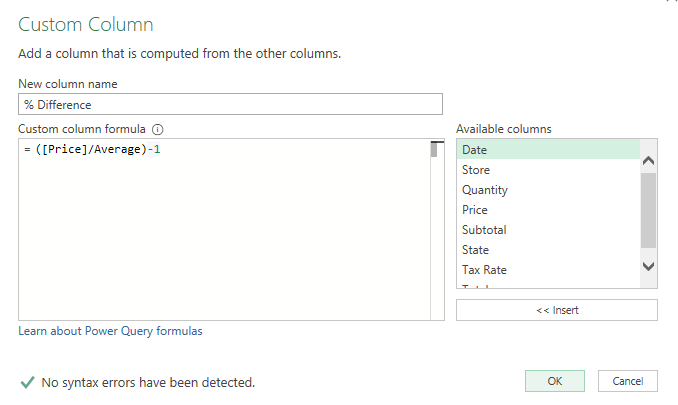
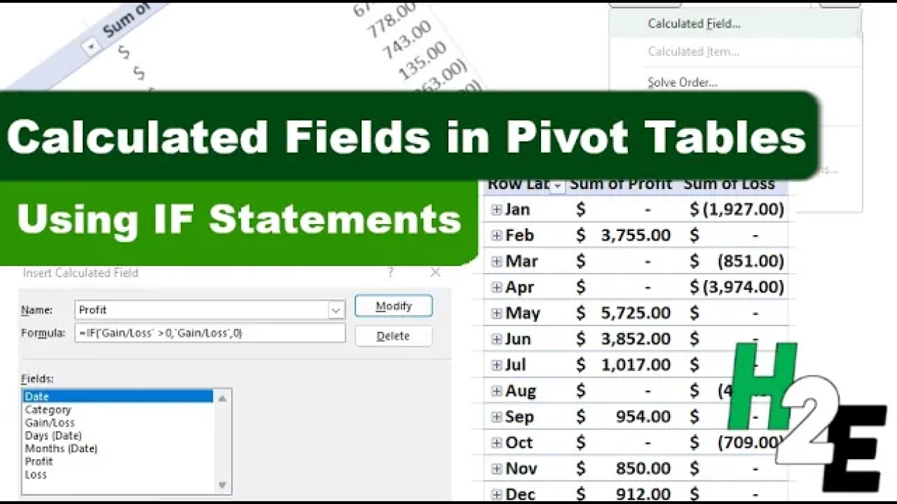
How to use an IF statement in your calculated field

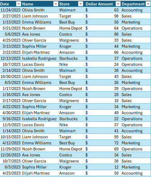
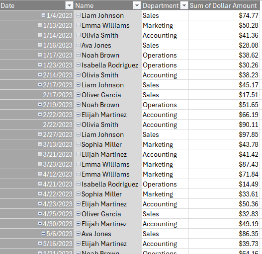
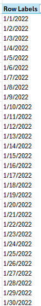
One of the more powerful uses of calculated fields is the ability to include conditional logic using an IF statement. This allows you to create dynamic calculations that can change based on the criteria you set. For my pivot table, I just have a list of dates to start with:

Pivot table showing a list of dates.

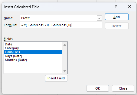
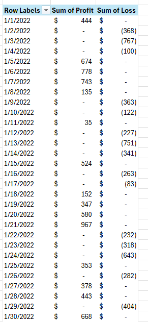
Suppose I want to create a calculated field which will show a value if it is profit (i.e. a gain), and a loss field which will show a value when it is negative.

In the formula box, I’ll write an IF statement for my profit field calculation. It will reference the gain/loss field which I already have. If the value is positive, it will retrieve that value, otherwise it will be zero.

Calculated field calculating a profit.

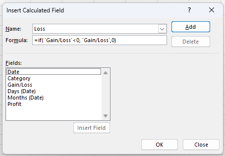
Now, I’ll click on Add and then I’ll setup the Loss field:

Calculated field calculating a loss.

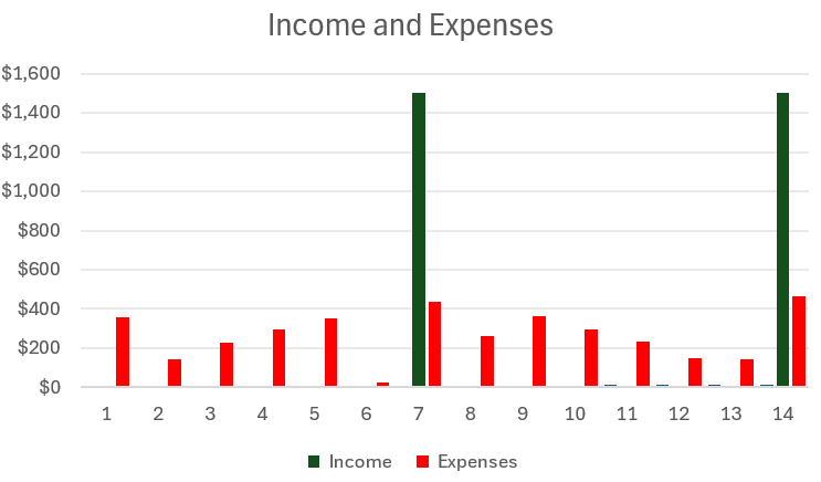
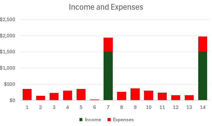
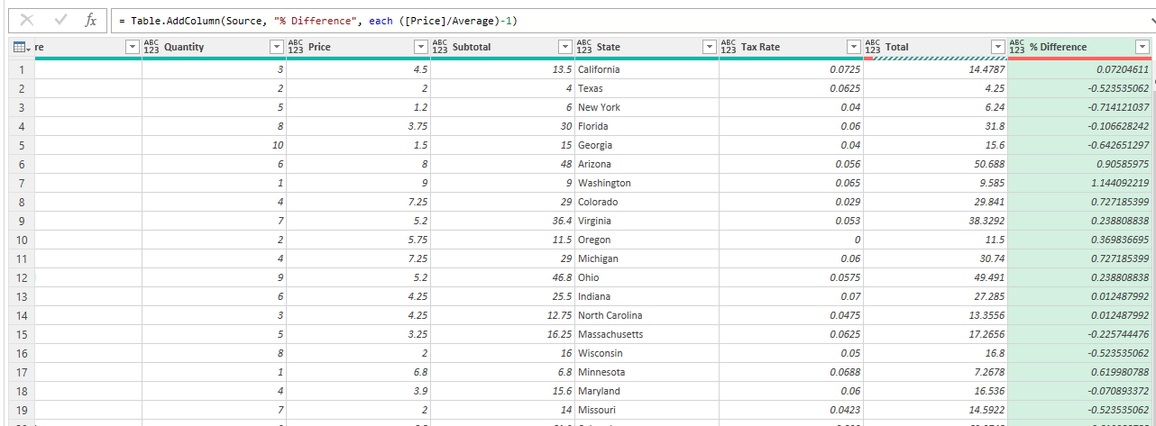
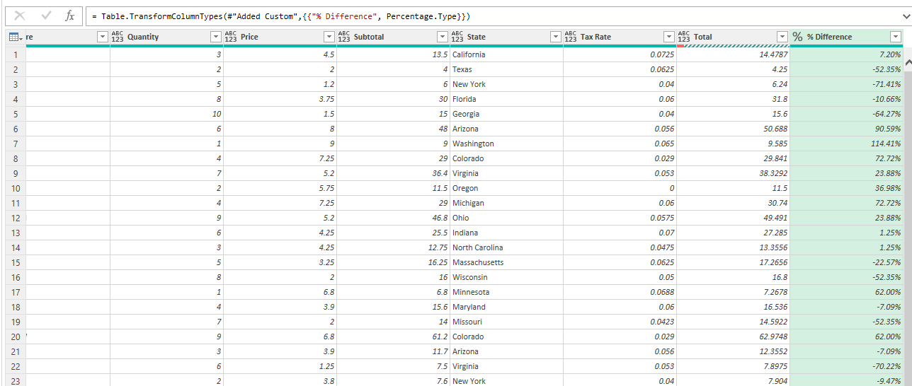
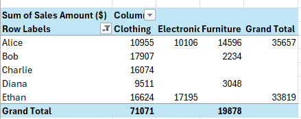
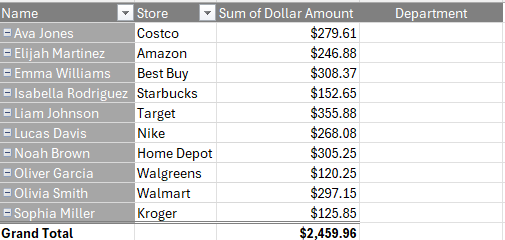
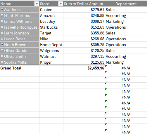
Now when I add these fields to my pivot table, I have one column for the profit values, and one for the losses:

Pivot table showing profits and losses in separate columns.

If you like this post on How to Track Income and Expense in a Single Chart, please give this site a like on Facebook and also be sure to check out some of the many templates that we have available for download. You can also follow me on Twitter and YouTube. Also, please consider buying me a coffee if you find my website helpful and would like to support it.

Income and Expenses Chart

How to Track Income and Expense in a Single Chart

Do you want to create a budget which tracks income and expenses on just one chart? There’s an easy way you can combine them where you can show positive and negative values in a single column. Suppose we have the following income and expenses over a 14-day period:

Table of income and expenses.

You might be tempted to plot these values on a simple column chart like this:

Column chart showing income and expenses.

This, however, means you’re using up two columns for each day. One for income, and one for expenses. While it is effective, what you can also do is combine the income and expense amounts into a single column. The key is to change the chart type and instead of using the default Clustered Column Chart, you select the option for a Stacked Chart. By doing this, you’ll now have both values on a single column:

Stacked column chart showing income and expenses.

This is still not optimal, however, as now we are just adding the income and expense together. Even though they are color coordinated, there is a better way to display this. Ideally, we will show expenses being a negative outflow on a given day while income will be positive. To fix this, let’s flip the expenses so that they are negative. But rather than doing this manually, you can do this with just a few steps.

To flip values from positives to negatives in Excel, do the following:

1. Enter a value of -1 into a cell.

2. Copy that cell.

3. Select the range which contains the values you want to flip from positive to negative.

4. With those cells selected, right-click and select Paste Special and select Multiply

Paste special options.

Doing this will flip your values negative by multiplying all the values by a factor of -1. You can also follow these steps if you want to flip negative values into positives.

After updating the formatting, my table now looks like this:

Table of income and expenses with expenses showing negative values.

And now my chart has also updated to show negatives beneath the income.

Stacked column chart showing income and expenses with expenses showing below income.

This ensures I’m not taking up extra space with an extra column and it still makes it easy to compare the outflows versus the inflows.


If you like this post on How to Track Income and Expense in a Single Chart, please give this site a like on Facebook and also be sure to check out some of the many templates that we have available for download. You can also follow me on Twitter and YouTube. Also, please consider buying me a coffee if you find my website helpful and would like to support it.

sddefault

How to Break Ties in Excel and Rank with Multiple Criteria

If you’re tracking standings in Excel, you know it can be challenging to ensure that you have your rankings setup correctly, especially when factoring in multiple criteria. Ranking values based on a single column or field isn’t complex, but when you start to factor in multiple conditions, it can get a little bit more complicated. Here’s a scenario I’ll attempt to solve where multiple teams have the same number of points, but where their goal difference isn’t the same:

Table showing team standings.

By using an additional criteria as a tiebreaker, you can ensure you rank the teams properly. But how do you setup the formula, and what if you also want to factor in more columns and use a method which can be used for more complex situations? That’s what I’ll go over in this post.

Using the Rank function

If you were to rank these teams based on points, you would use the RANK function. You would use the value in the points field and rank it based on those values. If my first value is in F2 and the range for the points field is F2:F5, my formula would be as follows:

=RANK(F2,$F$2:$F$5)

The limitation of this method is that it will result in repeating values since multiple teams have 4 points:

Table showing team standings with a field for a simple rank.

How to use multiple criteria in your ranking calculations

The RANK function only allows us to base the calculation on a single field. But there is a way we can still rank the values based on multiple fields. This involves using multiple functions, and fractions. Assuming the key criteria is points, then the current formula can be kept as is. But let’s assume the second criteria is goal differential. Then, we can rank the teams based on this field, but divide the value by a factor of 10. Here’s what the formula would look like assuming goal difference is in column G:

=RANK(G2,$G$2:$G$5)/10

This then gets added to the original formula:

=RANK(F2,$F$2:$F$5)+RANK(G2,$G$2:$G$5)/10

Based on this calculation, now my formula shows an additional decimal point and I can now rank the fields based on a second field:

Table showing team standings with a field for a rank based on multiple criteria.

And now I can re-sort the data based on the rank, which correctly tells me that Team 4 is in second place when ranking them based on points, and then goal difference.

A sorted table showing team standings with a field for a rank based on multiple criteria.

You can extend this logic to more criteria and fields. Let’s assume a more complicated scenario where the goal difference for the tied teams is 0. And instead, it comes down to a third criteria, which is their fair play score:

Table showing team standings with additional criteria for fair play scores.

Assuming Fair Play is in column H, here is my updated ranking calculation:

=RANK(F2,$F$2:$F$5)+RANK(G2,$G$2:$G$5)/10+RANK(H2,$H$2:$H$5)/100

In this situation, Team 2 will have the second-best ranking because it has the best fair play score.

A sorted table showing team standings with a field for a rank based on three criteria.

My ranking calculation now has yet another decimal place and another criteria which it can factor into its calculation. You can also adjust the criteria if, suppose, the lowest score for Fair Play is the best. Let’s say the lower the Fair Play score, the better the team should rank. In that case, we can adjust the formula so that we specify the rank should be in ascending order for that last criteria (the default is descending order):

=RANK(F2,$F$2:$F$5)+RANK(G2,$G$2:$G$5)/10+RANK(H2,$H$2:$H$5,1)/100

I just needed to add the final argument to the last criteria, setting it to 1. And now when I re-sort the rank, Team 4 gets the second spot:

A sorted table showing team standings with a field for a rank based on three criteria and when factoring in ascending order.

By setting up your ranking calculation this way, you can have the flexibility of adding more fields and criteria into your ranking. If you want to add another field, simply add it to your formula and divide that value by 1000, and so forth.


If you like this post on How to Break Ties in Excel and Rank with Multiple Criteria, please give this site a like on Facebook and also be sure to check out some of the many templates that we have available for download. You can also follow me on Twitter and YouTube. Also, please consider buying me a coffee if you find my website helpful and would like to support it.

sddefault

How to Add a Calculated Column in Power Query

Power Query can help you summarize and analyze your data. But did you know that you can also add calculated columns similar to how you might in a pivot table? In this post, I’m going to show you how you can compare your values against an average to show a percent change in a new calculated column within Power Query.

This is the table that I am going to work with for the purpose of this calculation:

Power Query table showing sales data.

Calculating an average from a column in Power Query

Before I create my calculated column, I’m going to create an average that I can compare against in the Price field. Here’s how I can calculate an average:

1. Create a new step in Power Query. This can be done by clicking on the fx button next to the formula bar. This will create a new step which will reference your most recent step automatically. Since my first step was just the Source that is what my new step will refer to:

Creating a new step in power query.

2. Use a List function to perform a calculation on a column. In Power Query, there are many List functions you can use to do calculations. In this example, I want to calculate the average based on the Price field. So my formula will be as follows:

= List.Average(Source[Price])

I have wrapped the Price field within the step that I was referencing (Source) and used that as the argument in my List.Average function. There are other List functions you can use to calculate things like max, min, standard deviations, and other common calculations. This formula now computes the average for that field:

Power Query performing an average calculation based on a column.

3. Rename your new step. This is an optional step but it is a useful one if you want to reference this value later on. Rather than referencing a ‘Custom’ step, I can right-click on the step and choose to Rename it. Since I’m calculating an average, I’m going to rename it to Average.

Creating a calculated field which compares the percent difference from the average

I’m going to create a calculated column that takes the current price and compares it to the average value that I calculated earlier. Then, I’m going to convert that into a percentage difference. Here are the steps to create a calculated column in Power Query:

1. Add a custom column. Click on the Add Column tab in Power Query and select Custom Column.

2. Enter the formula for the column. You will now be prompted to create your formula and name your new column name. I’ll call this % Difference. And my calculation will take the current value in the Price and divide it by the Average and subtract 1, to get the percentage difference. Here’s what the formula looks like:

Creating a calculated column in power query which determines the percent change.

One key thing to note here is that I reference the Average as that is the name of the custom step I created in the previous section. It is saved in my steps and so Power Query is referencing that step in this calculation. If you are referencing a previous step, you will want to ensure it is above your calculated step to avoid running into a circular reference.

A custom column calculation is listed below the average calculation.

After clicking on OK, Power Query now creates that additional step for me:

Power Query creating a calculated column showing the percentage difference.

3. Change the format (if necessary). My column has been created but since it is a percentage, I want to change the data type so that it correctly shows a % rather than a decimal number. To do this, I can right-click on the data type (where it shows ABC and 123 underneath), and change that to a percentage. Now my new column correctly displays as a percentage:

A calculated column showing the percentage change in a percentage format.

For another example of how to run these calculations, refer to the following video:


If you like this post on How to Add a Calculated Column in Power Query, please give this site a like on Facebook and also be sure to check out some of the many templates that we have available for download. You can also follow me on Twitter and YouTube. Also, please consider buying me a coffee if you find my website helpful and would like to support it.

hideblanks

Hide Blanks and Error Values on a Pivot Table

Do you want a quick way to clean up your pivot table and remove blanks and errors from it? Below, I’ll show you how to do that with just a few steps. In the below pivot table, I have error values and blank row values, which indicate that data is missing:

Pivot table with blank and error values.

Ideally, we would adjust our data set to ensure that this data is cleaned and there are no errors. But if you need to quickly clean this up, here’s what you can do.

How to remove error values from a pivot table

To prevent error values from showing on your pivot table, follow these steps:

1. Select your pivot table.

2. On the PivotTable Analyze tab, click on Options

3. Under the Format section, check off For error values show

4. If you want something else to show in place of an error value, enter it in that field. Otherwise, leave it blank and then press OK.

Replacing error values in the pivot table options.

Now your pivot table will not show any error values on it:

Pivot table without any errors showing.

There’s still the issue of the (blank) value in the row labels. Let’s address that issue next.

How to remove (blank) row labels from a pivot table

Follow these steps to get rid of the ‘(blank)’ row values which appear in your pivot table:

1. Select the drop-down filter button on your pivot table.

2. Select Label Filters and Does Not Equal

Applying label filters in a pivot table.

3. Set the criteria so that it does not equal (blank)

This will now remove the blanks from your pivot table:

A pivot table without blanksand errors

Now both the blanks and error values are gone from your pivot table.


If you like this post on How to Hide Blanks and Error Values on a Pivot Table, please give this site a like on Facebook and also be sure to check out some of the many templates that we have available for download. You can also follow me on Twitter and YouTube. Also, please consider buying me a coffee if you find my website helpful and would like to support it.

pivottablevlookup

How to Use VLOOKUP with Pivot Tables

Do you want to be able to use a VLOOKUP with a pivot table? While there isn’t a way to natively do so, there is a way you can make it look as though your pivot table has a lookup function within there, and make it so that it expands along with your data. Suppose you have the following pivot table, which shows employee spending:

Pivot table showing spending by employee.

Let’s say we want to look up the department that the employee belongs to, based on the following lookup table:

A lookup table in Excel.

We can’t create a field that does a lookup within a pivot table, but we can make it look as if that’s what we are doing.

Copy your pivot table formatting to make it look as though you’ve added another field

I can create a field called ‘Department’ directly next to my pivot table. And what I can do to make it look as though it’s a continuation of my pivot table is to use the Format Painter so that I can copy the formatting over. To do this, simply select the formatting for the pivot table header, click Format Painter, and then click on the new field. Now it looks as though it’s the same format as your pivot table:

Pivot table with a new field added next to it.

The one drawback is that if you adjust your pivot table, you’ll need to update the formatting. You’ll also want to make sure you don’t expect your pivot table to expand — i.e. you won’t be adding any more fields to expand it horizontally. If you do so, you’ll encounter an error saying that there isn’t enough room for your pivot table. In that case, you can insert a column. But ideally, you would set this additional field once you’ve added all the fields you plan to use in your pivot table.

Using the VLOOKUP function next to your pivot table

The next step is to use the VLOOKUP function the way your normally would. With the employee name in cell A2, and my lookup table in columns F:G, I can set my formula up as follows:

=VLOOKUP(A2,F:G,2,FALSE)

But this is still not ideal as copying this formula down to far will show errors for both grand totals and blank values:

Vlookup formula added to a pivot table.

The solution here is to add an IF statement before the VLOOKUP function. In the below example, my formula is checking for both a blank value and a ‘Grand Total’ value. If either criteria is met, it returns a blank:

=IF(OR(A2="",A2="Grand Total"),"",VLOOKUP(A2,F:G,2,FALSE))

Now I can copy my formula down and the formula won’t return a value when the value in column A is blank or is a grand total:

Vlookup formula added to a pivot table which also checks for blanks and grand totals.

Now it appears as though my lookup function is dynamic and automatically adjusting based on my pivot table selections.

Adding the field to the data set is the ideal solution

Creating a field by adding a formula next to your pivot table can work if your table never expands. But if it might need to, a more versatile option is to simply add the field into your original data set and do the lookup there.

A table in Excel.

In this data set, I’m missing the department field. But if I add the VLOOKUP formula here, I can pull in the department values right in there. The formula is setup the same and by doing it this way, I can add the field directly to my data set:

Excel table after adding a field for department.

Now, when I update my pivot table I can directly add the department field right into the Rows section:

Adding fields to a pivot table.

Then, my pivot table shows the additional field, and I won’t run into any issues whether I need to add rows or columns:

A pivot table with the department field added.

In some cases, you might just want a quick way to do a lookup and not adjust the data set, in which case the first method can be preferable. But if you are able to add the field directly into your data set, that is the ideal approach.


If you like this post on How to Use VLOOKUP with Pivot Tables, please give this site a like on Facebook and also be sure to check out some of the many templates that we have available for download. You can also follow me on Twitter and YouTube. Also, please consider buying me a coffee if you find my website helpful and would like to support it.

GetRidofWarning6

How to Get Rid of the Red Warning Bar in Microsoft Excel

Have you opened a file in Excel which contains macros in it only to find that you can’t use it, because the content is blocked? If you’ve come across the following warning bar, I’m going to show you how can you remove it once and for all.

Red warning bar in Microsoft Excel.

This is different than the yellow warning bar in the past where you can just click on Enable Content and be on your way. This fix requires an extra step.

Here’s how to get rid of the red warning bar

1. Close out of the Excel file completely.

2. Right-click on the file and select properties.

3. In the file properties, check off the option to Unblock the file and then click Apply.

4. Re-open the file, where you’ll be back to seeing the more familiar, yellow warning bar where you can select to Enable Content.

Once you click on that button, your file will now be able to run macros.

How can you prevent the red warning bar from popping up in Excel?

If you’re running Windows 11 then every Excel file that you download from the internet will have the red warning bar by default. Even if you send the file to yourself and open it from Outlook, you’ll see that error come up. There is, however, a way to get around it.

Here’s what you can to avoid encountering the red warning bar on macro-enabled Excel files:

  1. In Excel, go to File -> Options
  2. Go to the Trust Center and select Trust Center Settings
  3. Navigate to Trusted Locations
  4. Click on the button to Add new location
  5. Input a location on your computer where you plan to save macro-enabled files and click OK. You can select the option to include subfolders as well.

Any file you save in one of your trusted locations won’t get the red warning bar anymore — you’ll still have the yellow warning bar, however, depending on your macro security settings. But you’ll now able to enable content without having to close and re-open the file.


If you like this post on How to Get Rid of the Red Warning Bar in Microsoft Excel, please give this site a like on Facebook and also be sure to check out some of the many templates that we have available for download. You can also follow me on Twitter and YouTube. Also, please consider buying me a coffee if you find my website helpful and would like to support it.

sddefault

Converting Time Zones in Excel and Google Sheets

If you work on large teams and/or interact with people all over the world, you know it can be challenging trying to work with time zones. While they aren’t difficult to understand, it’s easy to make a mistake when trying to arrange a meeting, as one time might seem like it works well only to discover later on that it’s during an inconvenient time for another person. Office software like Microsoft Outlook can help with this, but you can also setup a template in Excel or Google Sheets to convert time into different time zones. In this post, I’ll show you how you can setup an easy-to-use template that can calculate these differences for you.

Creating a template to convert time into other time zones

To quickly convert time from one time zone to another, the key piece of information you need is the Greenwich Mean Time (GMT) offset. Once you know this, then it’s a matter of just making of using simple arithmetic to convert from one time zone to another.

Let’s suppose your home city is London. There is no adjustment needed as its offset is 0. For New York, the adjustment is -5, and for Sydney it is +11, and Tokyo is +9. This is during non-daylight savings times. Positives can be left without an indicator but for negative adjustments, we need to put in a negative value in front to ensure the conversions are calculated correctly.

Cities broken down by GMT adjustment.

Let’s assume London is my base time, and I sent it to 12:00:00 AM. To determine the total adjustment in hours, I need to compare to the two GMT adjustments. To convert from London to Sydney is simple as I just need to add 11 hours, and in the case of Tokyo, 9 hours. New York is a bit trickier since that is behind London — hence the negative value. To make it work with the TIMEVALUE function, I need the value to be positive. Whether I deduct 5 hours or simply add 19 hours (24-5), I end up with the same time. This means, when there is a negative difference, I can just add 24 hours. That results in my GMT hours adjustment formula looking like this.

=IF(B3-$B$2<0,B3-$B$2+24,B3-$B$2)

Where B3 is my New York GMT offset and B2 is my London GMT offset.

Next, to convert the time, I’ll use the TIMEVALUE function. This can be done with taking that time zone hours adjustment from the previous step, and putting it within the TIMEVALUE function, and adding it to my base time.

=$C$2+TIMEVALUE(D3&":00")

Where D3 is the adjustment from my previous step and C2 is my base, or home time. These calculations work the same whether you’re setting this up in Excel or Google Sheets.

You can re-use this template to do different conversions based on various parts of the world. With the correct GMT adjustments for each city, the calculations can easily be updateable.

In the screenshot below, I’ve highlighted any inputs in yellow and formulas in grey to help show how a user can modify the template to do time zone conversions.

Time zone conversions in Excel with London as the base city.

I don’t have to use London as my base city and instead I can switch it around to New York. I can also change it so that my starting time is 7:00 PM New York time. The results will be the same, and it’s just the adjustment value that changes.

Time zone conversions in Excel with New York as the base city.

If you like this post on Converting Time Zones in Excel and Google Sheets, please give this site a like on Facebook and also be sure to check out some of the many templates that we have available for download. You can also follow me on Twitter and YouTube. Also, please consider buying me a coffee if you find my website helpful and would like to support it.

heat map

Create a Heat Map in Google Sheets

Heat maps are visual representations of data where individual values are represented by colors. They are particularly useful for identifying patterns, trends, and outliers in large data sets at a glance. By using a spectrum of colors, typically ranging from cool (blue) to warm (red), heat maps make it easy to see which values are higher or lower, helping users quickly understand the data’s distribution and key insights.

Why heat maps are useful

  1. Visual Clarity: Heat maps turn complex data sets into easy-to-understand visual formats.
  2. Quick Analysis: They allow for the rapid identification of trends, patterns, and outliers.
  3. Enhanced Decision Making: By highlighting critical data points, heat maps aid in making informed business decisions.
  4. Comparative Insights: They facilitate the comparison of different data points within a set.

How to create heat maps in Google Sheets

Follow these steps to create a heat map in Google Sheets:

Step 1: Prepare Your Data

Ensure your data is organized in a clear and structured manner. Each column should represent a different variable, and each row should represent a different observation or data point. You should give Google Sheets enough data so that it can determine the location for your data points. In the example below, I have U.S. states listed in column A and values in column B. Since I’ve labeled column A as ‘State’ that gives Google Sheets sufficient information to map the data points. If I had a list of countries, then I would label the header as ‘Country.’

Table of values in Google Sheets.

Step 2: Insert the chart

Select any data point on your table and on the Insert menu, select Chart. Google Sheets will create a default chart but you can change it by selecting the Chart Type and then selecting Geo Chart from the Map section.

Selecting a geo chart in Google Sheets.

Step 3: Select the correct map

When the map chart is created, it may not automatically detect the correct area. In my example, it selects the entire world.

Map chart in Google Sheets showing the entire world.

The chart looks incorrect as nothing is filled in, but this is because I’m at too high of a level to see the values. I need to adjust my chart to focus just on the United States. To fix this, edit the chart and under the Customize tab, select the Geo settings and change the region to United States.

Selecting the region settings in Google Sheets.

You can adjust the range per your individual data set. But in this example, since my data has U.S. states only, then I need to select the United States. And once I do so, now my chart is filled in:

Map chart showing values for the United States.

Step 4: Adjust the color scales

By default, the chart shows green and red colors for high and low values, respectively. I can customize this in the Geo section as well. You can modify this so that blue colors are for the low values, green for the maximum values, and yellow for the mid-range values:

Modifying the colors on the heat map in Google Sheets.

Step 5: Modify other chart settings

The last step is, as with any other chart, modifying the font, background color, border color, and any other settings for the chart. These can also be changed in the Customize section of the chart settings.

Modifying the chart settings in Google Sheets.

Once you’re done, the heat map chart is ready to go:

A heat map chart in Google Sheets.

If you like this post on How to Create a Heat Map in Google Sheets, please give this site a like on Facebook and also be sure to check out some of the many templates that we have available for download. You can also follow me on Twitter and YouTube. Also, please consider buying me a coffee if you find my website helpful and would like to support it.

value error

How to Fix #VALUE! Errors in Excel

Microsoft Excel is a powerful tool for data analysis and financial modeling, but encountering errors like #VALUE! can be a frustrating hurdle for many users. This error generally signals an issue with the way your formulas are set up or how data is entered. Understanding the root causes of the #VALUE! error and learning how to fix it can save you time and stress. This article will explore why the #VALUE! error occurs and provide practical solutions to address it.

What Causes the #VALUE! Error?

The #VALUE! error appears in Excel when a formula contains cells that have incompatible data types or when the formula is improperly structured. Here are some common scenarios:

  1. Incorrect Data Types: This is the most frequent cause. Excel expects a certain type of data to perform calculations, but if it receives something different, it will return a #VALUE! error. For example, attempting to multiply a number by a text string will cause this error.
  2. Formula Errors: Sometimes, the error occurs because the formula is not written correctly. For instance, an extra space or a missing operator can lead to #VALUE!.
  3. Cell References: If your formula references a cell that does not contain data or contains inappropriate data (like text in a sum function), Excel will not be able to execute the calculation, resulting in a #VALUE! error.
  4. Date and Time Issues: Excel handles dates and times as serial numbers. Errors can arise when you try to perform operations on what appears to be a date or time but is actually a text string.

How to Fix the #VALUE! Error

Fixing the #VALUE! error involves checking the formula and the data types involved in the computation. Here are some steps you can take:

  1. Check Data Types: Ensure that all data used in calculations are of the correct type. Convert text to numbers if necessary by using Excel functions such as VALUE() or NUMBERVALUE().
  2. Review Formulas: Look for common mistakes like misplaced brackets, incorrect operators, or syntax errors. Excel’s formula auditing tools, found under the “Formulas” tab, can help identify and correct these issues.
  3. Clear Formats: Sometimes, cell formatting can cause issues. Clear all formatting to rule out any hidden formatting errors that might be causing the #VALUE! error.
  4. Use Error Checking: Excel has built-in error checking that can diagnose and offer fixes for various errors, including #VALUE!. This can be accessed from the “Formulas” tab, under “Formula Auditing”.
  5. Simplify Formulas: If your formula is complex, break it down into smaller parts and check each segment individually. This can help isolate the part of the formula that is causing the error.

How to Find the #VALUE! Error

In some cases, it can be difficult to locate the error. In the following example, the formula is summing up column D. But even just a single #VALUE! error within that range will be sufficient to trigger an error in a formula which is just doing a single summation. That’s because you can’t sum up values if they contain the error.

An excel table which contains a #VALUE! error.

The easiest way to find an error within the range is to do the following:

  1. Highlight the range you are checking an error for.
  2. Press F5 and select Special
  3. Select Formulas and uncheck everything except for Errors
Using the go to special menu to find errors in Excel.

After clicking OK, you will be taken to the first error cell within the range:

A range in Excel which contains a #VALUE! error.

In the highlighted cells, we see that there is an apostrophe after the 4, which turns the value into a text. To correct this, all that’s necessary is to remove the apostrophe. This will fix the calculation as Excel will now recognize the cell as a number; the formula will no longer by trying to multiply a text value against a number, and thus, no error will be present.

Repeat the steps for finding errors until you get the following message:

Best Practices to Avoid Future Errors

To prevent the recurrence of the #VALUE! error, consider the following best practices:

  • Data Validation: Use Excel’s data validation tools to ensure that the correct data types are entered into cells.
  • Template Use: Develop templates with predefined formulas and formatting to minimize the risk of errors.
  • Continuous Learning: Stay updated with Excel’s functionalities and best practices. Regular practice can help you understand and avoid common pitfalls in Excel.

The #VALUE! error in Excel typically stems from data type mismatches or formula mistakes. By carefully checking your data and formulas, and using Excel’s helpful diagnostic tools, you can efficiently resolve these errors and ensure smoother, more accurate data processing in your spreadsheets.


If you like this post on How to Fix #VALUE! Errors in Excel, please give this site a like on Facebook and also be sure to check out some of the many templates that we have available for download. You can also follow me on Twitter and YouTube. Also, please consider buying me a coffee if you find my website helpful and would like to support it.