CC Balance Transfer Savings

Calculate Interest Savings on a Credit Card Balance Transfer in Excel

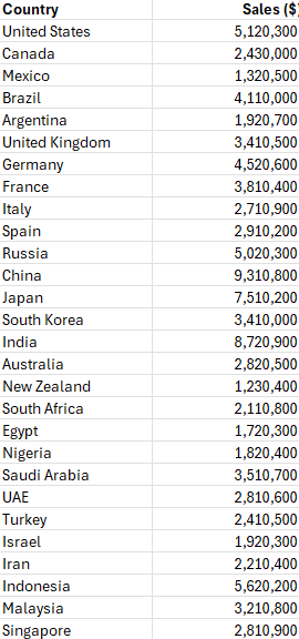
A balance transfer for a credit card allows people to move the outstanding balance from one or more credit cards to a new card, often with a lower interest rate. The purpose of a balance transfer is to reduce the amount of interest paid on existing debt, which can help cardholders save money. Many credit card issuers offer promotional periods with significantly reduced interest rates, sometimes as low as 0%, for a specified duration, typically ranging from six months to 18 months.

By transferring high-interest credit card balances to a card with a lower or 0% interest rate, cardholders can save a substantial amount of money on interest payments. For example, if an individual has a $5,000 balance on a card with a 20% annual percentage rate (APR), they would accrue approximately $1,000 in interest over a year. However, if they transfer that balance to a card offering a 0% APR for 12 months, they can avoid paying any interest during the promotional period, allowing them to allocate more of their payments towards the principal balance.

Additionally, a balance transfer can simplify debt management by consolidating multiple balances into one monthly payment. This can make it easier to keep track of payments and avoid missed or late payments, which can result in additional fees and negatively impact one’s credit score. However, it’s important to be aware of balance transfer fees, which typically range from 3% to 5% of the transferred amount. Even with these fees, however, the potential interest savings often outweigh the cost, making balance transfers an attractive option for those looking to manage their debt more effectively.

In the example below, I’ll show you how an Excel spreadsheet can help you estimate just how much you might save with a balance transfer.

Calculating credit card interest savings in Excel

You can estimate the interest savings from a balance transfer in Excel using the future value (FV) function. The function takes multiple arguments:

  • Interest Rate
  • Number of Periods
  • Payment Amount
  • Present Value
  • Payment Type (beginning or end of period)

Since we are looking at monthly payments, we will need to convert the interest rate to a monthly percentage. For this, take the annual credit card rate and divide it by 12. If your credit card charges a 20% interest rate annually, dividing that by 12 will give you a monthly percentage of 1.67%. In Excel, this would be input as 0.0167.

The number of periods would represent the number of months. If it’s a six-month promotional period, then six would be your input, 12 if it’s for 12 months, and so on.

As for the payment, let’s suppose that you will pay 3% of the balance. On a $1,000 credit card balance, that would translate into a monthly payment of $30.

For the present value, we’ll enter a negative value to indicate an amount owing. The input will be -$1,000.

The last argument, for the type of payment, can be left blank, assumes that a payment will be made at the end of the period. By setting it to a 1, that will assume the payment is made at the beginning. For the purposes of estimating, however, this won’t have a significant impact on the calculation.

The complete formula for the calculation based on the above assumptions for a 12-month period is as follows:

=FV(0.2/12,12,30,-1000)

This returns a value of $824.49. This is what the balance would be after 12 months of payments. Next, let’s compare this to what the balance would be if the interest rate was 0%. This what that formula would look like:

=FV(0,12,30,-1000)

This returns a value of $640, and it’s the same as if you were to deduct $360 (12 payments of 30) from the balance. Thus, the savings from the balance transfer, before accounting for fees, would be:

824.49 – 640.00 = 184.49

Furthermore, let’s assume there is a 4% balance transfer fee. On a $1,000 balance, that would be $40. The final cost savings would be as follows:

184.49 – 40.00 = 144.49

This is just one example of a savings calculation, but let’s adjust this so that it is more adaptable to other scenarios, and create a template which can be easily modified.

Creating a template to calculate savings from balance transfers

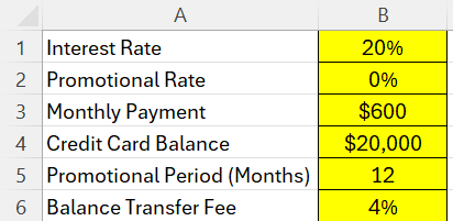
With the logic setup, to create a template is just a matter of determining the inputs to plug into the calculation. The variables which a user should be able to adjust are as follows:

  • The current interest rate
  • The promotional rate
  • The monthly payment amount
  • The credit card balance
  • The promotional period in months
  • The balance transfer fee

For this example, I’m going to use much larger amounts to help emphasize the potential savings. These are the inputs I’ve created in my sheet:

Excel sheet with inputs for credit balances and interest rates.

Now, it’s a matter of setting up the formula which links to these values. To do this, we need to combine the following calculations:

  • The FV based on the current credit card interest rate,
  • The FV based on a 0% credit card interest rate
  • Calculating the difference between the two FV calculations
  • Deducting the balance transfer fee from the above calculation

The first FV calculation is a copy of what was used before, except this time the values are not hardcoded and are instead linked back to the input cells above:

=FV(B1/12,B5,B3,-B4)

For the second FV calculation, we just need to reference the promotional rate:

=FV(B2/12,B5,B3,-B4)

Then, we deduct the difference between these calculations:

=FV(B1/12,B5,B3,-B4)-FV(B2/12,B5,B3,-B4)

The following formula also factors in the balance transfer fee:

=(FV(B1/12,B5,B3,-B4)-FV(B2/12,B5,B3,-B4))-(B6*B4)

Assuming a $20,000 credit card balance, with a monthly payment of $600, an interest rate of 20%, a 12-month promotional period at 0%, and a 4% balance transfer fee, the total cost savings would be approximately $2,889.74. The completed template is setup as follows:

Cost savings calculation in Excel showing the benefits of a credit card balance transfer.

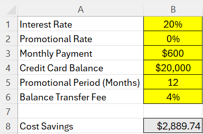
By setting up this template in Excel, you can adjust these inputs to do your own what-if analysis. These calculations assume that your credit card balance does not change and that you are simply paying it down and not adding to it.


If you like this post on How to Calculate Interest Savings on a Credit Card Balance Transfer in Excel, please give this site a like on Facebook and also be sure to check out some of the many templates that we have available for download. You can also follow me on Twitter and YouTube. Also, please consider buying me a coffee if you find my website helpful and would like to support it.

MensOlympicFootball

Free Men’s Olympic Football Prediction Template for Paris 2024

The Paris Olympics are taking place next month, and one of the more popular tournaments is likely to be the men’s football competition, which will include 2022 World Cup finalists France and Argentina. I have created a template in Google Sheets which will help track the tournament and allow you to make predictions with others.

Tracking matches in the template

On the main page of the template, there is a tab for Actuals where you can enter the actual results as they occur. And based on those results, the tables will automatically populate, to determine which teams will play one another in the knockout stages.

Men's 2024 olympic football match schedule.

You can also highlight countries you want to track by specify the name of country under the watchlist section below. There is also a space to adjust the time based on your time zone. In the example below, the match times are adjusted based on GMT-4. I have also chosen to highlight all the matches where either France or Argentina play.

Men's 2024 olympic football match schedule adjusted to GMT-4 settings.

Making predictions in the template

In addition to tracking the matches and results, you can also make predictions with your friends. There are five predictions tabs in the file. The tabs are the same as the actual tab. The one difference is that there is column for prediction points earned. The prediction results will compare to the actuals to determine if a result was correct and if so, the number of points that someone should have earned from that prediction.

You can adjust the points someone will earn by making changes to the scoring rules tab. Here are the default rules that are in the sheet:

Scoring rules for the Men's 2024 olympic football match template.

Points can be earned for determining the correct number of goals, the right result, score, and even if the teams were correctly predicted to be in the correct elimination stage.

To track how all the players are doing, update the scoring results tab with the name of the players — this should match the individual tabs. If you rename Player1, Player2, etc, then be sure to adjust the names on the scoring results tab. If you need more players, you can copy one of the existing player tabs.

Player standings in the prediction tab.

Try the template!

This template is available for free and you can access it by clicking on this link. It will create a copy of the file which you can then use.


If you like this free template for the Men’s Olympic Football Tournament for Paris 2024, please give this site a like on Facebook and also be sure to check out some of the many templates that we have available for download. You can also follow me on Twitter and YouTube. Also, please consider buying me a coffee if you find my website helpful and would like to support it.

MapCharts2

Creating a Map Chart in Excel and Google Sheets

If you have sales data organized by country, you can create map charts in both Excel and Google sheets. These charts can make it easy to visualize sales and identify patterns and trends. Below, I will compare the different ways to create map charts in Excel and Google Sheets, and highlight any similarities and differences.

For this example, I’m going to use a data set which just includes two fields, one for the country and one for the sales data.

Sales data by country.

Creating a map chart in Excel

To create a map chart in Excel, all you need to do is click anywhere on your data set and insert a chart. Excel will likely automatically detect the data and recommend a Filled Map as an option. But if it doesn’t, you can select a Map option under the All Charts tab:

Selecting a filled map chart in Excel.

You’ll now have a chart that displays the values based on a color scale. In this example, the larger values are in a darker shade of blue whereas the smaller values are in light blue. And if there is no data, the countries are filled in grey.

A map chart in Excel.

As with other Excel charts, you can specify a different color scheme and chart layout. In the chart below, I’ve used a theme which has a black background.

A map chart in Excel with a black background.

By using the dark theme, it makes it easier to focus on areas where there is data, as those countries stand out more prominently. You can also manually adjust the color scheme for the chart by formatting the data series. To do so, right-click on the chart, select Format Data Series and under the option for Series Color, you can specify a 3-color range. And you can adjust what the minimum, midpoint, and maximum values should look like. This logic is similar to how you might set up conditional formatting rules in Excel.

Formatting a data series in a map chart in Excel.

With more colors, readers can now see more variation in visualization.

Map chart showing three different colors.

Creating a map chart in Google Sheets

To create a map chart in Google Sheets, the process is comparable to Excel’s. Simply select a cell on your data set and when you create a chart, select the option for Geo Chart under the Map section

Selecting a Geo chart in Google Sheets.

The result is similar to Excel, with the countries being shaded based on their values:

A map chart in Google Sheets.

Under the Customize section of the chart settings, you can specify what the max, min, mid values should look like. In addition, you can specify how countries without values should be displayed.

In Google Sheets, you also have a bit more flexibility in how to zoom in on data. In the region drop down, you can specify whether you want to look at the entire world, or narrow in on specific continents.

Customizing a map chart in Google Sheets.

If I select North America, then I will only get a view of that continent, even if there is data for other countries.

A map chart in Google Sheets focusing on North America.

Google Sheets also allows you to create a Geo chart with markers, which is a bit similar but the difference is the countries are not filled in. Instead, there are circles representing the values.

A geo chart in Google Sheets using markers.

With this type of chart, you can add another field to track the size of the circles. In the following data table, I also have a field for the average sale price.

Table showing sales and average sale price by country.

The average sale prices are highest in North America and smallest in Asia, and that is visually represented in the chart below. In addition to having the colors indicating the overall sales values, I can compare the average prices by looking at the size of the circles.

A geo chart in Google Sheets using markers.

Overall, creating map charts is easy whether you’re making them in Excel or Google Sheets. In Google Sheets, however, there is some added flexibility, and the ability to use markers allows you to utilize an additional field in map charts.


If you like this post on Creating Map Charts in Excel and Google Sheets, please give this site a like on Facebook and also be sure to check out some of the many templates that we have available for download. You can also follow me on Twitter and YouTube. Also, please consider buying me a coffee if you find my website helpful and would like to support it.

TrackStocksinGoogleSheets v1

How to Track Hundreds of Stocks in Google Sheets

Google Sheets makes it easy to pull in data from the internet, including stock prices. An advantage it has over Excel’s StockHistory function is that it can pull prices even before the trading day has finished. This gives users access to more up-to-date information. Plus, it’s easy to track not just one or two stock prices in Google Sheets but even hundreds.

How to pull in a stock price for a ticker symbol in Google Sheets

Using the GOOGLEFINANCE function, you can quickly pull in a stock price easily. Here are the main components of the function:

  • Ticker
  • Attribute. Below are the attributes you can use for stocks:
    • “price”: current price, up to 20 minutes delayed.
    • “priceopen”: the opening price.
    • “high”: the current day high.
    • “low”: the current day low.
    • “volume”: the current day’s volume.
    • “marketcap”: the stock’s current market cap.
    • “tradetime”: the time the last trade was made.
    • “datadelay”: how delayed the real-time data is.
    • “volumeavg”: the stock’s average trading volume.
    • “pe”: the price-to-earnings ratio.
    • “eps”: the most recent earnings per share.
    • “high52”: the stock’s 52-week high.
    • “low52′: the stock’s 52-week low.
    • “change”: the change in stock price from the previous day’s close.
    • “changepct”: the percentage change in price from the previous day’s close.
    • “beta”: the stock’s beta value.
    • “closeyest”: the previous day’s closing price.
    • “shares”: the number of shares outstanding.
    • “currency”: the stock’s currency
  • Start Date
  • End Date
  • Interval

You don’t, however, need to fill in all of the arguments. For example, the following formula only uses the ticker and the attribute field and it will pull in Amazon’s current stock price:

=GOOGLEFINANCE(“AMZN”,”price”)

If you want to pull in Amazon’s stock price for the first trading day of the year, you could use the following formula:

=GOOGLEFINANCE(“AMZN”,”price”,”1/1/2024″)

This will return the following table:

Amazon's stock price for Jan. 2, 2024.

Although January 1 was not a trading day, the formula automatically gets the data for the next trading day. If you just want to get the closing price and don’t want the rest of the table, you can nest this formula within the INDEX function as follows:

=INDEX(GOOGLEFINANCE(“AMZN”,”price”,”1/1/2024″),2,2)

Since we are getting the second column and the second row, it will only retrieve the closing price for that day. This method works when you are just pulling in the stock price for a single date.

Adding a prefix for exchanges

If you want to track a lot of stocks, the one thing you may inevitably run into is a situation where Google Sheets doesn’t correctly identify your stock ticker. If, for example, you want to pull in a stock from a different exchange, entering just the ticker symbol alone won’t be enough. If I wanted to pull in the price for Air Canada stock, which has a ticker symbol AC on the Toronto Stock Exchange (TSX), this formula won’t work:

=GOOGLEFINANCE(“AC”,”price”)

Instead, that formula will return the value for Associated Capital Group, which trades on the NYSE. Google Sheets effectively takes its best guess as to which ticker you want to pull in. But as you can imagine, it may get it wrong if you have a symbol which is active on multiple exchanges.

To get around this, you can incorporate an indicator for the exchange. For the TSX, it’s TSE. If you’re not sure which one to use, go to the Google Finance website and look for the stock you want, and take note of the code for the exchange:

Google Finance quote showing the stock ticker and the exchange code.

To ensure the GOOGLEFINANCE function is retrieving the correct stock, I can adjust my formula as follows:

=GOOGLEFINANCE(“TSE:AC”,”price”)

You can follow the same methodology for other stocks and exchanges.

Creating a template to track hundreds of stocks

To create a template to help you track stocks in Google Sheets, all you really need are a few fields. One for the ticker, one for the exchange, plus one for the stock price. I’ll also add one for the % change. This can help you build out a dashboard.

If I have my tickers in column A and the exchange code in column B, I can combine the values to create a dynamic formula which will update based on those combinations. This way, I can avoid having to hardcode the individual stock tickers. Here’s how that formula would look:

=GOOGLEFINANCE(B2&”:”&A2,”price”)

The key is to combine those values and separate them with a colon in-between, so that the format is exchange:ticker. Now, when I create my template, I can copy that formula down and it will pull in stock prices which aren’t based solely on just the stock ticker:

Stock prices in Google Sheets based on multiple tickers.

Let’s extend this a bit further and now also include the percent change from the previous day. If I want to format it as a percentage, I need to make sure I divide the value by 100:

=GOOGLEFINANCE(B2&”:”&A2,”changepct”)/100

And now I can display both the stock price and the percent change from the previous day:

Stock prices in Google Sheets based on multiple tickers showing the price and the percent change.

You can copy these formulas down hundreds of rows, making it possible to track as many stocks as you need in Google Sheets.


If you like this post on How to Track Hundreds of Stocks in Google Sheets, please give this site a like on Facebook and also be sure to check out some of the many templates that we have available for download. You can also follow me on Twitter and YouTube. Also, please consider buying me a coffee if you find my website helpful and would like to support it.

DatabasesinExcel

Create a Database Entry Form in Excel to Populate a Sheet Using VBA Macros

Excel isn’t a database software but as long as you don’t need to manage millions of data points or have complex, interlocking systems, it can potentially do the job for you — and save you plenty of money. You can create forms, that with the use of visual basic, can populate a database which you can track within Excel and then create reports on later.

Designing a user form and database sheet

Let’s suppose we want to track sales and commission data. A form that someone may fill out could include the following fields:

  • Sales Rep
  • Store
  • Date
  • Product
  • Sale Amount

Upon entering this data, a user could click on a button to post the data to another sheet within the workbook, thereby adding it to a database. And with more entries, the data can grow over size. We could then use the data to run reports on and to track store sales, calculate commission, and other metrics.

Here’s how I’ve designed this form in Excel:

A sales entry form in Excel.

The ‘Post Data’ button was created using a shape. And it will be attached to a macro, which will then post to the database worksheet.

Next, I’ll create the corresponding fields where these values will post to on a separate sheet, which I’ll call the database sheet. The layout is a simple one which just involves the same headers from the sales entry form.

A database sheet contain the fields from the data entry form.

Populating the database sheet using a macro

Next, I’ll create a macro to copy the data from the sales entry form to the next row in the database sheet.

The following macro will find the next row in the database sheet, and then copy the values from the sales entry form into the corresponding field. I’ve also added a message box at the end to let the user know that the data was posted successfully to the database sheet. My inputs in cells C4:C8.

Sub copyinputs()

Dim cl As Range
Dim nextrow As Double
Dim wsinput As Worksheet
Dim wsdatabase As Worksheet

'set the worksheet variables
Set wsinput = Worksheets("Input")
Set wsdatabase = Worksheets("Database")

'detect the next available row based on values in column A
nextrow = WorksheetFunction.CountA(wsdatabase.Range("A:A")) + 1

'copy values over
wsinput.Range("C4").Copy wsdatabase.Range("A" & nextrow) ' copy the sales rep
wsinput.Range("C5").Copy wsdatabase.Range("B" & nextrow) ' copy the store
wsinput.Range("C6").Copy wsdatabase.Range("C" & nextrow) ' copy the date value
wsinput.Range("C7").Copy wsdatabase.Range("D" & nextrow) ' copy the product
wsinput.Range("C8").Copy wsdatabase.Range("E" & nextrow) ' copy the sale amount

MsgBox "Posted!"

End Sub

This macro, called copyinputs still needs to be assigned to the button. To do this, I need to right-click on the button on the sales entry form and select Assign Macro and then select this macro. After doing this, I can start entering data and populating my database. When I finish filling in my data and I click on the Post Data button, I get a message saying it has been posted.

Entering data on the sales entry form in Excel.

And in my database sheet, it has begun populating the data:

Database sheet in Excel containing data from the input page.

As I enter data and click on the Post Data button, it continues adding to my database:

The database sheet growing in size.

Since it is always calculating the next row, it isn’t overwriting the existing information.

Additional macros to setup

This current macro is a simple one which just posts the data. It doesn’t do anything besides that. It doesn’t check for if the fields are entered nor does it clear them after they’ve been entered. You can adjust this, however, to make the macro and form more robust.

Here’s a macro which includes the existing code plus code to clear the values after they’ve been entered, assuming the values are in the range C4:C8.

Sub copyinputs()

Dim cl As Range
Dim nextrow As Double
Dim wsinput As Worksheet
Dim wsdatabase As Worksheet

'set the worksheet variables
Set wsinput = Worksheets("Input")
Set wsdatabase = Worksheets("Database")

'detect the next available row based on values in column A
nextrow = WorksheetFunction.CountA(wsdatabase.Range("A:A")) + 1

'copy values over
wsinput.Range("C4").Copy wsdatabase.Range("A" & nextrow) ' copy the sales rep
wsinput.Range("C5").Copy wsdatabase.Range("B" & nextrow) ' copy the store
wsinput.Range("C6").Copy wsdatabase.Range("C" & nextrow) ' copy the date value
wsinput.Range("C7").Copy wsdatabase.Range("D" & nextrow) ' copy the product
wsinput.Range("C8").Copy wsdatabase.Range("E" & nextrow) ' copy the sale amount

'clear the data
wsinput.Range("C4:C8").ClearContents

MsgBox "Posted!"


End Sub

Additionally, we can setup rules to make sure that the fields have to be entered fully before clicking on the Post Data button. This can prevent incomplete entries from being posted to the database sheet. Here’s how we can add a code to check if the sales rep field contains a value. This can be repeated for all other required fields:

Sub copyinputs()

Dim cl As Range
Dim nextrow As Double
Dim wsinput As Worksheet
Dim wsdatabase As Worksheet

'set the worksheet variables
Set wsinput = Worksheets("Input")
Set wsdatabase = Worksheets("Database")

'detect the next available row based on values in column A
nextrow = WorksheetFunction.CountA(wsdatabase.Range("A:A")) + 1

'check if the sales rep field contains a value
If wsinput.Range("C4") = "" Then
    MsgBox "Please enter a sales rep"
    Exit Sub
End If


'copy values over
wsinput.Range("C4").Copy wsdatabase.Range("A" & nextrow) ' copy the sales rep
wsinput.Range("C5").Copy wsdatabase.Range("B" & nextrow) ' copy the store
wsinput.Range("C6").Copy wsdatabase.Range("C" & nextrow) ' copy the date value
wsinput.Range("C7").Copy wsdatabase.Range("D" & nextrow) ' copy the product
wsinput.Range("C8").Copy wsdatabase.Range("E" & nextrow) ' copy the sale amount

'clear the data
wsinput.Range("C4:C8").ClearContents

MsgBox "Posted!"


End Sub


If you like this post on Create a Database Entry Form in Excel to Populate a Sheet Using VBA Macros please give this site a like on Facebook and also be sure to check out some of the many templates that we have available for download. You can also follow me on Twitter and YouTube. Also, please consider buying me a coffee if you find my website helpful and would like to support it.

AgedARReport1

Create an Accounts Receivable Aging Report in Excel

An aged accounts receivable (AR) report can help you identify accounts with overdue receivables. It can help you stay on top of your AR to ensure that you are prioritizing collection efforts based on their relative ages.

Here’s a sample of what your AR data might look like, showing customers, invoice dates, due dates, and amounts:

Using a pivot table, we can summarize these details to determine how old the AR is, and create a report to help us stay on top of overdue accounts.

Creating the accounts receivable table

First, I’ll convert this data into a table, and call it tblAR. By creating a table, it will make it easy to add to the data and update it, and for the pivot table to refresh easily as new data is entered. Next, I’ll add a column to calculate the number of days past due. The formula for that is as follows:

=IF([@[Due Date]]>TODAY(),0,TODAY()-[@[Due Date]])

Now my table shows the number of days past due. And since it uses the TODAY() function, it will automatically update.

A table containing accounts receivable data.

Next, I need to create a lookup table for the aging, which I’ve setup as follows:

Then, I’ll create a lookup formula to determine what the description should be based on how old the receivable is. In my spreadsheet, the lookup table is in columns H and I. The following formula will pull in the ‘description’ field:

=VLOOKUP([@[Days Past Due]],H:I,2,TRUE)

Now I have a complete table that shows the correct aging category based on the days past due:

Setting up the pivot table

Once the data is ready to go, the next step is to create the pivot table. When putting the Aging Category in the Rows section and the Amount in the Values section, this is what the pivot table looks like:

A pivot table summarizing invoices by age.

This gives me a broad high-level overview of the overall aging. However, I can also set this up so that it breaks it down by customer. For that setup, I can put the Customer Name field in the Rows section, and the Aging Category going across in columns:

A pivot table breaking down aged receivables by customer.

I have dragged the ‘Current’ value to the front to ensure that the text value is at the start. Next, I will create a chart to help visually show the aged AR data. Since there are multiple aging categories per customer, a stacked column chart is ideal in this situation. Then, after applying custom formatting colors to each aging category, I have a visual representation of the AR aging chart:

An aged accounts receivable report displayed using an Excel chart.

If you have a lot of customers and can’t fit all of them on a single chart, you could insert a slicer to make it easy to select one or multiple customers.

An aged accounts receivable report displayed using an Excel chart and slicers.

To help visualize this further, I can also add a data table that shows the breakdown of the different aging categories. To enable this, select the chart, click on the Design tab, select Add Chart Element and select a Data Table With Legend Keys:

An aged accounts receivable report displayed using an Excel chart and slicers and a data table.

If you like this post on How to Create an Accounts Receivable Aging Report in Excel please give this site a like on Facebook and also be sure to check out some of the many templates that we have available for download. You can also follow me on Twitter and YouTube. Also, please consider buying me a coffee if you find my website helpful and would like to support it.

AutoUpdateChartsinPQ

Automatically Update Your Excel Chart With New Data Using Power Query

When you add data to an Excel spreadsheet, with regular charts, you often need to trigger a refresh to make sure that your chart reflects the latest data. But, by using Power Query, you can automate that process without the need for macros. In this post, I’ll walk you through the process of getting your data into Power Query, and how to set it up so that your charts will update automatically.

Step 1: Importing Data into Excel with Power Query

The first step involves pulling data into Power Query. This can be from various sources like databases, web pages, or local files. In this example, I’m just going to use data that’s on another sheet, but it can also be from another workbook. Here is an excerpt of some sales data since the start of the year:

Table showing daily sales data in Excel.

To get this into Power Query, I just need to click on any of the cells in the table and then under the Data tab, under the Get & Transform Data section, select the From Table/Range option. Now my data is in Power Query.

But before loading the data back into Excel, I’m also going to group the totals by week. To do this, I’ll click on the Group By option in the Home tab in Power Query. I’ll create a column name called Weekly Total and sum the Sales Amount:

Grouping sales by week in Power Query.

Now I have sales broken down by week which I can import back into Excel.

Sales data in Power Query broken down by weeks.

At this stage, I’ll click on Close & Load. Now I have another table of the data in Excel, this time, linked to Power Query and broken out by week:

Sales data from Power Query broken down by week.

Step 2: Creating a Chart from Imported Data

Next, let’s go ahead and create a chart to show these daily sales totals. For this example, I’ll use a simple column chart showing the weekly sales. To do this, click on your data set anywhere and on the Insert tab, select the option for a Column Chart. After applying some formatting, this is what my chart looks like:

Chart showing weekly sales data in Excel.

Step 3: Setting Up Automatic Refresh

With my chart and table now setup, I can go ahead and set the automatic refresh. When a query is created in Power Query, you will see it under the Queries & Connections pane. To show this pane, go under the Data tab and click on Queries & Connections. Then, right-click on the query and select Properties. You’ll now see the following options:

Query properties in Excel.

As you can see, there is an option to specify how often you want to refresh the data. You can have it refresh when you click on the Refresh All button but you can also set it to refresh when the file first opens. And you can even specify it to refresh every few minutes. I can even set it to refresh every minute:

Query properties in Excel set to refresh every minute.

Depending on how often your data may change, you may want to adjust this accordingly. But one thing to keep in mind is that whatever changes you made in Power Query, refreshing the query will trigger all those steps, which can make it time consuming if there are many steps for the query to go through.

But by setting up a rule to refresh every x number of minutes, you can have control over how often your data updates. And since it’s linked to a chart, your chart will also automatically update.


If you like this post on How to Automatically Update Your Excel Chart With New Data Using Power Query please give this site a like on Facebook and also be sure to check out some of the many templates that we have available for download. You can also follow me on Twitter and YouTube. Also, please consider buying me a coffee if you find my website helpful and would like to support it.

ExcelLeaderboard

How to Create a Leaderboard and Track Standings in Excel

Creating a leaderboard in Excel is a great way to visually rank and compare performance, whether it’s for sales, gaming scores, or any other competitive metrics. Below, I’ll guide you through the process of creating a basic leaderboard in Excel. Here’s a table which shows player scores based on points, kills, and deaths.

A table in Excel showing player points, kills, deaths, games played, and a kill/death ratio.

Setting up a scoring system

If you just have a single metric for points to sort a leaderboard on, then all you need to do is sort the data. But in more complex situations, you may want to apply weights to calculate a score, which you can then sort. In the above table, there are points, and a kill/death ratio would could be useful in determining a total score.

You may for example, want to multiply the points total by a factor of 0.5 and multiply the kill/death ratio by 2, to get a combined score which considers both metrics. Assuming the points value is in column C and the kill/death ratio is in column F, here is how the formula for the score would look, starting with the first value in the second row:

=C2*0.5+F2*2

By calculating a weighted average, you are effectively creating a tiebreaker in the situation where the points are the same. In this example, Player 1 and Player 2 have the same points. But with a better kill/death ratio for Player 2, that player earns the higher score.

A leaderboard in Excel showing scores by player.

Ranking the top players

The above table isn’t sorted according to score. To sort the leaderboard, all you need to do is to click a value in the score column, and on the Data tab, click on the button to sort the values in order from Largest to Smallest. This now gives us a list that has sorted the players in order of their scores.

A leaderboard in Excel sorted by score.

To refresh the data, simply click on the sort button again, which will re-sort the data.

Another option to sort the data is by using the SORTBY function. If you’re running the latest version of Excel, you’ll have access to this function. Here’s how you would enter the formula assuming the data is in a table called Table1:

=SORTBY(Table1[Player],Table1[Score],-1)

This returns a single array of data showing the player standings:

The benefit of using this formula is that the data will automatically re-sort the leaderboard for you; there is no need to click a button to sort. Since it is an array function, it will update as you enter updated values.

If you want to return the entire sorted table, you can use the following formula:

=SORTBY(Table1[[Player]:[Score]], Table1[Score], -1)

Here is what the array looks like, with some additional formatting added to it:

You can add conditional formatting to help identify high-performing players.


If you like this post on How to Create a Leaderboard and Track Standings in Excel please give this site a like on Facebook and also be sure to check out some of the many templates that we have available for download. You can also follow me on Twitter and YouTube. Also, please consider buying me a coffee if you find my website helpful and would like to support it.

GetFinancials2

How to Download Financial Statements Into Excel and Google Sheets

In a previous post, I went over how to download a company’s financial statements from the Wall Street Journal’s website. However, that connection appears to now be closed. One of the risks when using Power Query to download data from a website that the connection will always be there. But there is another way to get financial statement data, and it can allow you to download much more than what was available through the Wall Street Journal.

You’ll need to setup an account with Alpha Vantage

The website that you can use is Alpha Vantage. It provides API access which you can use to download financial data. There is a free account but there is a limit to the number of requests you can make every day — up to 25. But with the wealth of information you can get with just a single query, there’s a lot of data you can accumulate.

Once you sign up for an account with Alpha Vantage, you’ll have an API key that you can use to connect to its database. You’ll need to save that key to download the data.

Use the site’s custom Excel add-in

Once you have the API key, you can start downloading data. But rather than creating your own template or even using Power Query, what you can do is download the sample Excel files that are available on the site on the spreadsheets page. Here you can select to download the Office 365 add-on, which also includes sample Excel files that can get you started in seconds.

There is a template called FundamentalData.xlsx which contains a file that’s ready to go to import the financials. When you first open it, you’ll need to select the AlphaVantage(Web) tab and click on the Open Taskpane command.

The alphavantage tab in Excel.

From there, you’ll see an option to input your API Key.

The alphavantage API key section.

Then, on the filings tab, you’ll see an area where you can specify the ticker symbol you want, the type of filing (cash flow, income statement, or balance sheet) and the reporting frequency (quarterly versus annual). Then, as you make your selections, the data on your spreadsheet will update with various financial metrics.

Downloading financial statement data in Excel.

Using Alpha Vantage is one of the better options for investors today who want to download financial data into Excel.

Importing financial statement data in Google Sheets

The company also has a Google Sheets add-on available from the Google Workspace Marketplace, just go to Extensions ->Add-ons -> Get add-ons. Then search for ‘Alpha Vantage’ and download the add-on:

The Alpha Vantage add-on in Google Sheets.

Once installed, go back to the Extensions menu, select Alpha Vantage Market Data and select Enter API Key, where you can paste your API key into. Once that’s done, you can use formulas to pull in financials. The following pulls in the quarterly income statement data for MSFT stock:

=AVGetCompanyFilings(“MSFT”,”IncomeStatement”,”Quarterly”)

For a full breakdown of what you can download on Google Sheets, refer to the documentation on the Alpha Vantage website.

Download the data using Power Query

If you prefer not to install an add-in, then you can still download the data from Alpha Vantage using Power Query. You can refer to the documentation for the various links to pull financial data. For the income statement, for example, this is the following url:

https://www.alphavantage.co/query?function=INCOME_STATEMENT&symbol=TICKER&apikey=DEMO

Where Ticker is the stock symbol and Demo is your API Key. To generate the data in Power Query, use the Get Data option and select From Web and paste the URL into there:

Using Power Query to download financial statement data.

Then, once Power Query is loaded up you have the option to specify whether you want the list for the annual reports or the quarterly reports.

Selecting the type of financial report to download from Power Query.

If I select the quarterlyReports list, I’ll have another list of records. I can expand this by clicking on the Convert To Table button in Power Query:

Converting a list of records in Power Query into table.

This will put everything back into a single column. This time, however, I can expand all the fields out by clicking the two arrows going in opposing directions.

Expanding a column in Power Query to list all the fields.

Now my data looks complete:

Income statement data loaded in Power Query.

And this is what it looks like once it’s loaded back into Excel:

Income statement data loaded into Excel.

If you like this post on How to Import Financial Statements Into Excel and Google Sheets please give this site a like on Facebook and also be sure to check out some of the many templates that we have available for download. You can also follow me on Twitter and YouTube. Also, please consider buying me a coffee if you find my website helpful and would like to support it.

SecondAxis

How to Add a Second Y-Axis in Microsoft Excel

Using a second Y-axis in Microsoft Excel can significantly enhance your data presentation, particularly when dealing with variables of differing scales. This guide will walk you through the steps to add a second Y-axis in Excel, helping you display your data more clearly and effectively.

Why Use a Second Y-Axis?

1. Scale Variation: When charting different types of data together, one variable might be significantly lower or higher in magnitude than the other. Using two Y-axes allows each variable to be scaled according to its own range, making the chart easier to read and interpret.

An Excel chart showing website visitors versus page views.

The above chart shows website visitors, which are measured in thousands, versus page views, which are in tens of thousands. By using a second axis, it makes it possible plot both of the values on the chart without making one series look far smaller than the other.

2. Different Units: If your data variables are measured in different units (e.g. dollars versus percentages), a second Y-axis can help represent each in an appropriate context without confusing the reader. A common example may be where you want to plot the revenue on one axis and the year-over-year growth rate on a separate axis, as is the case in the chart below.

An Excel chart showing monthly revenue and a year-over-year growth rate.

3. Clarity and Emphasis: Using a second Y-axis can help emphasize the relationship between two different variables, making your analysis clearer and more impactful. In the following example, it’s easy to see the relationship between a rising customer satisfaction score and higher product sales.

An Excel chart showing product sales versus customer satisfaction.

Step-by-Step Process to Add a Second Y-Axis

Here’s how you can add a second y-axis to your charts.

Step 1: Prepare Your Data

  • Organize your data in Excel with your independent variable (e.g., time, dates, categories) in one column and the dependent variables in adjacent columns.

Step 2: Create a Combo Chart

  • Highlight your data range.
  • Go to the Insert tab.
  • Click to expand the Charts section and select the Combo chart from the bottom.

Step 3: Add the Secondary Axis

  • When selecting your chart types, check off the option for a Secondary Axis for at least one of the series.
  • While it’s not necessary to use a different chart type, setting it up that way can be helpful to distinguish the values more easily from one another.
Selecting a secondary axis for a chart.

Step 4: Customize the Secondary Axis

  • Once your chart is loaded into Excel, click on the secondary axis (now visible on the right) to select it.
  • Right-click and choose Format Axis to open the Axis Options pane.
  • Adjust scale options such as minimum and maximum values, tick mark spacing, and number formats to better align with the secondary data series.
  • You can also add axis titles by selecting the chart and clicking the Add Chart Element option from the Ribbon (under the Chart Design tab). Then, select Axis Titles and either Secondary Vertical for the secondary axis or Primary Vertical for the primary axis.

Adding a second Y-axis in Excel can turn a confusing overlap of data into a clear and insightful visualization, perfect for presentations or in-depth analysis. By following these steps, you can master the use of dual Y-axes in your charts, making your reports and presentations more professional and effective.


If you like this post on How to Add a Second Y-Axis in Microsoft Excel please give this site a like on Facebook and also be sure to check out some of the many templates that we have available for download. You can also follow me on Twitter and YouTube. Also, please consider buying me a coffee if you find my website helpful and would like to support it.