H2EPivotTableRunningTotals

How to Calculate Running Totals in a Pivot Table

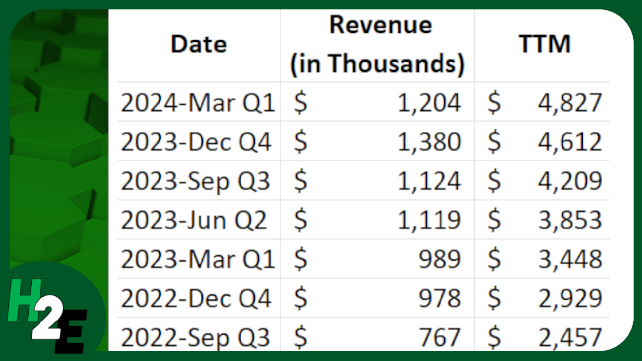
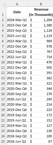
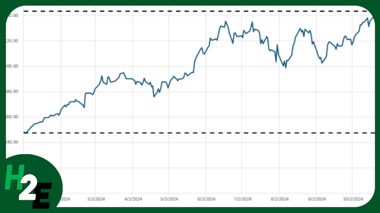
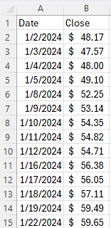
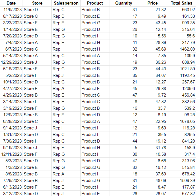
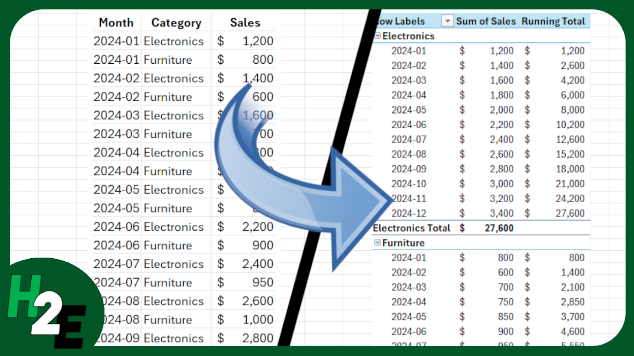
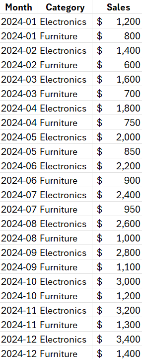
Pivot tables in Excel are useful for summarizing data. But you can do more than just simple summations and can also calculate running totals based on multiple fields. In the spreadsheet which I’ll use for this example, I have sale by month and by category.

Sales values in Excel, broken down by month and category.

Creating and setting up the pivot table

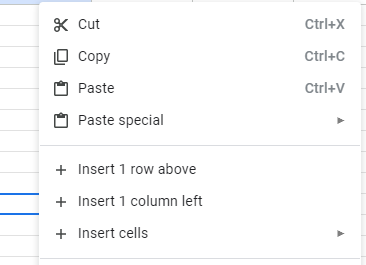
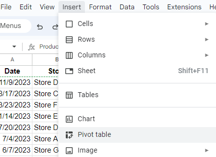
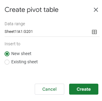
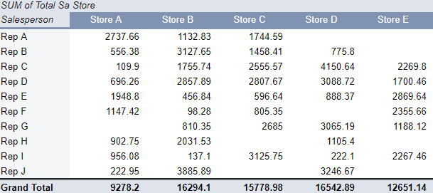
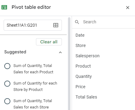
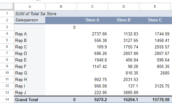
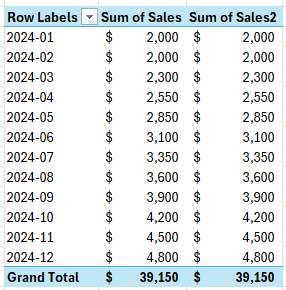
The first step is to create the pivot table. This can be done by just clicking anywhere on the data set and going to the Insert tab and clicking on Pivot Table. I’ll put the dates in the Row section and the sales field in the Values section. I’ll insert the sales field a second time so that I can have one value for the raw monthly sales alongside the running total. Here’s what it looks like thus far:

Pivot table showing sales by month with multiple value fields.

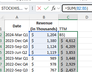
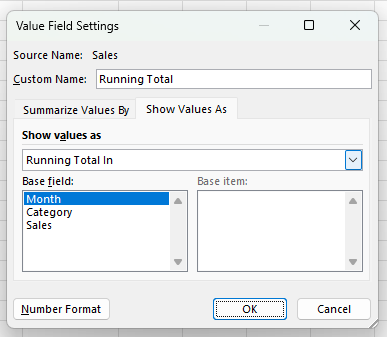
To create a running total, I’m going to right-click on the second sales column and select Value Field Settings. Next, in the Show Values As tab I’ll select Running Total In and use Month as my base field. I’ll also rename the field to say Running Total:

Creating a running total field in a pivot table in Excel.

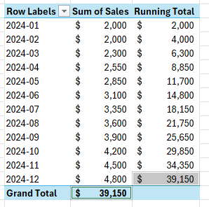
This sets up the pivot table to show my total sales alongside the running total. A good way to check to see that it is correct is to see that your grand total in the original sales field matches the last value in the running total:

Two sales fields in a pivot table showing the sales total and the running total.

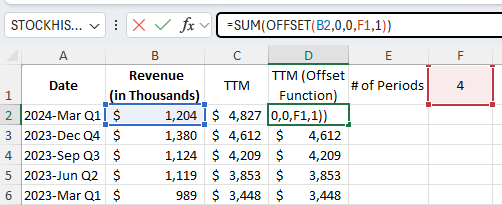
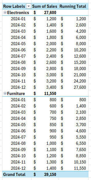
You can also have running totals reset based on the category. In my data, I have electronics and furniture sales. To break it down by those sections, I’ll add the Category field above the Month field in the Rows section. Now I have the running totals broken out by category while still tracking year-to-date values.

A pivot table showing running totals broken out by month and category.

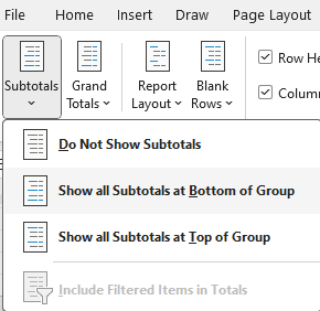
This format may be a bit confusing since the subtotals are above the data. What you may want to do is move the subtotals to the bottom of each section, so that it’s easier to compare them against the running totals to make sure they match up. To do this, click on the pivot table to activate the Design tab. Within there, there is a drop-down option for Subtotals where you can select to Show all Subtotals at Bottom of Group.

The subtotals menu options on a pivot table.

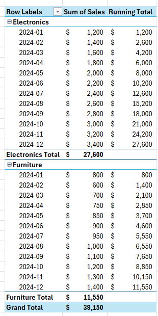
Upon selecting that option, the totals will now appear at the bottom.

A pivot table with subtotals at the bottom of a section.

If you like this post on How to Calculate Running Totals in a Pivot Table, please give this site a like on Facebook and also be sure to check out some of the many templates that we have available for download. You can also follow me on Twitter and YouTube. Also, please consider buying me a coffee if you find my website helpful and would like to support it.

TTMCalculation

Calculate Trailing 12 Month (TTM) Values in Excel

Calculating trailing-12 month values, also known as TTM, can be a powerful way to analyze financial or business data over the most recent year. This method focuses on the latest 12-month period, providing a rolling snapshot of performance or trends. Unlike calendar-based analysis, which adheres strictly to yearly or quarterly periods, TTM values are dynamic and update with each new data point. This makes them ideal for ongoing monitoring, where understanding recent trends is more relevant than sticking to predefined reporting periods.

The concept of a TTM value is straightforward: it involves summing, averaging, or otherwise aggregating data from the most recent 12 months. For instance, if you’re tracking monthly revenue, a TTM sum would include the total revenue for the latest 12 months, updating automatically as new months’ data becomes available. This ensures that you’re always working with the most current information, offering a more flexible and actionable view of performance.

Why Are 12-Month Trailing Values Useful?

Calculating TTM values is valuable in contexts where trends or seasonality play a significant role. For example, retail businesses may experience seasonal spikes during the holiday season, while other industries might have cyclical patterns tied to the economy. A TTM analysis smooths out these seasonal fluctuations, offering a clearer picture of overall performance without being skewed by short-term anomalies.

For investors, financial analysts, and business owners, this calculation can be a crucial metric. It helps in understanding key financial ratios (including price-to-earnings ratios), by providing a consistent timeframe for comparison. It also allows for benchmarking against competitors or industry averages, as trailing metrics are widely used in reporting and valuation. Moreover, it can aid in spotting trends early, such as declining sales or increasing costs, enabling proactive decision-making.

Calculating TTM Values in Excel

In the following example, I have sales data by quarter. Since they are quarters, I only need to pull the last four values to get the last 12 months worth of values.

Revenue by quarter.

In the simplest approach, you can just use the SUM function and grab the last four values from the top:

Using the SUM function in Excel to calculate trailing-12 month sales values.

By not freezing any cells and copying the formula down, it will automatically adjust so that it’s always getting the most recent four values.

You can make the formula more dynamic by using the OFFSET function. You can change the number of values you want to add up. And it can be useful if your data is at the bottom, and you want to start from the last value you input. Here’s how you can use a variable to determine how many trailing values you want to calculate.

Using a variable along with the OFFSET function to calculate TTM values in Excel.

Using the OFFSET function, you can specify the height and width of the range. In the above example, I’m using cell F1 to specify the number of periods I want to sum up.

If your most recent values are at the bottom of your range, the OFFSET function can help you with this as well. Here’s how the formula would look like:

=SUM(OFFSET(B2,COUNTA(B:B)-2,0,-4,1))

B2 is the starting reference point.

The COUNTA function counts the number of nonblank cells in column B. It is reduced by 2 since the reference point, B2, is in row 2. It needs to be reduced by 2 to get back to 0.

There are 0 columns to offset, hence the next argument is 0.

The -4 tells the formula that you want to go back 4 rows.

The 1 at the end tells the formula that it is just 1 column wide.

This produces an array, which is then summed up through the SUM function.


If you like this post on How to Calculate Trailing 12 Month (TTM) Values in Excel, please give this site a like on Facebook and also be sure to check out some of the many templates that we have available for download. You can also follow me on Twitter and YouTube. Also, please consider buying me a coffee if you find my website helpful and would like to support it.

StockHighandLow2

Add Horizontal Lines to Stock Charts to Identify Min and Max Values in Excel and Google Sheets

If you’re pulling in stock prices into your spreadsheet, you can easily plot those values on a chart. And one way to help visualize the data is to add horizontal lines to help you identify where the maximum and minimum values are. I’ll go over how this can be done in both Excel and Google Sheets.

Pulling in the historical stock prices in Excel and Google Sheets

In Excel, you can use the STOCKHISTORY function to pull in historical stock prices. And in Google Sheets, there’s the GOOGLEFINANCE function. Both are fairly straightforward functions which can extract stock prices going back days, months, and even years.

Below, I’ve pulled Nvidia’s stock price history from Jan 1, 2024 through to Oct 31, 2024, in Excel:

NVDA stock price history in Excel.

And here is the price history in Google Sheets:

NVDA stock price history in Google Sheets.

Calculating the highs and lows

In Google Sheets, you can pull in a stock’s 52-week high and low from right within the GOOGLEFINANCE function. But in this example, I’m going to calculate the minimum and maximum values based on the range that has been downloaded. This will make the chart more dynamic, allowing you to have these values updated based on your range.

In both Excel and Google Sheets, I’ll setup columns for HIGH and LOW. I’ll use the MAX function to get the highest value and the MIN function to get the lowest value. The only argument needed is the column which contains the closing price. The same value needs to be repeated in both of these columns to ensure the line is horizontal.

The formula is exactly the same whether you’re using Excel or Google Sheets. What’s important, however, is to ensure the values are the same all the way down; you’ll want to copy it all the way to the bottom. Here’s how it looks in Excel:

NVDA stock price history in Excel showing highs and lows for a period.

Plotting the values on a chart

Next, with the highs and lows added, it’s just a matter of creating a line chart which shows these values. The default formatting in Excel already does this effectively for me, displaying the high and low ranges:

High and low values plotted on a chart in Excel.

At this stage, it’s just a matter of any additional formatting you may wish to do, such as changing the line colors. I also prefer to make these dotted lines, and this can be done by changing the dash type. Here’s what my finished chart looks like in Excel:

Excel stock chart showing maximum and minimum values.

To format the individual lines, right-click to Format Data Series, where you can then change the color and the dash type. The changes I made above are to change the color to black and the lines to a dash. I have also added vertical gridlines to the chart by going to the Chart Design tab and selecting Add Chart Element and Gridlines and then clicking Primary Major Vertical.

On Google Sheets, the process is largely the same. The main difference is that you need to access the edit chart menu and under the Customize tab, select your options for gridlines, color, and dash type for an individual data series.

Google Sheets stock chart showing maximum and minimum values.


If you like this post on Add Horizontal Lines to Stock Charts to Identify Min and Max Values in Excel and Google Sheets, please give this site a like on Facebook and also be sure to check out some of the many templates that we have available for download. You can also follow me on Twitter and YouTube. Also, please consider buying me a coffee if you find my website helpful and would like to support it.

DynamicCalendar2

Dynamic Calendar Template and Organizer for Excel

Do you want to track deadlines and have an easy place to manage all your upcoming tasks and bills? In this post, I’m going to share with you my Dynamic Calendar Template. This template will allow you to input dates and create conditional formatting rules so that it’s easy to see important items on your calendar. You can also see up to five items per day and switching between different months and years, so you’ll only see items for that specific month.

How the Dynamic Calendar Template works

Everything is conveniently available in a single tab and there are no macros in this file. The calendar is on the left-hand side of the page while the events and important dates you input are on the right.

Dynamic calendar template in Excel.

Today’s day will automatically highlight in yellow. To add events, all you need to do is input a date, a description for the event, and you can also specify a flag (conditional formatting rule) that you want to apply to that item. In the example below, I’ve setup events for Nov. 28 and Nov. 29.

Dynamic calendar template with multiple events entered in.

Since I’ve set flags for the specific events, they are highlighted accordingly in my calendar. You don’t need to specify a color, but it is not necessary to do so.

You can also change the dates for the calendar by adjusting the month and year options in-between the calendar and the events table. If the events don’t relate to a specific month, they won’t appear on your calendar. This way, you can add many events far into the future and they won’t appear on your calendar until you are viewing that specific month and year.

You can download the free template available here.

Use the premium version for multiple calendars and recurring events

There is also a premium version available for this template which will allow you to use macros to generate recurring events. And you can also add multiple calendars. If you want to balance personal, work, family, and other types of calendars, you’ll be able to do that with this template. On the main calendar tab, there is an additional drop-down option where you can specify which calendar you want to use, in addition to setting the month and year.

Dynamic calendar template with multiple calendars to choose from.

On this template, there is a separate sheet for inputs, where you can add to the list of calendars and when entering events, you can include which calendar you want to use. To setup recurring events, I can create the events that I want to setup and specify how many events I want to generate in advance. And upon clicking the macro button, it will add them to the events table.

The recurring events section of the Dynamic Calendar template.

After clicking Generate Recurring Events, the events table is now populated with events for the next 12 occurrences. Since, in this case, they occur every 12 months, it will add the annual occurrence for the next 12 years.

Setting up recurring events in the Dynamic Calendar template.

Once the events are created, the value for the # of events to generate resets back to 0. The macro will only create instances when this value is filled in, the avoid creating extra events.

The recurring events section of the Dynamic Calendar template with events to generate set to zero.

You can, however, remove any events by just right-clicking on the events listed and selecting Delete Table Rows.

Deleting events from the Dynamic Calendar template.

Now, when going back to the calendar and adjusting the date to July 2025, the first even will appear.

The Dynamic Calendar template showing for July 2025.

If you are interested in purchasing the premium version, please visit the product page here.


If you like this Dynamic Calendar Template, please give this site a like on Facebook and also be sure to check out some of the many templates that we have available for download. You can also follow me on Twitter and YouTube. Also, please consider buying me a coffee if you find my website helpful and would like to support it.

sddefault (2)

How to Import Tables From Wikipedia Into Excel

You can import a lot of different data into your Excel spreadsheet. In this post, I’ll show you how you can get tables from Wikipedia both manually and with the help of Power Query. For this example, I’m going to use the page for the largest fast food restaurant chains. The data is sorted in a table, making it ideal to import into Excel.

How to import a Wikipedia table into Excel by copying and pasting

1. Copy and paste the values. Since the data is easily organized in Wikipedia, you can just use your mouse to drag, and copy and paste everything into Excel. The hardest part is just to make sure you’ve selected everything you want to copy.

Here is how the data looks after you’ve removed formatting:

Wikipedia table showing fast food restaurants and the number of locations.

Pro tip: if you have the latest version of Excel, you can use CTRL+SHIFT+V to copy the values without any additional formatting.

2. Remove the comments and values in brackets. In Wikipedia tables, you’ll often see references and notes after values. To remove this, you can use find and replace in Excel to get rid of the values. Set it up so that you replace [*] with nothing. The asterisk will remove everything which comes between the brackets, as well as the brackets themselves.

Replacing values in brackets with blanks.

You can repeat these steps if there are any values in parentheses ( ) as well and any other special characters. After these steps, your data should look much cleaner. The downside is that it may take multiple adjustments to get the data cleaned up correctly and for all the issues to be accounted for.

Wikipedia table showing fast food restaurants with data cleaned up.

Import Wikipedia tables using Power Query

Another way you can import tables is with the help of Power Query. Here’s how you can do that:

1. In the Data tab, select From Web and copy the link and press OK.

Using Power Query to import a web page.

2. Select the table which resembles the data you want to import. Oftentimes there can be multiple tables, so it can be a good idea to cycle through them to see which one is the best match for your data. Then hit the button to Transform Data.

Selecting the table to import in Power Query.

3. Remove any unneeded columns. To remove columns in Power Query, right-click on the headers and select Remove.

Removing columns in Power Query.

4. Clean up the data. You can use the Extract option in Power Query to grab values that come before a specific character. This is similar to the find and replace function but it can remove everything before a value:

Using the Extract function in Power Query.

Here you can specify the opening parenthesis as the character. You can repeat this step for brackets and other characters as well. This type of find and replace can also be done within Excel by just using *( to grab everything before the opening of a parentheses or *[ before an opening bracket.

Using text before delimiter in Power Query to pull values before a specified text.

Then, convert the values to Whole Number to ensure they are formatted correctly. If they aren’t, you’ll see some error values, in which case you’ll have to go back to the previous step to correct them. Otherwise, you are done and ready to move on to the last step.

5. Load the data back into your Excel spreadsheet. For this step, all you need to do is click on Close & Load on the Home tab.

The Close and Load button in Power Query.

Your formatted table is now loaded into Excel:

A Wikipedia table downloaded and formatted into Excel using Power Query.

The benefit of using Power Query is that it saves your steps just like a macro would. If you want to refresh the data and download it again, to check for updated information, you can just right-click on the table and select Refresh.


If you like this post on How to Import Tables From Wikipedia Into Excel, please give this site a like on Facebook and also be sure to check out some of the many templates that we have available for download. You can also follow me on Twitter and YouTube. Also, please consider buying me a coffee if you find my website helpful and would like to support it.

sddefault (1)

How to Print Graph / Grid Paper in Excel

An Excel spreadsheet has lines and displays like a grid. And rather than buying graph or grid paper, you can print it out yourself and customize it. Below, I’ll show you how.

How to create your own graph and grid paper in Excel

1. Select all the cells in your spreadsheet. You can do this by using the CTRL+A shortcut.

2. Adjust your column width. Right-click any column header and re-size the column width to 2. You can make this smaller or larger if you prefer.

Adjusting the column width in Excel.

3. Select the PDF printer. Go to File -> Print and select Microsoft Print to PDF.

4. Modify the margins. Instead of Normal Margins, select Custom Margins. Set the margins all to 0 to maximize the space on your sheet. Also, on the margins page, select the options to center your page both horizontally and vertically.

Modifying the margins in Excel.

5. Select the cells on the main tab. Go to the View tab and select Page Layout to see what an entire page will look like. Select all the cells for that initial page.

6. Adjust your borders. On the Home tab, select the drop-down option for borders and select More Borders.

Modifying borders in an Excel spreadsheet.

Here you can adjust the color and look of your gridlines. Although Excel looks like it has gridlines on the cells, they won’t actually print out until you do this step and actually format them. I prefer to use a moderate grey color so that the outline isn’t too dark or too light.

Applying border formatting to cells in Excel.

6. Save the file as a PDF. By saving the gridlines how you want, you now have a graph paper template which you can re-use to print out whenever you need to. If you want 1 page or 100, you can just create as many copies as you need.

The benefit of setting up your own grid paper is that you can customize it so that it looks just how you want. For example, you could decide to highlight certain cells a specific color and apply different types of formatting to suit your needs.


If you like this post on How to Print Graph / Grid Paper in Excel, please give this site a like on Facebook and also be sure to check out some of the many templates that we have available for download. You can also follow me on Twitter and YouTube. Also, please consider buying me a coffee if you find my website helpful and would like to support it.

sddefault (1)

How to Create a Secondary Axis in Google Sheets

If you want to create a chart in Google Sheets that displays different kinds of data, you may benefit from using a secondary axis. If you just use a single axis, that may not be ideal as depending on the scale, your data may not display correctly if the values are either too large or too small for a series.

In the chart below, I have data which shows actual sales numbers along with year-over-year growth rates. They are plotted with just a single axis being used. As you can see, it becomes difficult to see the growth rate because the values are so low.

Chart showing Netflix's sales data and growth rate.

The right line for the growth rate is barely visible at the bottom. Since the growth rate is in percentages, the values will be fairly small (less than one), hence they are only slightly visible. To fix this, I need to adjust the axis the growth rate shows on. Here’s how to put that series on a separate axis:

  • Select the chart, click on the three dots in the right-hand side, and select Edit
  • Click on the Customize tab and go under Series
  • Select the series you want to put onto another axis. In my example, it is the growth rate.
  • At the bottom, change the Axis selection from Left axis to Right axis
Changing a series axis in Google Sheets.

That’s it, now the growth rate shows more clearly and I can see the related axis on the right-hand side of the chart.

Chart showing Netflix's sales data and growth rate with a second axis.

You may also want to display the series differently, such as showing by dashes rather than a straight line, but that is an optional step. To make changes to an individual series, simply select the series as you did when changing the axis, and make changes in that same screen. In the chart below, I’ve simply changed the line so that is shows as a dash:

Chart showing Netflix's sales data and growth rate with a second axis and a dashed line.

For another example of how to add a secondary axis, check out the below video:


If you like this post on How to Create a Secondary Axis in Google Sheets, please give this site a like on Facebook and also be sure to check out some of the many templates that we have available for download. You can also follow me on Twitter and YouTube. Also, please consider buying me a coffee if you find my website helpful and would like to support it.

sddefault (1)

How to Use Compare Mode in Google Sheets

If you’re creating a chart on Google Sheets, there’s a really useful feature you can use which makes it easy to compare values, and that’s compare mode. In this post, I’ll go over how to use compare mode and how it can help you easily compare results in your charts. Here’s a sample data set I’ll use for this example, which shows excerpts from Nvidia’s annual earnings numbers:

Key earnings data from Nvidia.

These figures are all in billions and I’m going to plot them on a simple chart in Google Sheets to help display these values. This what a simple line chart showing these values looks like in Google Sheets:

Line chart in Google Sheets showing Nvidia's financial numbers from the past few years.

While the chart is easy to see, it can be challenging to see what those numbers are without the use of a data table. And using labels would be too cluttered. The best solution here is to use compare mode.

How to turn compare mode on in Google Sheets

To activate compare mode, select the chart in Google Sheets. Then, select Edit Chart and under Customize, select the option for Chart Style and then check off Compare Mode:

Enabling compare mode in Google Sheets.

Now, with compare mode enabled, you can easily see the values for each year. First, click away from the chart and then click back on it, to activate it again. Then, you when you hover over a data point, you will see all that data points which relate to that year:

A Google Sheets chart with compare mode activated.

This saves me the trouble of having to try and estimate what the values are and avoids having to use a data table or labels. And as I hover over different data points, I’ll get the updated values for each year.


If you like this post on How to Use Compare Mode in Google Sheets, please give this site a like on Facebook and also be sure to check out some of the many templates that we have available for download. You can also follow me on Twitter and YouTube. Also, please consider buying me a coffee if you find my website helpful and would like to support it.

sddefault

Quickly Add Rows and Columns in Google Sheets

Google Sheets is a powerful and versatile tool for managing data, whether you’re tracking expenses, analyzing survey results, or organizing information for a project. One of the fundamental skills you need to master is adding rows and columns to your spreadsheet. This guide will walk you through how you can quickly add either rows or columns to provide you with enough room for your data set.

How to Add Several Rows or Columns at Once in Google Sheets

You can add an extra row or column in Google Sheets by just right-clicking on any cell in your spreadsheet and selecting to either Insert 1 Row Above or Insert 1 Column Left:

Menu in Google Sheets to add rows and columns.

Since you’re adding an entire row or column, it doesn’t really matter which cell you select in your spreadsheet. But you might need to add more than just a single column or row. What if you wanted to add 20 columns, or 20 rows? In that case, simply select that many rows or columns and right-click to select whether you want to add columns or rows. In the below example, I’ve selected 20 rows and columns, and now I have the option to add that many as well:

Menu in Google Sheets to add 20 rows and columns.

If you want to add a lot of rows, there is an easier way to do this than selecting how many rows you want to add.

How to Input the Number of Rows You Want to Add

You can specify how many rows you want to add by just going to the bottom of your Google Sheets spreadsheet. By using the shortcut CTRL+DOWN two times, that will get you to the bottom of your sheet and you’ll see an option to enter in the number of rows you want to add:

Input to add more rows in Google Sheets.

Although the default is set to 1,000 you can add more or less than that. But if you specify a large number, it may take some time for those rows to get added.

How to Add Many Columns in Google Sheets

Unfortunately, going to the right-most column of the screen, you don’t get a similar option to specify how many columns to add. This is likely because adding a lot of rows is going to be more common for users than just adding columns; spreadsheets are more often going to be expanding vertically rather than horizontally.

The quickest way to add a lot of columns is to select all your cells using the CTRL+A shortcut and then adding as many columns as you have on your spreadsheet. This will effectively double the number of columns you have. You can repeat these steps to continue doubling until you have enough columns.

Important Note About Large Google Sheets Files

Before you try and create a Google Sheets spreadsheet with 100,000 rows, be careful because you may notice performance issues when your file gets too large. If you have an extremely large data set, you may still be better off using Excel for that purpose as opposed to Google Sheets. Handling large amounts of data isn’t ideal in a Google Sheets spreadsheet as it can take a while to make changes, and that can slow down your machine and the page may even crash.

While Google Sheets can be a great way to share information and data between users, I wouldn’t suggest trying to use it as a replacement for Excel, especially if you work with significantly large data sets (e.g. tens of thousands of rows long). It may work depending on the complexity of your file but you may want to test out the performance before relying on Google Sheets entirely.


If you like this post on How to Quickly Add Rows and Columns in Google Sheets, please give this site a like on Facebook and also be sure to check out some of the many templates that we have available for download. You can also follow me on Twitter and YouTube. Also, please consider buying me a coffee if you find my website helpful and would like to support it.

sddefault

Create an Automatically Updating Pivot Table in Google Sheets

Did you know you can create a pivot table in Google Sheets which automatically updates as you add data to it? Remarkably, it’s an easier process than in Excel where you would need a macro or where you might need to right-click on the pivot table and select to refresh the data. Here’s how we can go about creating a pivot table in Google Sheets, and having it automatically update.

Creating a pivot table in Google Sheets

For this example, I’m going to use the following data for my pivot table:

A table in Google Sheets.

To create a pivot table with this range, all I need to do is, with a cell selected, to go to the Insert menu and click on Pivot Table

Inserting a pivot table in Google Sheets.

As long as you have a cell selected on your data set, Google Sheets will automatically detect your range. If it looks correct, you can just select whether you want it to be placed in a new sheet or an existing sheet, and then click on Create.

Selecting where to create a pivot table.

The next part is to setup the pivot table and ensure that the value section contains values and you have something in either the rows, columns, or filters sections to summarize your data. In my example, I’m going to summarize my data by rep and store:

A pivot table in Google Sheets.

The pivot table is setup but the problem is it won’t automatically update. Here’s how we can fix that.

Setting up your pivot table so that it automatically updates in Google Sheets

The problem with this pivot table lies with the range. While Google Sheets correctly detected a range, it also set it to a specific number of rows. My data set went up to row 201 as it contained 200 rows of data. But if I add more data, my pivot table won’t automatically expand. To get around this, I need to adjust my pivot table range.

With my pivot table selected, I can see the range that it references in the Pivot table editor pane:

The pivot table editor pane in Google Sheets.

If I add another row of data, I can adjust this range so that it goes from A1:G202. But this would be a very tedious task if every time I added data I needed to remember to adjust the range. Instead, what I can do is adjust my range so that it references entire columns. By doing this, Google Sheets will automatically detect the size of my data set. In this example, I just need to set my range to A:G:

Changing the range in the pivot table editor.

Now my pivot table will include a blank value under the Salesperson field as well as a blank store value.

A pivot table in Google Sheets which includes entire columns.

To fix this, what I can do is hide row 3 and column B, since these ranges contain the blanks. And as long as the blank values always appear first, this can be an effective way to hide the data, even if the pivot table expands.

A pivot table with the empty rows and columns hidden.

If you like this post on How to Create an Automatically Updating Pivot Table in Google Sheets, please give this site a like on Facebook and also be sure to check out some of the many templates that we have available for download. You can also follow me on Twitter and YouTube. Also, please consider buying me a coffee if you find my website helpful and would like to support it.