Euro2024Template

Free UEFA Euro 2024 Prediction Template and Schedule

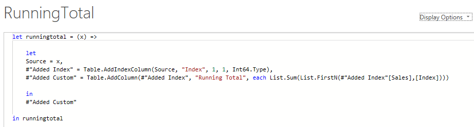
The UEFA Euro 2024 tournament is beginning in June 2024. And whether you want to track the games, make predictions, or just print out a schedule that highlights the games you want to track, this template has you covered. Below, I’ll go over how the template works, how to use it, and where you can download it.

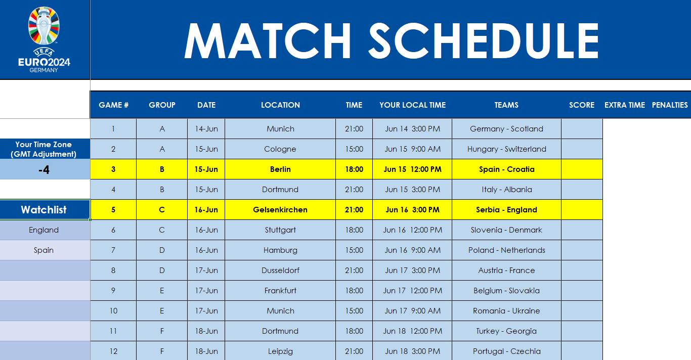
Tracking the games in your time zone

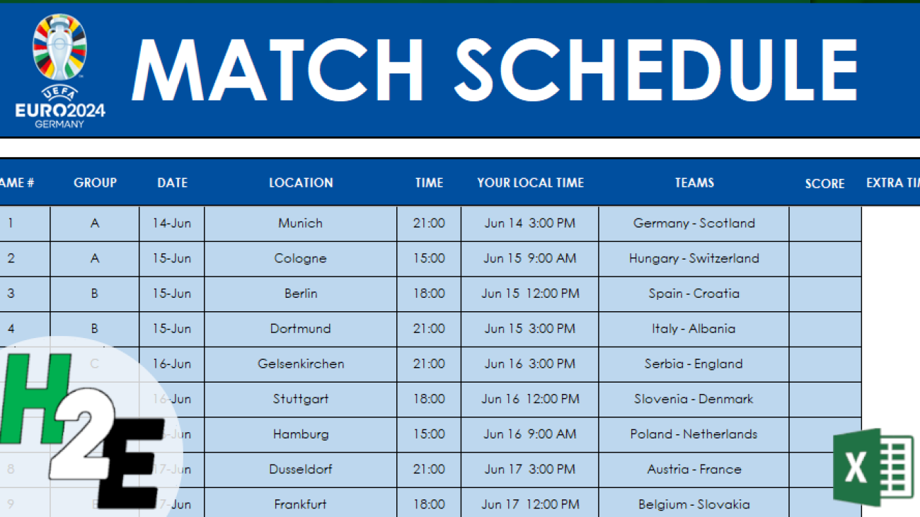
The template has a schedule of all the games in the tournament. And you can adjust the schedule by entering your time zone adjustment (e.g. for -4 GMT you would enter -4 whereas if you are +10 then you would enter just a positive 10). Based on that, the column for your local time will update to show what time the game is in your part of the world.

Euro 2024 match schedule showing games in a user's time zone.

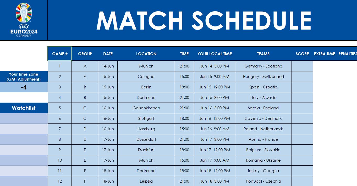
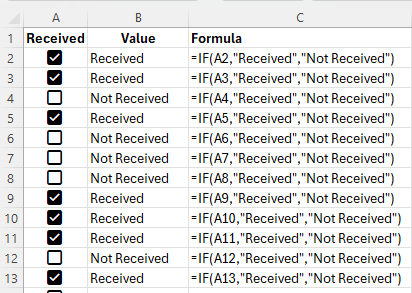
You can also track the teams you want to keep an eye on by entering them in the Watchlist area. In the following example, I’ve flagged matches involving England and Spain:

Euro 2024 match schedule showing highlighted games.

Entering scores and updating the results

You can also enter the scores as the games, and that will update the standings and determine the round of 16 and other elimination games. In the elimination games, if the score is tied, you can enter in extra time scores and penalties.

While there are tiebreakers setup in the template which should handle the vast majority of scenarios, there are also sections where you can override the standings for both the individual tables and for the third-place rankings. If you’re applying overrides, you’ll need to fill in the entire group standings, such as below:

Applying overrides for the table standings.

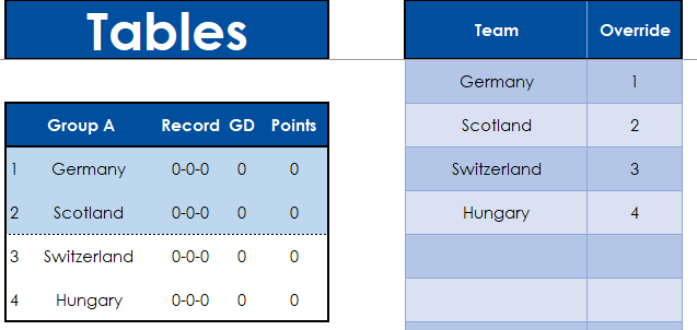
In the override column, I’ve specified the position for each team, and the table for the group also reflects that.

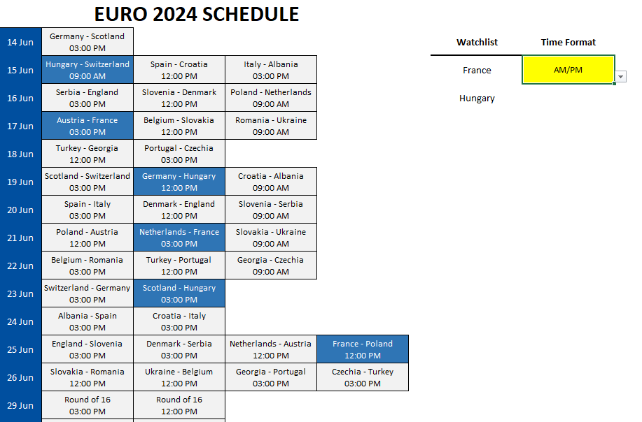
Printing out a schedule tracking multiple teams

On the Printout tab, there is a schedule that you can print out on a single page. This too, will automatically adjust based on the GMT value you entered on the Actuals tab. You can specify whether you want the time to show in AM/PM format or as a 24-hour clock. And here too, you can have a watchlist to help highlight teams you want to track.

Printing out a schedule to track individual teams.

Entering and tracking predictions

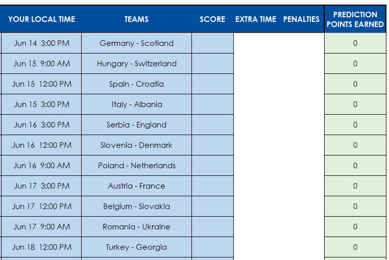
This template has, by default, five tabs created for predictions: Player1, Player2, Player3, Player4, and Player5. In each of these tabs, you can enter your predictions by entering your expected results. There is an extra column for Prediction Points Earned which will tell you how many points you earned for that particular prediction.

Predictions tab by player.

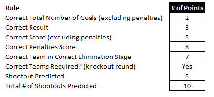
This is based on the scoring rules you specify on the Scoring.rules tab.

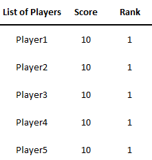
To compare how you have performed against other people, go to the Scoring.Results tab. Here, you’ll just need to update the list of players. Instead of Player1, Player2, etc., you can change this to represent actual names. You can also add more players/predictions by simply creating a copy of the player tabs.

Prediction results summary.

Note: you will see a #REF! error on the results tab if you have changed the tab name but you have not changed the list of player names on the Scoring.Results tab.

Download the template

The template is available to download here. There is also a Google Sheets version which works the same way, which is available here.

If you have any feedback, suggestions, or come across any issues, please let me know.


If you like this Free UEFA Euro 2024 Prediction Template and Schedule, please give this site a like on Facebook and also be sure to check out some of the many templates that we have available for download. You can also follow me on Twitter and YouTube. Also, please consider buying me a coffee if you find my website helpful and would like to support it.

MultipleLineChartsGrowthvsActual

Create Multiple Line Charts in Excel Showing Actuals and Growth Rates

A line chart in Excel can be a great way to display a time series in Excel. But did you know that you can show a series’ actual values along with the year-over-year growth rate, or change? By using a second axis and adjusting the scales, I’ll show you how you can create this effect in Excel.

Setting up the data

For this example, I’m going to use the personal savings rate as an example, specifically, to show what it was from 2017 until the end of 2019, and how much it changed. The raw data shows me the savings rate per month:

Personal savings rate by month, shown in Excel.

To calculate the year-over-year change, I’ll add a formula to determine the difference. In this case, I’m going to show the change in percentage points. To do this, all that’s necessary is to take the current month’s savings rate and deduct the savings rate from the same period last year.

Personal savings rate by month along with the percentage change, shown in Excel.

Plotting the data into a line chart

Next, after selecting one of the data points, I can go into the Insert tab to select a chart. To balance both of these line charts, it’s important to put each series on a different axis. When selecting a chart, got to the Combo section and have line charts selected for each series, but put one on a Secondary Axis.

Plotting line charts on multiple axis.

Right now, the line charts are still a bit too close together:

Two line charts displayed in Excel.

To create more a buffer, the next thing I’ll do is adjust the axis scales. This can be done by right-clicking on an axis and selecting the option to Format Axis. The key is to stretch one axis so that it doesn’t overlap with the other one. For the orange line chart (showing change), I can adjust the scale so its minimum value is -10 and the maximum is +30. This pushes the line chart down to within a fairly narrow range.

Two line charts showing on two different axis.

Next, I’ll add some data labels to show the values. I’ll also adjust the savings rate so it starts at the same point as the line showing the year-over-year change. Now, it’s easier to see both the actual savings rate and the change, displaying both the actual and the year-over-year change.

Two data series in Excel plotted on line charts showing the growth rate and the actuals.

If you like this post on how to Create Multiple Line Charts in Excel Showing Actuals and Growth Rate please give this site a like on Facebook and also be sure to check out some of the many templates that we have available for download. You can also follow me on Twitter and YouTube. Also, please consider buying me a coffee if you find my website helpful and would like to support it.

StaticDateStamps

Adding Static Timestamps in Excel Using Checkboxes

One way to enhance your spreadsheets is by adding checkboxes. Using checkboxes, you can make data entry easier for your users. And you can create formulas based on whether a checkbox is checked off or not. In the latest version of Excel, using Microsoft 365, it’s easier than ever to create multiple checkboxes in just seconds. And using checkboxes, you can also create timestamps that won’t change.

How to add checkboxes to your Excel spreadsheet in seconds

In Excel’s latest version, a checkbox can be added right from the Insert tab on the ribbon. Simply clicking on the checkbox button will insert a checkbox into your spreadsheet. To insert multiple checkboxes at once, first select all the cells which you want to contain checkboxes. Then, click on the checkbox button. The cells will now be filled with checkboxes.

Using checkbox selections in formulas

If a checkbox is selected, its value becomes TRUE, and FALSE if it is unchecked. Using an IF function, I can create a formula to check whether the value is TRUE or not, and based on that, determine the output. In the following example, I use checkboxes to determine if something has been received. If it is checked off, then the value is “Received” and if it’s not, then it will say “Not Received”

Excel spreadsheet using checkboxes to determine if something was received or not.

The formula is a straightforward and can be used to track whether something has been processed or not.

Creating a static timestamp in Excel using a checkbox

Let’s use a more complex situation in Excel, such as when we want to lock in the time of when someone received the order, not simply whether or not they received it. This involves a bit more complexity and we’ll need to allow for some circular references in this case, which is usually a no-no in Excel.

Here’s how we can get this scenario to work. Assuming the checkboxes are still in column A, the formula for cell B2 would be as follows:

=IF(A2,IF(B2=””,NOW(),B2),””)

The first argument in the IF statement checks to see if the checkbox is selected. It looks at A2 to see if it returns a value of TRUE or FALSE. Since it is a boolean argument, it is not necessary to state A2=TRUE; that goes without saying in this example.

If that condition is met, we move on to the next IF function. This one checks if B2 (the current cell, and thus, creating a circular reference) is blank. If it is, then the current date and time would be inserted with the NOW function. If it isn’t blank, then the value in B2 would remain as it is. And if the checkbox is A2 isn’t checked off at all, the value in B2 will be blank.

This formula initially won’t work and will give you an error stating that you’ve created a circular reference. To fix this, you need to allow for Iterative Calculations. This will ensure that Excel stops calculating after a certain number of attempts and take the last value. To activate this, go into Excel Options and under Formulas, select to Enable iterative calculation:

Enabling iterative calculations in Excel.

You can leave the default number of iterations. Now, your formula will calculate without the circular reference error. And when you check off boxes, the timestamps will all remain static until the checkboxes become unchecked again.

Checkboxes in Excel showing the time received.

In the above screenshot I only show time, but that’s because I have formatted it to only show time. Since the NOW function contains both date and time, you can choose to show both, or just time or date individually.

The drawbacks of iterative calculations

Before you enable iterative calculations, however, you should consider the risks with doing so:

Performance Issues. Iterative calculations can significantly slow down Excel, especially in large and complex worksheets. Excel has to repeatedly recalculate formulas until either the maximum number of iterations is reached or the difference between the results of two calculations is below a certain threshold. This can be particularly noticeable if the workbook contains many formulas or data points.

Accuracy and Precision. The result of an iterative calculation can depend on the maximum number of iterations and the maximum change settings. If these are not appropriately set, the result may be inaccurate or not precise enough for your needs. This is because the calculation stops once the set limits are reached, not necessarily when the correct or most accurate result is found.

Risk of Other Circular Reference Errors. While iterative calculations allow you to use circular references intentionally, they also increase the risk of unintended circular references. Unintended circular references can lead to errors and incorrect data, making it difficult to debug and correct issues within your workbook.

Compatibility Issues. If you share your Excel workbook with users who have iterative calculations disabled, or if the workbook is opened in a different spreadsheet program that doesn’t support iterative calculations, the intended functionality may not work correctly. This can lead to errors or data inconsistency.

Potential for Infinite Loops. Incorrectly configured iterative calculations can lead to infinite loops, where Excel continuously recalculates without reaching a conclusion. This can cause Excel to freeze or crash, potentially leading to data loss if changes haven’t been saved.

As long as you understand the risks of enabling iterative calculations, they can help you in setting static date and time stamps in Excel.


If you like this post on Adding Static Timestamps in Excel Using Checkboxes please give this site a like on Facebook and also be sure to check out some of the many templates that we have available for download. You can also follow me on Twitter and YouTube. Also, please consider buying me a coffee if you find my website helpful and would like to support it.

ProgressChart

Create Progress Charts in Excel

Whether you’re managing projects or working towards a goal, visualizing progress is important to ensure you’re on track for meeting your target. And by using charts in Excel, you can easily track your progress, making it easy for you to view and share it with your stakeholders. This post will walk you through the steps to create insightful progress charts in Excel.

Using a bar chart to track progress

One example where you might want to track progress is if you’re tracking how much progress a sales rep may be making with a customer account. You may have various stages in the process, such as making an initial contact, obtaining an in-person interview with management, all the way to getting a signed and approved contract. Rather than having someone verbally track this progress for you, you can use a combination of checkboxes and charts to help visualize progress.

With the help of Excel’s checkboxes, we can create a table which looks like this, making it easy to simply tick off boxes to indicate progress by prospect:

Table showing sales rep progress by prospect.

This table, while it’s helpful, isn’t easy to visualize the progress. Using a COUNTIF function, we can count the number of times a checkbox is set to TRUE. With 6 possible values, if there are 6 checkboxes ticked off, that tells us the sales rep has fully completed all the stages in the funnel and the deal is now closed. By then dividing this number by 6, we can numerically display the percentage of completion:

Table showing sales rep progress by prospect along with a percentage of completion.

Now, this data can be put into a chart, which displays those percentages.

Progress chart showing a sales funnel's percentage of completion.

Another way to display this progress is by adding another field, simply to show the total number of stages. Then, we can plot on a chart the # of checkboxes that have been ticked off, along with the number of total stages.

Progress chart showing overlapping bar charts to indicate the level of progress.

To make this work, make sure you do the following:

  • Select both the series for the # of checkboxes ticked off, and total stages. When selecting the data, make sure that the the field which contains the total is on top, in the legend entries.
  • Format the data series and ensure that series overlap is set to 100%. This way the bar charts will completely overlap with one another.

Creating a circle progress chart

Bar charts can be effective when you want to track multiple projects and tasks at once. But if you want to track just one project individually, or your overall total progress, then a circle chart may be more effective for that purpose.

Going back to the previous example, let’s suppose we want to track the progress of one prospect at a time. Company A is at 83%. Here’s how we could show that on a circle chart. We can display the information in the following way, to show what the progress is, in both raw numbers and as a percentage

Excel table showing progress and remaining percent.

By setting it up this way, we can now create the following donut chart in Excel:

Donut chart in Excel showing the level of progress.

With the percent %, I used that as a data label to put within the middle of this chart.

Using a donut chart, you can easily set up progress for one particular project. But it doesn’t have to be for just one particular item; this can also be part of a greater set of key performance indicators.


If you like this post on How to Create Progress Charts in Excel, please give this site a like on Facebook and also be sure to check out some of the many templates that we have available for download. You can also follow me on Twitter and YouTube. Also, please consider buying me a coffee if you find my website helpful and would like to support it.

Amortization calculator which calculates values for a specific period.

Create an Amortization Calculator in Excel

Amortization schedules are essential tools for anyone managing a loan or mortgage, providing a clear breakdown of how payments are allocated towards interest and principal over the loan’s term. Typically, these schedules detail each payment’s date, the interest portion, the principal portion, and the remaining balance, offering borrowers insight into the precise cost of borrowing over time.

Creating an amortization schedule in Excel can be a time-consuming process, but with the help of some advanced payment functions, you can expedite the process and even eliminate the need for creating an entire amortization table.

Generating the key components of an amortization schedule

Whether you’re creating a full-blown amortization schedule or just want to calculate the balance at a future point in time, you’ll need to know the following values before you can begin:

  • the loan value,
  • the interest rate and compounding,
  • the number of periods, and
  • the start date of the loan

Suppose you have a $500,000 loan with a 5% interest rate, which is for a period of 10 years, and that payments are made on a monthly basis. Given this information, you can start by calculating the monthly payment amount. Here’s what the inputs would look like for the PMT function:

=PMT(0.05/12,10*12,-500000,0) = 5,303.28

This assumes compounding to be monthly, hence the need to divide the interest rate by 12. And the negative 500,000 balance tells the function that this is an amount owing and that it will reduce over time. The following argument, 0, is to signify that the future value is 0.

There is also an additional argument, for whether the payments are made at the beginning or the end of the period. The default is set to the end of the period. If payments are made at the beginning, then the final argument is set to 1. If the payment is at the start, then the payment value would change to $5,281.27, assuming all the other values remain the same. But for the purposes of these examples, we’ll assume payments are made at the end of the period.

Creating a calculator for specific month’s calculations

Now that you have all the necessary variables, including the payment amount, you can start to create the calculator.

In this first case, we’ll look at how to calculate values for just a specific period. Let’s assume the loan’s start date is January 1, 2024. And let’s assume we want to calculate what the balance, interest, and principal payment amount will be for the month of Dec 2025.

How to calculate amortization amounts for a specific period:

1. Start with calculating the period number. One function that can help with this is the DATEDIF function. By using it, you can quickly calculate the difference between two time periods. Here’s how it would work in this example:

=DATEDIF(“1/1/2024″,”12/1/2025″,”m”) = 23

Two full years have not fully elapsed until we get to 1/1/2026. But since we want to calculate the values for the 24th month, we’ll need to add 1 to the equation. The formula to calculate the current period will be as follows:

=DATEDIF(“1/1/2024″,”12/1/2025″,”m”)+1

2. Calculate the interest payment for the period. To get the interest amount, use the IPMT function:

=IPMT(0.05/12,24,120,-500000) = 1,760.19

3. Calculate the principal amount paid down during the period. In this case, we can use the PPMT function. It is the same setup as the previous formula:

=PPMT(0.05/12,24,120,-500000) = 3,543.08

4. Calculate the ending value as of that period. Using the FV function, here’s the formula to get the ending balance as of the end of Dec 2025:

=FV(0.05/12,24,5303.28,-500000) = 418,902.68

By using these functions, you no longer need to make an entire amortization schedule. You can simply do a calculation for the period you need to sum up the values for. By creating inputs for the start of the loan, loan amount, interest rate, # of periods, and the period you want to calculate for, you can setup an amortization calculator as follows in Excel:

Amortization calculator which calculates values for a specific period.

Calculate amortization values for a specific range

Suppose you wanted to calculate the interest and payment values for all the months in 2025. This can be a bit trickier since we aren’t calculating amounts for just a single period anymore. Instead, we need to get a range of values.

How to calculate amortization amounts for a specific multiple periods:

Step 1. Get the correct period numbers. Let’s assume the loan began on June 1, 2023. We need to get the starting period number, which is Jan. 1, 2025. This can be done with the DATEDIF function:

=DATEDIF(“6/1/2023″,”1/1/2025″,”m”)+1 = 20

This tells us that January is the 20th month of the loan. If January is the 20th month, then that also means if we add 11, that December will be the 31st month of the loan. Thus, our range of periods is 20 through 31. You could, however, use the DATEDIF function to do the calculation for that period as well.

Step 2. Calculate the interest payments for the year. Now that we know the periods we need to calculate the interest for, we can use the CUMIPMT function:

=-CUMIPMT(0.05/12,120,500000,20,31,0) = 20,851.88

The present value cannot be set to negative for the cumulative function, or else you will get an error. To adjust for this and avoid a negative value, simply add a dash before the function to ensure the result is flipped from a negative value to a positive one.

Step 3: Calculate the total of the principal payments made during the period. To calculate the principal paid during the period, we can use the CUMPRINC function. The inputs are the same as that of the cumulative interest payment calculation:

=-CUMPRINC(0.05/12,120,500000,20,31,0) = 42,787.43

Step 4. Get the ending period’s balance. Just as with the previous section, we can use the same FV calculation to get the ending balance. This time, it will be for period 31.

=FV(0.05/12,31,5303.28,-500000) = 393,684.23

Here is how the calculator could be setup to make these calculations based on a range.

Amortization calculator which calculates values for a specific range.

You can download the amortization calculator I have created from these examples here.


If you liked this post on How to Create an Amortization Calculator in Excel, please give this site a like on Facebook and also be sure to check out some of the many templates that we have available for download. You can also follow us on Twitter and YouTube.

MovingAveragesinExcel

What Is the Difference Between a Moving Average and an Exponential Moving Average

Moving averages can be useful in data analysis, when looking at trends both in finance and in the stock market. You can look at 30, 60, 90 day trends, and even longer or shorter durations. There’s also a difference between whether you are looking at a simple moving average and an exponential moving average. In this article, I’ll go over the differences between the two, and show you how you can calculate them in Excel.

How to Calculate a Moving Average (MA) in Excel

A moving average is a simple tool used by investors and traders to smooth out price data over a specified period. It is called “moving” because it is continually recalculated based on the latest data, providing a dynamic view of an asset’s average price over time. The advantage of an MA is its simplicity as it can easily be calculated.

A moving average is calculated by simply taking the average of the trailing periods. In the case of a 60-day MA, you would look at the average over the past 60 days. If it’s a 90-day MA, then you average the past 90 days. In the following example, I have the price of Bitcoin over the past few years. Ideally, when setting up moving averages, you want your dates in ascending order, going from oldest to newest.

Price of Bitcoin in an Excel spreadsheet.

Here are the steps to calculate the moving average:

  1. Determine the number of periods you want to go back. For 5 days, it will be 5, for 10 days it will be 10, and so on.
  2. Calculate the average in the adjacent column. Make sure you do not freeze cells.
  3. Copy the formula down so that the average moves (hence why you do not want to freeze cells).

Here is what the values look like, along with the formula for each cell:

20-day moving average of Bitcoin in an Excel spreadsheet.

The average is continuously moving with each cell, but it always contains a range of 20 values since the 20-day MA contains 20 days. Oftentimes, people using multiple moving averages as a way to identify crossovers, such as when stocks cross 20-day MAs and 50-day MAs. Depending on the direction of the crossover, it can be a very bullish indicator (20-day MA crosses from underneath) or a very bearish indicator (20-day MA crosses from above). This is what those moving averages look like for Bitcoin and how they appear on a chart:

A bullish crossover involving Bitcoin's 20-day moving average and its 50-day moving average.

In this example, the 20-day MA made a bullish crossover recently, going higher than the 50-day MA. This is a very bullish trend. However, with simple moving averages, these trends can take a while to develop, and that is one of the drawbacks of using them — they are slower to react to recent price movements.

How to Calculate an Exponential Moving Average (EMA) in Excel

The exponential moving average (EMA) gives more weight to recent prices, making it more responsive to new information, and thus, there’s less of a lag effect; changes and crossovers can occur much more rapidly. This characteristic makes the EMA a preferred choice for many traders, especially those looking to capitalize on short-term trends.

Here’s how to calculate an exponential moving average in Excel:

  1. Determine the number of periods, as you did with the simple moving average.
  2. Calculate a multiplier, using the formula 2 / (period +1). In the case of a 20-day MA, the multiplier would be 0.095, which is 2/(20+1).
  3. Calculate the moving average for the first period. The very first period needs to be a simple moving average.
  4. For every value afterwards, you’ll use the following formula: =Multiplier x (Current Price – Previous EMA) + Previous EMA.

Here’s how this would be calculated with the price of Bitcoin, as in the previous example:

Calculating Bitcoin's exponential moving average in Excel.

After the initial moving average, the subsequent averages are calculated using the weighting. Here’s a side-by-side comparison of how the 50-day EMA compares with the 50-day MA. I’m using 50-day averages here since they are normally slower to see movements in. But by using an EMA, that can help expedite trends.

Comparing Bitcoin's 50-day exponential moving average against its 50-day simple moving average.

The 50-day EMA makes quicker, more rapid movements and is changing more frequently while the 50-day MA is smoother and more gradual in its changes. With Bitcoin’s price rising rapidly in recent weeks, that uptrend is observed more immediately with the EMA than with the simple MA.

Which Should You Use: MA or EMA?

While both MAs and EMAs provide valuable insights into market trends, the choice between them depends on the specific needs of the trader or analyst. MAs are best suited for identifying long-term trends, as they smooth out price fluctuations evenly. In contrast, EMAs are ideal for those looking to react quickly to recent price changes due to their emphasis on newer data.

By understanding the differences between these two types of averages and knowing how to calculate them in Excel, investors and analysts can better tailor their strategies to suit their goals. Whether it’s the simplicity and broad trend identification of the MA or the responsiveness of the EMA to new information, both tools can be useful.


If you liked this post on What Is the Difference Between a Moving Average and an Exponential Moving Average, please give this site a like on Facebook and also be sure to check out some of the many templates that we have available for download. You can also follow us on Twitter and YouTube.

StockTradingTemplate2024

2024 Stock Trading Template

Do you buy stocks? Help track your transactions and your returns with this stock trading template. This is an update over the previous stock trading template, offering more reports and analysis, and the ability to more easily track your portfolio’s performance. In this post, I’ll go over how the template works, and how to use it.

Using the stock trading template for the first time

When you first use the 2024 stock trading template, there are a few items you may wish to modify on the Settings tab. These are the end date (by default set to today) and the short-term trading days cutoff. The end date is used because the reporting tab looks at the trailing 12 months. So if you want a cutoff as of Dec. 31, 2023 and see the full year, you can modify the cutoff there. But if you want to look at your returns up until today, you can leave that as is, up to today’s date.

The short-term trading days cutoff is used for a report which pulls your gains and losses over this number of days. If you’re a very active trader, you my want to lessen this interval to 30 days or less. If, however, you don’t trade that often, you may prefer a longer cutoff. The default is set to 60.

Enter transactions in the file

To make the data-entry process simple, there is a userform which will allow you to enter your buy and sell transactions. You can also enter starting balances and dividend payments. You can access the form from the Trading Journal section on the Home tab, right within the Excel ribbon.

The trading journal buttons for the stock trading template.

By clicking the Enter Transaction button, you will see the following form pop up:

The userform to enter transactions in the stock trading template.

To start, you can use the Date Picker button to select the transaction date. With the date picker, you can use the button on the left and right side to move one month at a time. You can also select the month from the drop-down list. You can change the year by just typing in the year of the transaction. Once you have the right date and month, use the tab key so that the calendar updates. Then, click on the date the transaction relates to.

The date picker userform in the stock trading template.

Next, select the action type. This will determine which fields you need to enter. There are multiple options to choose from.

Selecting a transaction type for the stock trading template.
  • If you are buying a new stock you don’t already own, select Open New Position.
  • If you already own a stock and are adding more shares, select Add to Existing Position.
  • If you are selling shares of a stock you own, select Sell Shares.
  • If you are adding cash to your portfolio, select Enter Contribution.
  • If you are withdrawing cash from your portfolio, select Enter Withdrawal.
  • If you are recording dividend payments, please select Enter Dividends.
  • If you are already own stocks and need to enter in your initial positions, select Starting Balance. For starting cash positions, use the Enter Contribution option.

You will then see a different form based on your selection, showing you which fields you need to enter.

Using different investing strategies

By default, there are three investing strategies you can select from when buying a stock: Buy and Hold, Contrarian, and Speculative. This can be helpful if you want to track how your different strategies work. If you don’t use different strategies, you can just leave everything as Buy and Hold. If, however, you want to add or modify strategies, click on the Update Strategies button when entering a new position:

Selecting a strategy on the stock trading template.

That will then populate a new userform where you can manage the different strategies.

Modifying strategies on the stock trading template.

How the template tracks transactions

When you enter a transaction, it goes into two places. One is the Activity tab, and this acts as a log for everything you’ve entered. There is also the Transactions tab, which is designed for traders to track their opened and closed positions.

The data also flows through to the Summary tab, where you will be able to see your running portfolio balance, track gains and losses, and also see reports highlighting your overall trading performance. To make sure that all the charts update correctly, click on the Refresh button from the Trading Journal section on the Home tab.

Chart showing portfolio balance by month.

Download the template

Want to try out the template? You can download the trial version here. It is limited to 25 transactions. If you like it, please consider purchasing the full version.

If you run into any issues with the template or have feedback or suggestions for improvements, please feel free to contact me. Please include the name of the template when drafting your message.


If you like the 2024 Stock Trading Template, please give this site a like on Facebook and also be sure to check out some of the many templates that we have available for download. You can also follow us on Twitter and YouTube.

WeeklySalesReports2

Compare Weekly Sales in Excel Using a Pivot Table

Do you need to create weekly sales reports that compare the same days of the week? This kind of analysis can be tricky to ensure that you are comparing the same day of the week against the same week in the previous year. Simply comparing dates may not be sufficient, as you could end up comparing a Sunday’s revenue numbers against a Friday’s, and depending on the industry you are in, the results could look drastically different. In this post, I’ll show you how you can make reliable comparisons which look at the same weeks and the same days of the week.

Preparing the data

Let’s start with a pretty simple data set which just has the date and the sales amount, as such:

A table in Excel showing daily sales data.

The data set contains sales for January and February of 2024 and 2023. To facilitate the comparisons, I’m going to add fields for the week # and the day of the week. For the week, I can use the WEEKNUM function, which just takes the date as a single argument. And for the day of the week, I’ll use the TEXT function, which can use the “dddd” format type to specify the day. Here’s how the data looks after I’ve added those fields:

A table in Excel showing daily sales data with week and day of the week information.

Loading the data into a Pivot Table

Now that my data is ready to analyze, I can create a pivot table. While any cell on the data set is selected, I’ll click on the Insert tab and select Pivot Table. Next, I’m going to set up the pivot table as follows:

  • Columns: Year
  • Rows: Week , Day
  • Values: Sales Amount

To get the year to show, I’ll select the Date field and put the Years (Date) value under columns. You could also create a formula in the previous step to calculate the year value based on the date. Here is what my pivot table looks like thus far:

Pivot table showing sales by week and day.

There are a few things I will do improve the appearance and usefulness of the pivot table, including:

  • Removing the grand total, since I’m comparing and not adding the values.
  • Changing the report layout to a tabular format so that the Week values will now create subtotals.
  • Change the value field settings for the Sales Amount so that it resembles a currency format.
Pivot table showing sales by week and day after applying formatting.

Now, I’m ready to do the analysis in the pivot table.

Comparing values in a Pivot Table

If I want to compare values from one year to the next, I need to pull in another field for the values section. I’m going to pull in the Sales Amount into the section again. While at first, this looks like I’m just duplicating the values, I’m going to change the appearance of the second field. If I click ok the Sum of Sales Amount2 field and select Value Field Settings, I can change how the values are shown. Instead of a sum, when selecting the Show Values As tab, I have the ability to select % Difference From:

Selecting the percent difference from in a pivot table.

I then select my base field. I need to select the Years (Date) field, since I’m comparing years. As for the base item, I’m going to select (previous). If you’re always going to be comparing against a certain year, you can select the specific year. But if you always want to be comparing against the previous year, choose previous.

Selecting the percent difference from a previous year in a pivot table.

I have also renamed the field to ‘Revenue Growth %’ to signify that the value in the field represents the growth (or decline) compared to the previous year. Here’s how my data looks with the new field:

Pivot table showing percent change from the previous year.

There are a few things I need to fix there. The first is that I have a #NULL! error in the first row. This is because in the previous year, there was no sales, presumably as this would have been a holiday. To fix this, I can go into the Pivot Table options and check off the option For error values show and just leave it blank.

Setting the for error values show in a pivot table to be blank.

That gets rid of the error. Another thing I need to do is get rid of the unnecessary revenue growth field for 2023. As there is no comparable, it will always be blank for the first year. The simple solution here is to just hide the column entirely. Now I’m left with a pivot table that shows my sales data by week, day, and year, and the year-over-year change in percent:

Pivot table showing year-over-year change in revenue by week and day.

One last thing you may want to do is add some conditional formatting, to help highlight the good and bad weeks and days. Using a directional icon set could help make the results stand out:

Creating conditional formatting rules with icon sets in Excel.

By using this formatting, any values where the growth rate is more than 5%, will have a green triangle. Anything less than 0 will be red, while anything in-between will show a yellow horizontal line.

Pivot table showing year-over-year change in revenue by week and day with conditional formatting applied to highlight good and bad days.

If you liked this post on How to Compare Weekly Sales in Excel Using a Pivot Table, please give this site a like on Facebook and also be sure to check out some of the many templates that we have available for download. You can also follow us on Twitter and YouTube.

PEGRatio

How to Calculate the PEG Ratio in Excel

What is the PEG Ratio?

The Price/Earnings to Growth (PEG) Ratio is a metric that enhances the traditional price-to-earnings (P/E) ratio by incorporating the company’s earnings growth rate into the calculation. This ratio is calculated by dividing the P/E ratio by the annual earnings per share (EPS) growth rate.

This calculation provides a more nuanced view of a stock’s valuation by factoring in future earnings growth, offering a more comprehensive perspective compared to the P/E ratio alone, which only considers the current price relative to earnings.

Why Investors Find the PEG Ratio Useful

Investors use the PEG ratio for several reasons. It allows for a more balanced comparison between companies with differing growth rates. A high P/E ratio might suggest a stock is overvalued, but when accounting for strong anticipated growth (as the PEG ratio does), the stock might actually be undervalued. This makes the PEG ratio a favored tool for identifying stocks that might offer a better return on investment, particularly when looking for good growth stocks.

The PEG ratio also aids in evaluating the potential overvaluation or undervaluation of a stock in relation to its growth prospects. A PEG ratio below 1 is often interpreted as a stock being undervalued given its earnings growth, whereas a ratio above 1 might indicate overvaluation. This simple benchmark can guide investors in making more informed decisions.

What is the Formula to Calculate the PEG Ratio?

The PEG ratio includes two components: the stock’s P/E ratio and the annual EPS growth rate. This is what the formula looks like:

PEG ratio formula.

Creating a template in Excel to calculate the PEG Ratio

Calculating the PEG ratio in Excel is straightforward, allowing investors to efficiently assess multiple stocks’ growth prospects against their valuations. Here’s a step-by-step guide to setup a worksheet to help you do this:

  1. Input Data: Begin by entering the necessary data into Excel. You’ll need the current stock price, EPS, and the annual EPS growth rate. Ideally, you’ll want to setup the inputs first, followed by the formulas at the bottom. This will make it easier to enter the data in logical steps: first the ticker, the stock price, the EPS, and then the annual EPS growth.
  2. Calculate P/E Ratio: In the first calculation cell, I’ll calculate the P/E ratio by dividing the stock price by the EPS.
  3. Calculate PEG Ratio: The next calculation cell is the PEG ratio. This is calculated by taking the P/E ratio and dividing it by the annual EPS growth rate. If a stock is expected to grow at a 50% growth rate, the value should be 50, not 0.5 (i.e. don’t enter it as a percentage). Otherwise, this won’t calculate correctly.
  4. Conditional Formatting. This is an optional step, but one which can help with your analysis. Use conditional formatting rules to highlight the PEG ratio based on its value. If it is less than 1, I’ll apply a green highlighting, a red highlight if it is more than 3, and yellow for anything in-between. Here is how you might set that up with an icon set
Creating conditional formatting rules using icon sets.

Here is how the template looks based on their stock prices and data as of Feb. 1, 2024:

In the above example, we have a fast-growing stock in NVDA, a moderate-growing stock in AAPL, and a slower-growing one in KO. Essentially what we are doing here is looking if the EPS growth rate is higher than the P/E ratio. If it is, that suggests it is not an expensive buy. NVDA, for example, is expected to more than double each year for the next five years, as is evident by its 102% EPS growth rate. While that would make it look like a cheap buy, you’re also assuming that it really can achieve that kind of a growth rate, which would be no easy feat. That leads us to an important part section: the limitations of this calculation.

Limitations of the PEG Ratio

While the PEG ratio offers valuable insights into a stock’s potential value by incorporating growth into the valuation equation, it’s important to recognize its limitations. Understanding these constraints can help investors use the PEG ratio more effectively alongside other analysis tools.

  1. Growth Rate Estimations: The PEG ratio is heavily dependent on the accuracy of the earnings growth rate projections. These forecasts can be highly speculative and vary widely among analysts. Overly optimistic or pessimistic growth estimates can skew the PEG ratio, leading to potentially misleading conclusions about a stock’s valuation.
  2. Historical Growth vs. Future Potential: The PEG ratio typically uses historical data to predict future growth, but past performance is not always a reliable indicator of future results. Companies in rapidly changing industries or facing new competitors may not sustain their previous growth rates.
  3. One-Size-Fits-All Approach: The simplicity of the PEG ratio, while a strength, can also be a drawback. It does not account for the nuances of different industries or the specific risks and opportunities facing individual companies. A low PEG ratio does not guarantee success, nor does a high PEG ratio always indicate a bad investment.
  4. Dividend Exclusion: The PEG ratio does not consider dividend payments. For income-focused investors, a company’s dividend yield and the stability of its dividend payments can be as important as growth. Companies with high dividend yields might be undervalued by the PEG ratio, which only focuses on earnings growth.
  5. Market Conditions: The effectiveness of the PEG ratio can also be influenced by the overall market conditions. During bull markets, growth stocks tend to perform well, and their high PEG ratios may be justified by the market’s momentum. Conversely, in bear markets, value stocks with lower PEG ratios might be more favorable, regardless of growth projections.
  6. Quantitative Focus: The PEG ratio is a purely quantitative tool and does not take qualitative factors into account. Elements such as management quality, brand strength, market position, and industry trends can significantly impact a company’s future performance but are not reflected in the PEG ratio.

If you liked this post on How to Calculate the PEG Ratio in Excel, please give this site a like on Facebook and also be sure to check out some of the many templates that we have available for download. You can also follow us on Twitter and YouTube.

RunningTotalsinPQ

How to Calculate Running Totals in Power Query

Do you have year-to-date values and need to calculate running totals? What about if you have criteria you want to track running totals for? In this post, I’ll show you how to accomplish both and how you can create a custom function in Power Query that you can re-use in other queries. Here is a simple table I am going to use for this example:

Table in Excel showing sales by day, rep, and location.

In this table we have date, sales, salesperson, and location. Initially, I am just going to calculate the running total, regardless of the salesperson. I just want to know how much everyone has generated up to a certain point in time. The one step that I need to do is sort the dates in order, so they are going from smallest to largest. You can do this in either Excel or within Power Query.

Creating a running total for everything in Power Query

Step 1: Load your data into Power Query

To load your existing table into Power Query, click on your table and select the Data tab and click on From Table/Range.

Selecting the From Table/Range button in the Data tab.

Step 2: Sort your data

If your data is not already sorted in Power Query, then select the Date column and click the button to sot in ascending order.

Sorting data in Power Query.

Step 3: Create an Index column

On the Add Column tab, select the option to insert an Index Column, and select to the option to start From 1:

Creating an index column in Power Query.

This now creates a simple column that starts from 1.

A Power Query table with an index column.

Step 4: Create a column for the Running Total calculation

Select the Custom Column button from the Add Column tab, which will let you create a column based on a formula.

Selecting the Custom Column button from the Add Column tab.

There are two functions will be used in the formula. The first is the List.Sum function, which as the name describes, will sum up the values in a list. Within that will be the List.FirstN function which will grab all the index values up until that point. The custom column formula to enter, is as follows:

=List.Sum(List.FirstN(#"Added Index"[Sales],[Index]))

This is how it appears within the Power Query screen:

Creating a formula for a custom column in Power Query.

This now creates a Running Total column which calculates the year-to-date sales values:

A Power Query table after adding a Running Total column.

Creating a running total for when criteria is met in Power Query

This time around, I’m going to show you how to create a running total which resets for each salesperson. By doing this, you can track their individual year-to-date totals. If you’re starting from scratch, you will need to repeat the steps from the previous section in order to arrive at your Running Total formula.

Step 1: Convert the Running Total formula into custom function

Once you have created the Running Total formula, you can convert it into a custom function. If you select the query and click on the Advanced Editor button on the home tab, you will see the code for all the steps which were previously created:

Power Query advanced editor showing multiple steps.

To reuse this code and use it as a function, I need to add a place to enter a variable at the beginning.

let runningtotal = (x) =>

In the above example, x is the input. It will refer to the table which the custom function will execute on. And at the end of the custom function, there should be another ‘in’ keyword to circle back to the function, such as follows:

in runningtotal

Here is how my custom function looks like after removing the Changed Type step and setting the source equal to the variable:

The advanced editor showing a formula to calculating a running total.

If you remove any steps, however, just remember to update the formulas. In the “Added Index” step, I updated the step I’m referencing to Source. Otherwise, it would reference a step that doesn’t exist and would result in an error.

After saving, you should notice an fx function next to your query, which you may want to now rename to your desired function name. This is what you will reference it to when invoking the function. In this example, I’m going to call it RunningTotal to keep everything consistent.

Now the function is ready to be used.

Step 2: Group the data

On the Home tab, select the Group By button. This will allow you to break your data into multiple tables.

Selecting the Group By button in Power Query.

In the Group By section, select the option to group by Salesperson and use All Rows as the operation, which ensures no data is lost. I’ll name the new column Data.

Grouping data by salesperson in Power Query.

This now creates a column that contains tables based on the salesperson:

Power Query data which has been grouped by salesperson.

Step 3: Invoke the custom function

On the Add Column tab, press the button to Invoke Custom Function

Invoking a custom function in Power Query.

Then, on the details, enter the column name, the function to invoke, and the data which contains the variable. Since the new ‘Data’ column contains the table, that will be the variable in this example. But if you named the column differently, you would use that name.

The invoke custom function dialog box.

This will now create an additional column, which also contains a table.

A Power Query table after invoking a custom function to create a new column.

If you click on any of the cells in the newly created field, you’ll see that the preview contains the running total field:

A preview in Power Query of a table nested within a field.

Step 4: Expanding the table

The last step involves expanding the tables in the newly created field. By pressing on the two arrows going in opposite directions, you will be able to expand all of the columns.

Expanding a table in Power Query.

You can omit including the Index column as that is not necessary, and the Salesperson field is already there. The only other column you may want to remove in addition to this is the Data column, but that has to be removed with an additional step. Here is how my final table looks:

A Power Query table after adding a field for the running total.

You can see that as the name changes to a different salesperson, the running total doesn’t continue adding; it starts from the first date for that salesperson.


If you liked this post on How to Calculate Running Totals in Power Query, please give this site a like on Facebook and also be sure to check out some of the many templates that we have available for download. You can also follow us on Twitter and YouTube.