ProjectTracker

Free Project Tracker Template in Excel

If you do work on a lot of different projects, this is a template that can make your life a lot easier. It’s one that I use regularly that helps me accurately track my time. It will allow you to set up a list of different projects, and just by using a couple of buttons, you can specify when you started and stopped working on them. Whether you want to ensure you’re billing your time effectively or you just want to better manage your time and review your productivity, this template will help you do that.

How the template works

This template has two tabs: Summary and Data. You’ll first need to add your projects in the Summary tab. This will populate your drop-down list for the project field when entering data. Once you’ve updated the project list, you can go to the Data tab and start entering in data.

Entering data in the project tracker template.

You select the project, and for the details, enter a description for your task. Then, click on the green Start button. That will create a timestamp. I suggest saving the file at this point just to make sure that in the event Excel or your computer crashes, you don’t lose the timestamp. And then, when you’re done working on the task, click on the red End button. That will create another timestamp, and then it will add it to the table below. Since the file uses timestamps, you don’t need to keep it open as you work on your task.

Project tracker template showing entries of tasks that have been done.

As you add entries, this table will expand. You will have the details by day, summarized by week, and it will also show you the hours spent on the task. On the Summary tab, you’ll have a pivot table that when you refresh it, will give you a summary of the time you spent both by project and by week:

Pivot table showing time spent by project per week.

Download the file

The project tracker template is completely free to use. Feel free to contact me if you have any comments, suggestions, or feedback on the file.


If you liked this Project Tracker Template, please give this site a like on Facebook and also be sure to check out some of the many templates that we have available for download. You can also follow us on Twitter and YouTube.

FilterFunction

How to Use the Filter Function in Excel

Did you know that you can filter data by just using a single function in Excel? There’s no longer a need to use advanced filters or to manually select the data you want, you can just use the FILTER function, and it will give you an array of values that have met your criteria. By using the function, you can save time and make it easier to extract the data into another place on your spreadsheet.

Applying a single filter

In the data set below, I have a list of makes and models of cars, and their prices.

Data set showing cars and their different prices.

Suppose you wanted to filter the data so that you only saw all the Ferraris on this list. You could use a normal filter in Excel to only see certain data. But by doing so, you will change the look of your data set. With the FILTER function, you can create a formula in another part of your spreadsheet and apply the filter you want to use.

Here’s what the formula could look like:

=FILTER(A:B,A:A=”Ferrari”)

In the above formula, I’m selecting both columns A and B (brand and model.number), but I’m only filtering column A where it equals the value of Ferrari. Now, in the area where I’ve entered my formula, I get an array back of all the Ferraris, with the values that were in both A and B.

Filtered list of Ferrari vehicles.

You can apply more advanced filters than this.

Applying multiple filters

Suppose you wanted to also apply a filter so that you can see the Ferraris that are over $500,000. This part can be tricky because there’s only one argument field for what to include. The key here is to create multiple rules, and then multiply them by one another to determine if the result is true (i.e. both criteria are met).

The second criteria will be to look at column C and check if the value is more than $500,000:

C:C>=500000

To combine both of the rules, the criteria need to multiply against one another. If a criteria is met, the result is 1 (True). If it isn’t met, then it is 0 (False). So if both criteria are met, it would be multiplying 1 x 1. And if it’s a 1, then the value gets included. Here’s how the full formula looks like:

=FILTER(A:B,(A:A=”Ferrari”)*(C:C>=500000))

By deploying multiple criteria, the list of Ferraris becomes much smaller:

List of Ferrari vehicles that are more than $500,000.

You could also expand this criteria even further. To add another criteria, simply add another condition to multiply against. That way, you can have even more specific criteria to apply.

At the same time, you can use OR criteria. And this can be accomplished by adding instead of multiplying criteria. If instead of multiplying I add my criteria, now my filter will look for either a Ferrari or a car that is priced at $500,000 or over:

Vehicles that are Ferraris or that are priced at $500,000 or more.

This now covers a much broader list that includes non-Ferrari vehicles. By using multiplication and addition, you can create a variety of different rules. The key to remember is that if the end result will be a 1 (True), then it is included. If it will be a 0 (False), then it won’t be.


If you liked this post on How to Use the Filter Function in Excel, please give this site a like on Facebook and also be sure to check out some of the many templates that we have available for download. You can also follow us on Twitter and YouTube.

MortgagePaymentSchedule

Mortgage Payment Calculator Template

Are you planning to buy a home? With this mortgage payment calculator template, you can do different what-if scenarios to see what your monthly payment will be. You can adjust interest rates, home prices, and downpayment amounts. The template will do a sensitivity analysis for you based on those variables.

How the mortgage payment calculator template works

There are eight cells that are highlighted in yellow on the template. These are all the values that you can change.

Inputs for the mortgage payment calcultor

You can specify the house price you want to start from, and the increments you want to jump by. The same fields exist for interest rate. You can also specify the term of the mortgage and your downpayment amount. There’s a space for rental income as well, in the event you plan to rent out part of your home. And lastly, there’s a monthly budget. By entering in this, the template will calculate what your maximum house price will be. This shows up in the cell that is highlighted in grey.

Once the inputs are filled in, you’ll see a range of values below. This shows you the different monthly payments at different house prices and interest rates. The beginning interest rate which you entered shows up in the middle. That way, you can see what the impact will be if interest rates are both higher or lower. If you want to see larger jumps in the house prices or interest rates, simply adjust those variables.

Conditional formatting is also used here to show you where the lowest values are (green) versus the higher ones (red).

Schedule of monthly mortgage payments with conditional formatting applied to show high versus low values.

Downloading the template

This template is entirely free to use. You can download it from here.

You may also be interested in the web-based mortgage payment calculator that’s available on this site. That too, will show you what your monthly mortgage payment will be as interest rates change.


If you liked this Mortgage Payment Calculator Template, please give this site a like on Facebook and also be sure to check out some of the many templates that we have available for download. You can also follow us on Twitter and YouTube.

VBAfolderpath

Use VBA Code So a User Can Select a File or Folder Path

If you need to reference other files or folders within an Excel sheet, trying to predict what the path will be can be challenging. The easier option is to just have the user select the file or folder from their computer, and then have the path get pasted into a cell. To do this, you will need to use visual basic (VBA) for Excel to be able to get this value for you. In this post, I’ll show you how you can do that.

Creating the VBA code to select a file or folder

There are a couple of variables that need to be setup for this code. One is for the file or folder selection, and the other for the actual path. In the below example, I’m going to use the folder picker option. I’ll also disallow multiple selections to ensure the path value can easily be pasted into Excel:

Dim folder As FileDialog

Dim path As String


Set folder = Application.FileDialog(msoFileDialogFolderPicker)

folder.AllowMultiSelect = False


If folder.Show = -1 Then

path = folder.SelectedItems(1)

End If


If path = "" Then Exit Sub


If Right(path, 1) <> "\" Then path = path & "\"

Range("mypath") = path

The folder.show = -1 line is simply to make sure that the user has clicked the button. And if they do, the macro will just pull in the path of the selected item (since multiple selections are disallowed). Towards, the end of the code, there is also a backslash that is added in case it isn’t included within the path. If you were dealing with a file selection, this wouldn’t be necessary.

The last line of code assigns the path to a named range in your spreadsheet called ‘mypath’. You will need to create this to ensure the path goes to the right cell.

The above code will work just as well if you need to select a single file. The only difference is rather than referencing the msoFileDialogFolderPicker, you would want to access the msoFileDialogFilePicker. You can also remove the line that adds the backslash. And you would probably want to change the name of the variable from folder to file.

Create a button to run the macro

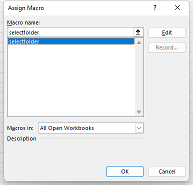
One thing you’ll want to do when setting up this macro is to add a button. This way, the user can just click the location next to where the path will be go. To create a button in Excel, go to the Insert tab. Then, select the drop-down menu for Shapes, and then select a square or rectangle to create a button. Once you have created it, right-click and select Edit Text. Here, you can type in a description for the button, such as Select Folder. Next, you can right-click the button and select Assign Macro. Then you should see the following dialog box, where you can select the macro you just created:

Once you’ve assigned the macro, you will be able to just click it so that it runs.

Selecting multiple file and folder paths

If you want to have the user select multiple paths, the easiest solution is just to have multiple places where you can select files or folders. The good news is you don’t need to create multiple macros for this. Instead, you just need to modify the code so that it looks at which row the button you click on is in. This requires using the application caller. Instead of using a named range, I’ll refer to a set column and the row that the button is on. To adjust the macro, I need to add a variable for the selectedRow and assign its value as follows:

Dim selectedRow as integer

selectedRow = Activesheet.Shapes(Application.Caller).TopLeftCell.Row

Assuming that I want to put the path in column A, this will now be my last line of code:

Range("A" & selectedRow) = path

Here is the full code:

Sub selectfolder()

Dim folder As FileDialog
Dim path As String
Dim selectedRow As Integer

Set folder = Application.FileDialog(msoFileDialogFolderPicker)
folder.AllowMultiSelect = False

selectedRow = ActiveSheet.Shapes(Application.Caller).TopLeftCell.Row


If folder.Show = -1 Then
path = folder.SelectedItems(1)
End If

If path = "" Then Exit Sub

If Right(path, 1) <> "\" Then path = path & "\"

Range("A" & selectedRow) = path


End Sub

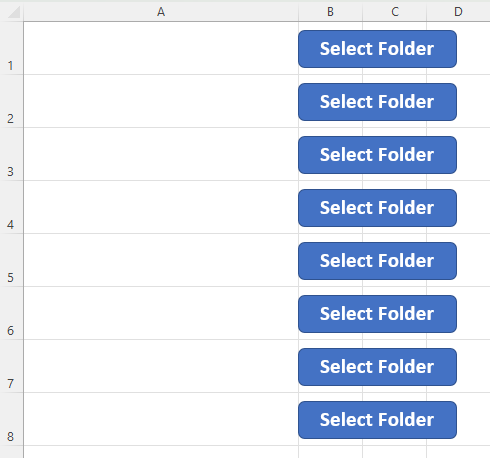
Since it looks at the selected row, you can just copy the button to multiple rows. You don’t need to create a different macro. However, since it looks at the top left cell, it’s important to keep the button within just a row. Don’t let it bleed into another row. Otherwise, you may populate the path into the wrong cell. Here’s how the buttons look in my example:

It doesn’t matter if the buttons span multiple columns. Using the code above, they simply shouldn’t be extending into another row. In the above example, I have just copied the button multiple times. Now, when a user click on them and makes a selection, it will paste the selected path into the corresponding cell in column A.


If you liked this post on How to Use VBA Code So a User Can Select a File or Folder Path, please give this site a like on Facebook and also be sure to check out some of the many templates that we have available for download. You can also follow us on Twitter and YouTube.

Alphabet's historical stock price.

Use MAXIFS and MINIFS to Find Values Within a Range

Whether you’re using VLOOKUP or XLOOKUP, one limitation you’re going to face with those functions is that you can’t search within a range or use multiple criteria in your lookups. For example, suppose you’re looking at a stock’s history and wanted to know the last time it fell within a certain price range. You wouldn’t be able to do that with the aforementioned functions. But there is a way to accomplish that, using either MAXIFs or MINIFs. Here’s how.

Using MAXIFs and MINIFs as a lookup

With the MAXIFs and MINIFs functions, you are extracting either the smallest or largest data point in a range. And since you can apply multiple IF statements within these functions, you have the possibility to use multiple criteria. In the following example I have a list of Alphabet’s historical stock price going back multiple years:

Alphabet's historical stock price.

Let’s suppose I wanted to find the last time that the stock was trading between $70 and $80. This is how the formula would look, assuming the date is in column A and the closing price is in column B:

=MAXIFS(A:A,B:B,”>=”&startprice,B:B,”<=”&endprice)

In column B, I have two criteria, one to check if the value is greater than or equal to the startprice variable ($70), and another to see if the value is less than or equal to the endprice variable ($80). Whenever that criteria is met, the value from column A is returned. And since the function is taking the maximum of those values, it will return the latest date in column A (i.e. the most recent, or the one closest to today’s date). If the date values were sorted in descending order rather than ascending order as they are above, then I would use the MINIFS function to get the same result.

Using the formula, it tells me that the last time Alphabet’s stock price was between $70 and $80 was on Oct. 29, 2020. And when looking at the range, it’s evident that looks to be correct:

Alphabet's historical stock price.

Without the use of ranges and utilizing MAXIFS, this would have been a much more difficult process. There are multiple ways to approach a lookup and it ultimately depends on the situation and what you need to accomplish. MAXIFS and MINIFS are particularly useful when working with dates. But in other situations, you may need to use a different function instead.


If you liked this post on Use MAXIFS and MINIFS to Create a Lookup With Multiple Criteria in Excel, please give this site a like on Facebook and also be sure to check out some of the many templates that we have available for download. You can also follow us on Twitter and YouTube.

PE Multiples

How to Calculate Trailing P/E and Forward P/E Multiples in Excel

If you’re looking to buy stocks, a one of the more common ratios you’ll likely consider in your analysis is the price-to-earnings, or P/E multiple. You can look at either the trailing P/E or the forward P/E. Below, I’ll look at what the difference between those multiples is, how to calculate each one, and how you can use them to determine a company’s expected growth rate.

What is the difference between the trailing P/E and the forward P/E?

The P/E ratio looks at the stock price in relation to earnings per share. If it’s a trailing earnings multiple, then that means you’re looking at the company’s earnings over the trailing twelve months, or ttm. A forward earnings multiple is based on analyst expectations and what the company’s earnings will be over the next year.

If a company had a worse year than normal or analysts are expecting lots of growth in the year ahead, the forward P/E will be lower than the trailing P/E. If, on the other hand, the company performed exceptionally well and perhaps benefitted from one-time gains, then its trailing P/E may look better (i.e. lower) than its forward P/E if analysts don’t expect a significant change in the business over the next year.

The smaller the gap between the trailing P/E and the forward P/E, the more consistent the earnings numbers are and the less of a change analysts are expecting from the previous year. If, however, the gap is significant, that could be an opportunity for investors because if a stock has a high trailing P/E multiple (due to an abnormally bad year), it can be missed on stock screeners if people are searching for stocks with low P/E multiples.

You can think of a forward P/E as what the company’s earnings will be in a normal or typical year whereas the trailing P/E is one that may have been distorted for a number of reasons.

How to calculate the trailing and forward P/E ratios

Here are the steps you can take to calculate the trailing P/E multiple:

  1. Add the company’s net income over the past four quarters. This is its income over the trailing twelve months.
  2. Take that total and divide it by the averaged diluted shares outstanding over the course of the year. Unless there’s a significant variation over the course of the past year, you can often just use the shares outstanding as of the most recent quarter. The result of this calculation will give you diluted earnings per share, or EPS.
  3. Get the current share price and divide it by EPS. This will be your trailing P/E multiple.

Here’s how I did the above calculations for Tesla’s stock in Excel, based on data as of Jan. 16, 2023 that was pulled from Yahoo Finance:

Trailing price-to-earnings calculation in Excel using Tesla as an example.

For the forward P/E multiple, the calculation is more straightforward since it is based on analyst expectations. Here are the steps to calculated the forward P/E multiple:

  1. Obtain the average analyst earnings per share estimate for the next year.
  2. Take the current share price and divide it by that estimate.

If you go to Yahoo Finance and go under the Analysis tab, you will see a series of analyst expectations for earnings for the new year:

Earnings estimates for Tesla's stock price as of Jan. 16, 2023.

Since I’m looking for the full year, I’ll take the average estimate for ‘Next Year (2023)’ which is an EPS of $4.79. By taking the share price of $122.40 and dividing by this figure, I arrive at a forward P/E of 25.55. This tells me that analysts are expecting Tesla to have a better year in 2023 as its forecasted EPS of $4.79 is higher than the $3.23 it has reported over the past four quarters.

You can use earnings multiples to estimate the earnings growth analysts are forecasting

This year, analysts are projecting that the company’s EPS will be $4.79, which is 48% higher than the $3.23 it reported over the past four quarters. However, you can estimate how much growth analysts are expecting from the business without having to dive into the EPS numbers.

Since the numerator, price, in the P/E multiples remains constant, the only change is the earnings, the denominator. You can do the same earnings growth calculation by taking the trailing P/E and dividing it by the forward P/E, and then subtracting 1 from that value:

Estimating earnings growth using the trailing and forward price-to-earnings multiples.

If the forward P/E is lower than the trailing P/E, that tells you that analysts are expecting that the company’s earnings are expected to decline in the coming year.


If you liked this post on How to Calculate Trailing P/E vs Forward P/E in Excel, please give this site a like on Facebook and also be sure to check out some of the many templates that we have available for download. You can also follow us on Twitter and YouTube.

ElapsedTime

How to Show Elapsed Time in Excel

Do you need to calculate the time that that has elapsed between two date values in Excel? In this post, I’ll show you how you can show the difference in hours, minutes, and seconds. This can be useful if you need to determine hours on a work shift or just to see how much time is remaining until a deadline.

The following table is what an employee’s shift schedule might look like over the course of a week:

Employee shift schedule in Excel.

You have the time they started work, left work, and the duration of their break. To calculate the time difference and net hours worked, this can be accomplished by the following formula:

Time Work : Time Out – Time In – Break

It’s just a simple subtraction formula. However, the tricky part is that by default, Excel will calculate this difference in days and so the result will be shown as a fraction of a day (since it is less than 24 hours):

Total shift hours in Excel shows as a fraction of a day.

There are a couple of ways to fix this. The first way is to multiply the results by a factor of 24 so that the calculation gets converted into hours:

Total shift hours in Excel when taking fractions of a day and multiplying them by 24.

The caveat here is that now instead of fractions of a day, you now have fractions of an hour. If you prefer to not do any conversions and instead just want to display the value as elapsed time as hours and minutes, that can be done by formatting the cells, which is the alternative method.

To do this, select the cells in the Total Time column and select CTRL+1 to Format Cells. From there, go to the Custom category and enter [h]:mm as follows:

Modifying the number format to show elapsed time in Excel by using the [h]:mm format.

By doing this, the result will be similar to when you multiplied the values by 24:

An important difference you’ll notice is that the Total Time column shows in terms of hours and minutes, whereas the Hours column still shows fractions of an hour. For instance: 9 hours and 30 minutes shows up as 9:30 in Total Time but under the Hours column it is 9.50. One column is showing the actual minutes while the other is showing it in terms of fractions of an hour.

If you wanted to only show the number of minutes elapsed, the time format would simply be [m]. Then, your time would show in terms of minutes.

Showing elapsed time in terms of minutes in Excel by using the [m] format.

And to show the time in seconds, use [s]:

Showing elapsed time in Excel in terms of seconds using the [s] format.

You could, of course, do all of these conversions by multiplying the hours field by 60 to convert it into minutes and then by 60 again to convert into seconds. By just changing the number format, you aren’t doing any changes to the original calculation. Either option can get the desired end results. However, if you want to specifically show hours and minutes and seconds, and not fractions of an hour, you’ll want to use either [h]:mm or perhaps [h]:mm:ss if you have your time broken down to the second.


If you liked this post on How to Show Elapsed Time in Excel, please give this site a like on Facebook and also be sure to check out some of the many templates that we have available for download. You can also follow us on Twitter and YouTube.

CalculatedFieldsImage

How to Add Calculated Fields to a Pivot Table

Pivot tables do a good job of summarizing your data and showing you the totals based on various splits and categories. In some cases, however, you may want to add calculated fields to your pivot table if it doesn’t go far enough in analyzing your data. Below, I’ll show you how you can do that.

Adding a calculated field

In the pivot table below, there is a break down by sales and cost by order status:

Pivot table summarizing sales and cost by order status.

Suppose you wanted to calculate the margin to show how much you are making per order. Since in this data set a margin field doesn’t exist, it needs to be added as a calculated field. To do that, click anywhere on your pivot table and then select the PivotTable Analyze tab on the ribbon. There, you’ll see an option for Fields, Items & Sets. Click on that, and you’ll see an option to add a Calculated Field:

Adding a calculated field in Excel.

Creating the formula

In the next step, you can name your field as well as set up the formula to determine what it should be calculating. You can use the fields in your pivot table and insert them into the formula. To do this, just double-click on any one of the fields. This is a better option than simply typing in the field because if you miss a space or enter it differently, the formula will not compute.

In the case of a margin calculation where we want to know how much of revenue is remaining after costs, the formula is just sales minus cost.

Creating a calculated field for the margin.

After clicking OK, your calculated field will now show up on the pivot table:

A pivot table after adding a calculated field.

Ideally, we would also have a field that shows margin as a percentage to help add context. To do this, I can add another calculated field. For this formula, all I need to do is take the recently created margin field and divide it by sales:

Creating a calculated field in a pivot table to determine the margin percentage.

You could potentially do this all within a single calculated field. But the point here is to illustrate that you can use a calculated field within another calculated field. In some cases, it can make it easier to break them out separately. And this also gives you more flexibility in how you want to present the data.

After converting the format to a percentage, now I see a margin % in the pivot table:

Pivot table showing multiple calculated fields.

If you liked this post on How to Add Calculated Fields to a Pivot Table, please give this site a like on Facebook and also be sure to check out some of the many templates that we have available for download. You can also follow us on Twitter and YouTube.

H2ESubtotals

When to Use Subtotals In Excel

Doing a simple summation in Excel is as easy as clicking on the AutoSum button or just using the SUM function. But in some cases, you don’t want to be summing up everything within a range. In those situations, you may want to use the SUBTOTAL function instead. In this post, I’ll go over how that function works, and illustrate the differences between it and SUM function.

What’s the difference between SUM and SUBTOTAL in Excel?

Suppose you have the following data set, which sows airport delays by carriers at different airports:

Table showing airport delays by airlines.

Using the SUM function on column header for carrier_delay, the total value comes out to 133,453,066. Even if you were to filter the data based on a single airport (in this example, JFK), the total value would remain the same:

Filtering a table in Excel by the airport.

If you were to use the SUBTOTAL function, however, then it would only perform a calculation on the cells that are visible and filtered. If you’re using SUBTOTAL, you just need to specify the type of calculation you want to perform:

Selecting the argument for the SUBTOTAL function in Excel.

To do a summation, you just enter 9 for the first argument. As you can see, there are options to do COUNT, COUNTA, MAX, MIN, PRODUCT, AVERAGE, PRODUCT, standard deviation, and variance calculations. Once you specify the first argument, all you need to do after that is select the range as you would in a normal SUM formula. Here’s what the SUBTOTAL formula looks like in my spreadsheet, where I am adding up the values in column Q:

=SUBTOTAL(9,Q7:Q500000)

Now, there’s a difference between the SUM and SUBTOTAL formulas in their results:

Table with SUM and SUBTOTAL formulas showing different values.

If you were to change your filters and selections, the SUBTOTAL value would change while the SUM value would remain the same.


If you liked this post on When to Use Subtotals In Excel, please give this site a like on Facebook and also be sure to check out some of the many templates that we have available for download. You can also follow us on Twitter and YouTube.

World cup attendance figures between 1930 and 2018.

Use Drop-Down Lists With Charts in Excel to Make Them Dynamic

A drop-down list is a way you can control a user’s input in Excel, to ensure that they don’t make a mistake when entering in data. It can also serve as a helpful way to make your chart more dynamic. In this post, I’ll show you how that’s possible.

Starting with a regular chart

For this example, I’m going to use the following table in Excel that shows historical World Cup attendance between 1930 and 2018. It shows the total, average, and highest attendance at each tournament:

World cup attendance figures between 1930 and 2018.

Now, you could chart this out but the problem is that things can get a bit crowded:

Excel chart showing World Cup attendance figures.

Another issue here is because the chart is looking at total attendance along with average and highest numbers, the scales will distort the chart, making it difficult to compare averages and highest attendances. The solution to this is to use a drop-down list where the user can select which metric they want to see.

Setting up the drop-down list

Creating a drop-down list is simple and it involves just going into the Data tab and selecting the Data Validation button, where you can select the List option and enter all the possible selections you want a user to be able to choose from:

Creating a drop-down list in Excel.

The key is to use the user selection and then populate a column with those values. For example, I’ll set a column header so that it is linked to the drop-down selection. That way, if someone selects Total Attendance, that will be the the header for the new column. I will also use the OFFSET function to determine which of the columns that I’m copying the values over from:

=OFFSET(A2,0,MATCH($F$1,$A$1:$E$1,0)-1)

In the above formula, I’m looking for cell F1 (the header that’s referencing the drop-down selection) within the range A1:E1, to see which one of the headers it matches up with. Using the OFFSET function, I can then pluck the value from the correct column. If I copy the formula down, then my new column will be based on the drop-down selection and it will automatically update based on the selection that is made

And that column, which is highlighted in yellow, is now the only one that is used in my chart. Now, the chart is cleaner and only includes the selected series rather than all three of them:

Excel chart showing World Cup attendance numbers by tournament.

If you liked this post on Use Drop-Down Lists With Charts in Excel to Make Them Dynamic, please give this site a like on Facebook and also be sure to check out some of the many templates that we have available for download. You can also follow us on Twitter and YouTube.