postspeeding

Excel Analysis: How Much Time Does Speeding Save?

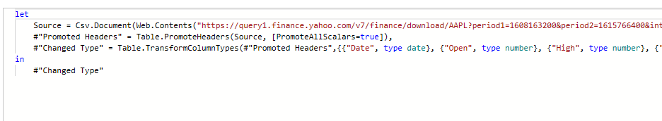
Speeding saves time but it also can put yourself and other people in harm’s way. But how about if you only speed 5 miles over the speed limit? What about 10 miles? Below, I’ll do a sensitivity analysis in Excel to calculate just how much time you are saving by speeding over various time intervals.

Setting up the file and creating the formulas

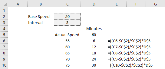
I’m going to create a base value of 50 mph to serve as my default speed. I will also create a variable for the interval to determine the different rates I want to move by for my sensitivity analysis. Here is what it looks like thus far:

Template for calculating time savings based on different speeds.

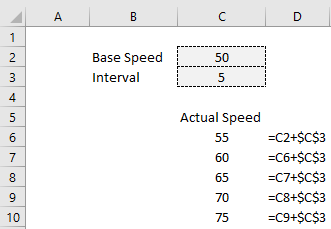
The formulas for the actual speed are off to the right. I am just taking the previous speed (or in the case of the first value, the default speed) and incrementing it by the interval. Doing it this way will make it easy if I want to adjust the interval or base speed variables without having to manually update the other values.

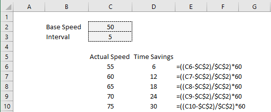
Next, I need to set up my calculation to determine the time that is saved. At 55 mph, over the course of an hour, I will have traveled 5 miles more than if I was traveling 50 mph (let’s assume this is the legal, posted rate). And since 5 miles is 10% of the 50mph I would be going on an hourly basis, that equates to 6 minutes (10% of 60 minutes) of additional driving that I would do at the posted rate. That is the time saved by speeding at a rate of 55 mph. To put this into a calculation, I first need to take the difference in speed:

=C6-$C$2

C6 is the first value in the speed column and C2 is the default speed. I also need to divide this by the default speed to get the % of an hour this would represent:

=(C6-$C$2)/$C$2

The next step is to multiple all of this by 60 (number of minutes in an hour) to convert this into minutes:

=((C6-$C$2)/$C$2)*60

Now, I can copy this formula down and now I have the time savings per hour by the different speeds:

Time savings when speeding by hour.

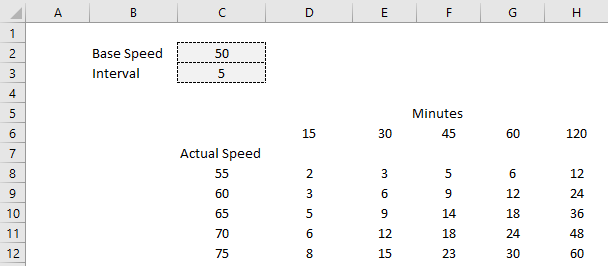
Next, what I will do is add different time intervals. I don’t want to strictly look at just a single hour. It will be helpful to set up various different periods. To do this, I’ll create a header for the number of minutes and adjust my formula so that it references the header rather than just multiples by 60:

Time savings when speeding.

Now, what I will do is set up more periods and copy the formulas across. Here is what the time savings look like across 15, 30, 45, 60, and 120 minute periods:

Time savings when speeding across multiple intervals.

To better visualize this, I will create a line chart that shows this data:

Line chart showing time savings when speeding.

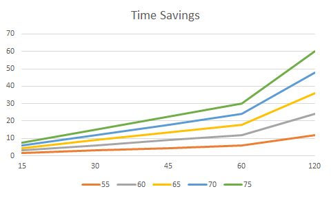
The important takeaway from all of this is that for short trips of 30 minutes or less, you aren’t saving even 10 minutes worth of time unless you are speeding excessively (70 mph vs 50 mph), which is not just dangerous but can run you the risk of getting a ticket. But over a few hours of driving, even a 5 mph bump up in speed can save you 12 minutes. It is a safer and more sustainable option to go slower and gradually accumulate time savings.

If you want a quick way to do these calculations without using a spreadsheet, simply calculate how much faster you are going than the speed limit and convert that into a percentage. Then, multiply that by the number of minutes that you are driving for. In the example of going 70 in a 50 zone, you would be 40% over the speed limit. Multiply that by 15 minutes of driving time, and the time saved would be 6 minutes. The formula looks as follows:

I’m not advocating for driving fast and the purpose of this was simply to calculate the theoretical time savings in Excel. If you have other suggestions for problems to solve in Excel, please contact me with your ideas.


If you liked this analysis on how much time speeding saves, please give this site a like on Facebook and also be sure to check out some of the many templates that we have available for download. You can also follow us on Twitter and YouTube.

H2EPostImagstockprices1

How to Get Stock Quotes From Yahoo Finance Using Power Query

There are a few different ways you can pull stock prices into Excel. You can use the new STOCKHISTORY function, pull data from Google Sheets which has a native stock function, or you can also use Power Query. In this post, Power Query is what I am going to focus on and show you how you can pull data right from Yahoo Finance. Of course, if you don’t want to do it yourself, I also have a template that is ready to use and download (at the bottom of the page).

Creating the query

For this example, let’s pull Apple’s stock history for the past month. To do this, we can simply go to the Yahoo Finance page that shows the stock’s recent price history, located here and select any interval, whether it is five days, one month, or three, it doesn’t matter.

To get the complete data set, I’m going to copy the actual CSV download link from that page, not simply the URL. That way, it is possible to pull a much wider range than the default of 100 days.

I’m going to use that link to set up the query. To create it, go into the Data tab, select the From Web button next to Get Data:

Get & Transform data section in Excel.

On the next page, you’ll be given a place to enter a URL, and this is where I am going to enter the download link from Yahoo Finance:

Setting up the web query.

Click on OK and Power Query will connect to the web page. Next, you will see a preview of the data and if it looks okay, you can just click on the Load button:

Then, the data will load into your spreadsheet and it should look something like this:

Stock price data downloaded into Excel from Yahoo Finance using Power Query.

If that’s all you need, you can stop here. The only downside is if you wanted to look at a different ticker or change the date range, you would need to get a new link, and update the query manually, which is not ideal at all. This can be automated and takes a little more effort but it can be done by adding some variables and making some tweaks to the query.

Setting up the variables

In Power Query, you can utilize named ranges. In this case, I’ll set them up for the ticker symbol, as well as the start and end dates. That way, I can pull up a stock’s history for a specific time frame. The three named ranges I’m going to create are called Ticker, StartDate, and EndDate which can be entered all in the same place:

Named ranges.

For the dates to work on Yahoo Finance, they need to be converted to a timestamp. This is what that calculation looks like:

 =(A1-DATE(1970,1,1))*60*60*24

Where A1 is the date. This is what the dates look like when converted into this format:

Converting date into timestamps.

Those timestamps are needed for the Yahoo Finance URL to populate properly. These are the values that need to be tied to a named range.

Next, these ranges need to be coded into Power Query. To do this, click anywhere on the table that the query created, and you should now see a section for Query in the Ribbon and click on the Edit button:

Editing the power query.

That will launch the editor. From there, you will want to click on the Advanced Editor button:

Advanced editor in the power query menu.

Then, you’ll see how the query is coded:

You can see the source variable is where the URL goes. To insert a named range from the Excel document into this code, we need to use the following format:

VariableName = Excel.CurrentWorkbook(){[Name=”namedrange“]}[Content]{0}[Column1]

Creating the ticker variable will look as follows:

Ticker = Excel.CurrentWorkbook(){[Name=”TICKER”]}[Content]{0}[Column1]

To keep things simple, I kept the name of the variable the same as the named range within the Excel file. Here is what the editor looks like after adding in the variables for the ticker, start date, and end date:

Power query editor after adding variables.

The one thing that I still need to adjust is the source. This is a hardcoded URL and it needs to be more dynamic, utilizing the variables.

In this part, I’ll need to adjust the query carefully to ensure that it is generated correctly. I will put the ticker variable where the ticker should go, and put the start and end dates (in Unix format). This is an excerpt of how the updated source data looks like:

Note that for the start and end date named ranges, I included the = sign to ensure the variable is read as text.

Now that the source is changed, all you need to do is update the variables and click on the Refresh All button on the data tab, and the table will update based on what you have entered.

If you want to download my template, you can do so here.


If you liked this post on how to get stock quotes from Yahoo Finance using Power Query, please give this site a like on Facebook and also be sure to check out some of the many templates that we have available for download. You can also follow us on Twitter and YouTube.

Convert1

How to Convert Numbers From Billions to Millions to Thousands in Excel

Depending on what kind of data you are working with and how you need to present it, you may need to show numbers in thousands, millions, or billions. Below, I’ll show you how you can quickly and easily make those conversions. You’ll also learn how to add a letter behind each number to indicate either B for billions, M for millions, or k for thousands.

Converting between billions, millions, and thousands

If you are dealing with raw numbers, to convert millions into billions you only need to multiply them by 1,000. And you don’t need to convert one value at a time. To multiply an entire range, copy a cell that contains the number 1,000 (or whatever factor you want), select the range you want to multiply, right-click paste special and you will see the following options:

Paste special options.

Selecting the Multiply option will multiply the cell against each one of the values in the range. If you wanted to reverse the calculation and convert billions into millions, then you would follow the same steps except instead of selecting Multiply, you would choose to Divide. You can use this for other operations as well, including addition and subtraction.

Another potential use you may have for this is if you have numbers that Excel is recognizing as text. Multiplying all of them by a factor of 1 could fix that. And multiplying by -1 would flip their signs if you needed to switch them from positive to negative, or vice versa.

However, in some cases, things can be a little more complicated and you need to do more than just multiplication. When you are looking at stocks and trading volumes, for example, you may see abbreviations such as B or M. Here’s a look at some of the best-performing stocks from March 10 and their trading volumes, as per Yahoo! Finance:

Top-performing stocks for March 10, 2021, and their volumes.

While most of them contain M for million, some of the numbers are in thousands. Simply getting rid of the M wouldn’t fix this problem as then the numbers in millions would appear smaller than those that are in thousands. To fix these values, we’ll need to do two things:

  1. Get rid of any letters.
  2. Scale the numbers consistently.

To avoid the numbers getting too long, I’ll convert these numbers all into millions. That means for numbers that have an M, I only need to get rid of the letter. And for thousands, I need to convert those numbers into a fraction of 1 million.

This is going to require an IF statement to correctly convert all of the values. The first thing that needs to happen is to determine if the number is in thousands or millions. This just requires using the RIGHT function, which will tell us the last letter or number in a cell:

=IF(RIGHT(A1)=”M”

Where A1 is the cell that contains the value. If this test evaluates to true, then the next step will be to get rid of the letter using the SUBSTITUTE function. Since I’m leaving the values in millions, I won’t need to multiply or divide the value by anything besides 1. The formula will now look as follows:

=IF(RIGHT(A1)=”M”,SUBSTITUTE(A1,”M”,””)*1

I replaced the “M” with a blank value. I also need to multiply everything by a factor of 1 to make sure it reads as a number. Otherwise, it would simply be text.

If I also had billions in my data set, I might use another IF statement here and do the same thing, only instead of multiplying by 1, I would multiply by 1,000 to arrive at millions. For example, $1B would become $1,000.

However, the data set doesn’t include billions and so I only need to account for thousands. The remaining values that aren’t millions I can just divide by 1,000,000 to determine what fraction of 1 million they are. The factor has to be this large because the numbers are raw and aren’t in thousands.

Here is why my complete formula looks like

=IF(RIGHT(A1)=”M”,SUBSTITUTE(A1,”M”,””)*1,A1/1000000)

Now I can copy this formula down across my data set, and this is how it looks:

Volumes after converting them into millions.

The numbers that were in millions simply lost the ‘M’ at the end of their values. And those that were in thousands now are in decimals, indicating how much of 1 million they are. For 342,271, it now shows 0.342271.

This is a complex example where you are dealing with text and the important thing to remember is that once there are letters involved in a number, the value automatically becomes text. If you want to apply some sort of calculation, it is going to be necessary to convert it back to a number — after you have gotten rid of any letters.

How to show numbers with B, M, or k

Next up, let’s take a look at how you can add letters to an existing number. Essentially, I am going to undo what I did above. Let’s start with turning our decimals into thousands. To do this, I can look for if a value if less than 1. If it is, then I will multiply it by 1,000 and add the letter ‘k’ to the end of it. Here’s how that formula will look:

=IF(A1<1,A1*1000&”k”

My value of 0.342271 becomes 342.271k. However, if I don’t want the decimal places and I want to round, I can adjust my formula accordingly:

=IF(A1<1,ROUND(A1*1000,0)&”k”

Using the ROUND function and setting it to 0 decimal places, I round up and now my value shows as 342k.

Next, I’ll need to add an “M” if the number is in millions. If any of the numbers were in billions, what I could do is check if a number is 1,000 or greater (e.g. 1,000 million). But since I don’t have billions in this data set, I can just simply add an “M” on to everything that is not in the thousands:

=IF(A1<1,ROUND(A1*1000,0)&”k”,A1&”M”)

This is what my values look like after this latest conversion:

Volumes after converted with M for millions and k for thousands.

For argument’s sake, I’ll change the first value so that it is 1,536 and show you how I would adjust for this calculation if that were $1 billion. As mentioned above, I would check if the value was more than 1,000. And if it is, I will divide it by 1,000 and add a “B” to the end of it. My formula, accounting for millions, billions, and thousands, will look like this:

=IF(A1<1,ROUND(A1*1000,0)&”k”,IF(A1>1000,(A1/1000)&”B”,A1&”M”))

And this is how my calculations look:

Converted values showing B for billions, M for millions, and k for thousands.

The reason I leave the millions calculation last in that formula is that I know if it isn’t less than 1 (thousands) and if it isn’t more than 1,000 (billions), then it has to be millions.

Remember: by adding letters to these numbers, they can’t be used in any sort of calculations. And so before you decide to go that route, it’s important to consider those limitations.


If you liked this post on how to convert numbers from billions to millions to thousands in Excel, please give this site a like on Facebook and also be sure to check out some of the many templates that we have available for download. You can also follow us on Twitter and YouTube.

CorporateBingo

Play Corporate Bingo

Are you stuck doing boring Zoom calls or have a boss that likes to say the same phrases over and over? I’ve got a great way for you to help pass the time at the office and make your meetings more interesting: play Corporate Bingo with your co-workers. This Excel-based template is easy to use and you can quickly hide it if necessary.

You can download it here.

How the game works

If you’ve played Bingo before then you know how to play this game as it works the same way. There are 24 squares (plus the free center square). To win, you need to mark off a row, column, or diagonal set of spaces. Although I have set the squares up as phrases, you could also use this Bingo card for actions. To the left of the Bingo card is where you can enter the values you want to use. I’ve already populated some of my most dreaded corporate phrases/words for you:

Bingo words.

You will need to enter something for the center square as well as the others. When you make a new game, the other squares will be randomized. Here’s how the board looks:

Bingo card.

If you’re in your meeting and someone says one of these terms, what you can do is double-click on the cells, and then there will be a red ‘X’ that marks that spot.

Red X on a Bingo card.

Once you have a line, whether it is across, down, or diagonally, it will highlight in red:

Bingo! card after win.

If you make a mistake or want to create a new game, use CTRL+SHIFT+N and the board will re-populate.

The values and formulas on the board are password-protected. This is to prevent accidentally overwriting the values on there, since they are automatically randomized each time.

Hiding the sheet

I made this game easy to hide in case someone walks past your desk or you want to keep it discrete. Using the shortcut of CTRL+SHIFT+Z, you can quickly hide the sheet. And if the game is hidden, using the same shortcut will unhide it again for you. The one caveat is you need to ensure that the sheet names remain unchanged.

Although you can’t change the sheet names, you can change the name of the Excel file to something other than Bingo.


If you liked this post on Corporate Bingo, please give this site a like on Facebook and also be sure to check out some of the many templates that we have available for download. You can also follow us on Twitter and YouTube.

calendar1

Excel Calendar Template

Do you need a calendar in Excel to quickly write down your tasks or keep track of deadlines and appointments? With this free template, you can create a calendar within seconds for the month and year that you want. You can copy multiple tabs and create multiple months in advance. The template will also allow you to specify whether you want the day of the week to start on a Sunday or a Monday. If you would like to try it out, you can download it here.

How the template works

The template only has three areas where you need to make inputs. That includes the month, year, and when you want the week to start. To update the month, simply click on the dropdown in the month field, where you will be able to select from any of the 12 months in the year. You can also type in the month but if you make a typo, then you will get an error.

Dropdown selection for the month.

Next up, enter the year for the calendar, which is right next to the month. In this field, you can just enter in a number as a dropdown isn’t necessary here. Then, once you have selected a month and year, the calendar will automatically update based on your selections:

Calendar in Excel showing for January 2021.

By default, I have the calendar set up to start on a Sunday. But if you prefer for the week to start on a Monday, simply scroll over to the right-hand-side of the sheet where you will see a dropdown. There, you can change the selection and specify which day you want the week to start on:

A dropdown option determining which day of the week the calendar should start on.

If I change this to Monday, then my calendar will update again, this time shifting the dates:

The calendar adjusts after changing the day the week starts on.

If you need to create multiple months, you can simply copy the tab for the calendar over and make the selection for another month and year. Whether you need one, two, or a full 12 months, you can set this up easily with this template. This is a file that you can potentially use forever as you can simply adjust the month and year combinations as many times as you like. There are no limitations as to the number of times you can create, copy, or move tabs.

The template is also set up so that there are five cells for each day, one for each potential task or meeting that you need. If you need to squeeze more into there, what you can do is shrink the font down.

However, the sheet is locked down outside of areas where you can enter in data (including the inputs, and the cells below each day). This is simply to prevent people from accidentally overwriting formulas or otherwise causing the file not to function as intended.


If you liked this post and the free Excel calendar template, please give this site a like on Facebook and also be sure to check out some of the many templates that we have available for download. You can also follow us on Twitter and YouTube.

H2EMapChart-min

How to Make a Map Chart in Excel

If you’re creating a dashboard or just want to visualize your data by what part of the world it’s coming from, a map chart can be a great way to accomplish that. Below, I’ll show how you can use a map chart to show data points at regional and global levels. And while you technically can’t use them with pivot tables, I’ll show you how you can use slicers to seamlessly drill down and dynamically update your chart.

Creating a global map chart

It should be easy to tell if the map chart is available on your version of Excel as the Maps icon stands out in the chart section:

Default chart options on the insert tab.

If you see the maps option, then you have a compatible version to work with.

To set up the data to work with the maps chart all you need is a simple table that shows a location along with a value. In this example, I’ll focus on different country data. My data set shows the GDP per capita (in U.S. dollars) by country, courtesy of the World Bank. Here’s what a glimpse of what it looks like:

GDP per capita by country in U.S. dollars.

This table doesn’t look terribly great in text and it’s an ideal thing to visualize on a map. As long as your data looks like this and the country names are correct, you can just select this data set and go to insert the map chart, and you’ll get something that looks like this:

GDP per capita by country on a map.

As you can see, the dark blue parts of the world have the highest GDP per capita while the lowest shades are on the bottom end of that scale. And the areas in grey do not contain data.

The map automatically adjusts based on how many countries you have included in your data set. If I only include data for Canada, the U.S., and Mexico, my map looks like this:

Map chart showing only North America.

One of the cool things is you can really zero in on specific regions depending on your data set.

The one thing you might be disappointed to learn is that this type of chart does not work with pivot tables. But in the next section, I’ll show you how you can still drill down on the data and the chart using slicers.

Using slicers to break down the data

Using data from the Bureau of Economic Analysis, I downloaded data for per capita income by county in the U.S., below is what the table looks like:

I had to do a bit of cleaning up the data to ensure that every line contained the state. And it’s also important to convert this into a table so that slicers will work with it.

With the maps chart, one of the things you’ll notice is you need to provide enough of a trail for Excel to be able to determine which location you are referring to. Cities, for example, could have the same names in multiple states or countries. And that’s why whether you’re looking at counties or cities, the more information you provide Excel, the more likely the chart will come out as you want it to.

When you first create a map chart it may not look as you expect it to as it could get the categories all wrong, especially if you have multiple fields. You’ll want to make sure that your series and categories are correctly set up if something looks off.

Under the Series, you should only have your values, such as in my example where it only contains per capita income:

Legend entries set up on a map chart.

If there’s anything else in there, you may need to delete it and adjust your range. And for your values to show up as a scale (which I’d recommend, otherwise you’ll see a big legend with many colors), you’ll want to edit the legend and make sure the following option is selected:

Selecting color by numeric values in Excel legend for a map chart.

You may also need to adjust the Horizontal Axis to ensure it includes all of your category columns. Again, this is if your map doesn’t look correct and the regions aren’t showing up correctly. Here is how my horizontal category axis looks like, showing both state and county:

Horizontal category axis in Excel for a map chart showing state and county data.

If it’s all set up correctly, your map chart should look something like this:

A map chart that shows per capita income by county.

Now, because this is county-level data, it’s not easy to conceptualize what you’re looking at. But with the help of slicers, you can easily jump to different states. Since the data is in a table, you can add a slicer for the state. If you’re not familiar with how slicers work, check out this post. Although that’s for pivot tables, they’ll work the same within a table.

Once the slicers are in place, you can easily jump through and toggle between the different states. Doing so will automatically adjust your map chart which will now focus in on that specific state, just like when it narrowed in on North America when I only had data for three countries:

Map of Washington showing country per capita income.

Just like with any other chart, you can hover over and see what the values are and the name of the county.


If you liked this post on how to make a map chart in Excel please give this site a like on Facebook and also be sure to check out some of the many templates that we have available for download. You can also follow us on Twitter and YouTube.

H2ESlowSpreadsheet-min

7 Ways to Fix a Slow Spreadsheet

Is your spreadsheet running slow or constantly freezing and crashing on you? There are many ways you can make it quicker and more efficient. Below, I’ll cover seven different ways you can fix some of the more common reasons your file may not running well.

1. Turn off calculations for the workbook

The first thing you can do is to turn off calculations. If you don’t need your data to constantly be updating, then the easiest way to ease the load of your spreadsheet is to make sure those formulas don’t keep calculating. To do this, you can go to the Formulas tab and under the Calculation group, select Calculation Options and choose Manual:

How to select manual calculations in Excel.

You can always turn the formulas back on and use F9 to do a force calculation. But if you don’t want to re-calculate everything, a quick trick you can do is to use Find and Replace and replace the equals sign (“=”) with equals. It seems redundant but doing this will refresh your formulas and recalculate the range you selected. This can be an easier alternative to enabling calculations for everything and then having to wait for every calculation to update.

The danger with turning off calculations is that you could end up looking at data that hasn’t been updated and potentially incorrect values as a result of that. This is why you’ll always want to be careful when turning off calculations for an entire workbook.

2. Turn off calculations for individual worksheets

If you don’t want to turn off everything, you can turn off the calculations for specific worksheets. Although there isn’t a way from the calculation options to specify which sheets to turn off, you can do this through a macro.

To do this, go into visual basic (ALT+F11) and go into the ThisWorkbook object:

VBA Project list.

We’ll want to turn off calculations when the workbook is first opened so you don’t have to remember to do it later. The initial subprocedure looks as follows:


Private Sub Workbook_Open()

End Sub


To turn off a calculation, you just need a single line of code:

Worksheets(“Sheet1”).EnableCalculation = False

Then entire subprocedure look as follows:


Private Sub Workbook_Open()

Worksheets(“Sheet1”).EnableCalculation = False

End Sub


Where Sheet1 is the name of the sheet that you want to turn calculations off for. And if you want to turn them back on, you change the value from False to True.

This isn’t the easiest option, especially if you aren’t familiar with macros or don’t want to worry about coding anything. But with VBA you can turn off the calculations and then use a button to turn them back on.

3. Separate the data into multiple tabs

If you have a data set that includes multiple years worth of data, you may want to consider breaking it up. Have one tab for the current year, one for the previous year, and so on.

Using the INDIRECT function, you can refer to different worksheets in your file. By naming a header the same name as a tab (e.g. ‘2020’), you can make your formulas dynamic and pointing to a different worksheet as opposed to one very large tab. Looking up 10,000 rows in one tab versus 50,000 rows in a massive collection of all your data can significantly improve the time it takes for your calculations to run.

4. Separate data into multiple files

A more drastic move than breaking up data into different tabs is moving them onto completely different files. If you’re carrying lots of old data into one big spreadsheet, consider archiving some of it and saving it in another file. Unless you really need access to the old data all the time, it might make a lot of sense to break up your files and to keep your current version as lean as possible. You could even have your data on one file and a separate file for your reporting while using PowerQuery to create a snapshot of your data and simply refreshing it as you need it.

5. Use COUNTA and INDIRECT to limit the scope of your calculations

The INDIRECT function can also help you to ensure your formulas don’t include too many rows or columns. If you select an entire column to run your calculations on rather than just the first couple hundred rows that actually have data in them is another way you can slow down your spreadsheet.

To do this, you can use the COUNTA function on a range to determine how many cells have values in them. The formula is a simple one that you can run on an entire column:

=COUNTA(“A:A”)

Then, using the INDIRECT function, you can write a formula that does something like this:

=SUM(INDIRECT(“A1:A”&B1))

B1 in the example above contains the COUNTA formula and will give you the total number of rows that are used. Rather than doing this:

=SUM(A:A)

and selecting everything in column A to sum up, you can shrink your range down using a combination of the INDIRECT and the COUNTA function. This can be a time-saver when you’re dealing with complex calculations, especially if there are thousands of rows of data.

6. Minimize formulas and utilize pivot tables where possible

Another way to cut down on resources is to make use of pivot tables. Pivot Tables are more efficient than formulas and using them can help make your spreadsheet run smoother. The one drawback is that they’re not as flexible as formulas are. Refreshing the data also takes seconds and you don’t have to worry about turning calculations off.

7. Make sure your worksheets aren’t too big

Large files can take long to open and they freeze up a lot. A common problem I see is that worksheets are sometimes thousands of rows long even though there’s nothing there. This can happen if you download a large data set into a sheet and clear it out later. And although those rows may no longer be occupied with data, they’re still technically taking up space. This can add several MB onto a file and make it a lot more difficult to run.

How can you spot this issue? An easy way is to cycle through the tabs and click CTRL+END. You’ll be taken to the last cell in your sheet. If that takes you far beyond your last row or column of data, then that tells you your sheet is using up more data than it needs to. What you can do is delete all the cells in between the last cell (using CTRL+END) and the last cell that actually contains information in it. Then, save the file. You should see your file come down in size. Do this for each worksheet that has this issue. Even though the cells appear to be empty, they can be making your file unnecessarily large.


If you liked this post on 7 ways to fix a slow spreadsheet please give this site a like on Facebook and also be sure to check out some of the many templates that we have available for download. You can also follow us on Twitter and YouTube.

roadtrip1

Road Trip Planner Template

Whether you’re going on a road trip soon or just want to start planning one, this free road trip planner template can help you with that. Not only can you plot up to 10 destinations, you can factor in breaks, select either a desired start or end time (even if your trip may span more than one day), make notes, and add any points of interest you want to mark along the way. The template will even generate a link for you in case you want to quickly pull up a search of hotels in the area.

If you’d like to give the template a try, download it for free, right here. Below, I’ll go over how it works.

Step 1: Set the initial start or end time

The very first option you’ll find in the road trip planner is whether you want to leave or arrive at a certain date and time. This will determine whether the road trip planner works backwards from your desired ending time or if it starts from your start time and counts forward.

Selecting the arrival or departure time.

Under the Option dropdown, you can select either Fixed Arrival or Fixed Start. Then, next to that cell, you’ll specify the start or end time, which can include the date — this is useful if your trip is overnight or will be a long one that may include a hotel stay.

Step 2: Enter your arrival locations, duration, break times, and any notes

Now comes the part where you enter the details of your trip. The fields in light grey are formulas and are locked. This is to prevent mistakes and avoid errors. Besides the starting departure location, all subsequent departures will automatically populate based on your last arrival location.

To enter the duration of the trip, make sure you enter it in the following format:

hours:minutes

For example, If a trip will take 30 minutes, you would enter 0:30. If it takes one hour and 20 minutes, the entry needs to be 1:20. This is also how you will enter the break times. The break is simply how long until you plan to resume traveling. And so if you’re staying overnight at a hotel, you might put in eight hours, or 8:00 for a break. The break time will add on top of your arrival time to determine your estimated departure time for your next destination.

If you want to mark places along the way you want to visit in your road trip or just make some notes, you can use these last two columns for this purpose. This might be a good place to mention where you want to fill up for gas.

Additional features

If you want to be able to quickly check the price of hotels in your arrival destinations, click on the the dropdown box after the notes column and select Y for whether you need a hotel:

Dropdown option asking whether a hotel is required.

Doing this will generate a link to TripAdvisor’s hotel page for the arrival location that you specified for each line. For example, if my first location was London and I specified Y for Hotel, I would have a link that I could click on to take me to the TripAdvisor page:

Link to click on a hotel in the arrival location.

It’s a quick way to get to that page and scan hotel availability and rates.

If you’ve got the latest version of Excel, there’s another cool feature you can make use of, and that is its new Data Types (it is location in the Data tab). If I click on the cell for London, under Data Types, I can select the Geography button:

Data Types menu in Excel.

Now, on the cell there’s a little icon indicating a map on it:

Cell showing a map icon for data types.

If I click on that icon, I get the following pop-up:

Pop-up that comes up after selecting the map icon.

It’s a new feature in Excel that can help you pull up some details on your destination and it gives you a way to bring in even more data into the spreadsheet. However, please note that using this custom data type will break the link for hotels as it will no longer read as a normal text entry.

If you have any suggestions as to other items you’d like to see in this template please let me know. I’m also planning to work on a broader vacation template that considers costs in addition to just travel time.


If you liked this post and my free road trip planner template please give this site a like on Facebook and also be sure to check out some of the many templates that we have available for download. You can also follow us on Twitter and YouTube.

H2EIncrement-min

How to Extend and Increment Formulas

When you have created formulas in Excel, you may want to extend and increment them down to other cells. In many cases, you can just drag down a cell that contains the formula and pull it down so that it automatically gets copied. However, there’s a problem if you need to increment a formula or number in an argument. Below, I’ll show you an example of this and how you can address it in multiple scenarios.

Let’s start with just pulling the largest value in a data set. Using the LARGE function, you can grab the largest value with a formula of =LARGE(A:A,1) — that will give you the largest value in column A. However, you’ll notice quickly that just copying this formula down won’t work as expected, it’ll keep copying the 1 in the second argument down; you will continue extracting the largest value. Sometimes Excel just isn’t good at detecting patterns. But there are ways you can adjust the formula to ensure your formula is incrementing correctly.

Option 1: Using an Additional Column

In a separate column, you could list the numbers 1 until 100 or whatever range you needed to and reference those. In the example below, I can pull the largest 10 items using the LARGE function and a referencing the cells to the left:

Using the LARGE function to pull the top 10 amounts in a data set.

The problem with this approach is that it isn’t always practical within a spreadsheet, especially if you don’t have room to spare and don’t want to be creating extra columns for the sake of what should be a simple calculation. It may also be difficult to determine what the upper limit should be. That’s where the second option is going to be a better one.

Option 2: Using the ROW Function

There’s an easy way to adjust the above calculation so that you don’t need to reference the actual number, nor do you need to manually enter it. The trick is to use the ROW function. It returns the row value of a specified cell. If I entered =ROW(A20), it would return a value of 20 for the row value. You don’t need to enter an argument and using =ROW() will just return the row of the cell that contains the formula. The function is particularly useful when you want to increment values because as you drag it down, the results will increase by one each time.

In calculating the largest values, we’ll use the ROW function as the argument to determine which value we want, whether it’s the fifth largest or 20th largest number. Here’s how the initial formula would look like, assuming we wanted to start with the largest value:

=LARGE(D:D,ROW(A1))

In the above formula, the calculation will return the largest value since ROW(A1) will return a value of 1. Now, if the formula is copied down, here’s what it will look like:

Using the LARGE and ROW functions to pull the largest values in a data set.

By copying down the formula, ROW(A1) changed to reflect the next row. Excel does a better job of detecting patterns when they’re part of a function as opposed to just standalone numbers. Using the ROW function eliminates the need for the extra column. And as you’ll notice, the results are the same as in the earlier example.

This is just one example and there are many others where you can use the ROW() function to your advantage and increment values down. If you need to increment as you’re going to the right instead of down, then you’ll want to use the COLUMN function, which effectively does the same as the ROW function, only it’ll pull the column number that a cell is in.


If you liked this post on how to extend and increment formulas please give this site a like on Facebook and also be sure to check out some of the many templates that we have available for download. You can also follow us on Twitter and YouTube.