webdesign-3411373_640

3 Reasons Why You Should Always Save Excel Templates as .xltx or .xltm

If you’ve spent the time to create a template in Excel, it’s important to save it in the right format to help protect your work. While the temptation may be to just save it as the default .xlsx or.xlsm format, you’re best off saving it in the correct template format – .xltx or .xltm, and here’s why:

1. You avoid easily overwriting the file

One of the biggest mistakes you can make with a template is not backing it up. As much as you can test a template to make it as error-proof as possible, someone usually will find a way to make it not work the way it was intended. If someone uses the live template file then that’s just asking for trouble. Once data is entered on the file and things are moved around, if something is not working at a later point in time it’s hard to go back and try and figure out what went wrong, especially if the structure or file was changed in some way.

One way I normally mitigate this is by saving the template somewhere else and have someone use a copy of it. If something has gone terribly wrong and formulas have been altered, it’s a lot easier to copy the data back into something that you know was working (the file that was backed up) than it is try and troubleshoot on a modified file where you’re unsure as to what has changed.

Saving it as a template file (.xltx or .xltm – for templates with macros), however, will allow you to mitigate the potential for someone to save over the template by accident. By saving it as one of these formats, when a user opens the template file it will automatically change the name to add a number to it and when they go to save it won’t save as a template file (unless they manually change it). While a user can still technically save over the template file, it’ll take some work to do so. In all likelihood, the user will end up saving it as a non-template file. Either way, you’ll still probably want to save a backup file somewhere else, but the risk of being overwritten should be minimized this way.

2. It makes it easy to find your templates on your computer

If you have your Excel files, including templates, in one folder, it becomes easier to sort and identify the templates by just looking for those that end in .xltx and .xltm. What you can do is sort by file type or when you go to open a file select the type of file you’re looking for. This will help avoid opening the wrong file.

If your files aren’t all in one location, you could also do a search of files ending with .xlt across a range of folders to help find all your templates. This could make it easier than to add the word ‘template’ into every one of your templates.

3. Easy access for users

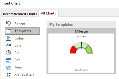
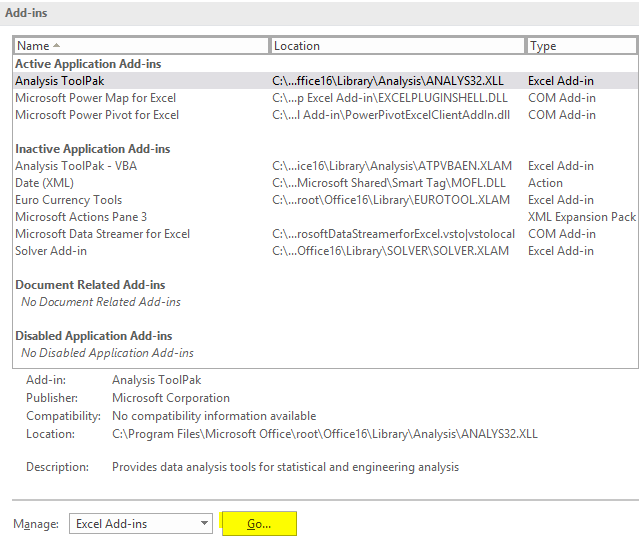
By default, when you go to save a .xltx or .xltm file, Excel will select the templates folder. You don’t have to save your files there, but by doing so your templates will now show up when a user goes to create a new file and looks for templates. Your saved templates will be available by selecting the Personal section:

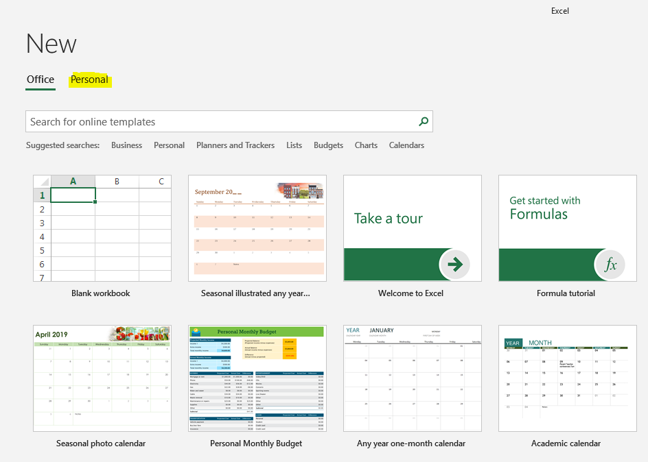
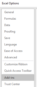
By being able to access the templates when creating a new file, a user doesn’t have to worry about finding the location of a template. If you don’t want to use the default location that Microsoft has assigned for templates, you can change the folder in the Excel options under the Save section:

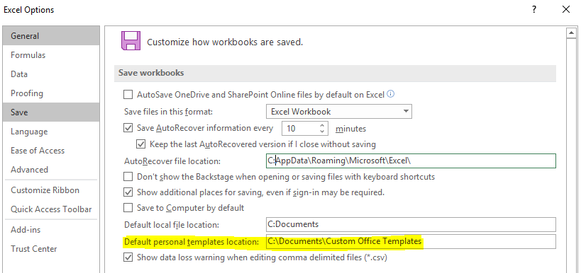
This way you can also have all your templates in a shared location among many users. The user would simply need to change these settings to direct Excel to the correct folder.

1068x600

Monthly Expenses Template: Analyze Your Spending Quickly and Easily

A great way to start finding opportunities to save money is by simply looking at your monthly expenses. It can be as easy as downloading your recent transaction data from your bank or credit card issuer. While there are apps that can do that for you, by downloading it you have more control over the information and you also don’t have to give access to a third-party application. With the monthly expenses template, you can easily analyze your expenses in seconds.

The template has three tabs: DATA, CATEGORIES and SUMMARY. Let’s start with the most critical step, and that’s downloading your data and getting it into the template.

1. Getting Your Expenses In the Right Format

The most important part of the process is just getting the data correct from the start. On the DATA tab, there are four main headers (highlighted in blue) that you’ll want to populate information for: Transaction Date, Posting Date, Description, and Amount. You don’t need to use Posting Date since the monthly expenses template only uses the Transaction Date, but I included it since I found that many downloads included both dates.

The Description is a key field since it includes the Doing Business As (DBA) name, and this is crucial to ensuring that the right vendor name is extracted. Normally you’ll see the vendor name somewhere in the description. Have a look at this post as an example of how to extract the DBA name. It may not work 100% of the time as it ultimately depends on how the merchant sets up their DBA name, but generally, it should give you a pretty accurate result. There may also be instances where you have multiple vendors that are the same, and this again will likely be due to inconsistency in how one location inputs its DBA name versus another. In my sample data set, here’s how two purchases from Amazon can show up differently:

vendor description dba name monthly expenses template

Without changing the actual description, we’d end up with two different vendors. This isn’t ideal, but it also shouldn’t be all that common. It’s likely a result of one purchase being made for a different type of product or service on Amazon and a different DBA name being used in that instance. What you could do is create a category for similar-named vendors to help at least group them at the category level (see step 2 for that).

Lastly, there is the amount field. Whether this is positive or negative doesn’t really matter as long as your expenses are consistent.

Once all your data is in, the columns in red will autofill as they contain formulas. If they don’t, you may need to copy the formulas down but they should be automatic as long as the data is in the table directly below the most recent row. At this point, you can go setup categories for your vendors if you want to slice the data a bit further, or you can go straight to updating the report (step 3)

2. Setting Up Categories to Track Your Monthly Expenses (Optional)

Quick note: on the CATEGORIES tab, you’ll see an option to change the month-day-year format into day-month-year. This is only necessary if your date is downloaded in text (e.g. doesn’t read as a date) and it’s in day-month-year format (month-day-year format is the default). However, if you’re just downloading data for the last week or month, this may be irrelevant for you if you’re not looking to analyze expenses over a longer period of time.

In this tab, you’ll be able to set up any categories that you want to track. However, you don’t have to add any categories and the analysis will simply look at the expenses at the vendor level.

To set up a category, all you need to do is enter the vendor name and next to it the category that you want to map the vendor to. This will ensure that on the DATA tab, the category will automatically be pulled in for a particular vendor. However, it’s important to note that the matches need to be exact, otherwise this won’t work. Even an extra space in the vendor name won’t result in the formula pulling the correct category.

categories expenses monthly spending

3. Updating the Reports

The SUMMARY tab creates a dashboard for all your expenses. The only step you need to do here is to go to refresh all the tables. To do this, on the ribbon, select the Data tab and click on Refresh All. This will ensure all the pivot tables are updated.

From there, it’s just a matter of how you want to filter or view your data. You can select the slicers if you want to narrow in on a certain month or category.

There will be two columns that you can look at: one will be for the total spend, and the other for the % of the total. If you have set up categories, you can narrow in to see which vendors made up a given category and the percentage will show their overall share.

You can download the monthly expenses template here. It is completely free and unlocked so you can make any changes you’d like to it. If you find this or other templates on this site useful, please give us a like on our Facebook page.

image-1

Monthly Goal Tracker Template in Excel

Whether you’re trying to lose weight or wanting to learn a new skill, sometimes it can be challenging to stay on top of those goals. One way to you can make that easier with this goal tracker template. It’ll allow you to keep a record of how you’ve done versus your goals and show you the progress you’ve been making. Just being able to see that progress can sometimes help encourage you to keep working at it, and this template will do just that.

The spreadsheet has two tabs: the calendar where you can select the month and year, and the data entry tab where you’ll enter your progress. Let’s start with the data entry since that is going to be where you make any changes and will serve as a starting point.

Setting Up Your Goals and Entering the Data

On the DATA.ENTRY tab, the first three rows are dedicated to the name of your goal, the frequency of it, and your desired target. The goal name is straightforward and doesn’t impact anything but what you’ll refer to it going forward. This can be changed at any point.

The second row is the frequency, and here you can enter either Weekly, Monthy or Daily. They’ll track your totals accordingly and which frequency you select will determine how the calendar will highlight your progress. As soon as you hit a goal that’s set to monthly, the spreadsheet will highlight the entire month in green to indicate that the goal has been met:

goal tracker template excel monthly

If it’s a weekly target, then only the week the goal was met will be highlighted:

goal tracker template excel weekly

Daily targets will only be highlighted one day at a time.

The third row on the data entry tab relates to the actual goal number itself. In my example, I’ve put 500 for the weekly amount of calories burned and 100 studying hours in a month. These are the metrics that will be tracked. They will reset each period as well so if 400 calories were burned in a week, that week won’t highlight in green. But if on the following week 500 are burned, then it will highlight that week.

For daily goals, no goal amount needs to be entered. You’ve either met the goal or not for that day, and avoiding numerical totals here will allow you just to mark an ‘X’ on whether you were on track for that day. This can be useful if it relates to a task that might not have a numerical value. It’ll also allow you to create a chain of X’s like the method made popular by Jerry Seinfeld.

goal tracker template excel daily x jerry seinfeld

This way, you’re not limited to trying to assign a number to every goal. If you do have a numerical goal for every day, you can simply convert that into a weekly or monthly total. The only impact there will be when the cells will be highlighted.

There’s no limit to the number of goals that you can have so you can have a mix of monthly, weekly and daily goals to suit your needs.

For the actual data entry itself, I’ve pre-populated a date of July 28 but you can certainly change that to a different start date. The data entry tab will auto-populate the next 365 days for you. However, you can certainly extend beyond that as well.

Once you’ve got your start date, you can start entering in your data. Just look for the date and goal name (top row) to make sure you’re entering it in the correct cell. For daily goals, simply mark an ‘X’ to indicate they were met. For weekly and monthly targets, enter a number.

goal tracker template excel data entry

The Goal Tracker Calendar

Once you’ve got your goals set up and your data entered, you can switch over to the GOAL.CALENDAR tab. Here, you can change the month and year that you want to look at, and select the goal as well, from the yellow drop-down directly above the date.

Once you’ve selected the goal, it’ll highlight whatever progress you’ve made. For daily goals, it’ll show any X’s, which will automatically be highlighted in green. For other frequencies, you’ll see the actual numbers themselves so you’ll see how you’ve done on each day.

You’ll notice that the calendar for August won’t start on August 1 but on the first day of that week. The purpose of this is to track those weekly goals as otherwise part of the week will be cut off and could appear like a goal wasn’t reached.

You can download the template here.

If you like this Monthly Goal Tracker Template, please give this site a like on Facebook and also be sure to check out some of the many templates that we have available for download. You can also follow us on Twitter and YouTube.

chart-2785979_640

How to Make a Bar Graph in Excel Using a Formula

Excel has a lot of charts and graphs that you can use to visually show data. However, there’s a way to create a graph using just a simple formula and applying some formatting to it. Below, I’ll show you how to make a bar graph easily without having to worry about legends, axis, or any other chart element you might otherwise need to manipulate.

The key function that makes this all possible is REPT, which just repeats a character a set amount of times. Here’s how it works in practice:

REPT function excel

In the first argument, I specify the character that I want to be repeated. The | symbol, in this case, is repeated five times, which is what the second argument specifies. Right now, this doesn’t look anything like a bar chart, but that’s as easy as changing the font. Here’s how it looks like if the font is set to Britannic Bold and size 11:

rept function excel

If I had several of these values, I could make it look like a bar chart pretty quickly. Below are some random numbers from 1-10 and how I turned them into a bar chart using the earlier formula:

rept function excel bar graph chart

In the above formulas, I replaced the second argument with the numbers specified above. If an item had the number 10, the | character would be repeated 10 times.

Scaling the bar graph

Now, if you’re dealing with really small or really large numbers, your bar graph could look very skewed. What I’d suggest doing is determining how big you want your graph to look. For a column with a width of 15, I found that 35 characters would fill the bar chart all the way to the end of the cell (using the font type, size and character that I used above).

So to help make sure that my data was properly scaled, I’d calculate the maximum number from my data set, divide the specified number by that, and then multiply it by 35.

Here’s another example with numbers between 100-1,000, if I were not to adjust anything from the previous formula:

rept function excel bar chart graph

If I were to use the above formula as is, you can see my bar chart is going to explode with bigger numbers. So what I’d want to do is adjust the number of times the characters above repeat, to a maximum of 35.

First, I need to determine what value should maximize the cell or bar chart. In the above data set, 988 is the largest number. However, if my scale goes up to 1,000, that might be a better number to use as the maximum.

In that case, my formula for the number of repeats will look something like this: (value/1000)*35. That way, for the value 988, that will return 34.58 as the number of times I’ll repeat the | character. If I use that formula for the data, here’s how it looks now:

rept function excel bar chart graph

Adding more formatting

Now, I’ve got a bar chart that looks a lot more contained. However, this is still kind of a bit boring. So what I can do is add some conditional formatting to help make some of the items stand out a bit more:

rept function excel bar chart graph conditional formatting

In the above example, I set rules for anything below 300 to be highlighted red and anything above 800 to be green. When applying the conditional formatting, make sure you’re changing the font color, not the fill color. For more information on how to set up conditional formatting, check out this post.


If you liked this post on How to Make a Bar Graph in Excel Using a Formula, please give this site a like on Facebook and also be sure to check out some of the many templates that we have available for download. You can also follow us on Twitter and YouTube.

accounting-1928237_640

How to Save an Excel Chart As a High Resolution Image

Do you use Excel charts in PowerPoint presentations or want to use them in some other programs? Then you probably know it’s not something that’s very intuitive and often when you save a chart from Excel it’s not the high resolution image that that you were hoping for. And embedding charts within PowerPoint is a whole separate headache altogether.

The good news is that there’s a fairly easy solution. In the past, I’ve used code to save a chart as an image file, but even that didn’t always work very well and it involves running a macro. Once you try stretching it out you’ll still likely see a bit of a reduction in quality.

Let’s take this chart as an example:

sales chart excel

If I use the method to save it as a chart using VBA, this is how it will look expanded:

sales chart excel high resolution image

The image starts to get a bit faded and it’s far from ideal.

How do you get around that? Save the file in Microsoft Paint. Select the chart, copy it, and paste it into Paint and then save it as an image file. Besides cropping it, I don’t do any editing or special changes to the chart. However, the chart still needs to be a decent size in Excel so if it still looks faded, try making the chart bigger and then repeat the steps.

Here’s how the same chart looks, but using Paint:

sales chart excel high resolution image

It’s a higher quality image and the process is a bit easier unless you’ve got lots of charts that you want to save quickly. Visuals can be useful tools in presentations and I hope this has helped you learn how to save an excel chart as high resolution image.


If you liked this post on How to Save an Excel Chart As a High Resolution Image, please give this site a like on Facebook and also be sure to check out some of the many templates that we have available for download. You can also follow us on Twitter and YouTube.

white-male-2064876_640

How to Add Stock Quotes Into Your Excel Spreadsheet

Unfortunately, there’s no Excel formula that can add stock quotes for you. However, there is a workaround for that which can help you get what you’re after. In a previous post, I covered how to pull stock quotes using Google Sheets which is able to pull in prices and all sorts of other data. And in this post, I’ll show you how to get the data from Google Sheets into Excel.

In essence, Google Sheets is your data source or database, and you’re going to import that into Excel. It’s not specific to stock quotes, but it’s an example of how you can accomplish the same thing. So first up, you want to create your file in Google Sheets using that earlier post as a guide. Here’s an excerpt of what my file looks like in Google Sheets:

google sheets stock prices

Once you’re ready, it’s time to link your Excel file to that Google Sheets file, and here’s how to do that:

How to Link Google Sheets to Excel

  1. On the File menu, click on the button to Publish to the web
publish to web google sheets

On the next screen, you should see something like this:

publish to web google sheets

2. Select the tab that you want to export under the Link section and change Web page to Comma-separated values (.csv) and click on the Publish button, that will generate a URL:

publish to web google sheets

3. Copy the URL that was generated in Step 2 and go back into Excel and under the Data tab click on the From Web button which is in the Get & Transform Data section

excel import google sheets

Paste it into the next screen’s URL field and click OK

import excel google sheets

On the next page you should see a preview of your data and if it looks okay then click on the Load button.

import excel google sheets

What you should see afterwards is what was on your Google Sheets tab from earlier:

import excel google sheets

And there you have it, your data from Google Sheets linked into Excel. If you make changes to your Google Sheets file, or if you want to refresh the stock quotes, right-click anywhere in the Excel sheet and select Refresh. Note that sometimes it may take some time before the file is updated on Google Sheets and before you’ll see any changes that you have made to the file.

It may not be an ideal solution if you’re looking to get stock quotes, but it gets the job done and avoids you having to try and find a complex formula or macro to pull the data that you want. You can use the Excel sheet with your Google Sheets data as a database and then lookup the stock prices from another sheet. The benefit of using Google Sheets is that you can have the best of both worlds – putting data online that you can easily update, and not be limited to Google Sheets and be able to edit and manipulate it as you need to in Excel.

Word of caution: if you delete or move around data in Google Sheets it could cause issues, especially if columns are missing and when you go to refresh it cannot find them anymore. If there is an error as a result of it or if you need to change the source, you’ll want to edit the query. When you click on the data in Excel you should see a section for Queries & Connections where you can edit the query. This is where you can select which data you want to include as well as change the source that you are pulling from. However, if it may be easier to just re-publish the data.


If you liked this post on How to Add Stock Quotes Into Your Excel Spreadsheet, please give this site a like on Facebook and also be sure to check out some of the many templates that we have available for download. You can also follow us on Twitter and YouTube.

excel-3873854_640

How to Customize the Ribbon in Excel Using XML

If you want to customize the ribbon in Excel then you know simply changing doing it through the front end is only going to work on your computer. The customization isn’t technically saved within the file and it won’t move from one file to another unless you actually adjust the xml.

It’s by no means an easy process, but if you’re just looking to add a custom tab with some buttons for some macros that you have, I can show you a quick way to do that as painlessly as possible. It’s by no means comprehensive, but it’ll get the job done.

Step 1: Open your Excel file in a program like Winzip/7-Zip

If you right-click on your Excel file you should have an option that says Open Archive if you have a program like Winzip or 7-Zip installed. There, you should see something that looks like this:

These are the files and folders that are within the Excel file itself.

Step 2: Create a folder called customUI

Step 3: Open up notepad and paste the following into it:

<customUI xmlns="http://schemas.microsoft.com/office/2006/01/customui">
<ribbon startFromScratch="false">
<tabs>
<tab idMso="TabHome">
<group id="myMacros" label="My Macros">
<button id="Macro1" label="Macro1" imageMso="HappyFace" size="large" onAction="cbMacro1" />
<button id="Macro2" label="Macro2" imageMso="TableDrawTable" size="large" onAction="cbMacro2" />
</group>
</tab>
</tabs>
</ribbon>
</customUI>

What the code will do is add two buttons to the end of the Home tab. I’ll show you how to modify it further down this post.

Save the file as customUI.xml

Step 4: Put the file into the customUI folder that you created in Step 2

Step 5: Back in the archive, navigate to the _rels folder and open the .rels file (in Notepad)

Find this line:
<Relationships xmlns="http://schemas.openxmlformats.org/package/2006/relationships">

and then insert the following right after it:

<Relationship Id="R4863ef4e23f1404c" Type="http://schemas.microsoft.com/office/2006/relationships/ui/extensibility" Target="customUI/customUI.xml"/>

Step 6: Close the archive, save changes and open the file

You should now see the two buttons at the end of the home tab:

The problem is that they don’t do anything just yet. In the code that you copied back in Step 3, there were some callback items (‘CB’) that we need to reference back to inside VBA. Those are effectively a link from when a user presses the button on the ribbon to the macro that you’ve coded.

What you’ll need to do now is go into a module within VBA and enter the following code:

Sub cbMacro1(control As IRibbonControl)
***name of your macro***
End Sub

Sub cbMacro2(control As IRibbonControl)
***name of your macro***
End Sub

In the subprocedures for the two buttons all you need to do is call your macro (in place of the code within the ***), and now the buttons should work.

Modifying the code to add more customization

In Step 3, the code there was for a couple of buttons that you could add to your ribbon. If you want to add more, simply following the sequence you can easily add another button:

<button id="Macro3" label="Macro3" imageMso="Smile" size="large" onAction="cbMacro3" />

The button id doesn’t matter too much itself. The label is what will show up underneath the button. ImageMso is the image that will show up. If you do a google search for ImageMso you’ll find what some of the different codes are.

You can shrink the image down to “small” by changing the size attribute here. Note that some of the ImageMso’s are already small and can’t be made large, but you can shrink large ones down in size.

The most important item when adding a button is the onAction attribute as this is what your callback code needs to reference inside VBA. Obviously the more consistently you name your buttons the easier it’ll be to add more without getting lost in your code.

Adding a new tab

In the above code, I added the buttons to the Home tab. However, if you’ve got more that you want to add then you can put them on an entirely new tab instead.

What you can do then is just change the following:

<tab idMso="TabHome">

into this:

<tab id="MyMacros" label="My Macros">

And now all of your macros will be saved onto a new tab rather than take up space on the Home tab. You can also group your buttons based on the group code as well.

This is a small sample of what you can do to customize the ribbon in Excel. The benefits of making these changes through XML and not within Excel’s interface is that your modifications are stored within the file regardless of what computer you open it on and won’t be lost.

There is another way that you can do this using the CustomUI editor and I’ll include that in a later post.


If you liked this post on How to Customize the Ribbon in Excel Using XML, please give this site a like on Facebook and also be sure to check out some of the many templates that we have available for download. You can also follow us on Twitter and YouTube.

card-1673581_640

How to Parse Data in Excel: DBA Names

If you deal with credit card transactions a lot then you know that trying to get the vendor name out of the descriptions can be challenging to say the least. Companies can sometimes cram a lot of information into their doing business as (DBA) name that can show up on your statement. Information such as store number or even the contact phone number can show up in there. The problem is that when trying parse this data in Excel, it can get a little messy.

However, I’ll show you how you can pull valuable information out of the data just by using a formula. Because there are no rules around DBA names, there’s no way that will work 100% as ultimately it’s up to the company to determine how the data shows up.

Quick side note – I’ve seen some interesting variations when it comes to DBA names, especially on corporate cards when some less-than-savory adult establishments tried to decoy themselves as restaurants. For example, it took some digging when I was examining expense reports to find out that a DBA name of Glenarm Restaurant in Denver was actually a strip club, the Diamond Cabaret. So yes, there’s not even a guarantee that the DBA name will reflect what’s even the name of the company. It’s a clever (and sleazy) way for an establishment to disguise itself as something else, especially say if someone’s spouse were to catch glimpse of their credit card statement…

…And we’re back from commercial break.

So as you can see from the above example, there’s an inherent limitation when it comes to using DBA names. However, we can still find ways to pull useful data from the majority of names that have at least predictable patterns and honest names in their descriptions. Here are some items from my latest credit card statement:

When it comes to parsing data it’s all about patterns. And there are a few things that stand out from the above list.

  • The vendor name shows up at the beginning of the description.
  • For those that have a store #, anything to the right of it is store and location level data and unnecessary for pulling the vendor name.
  • For those that don’t have a # we can usually just take the first couple of words as in most cases a vendor name won’t go to three words, and at the very least ,two should be enough for us to figure out who the vendor is.

So what we’ll have to do now is to build a formula that accounts for these assumptions to effectively create a formula that will parse it out.

First, let’s create a formula that will pull everything up until the # sign. A good test will be the fast food transactions, which typically have store numbers. To do this I’ll rely on the MID function as well as the FIND function. Here’s how it looks like:

=TRIM(MID(B1,1,FIND(“#”,B1,1)-1))

In the above example, assume that column B is where the data is stored in. Since the name begins in the first position, the second argument is the number 1, and the third argument is up until where the # sign is and that’s the point of the find function. A -1 is deducted to ensure the # sign itself isn’t included. That way, the description will grab everything up to just before the # sign. To clear off any trailing space, we can also the TRIM function to make sure no extra spaces are included in the results.

That takes care of the descriptions that have a # sign, but for the ones that don’t, it’ll result in an error. This is where we’ll want to create another formula to pull the first two words. The formula for that looks like this:

=MID(B1,1,FIND(” “,B1,1+FIND(” “,B1,1))-1)

This is a bit more complicated of a formula because it’s looking for the second space within the string. To do that, I have to the second FIND function picking up where the first one left off at is it starts looking for the blank cell after the first one is found (this is why the starting point is 1+ where the first blank cell is found). For the length of the string, here too we’ll want to add a -1 to the end to make sure that the blank space isn’t picked up.

So now we’ve got two formulas, and the next step is going to be to combine them into one. To do that, I’ll add an IF function to say if there is a # sign found within the text, to use the # sign formula, otherwise to use the two word formula. The IF condition looks like this:

=IF(ISNUMBER(FIND(“#”,B1,1)),1,0)

I will now replace the 1 or true argument with the # formula, and the 0 with the two word formula. And here’s what we’ve got so far:

=TRIM(IF(ISNUMBER(FIND(“#”,B1,1)),MID(B1,1,FIND(“#”,B1,1)-1),MID(B1,1,FIND(” “,B1,1+FIND(” “,B1,1))-1)))

The one change I made was I moved the TRIM function at the beginning of the formula to include all the arguments.

Lastly, I’ll want a catch all just in case I run into a DBA name that has fewer than two spaces in its name and no # signs. To do this, I’ll just use an IFERROR function at the beginning and the default will then be to just use the entire cell’s contents:

=IFERROR(TRIM(IF(ISNUMBER(FIND(“#”,B1,1)),MID(B1,1,FIND(“#”,B1,1)-1),MID(B1,1,FIND(” “,B1,1+FIND(” “,B1,1))-1))),B1)

It’s gotten to be a pretty big formula but this will do a pretty good job of getting the vendor names pretty well. Like I mentioned, it won’t be perfect, but at the very least it’ll do a good job of pulling out most of the vendor information that you need.

In my example, the DBA name was in cell B1, but you can just do a quick find and replace on this formula to adapt to your data set and then just copy the formula as you need it.

Here’s how my data looked like using this formula:

Looks like a pretty good job by the looks of it. At the very least, the vast majority look to be unique enough in case I wanted to group them.

This is part of an upcoming template that I’m working on to help quickly analyze expenses, and a key part of that is being able to efficiently pull out vendor data from your statement.

If you have any questions, comments or suggestions please let me know.


If you liked this post on How to Parse Data in Excel: DBA Names, please give this site a like on Facebook and also be sure to check out some of the many templates that we have available for download. You can also follow us on Twitter and YouTube.

guagechart6

How to Make a Gauge Chart in Excel

Whether you’re building a dashboard or just wanting another chart to add to your disposal, the gauge chart is always a popular choice. In this post, I’ll show you how you can create it painlessly and add it to your disposal next time you want to use a chart. It’s especially useful if you’re looking to compare actual vs forecast or need to track a completion percentage

As long as the version of Excel you’re using has a doughnut chart available, you’ll be able to follow these steps.

STEP 1: Set Up the Data for the Gauge Chart

First, you’ll want to set up two columns: one for the intervals and how big the pieces of the gauge chart will be.

For the intervals, normally, what I’ve seen is a 25/50/25 split, meaning the first and last portions are the same size, with the middle being the largest. The column needs to add up to 200, and so the last piece in this example would be 100.

For the second column, this is where you’ll determine where the marker shows up to track your progress or where your actuals come in at.

  • The first number should be 0
  • The second number the percentage; how far on the gauge chart you want the marker to be. This is where you’ll probably want to use a formula as this is the only number that should move on this chart.
  • The third number is how big the marker should be. In this example, I set it to five, and that’s about the highest I’d suggest it should be.
  • The last number is the remainder – here too, you’ll want the total for the column to add up to 200.

Here’s how my columns look right now:

gauge chart table

To move on to step two, create a chart using the Marker and Interval columns (include the labels).

STEP 2: Select the Two Columns and Create a Combo Chart

On the All Charts tab, at the very bottom, you’ll see an option for Combo. The Interval column should be a Doughnut chart while the Marker column should be a Pie chart. You’ll want them on two different axes, so make sure you have Secondary Axis ticked off as well.

excel combo charts

STEP 3: Format the Data Series on the Charts

Right click on the chart and select Format Data Series and select Angle of First Slice to 270 degrees. You’ll need to do this for both charts. To switch between charts, click on the Series Options button and select the other series.

series options selection excel

STEP 4: Change the Colors

Using the Series Options from above, make sure you have the Marker series selected. Here is where it gets a little tricky – you’ll need to select every part of the chart and make it blank except for the size of the slice – which you’ll probably want black.

If you have trouble moving across the different parts of the chart, use CTRL + left/right arrow keys to move along the sections. Your chart should now look something like this:

bar chart and doughnut excel

Now, switch over to the Interval series. Here you’ll do the same, except now you’ll be changing the bottom half of the doughnut so that it is blank, and everything else you can change to your liking. In my example, I’m going to go from red to light green to dark green. Here is what the chart looks like after those changes:

gauge chart basic

STEP 5: Additional Formatting (Optional)

You can do any additional formatting to the chart to make it look how you want. In my example, I added a bevel and some shadows to it to make it stand out a little more. I also shrunk the size of the slice to two:

gauge chart excel bevel

Save the Gauge Chart for Future Use

If you like your chart and think you’ll reuse it in the same type of layout, what you can do now is save it as a template. To do that, simply right click on the chart and select Save as Template

excel chart save template

Now, if you have the data in the same format you can go back to insert chart and look for the Templates folder which will now have the saved chart template:

excel chart template

That’s all there is to it! Please let me know if you run into any issues or require clarification on any of the steps above.


If you liked this post on How to Make a Gauge Chart in Excel, please give this site a like on Facebook and also be sure to check out some of the many templates that we have available for download. You can also follow us on Twitter and YouTube.

presentation-1454403_640

How to Make a Correlation Matrix in Excel

To find correlations between data points is useful when you’re trying to find a pattern or any sort of relationship. Below, I’ll show you how you can quickly do a correlation matrix as well as how to do a calculation if you’re only looking at two data sets to compare.

Step 1: Enabling the Data Analysis Add-on

One of the biggest challenges in creating a correlation matrix is just finding where the option to calculate the correlations is. In order to access it, you need to first enable the Data Analysis add-on.

To do this, you have to get to the Excel Options. This will vary depending on which version of Excel you have, but in newer versions, you go to the File tab and select the Options button at the bottom of the page. Once there, you’ll want to select the Add-ins option.

excel options

From there, you’ll have a list of all the Add-ins available. Then, next to the Manage button at the bottom, click on the Go button (highlighted in yellow).

excel add-ins

After clicking the button, you’ll have a list of all the Add-ins that you can install.

excel add-ins data analysis

Click on the checkbox next to the Analysis Toolpak and then click OK.

Step 2: Running the Correlation Add-in

Now, if you go onto the Data tab, you should see off to the right, a button for Data Analysis, next to the Outline group.

data analysis group

Clicking on the Data Analysis button will give you a lot of different options, but for this example, we’re just going to use the Correlation option.

data analysis correlation

Step 3: Selecting the Ranges to Evaluate

Next, you’ll be asked to select your Input Range. This is where you’ll enter the ranges that you want to compare. You can select either rows or columns. In most cases, you’ll probably leave the default, which is columns. You’ll want to select the columns you want to compare and specify if the label is in the first row.

Once you’ve selected your data along with where you want to output the data (I usually leave the default, which is New Worksheet Ply), then click on OK.

If you don’t have numbers in all your columns, you might see the following error come up:

correlation error

To fix this, you’ll need to look for any blank cells that might be in your data. If you have any if formulas that have a result of “”, then those will cause a problem as well. Either way, your data will need to be cleaned up to ensure that only numbers are in the range that you want to calculate correlations on.

Once you’ve cleaned it up, depending on how many columns you selected, you should end up with something that looks like this:

correlation matrix excel

Step 4 (Optional): Apply Conditional Formatting to the Correlation Matrix

Although the matrix is technically complete, this is not an easy way to identify significant correlations, especially if you’re looking at several columns. This is where conditional formatting can help us.

What I’ll do is setup formatting so that anything between 0.7 and 0.99 shows up as green, and anything that is between -.1 and -.99 will be red to indicate a negative correlation. Now the matrix looks a bit easier to read since I can focus on areas of high or negative correlations:

correlation matrix conditional formatting excel

For a detailed look at how to do conditional formatting, refer to this post.

Recreate a Correlation Matrix Using a Formula

That’s how you can create a correlation matrix in Excel, but what if you just want to look at the correlation between two pairs of data sets? In that case, you can use the CORREL function.

Back to my data set, I can use the CORREL function and select two data sets.

correl function

After hitting enter, it tells me the correlation of the two columns is 0.61. The one limitation of this is that you can only compare two data sets at a time. However, you don’t have to go through data analysis feature and can use this to put the correlation results in any way that you want.